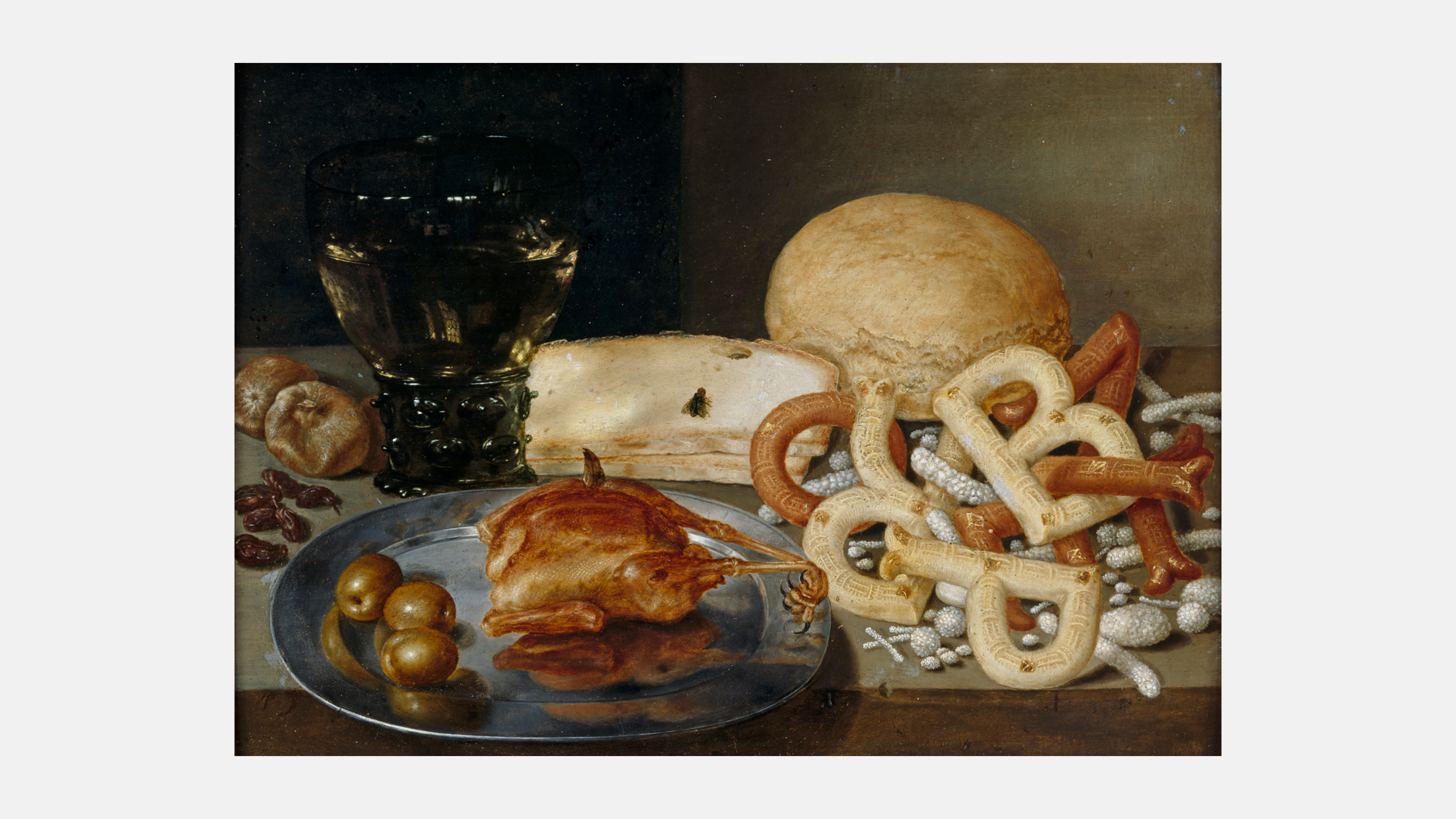
Peter Binoit, Still Life with Letter Pastry, 1615
Here, taste an A — they’re very good.
— Norton Juster, The Phantom Tollbooth
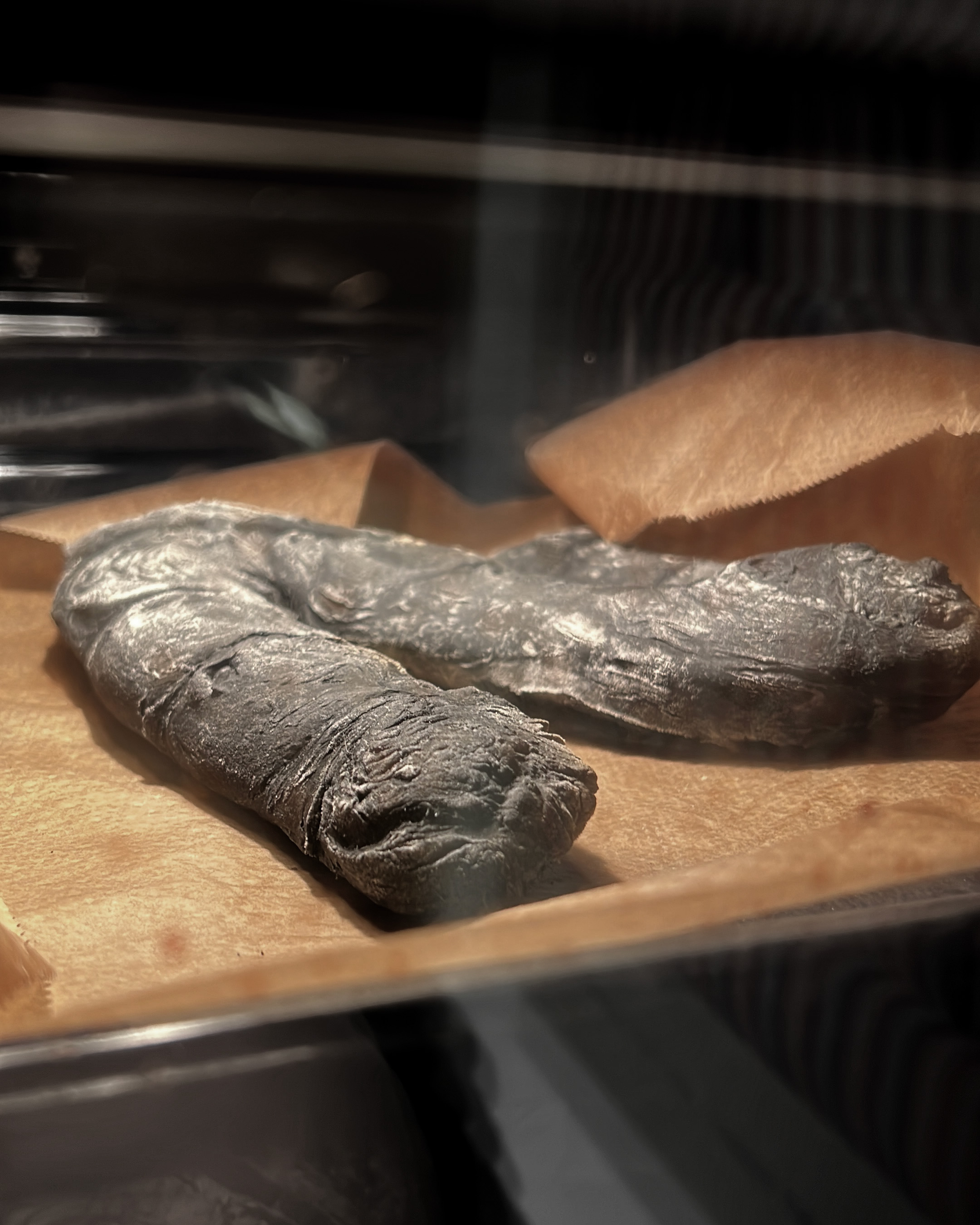
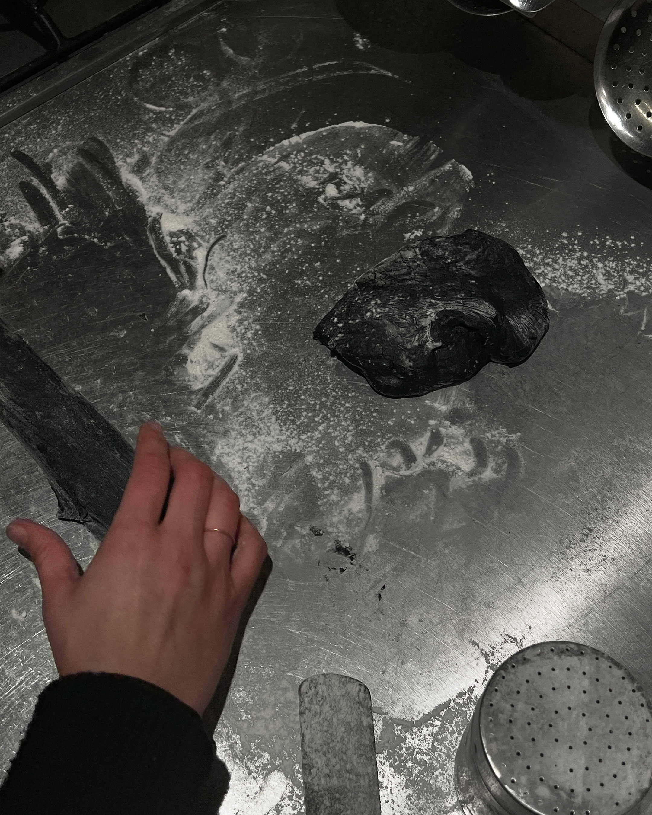
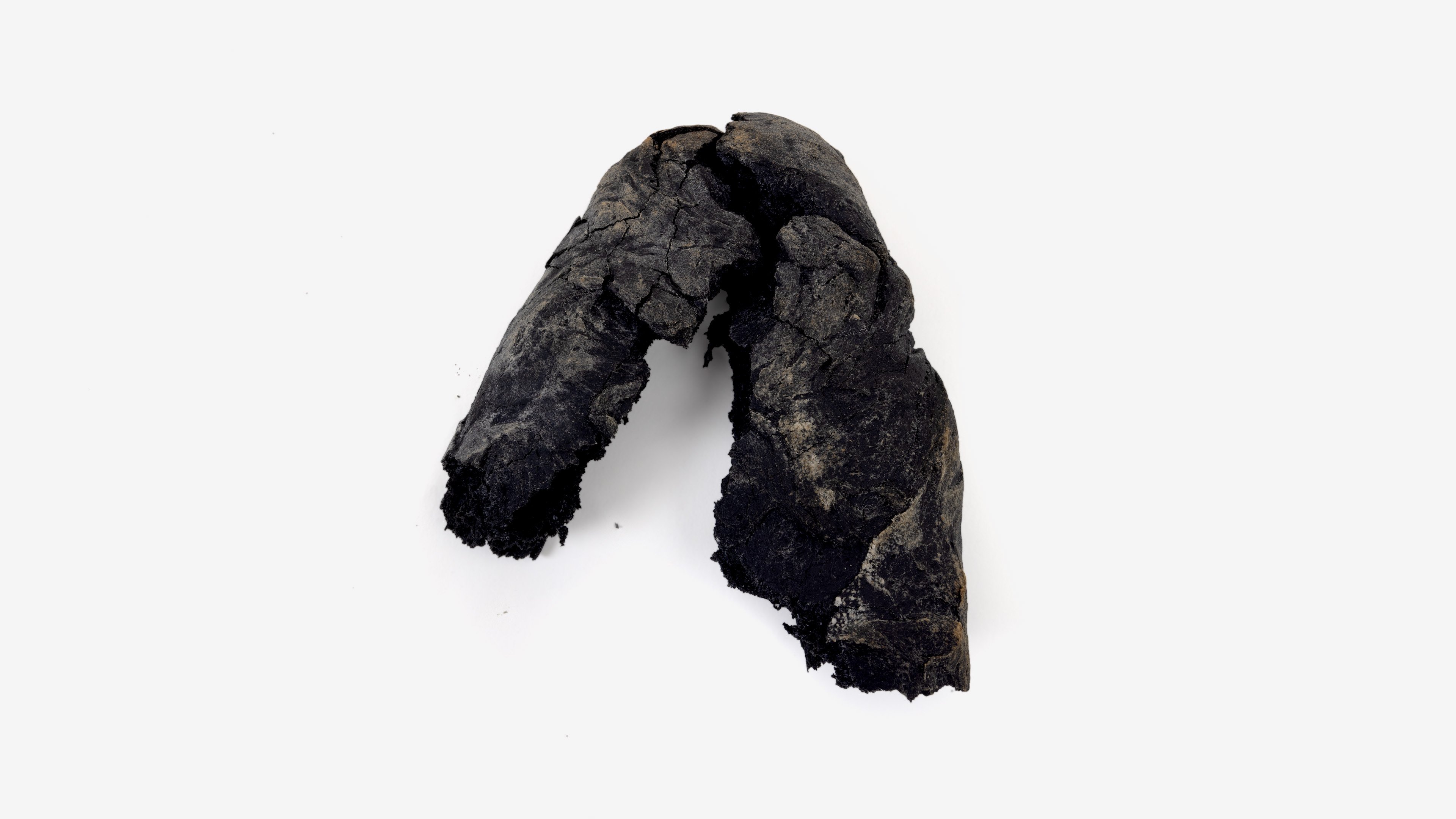
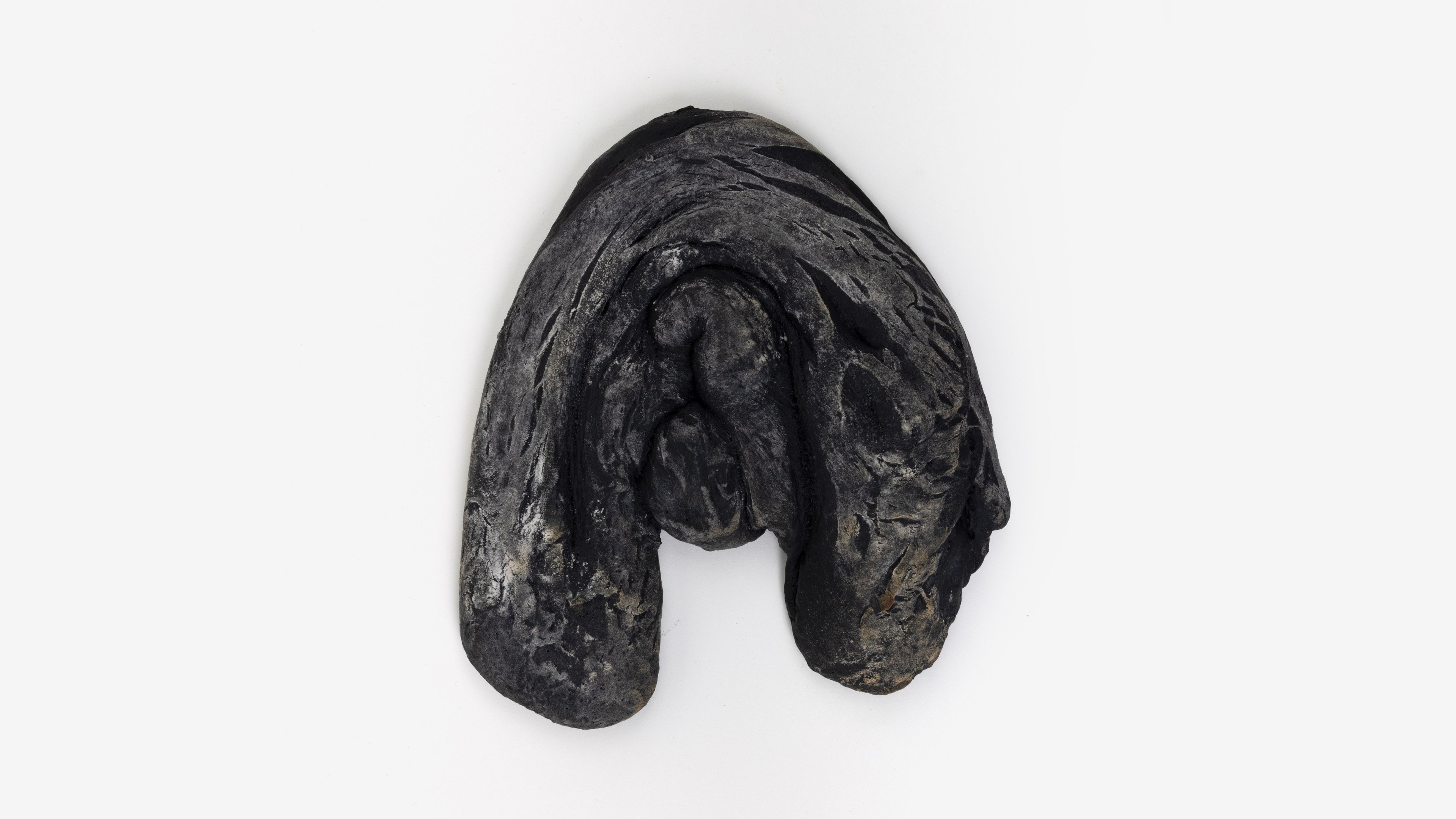
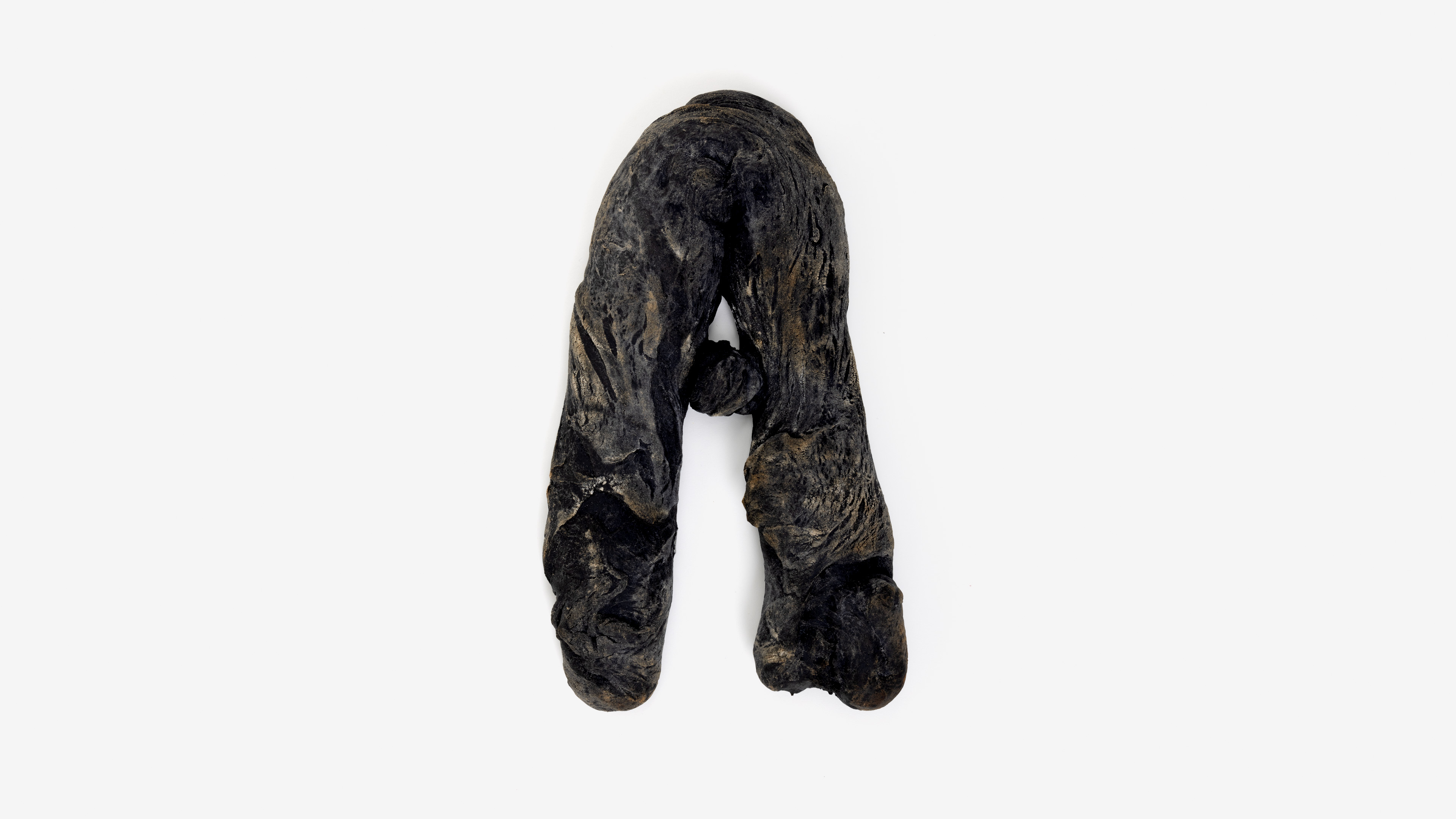
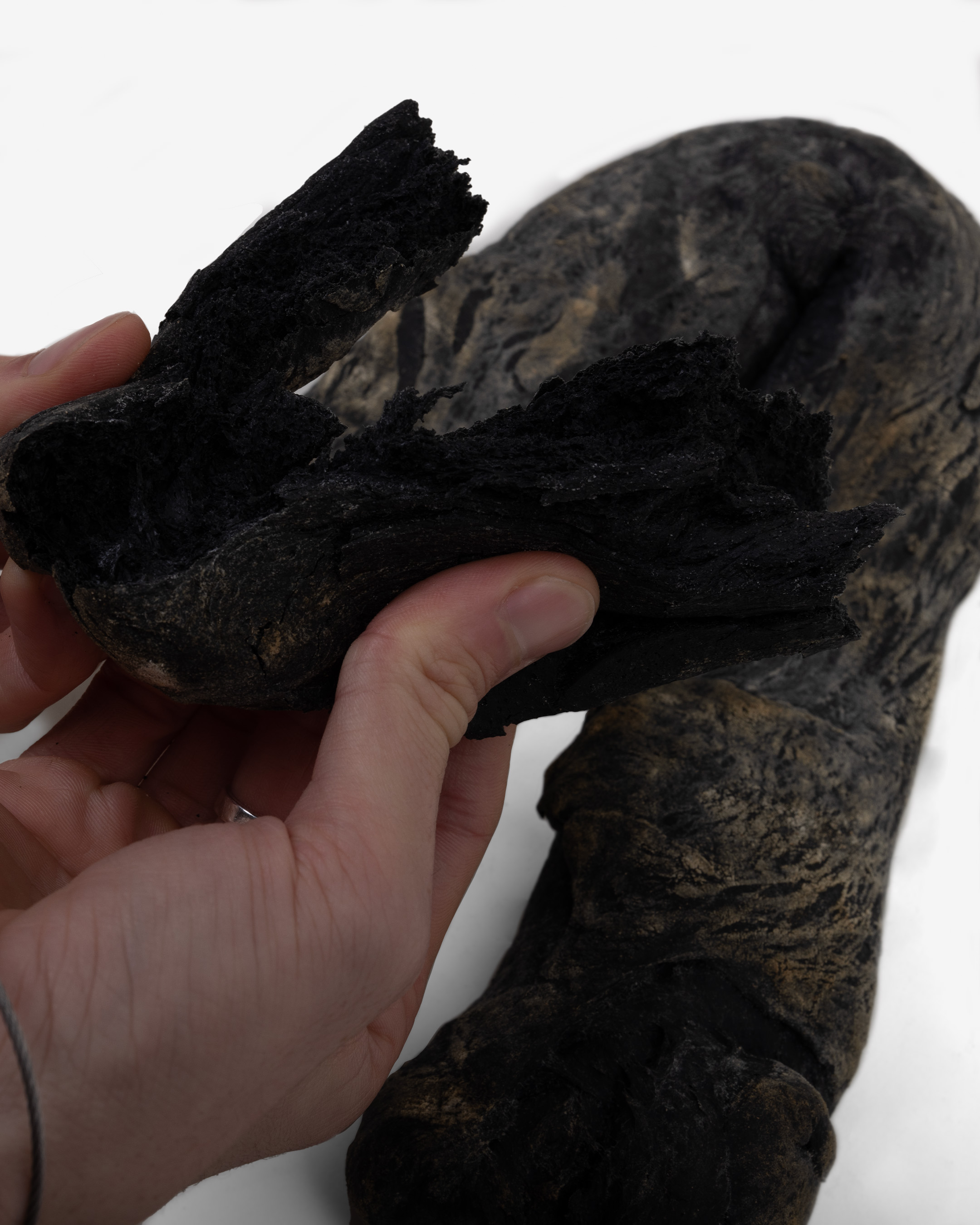
A brief step into the object-world of Dutch still-life painting reveals a mystery of both baking and typography. A pile of entwined letters made from bread; baked S’s and J’s next to a giant lobster on a platter; pretzel-like B’s and P’s lying discarded on a white tablecloth — details such as these are visible across several early seventeenth-century paintings. Almost as soon as still-life painting was developed in the Netherlands, depictions of letter-shaped food began to appear in various examples of the ‘banquet scene’ subgenre.
The painting with the largest and most noticeable of these letters, Peter Binoit’s Still Life with Letter Pastry, has been cited by the type designer Gerard Unger as the first example of sans-serif letterforms. Produced in 1615, the painting predates the typically acknowledged invention of sans-serif typefaces by around two hundred years. Presumably it was too fiddly to bake serifs. And Binoit wasn’t the only painter to have portrayed these edible letters: examples appear in the work of contemporaries such as Floris van Dyck, Pieter Claesz, Clara Peeters, Osias Beert, Floris van Schooten and Frans Francken the Younger.
Why letters like this might appear in paintings from this time is, on the one hand, an easy question to answer. Banket letters — S-shaped pastries filled with almond paste — are still around today, not just in the Netherlands, but also in Iowa, where they were introduced by nineteenth-century Dutch immigrants. Described variously as bread, pastry, biscuits or cookies, it’s a decent bet that the letters painted by Benoit et al are essentially a variant of these. Edible letterforms have been traced back to the Middle Ages, when trainee monks learned literacy with pastry alphabets, which they were then allowed to eat as a reward for studying hard; the food historian Gillian Riley tells us that gingerbread letters were later used to teach children the alphabet as literacy became more common. Indeed, edible letters have retained their association with learning, right up to Haribo’s bärenschule (‘bear school’) sweets, which are available in Germany and whose branding features a cartoon bear learning to read.
On the other hand — why are these letters here? Still-life paintings are famously allegorical, with each item carefully selected for its symbolic potential. Candle: the passing of time. Human skull: death, a memento mori. Fruit: fertility, or perhaps the soul; it depends who you ask. Virtually anything, it turns out, can be interpreted as a Christian symbol of some kind. Banquet scenes are very much included in this injunction towards metaphor. Often including items of food considered rare or opulent, they are documents of the Dutch ‘Golden Age’, when trade and colonial exploitation brought unprecedented wealth to the country. But in a particular spin on the vanitas subgenre of the still life — which contrasts symbols of life and material success with reminders of transience and mortality — it’s not uncommon to see these in a state of decay, or otherwise subverted (Binoit’s Still Life with Letter Pastry, for instance, has a couple of telltale flies hovering around, tainting the scene). Life is good, they say. But not for long.
In other words, the presence of pastry letters in these paintings isn’t just a matter of historical accuracy — in a world where every object became a symbol, they had to mean something. Exactly what this might have been is a harder question to answer. Riley wonders what a pastry ‘P’ signifies in a 1612 Peeters painting. Could it be the artist signing her name? The letters in Binoit’s painting, though it’s hard to tell for sure, might conceivably spell out his surname, but other examples, like Pieter Claesz painting S- and D-shaped biscuits, have no clear relation to the painter at all. Could it then be the name of a patron? A reference to Saint Peter? “A hope for peace, Pax, in a region worn by religious conflict and foreign invasions”? Or are letters like this simply “chosen for their abstract geometrical shapes alone”, painters delighting in their sheer formal pleasure?
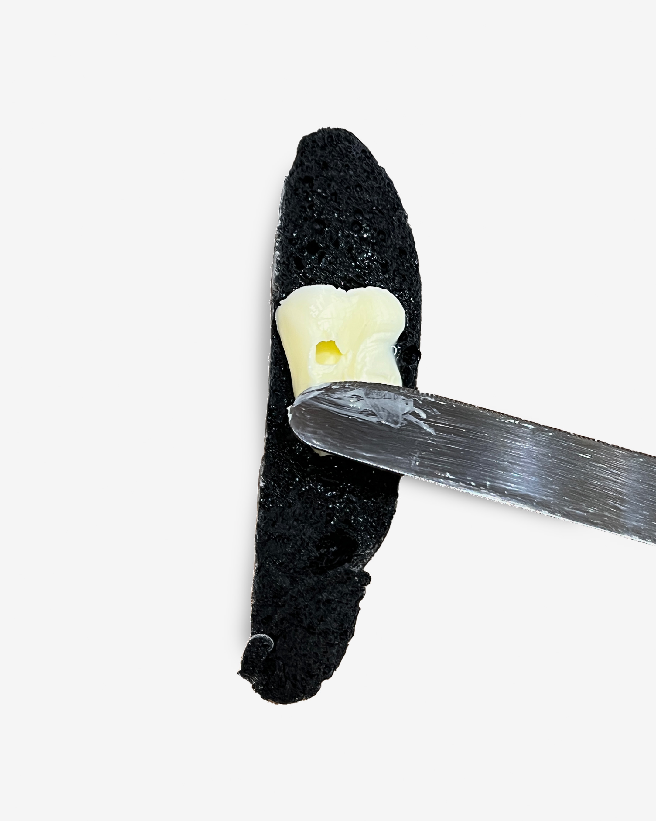
If the letters stood for anything in the first place, then each has a resonance lost to us now. They are are empty signifiers, language which has forgotten its sense, typography that has lost its representative capacity; unknowable scraps of meaning adrift in landscapes laden with excessive symbolic richness. But beyond a painter’s specific attachment to individual letters, perhaps these images of edible type retain an unexpected ability to articulate what it’s like to actually use language. The twentieth-century French writer Michel Leiris describes a formative childhood experience with alphabetti spaghetti: “these noodles shaped into letters,” he writes in his memoir Scratches “played a part in suggesting to me that one of the basic characteristics of language (which only takes on reality when it sculpts itself in one’s mouth) was that it could be mixed with saliva, kneaded by the tongue and teeth, eaten and savoured."
Language, Leiris suggests, isn’t some kind of perfect mirror for thought or unmediated representation of reality, but instead a kind of food — just as protean and endless, something to be broken down and absorbed into the body. The 1960s children’s book The Phantom Tollbooth features a ‘Word Market’, with edible letters for sale so that the buyer can make new words; we’re told that the real reason Zs and Xs are less common in English words is that they don’t taste as good. If typography is conventionally the art of written language, then could it be that these depictions of edible letters are an inadvertently successful typographic representation of speech?
The disparate tradition of edible letterforms continues today with the chocolate letters given as gifts for the Dutch celebration of Sinterklaas, with people receiving the first letter of their name to eat. Unlike the Golden Age bread letters, these are set in a serif typeface, usually Égyptienne — a midcentury invention, like the mass-production of chocolate. Chocolate Sinterklaas letters present a technical challenge of their own: despite their varying shapes and sizes, each letter is made to weigh exactly the same so that no-one feels short-changed. According to type foundry Fontshop, chocolate letter-makers Verkade experimented with digitally inspired LCD letterforms for a short period before switching back to Egyptienne (in 1990, Gerard Unger also designed a new, more rounded, but never-used chocolate typeface). “People prefer the traditional letter: somehow you always manage to break off a bigger piece than you intended.”