Posters
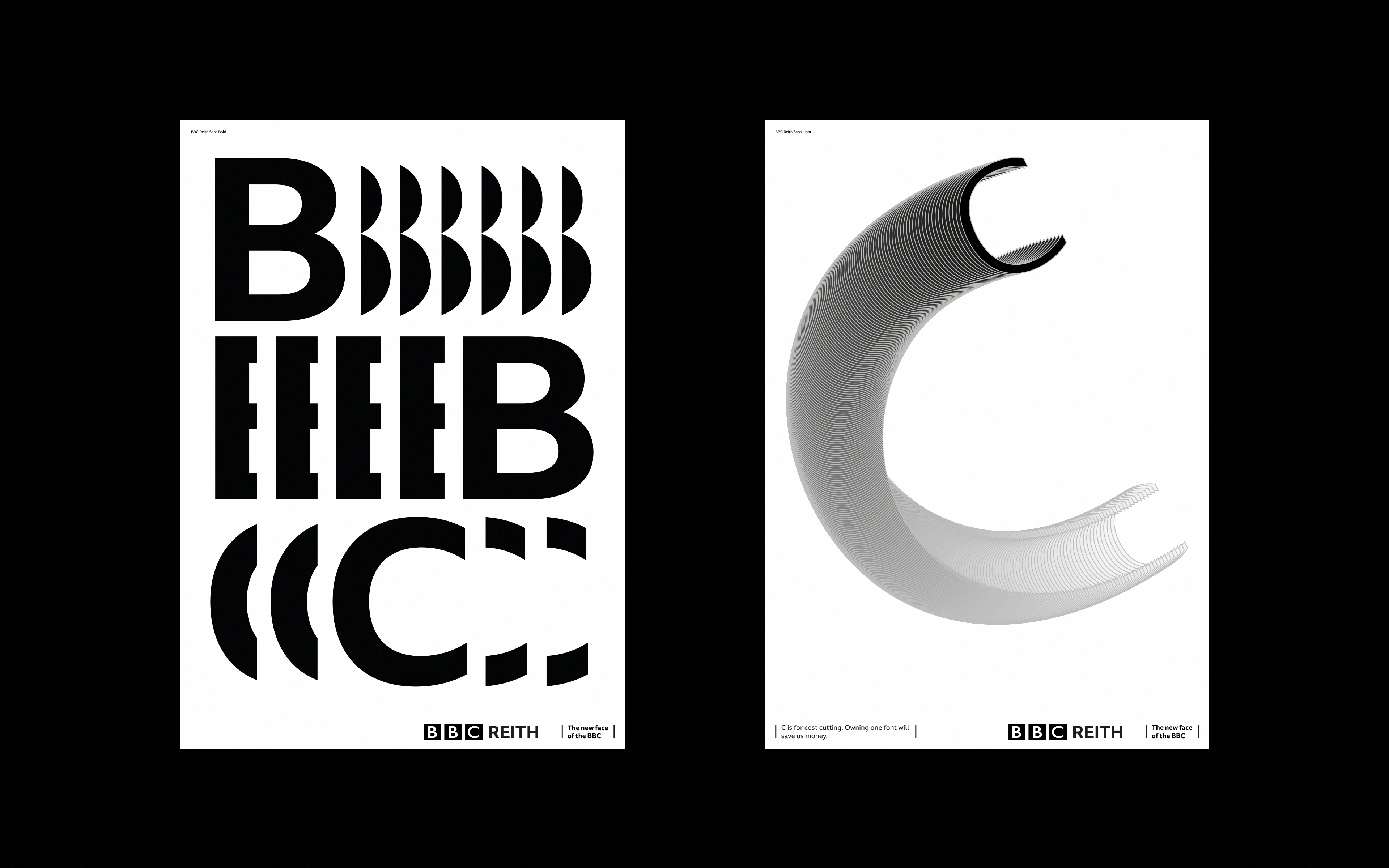
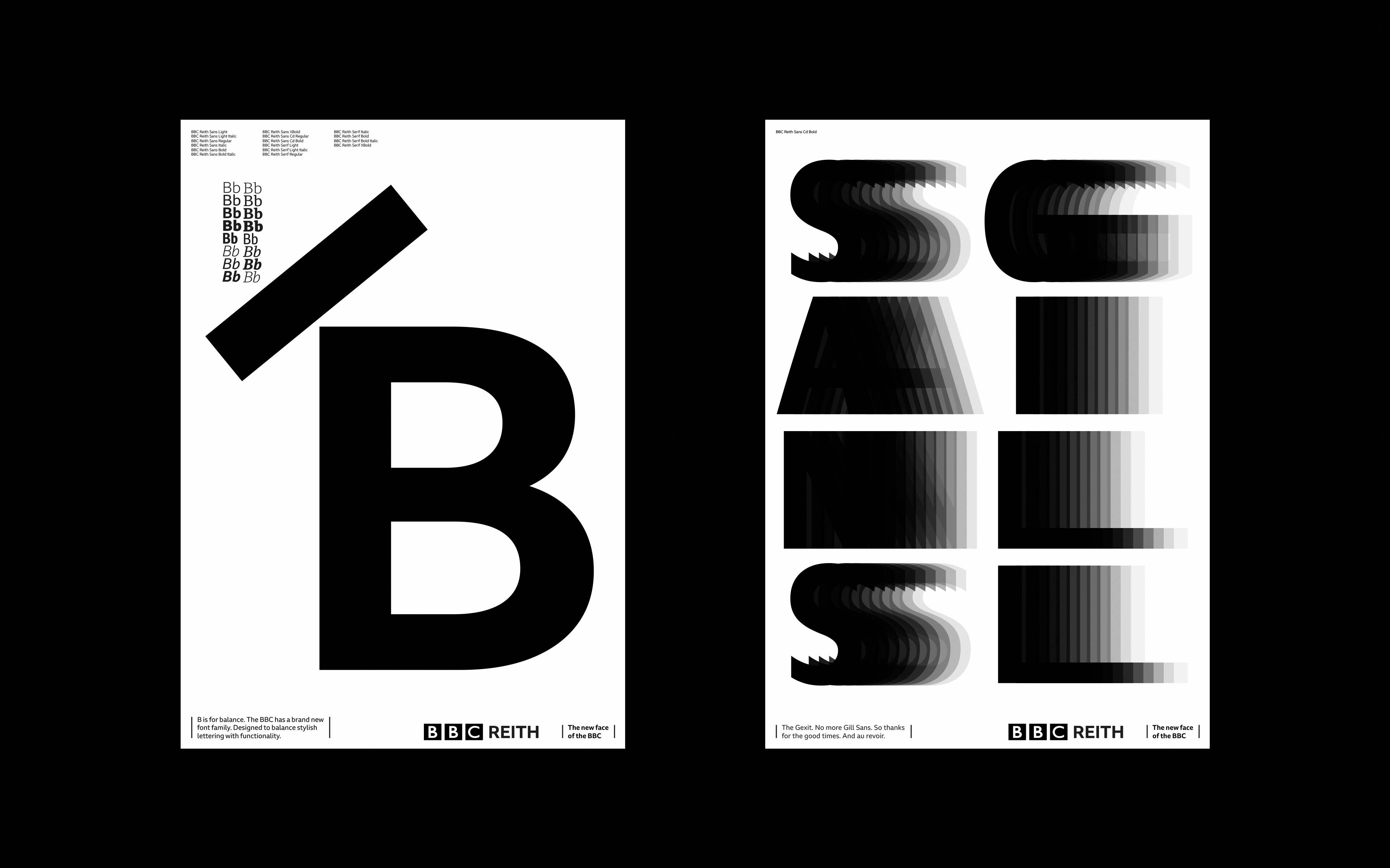
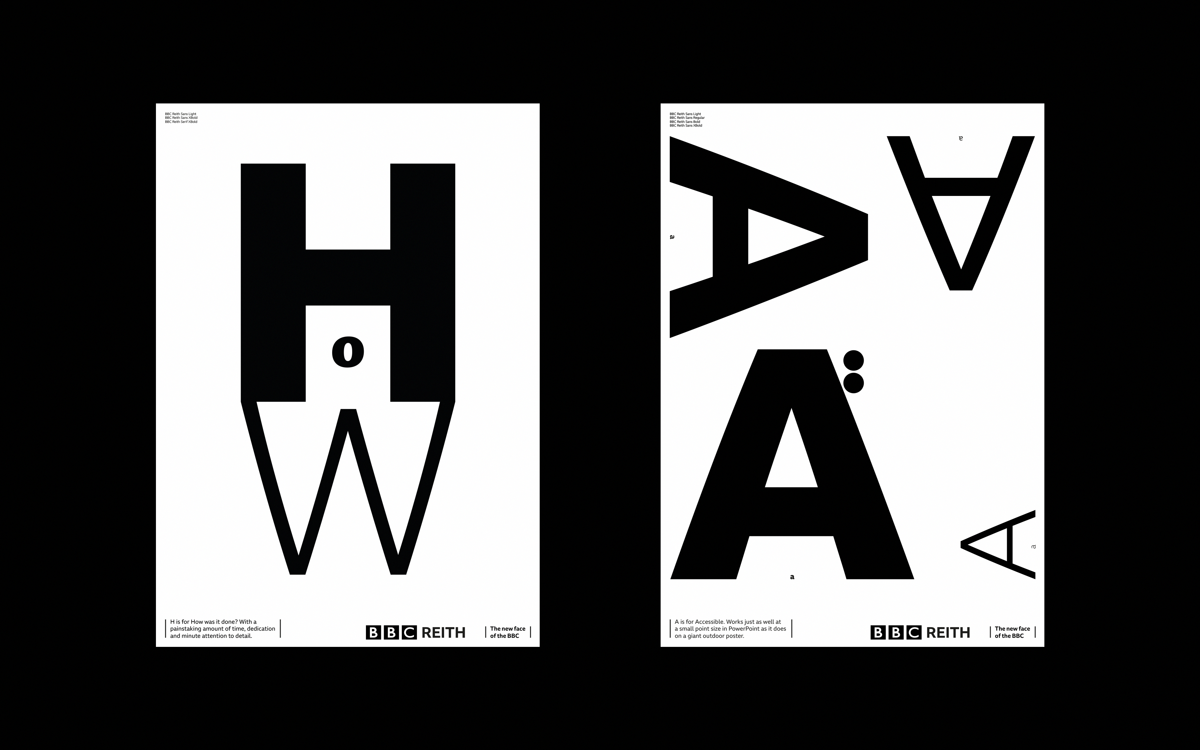
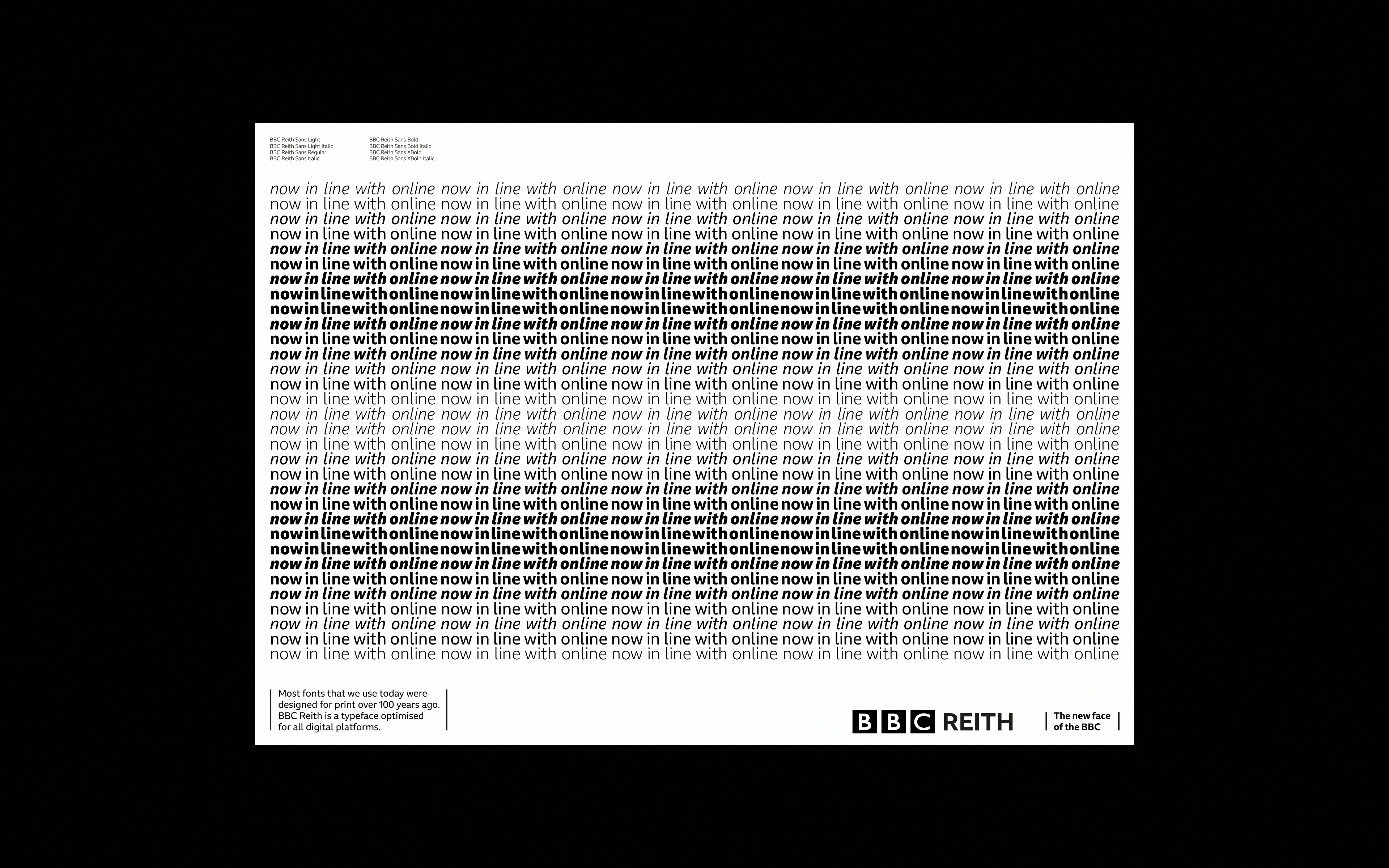
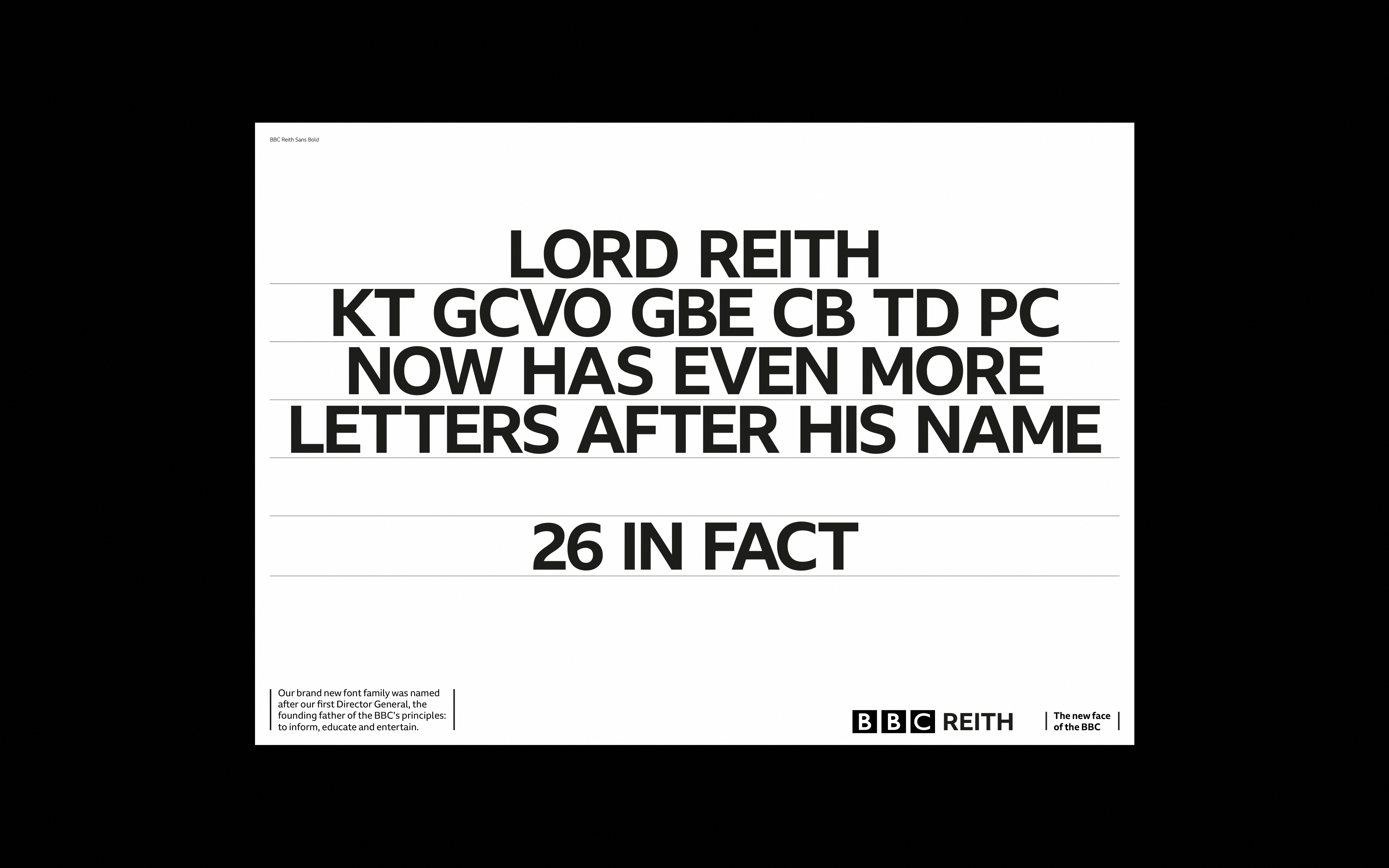
A bespoke typeface can be a huge opportunity for a company: it creates a singular and consistent mode of expression, a unique voice to speak in. When the BBC, one of the best-known national broadcasters in the world, created its first ever custom font, they needed a way to promote it to their 20,000 employees, introducing them to just that voice. BBC Reith — named after the corporation’s founder, Lord John Reith — was produced with the help of the renowned type foundry Dalton Maag. Designed to meet the holistic demands of contemporary usage and the digital world without compromising on aesthetics, the typeface is, as they put it, ‘anchored in tradition but with a progressive outlook’.
Animated posters
Once the typeface had been finalised, we worked on its launch campaign in collaboration with BBC Creative. Highlighting various details, we articulated its particular appeal and utility in an eye-catching and entertaining way, producing a poster campaign that was displayed in all the BBC’s UK locations as well as an online guide to the font family. We focused on the advantages that BBC Reith brought to the company’s output: increased legibility both on- and off-screen, a more distinctive personality, greater creative possibilities, the versatility offered by its variety of weights and styles, and huge cost savings. Posters, animations, and the website all used a variety of striking and artistic treatments of Reith letterforms to bring the font to life, while the interactive guide combined utility and visual appeal, using an ‘A to Z’ format to showcase each individual Reith letterform and give 26 reasons why the typeface was worth having. The project also included a limited-edition set of silk-screened posters.
Micro-site