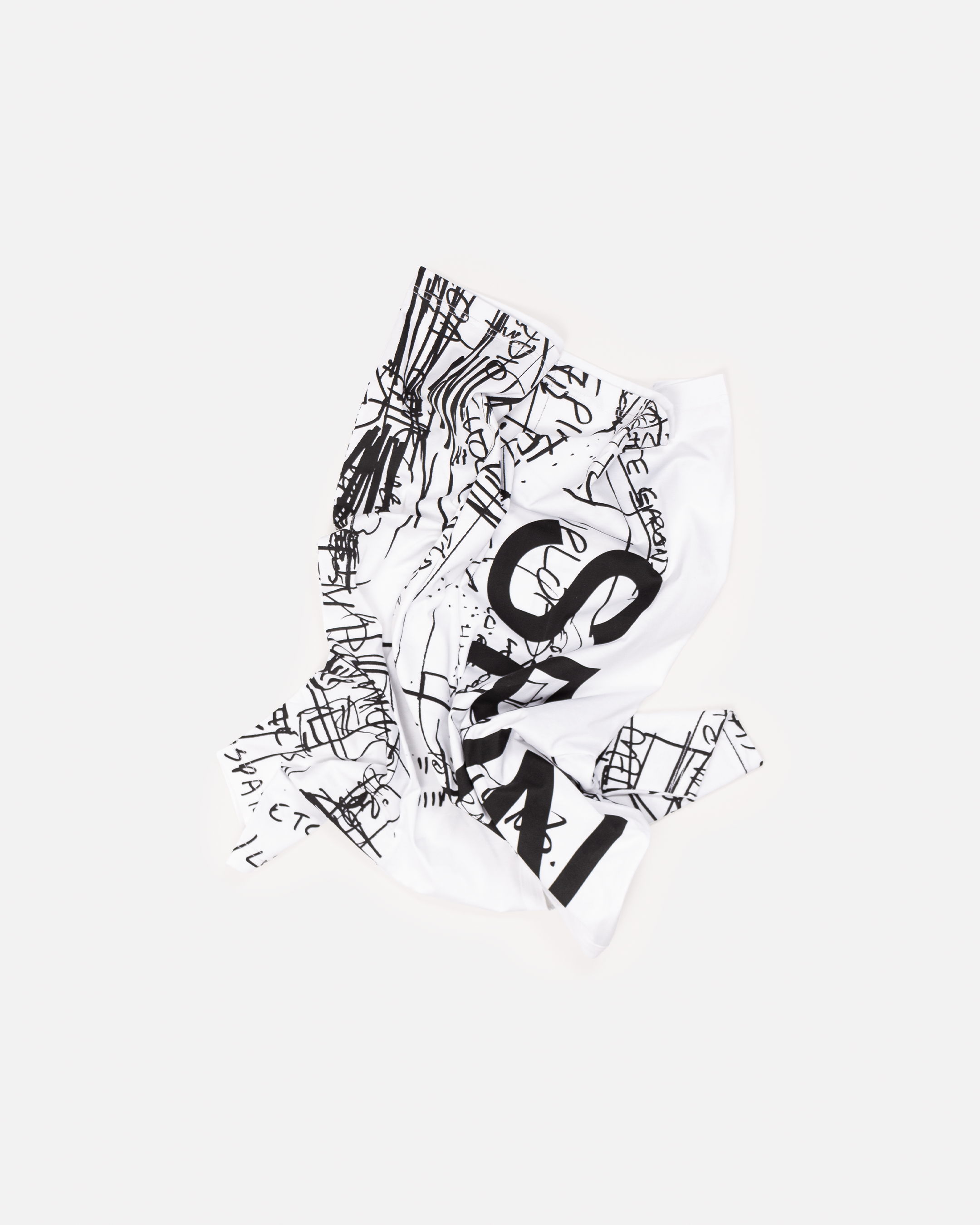
Shirt
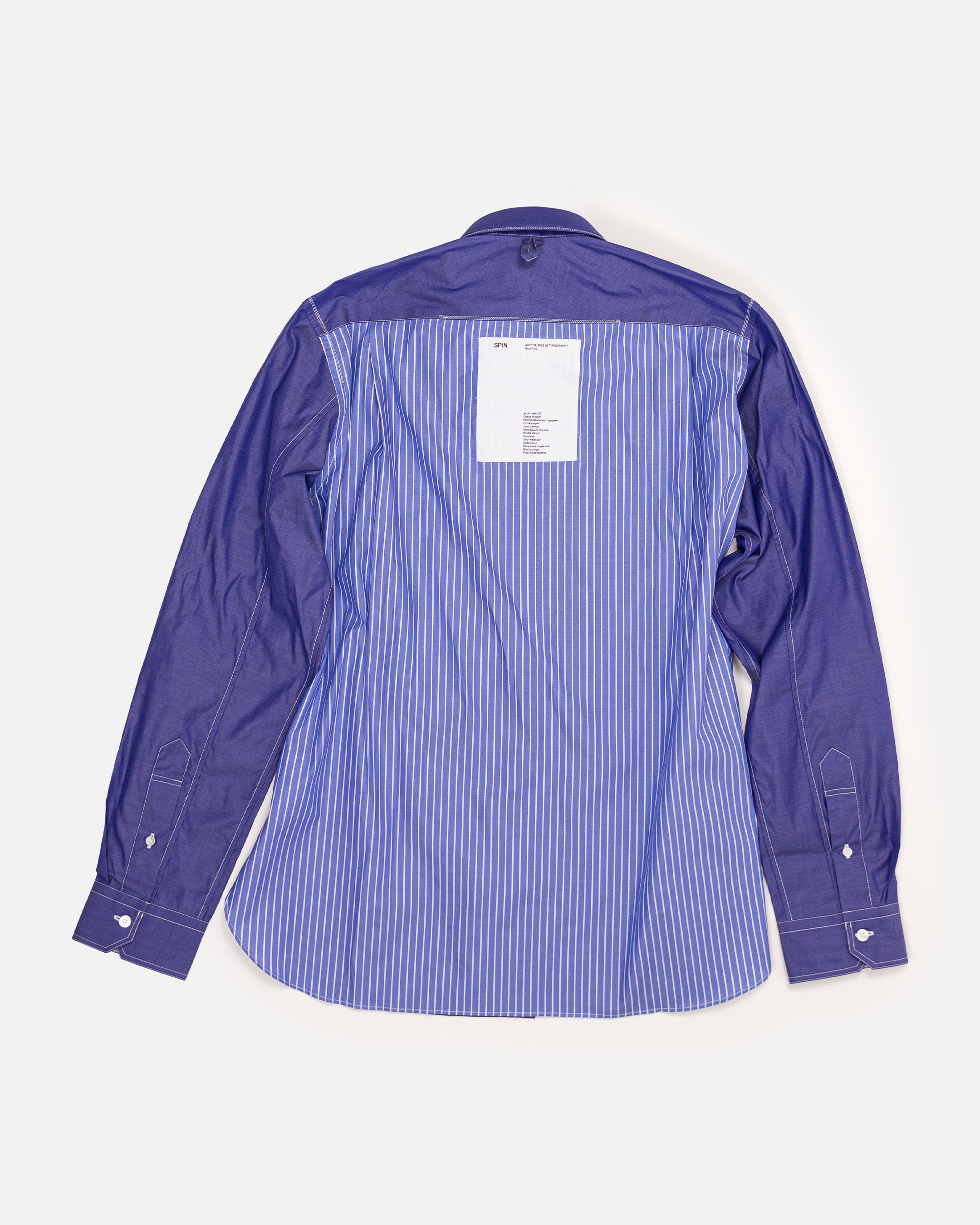
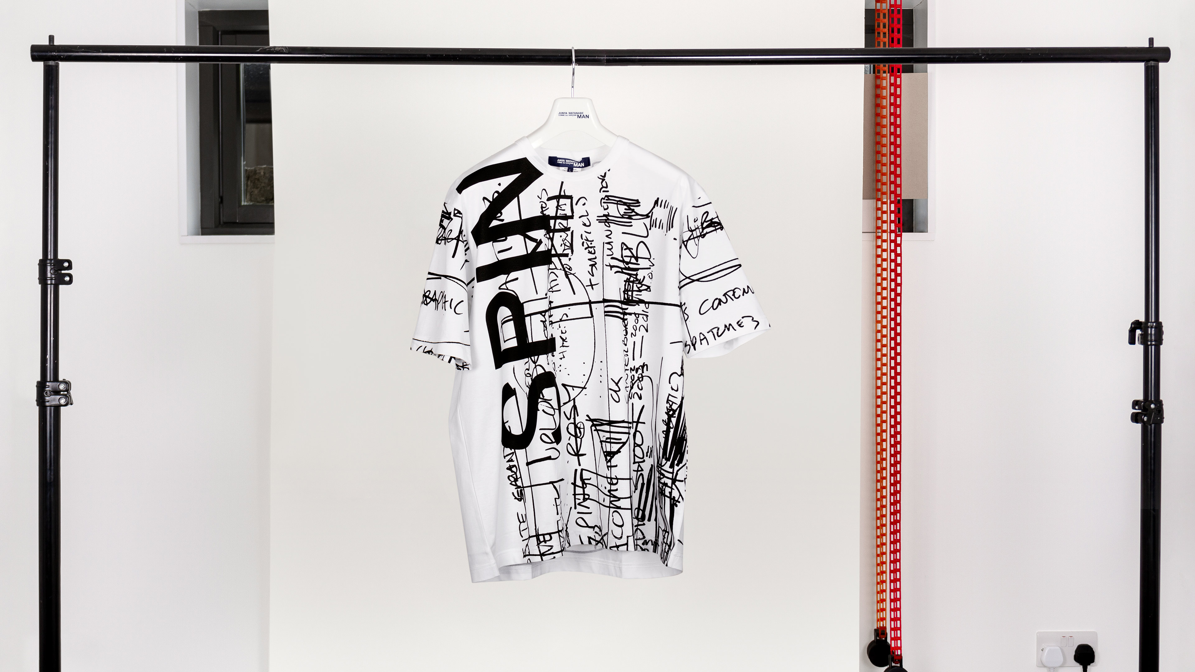
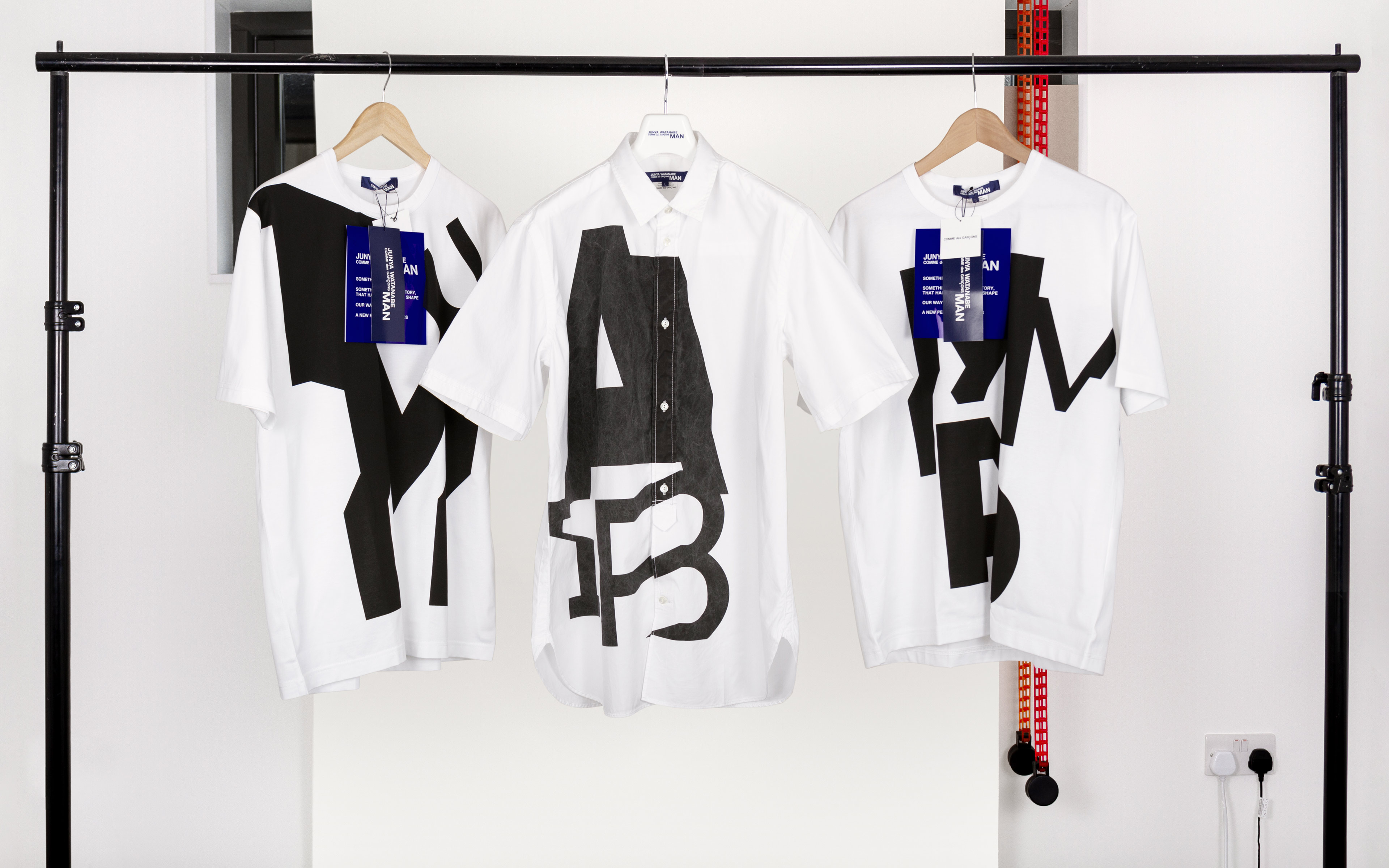
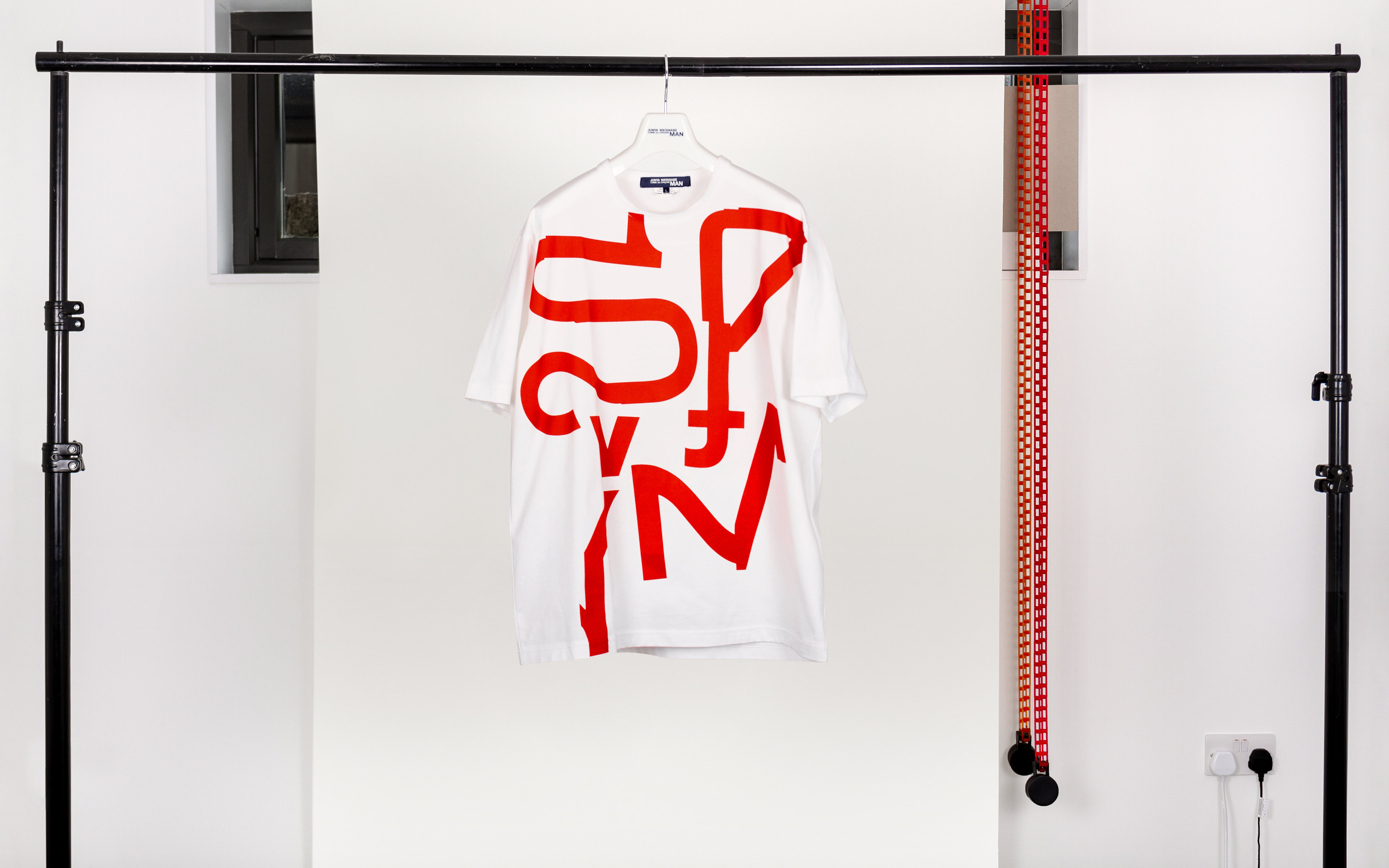
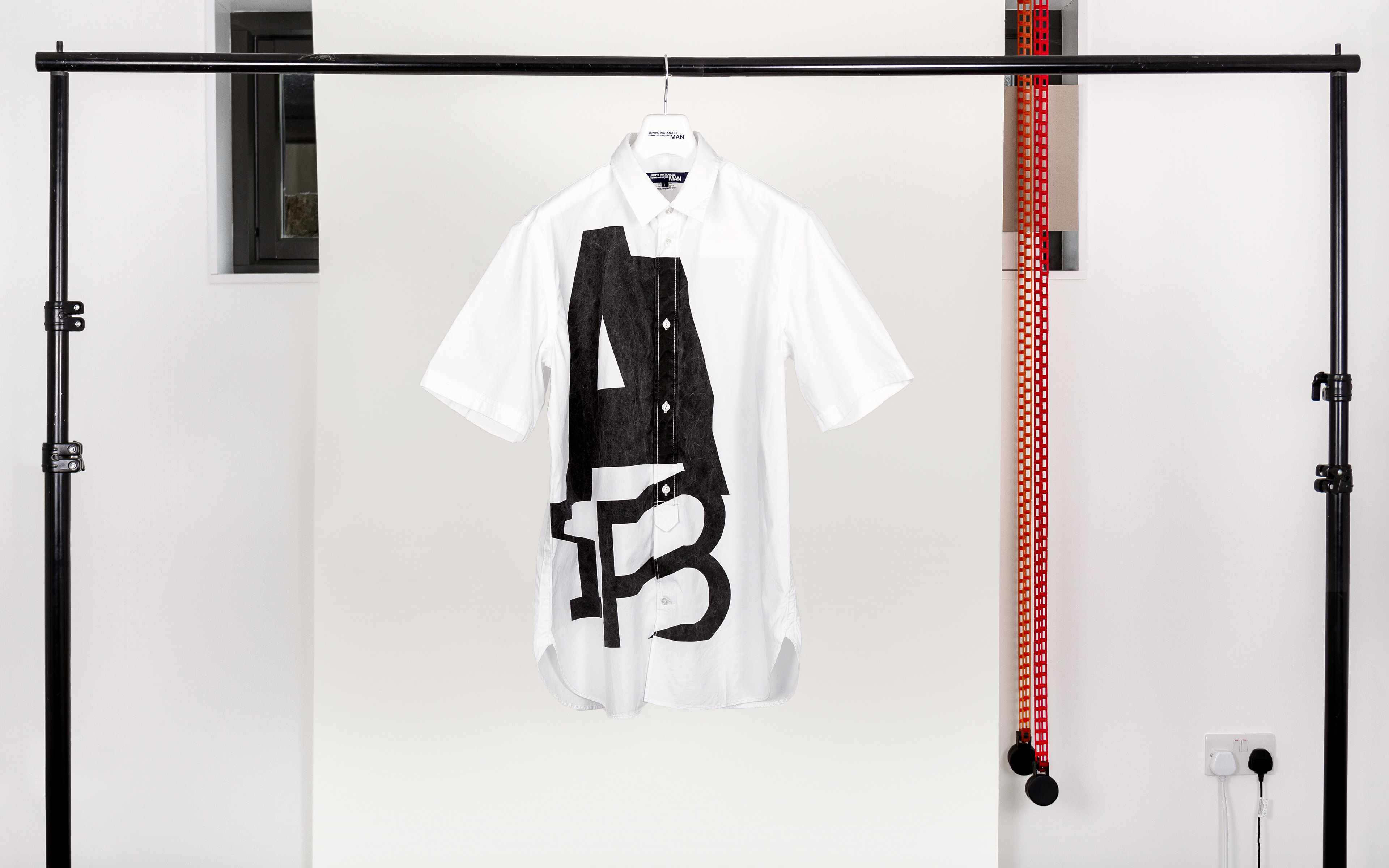
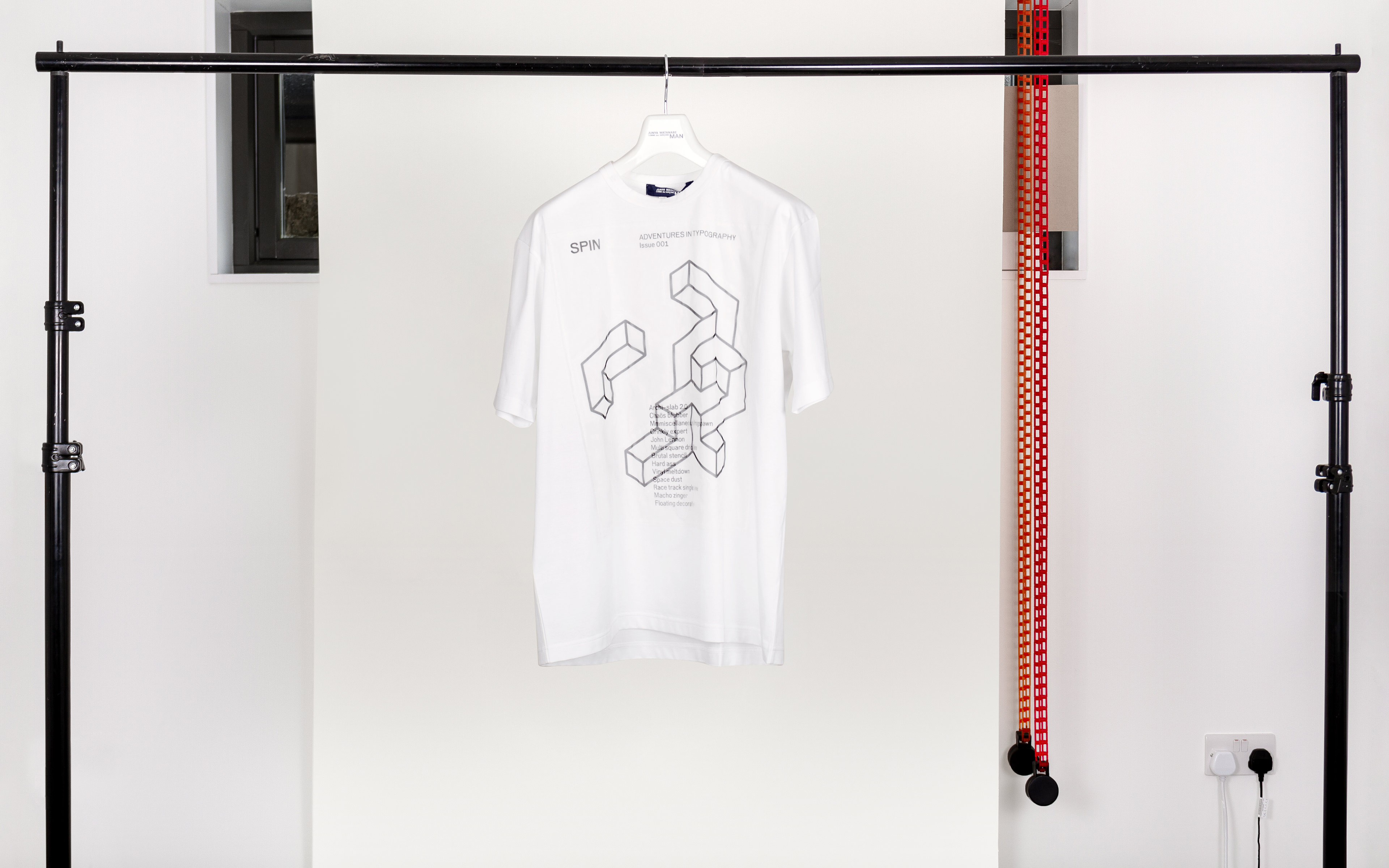
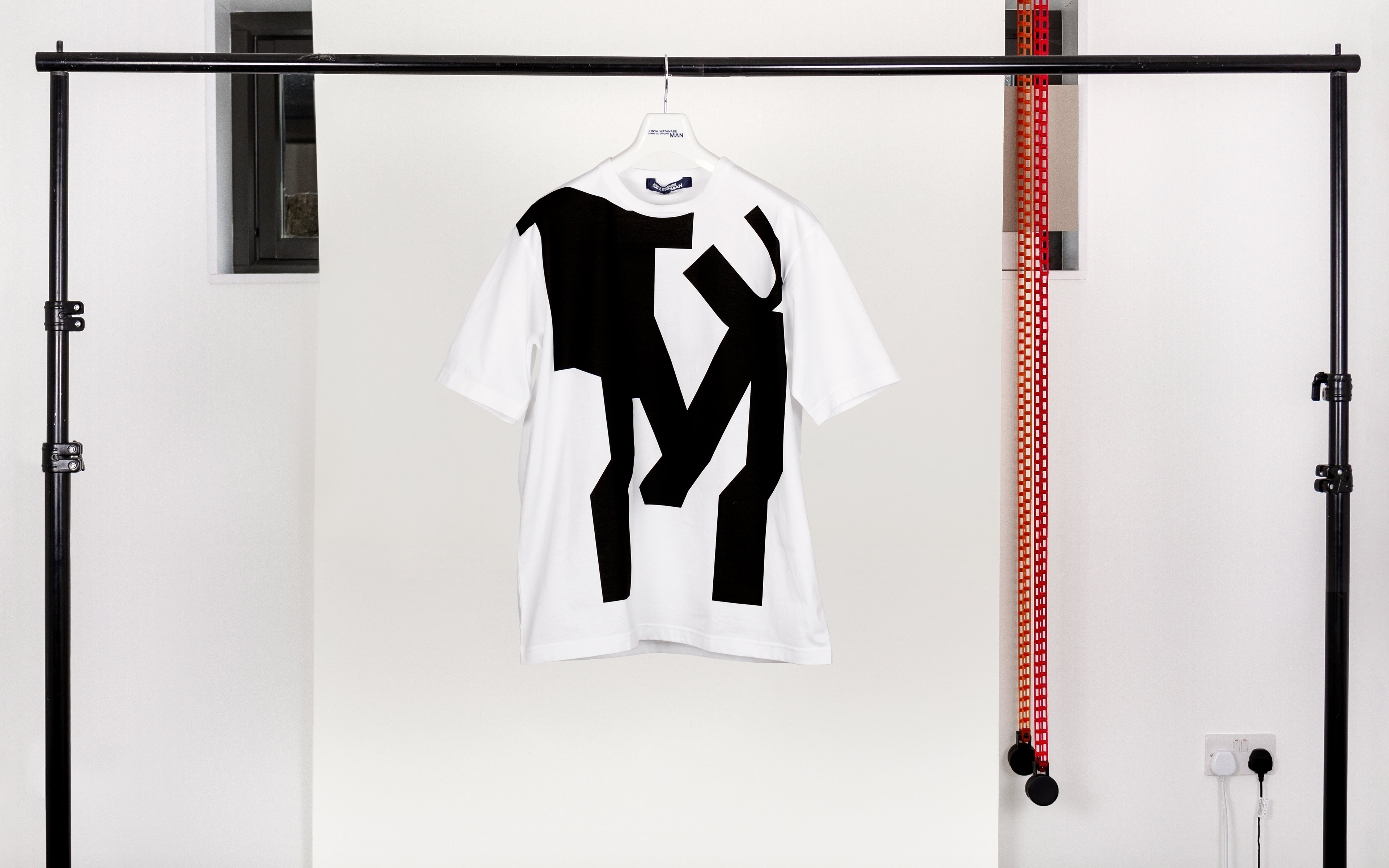
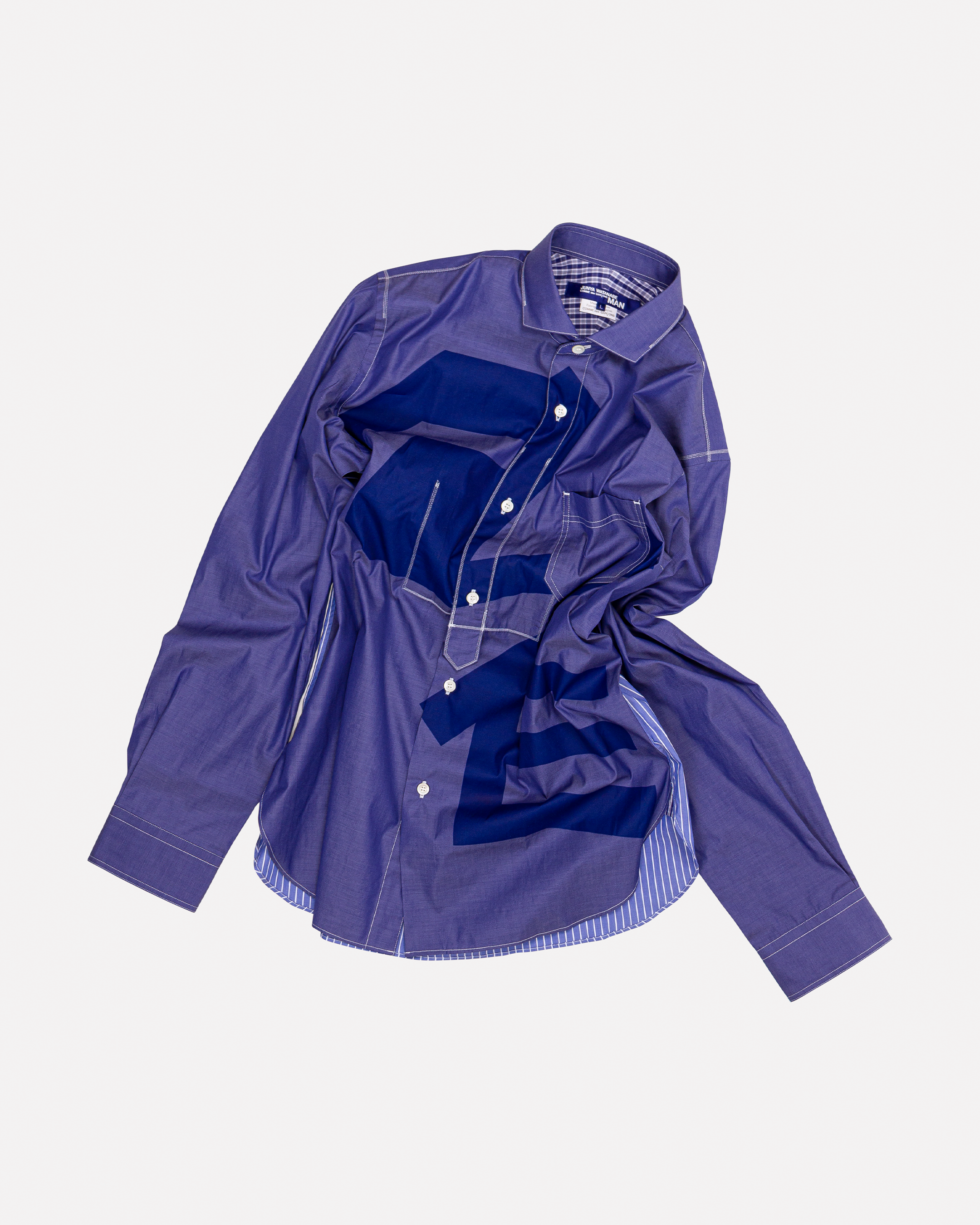
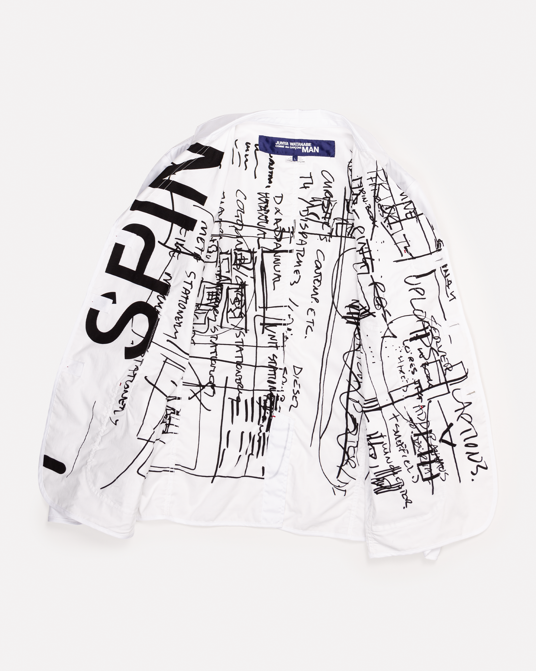
We worked with the Japanese fashion designer Junya Watanabe on his Comme des Garçons Man S/S21 collection, inspired by the books that surround him and featuring a range of titles designed by SPIN and published by Unit Editions. We contributed our monograph SPIN: 360º and journals SPIN: Adventures in Typography 1.0 and 2.0 — graphics from these, including cover designs and playful typographic experiments like ‘Frankenstein's Helvetica’, were incorporated into clothes and accessories designed by Watanabe.
Shirts and t-shirts
Junya Watanabe was born in Fukushima in 1961 and graduated from Tokyo’s renowned Bunka Fashion College before starting out as a pattern-cutter at the Comme des Garçons label, famed for its avant-garde credentials and punk influences. Having become the protégé of founder Rei Kawakubo, Watanabe took on various roles at the label before starting his own line under its name in 1993 and showing at Paris for the first time that same year. Working within the oppositional spirit of Comme des Garçons but with a decidedly utilitarian bent, he has since become one of the world’s most original and revered designers.
Watanabe is known for combining a quest for pure functionality in his clothing with a highly conceptual and detailed approach towards his creations, drawing not only on fashion history but on work across art and media to execute a precision-engineered deconstruction of a particular idea. Often classed as cerebral or even anthropological in his embrace of complexity, Watanabe would rather use the Japanese term monozukuri (roughly, the creative fusion of craft and science) to articulate his philosophy of work. Freely admitting to being unaware of the work of his fashion contemporaries, Watanabe is motivated not by trend but by invention: “I don’t know how others see ‘fashion’… but to me fashion is creating something, creating something new through clothes.”
Jacket lining
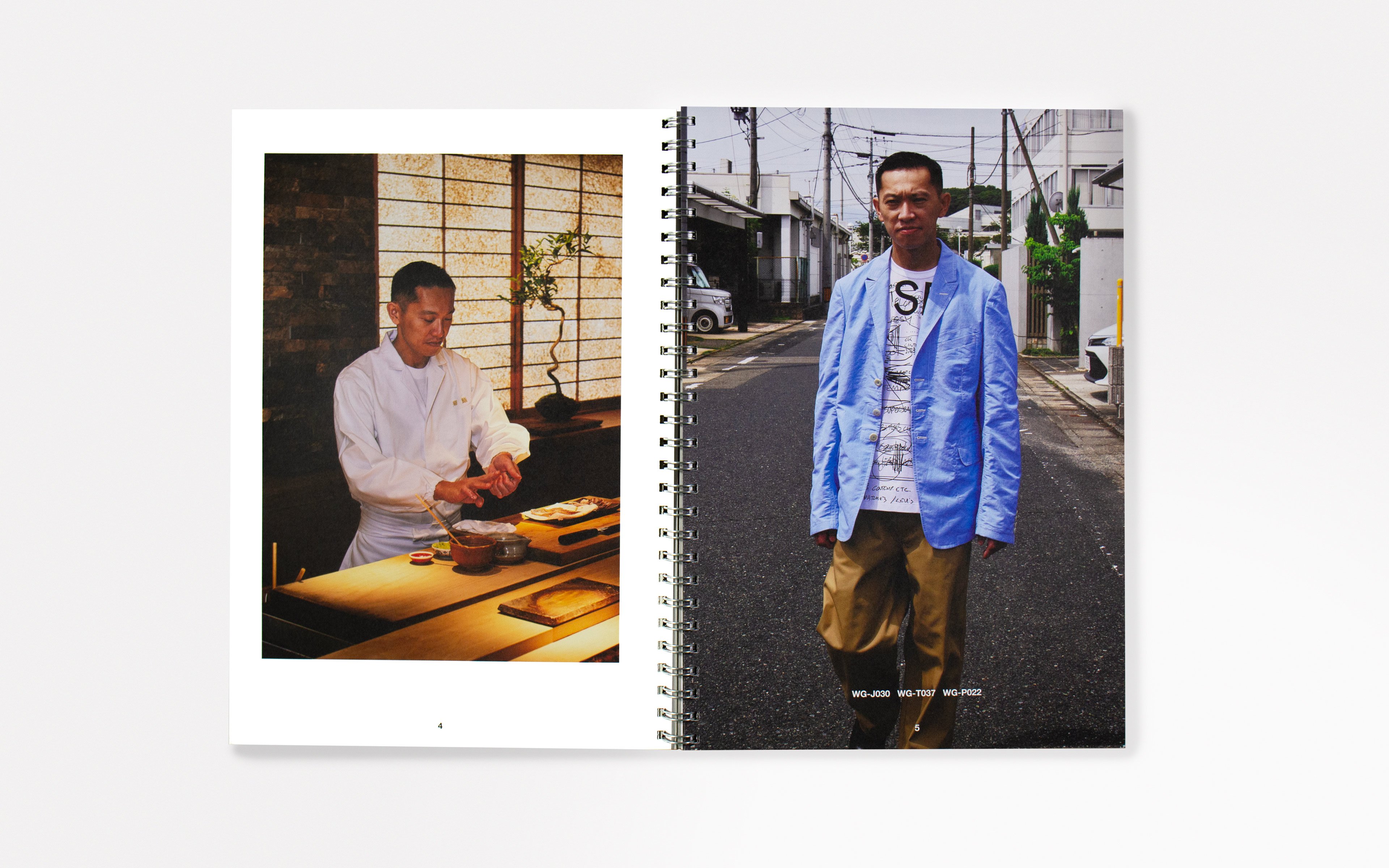
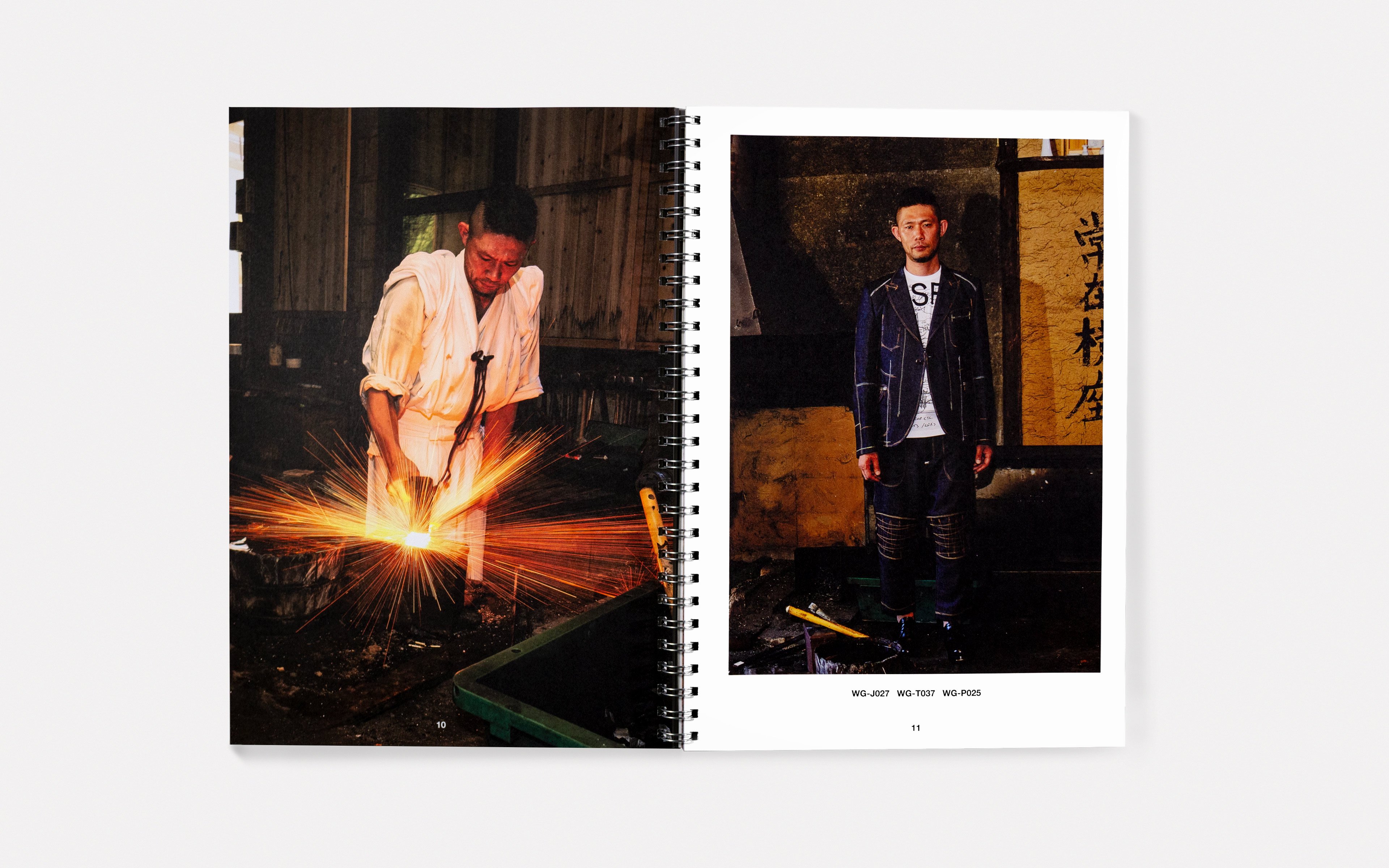
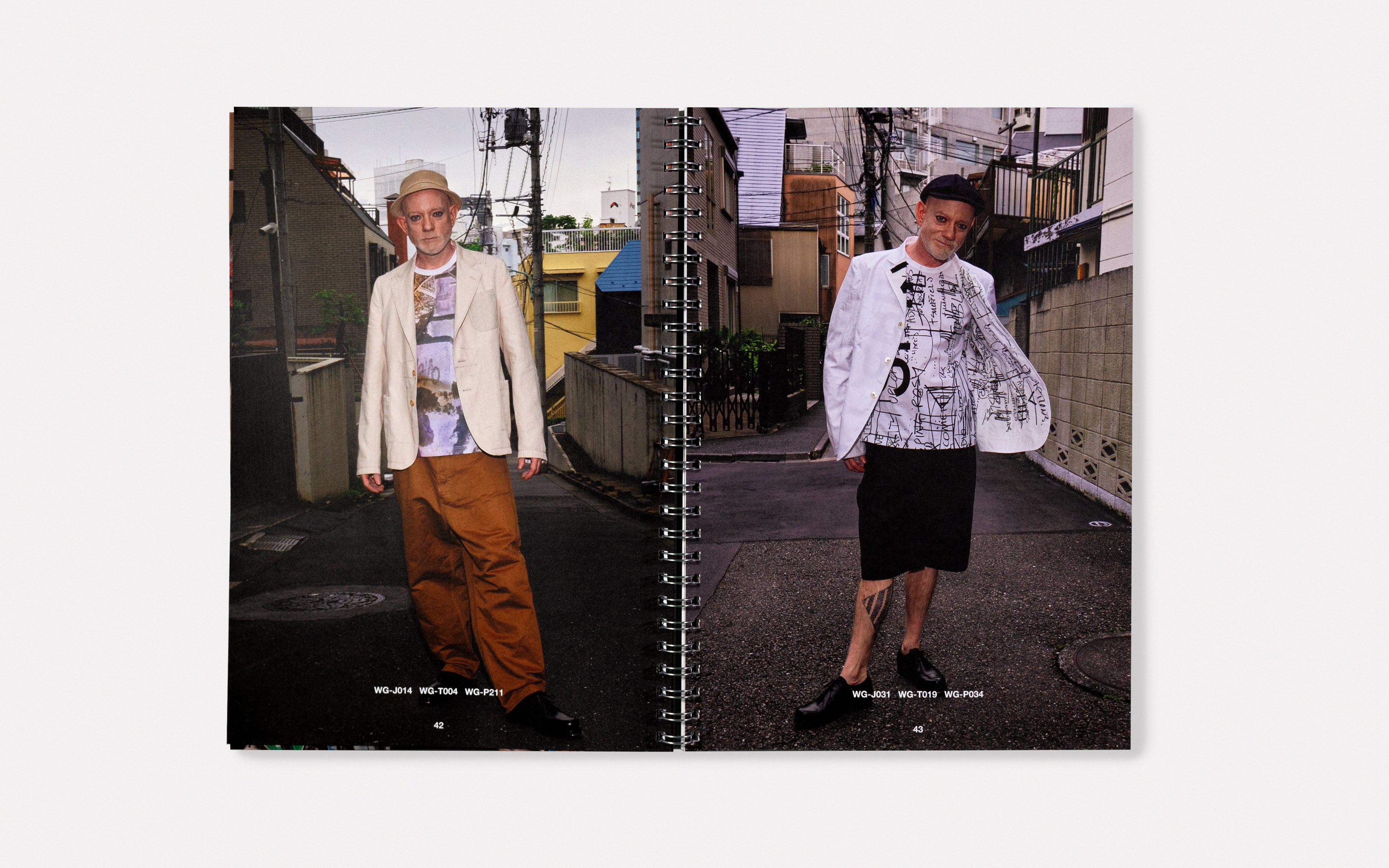
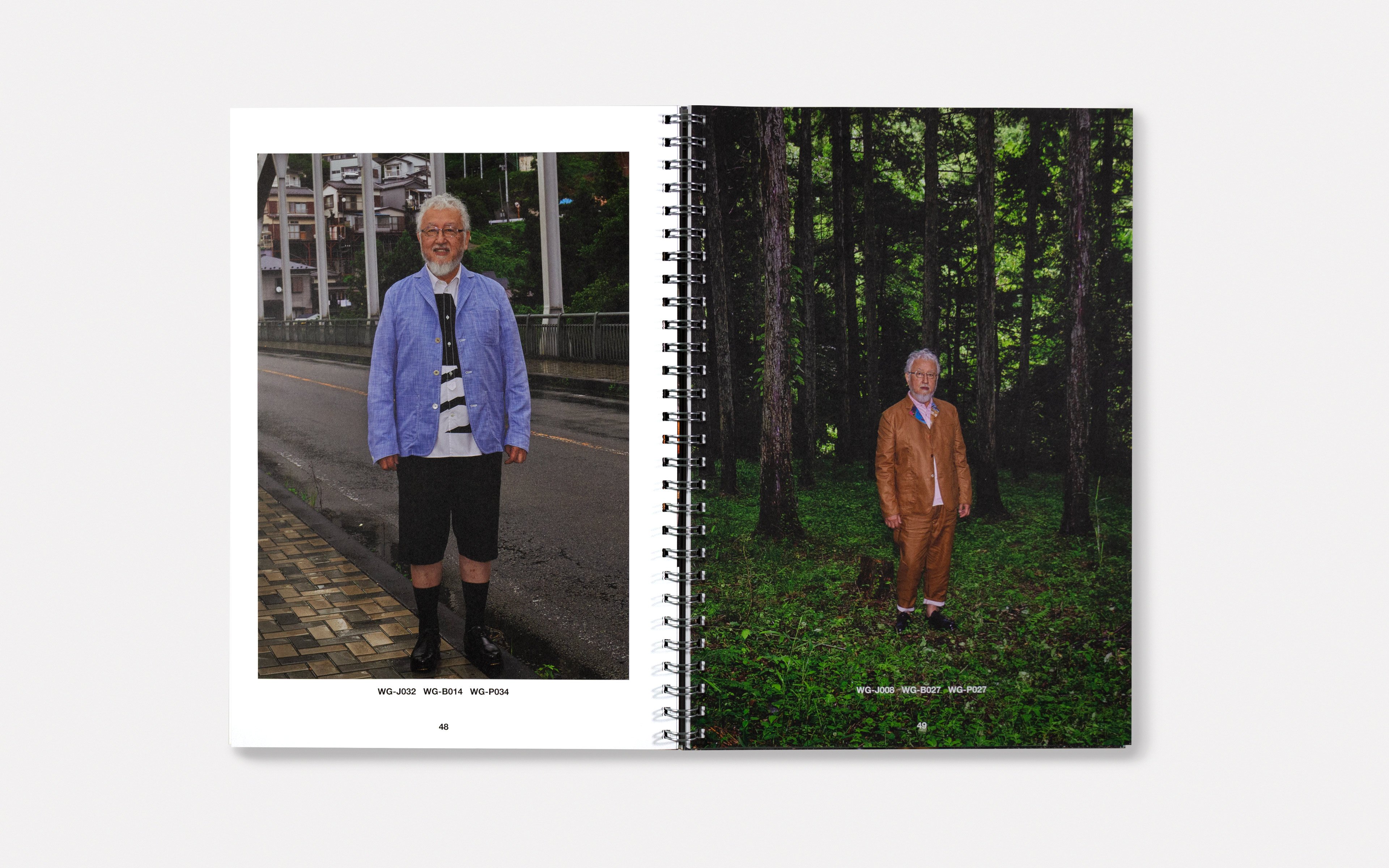
We also produced a co-ordination manual for the collection, a print publication featuring photography from Keizō Kitajima that works both as the collection’s lookbook and as a photography series accompanying Junya Watanabe’s designs. The concept for this was inspired by the workers featured in Kitajima’s photography, with a minimal grey cover and low-key typography giving it a stripped-back, industrial feel.
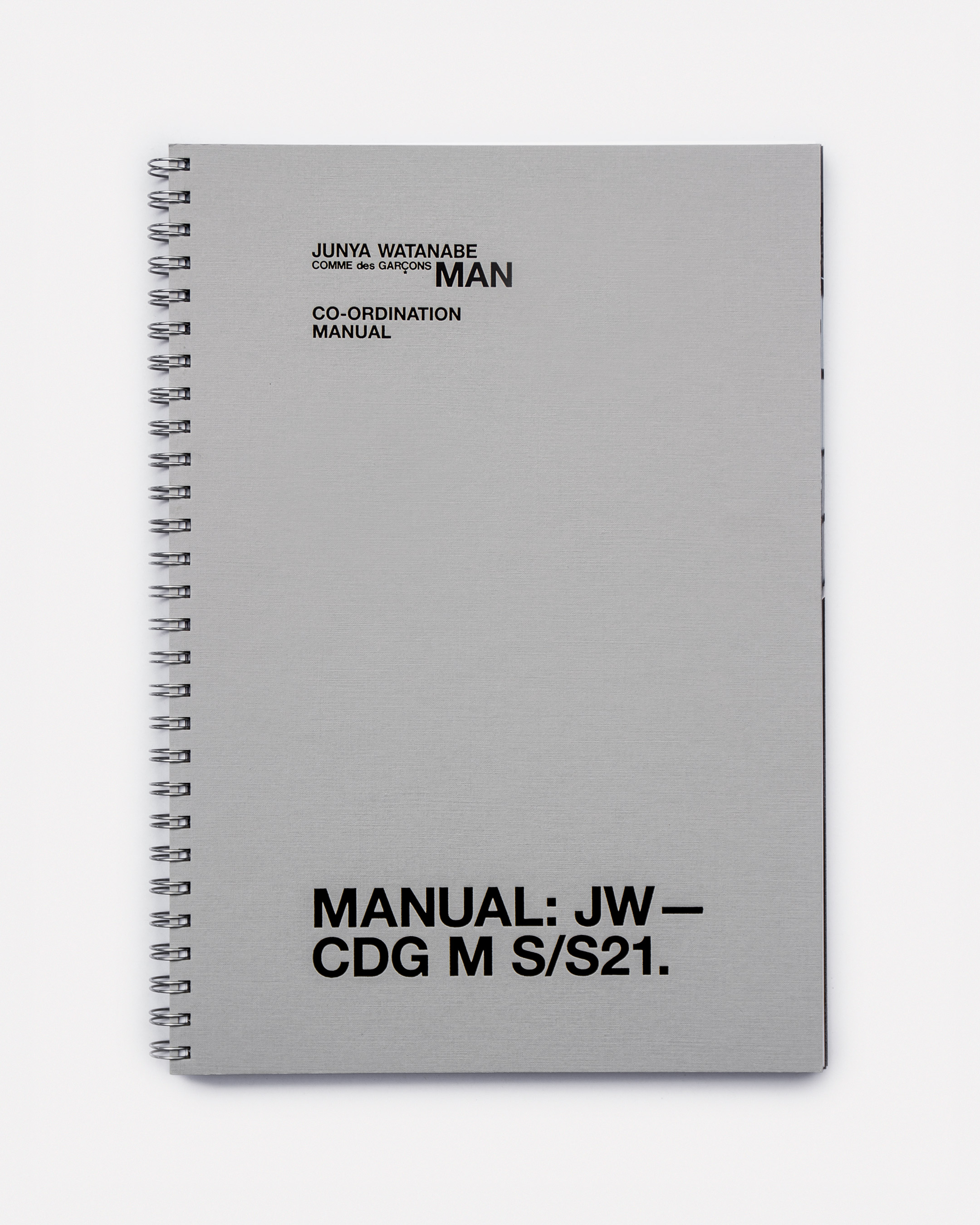
Collection lookbook

Lookbook spreads
