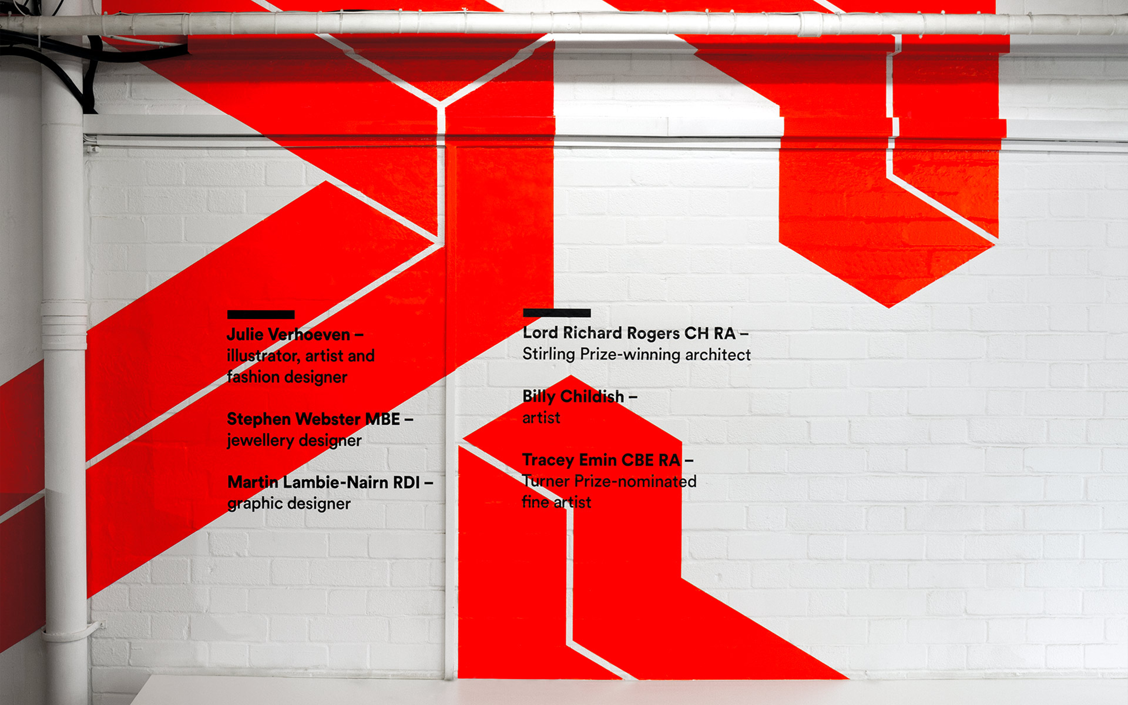
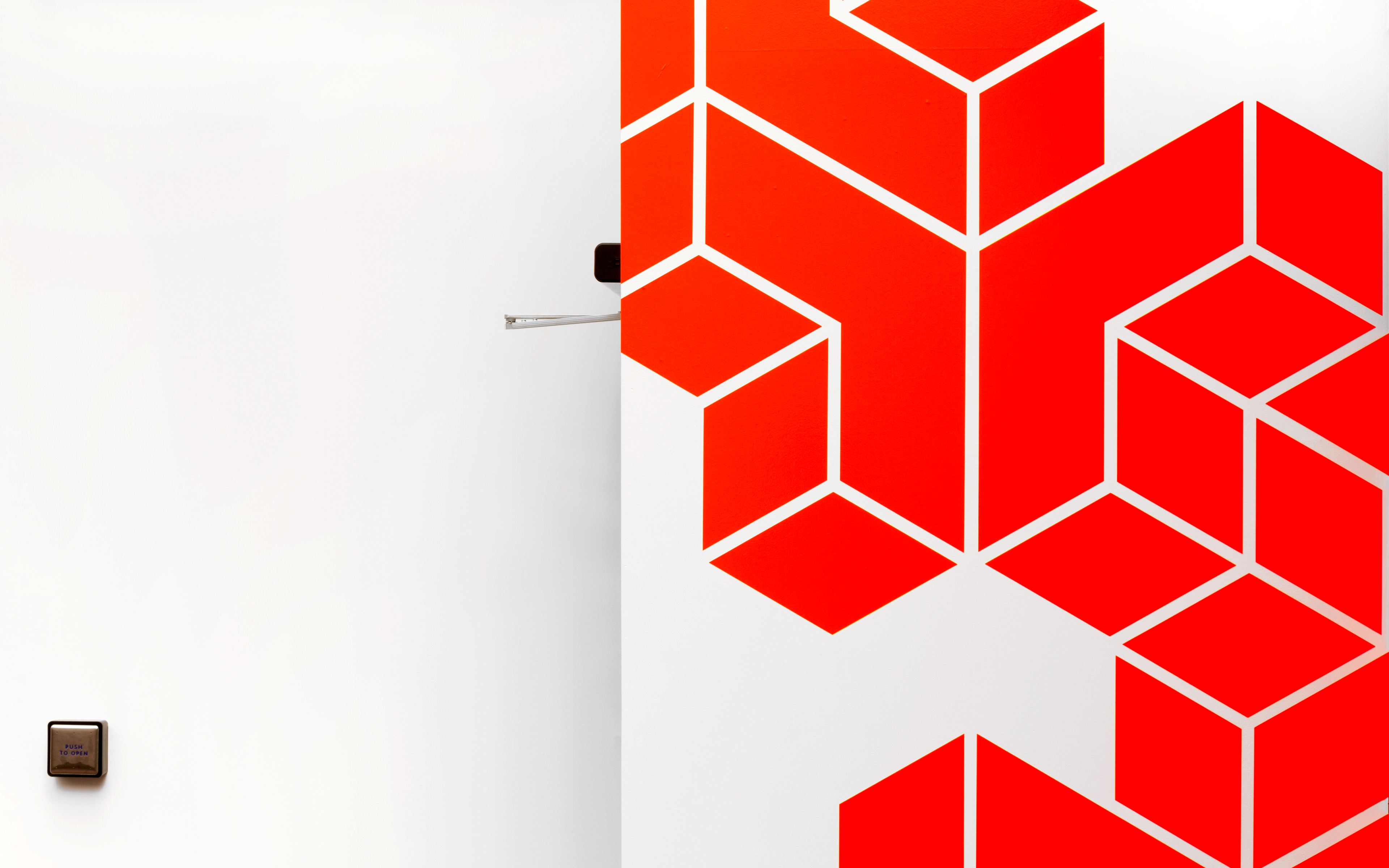
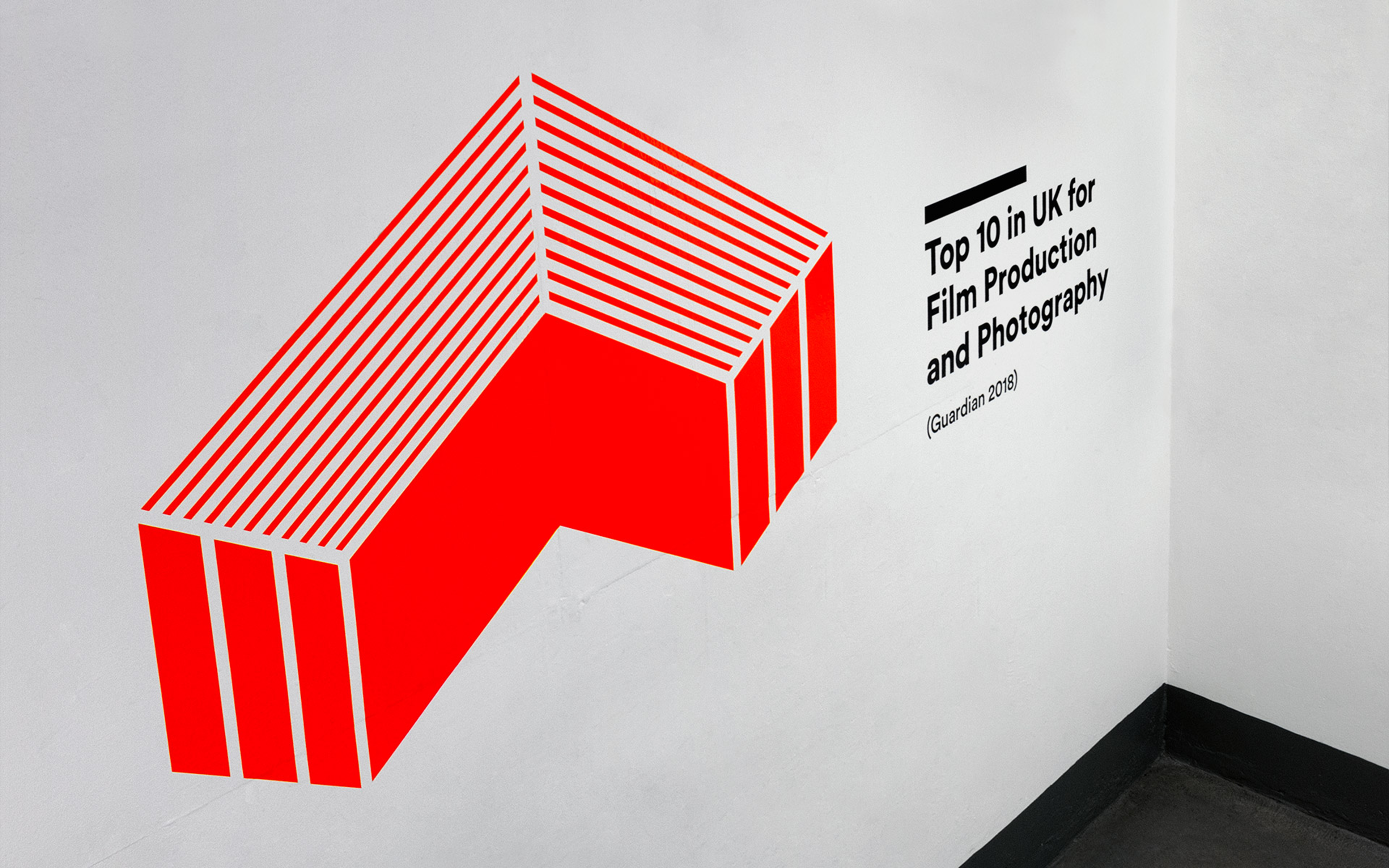
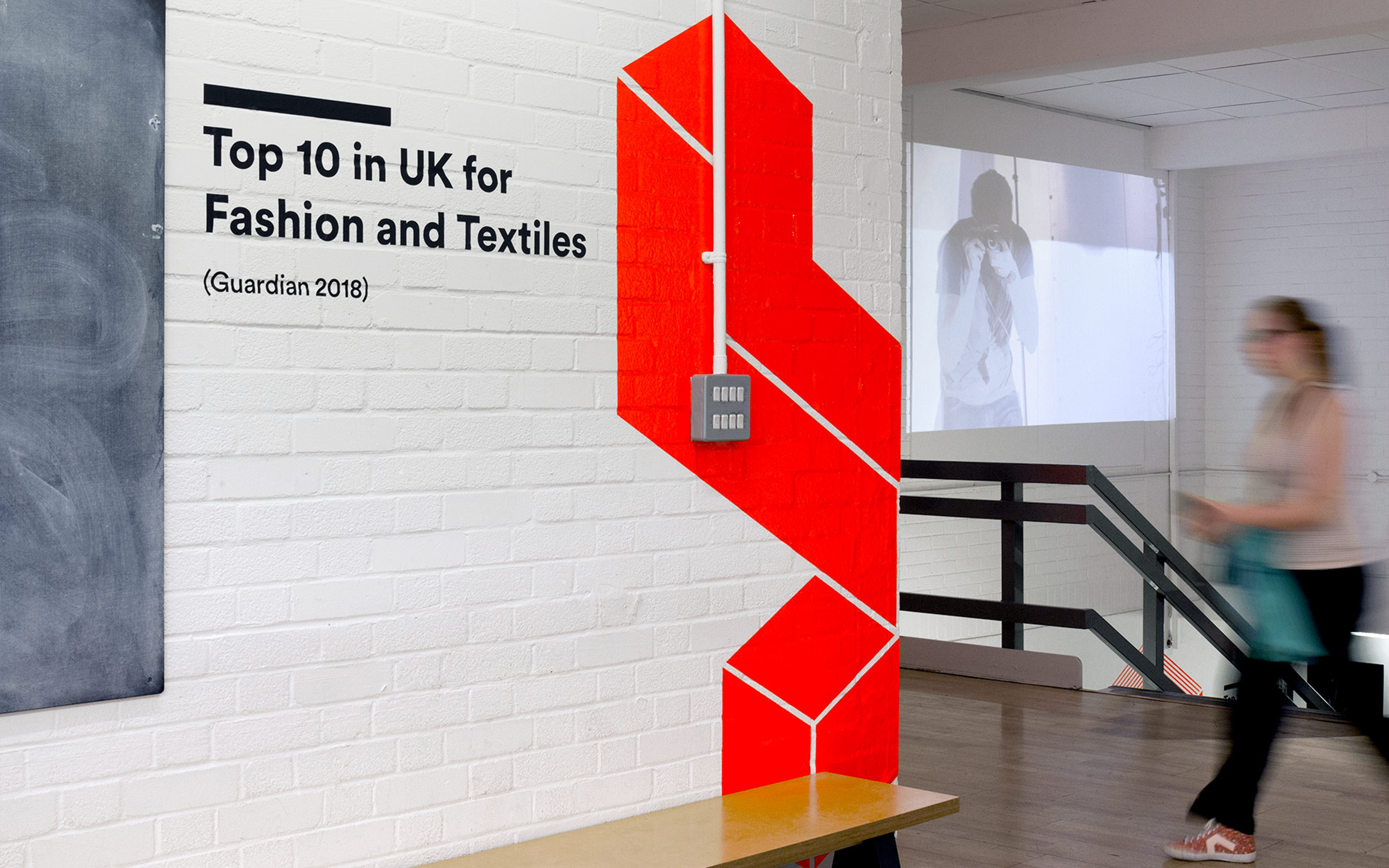
Supergraphics in Epsom and Rochester
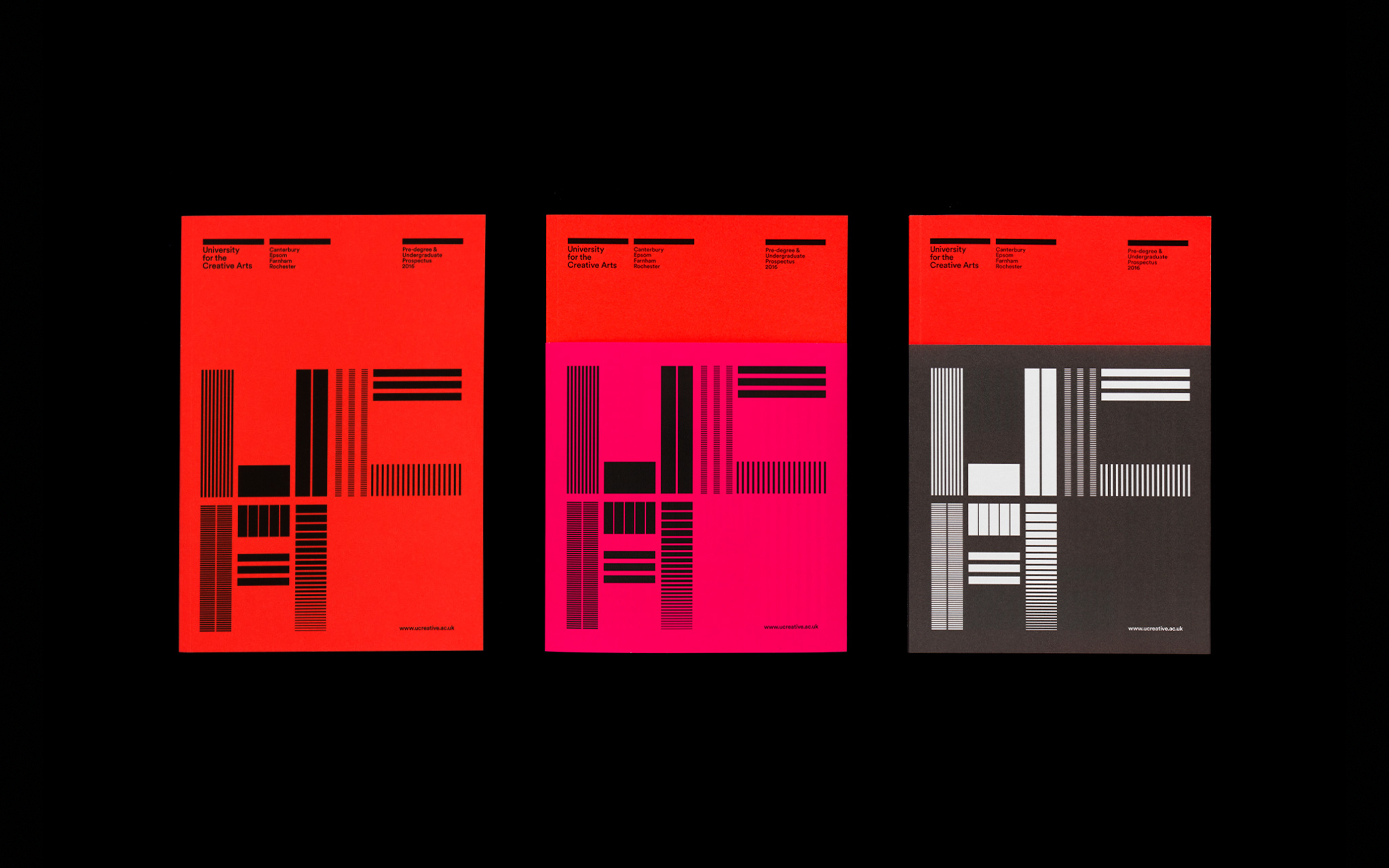
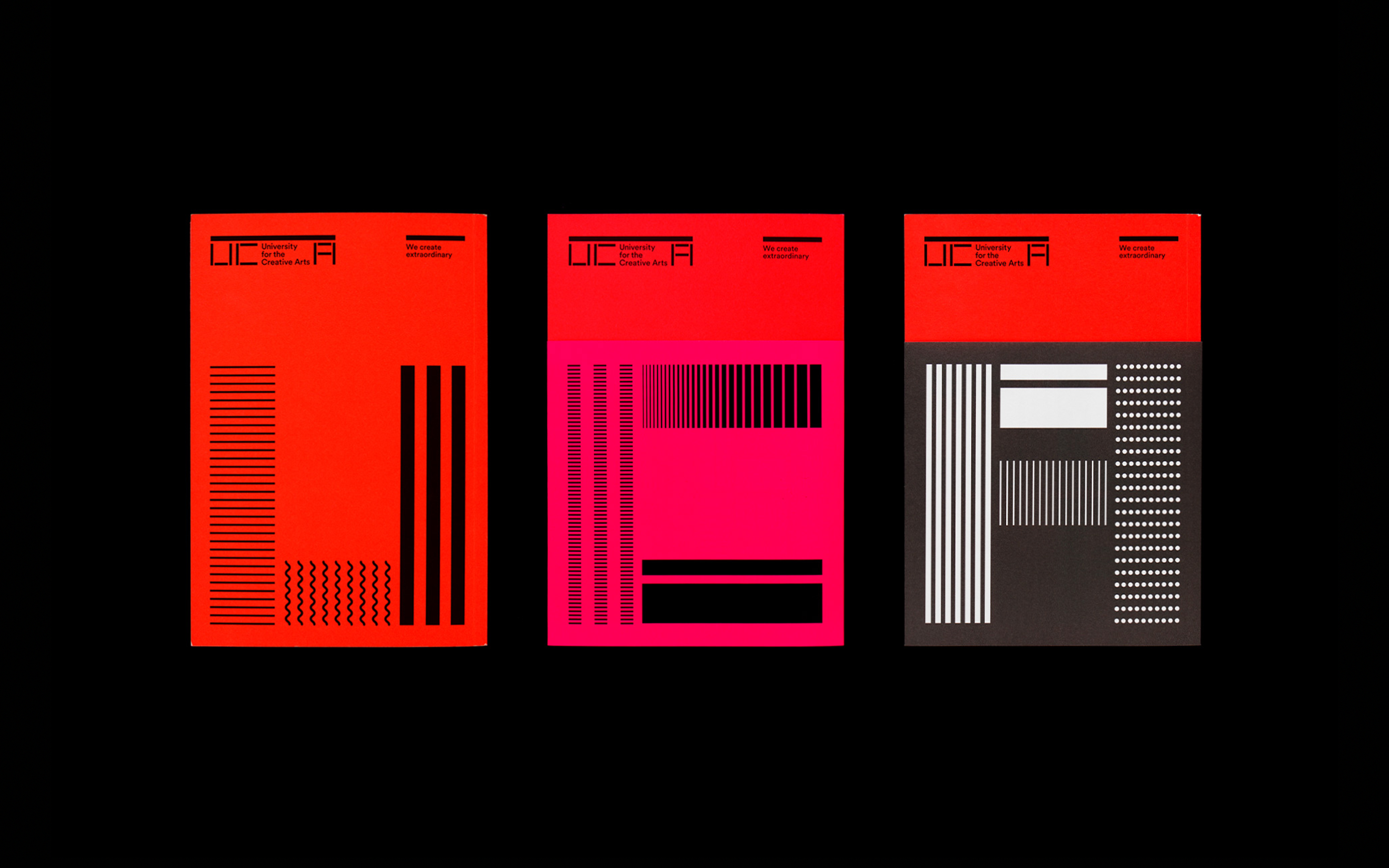
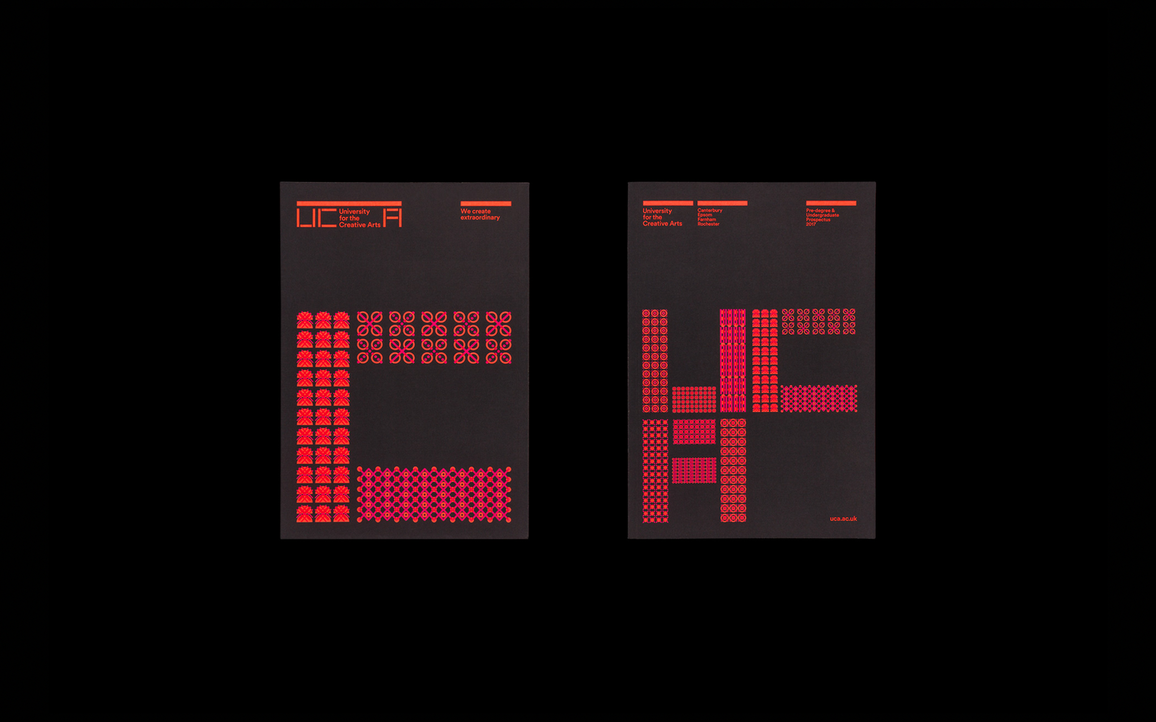
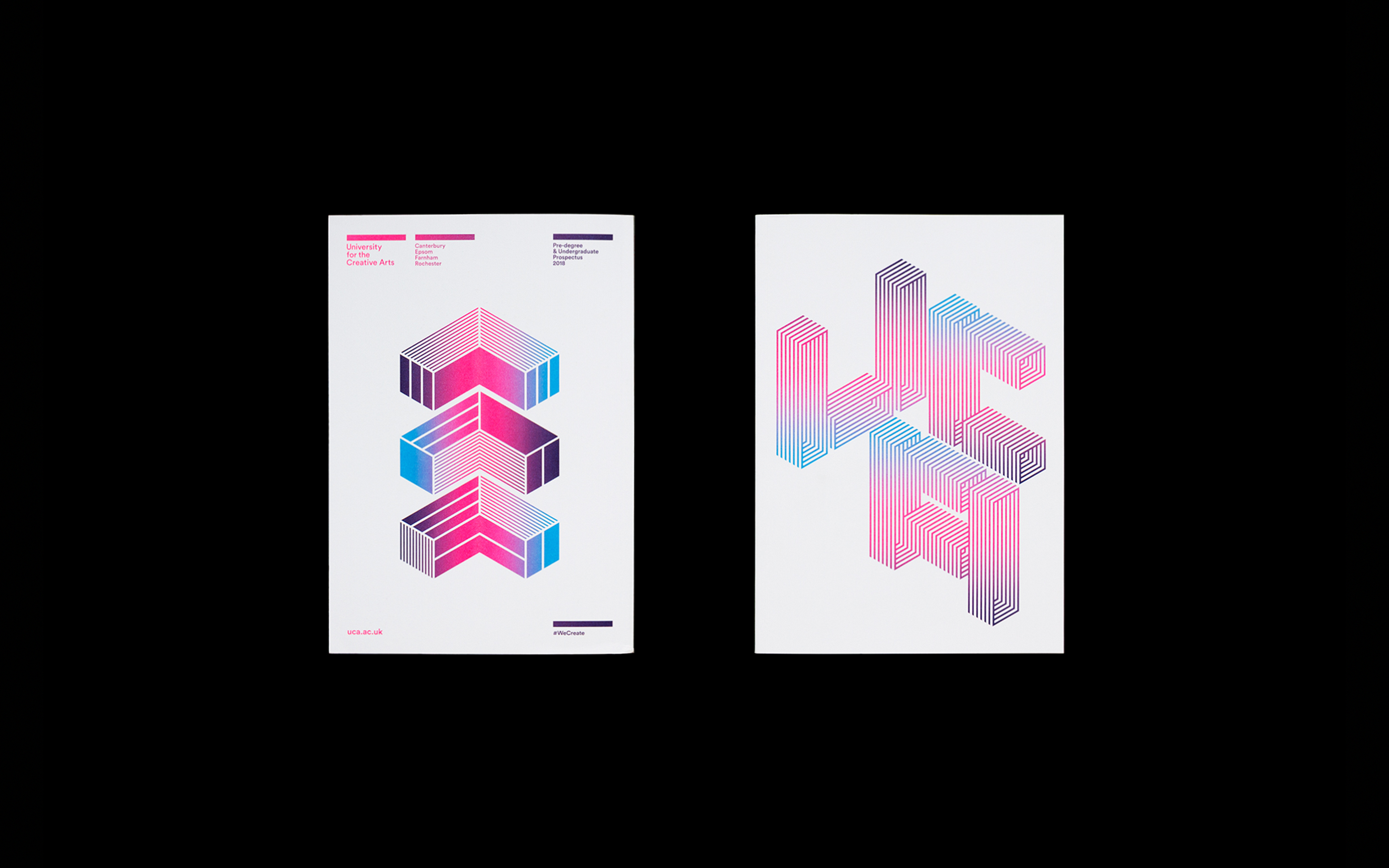
Prospectuses
The University for the Creative Arts is a specialist arts institution in the South-East of England, offering degree programmes across disciplines including film, fashion, fine art, architecture and communication design.
Formed through a series of mergers at various points over the last 160 years, UCA today has campuses across Kent and Surrey, at Canterbury, Rochester, Epsom and Farnham. This geographical complexity meant that their new visual identity had to be flexible enough to represent all of these while uniting them under the UCA banner.
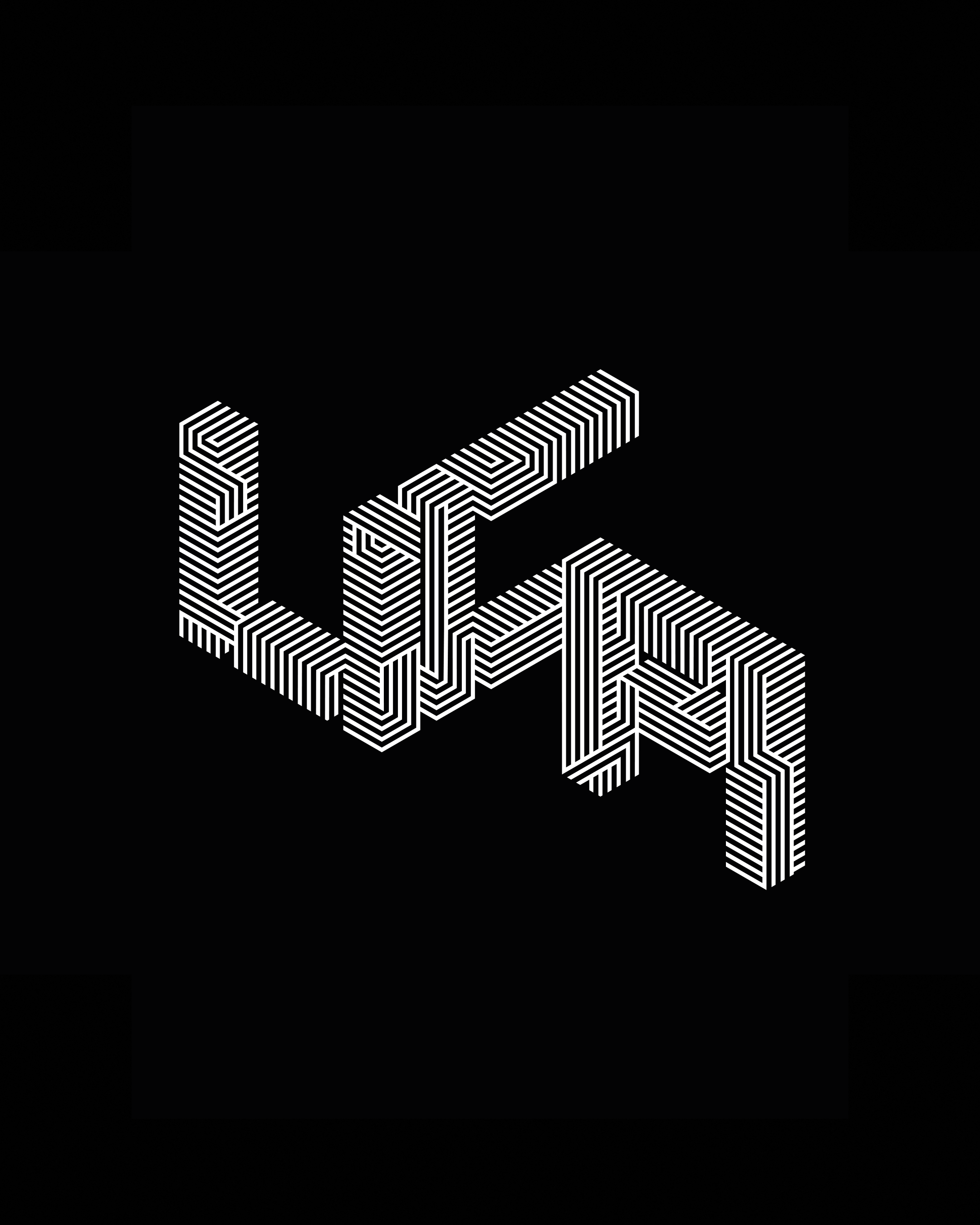
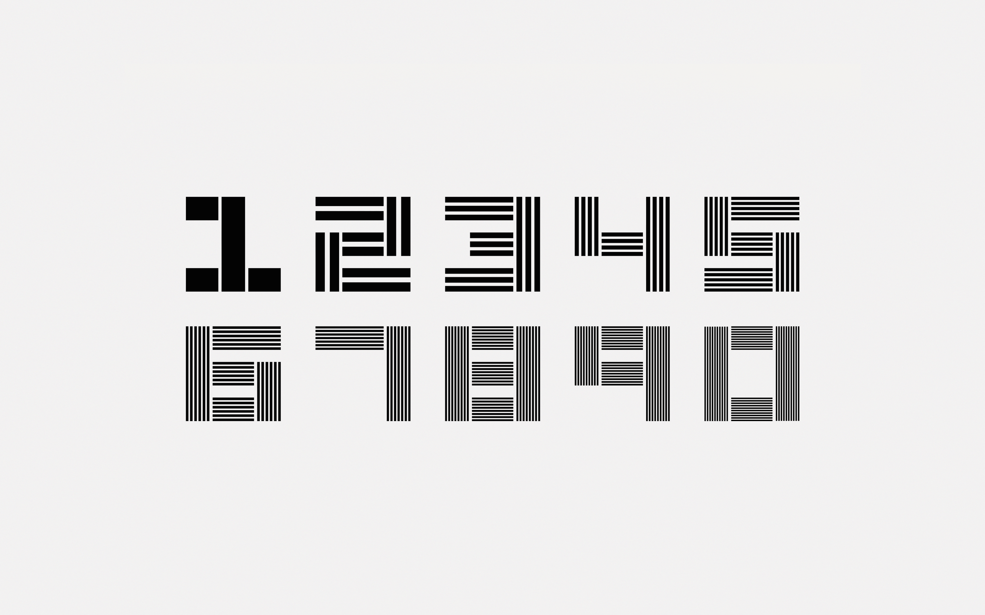
Following an extensive research phase, our approach was built around expressing the essential quality of the university: creativity. We used the stencil as our route into this concept: a tool synonymous with the working process of designers and architects, used to mark work in progress. Our interpretation of stencilled letterforms, tapping into the creative process while also echoing the university’s distinctive midcentury architecture, forms the central element of the identity. The easily adaptable lock-up consists of the stencilled acronym, plus a modern, rounded supporting typeface for the institution’s full name.
Identity variations
Graphic expression
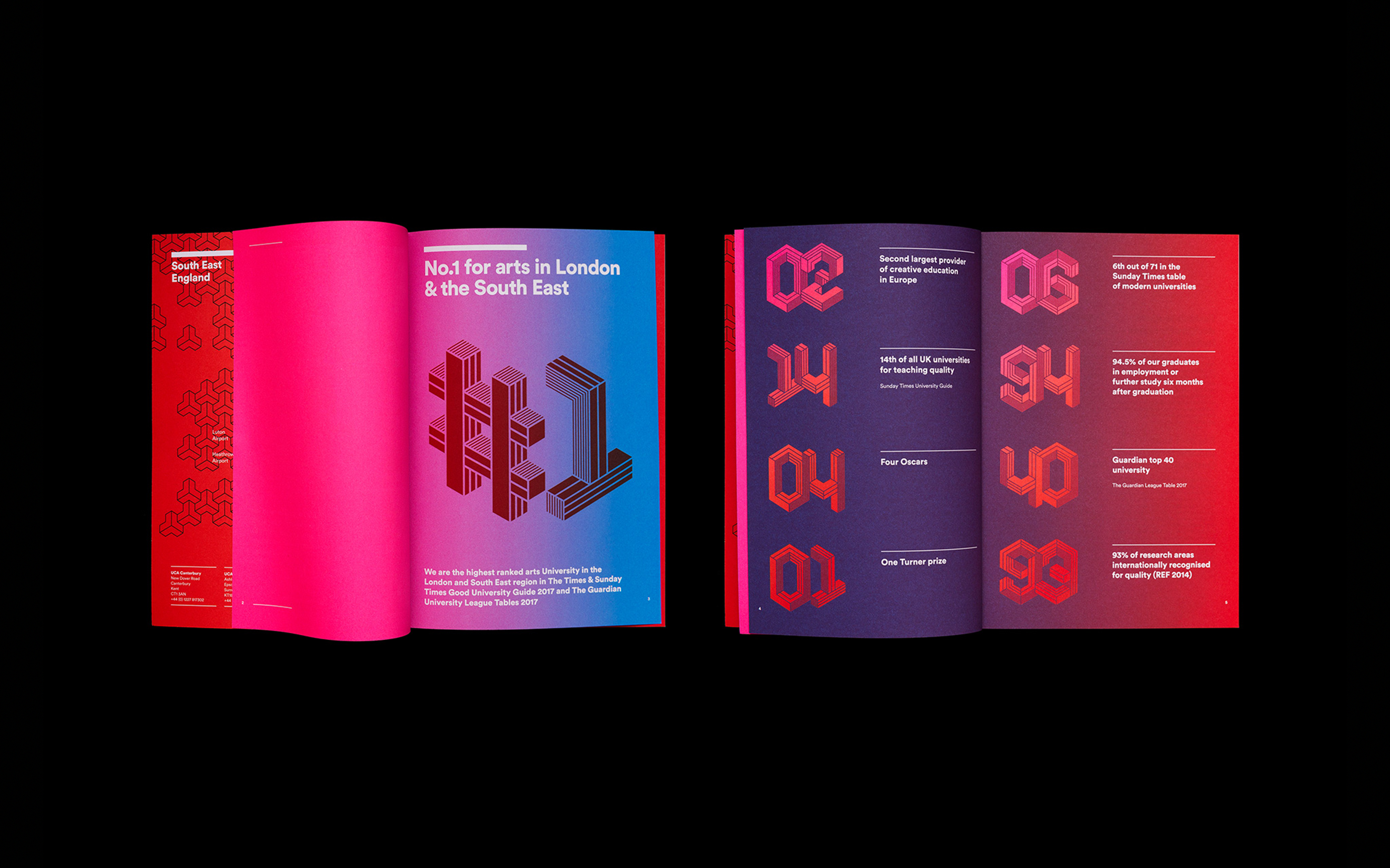
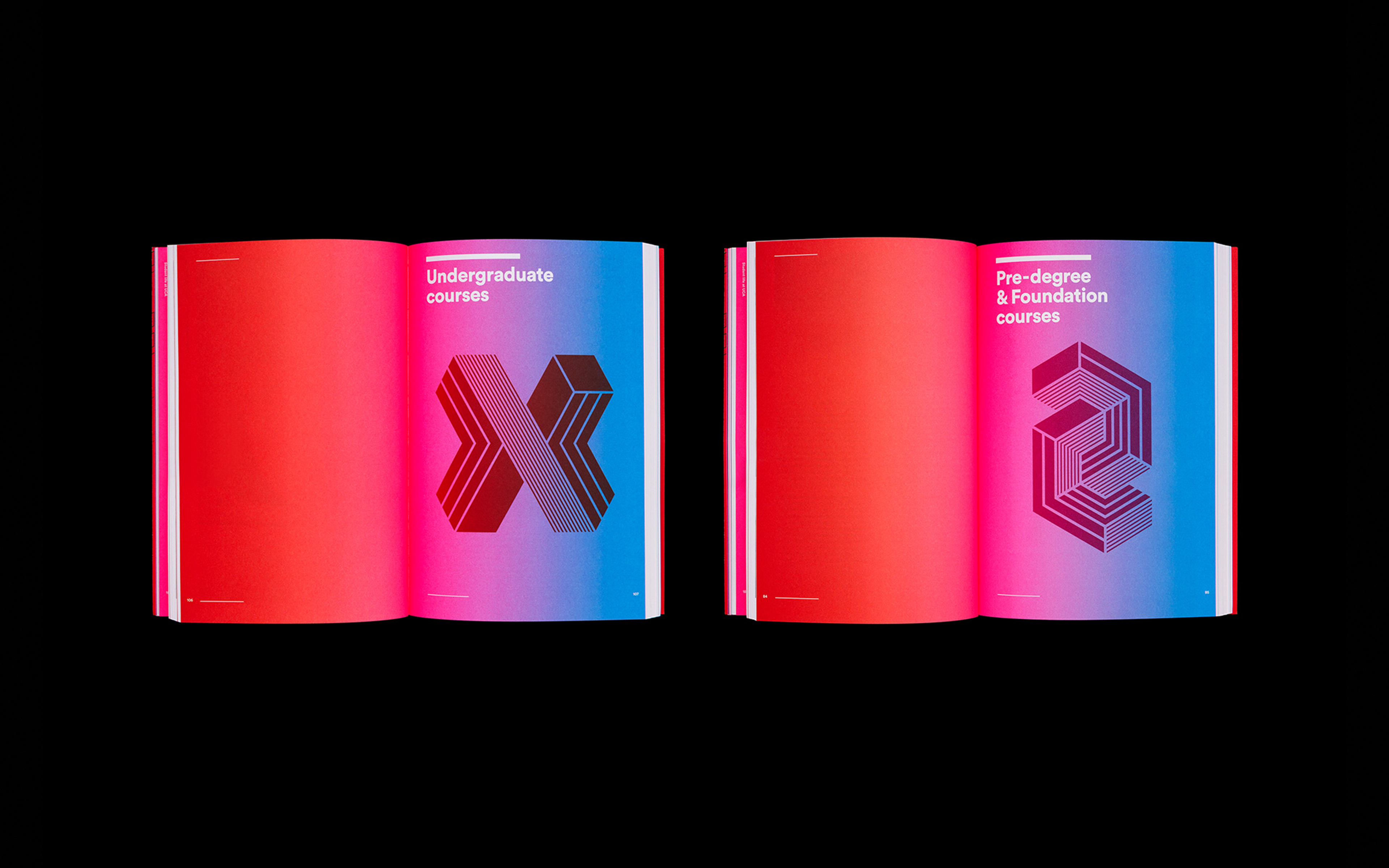
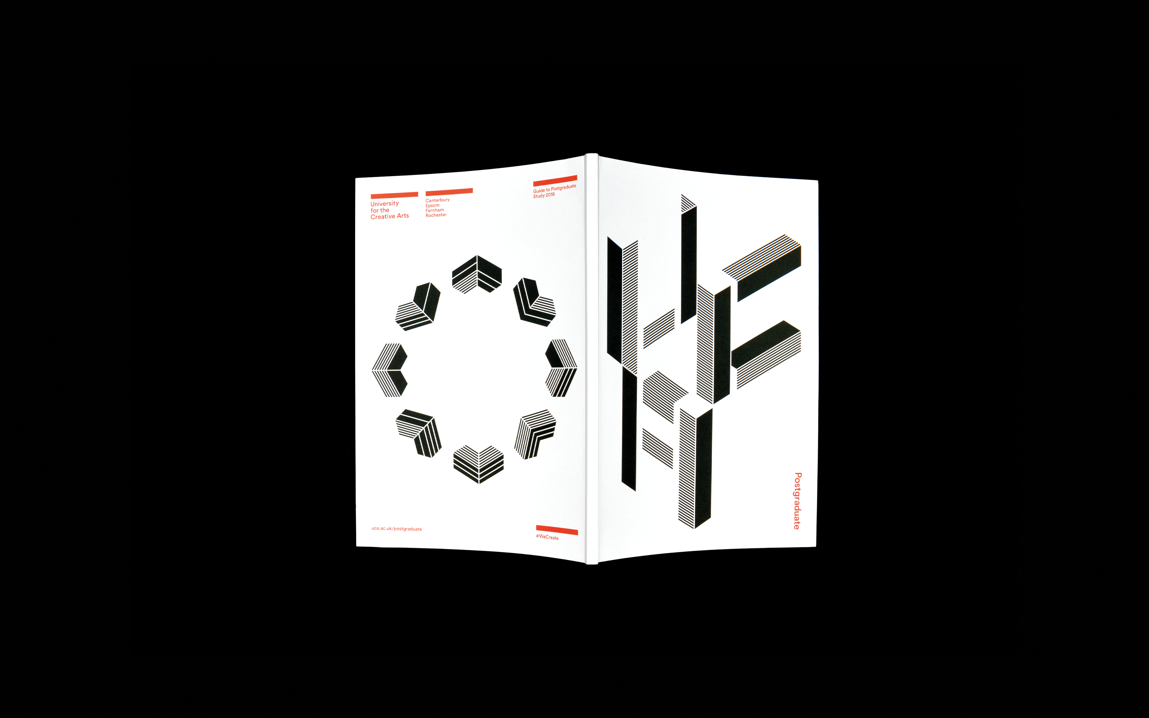
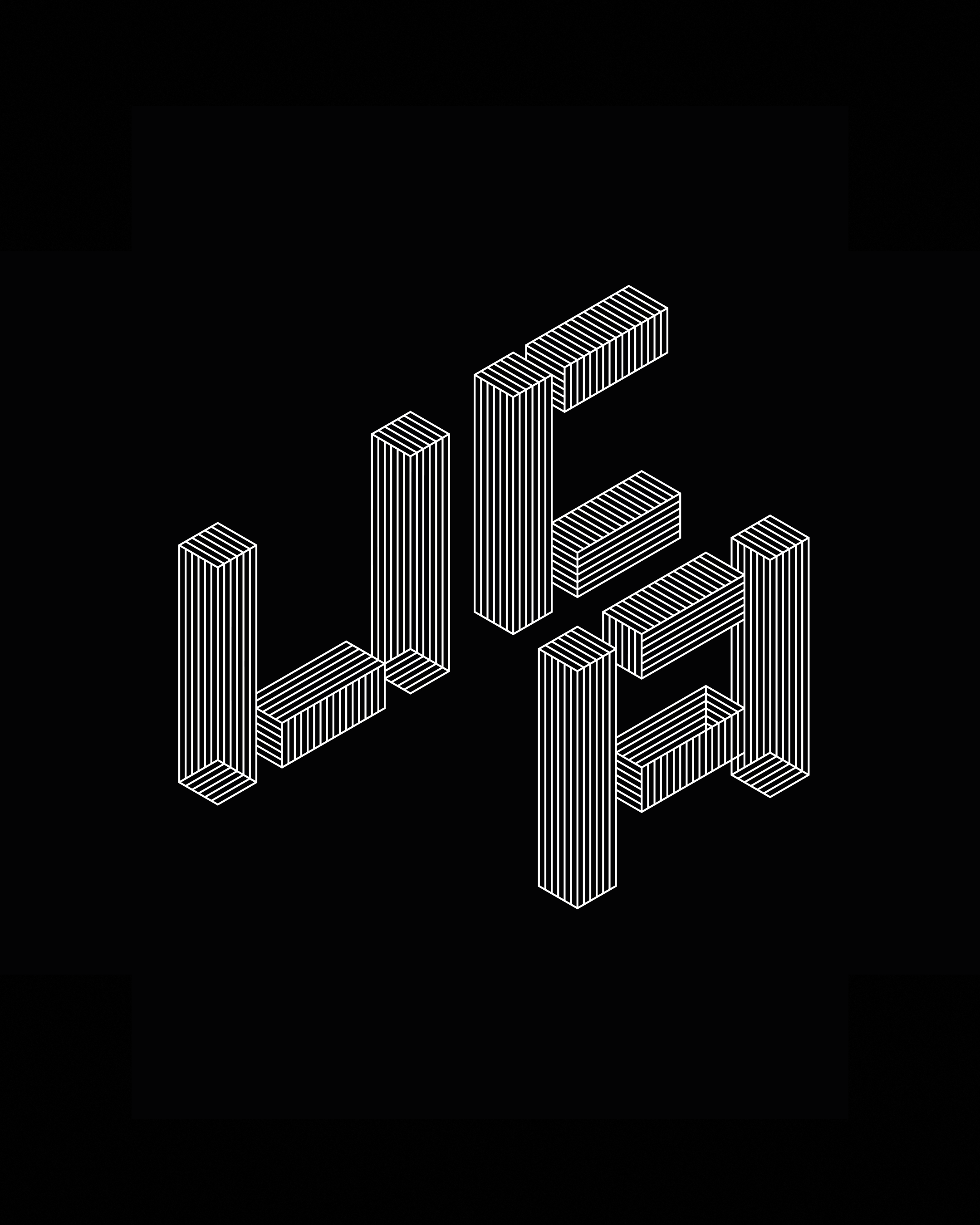
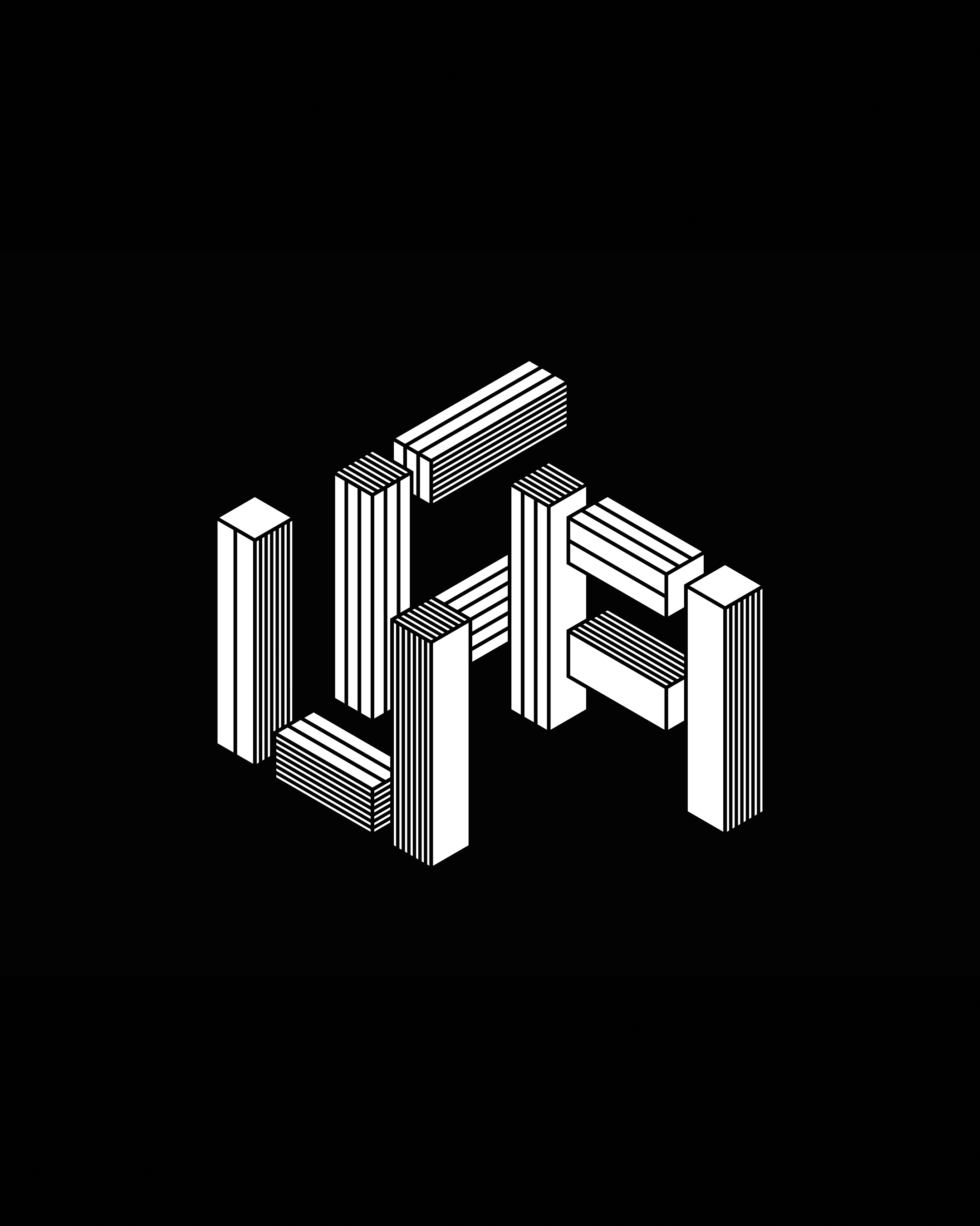
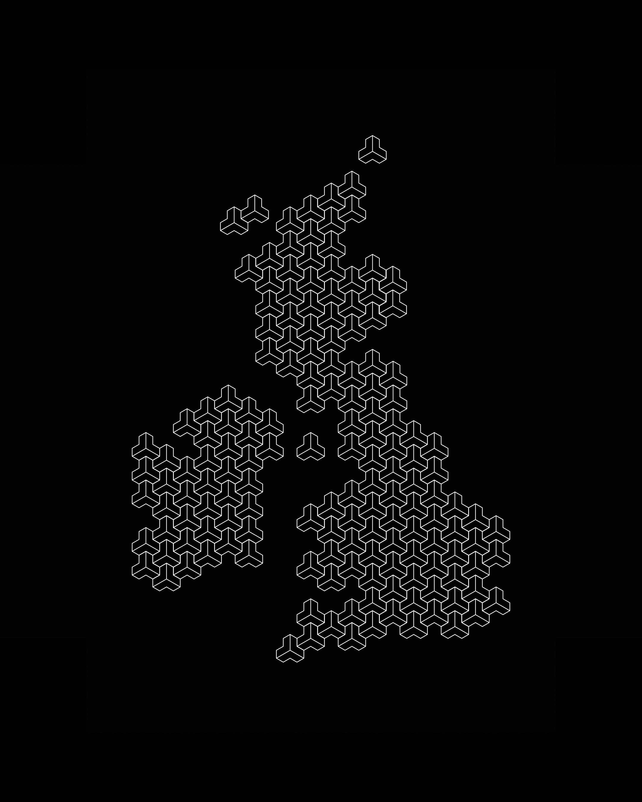
Offering freedom within a defined structure, the components of this idea form the foundation on which which the identity can reinvent itself year on year. With the ability to play with colour, form, size and position, it can be personalised for specific campuses, campaigns or subjects. An extended visual language comes fully into view across geometric supergraphics and print materials that play with three-dimensional form. Colour options extend from minimal black-and-white to striking gradients of blue and pink.
Graphic language animations
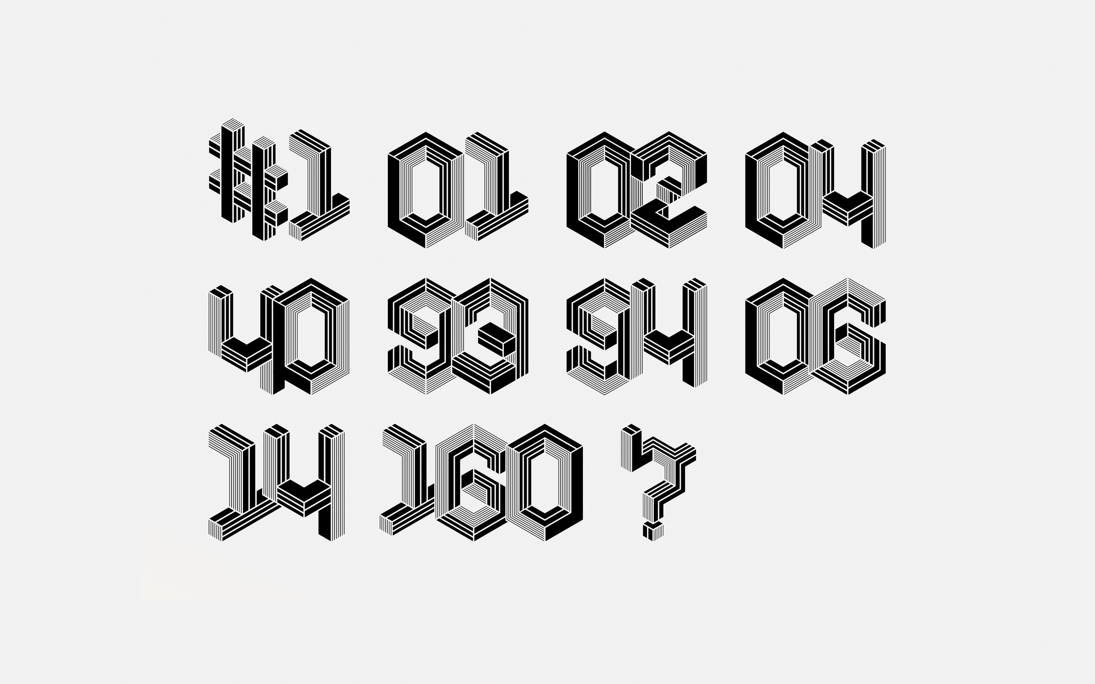
Bespoke typography
