Matthew Hilton Studio is a renowned furniture, lighting and product design firm based in London. Examples of their work are held in the permanent collections of the Victoria and Albert Museum, London’s Museum of the Home, and the Manchester City Art Gallery.
Having established his reputation working for the likes of Habitat, SCP and Case, Matthew set up his own design consultancy in 2007 with a critically acclaimed, personal range of furniture, often using clean, simple lines and characterised by its formal integrity and elegance. Rather than belonging to any distinct design movement, his practice is the considered result of viewing design as the evolution of an object throughout history.
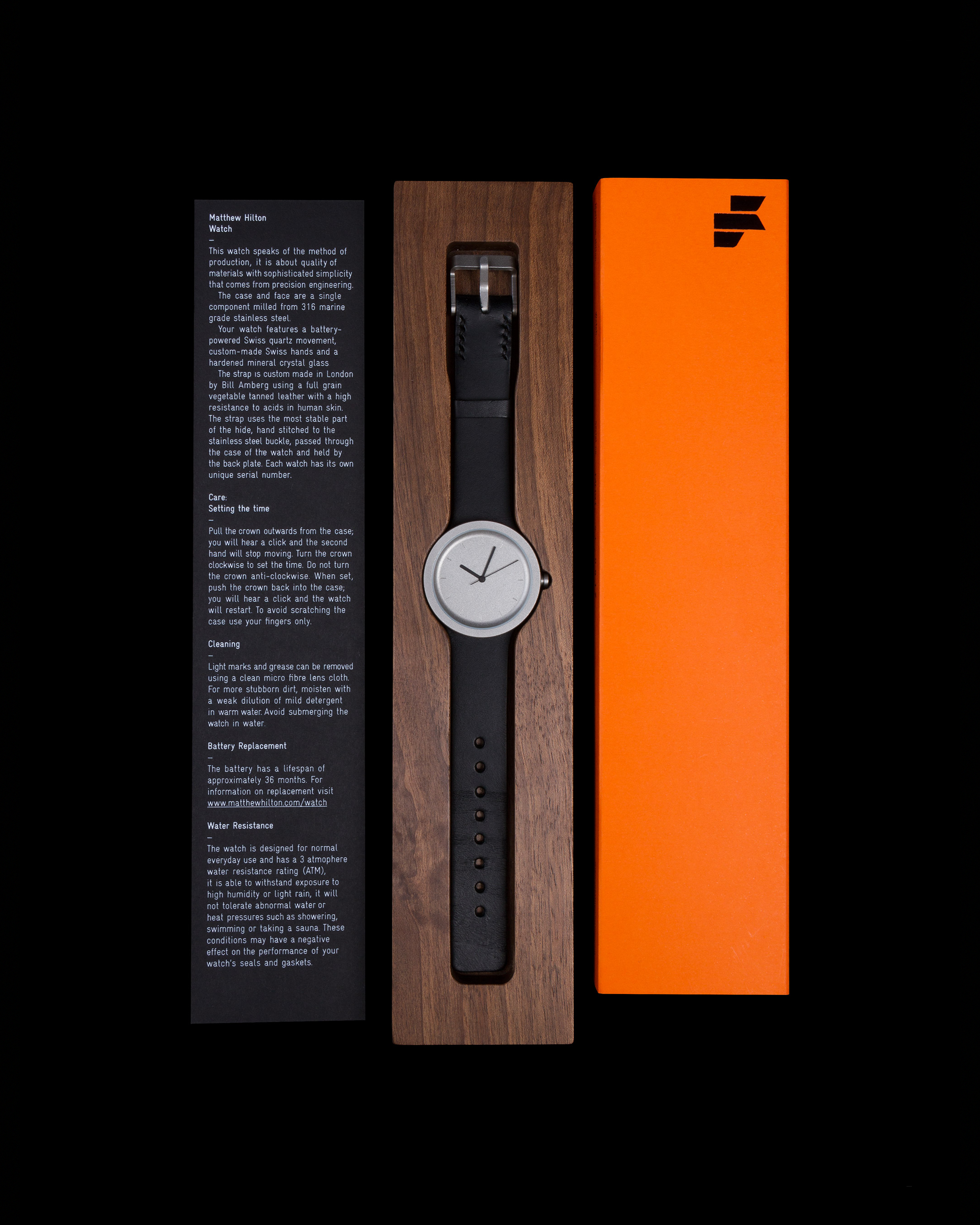
We created a new identity for the studio to support the launch of this, before expanding it to include a logo for Matthew’s first collection at the Milan Furniture Fair, various stationery and product designs, and ongoing consulting on the company’s visual language and digital presence.
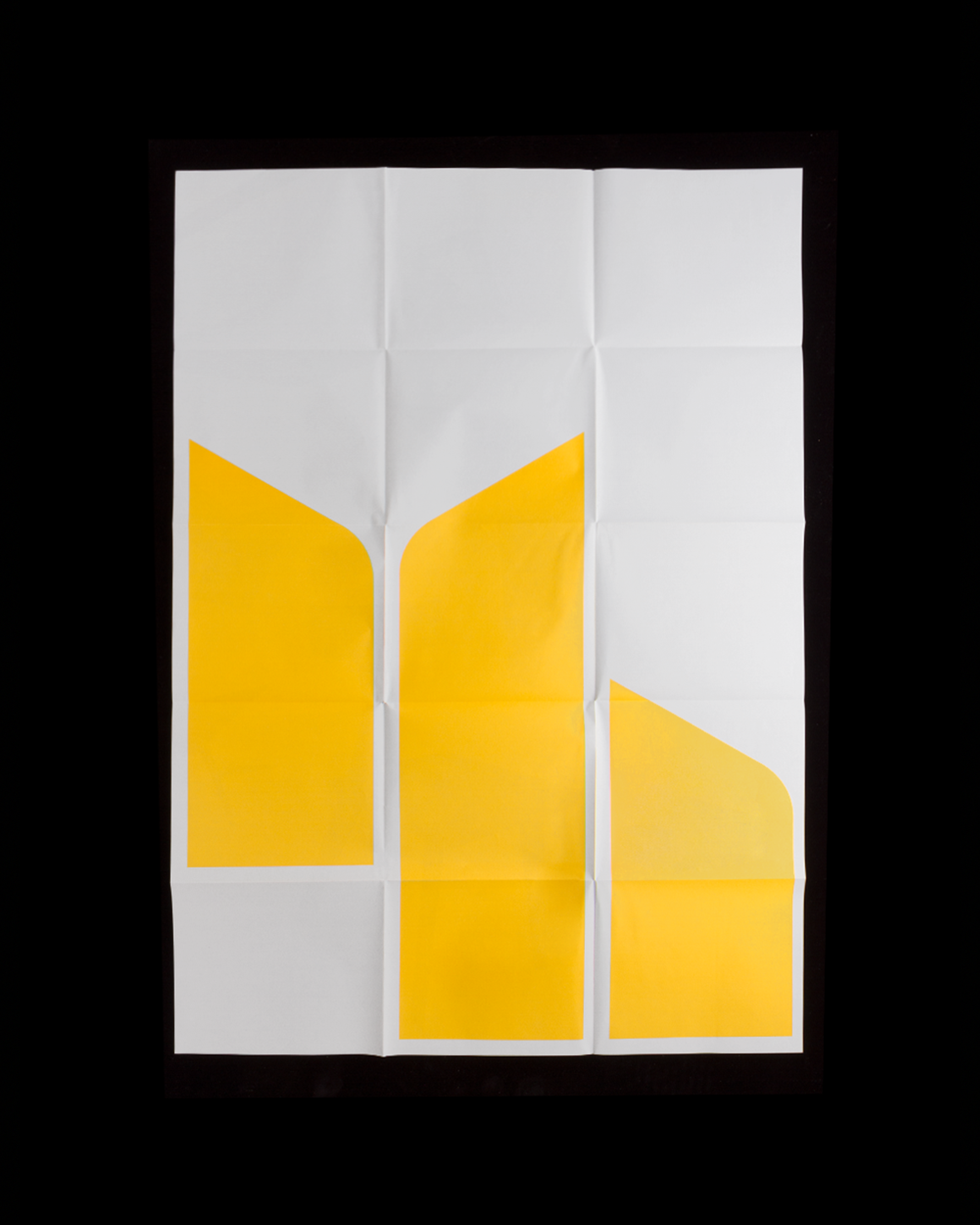
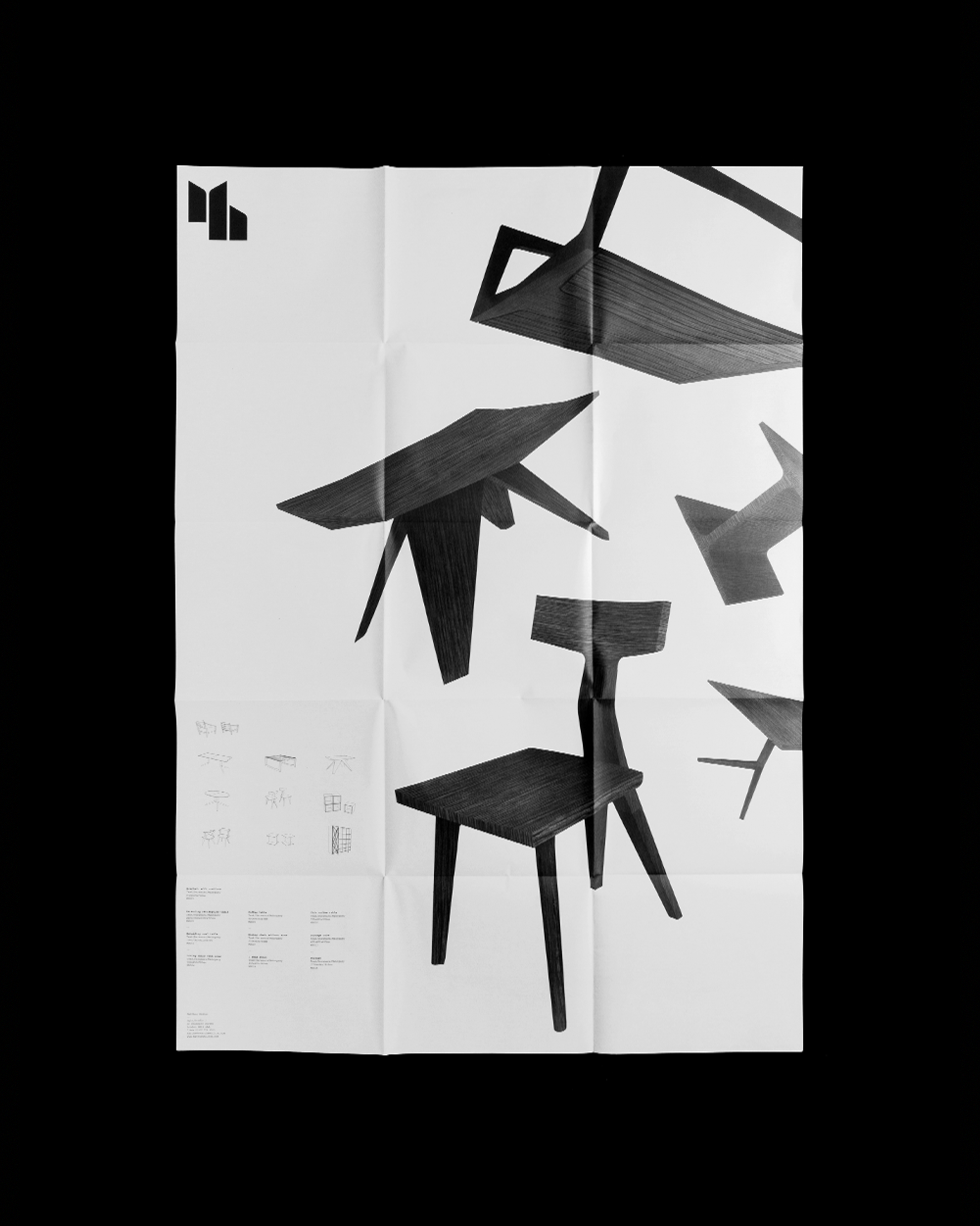
Posters
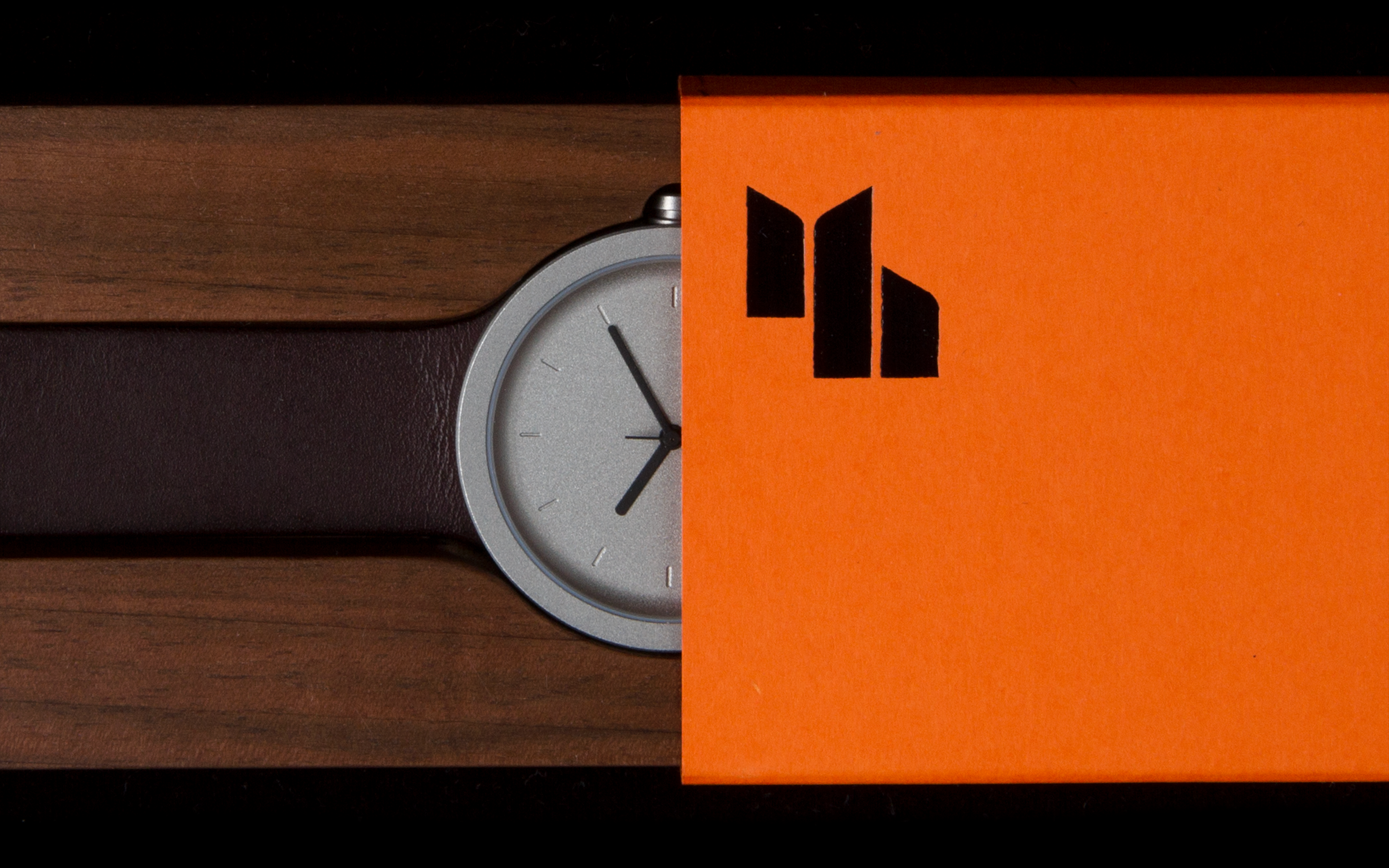
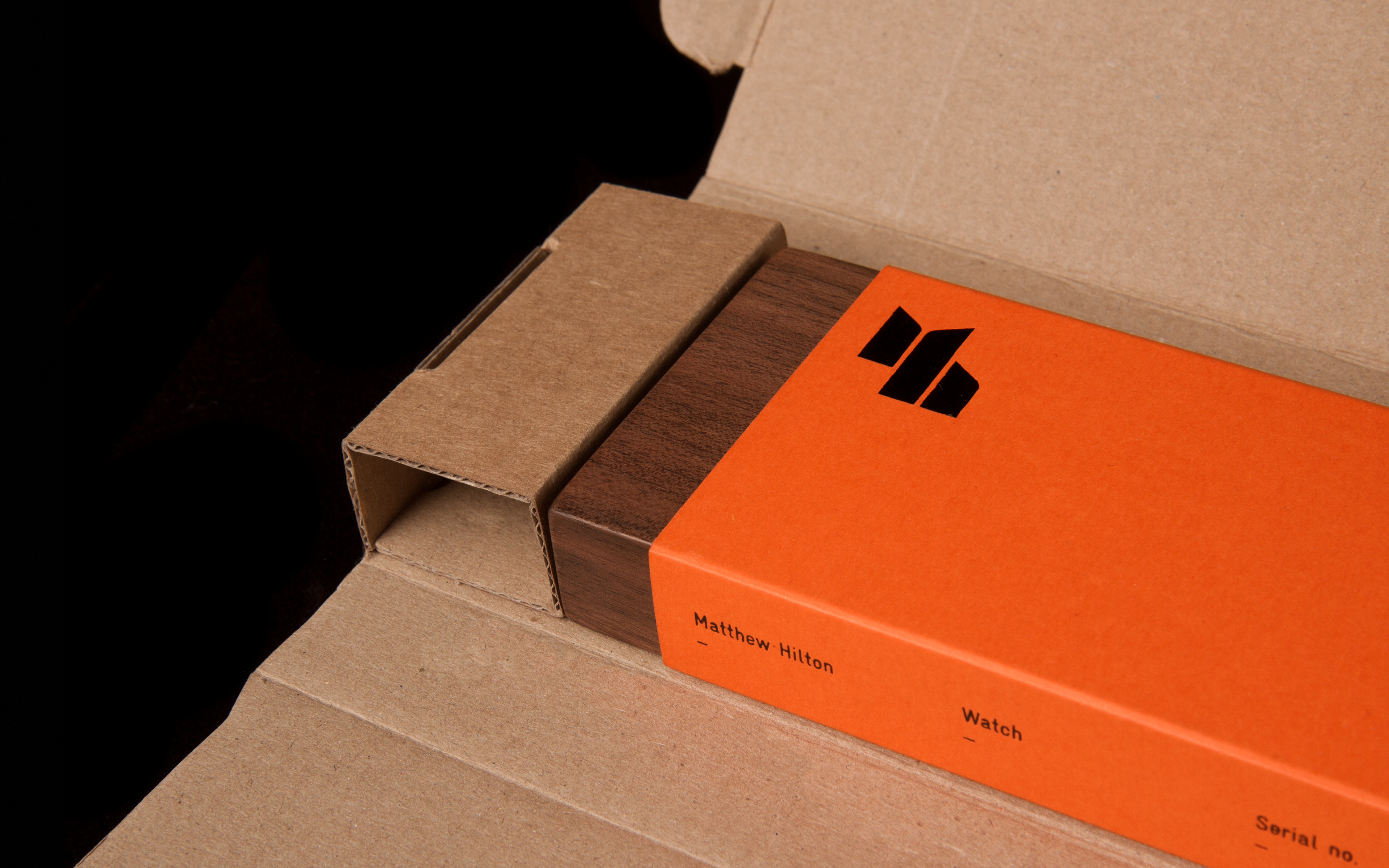
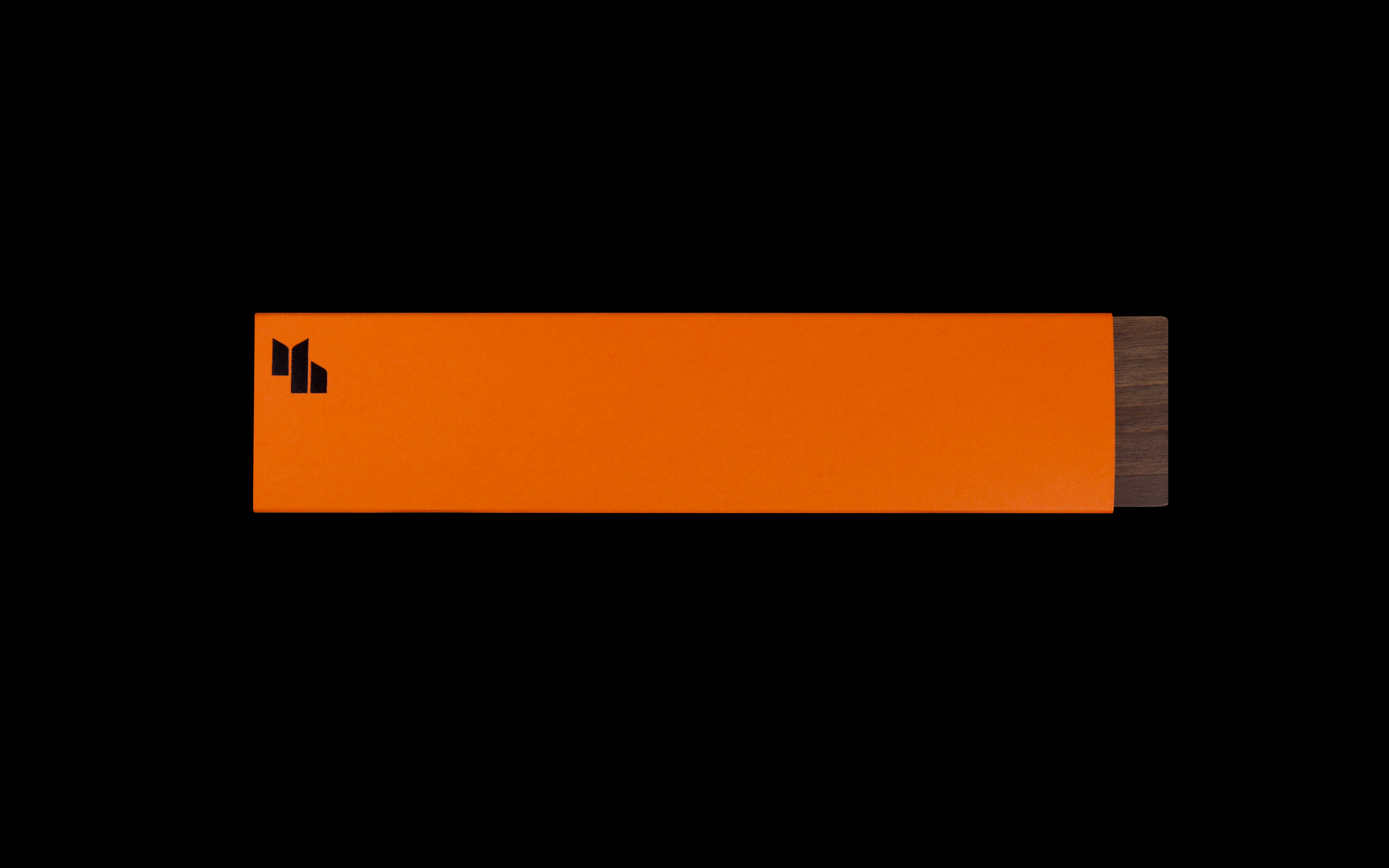
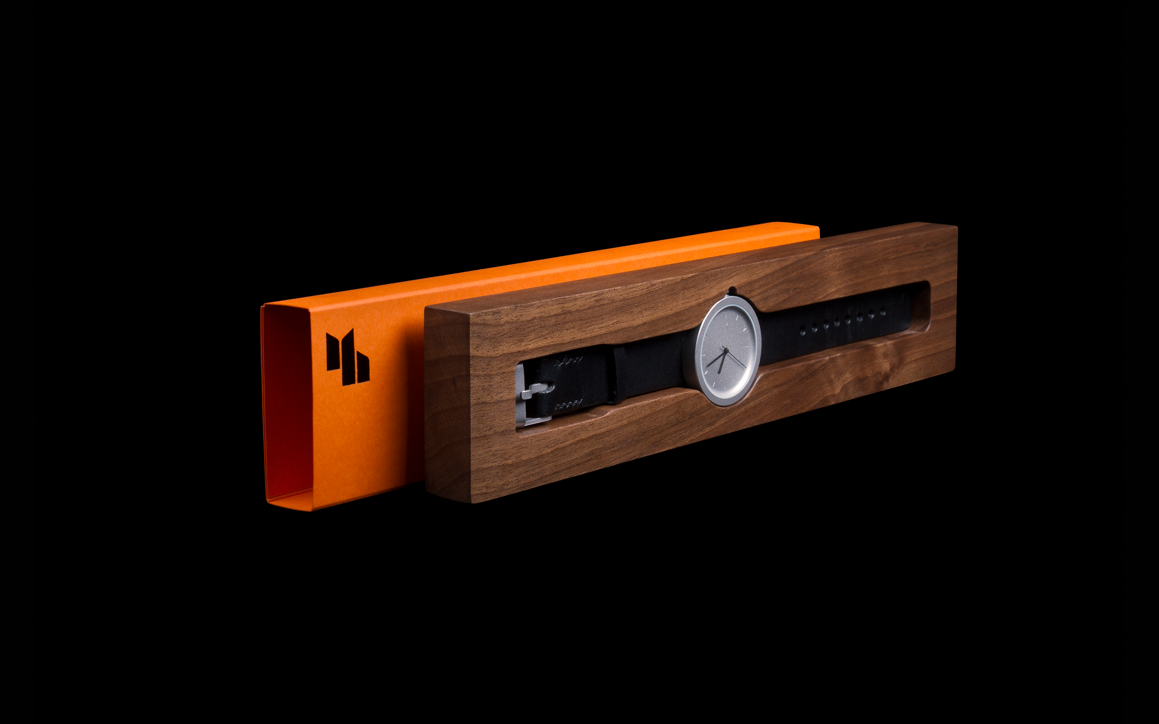
Packaging
Our identity for Matthew is a direct response to his interest in confident modern form, reinventing the classic single-colour marks of the 1960s with a decidedly contemporary visual language. The mark uses Bauhaus-inspired letterforms to create a pronounced, abstract version of Matthew’s initials that captures the studio’s strong vision, centred around unique and well-made furniture. The concept of using stencilled forms came from the functional and utilitarian aspects of Matthew’s output — the feeling that what he makes works.
The mark is designed to be receptive to the range of materials that Matthew works with – wood, glass, ceramic — and can be imprinted, engraved, impressed or burned on. We also created a new website for the studio with the aim of avoiding the clichés of interior design imagery (lots of white space, and so on) to emphasise their work’s well-crafted quality and communicate the narrative behind it. The blending of monochromatic colour — via frequent blue accents — with technical 3D renderings give our website design a punchy and uncompromising edge.
Our work for Matthew Hilton Studio was featured in the Design Museum’s ‘Designs of the Year’ exhibition for 2012.
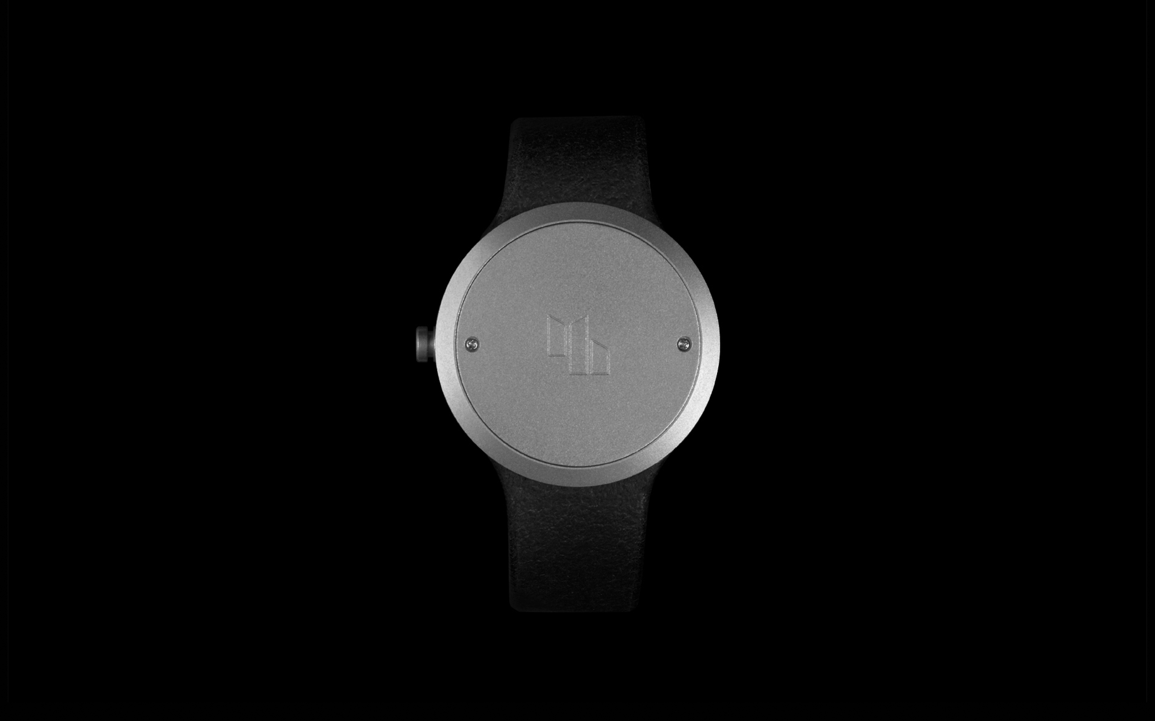
Watch
