In official communications — on our website, in presentations, in short biographies that are attached to projects or talks — SPIN describes itself as ‘the creative output of a London-based studio which has been rotating between the poles of art and design since 1992’. What does this mean? The studio is best known for our work in the field of graphic design, and in particular for the creation of innovative contemporary visual identities. But recent years have found us balancing commissioned work with self-initiated projects, and in July 2022 we hosted an exhibition, titled Etcetera, of recent work which it seemed impossible not to categorise as art. The ongoing process of formalising the studio’s self-initiated work under the banner of art has made certain questions hard to avoid. What distinguishes the work of the designer from that of the artist, when they’re often working with the same tools? Is it even useful to draw a distinction between art and design, and what could it mean to exist in the space between them? If the boundary between art and design has become blurred, then why?
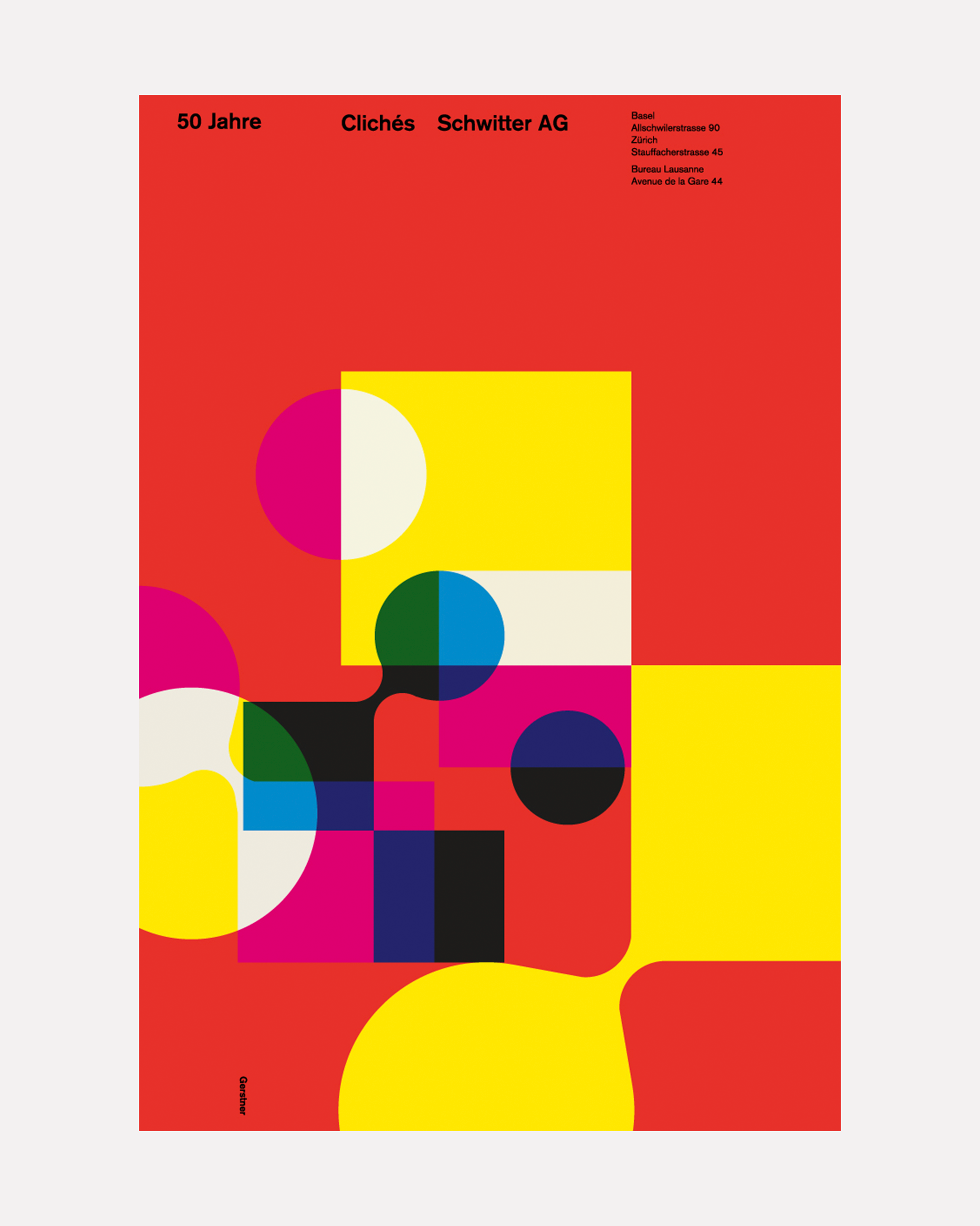
Karl Gerstner, advert for Schwitter AG, 1957
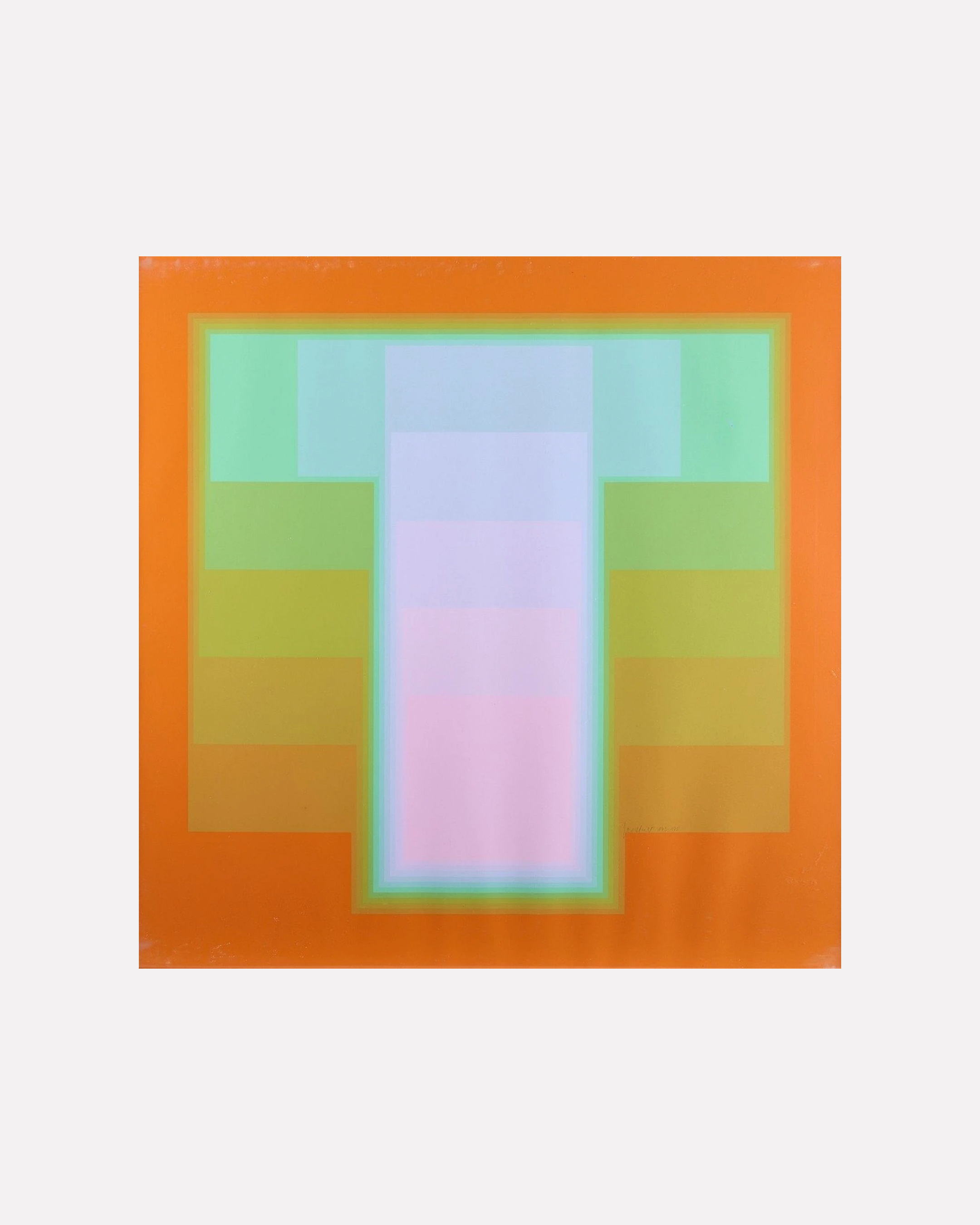
Print from Colour Sound series, 1972–86
One prevailing attitude to the ‘art vs design’ question focuses on the presence of the client; that design is commissioned and art is not. It’s a logical, nicely materialist argument that works because it avoids having to make ultimately untenable formal distinctions between art and graphic design. (Try arguing, based purely on their aesthetic qualities, that Franco Grignani’s Op Art pieces are categorically different from his Woolmark logo; or that Man Ray’s 1938 poster for London Transport can be separated from his Dada ‘rayographs’; or that Karl Gerstner’s adverts for Schwitter AG are unrelated to his Colour Sound silkscreen prints).
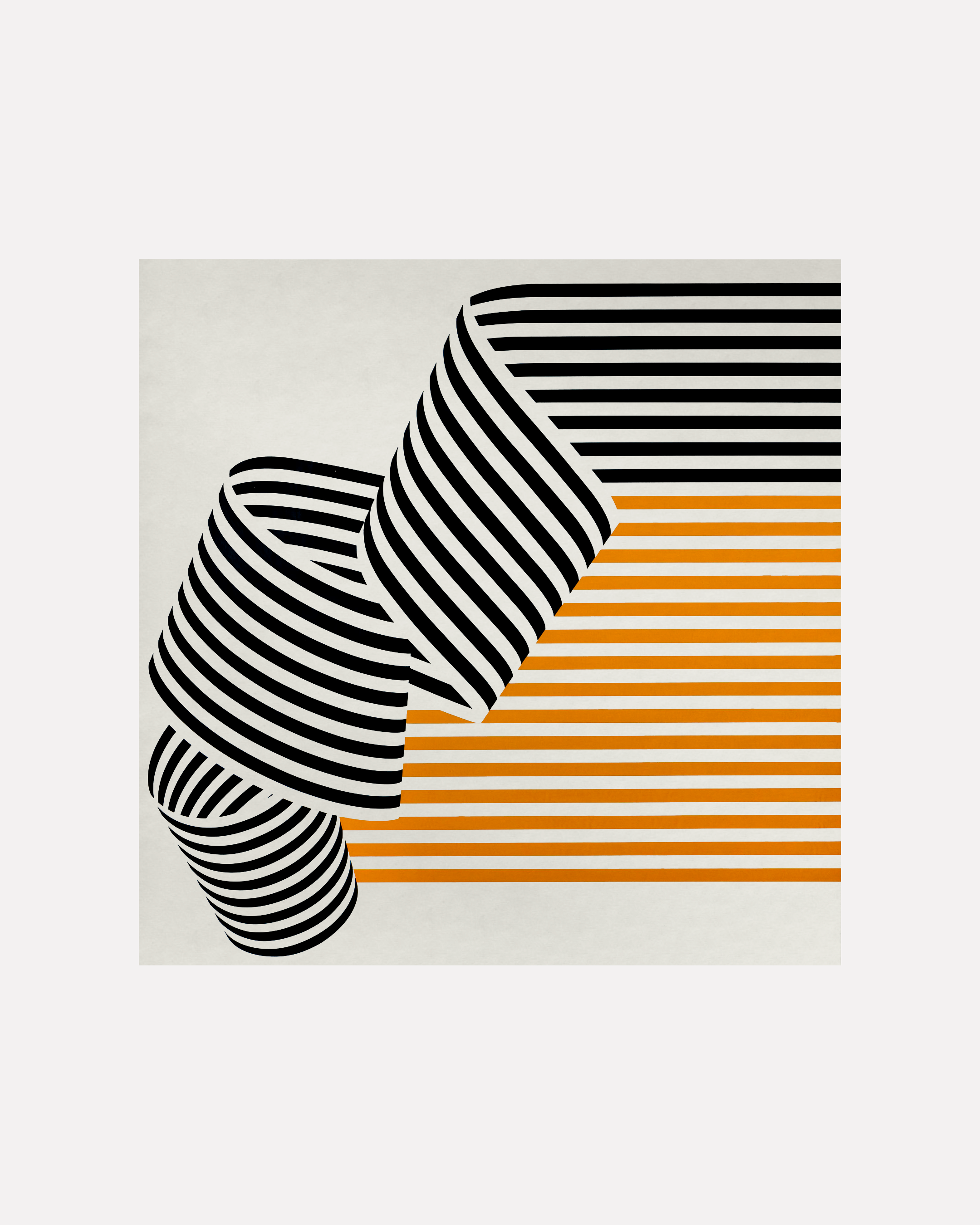
Franco Grignani, Dissociazione al bordo, 1969

Woolmark logo, 1964
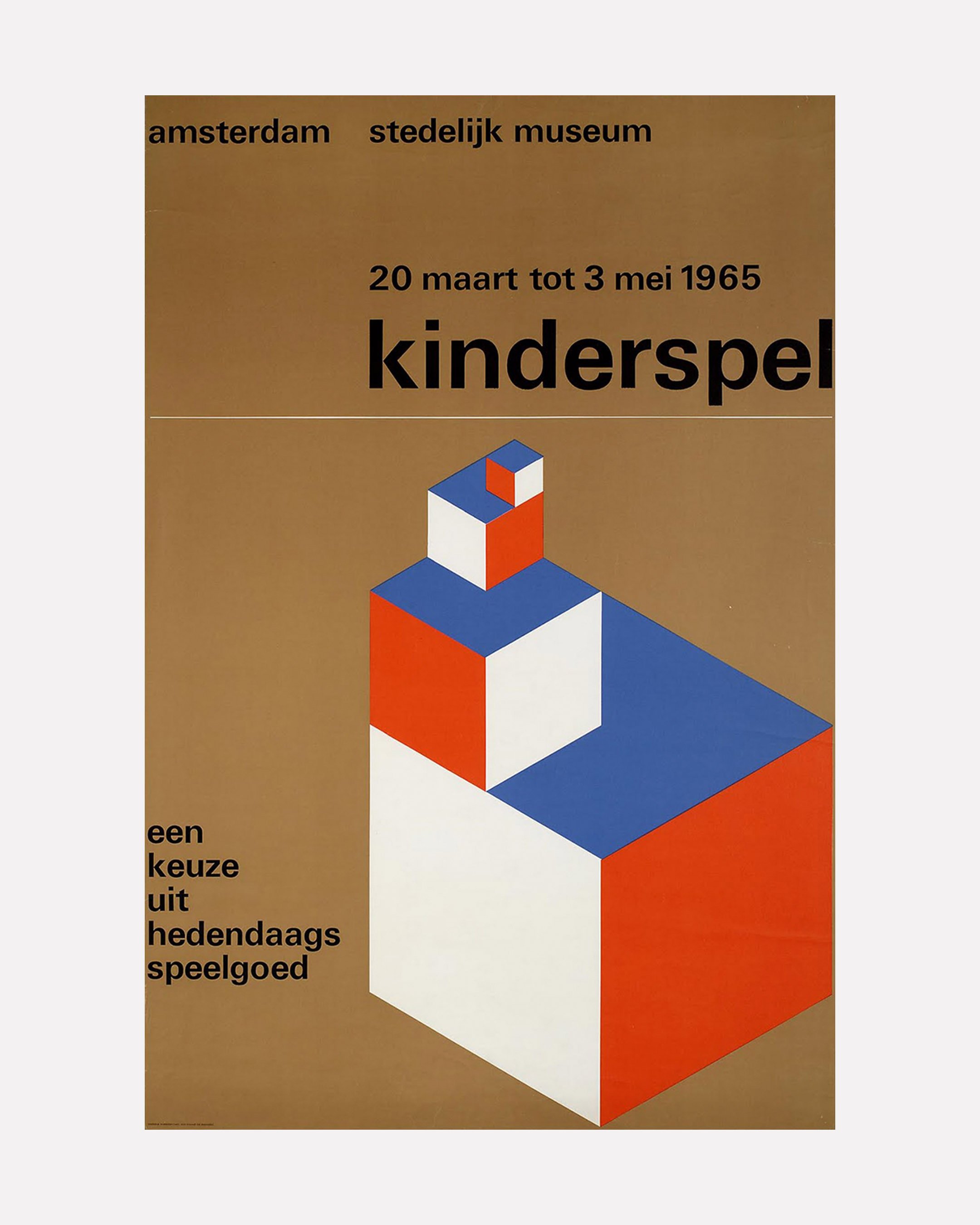
But this attitude arguably leads too easily into a set of implications that we, at least, are less comfortable with. As Milton Glaser has put it, “design is the process of going from an existing condition to a preferred one. Observe that there’s no relationship to art”. Surely no designer would deny the solution-oriented aspect of their role, and the creative satisfaction that successful visual communication brings. But understood solely on these terms, as pure problem-solving, and you can skirt too close to a strictly non-creative, functional characterisation of graphic design, while if design is about solving problems and meeting the needs of clients, then a parallel image emerges of art as pure storytelling and emotional expression. Design, however ‘artistic’-looking, will always be fatally compromised by its link to commerce and functionality (think of graphic design’s early synonym ‘commercial art’). Design is professional, art is authentic. Design is anonymous, art is personal. Design translates meaning, art expresses it. Design is functional, art is creative. Design is commodified, art is liberated from the marketplace. Perhaps these characterisations are fantasies. Art, of course, is intimately related to questions of commerce and the market, even if this relationship can sometimes appear as something of a complex (as the writer Ben Lerner has put it: “walk through the galleries of New York’s Chelsea or Lower East Side and you will find works that claim to be a critique of capitalism or the commodification of art […] such art might be brilliant, or disturbing, or derivative and predictable; regardless, it is very much for sale”).1 Meanwhile, in an interview, Wim Crouwel was once asked whether design should “produce things which are necessarily useful”, and answered that this was “wishful thinking. In reality, design is often not useful at all”.2 If it’s not useful, then what is it? Some answers: expressive, conceptual, formative, even beautiful (Saul Bass: “I want to make beautiful things, even if nobody cares”). Perhaps the design industry will always be at odds with itself on this issue: whether design is about solving other people’s problems, or whether it’s about good visual taste, even beauty. Either way, if the word ‘artistic’ is sometimes unthinkingly used as another way of saying ‘good’ when it comes to design (Charles Eames: “[design] may, if it is good enough, later be judged as art”), then perhaps we should take this unthinking description, and its attendant categorical slippage, more seriously.
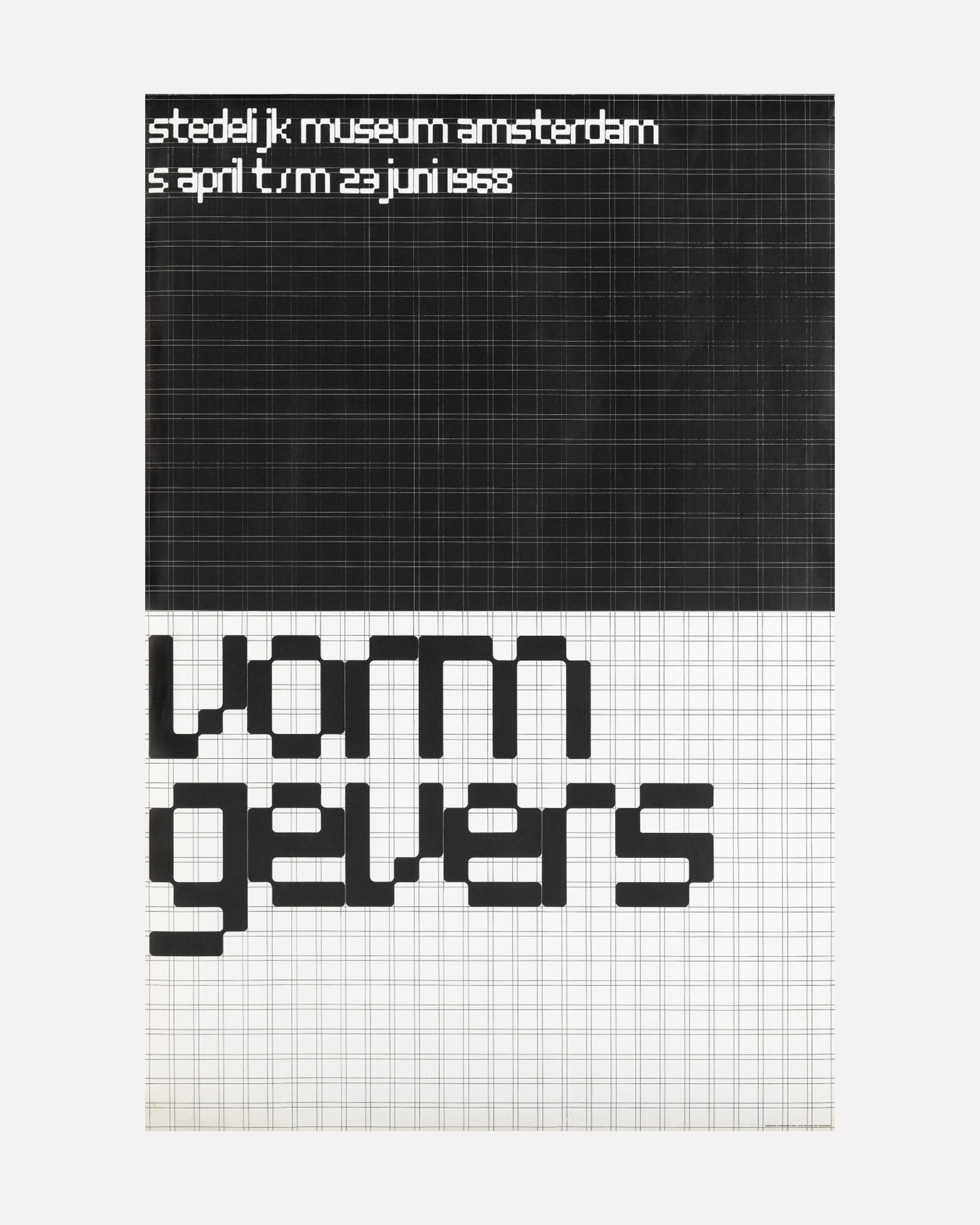
Wim Crouwel: "in reality, design is often not useful at all." Posters for the Stedelijk Museum, 1965–8.
Giving a speech in 1896, William Morris declared that “the public in general must be interested in art; it must be part of their lives; something that they can no more do without than water or lighting”. The romantic utilitarianism of the Arts and Crafts movement, with which Morris was involved, marked an unprecedented fusion of the ideals of art and design — a visionary project taken up by European modernism in the early twentieth century. From Piet Mondrian’s ultra-rational approach to painting to the Constructivists, who reimagined art as a process of organisation and several of whom worked as graphic designers, visual and conceptual principles that today we would instinctively think of as belonging to ‘design’ were everywhere, including in some of the period’s most radical aesthetic movements. The well-known surrealist artists Rene Magritte and Man Ray both had backgrounds in advertising and graphic design, while the work of Kurt Schwitters has showed that dadaist aesthetics were perhaps surprisingly amenable to commercial art: his wide-ranging Merz project (which took its name from a fragment of the German word for ‘commerce’, kommerz) included not only the collages for which he is best known, but also paintings, buildings and an advertising agency, Merz Werbezentrale.At the Bauhaus, the compulsory ‘Basic Course’ demonstrated supposedly universal aesthetic principles that could be applied across the spectrum of art and design, and was taught variously by artists including Johannes Itten, Laszlo Moholy-Nagy, Josef Albers, Paul Klee and Vassily Kandinsky. As Ellen Lupton has explored, these figures collectively established the idea of a ‘visual language’ as a governing metaphor for their modernist-utopian vision of uniting art and design, a metaphor which has gone on to become the model for how we talk about graphic design to this day — how many university design courses are officially titled something like ‘visual communication’?.3
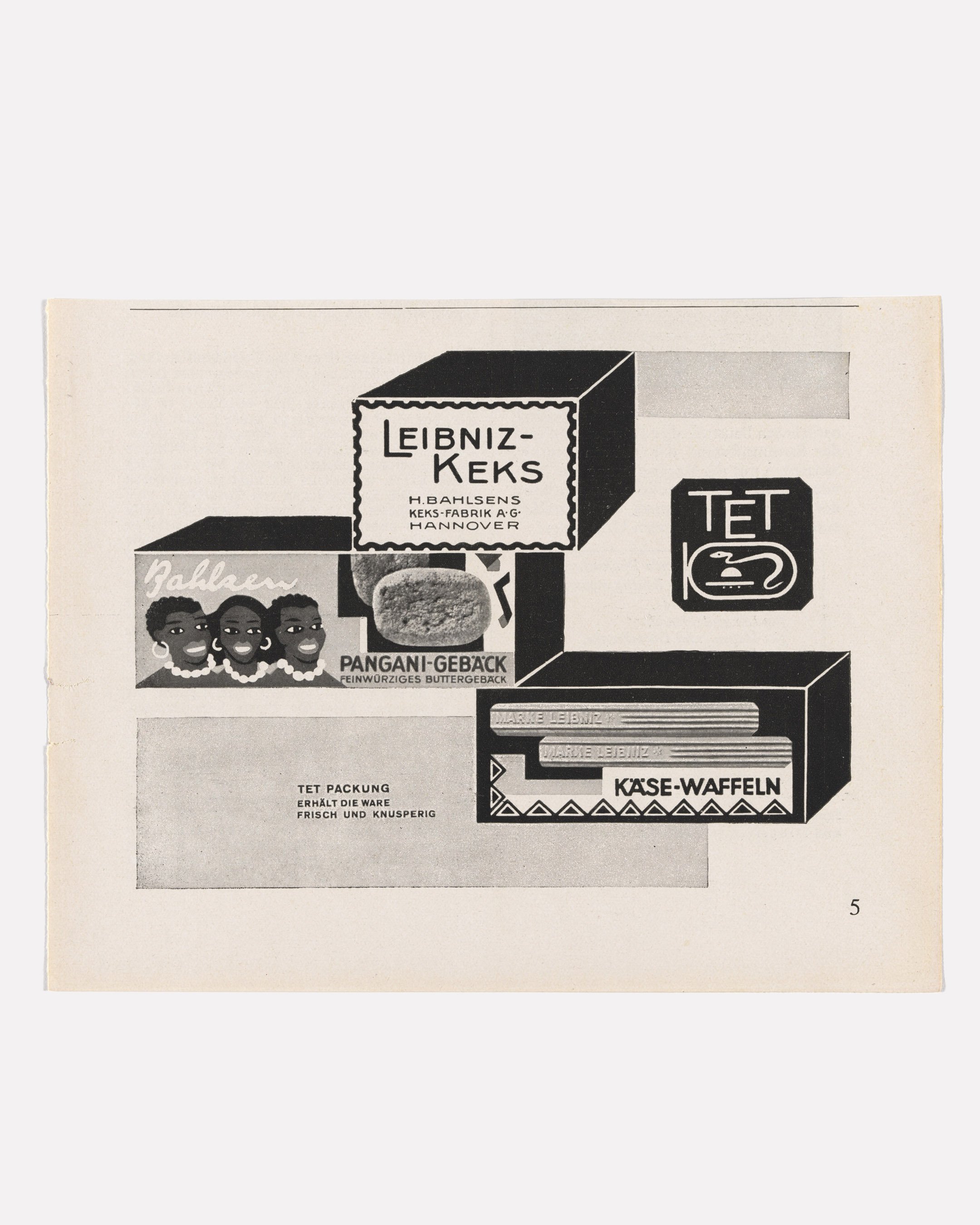
Kurt Schwitters, advert for Leibniz-Keks, c.1929
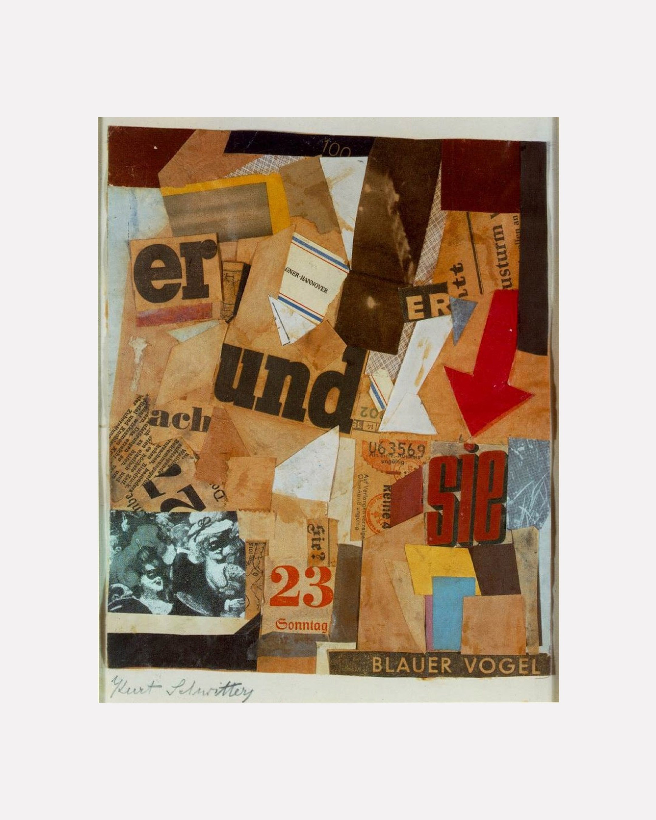
Merz Blauer Vogel, 1922
In 1956, the exhibition This Is Tomorrow was shown at the Whitechapel Gallery in east London. Centring around the work of the Independent Group, the exhibition consisted of twelve exhibits, each produced by a different sub-Group of artists working in collaboration. The show, and the Independent Group more widely, are probably best known for the contributions of Richard Hamilton — whose collage Just what is it that makes today’s homes so different, so appealing? was created for the exhibition — and Eduardo Paolozzi, who along with Hamilton is often regarded as the main progenitor of British pop art. But beside its most famous individual works, what was groundbreaking about This Is Tomorrow was its attitude towards artistic media and disciplines, with a list of participants that included painters, sculptors, architects, critics — and graphic designers. Group One, in particular, saw the graphic designers Edward Wright and Germano Facetti working with the sculptor, painter and printmaker William Turnbull and the architect Theo Crosby on a multimedia installation piece. From Richard Hamilton’s media-saturated work that appropriated mass culture and the discourse of advertising to the inclusion of graphic designers within a generalised sphere of art, This Is Tomorrow signalled the start of a new era, one characterised at least in part by the breakdown of any distinction between art and graphic design (or ‘commercial art’). What This Is Tomorrow foresaw was the popularisation of art, and the explosion of ‘pop’, that was to take place the following decade, and which resulted more or less in the invention of the ‘visual landscape’: a newly available geography of images, which saw little or no distinction in status, or in the viewer’s experience, between art and graphic design (Hamilton: “the artist in twentieth-century urban life is inevitably a consumer of mass culture and potentially a contributor to it”). Perhaps the modernist ideal of borderless visual communication had inadvertently come of age in the era of pop.
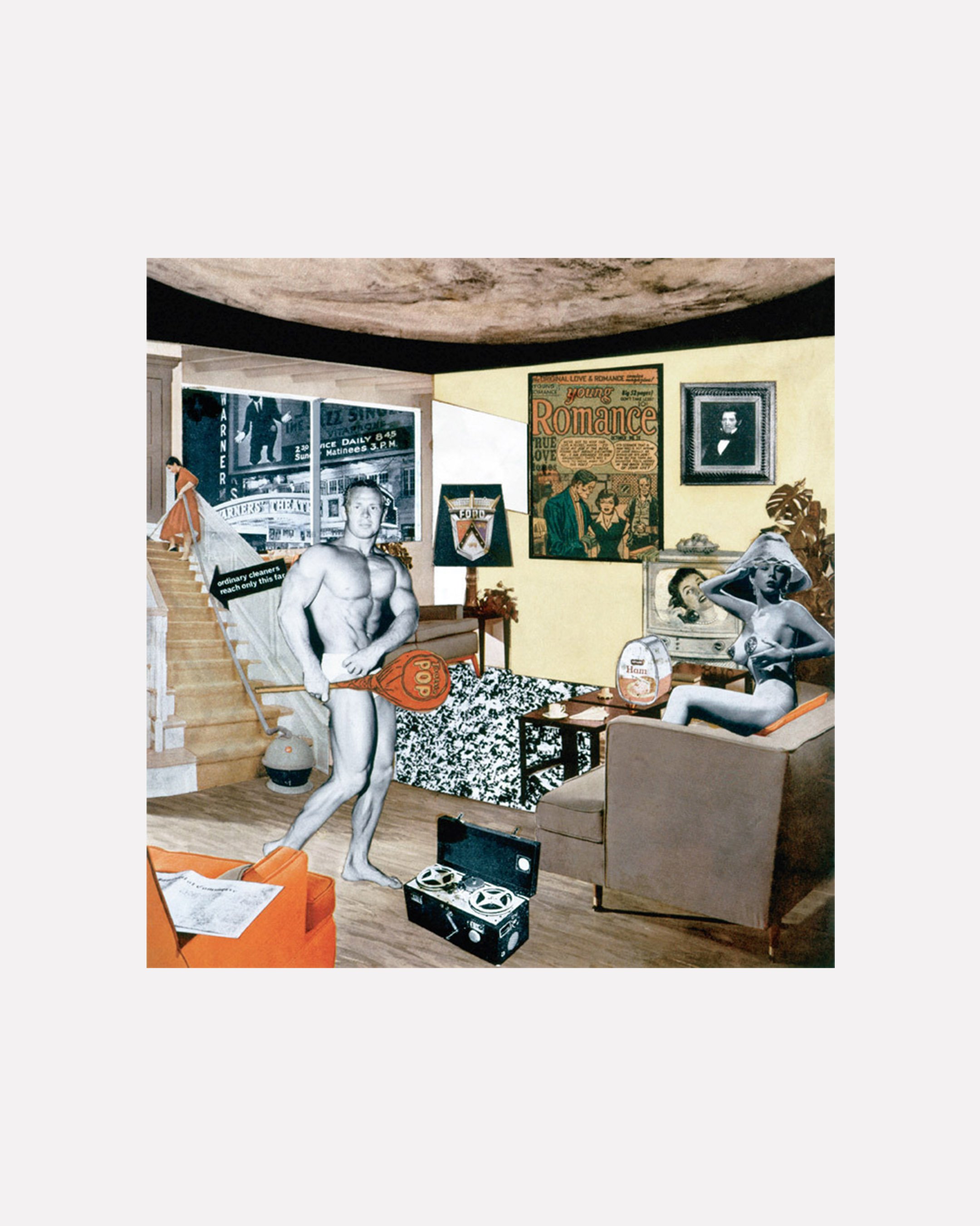
Richard Hamilton, Just what is it that makes today's homes so different, so appealing?, 1956
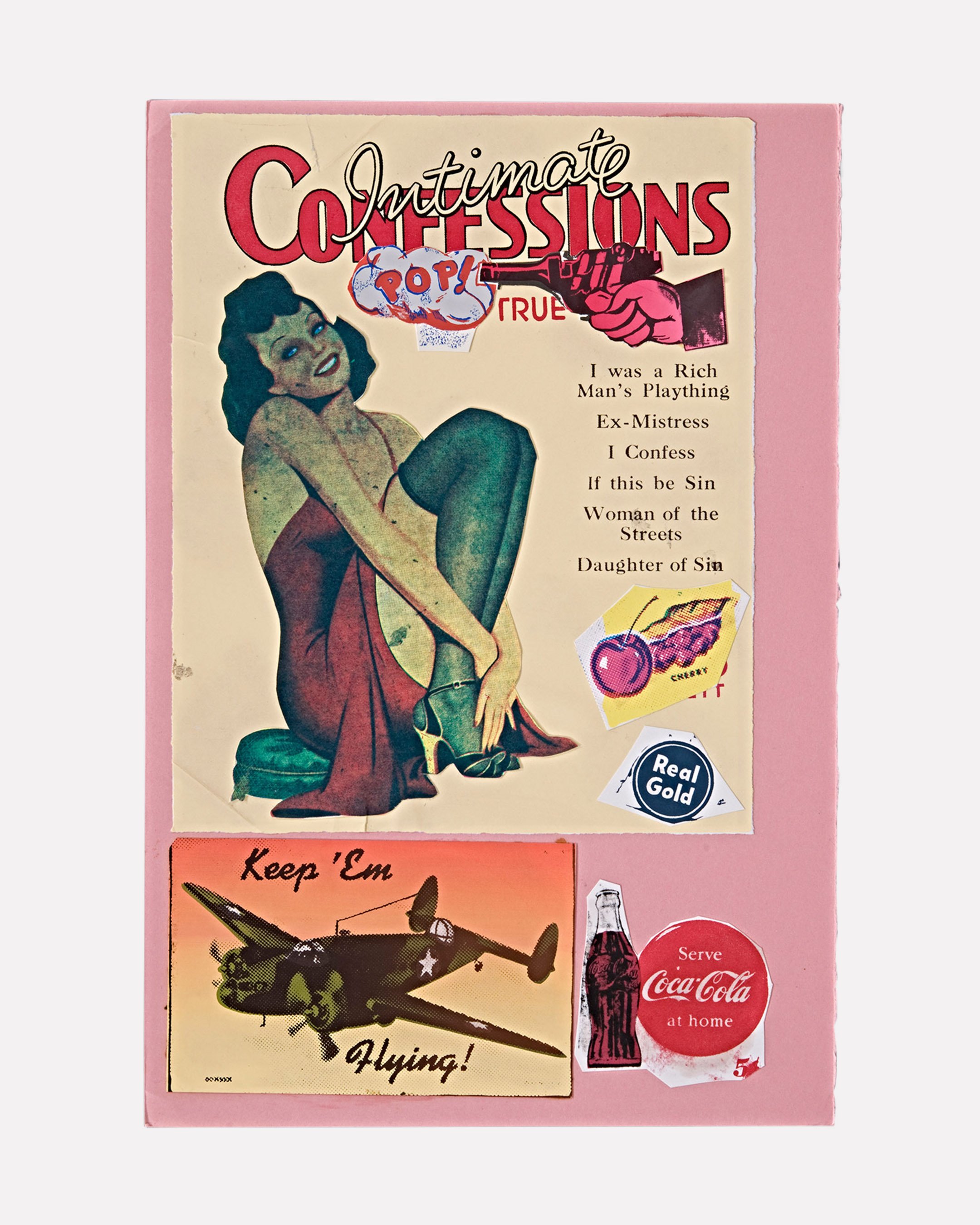
Eduardo Paolozzi, I Was a Rich Man's Plaything, 1947
Fourteen years later, an unofficial catalogue of this episode in art history appeared with the title Art Without Boundaries: 1950-70, edited by Gerald Woods, Philip Thompson and John Williams, all of whom worked and taught as designers. Taking its cue from what it calls the “steady erosion of traditional boundaries” in then-recent art, the book highlights the work of seventy-odd figures, categorised alphabetically rather than by medium or genre: Franco Grignani rubs shoulders with Jean-Luc Godard; Paul Rand with Robert Rauschenberg; Diter Rot with Alain Robbe-Grillet. Notably, Woods opens his introduction to what he saw as a uniquely exciting period of creativity by addressing the disappearing fault-line between art and design:
“At one time it was easy to distinguish between the ‘fine’ artist and the commercial artist. It is now less easy. The qualities which differentiated the one from the other are now often common to both. The painter, who once saw the commercial designer as a toady to the financial pressures of industry, may now find that the dealer can impose a tyranny worse than that of any client. During the last twenty years or so, barriers have been broken down; and they are still being broken down.”
The introduction also quotes the artist Claes Oldenburg self-describing as a ‘visual communicator’ — the Bauhaus/modernist rubric proving its staying power. Art Without Boundaries offers a view of art which may not have been widely taken up by the art world, but whose accuracy in recording a certain cultural moment and attitude towards creativity is hard to deny. As Woods goes on to say, “today, both painters and designers have become non-specialists; indeed, one man may well engage in both activities.”4
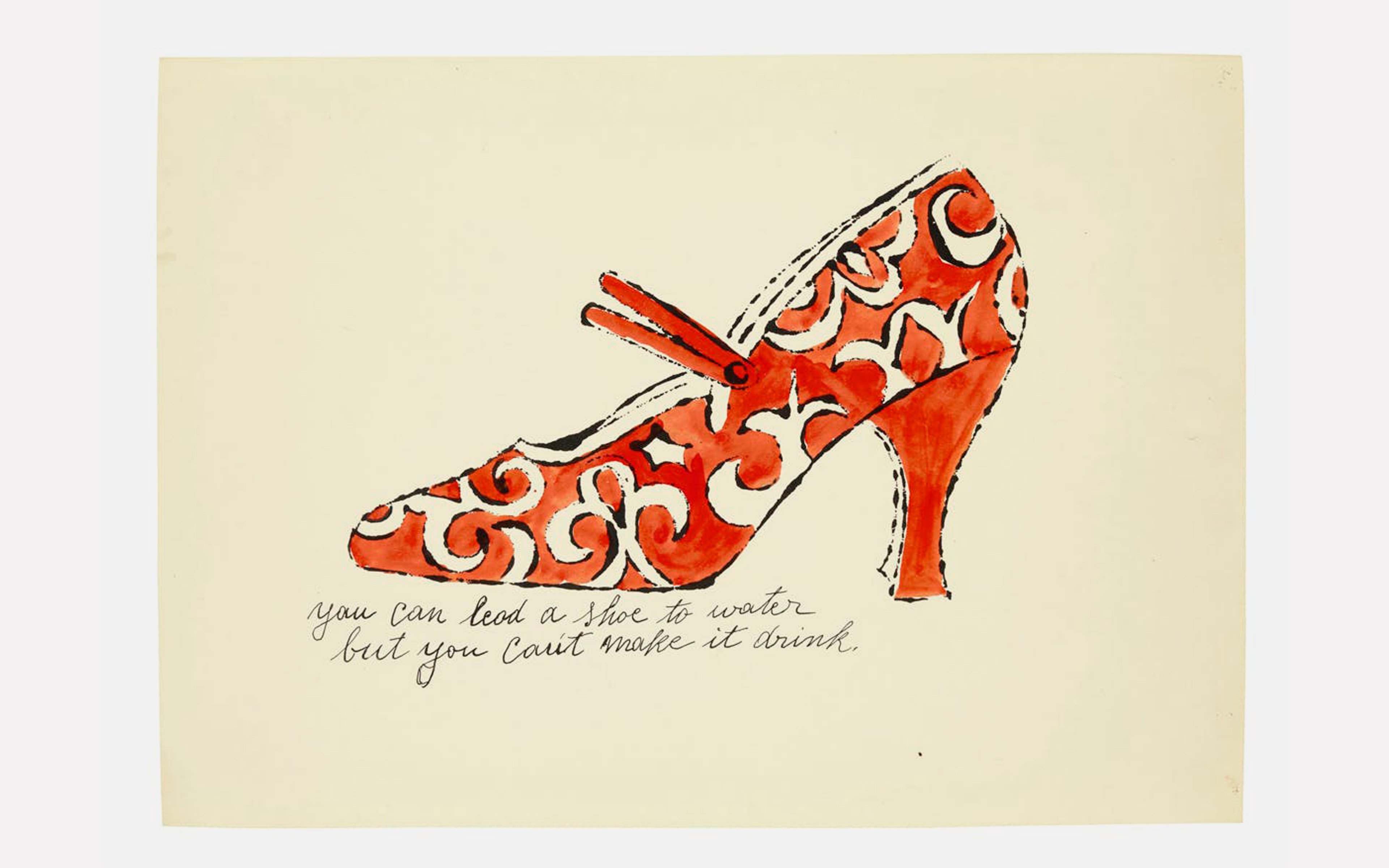
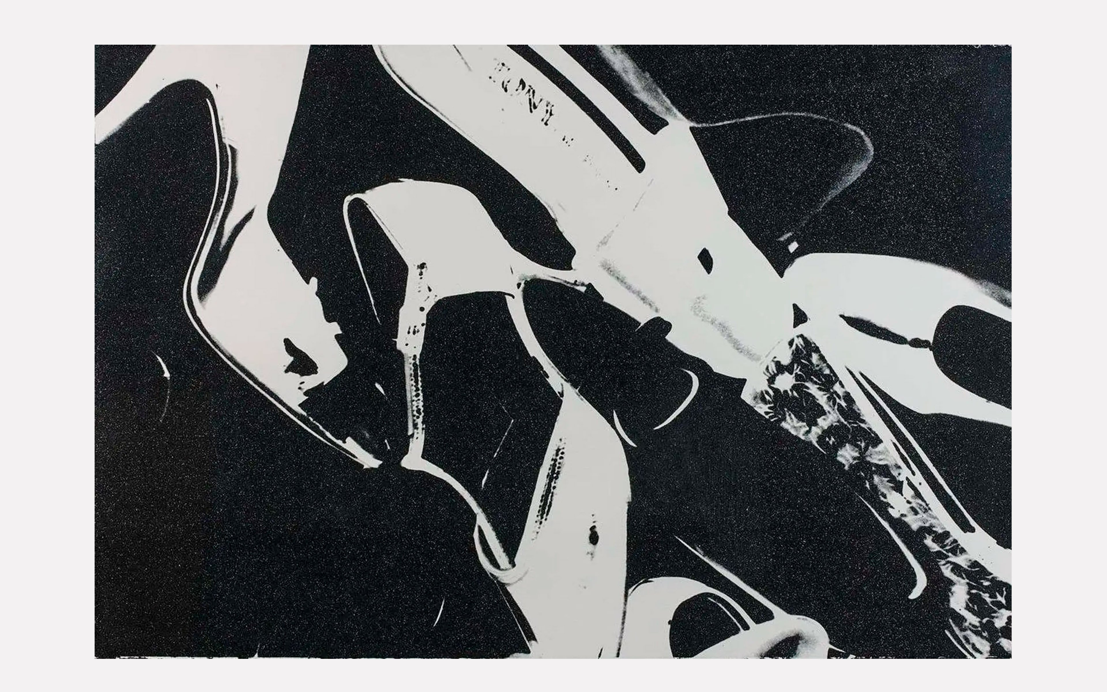
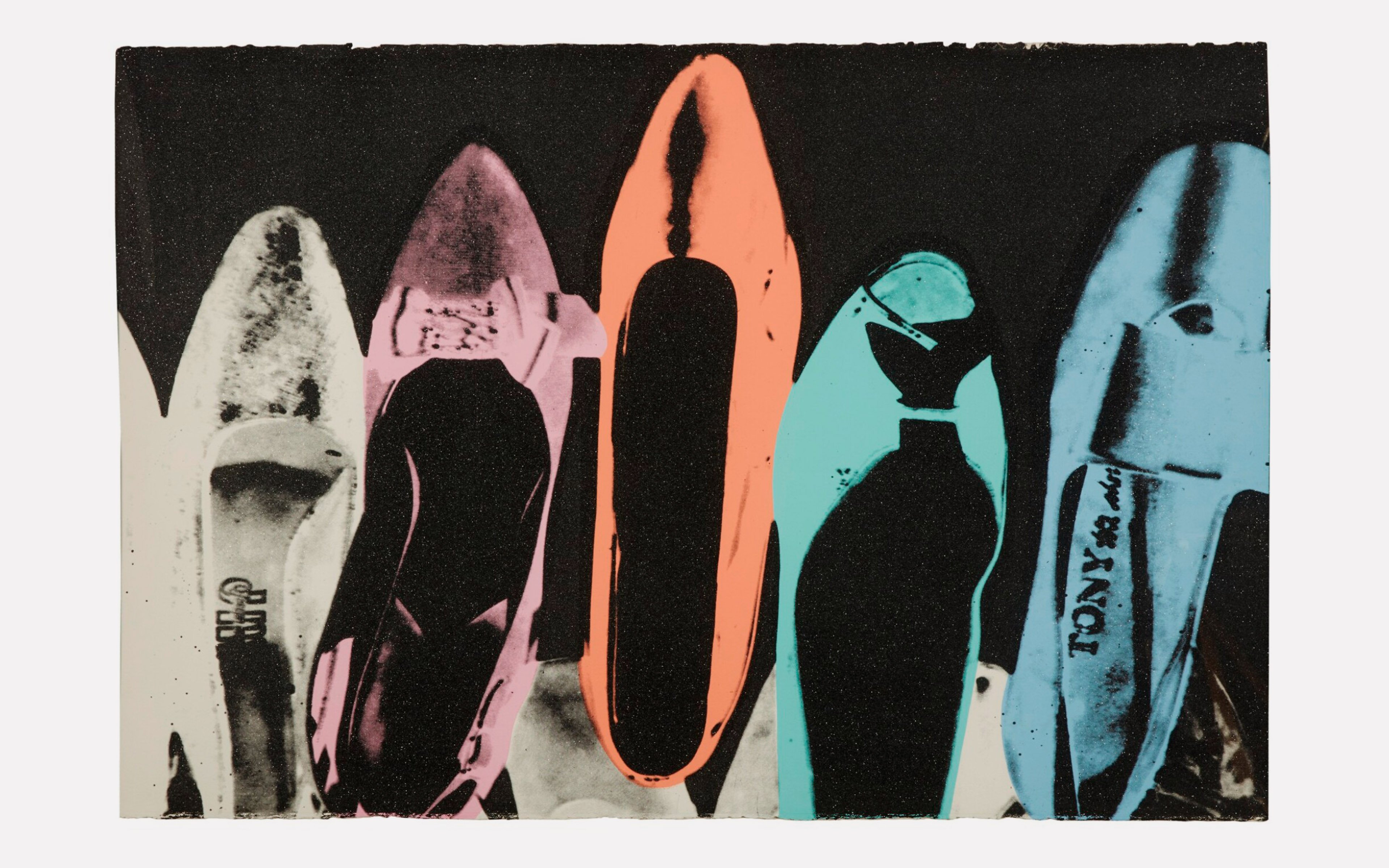
Andy Warhol, shoe illustration, 1955, and Diamond Dust Shoes, 1980
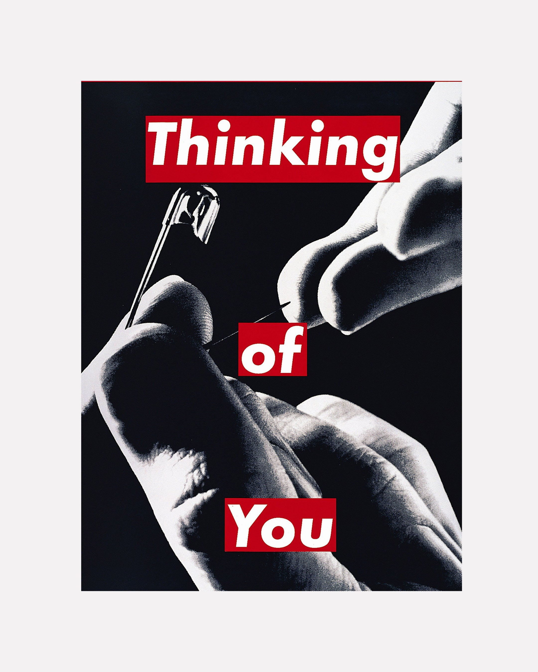
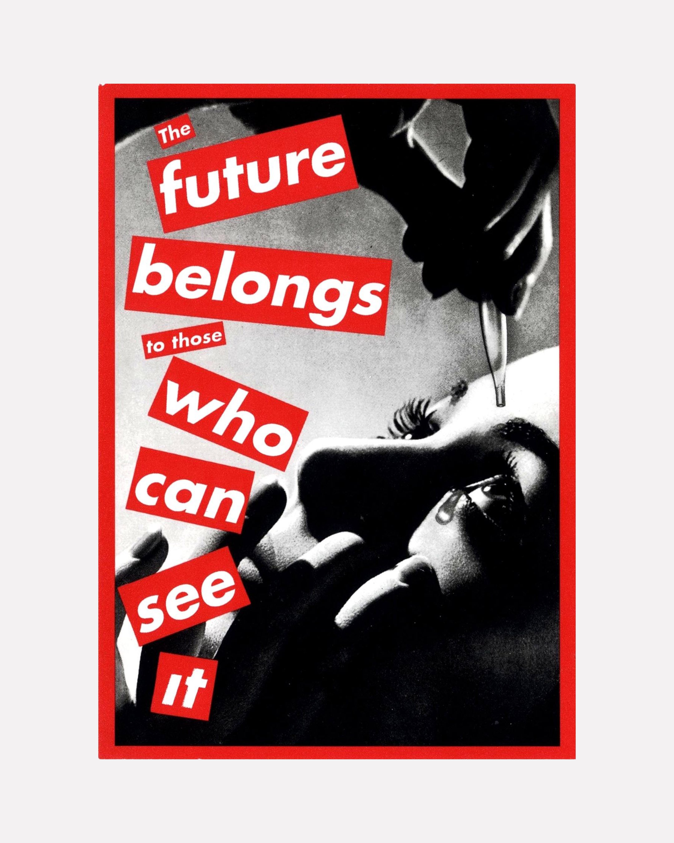
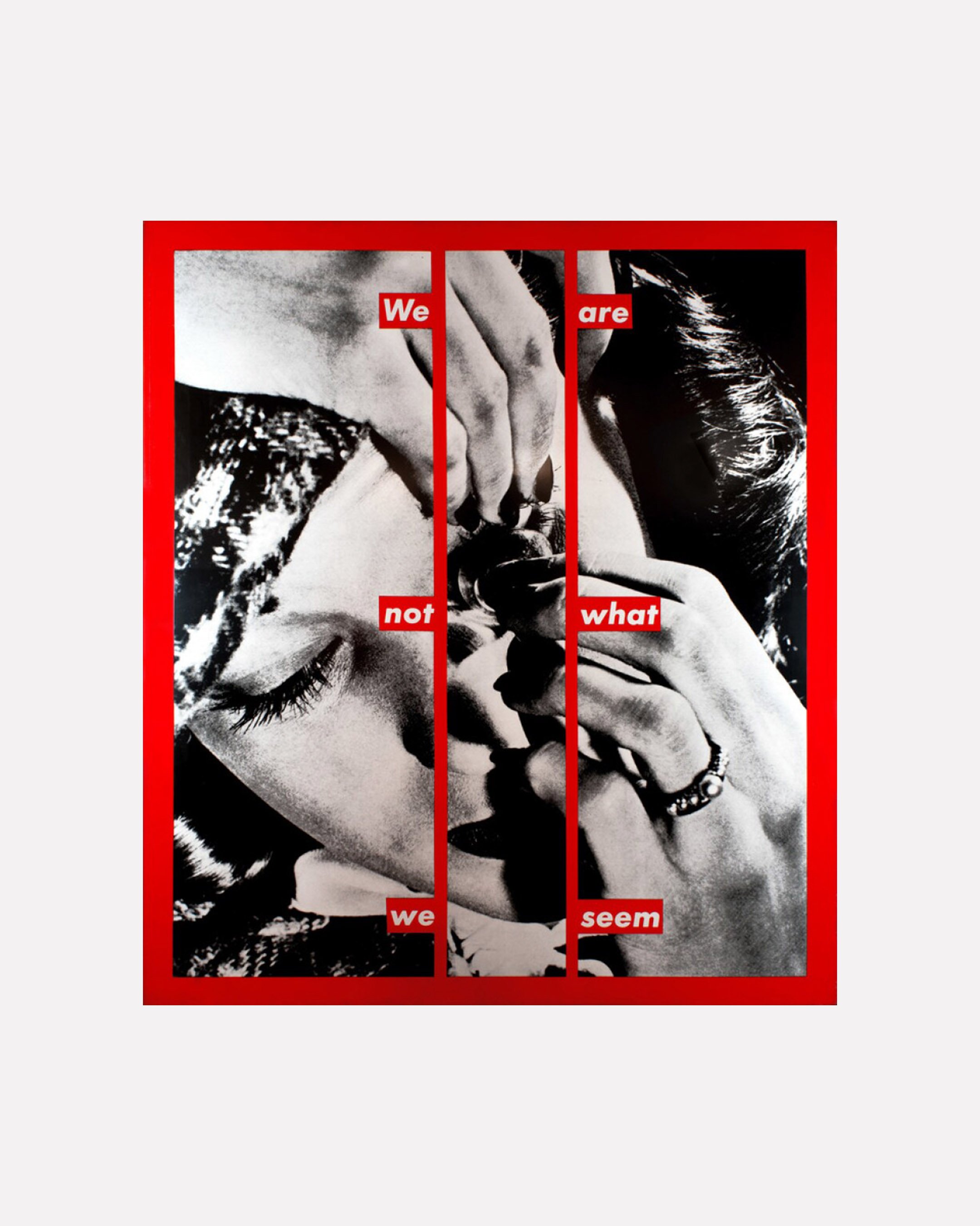
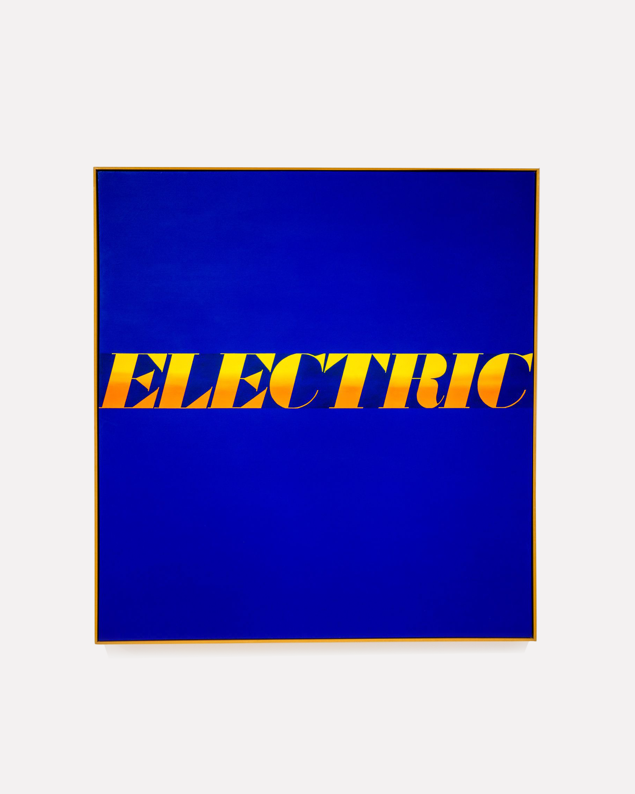
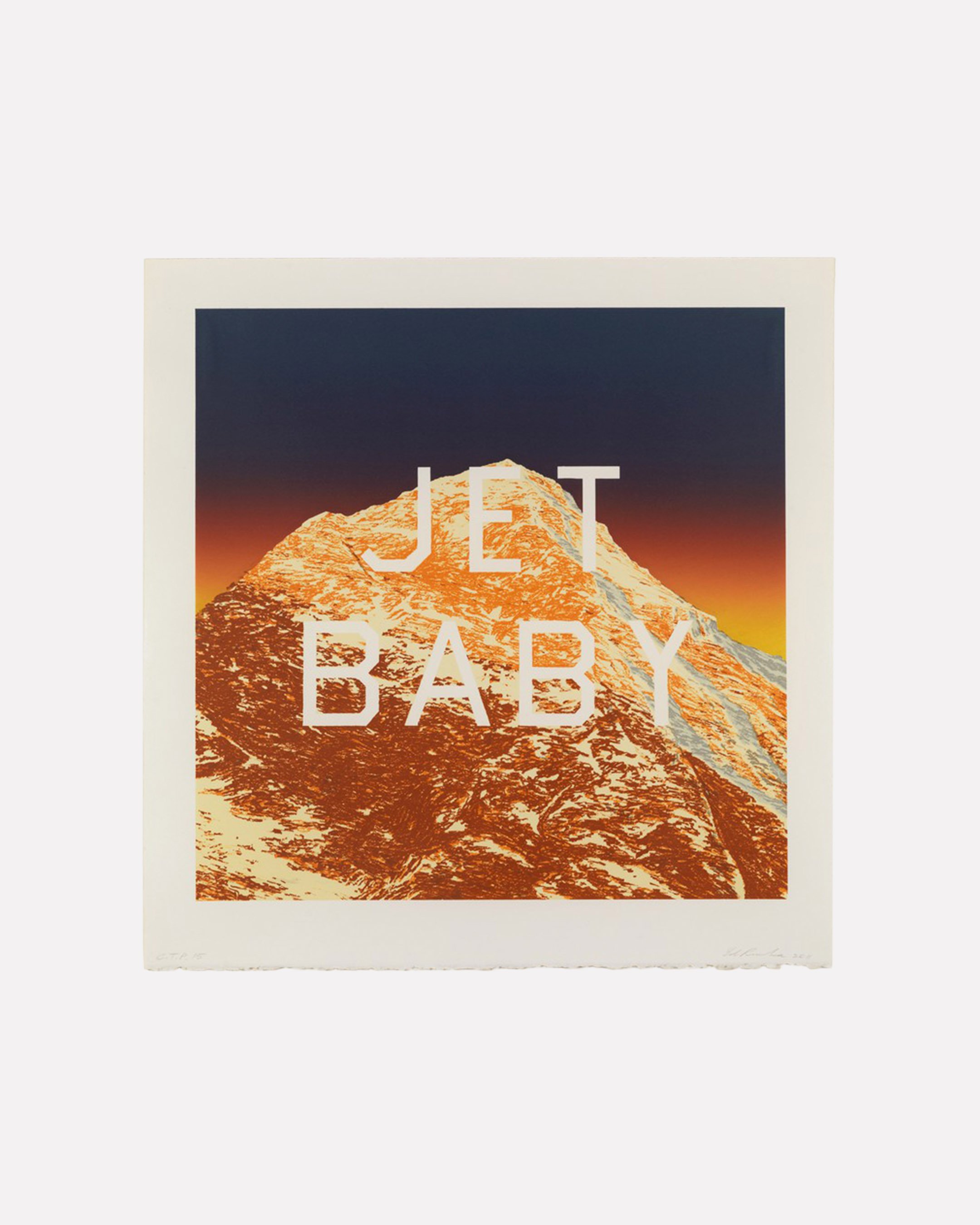
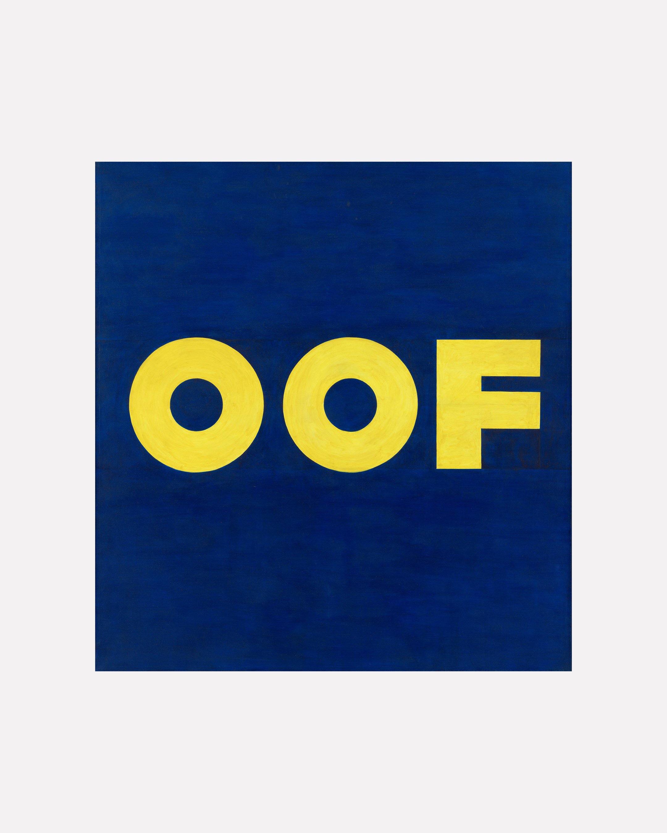
As Woods predicted, the following decades saw several artists who began their careers in commercial art rise to prominence. Andy Warhol worked as an award-winning commercial illustrator, producing record sleeves, book covers and drawings of women’s shoes for adverts in fashion magazines, later to be echoed in his Diamond Dust Shoes series of prints. In fact, Warhol’s background as an illustrator for hire seems to underwrite his entire career as an artist who made his name with paintings of everyday commodities and called his studio ‘The Factory’ — as Warhol himself said in 1987, “I was always a commercial artist”, while the Diamond Dust Shoes, in their twenty-five-year journey from Glamour to the gallery, seem to oscillate between commercial object and artwork. The typographic paintings of Ed Ruscha — who started out working for advertising agencies — quote abstract fragments of everyday language to make strange the landscape of mass culture, commerce and the mediated construction of American life. Barbara Kruger, known for her subversively sloganeering, much more explicitly political, works and her distinctive visual language (black-and-white imagery; red banners for text; type in Futura), has described her graphic design career, which took place mostly for the publisher Condé Nast, as “the biggest influence on my work…[it] became, with a few adjustments, my ‘work’ as an artist”. Ruscha and Kruger are both influential figures in the history of typographic art, a genre which includes many other artists often described as ‘conceptual' (Fiona Banner, Lawrence Weiner, Christopher Wool, Mel Blochner, et al). Indeed, their shared background in commercial art is only the most visible sign of graphic design’s influence on much of the postwar avant-garde: witness the minimalist work of Sol LeWitt (whose obsession with grids will be recognisable to any contemporary designer), the neon signs of Bruce Nauman, or the activist art of the Guerrilla Girls.
Design as art: Barbara Kruger and Ed Ruscha
Something like the Ruscha/Kruger pop-conceptual crossover from design to art was enacted in reverse with the case of The Offices of Fend, Fitzgibbon, Holzer, Nadin, Prince & Winters, an early-career initiative from six artists (including the now-well-known Jenny Holzer and Richard Prince). As per their business cards, the group offered “Practical Esthetic Services Adaptable to Client Situation” and “socially helpful work for hire”. Their definition of the artist as “an agency for the initiation of a function” was a strikingly unorthodox one, perhaps coming closer to the territory of the designer or creative consultant. As artists operating beyond the art world, The Offices was founded on the assumption that art had something to offer the more commercial, goal-driven world of clients, projects and creative solutions — and vice versa. But as Offices member Peter Fend tells it, “we were asked by scientists at the California Institute of Technology to help develop a creative media campaign for promoting a scheme for replacing fossil fuels with a marine-biological source. Shortly afterwards, however, The Offices collapsed. No such campaign, nor other campaigns were ever undertaken. Instead, art took quite another course.”5 Why? Were potential clients unable to take seriously the idea of artists as commercial problem-solvers? Were the artists themselves ill-equipped for the work? Or was it a semi-ironic statement about art and commerce whose authors misjudged its reception, à la Heaven 17’s adoption (in the climate of Thatcherite Britain) of the visual language of the corporation for their 1981 album Penthouse and Pavement? Either way, it’s hard to see any of those reasons holding up today. Though the level of irony behind the endeavour is ultimately hard to read, if we take it seriously then it seems that The Offices was at once behind and ahead of its time, uncannily reanimating the modernist ideal of the artist-designer-visual communicator and offering a model for creative practice today. The Offices is something like an art-world mirror for the marketing strategy of PARCO, a Japanese chain of department stores, whose campaigns in the 1980s, according to the art critic Taro Nettleton, “advertised a sensibility rather than actual commodities. The boundaries between culture and consumerism were pushed to their limits as PARCO aggressively promoted itself as a cultural institution, operating a theatre that hosted ‘underground’ plays as well as contemporary classical music concerts, an art house cinema, a publishing house, art bookstores and a record store”. Like The Offices, this is a prescient forerunner of today’s interplay of commerce and creativity, in which marketing sells a lifestyle rather than a product and brands publicly reposition themselves as cultural producers. Writing about the artist Harumi Yamaguchi, who worked for PARCO at this time, Nettleton argues that her airbrushed creations “allow us to reconsider in a more nuanced and complex way the supposed opposites of fine art and commercial art, superficiality and substantiality, and progressiveness and conservatism… provocatively ambivalent, Yamaguchi’s oeuvre troubles assumptions that commercial work is regressive while avant-garde work is progressive”.6
As early as 1961 the cultural critic Raymond Williams was able to write that “advertising is… the official art of modern capitalist society: it is what ‘we’ put up in ‘our’ streets and use to fill up half of ‘our’ newspapers and magazines: and it commands the services of perhaps the largest organised body of writers and artists, with their attendant managers and advisers, in the whole society”.7 Today, the line between design and art, the commercially commissioned and the supposedly independent, has become especially indistinct. Not only do brands sponsor exhibitions or fund awards, but increasingly commission artists themselves. The acclaimed sculptor/photographer Thomas Demand has created store window designs for Prada. Young artists find themselves tapped up for campaigns by Airbnb or WeWork. Valentino has enlisted novelists and poets to produce creative writing for its campaigns: short stories on the topic of love, or featuring the word ‘Valentino’, inspired by Donna Tartt’s description of a character as “all Valentino-ed up and on her way out the door” in her 2013 novel The Goldfinch. Is this art? Advertising? Literature? Design? Increasingly our visual landscape, and those who contribute to it, make little distinction between these categories. Meanwhile it’s not difficult to find graphic designers, often commercially successful ones, who take on self-initiated work of some description alongside the portfolio they show to clients; perhaps, in fact, it’s more difficult to find those who don’t. Scan the pages of the design press and it won’t be long before you come across a glowing write-up of a young creative whose practice ‘blurs the line between art and design’ or similar. Indeed, various ideas of the ‘designer as author’ — the designer who originates content they work with, rather than simply communicating it as a neutral third party — have become touchstones for various designers making a case for the creative, rather than simply ‘functional’ aspects of their profession. But at what point is this description of the ‘designer as author’ actually distinct from simply being a description of an artist?

Thomas Demand, Blossom for Prada, 2020
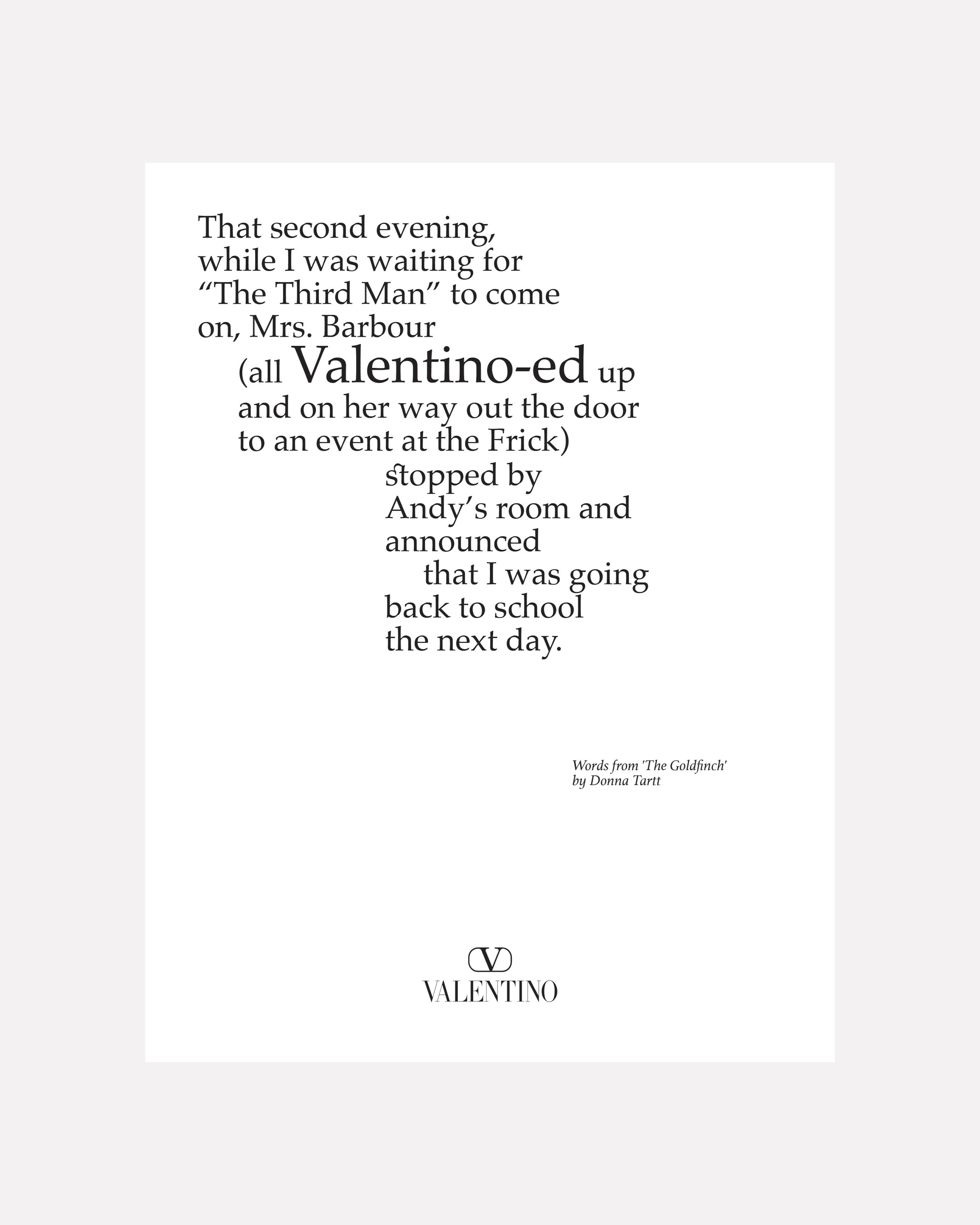
Valentino advert featuring writing by Donna Tartt, 2021
When art can be commissioned and design can be self-initiated or clientless, then perhaps it’s time those categories were reimagined; and perhaps the real point has less to do with art and design changing as disciplines than with the language we're used to defining them with having been taken for granted for too long. Rather than being strictly defined by diametrically opposed qualities or purposes, ‘art’ and ‘design’ are as much a set of discourses and institutions as anything else — a line familiar from the ‘institutional critique’ art of the postwar period. To Ruscha’s tongue-in-cheek pair of typographic drawings Artists Who Do Books and Artists Who Make “Pieces” (1976), which playfully analysed the language of conceptual art and the complications in defining art at all, we can now imagine a counterpart, forming a triptych — perhaps called something like Designers Who Make Art.
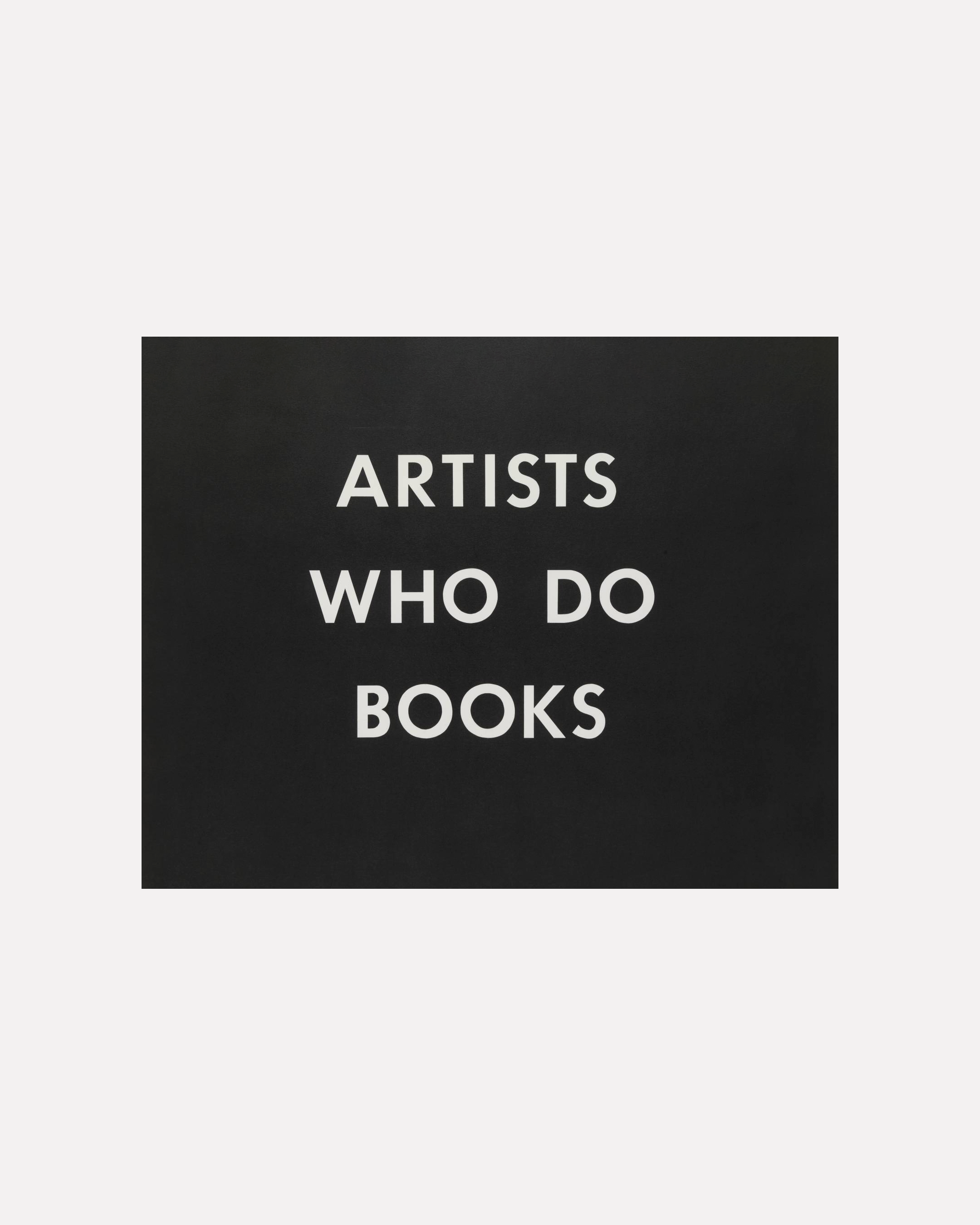
Ed Ruscha, Artists Who Do Books, 1976
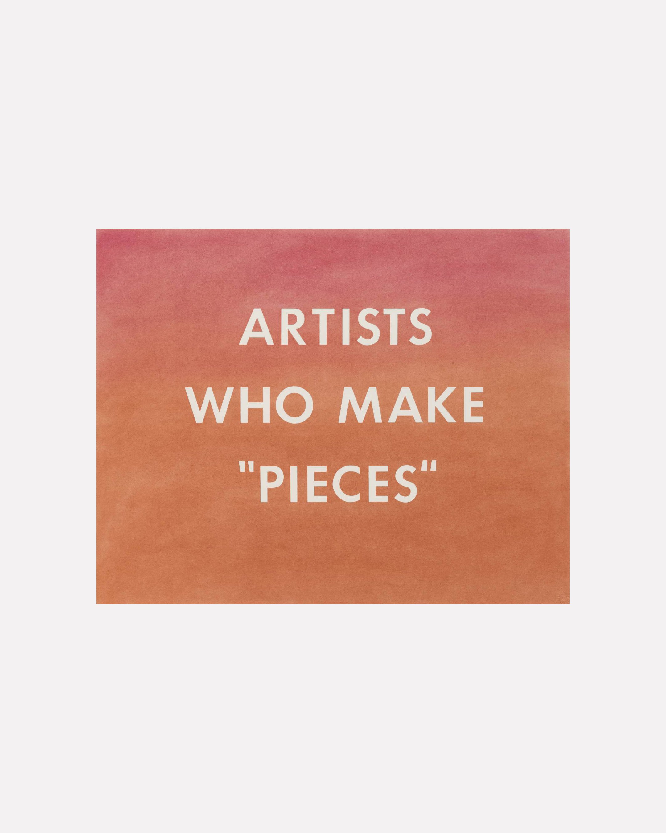
Artists Who Make "Pieces", 1976
