Gallery entrance signage
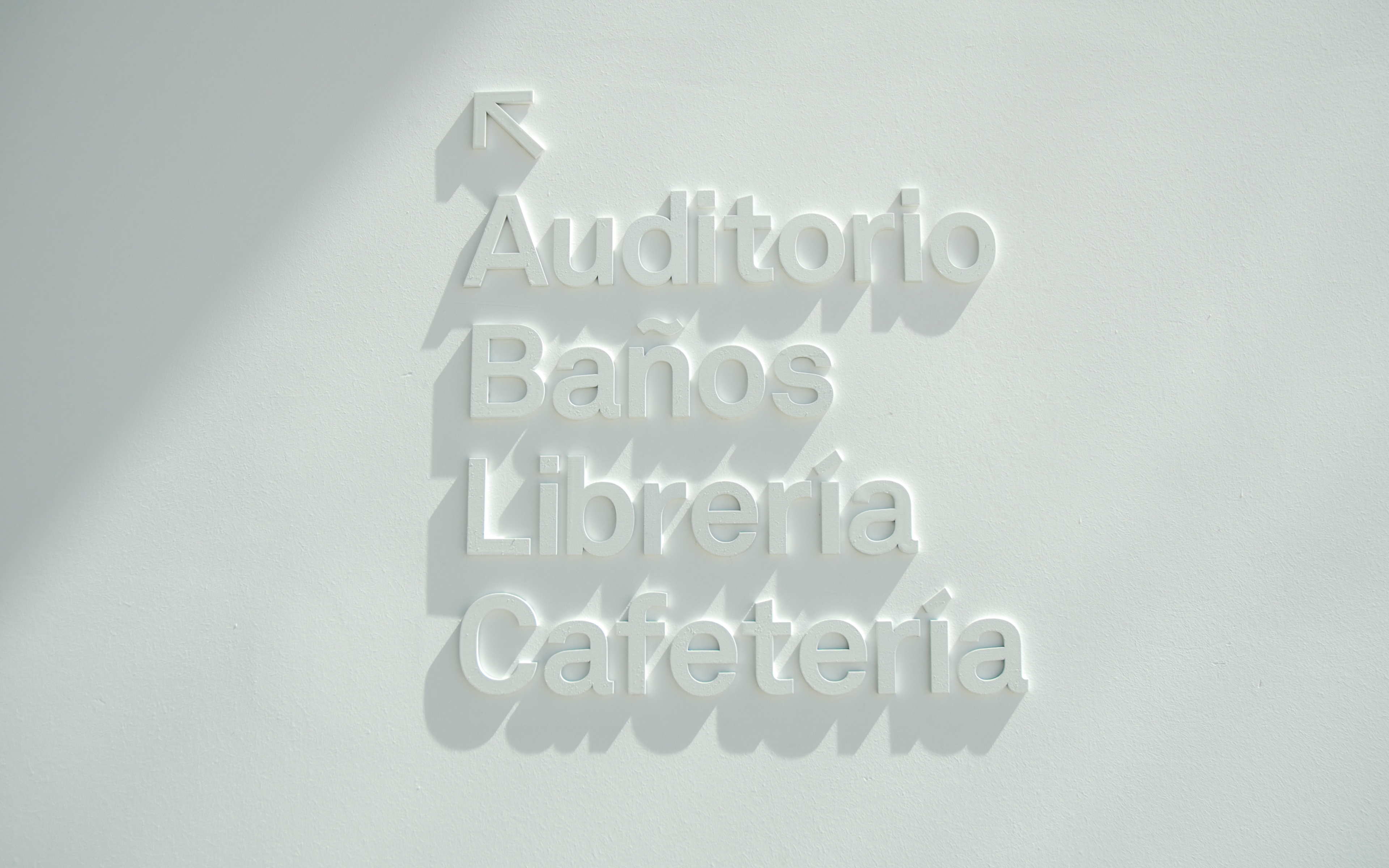
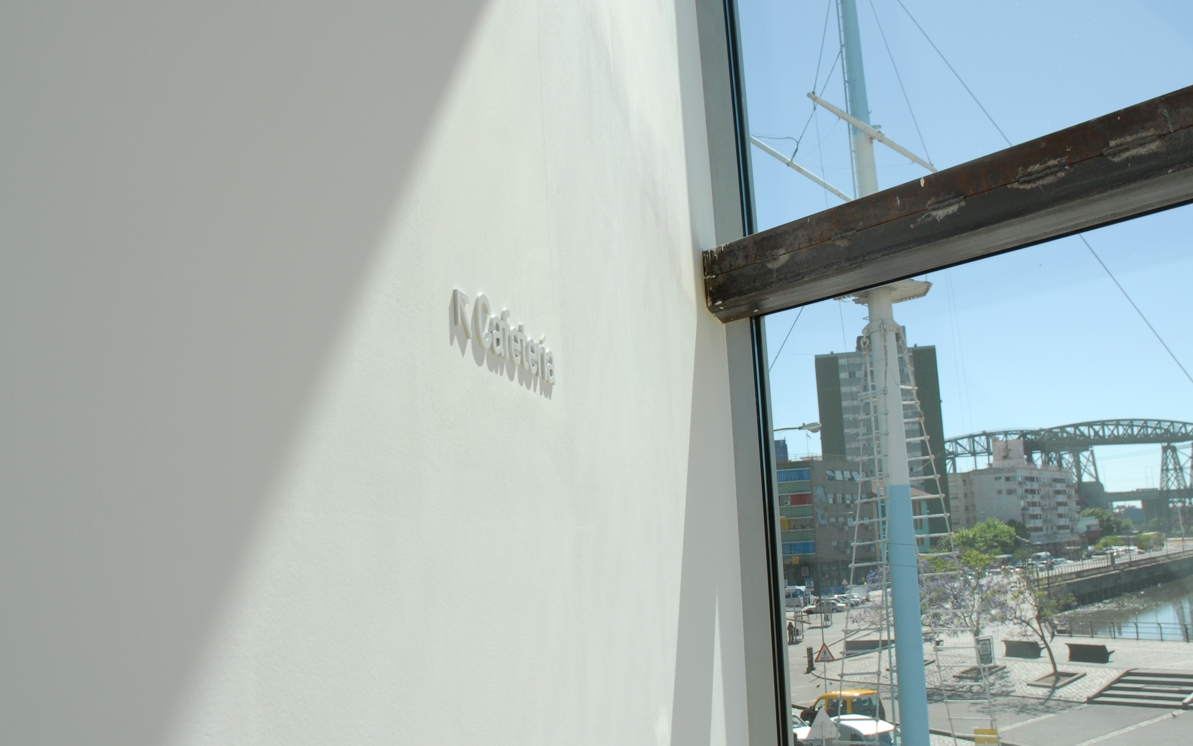
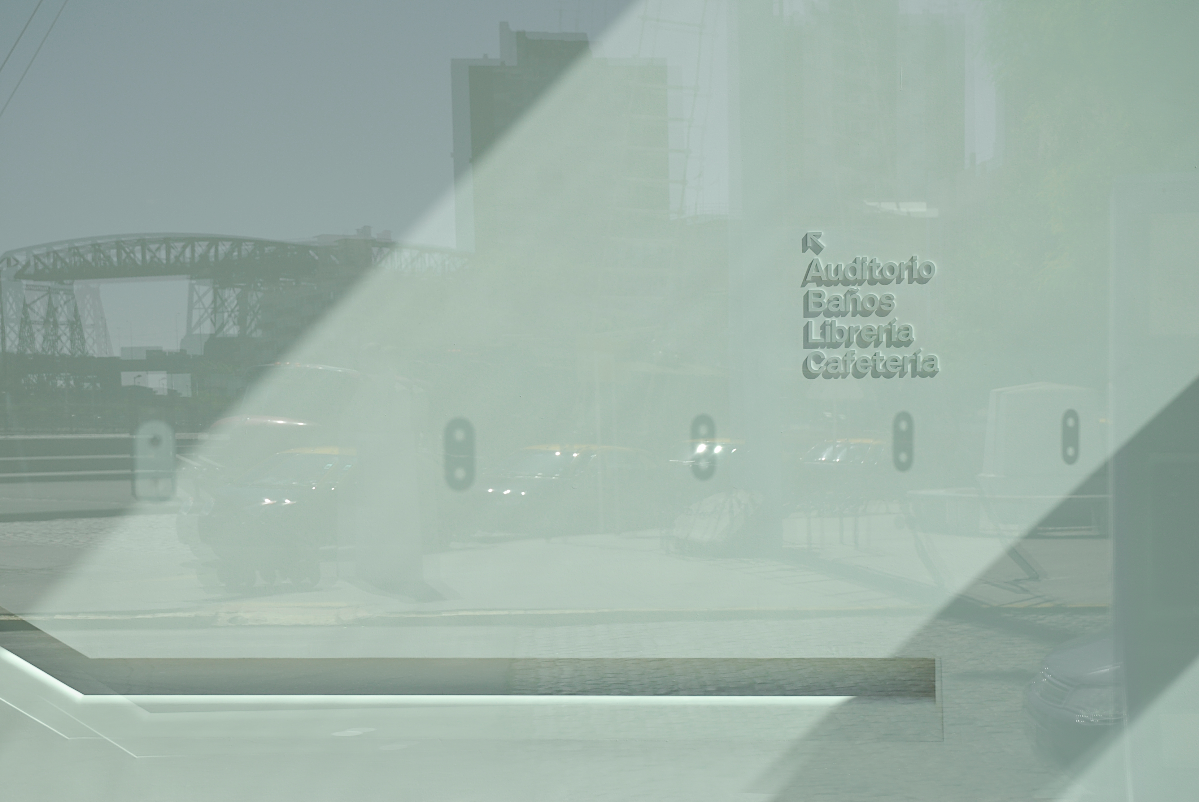
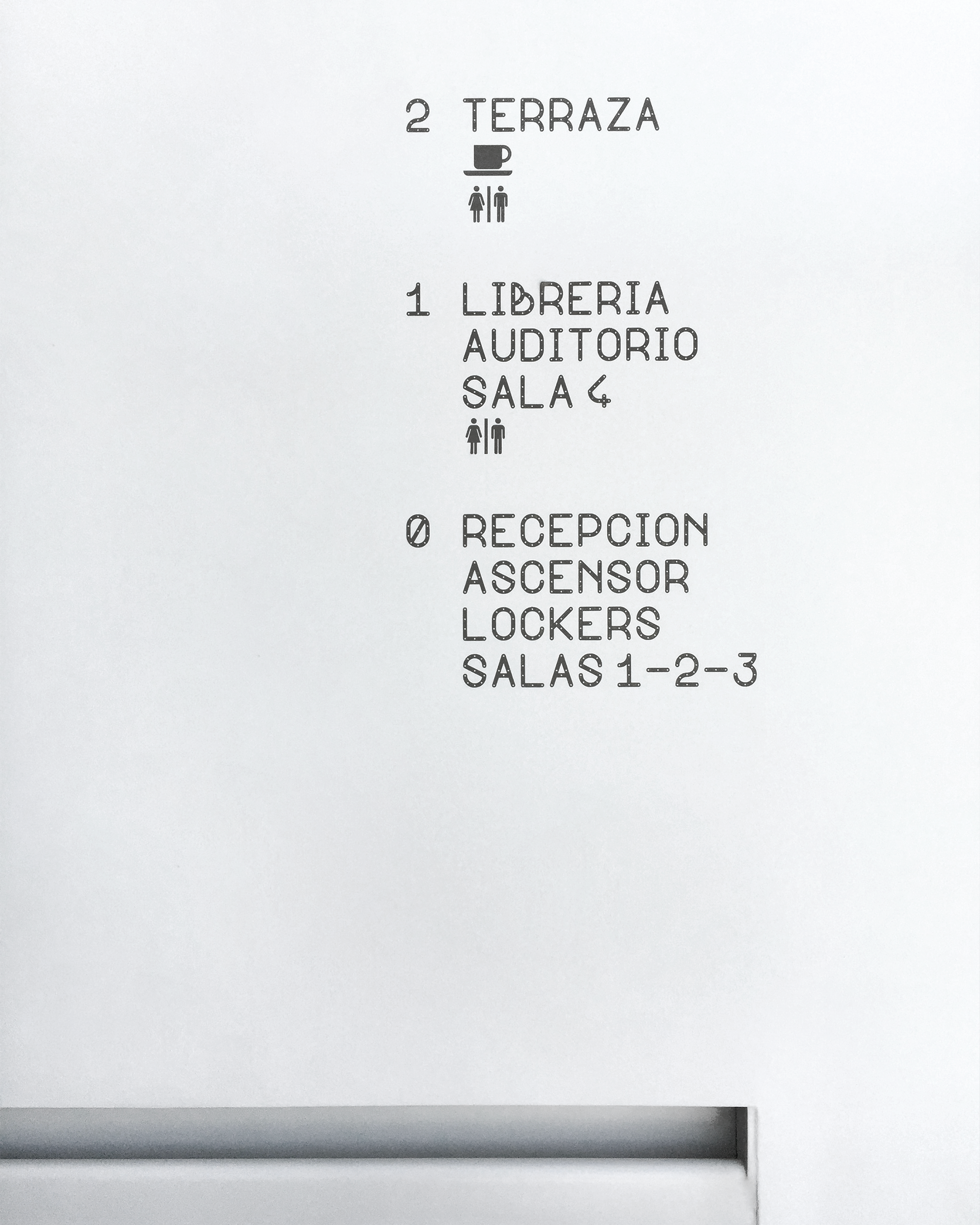
Signage
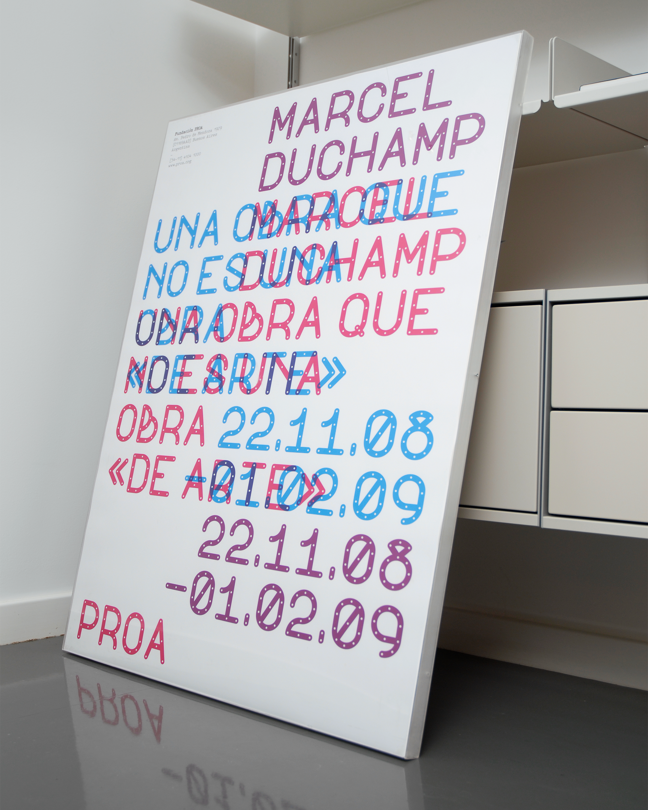
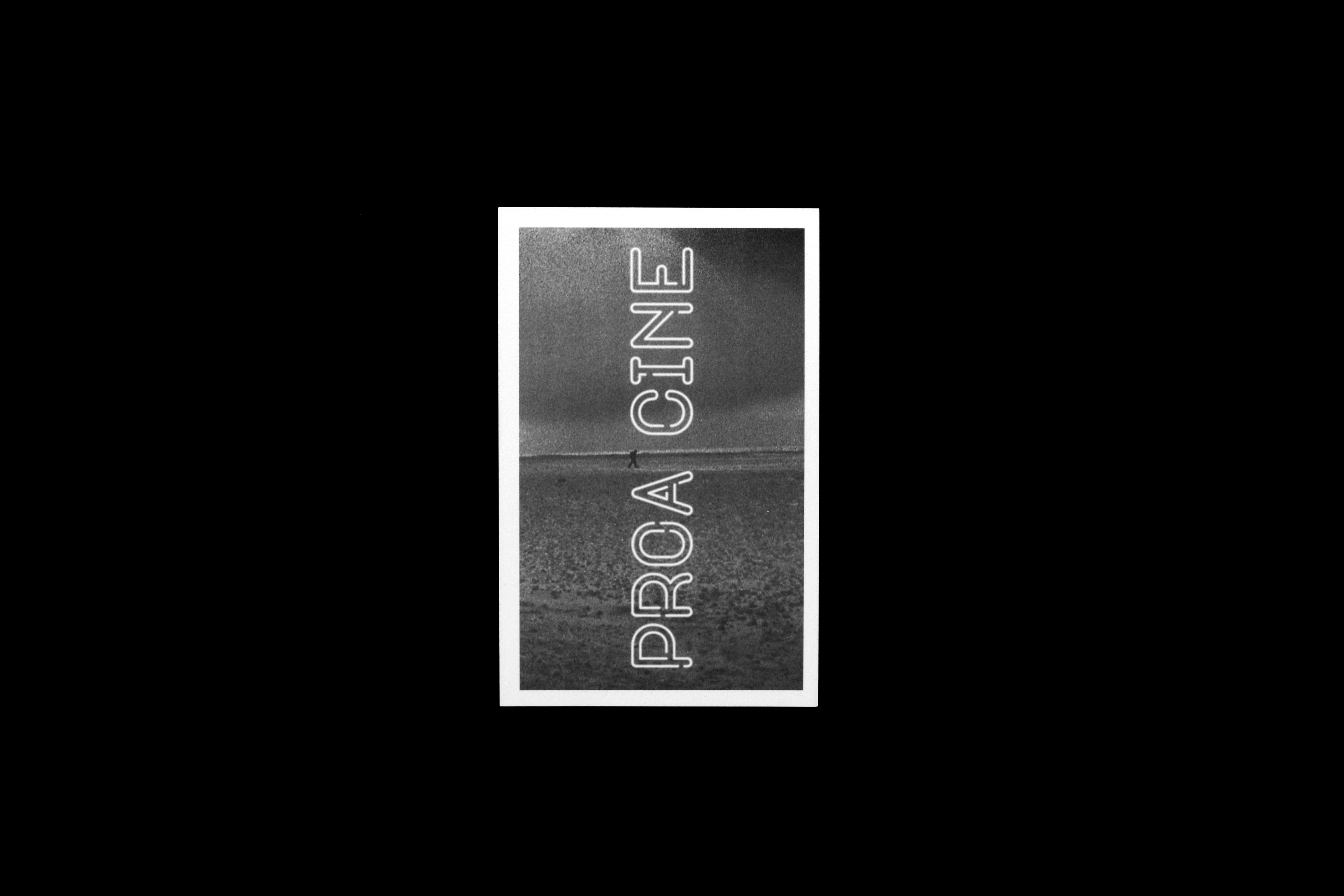
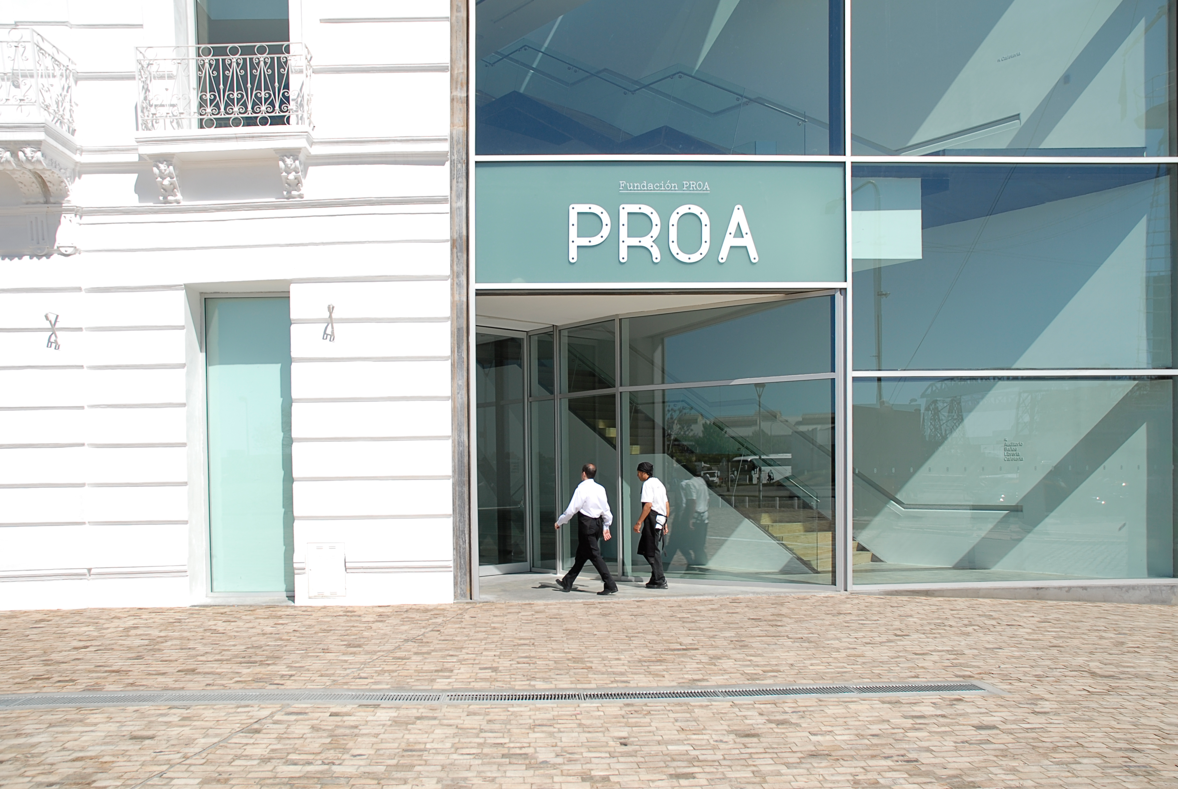
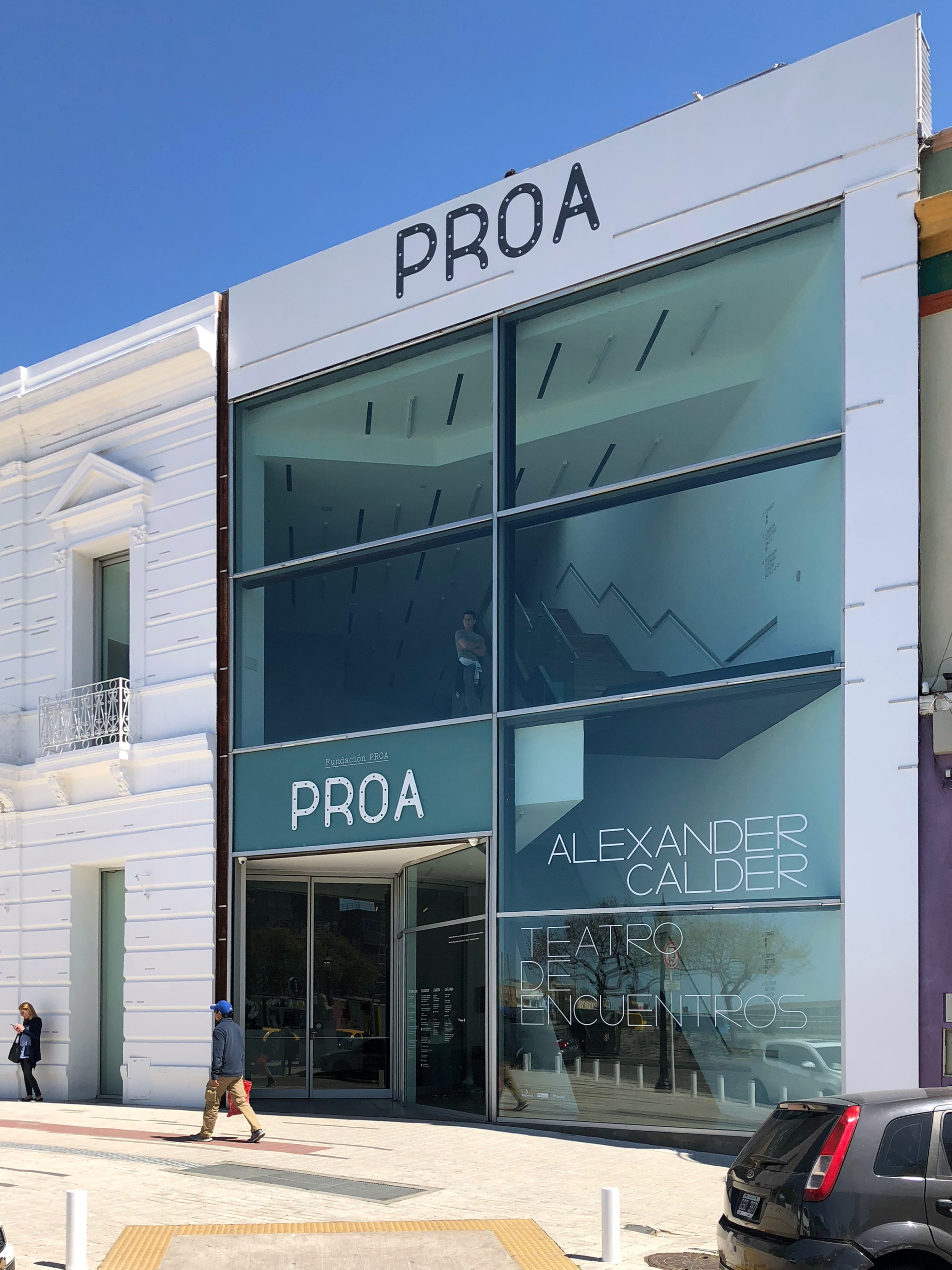
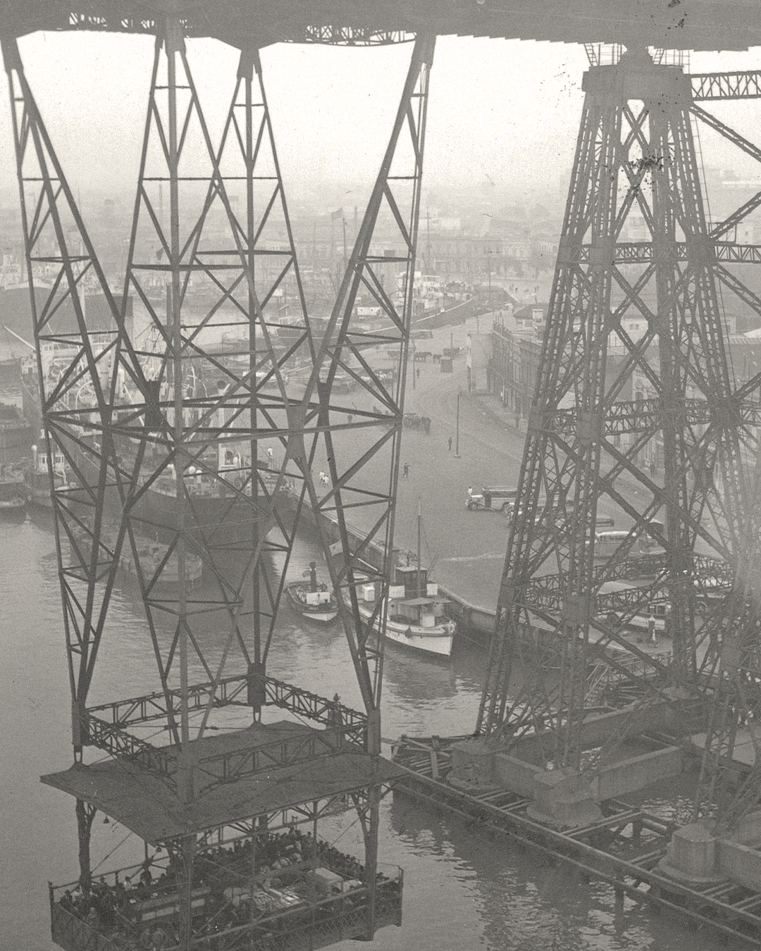
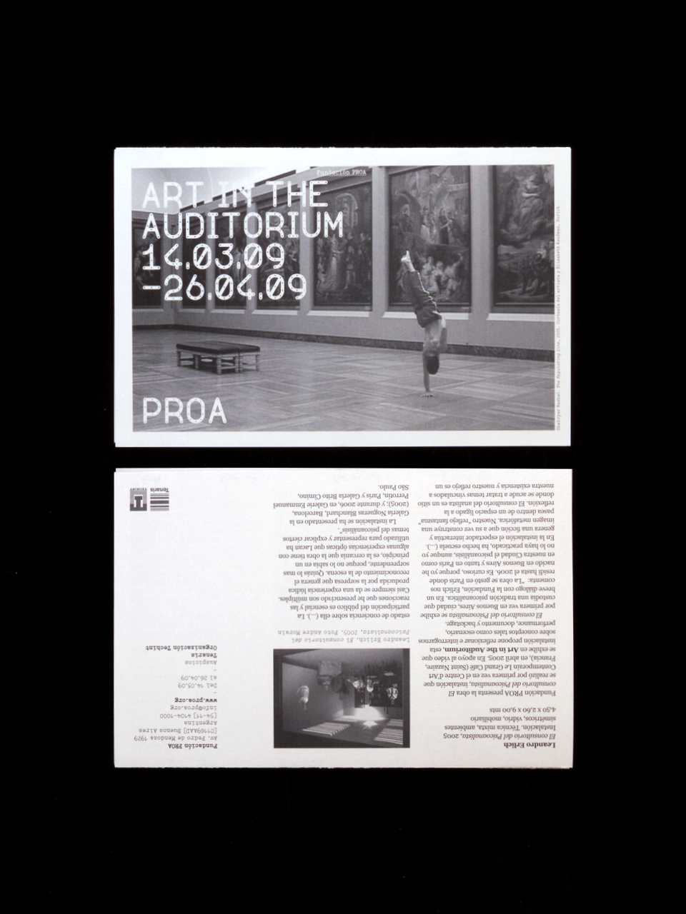
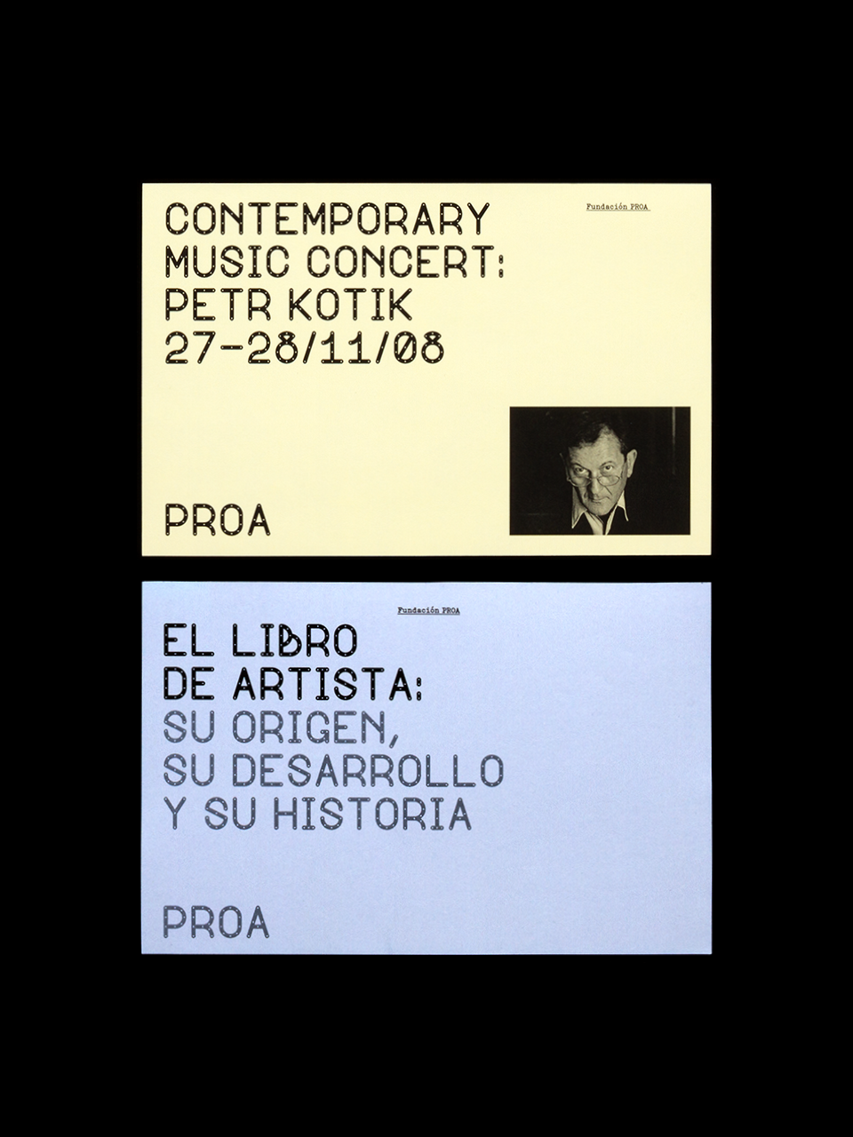
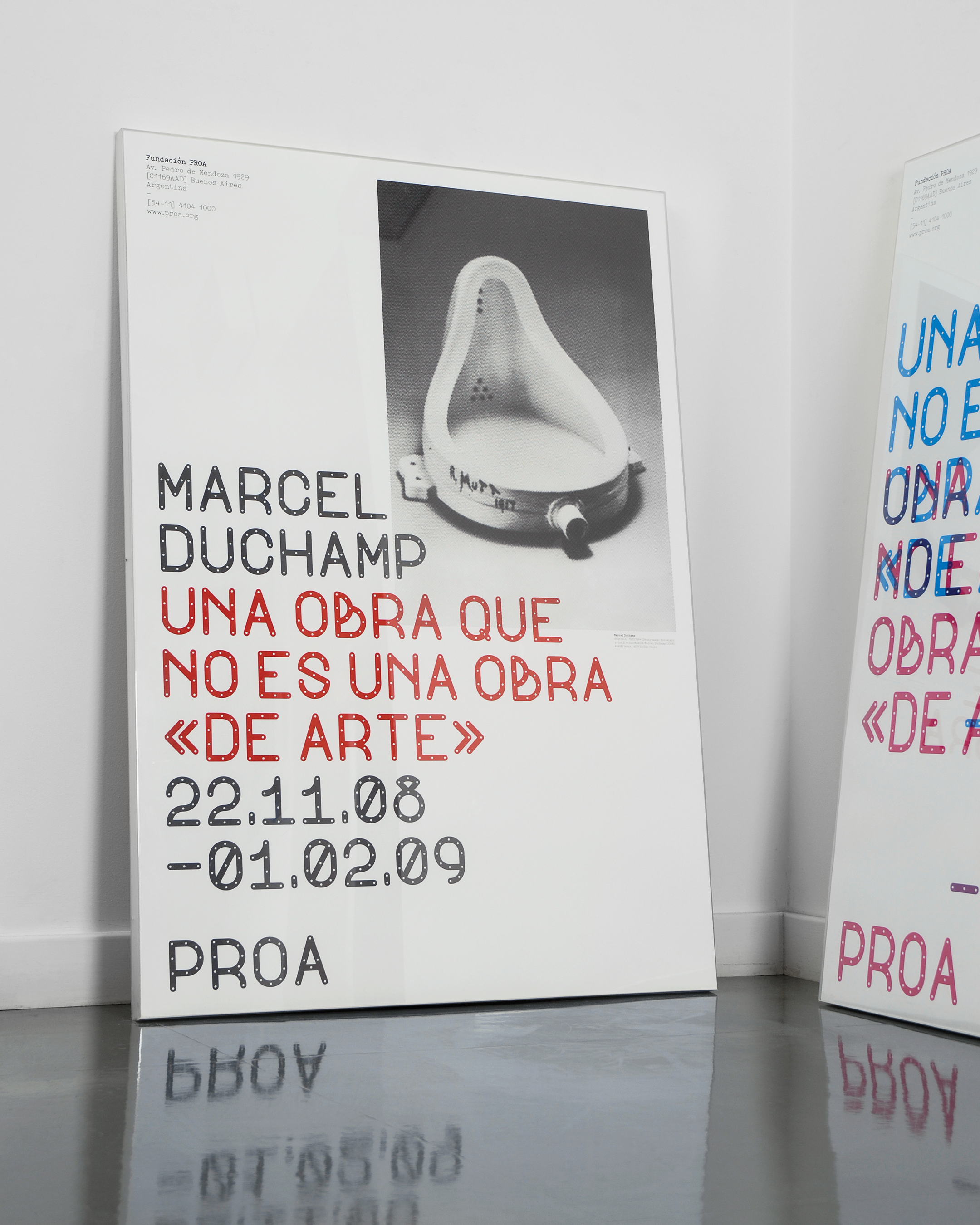
Founded in 1996, the Fundación Proa is a centre for arts and culture based in Buenos Aires, with galleries showing modern and contemporary art alongside a cinema, auditorium, bookshop and restaurant. Proa hosts a broad programme of events: art exhibitions, but also video and film installations, dance performances, live music, conferences, courses, debates and workshops. We created their new visual identity, centred around a bespoke typeface inspired by a local landmark – the Puente Trasbordador (‘transporter bridge’) that crosses the Riachuelo river in front of the gallery. Drawn on a regular, systematic grid, the typeface is utilitarian but occasionally eccentric in form – and always characteristic of Proa, whose identity as an institution has close ties with the local La Boca area.
Signage
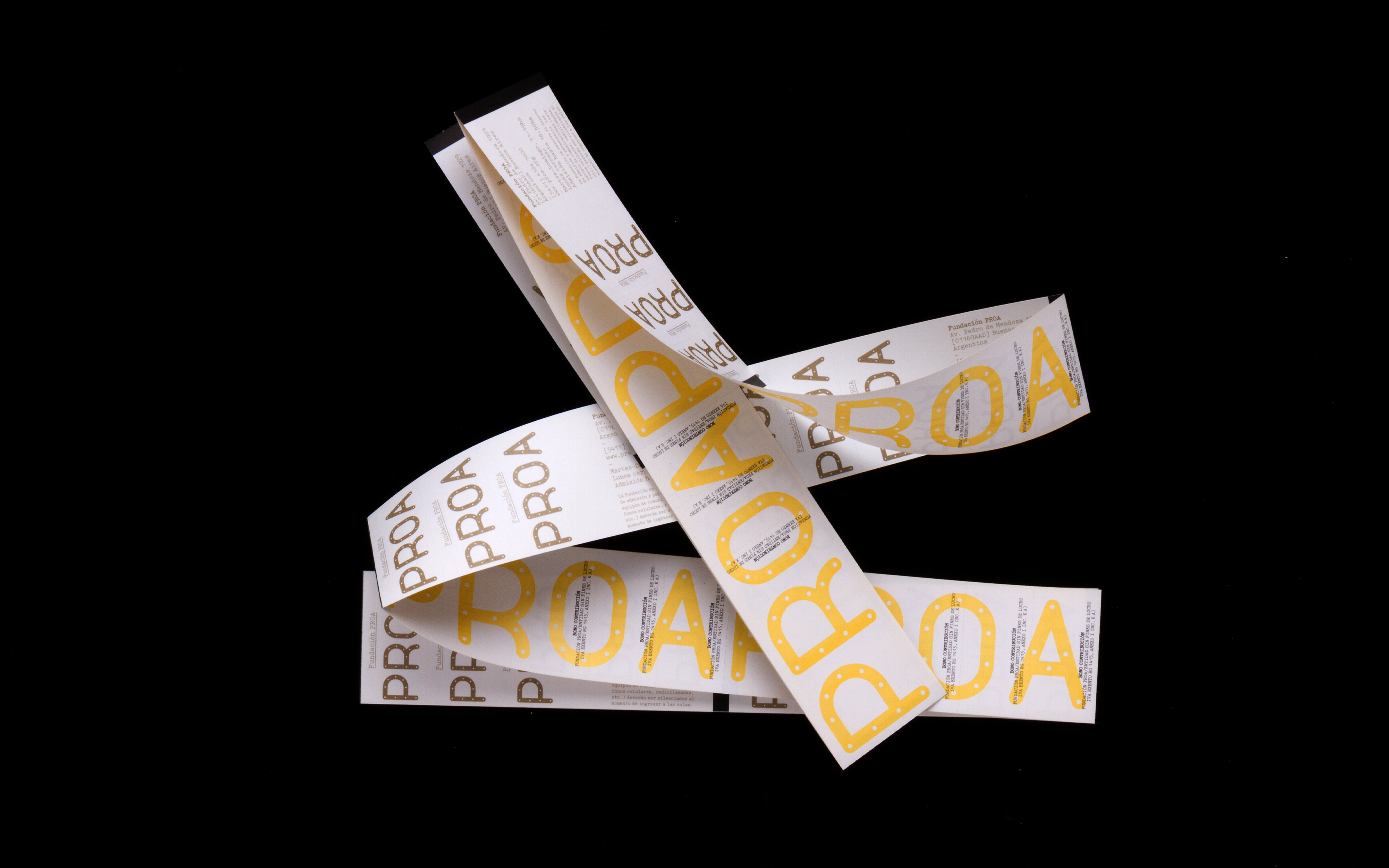
Tickets
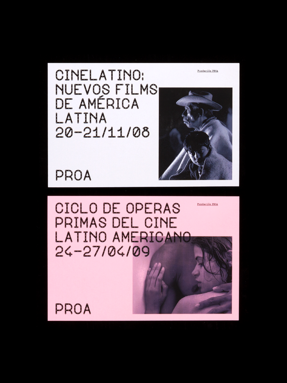
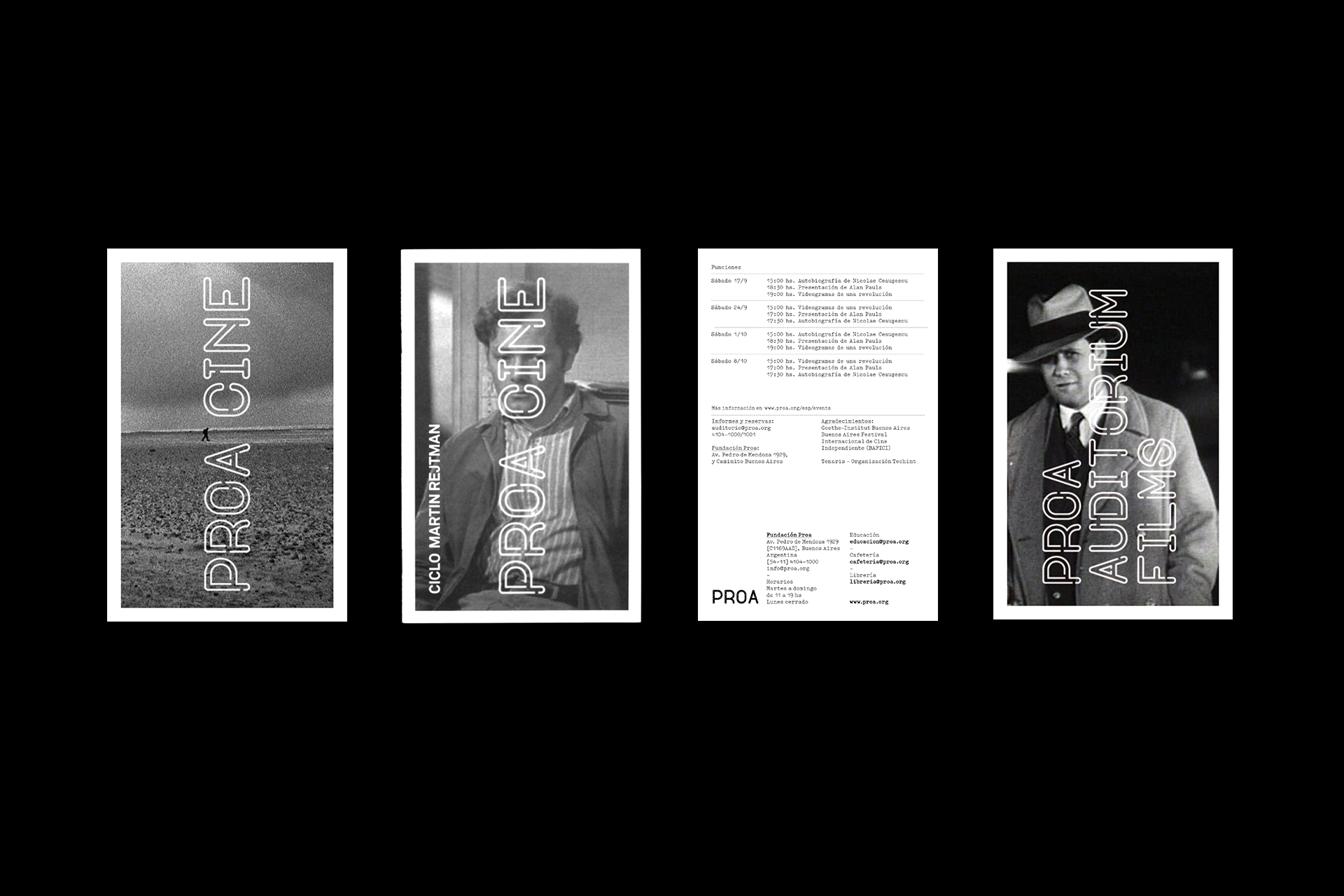
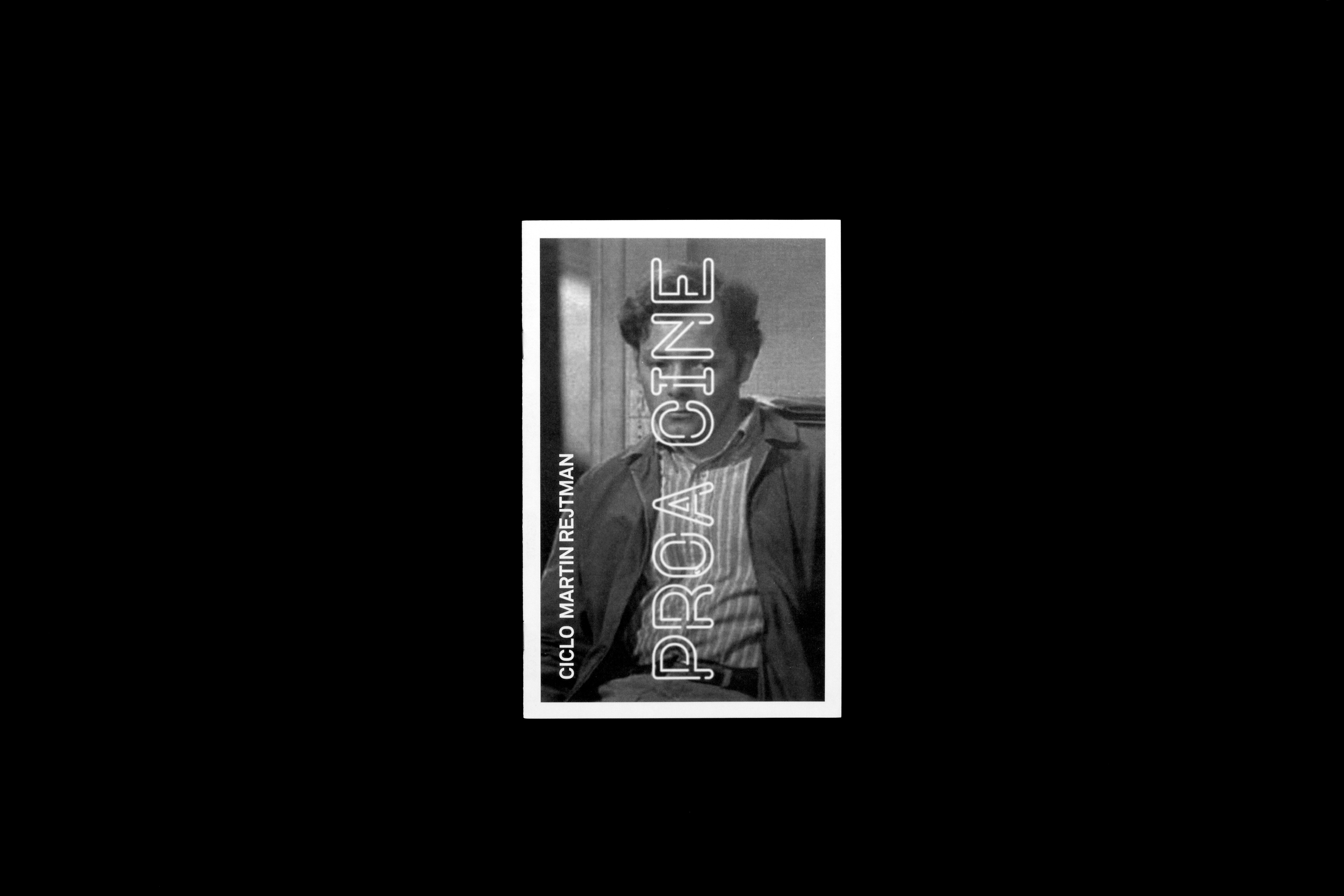
Flyers
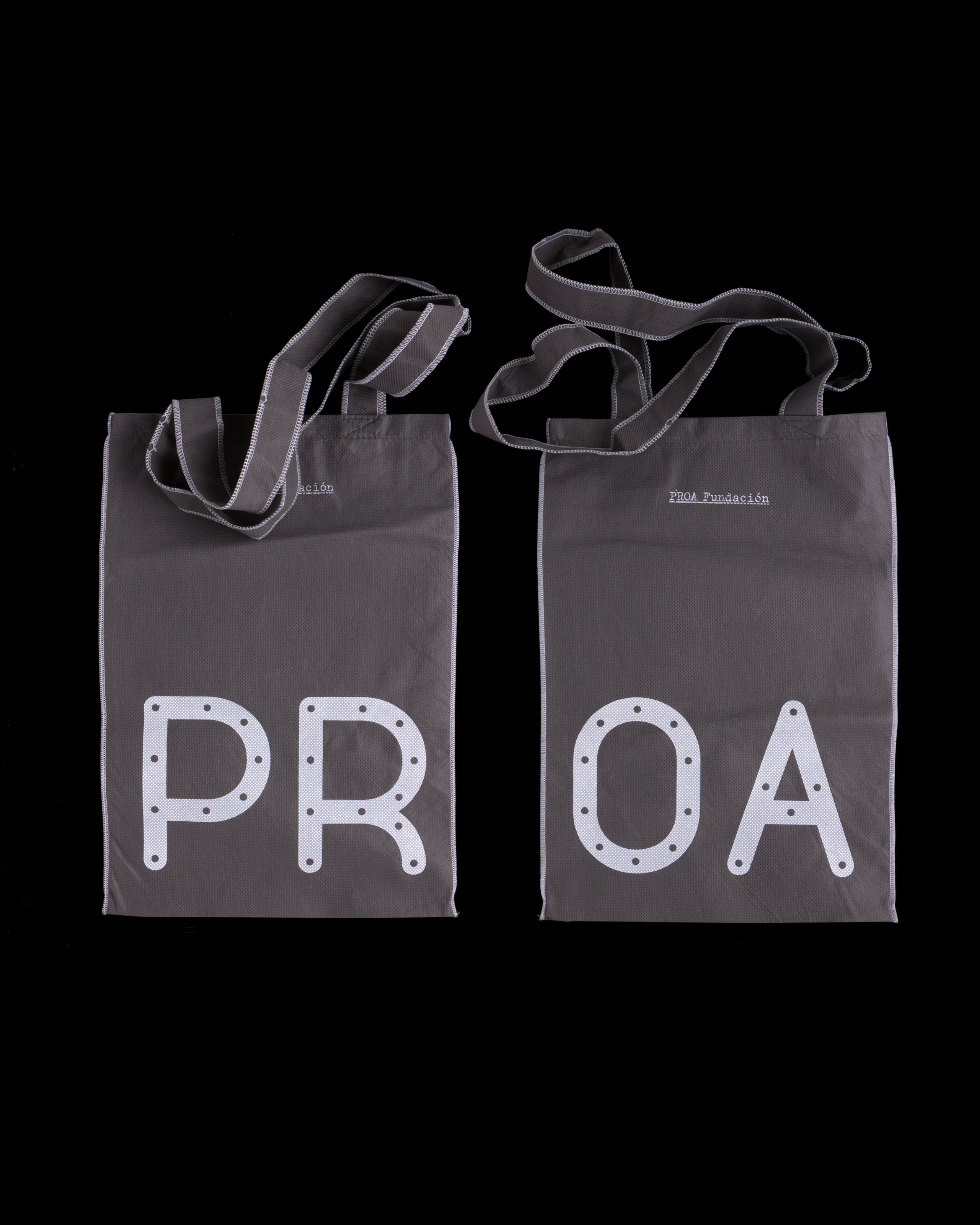
Tote bags
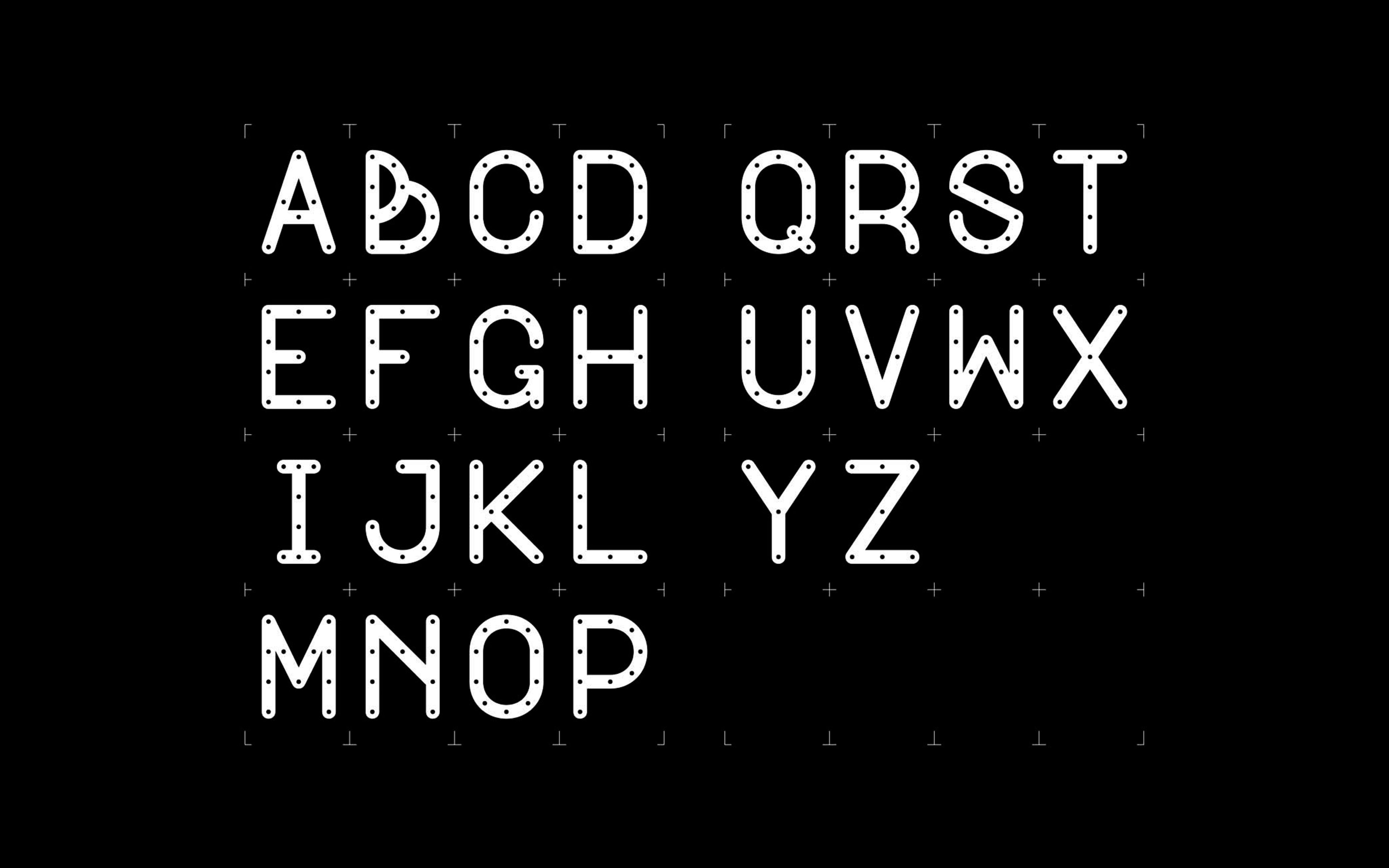
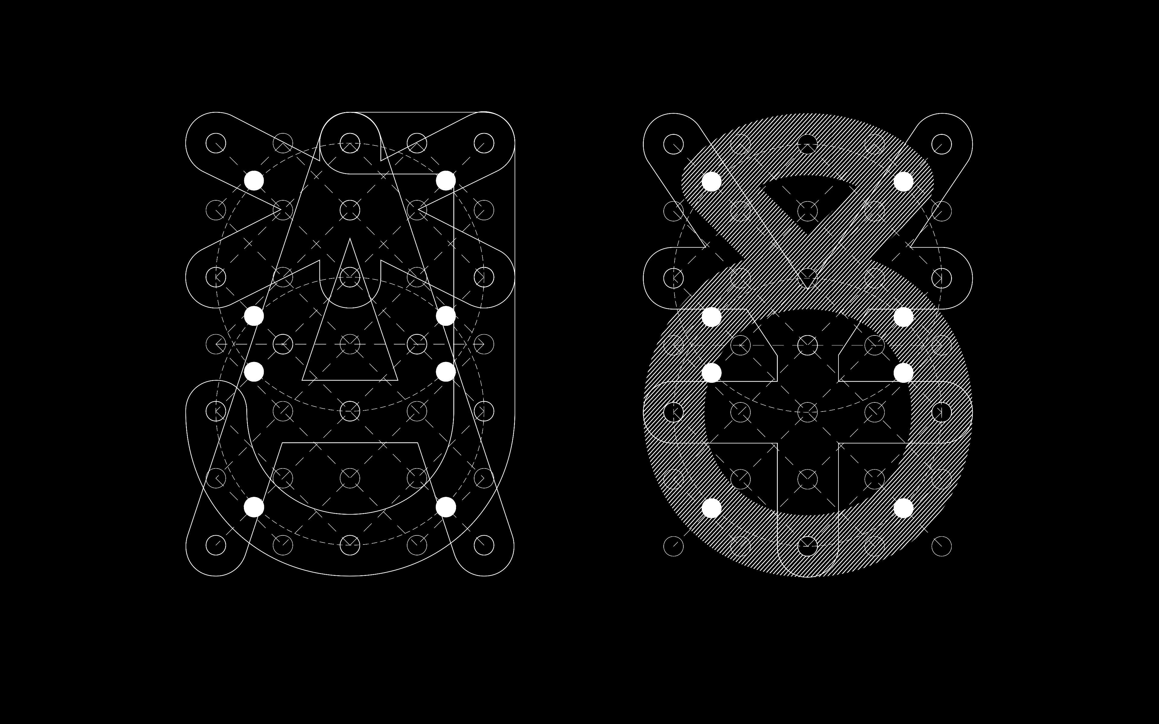
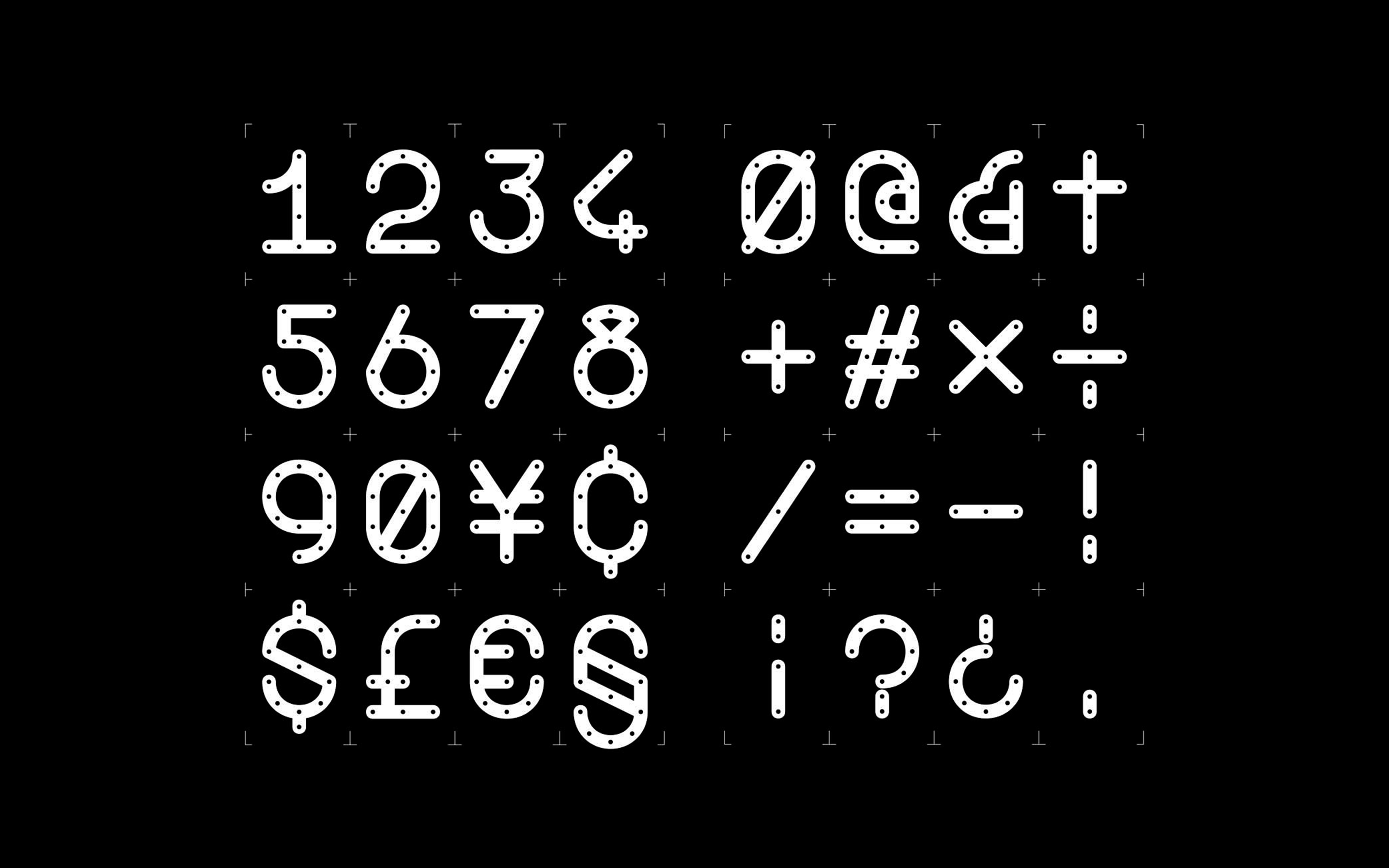
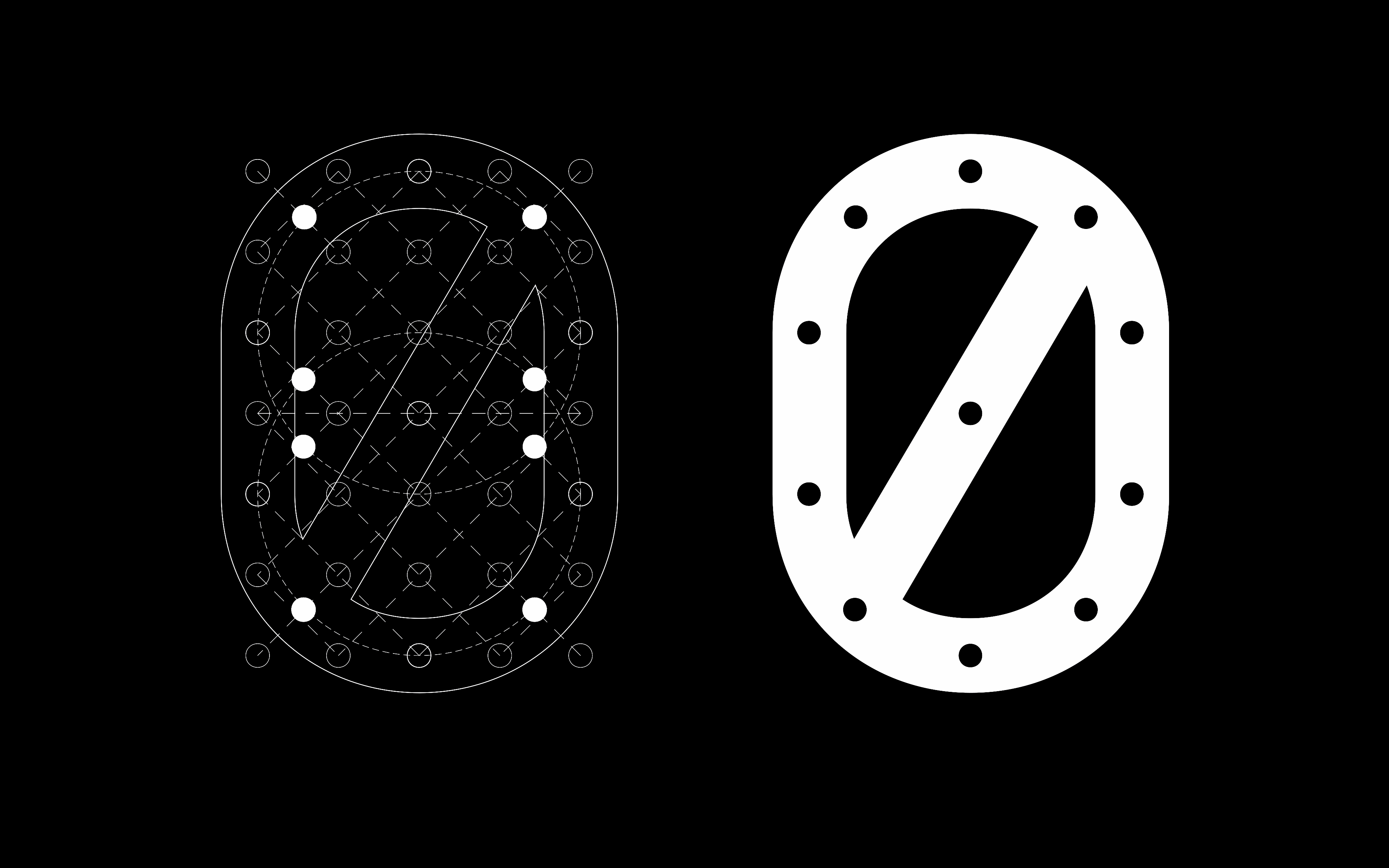
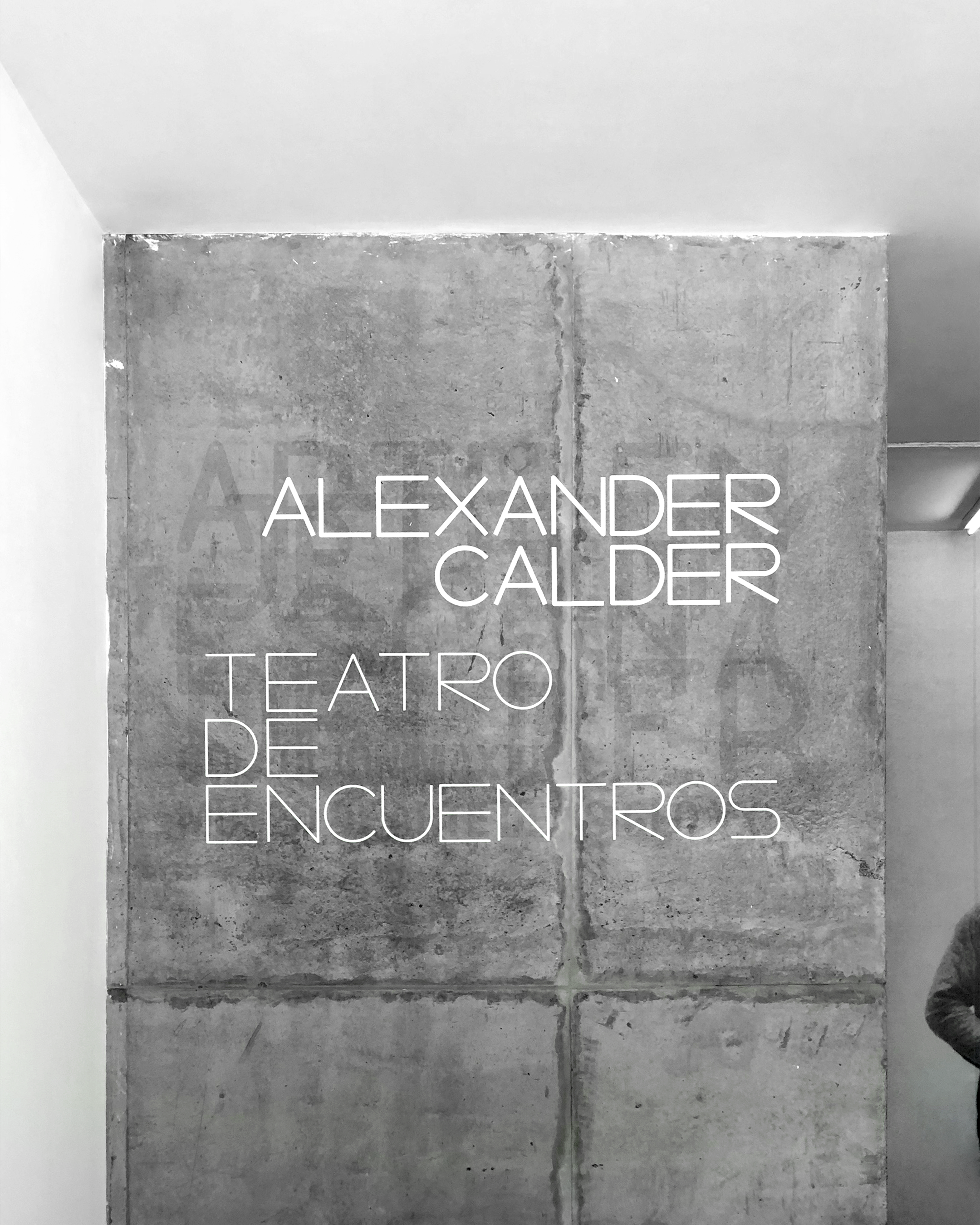
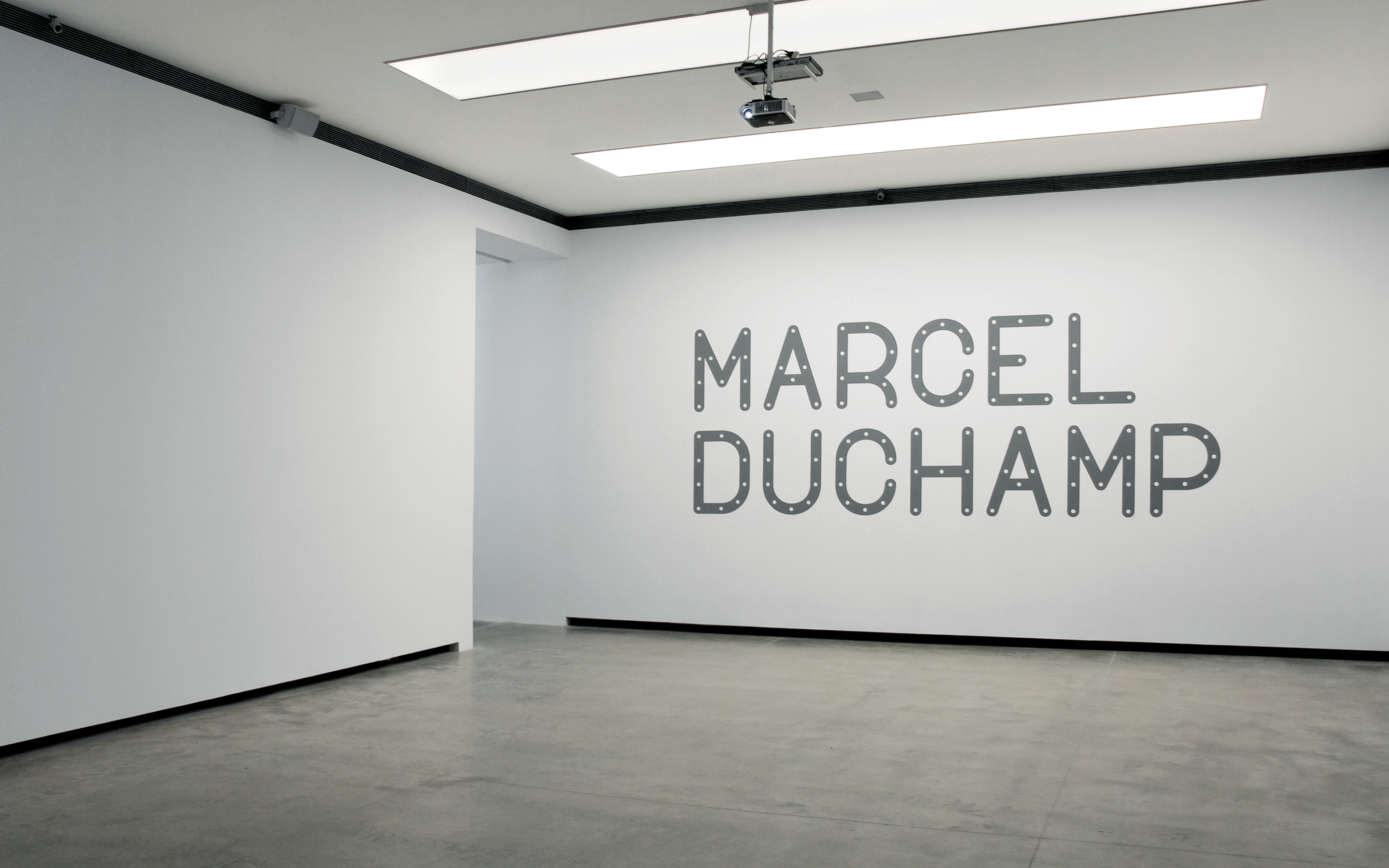
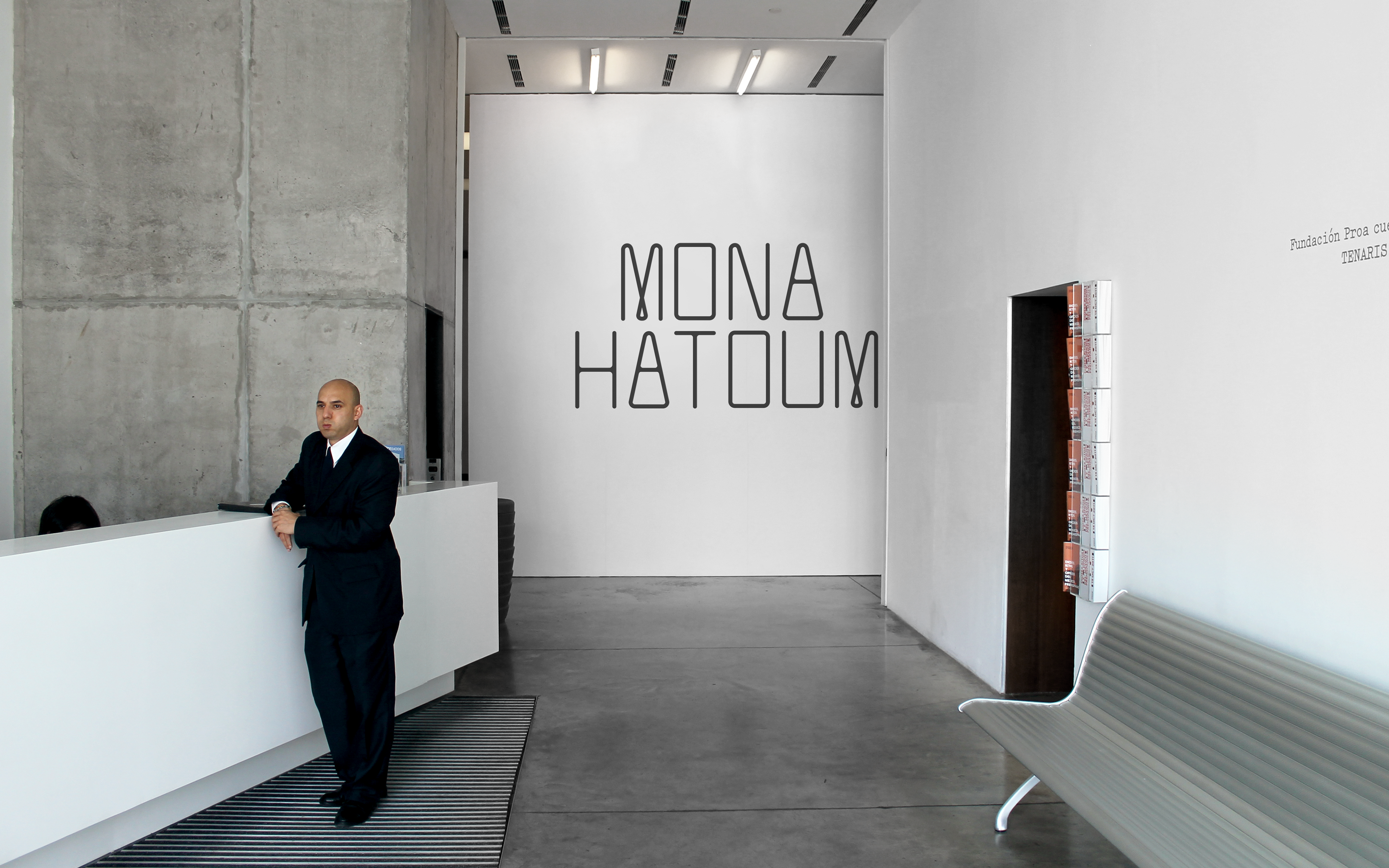
Bespoke typeface
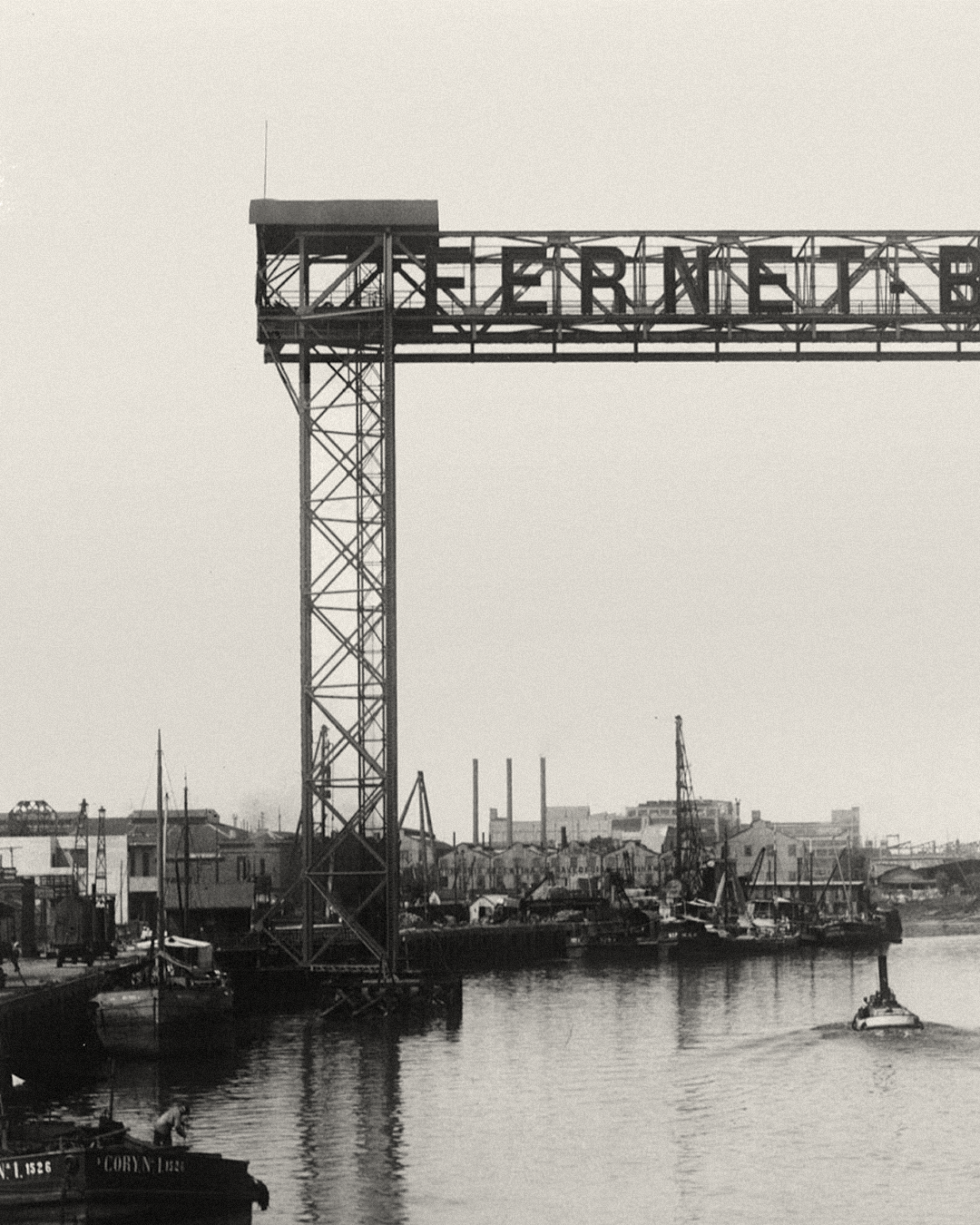
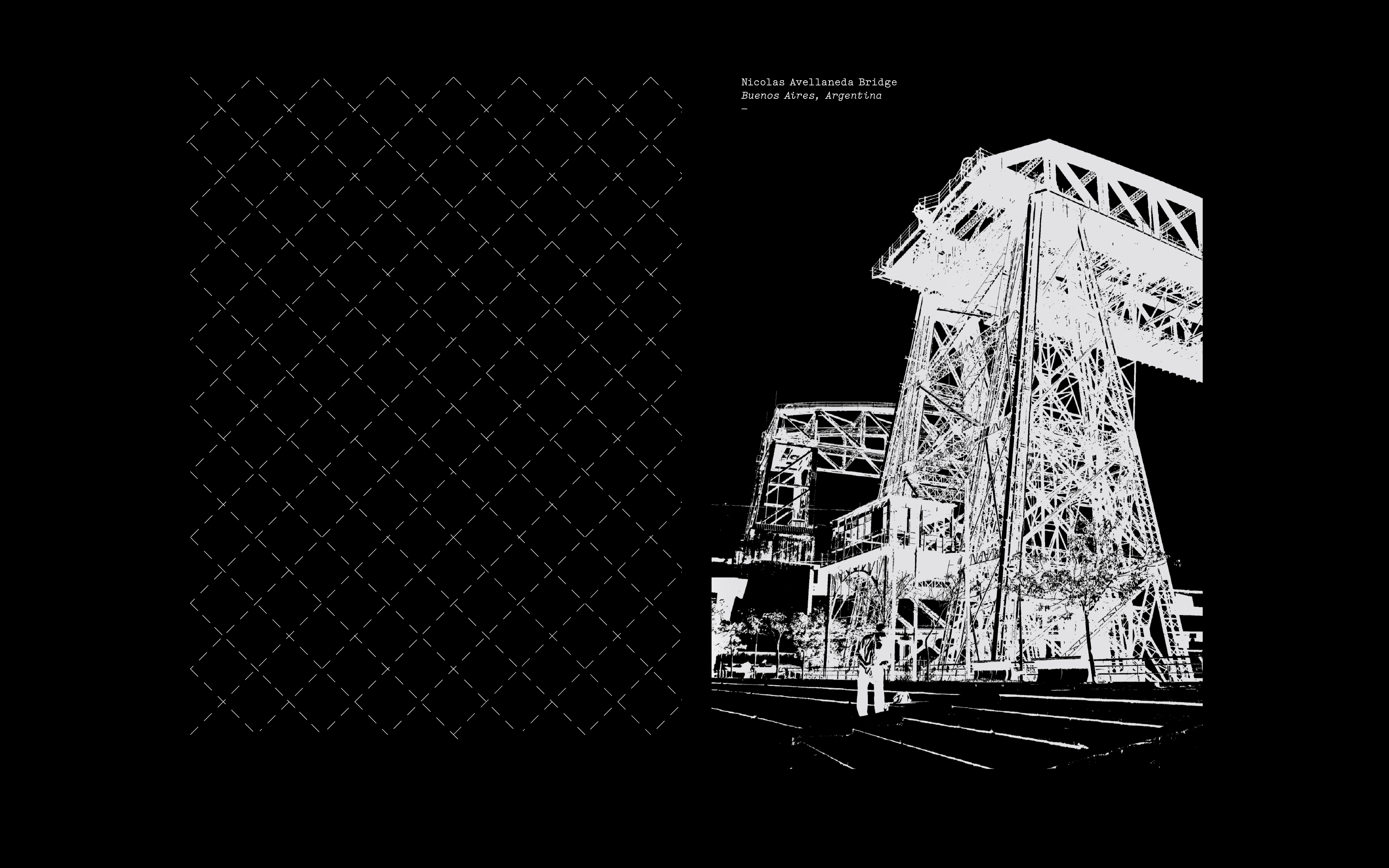
Inspiration
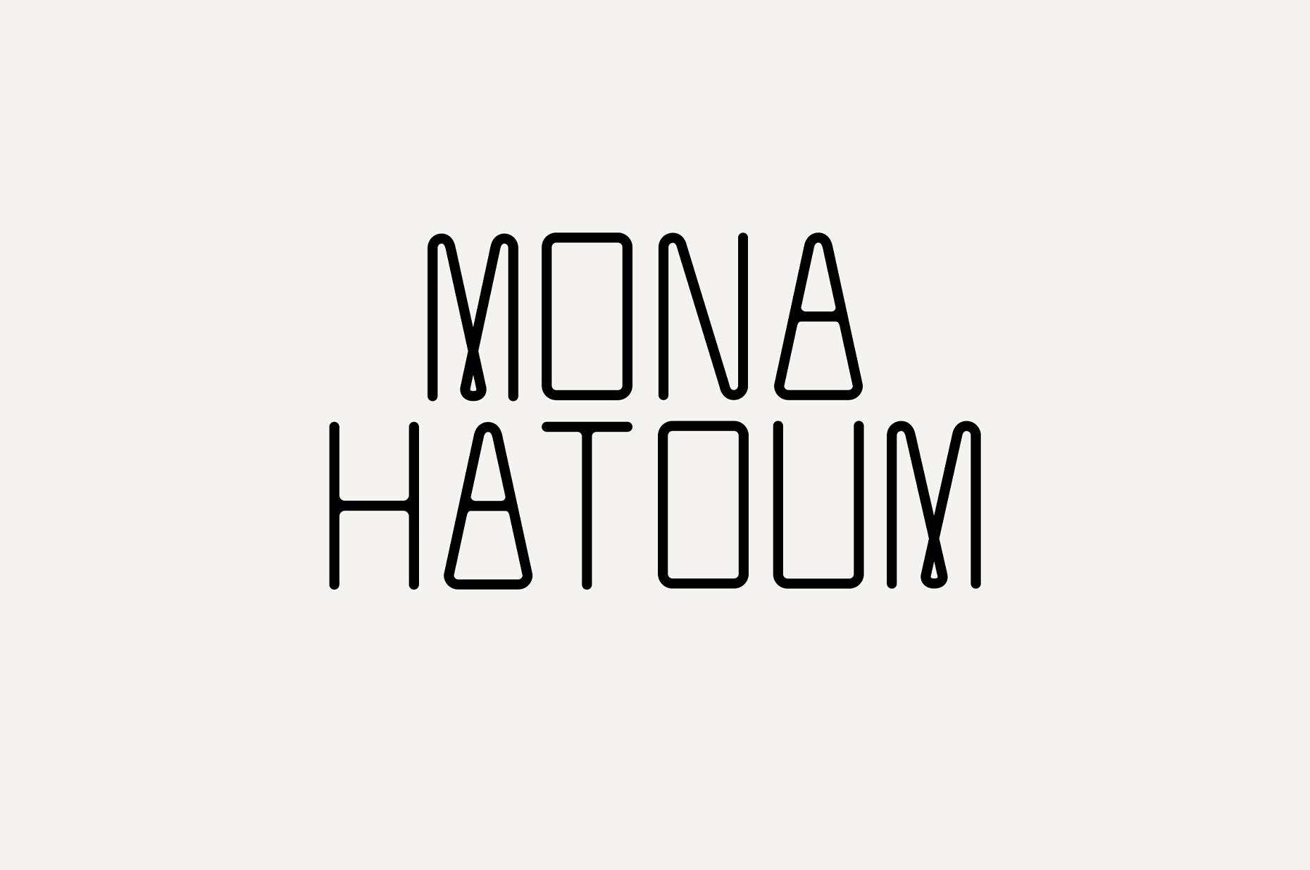
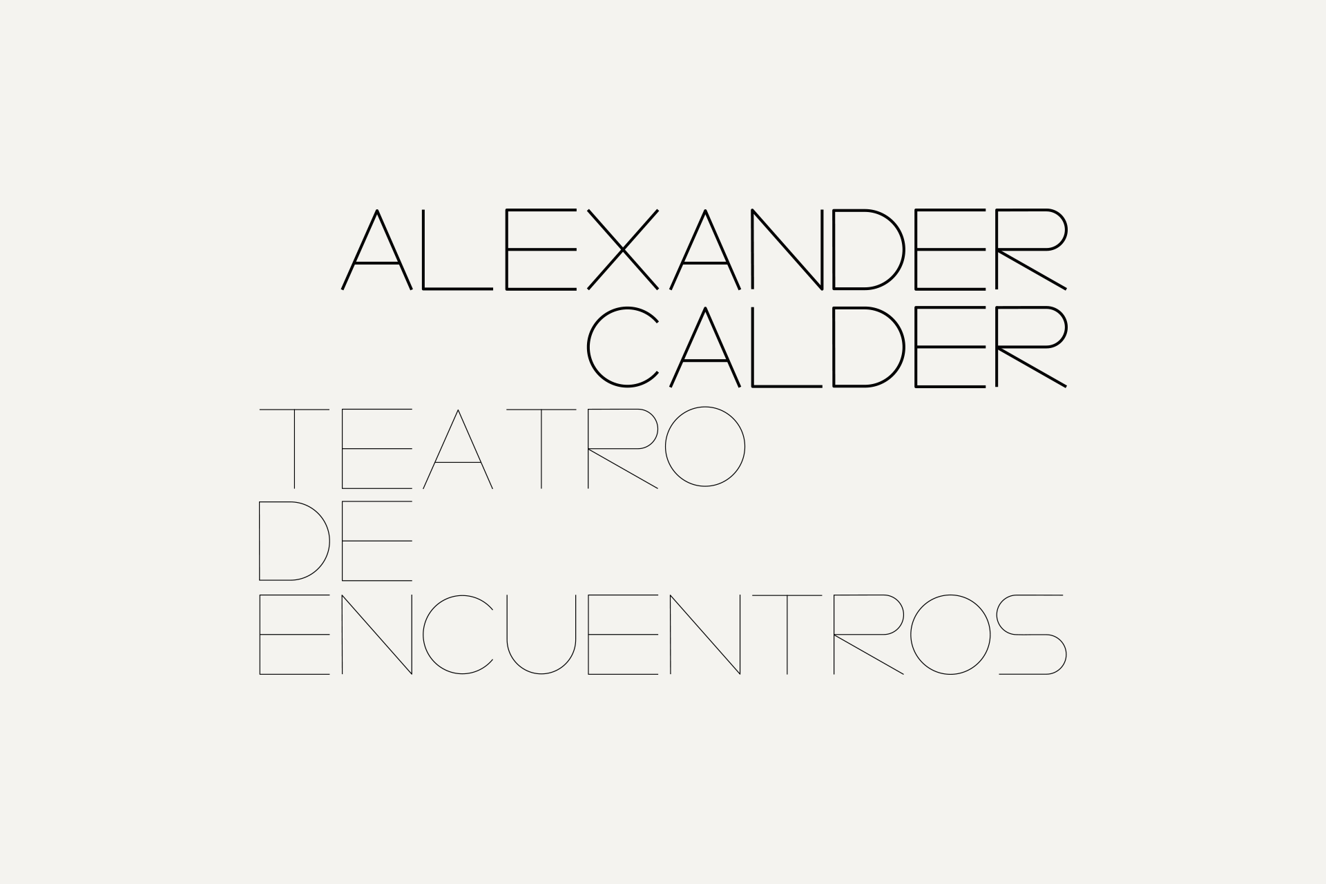
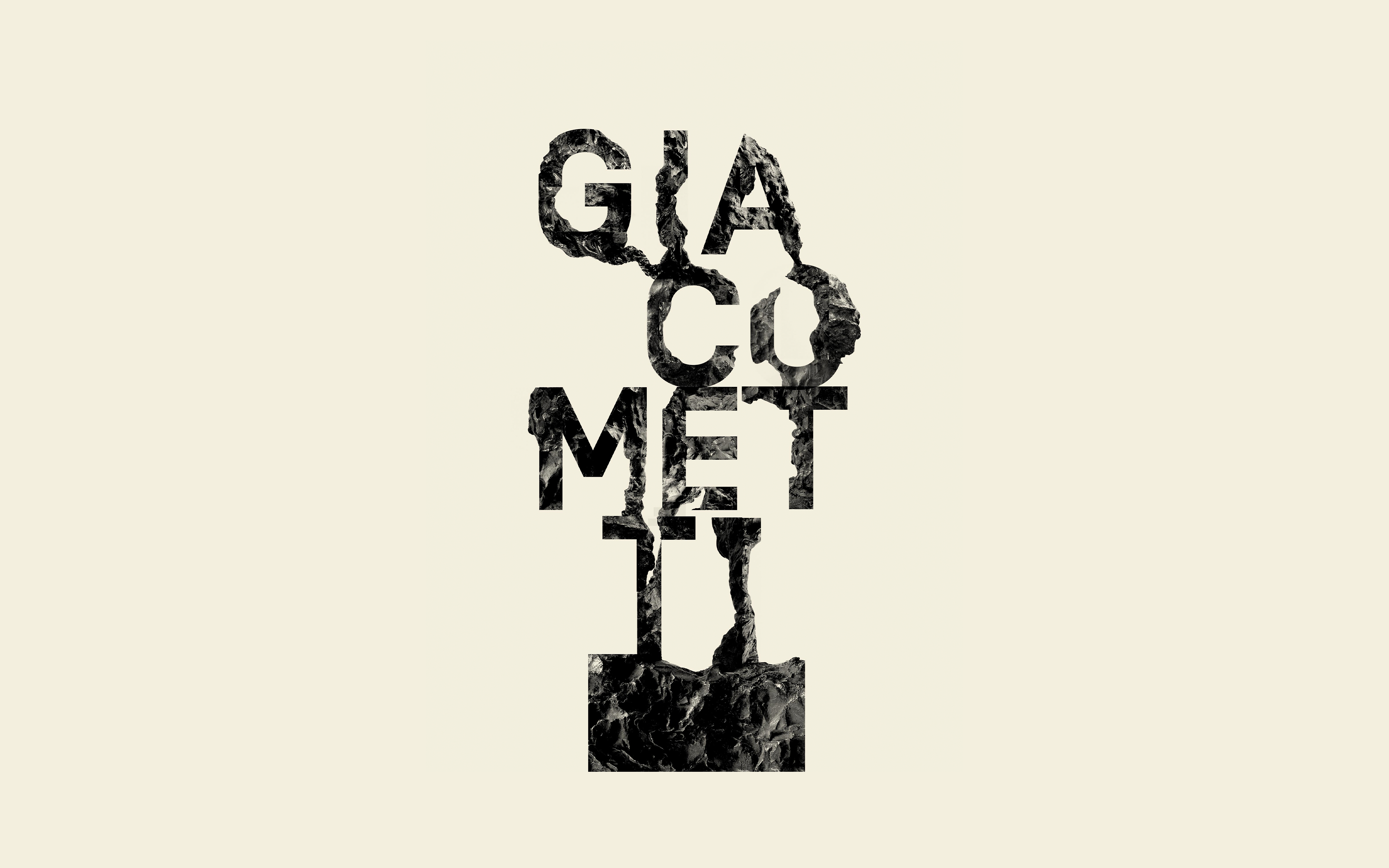
Exhibition identities
Located on the outskirts of the city, La Boca has a unique history. Known these days for its picturesque streets and reputation as an artists’ colony, it was also an important location for immigrants arriving in Buenos Aires in the early twentieth century. The symbolism of this is important for Proa, whose name, in Spanish, refers to the bow of a ship and whose main building is located in front of the port. Drawing on the history of the area, the foundation aims to open up Argentine shores to the international art world, and to this end has exhibited work from important modern artists like Kazimir Malevich, Dan Flavin and Louise Bourgeois. The Trasbordador bridge struck us as an ideal expression of the local and international dimensions of the foundation: recognisable as a Buenos Aires landmark, yet also significant as one of the first sights of Argentina encountered by countless immigrants. Referencing the bridge in a direct but creative way, the identity gives Proa a strong contemporary character, and reflects the importance it is increasingly assuming on the international stage while remaining tied to its local environment. Since the launch of the initial identity, we have worked with Proa to expand it across their many spaces and events, with subsequent exhibition identities involving new, unique typography.
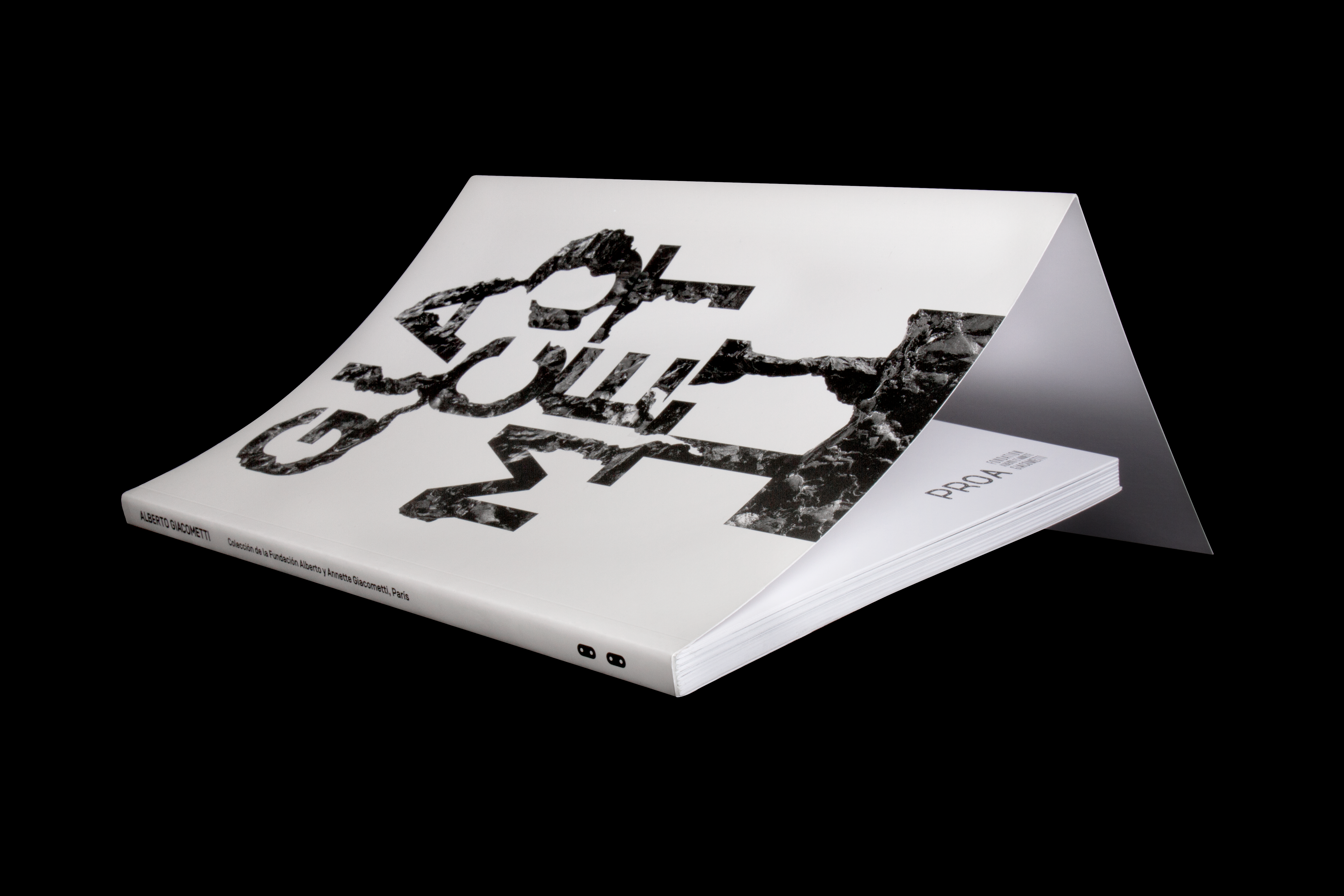
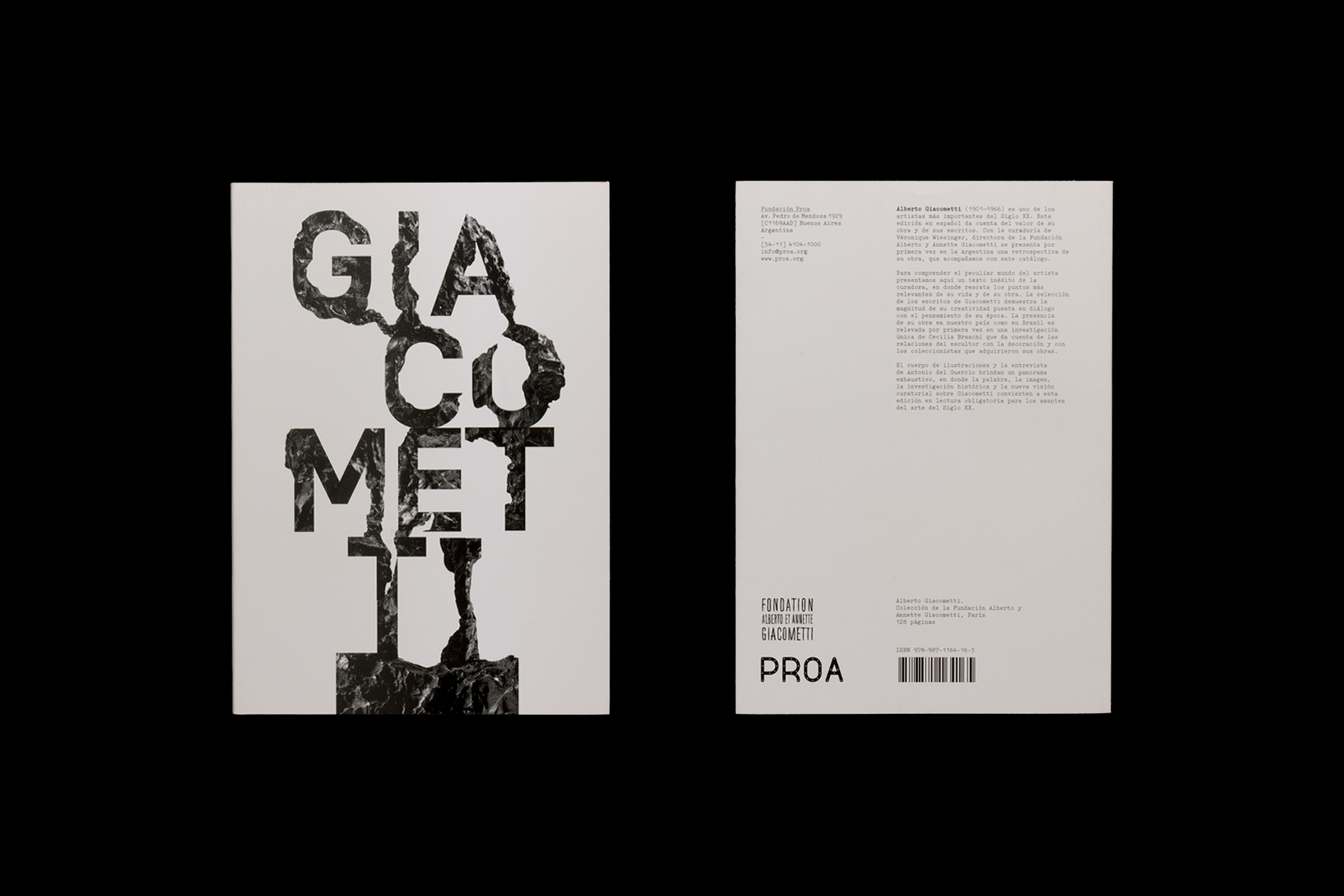
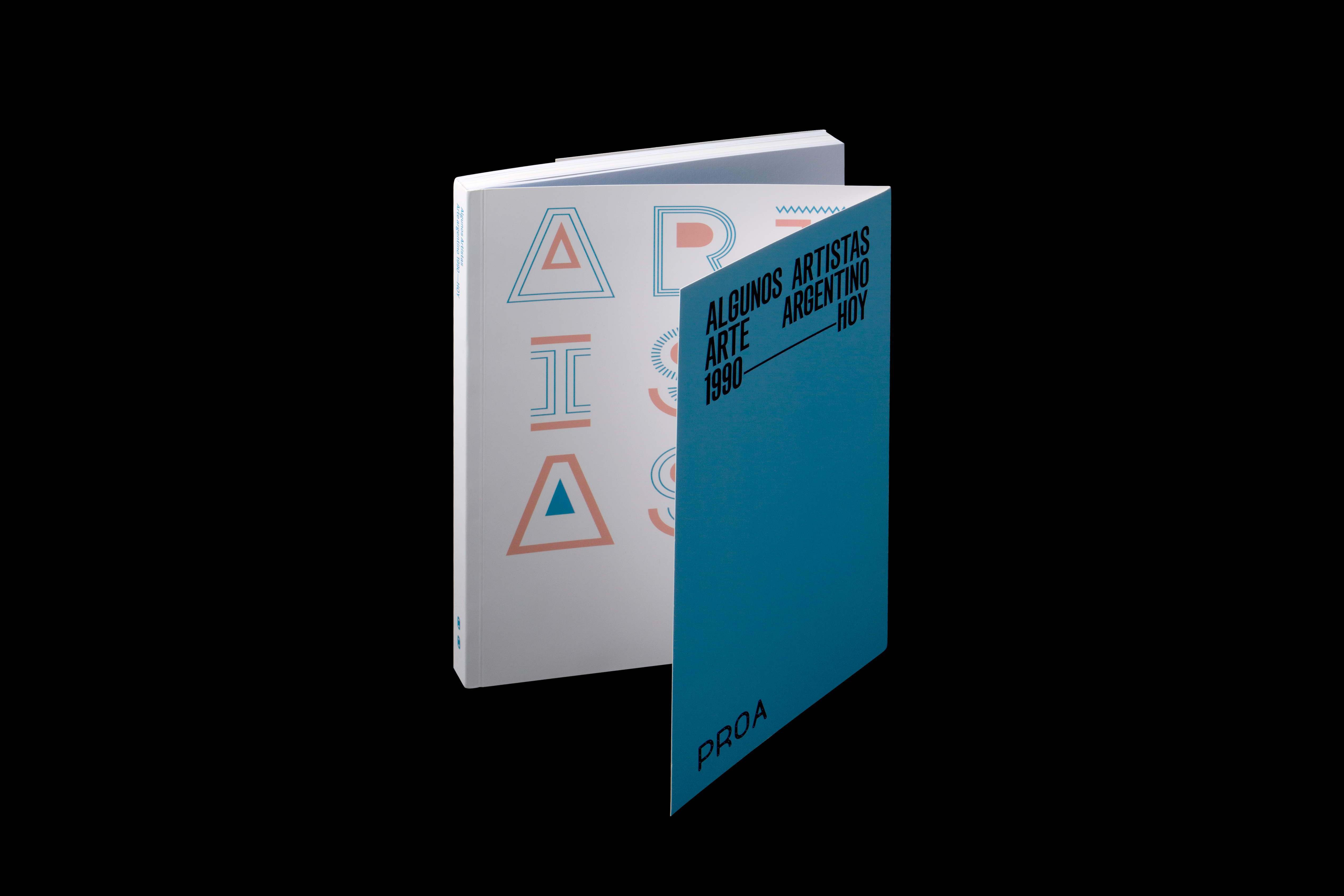
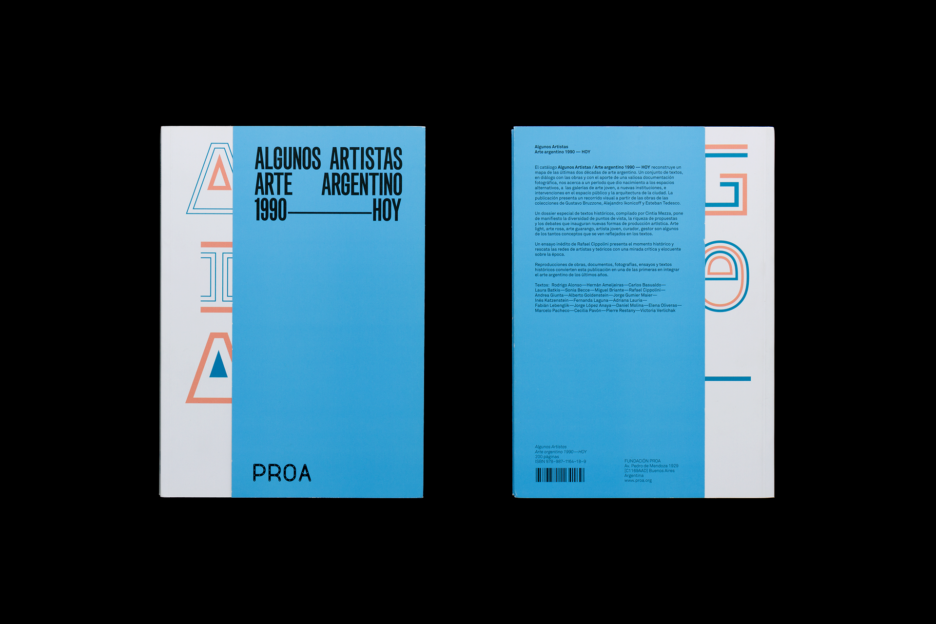
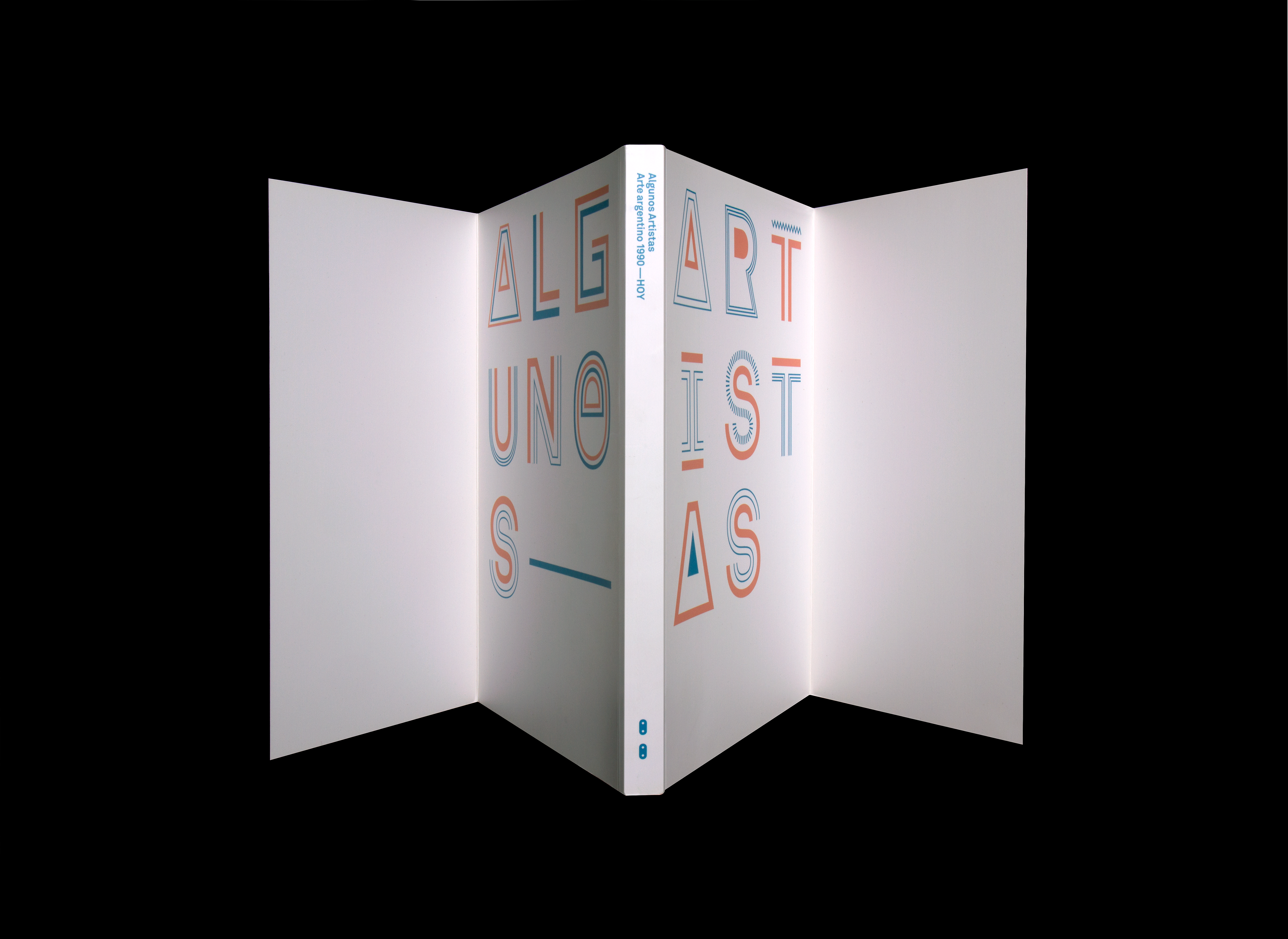
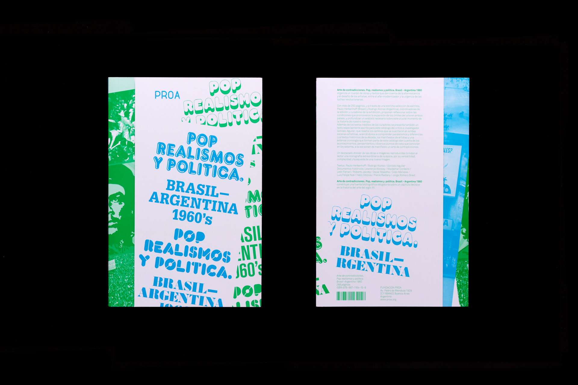
Exhibition catalogues
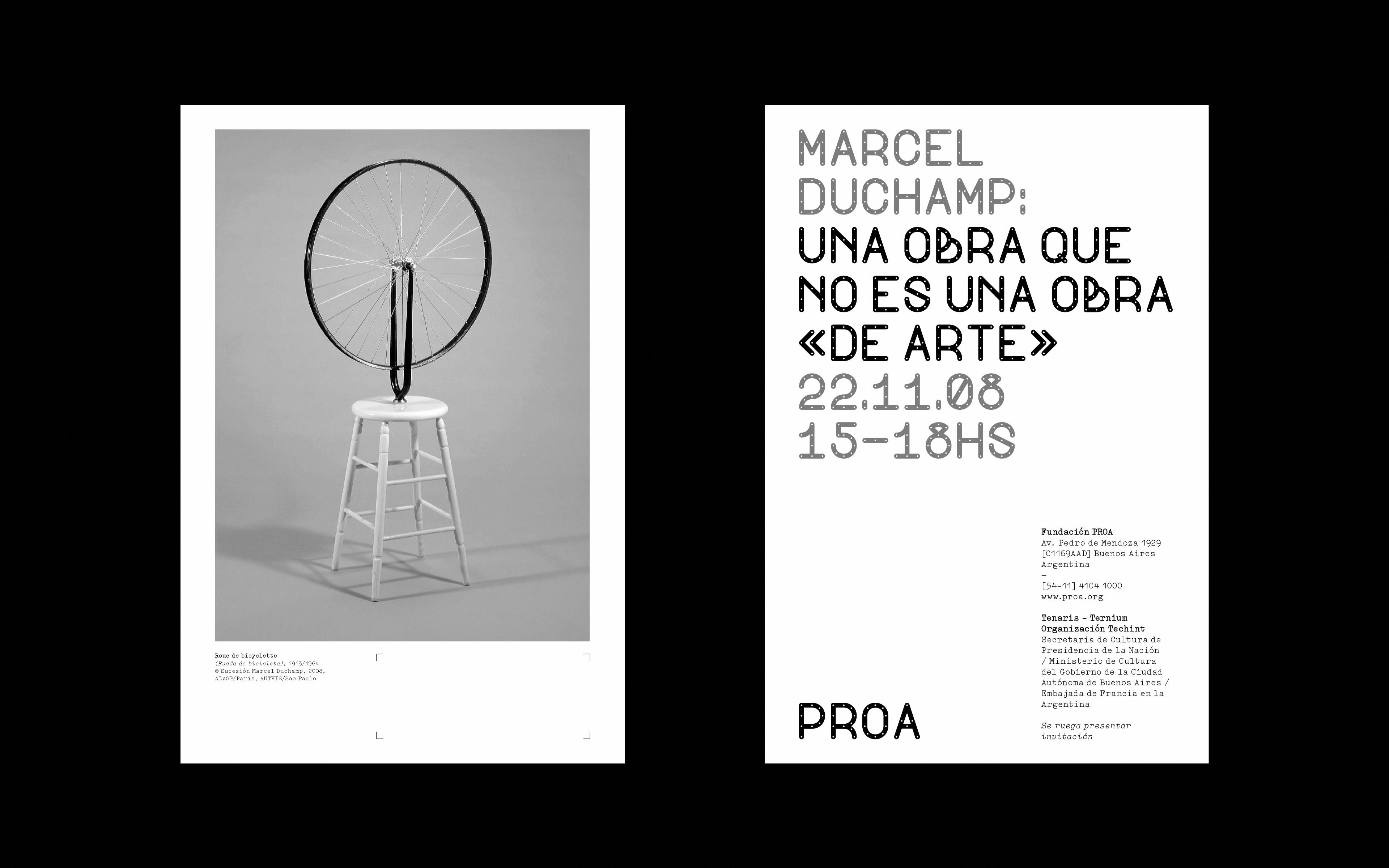
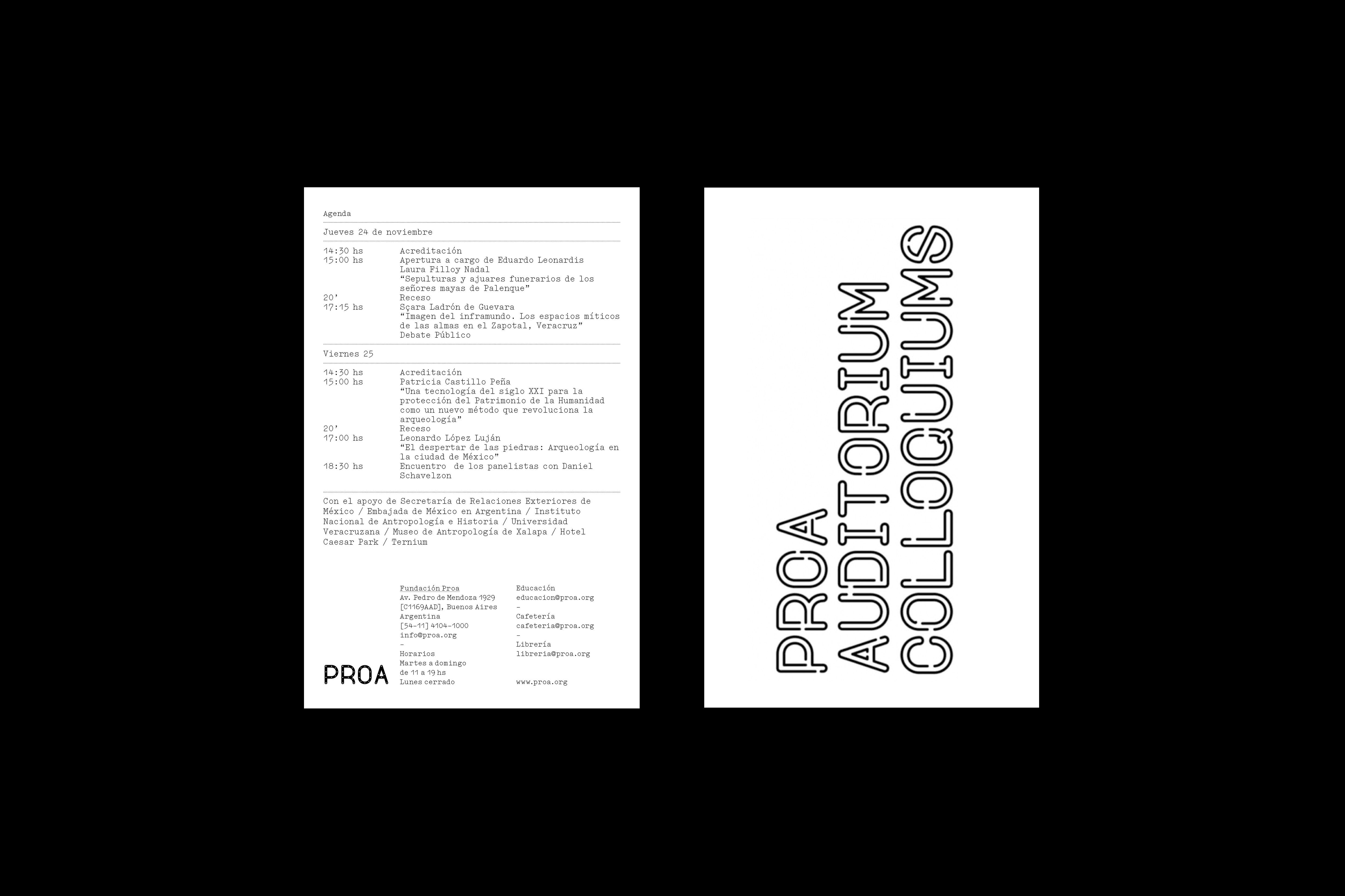
Invitations
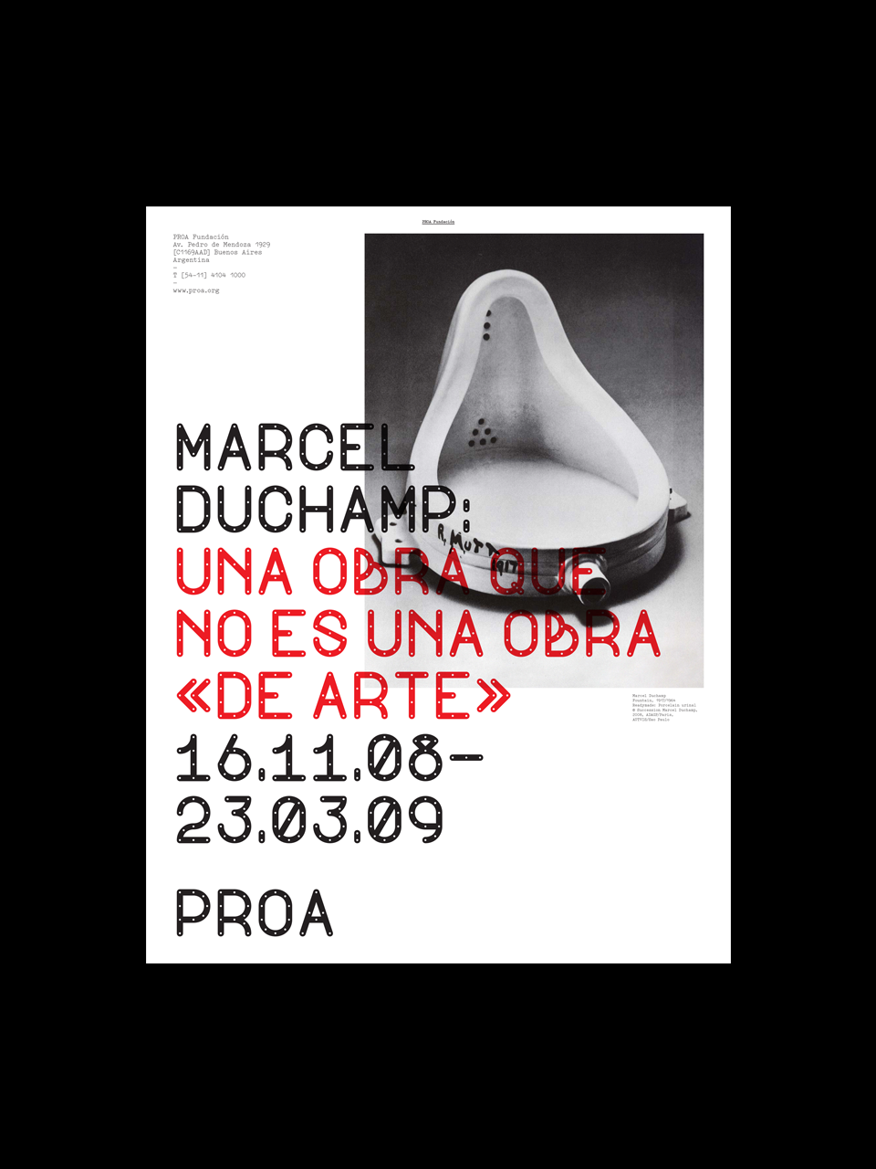
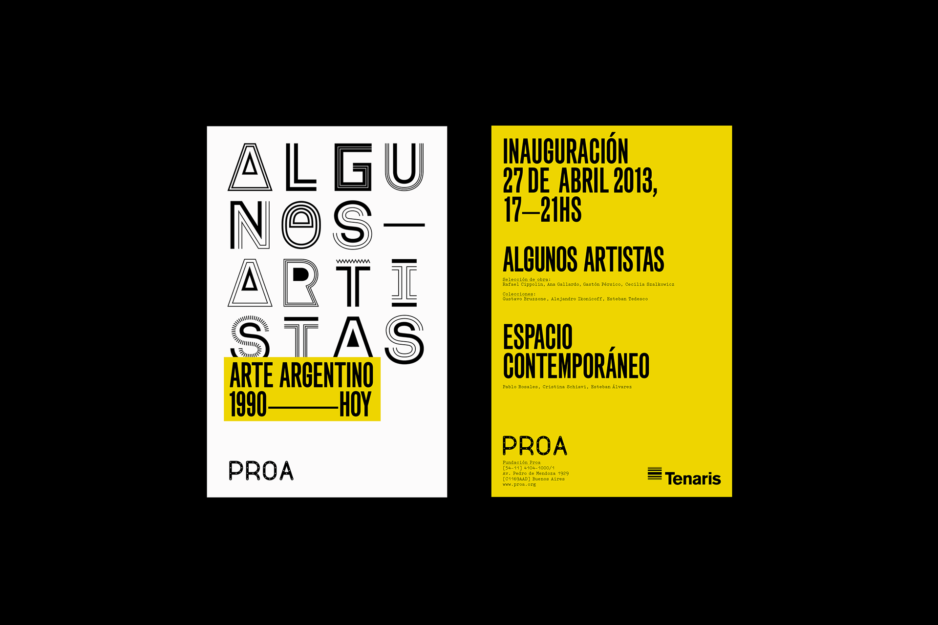
Posters