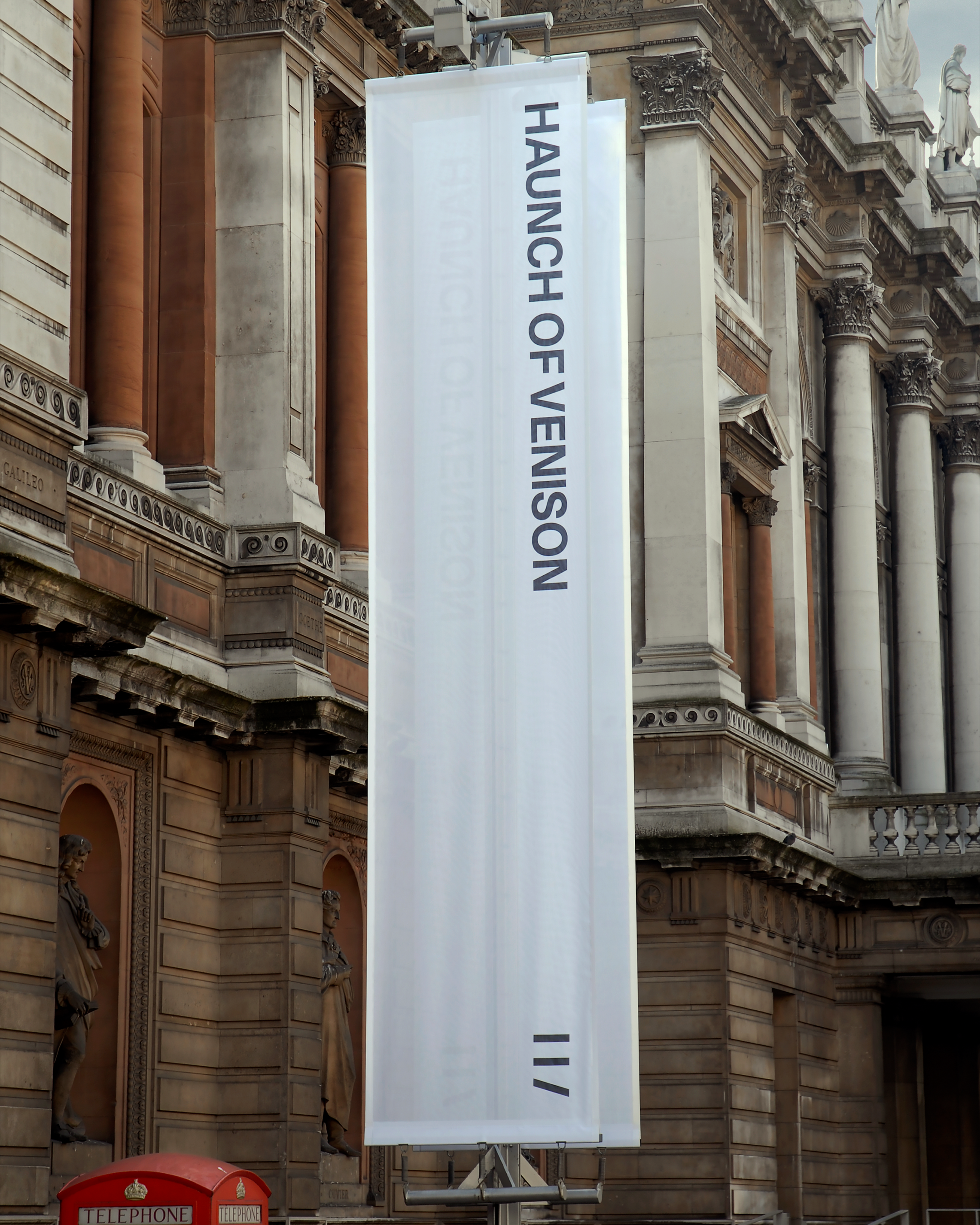
Signage
Environmental graphics
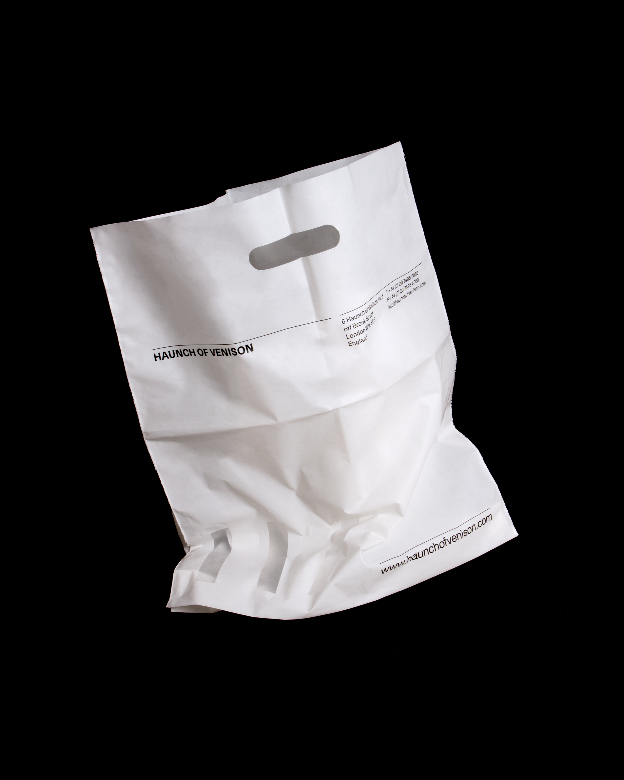
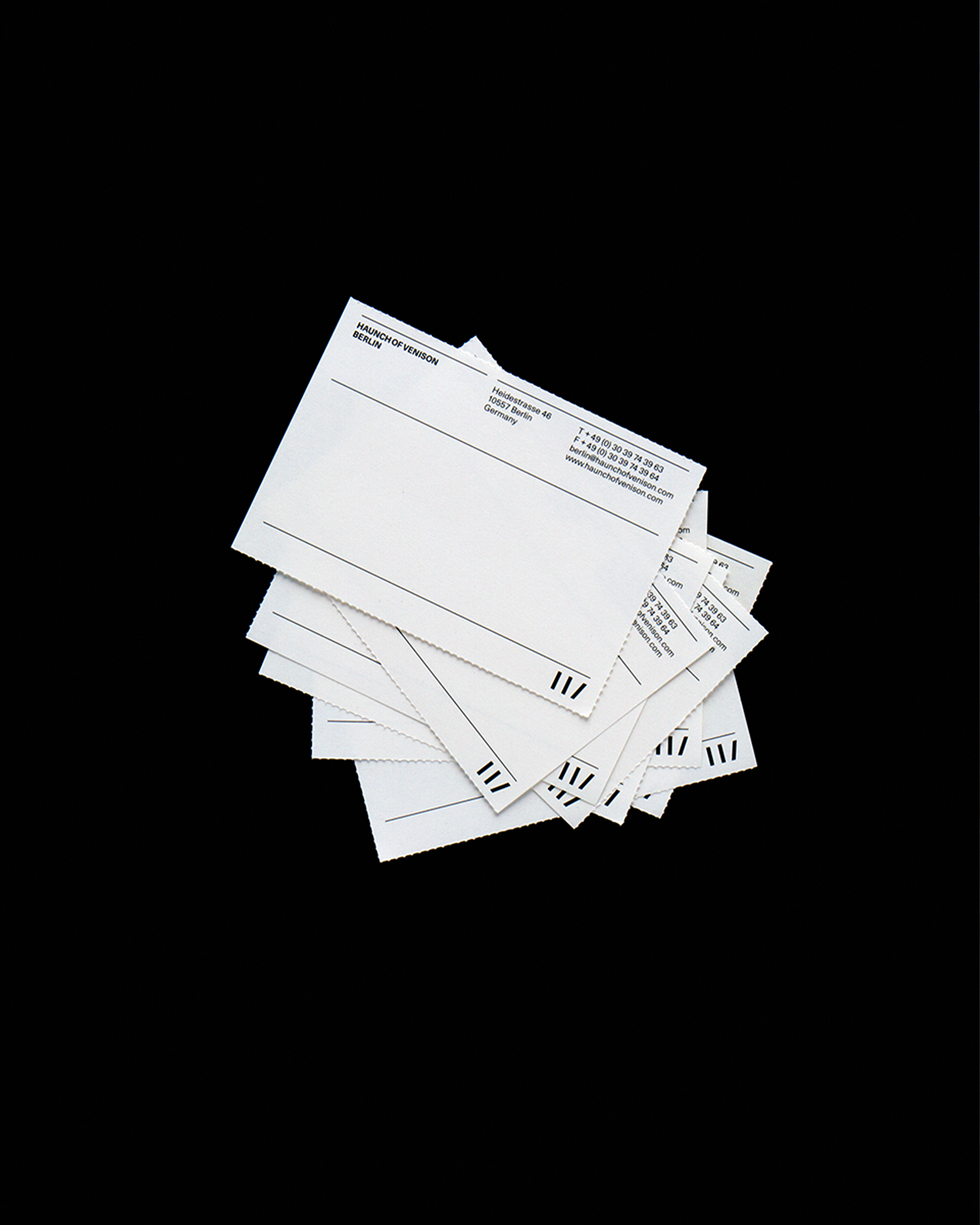
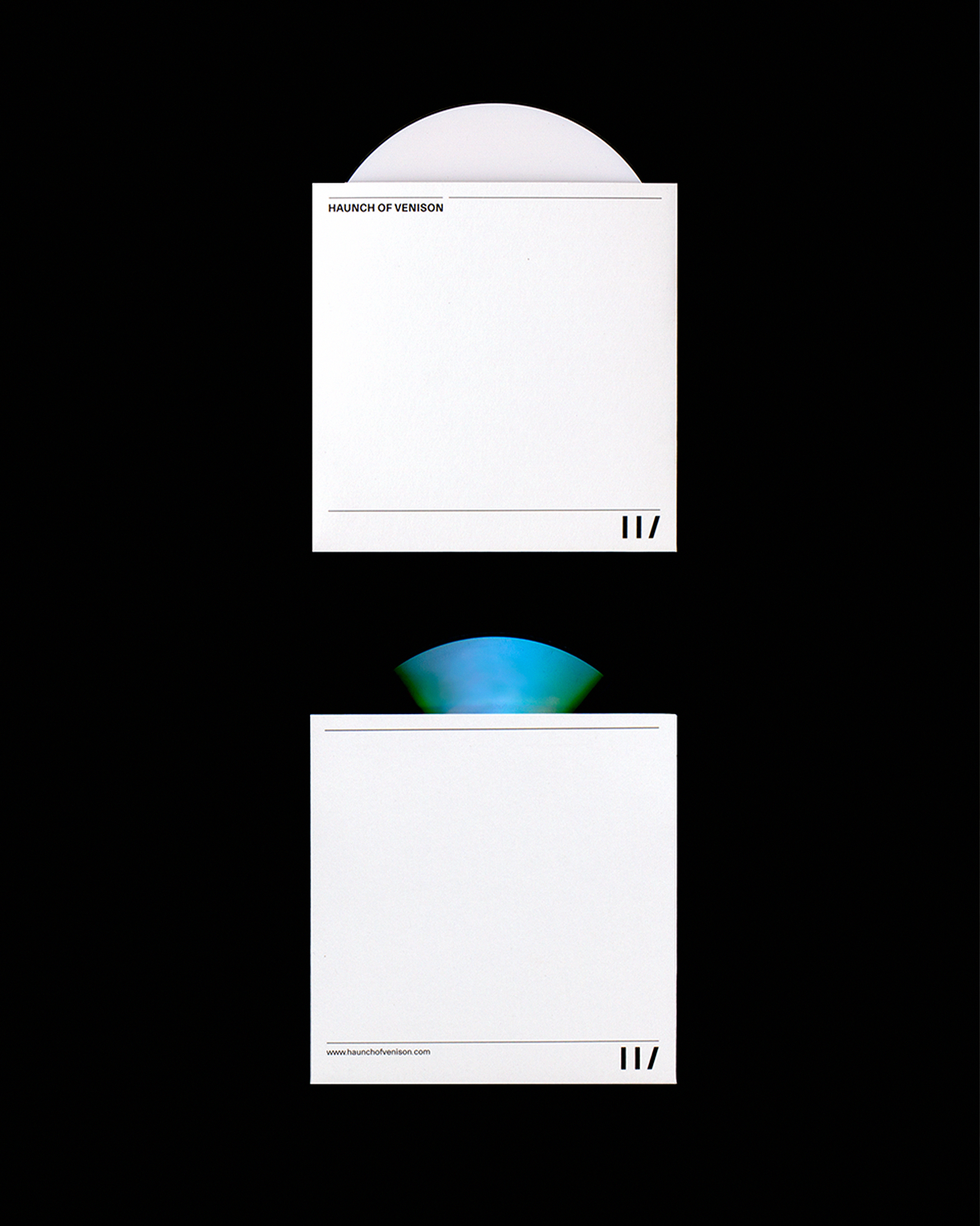
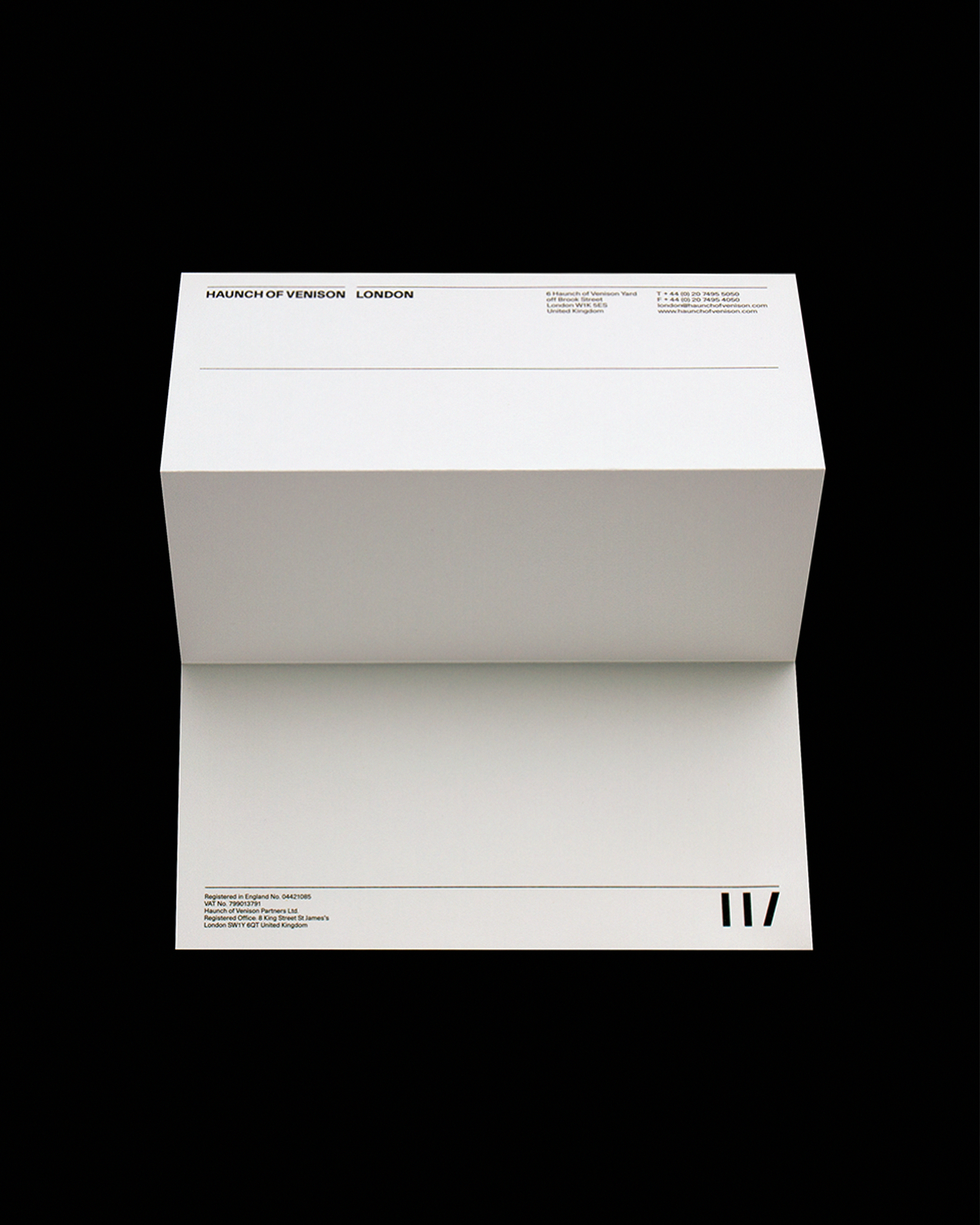
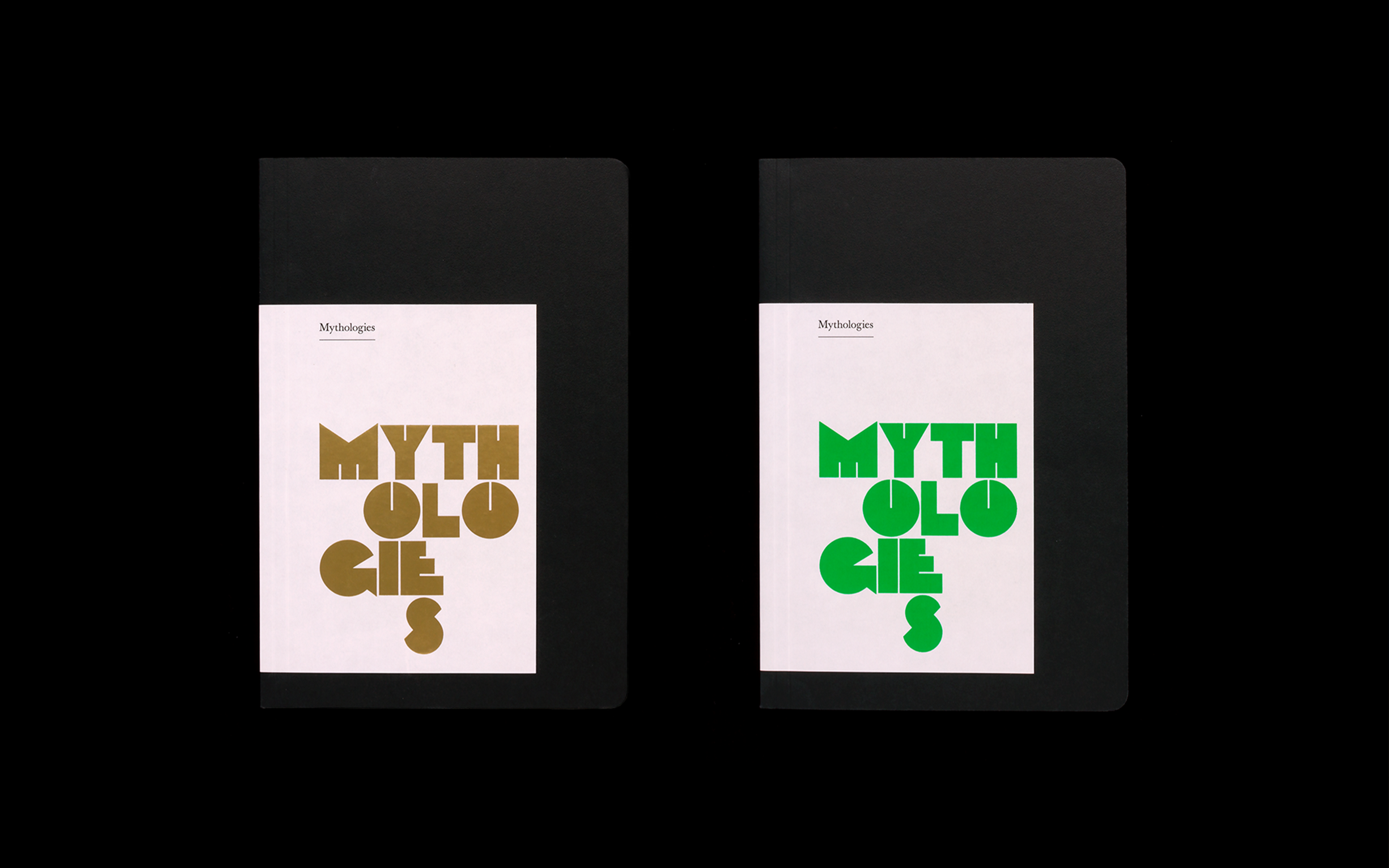
Marketing materials and stationery
Haunch of Venison was an art gallery founded in London in 2002, whose roster of artists included the likes of Richard Long, Bill Viola, Keith Tyson and Thomas Heatherwick. Soon after being set up, Haunch of Venison quickly established itself as one of the world's leading private galleries, expanding to include further locations in New York, Berlin and Zurich. This ambition was clearly held from the very beginning and it was hugely gratifying for us to play such an important role in its success.
We worked on all aspects of their identity and communications, beginning with a naming process. Taken from the gallery’s London site in Haunch of Venison Yard, the name was rooted in a specific place, but had a nicely abstract ring to it. The logo, meanwhile, is both a minimalist sketch of a three-legged deer — the fourth leg being the gallery’s name itself — and representation of the initials H and V in bold graphic lines.
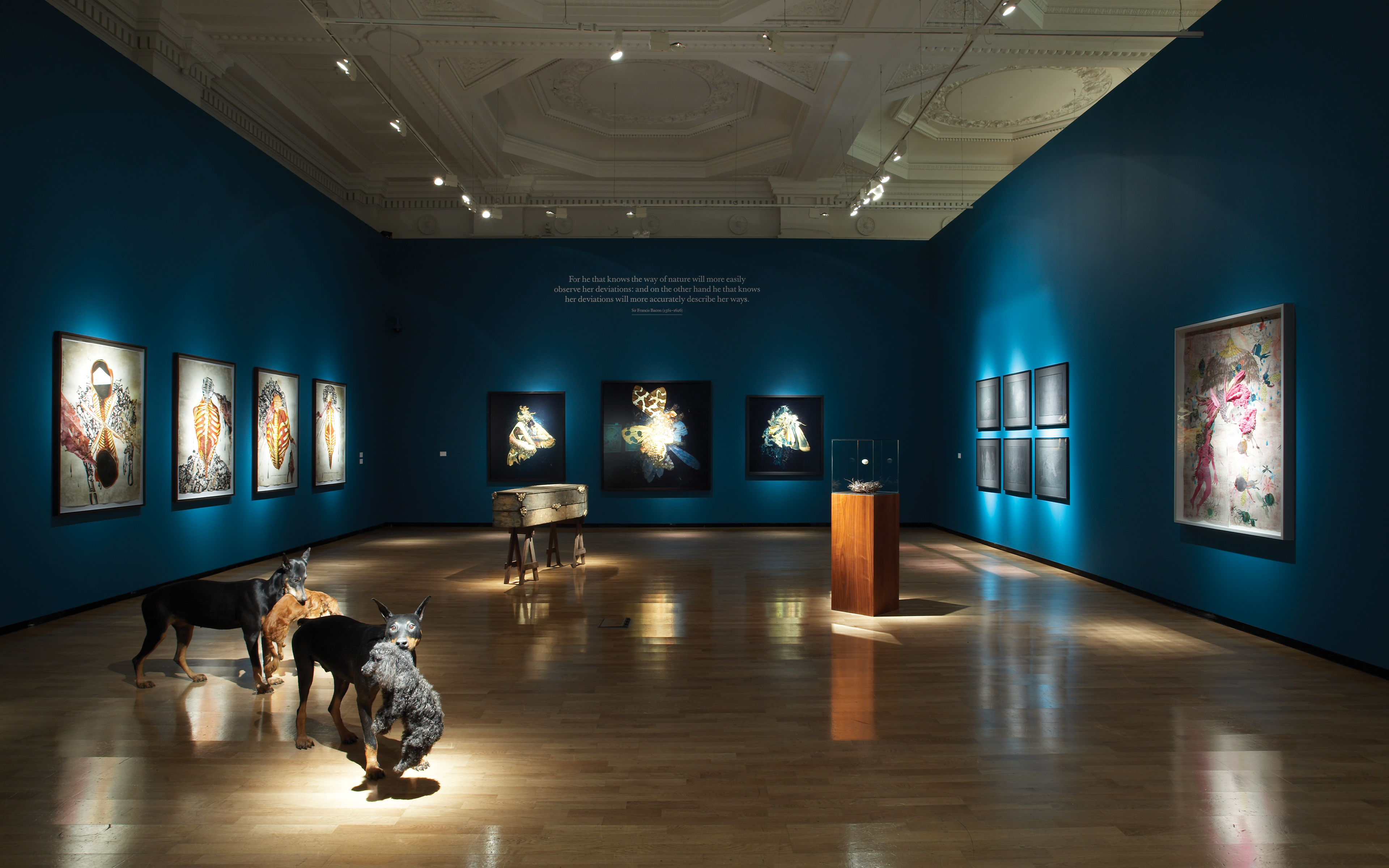
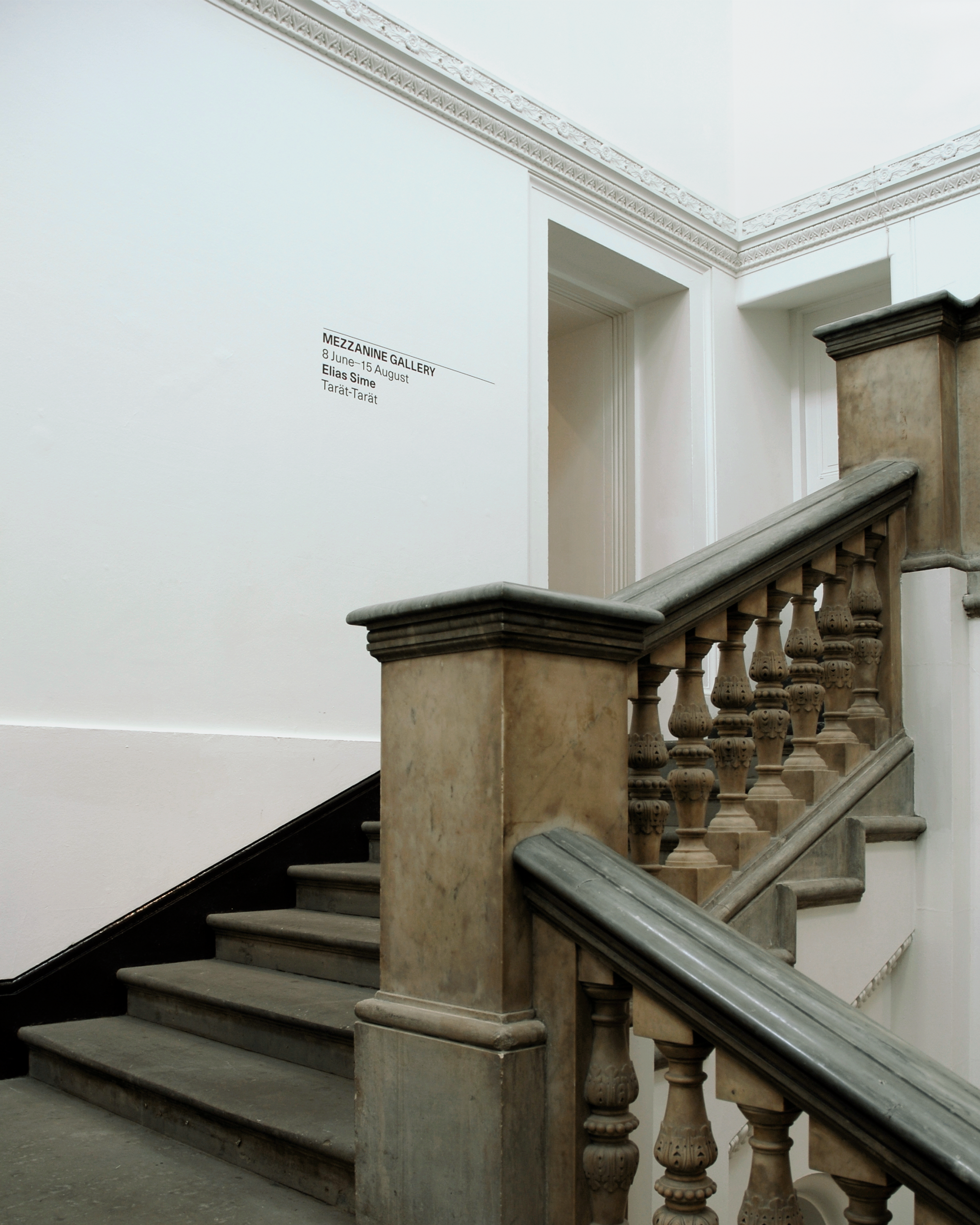
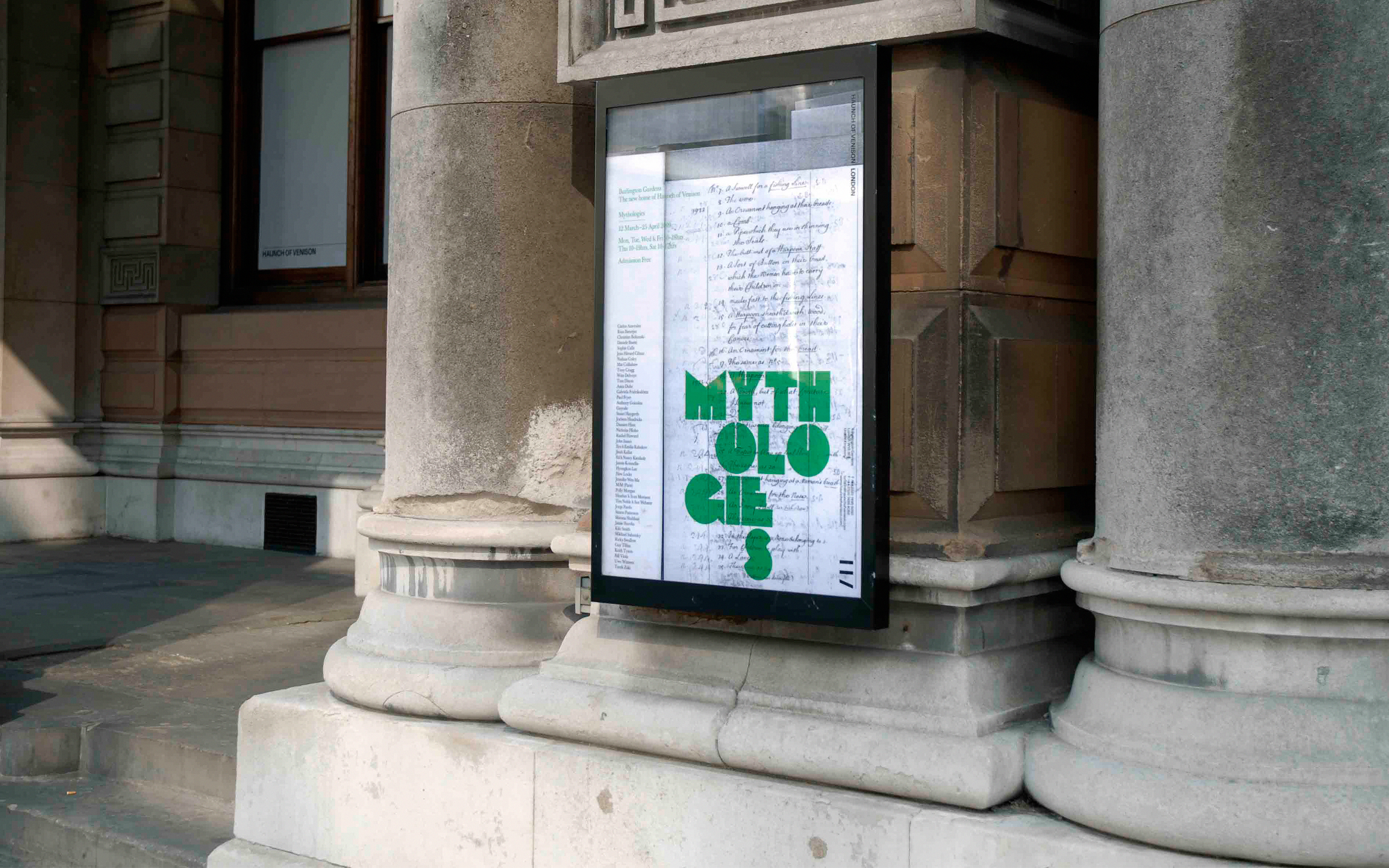
Exhibition graphics in situ
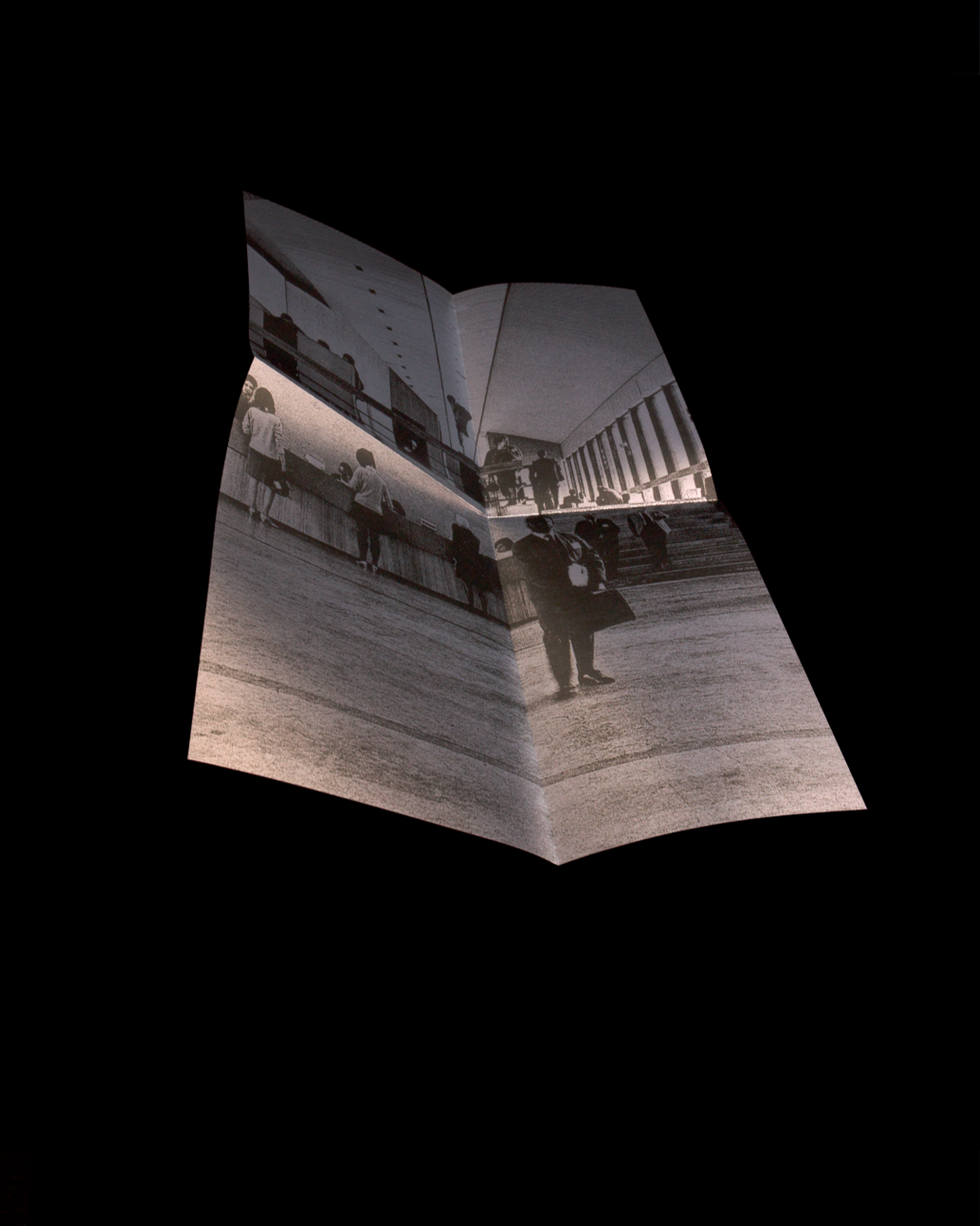
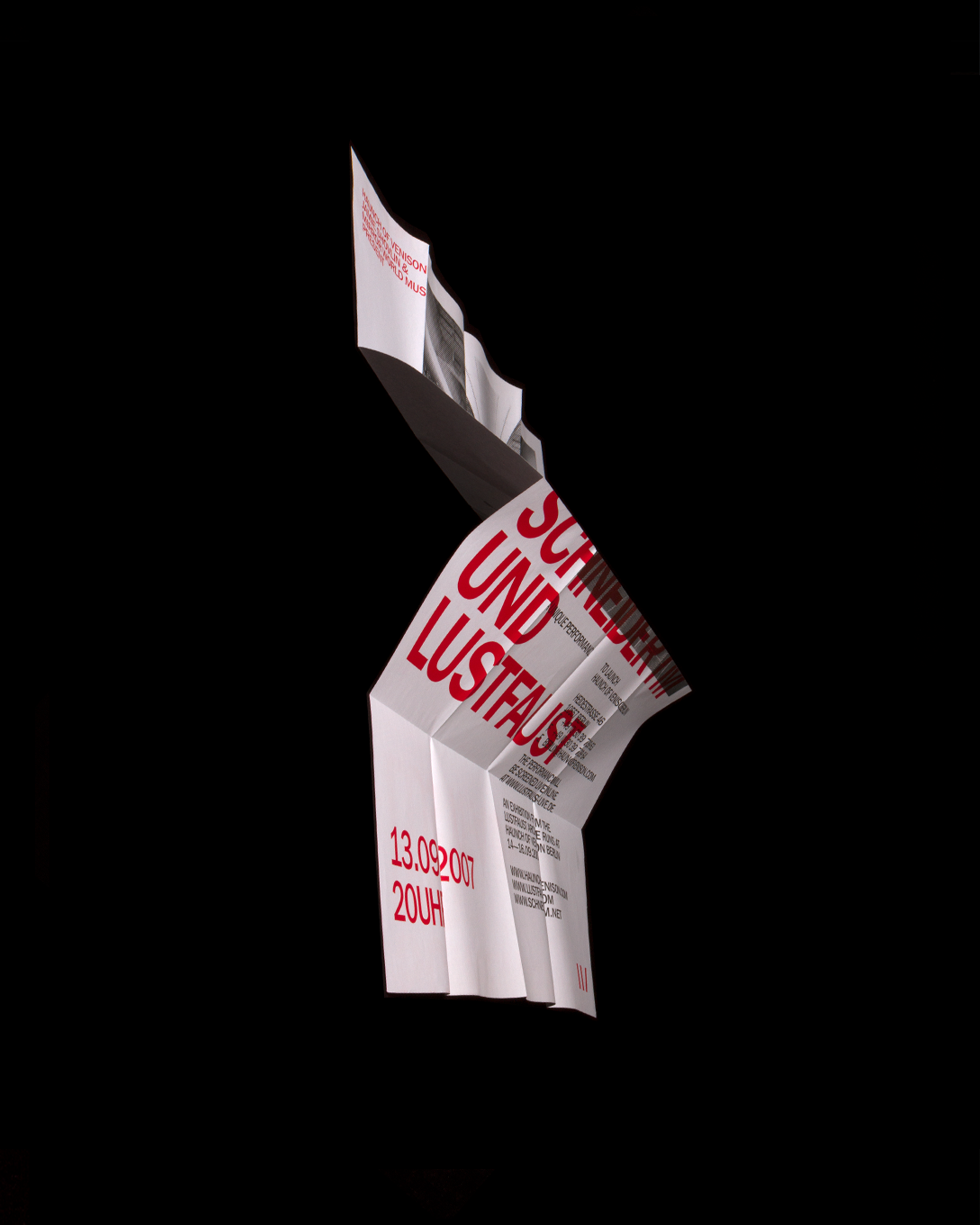
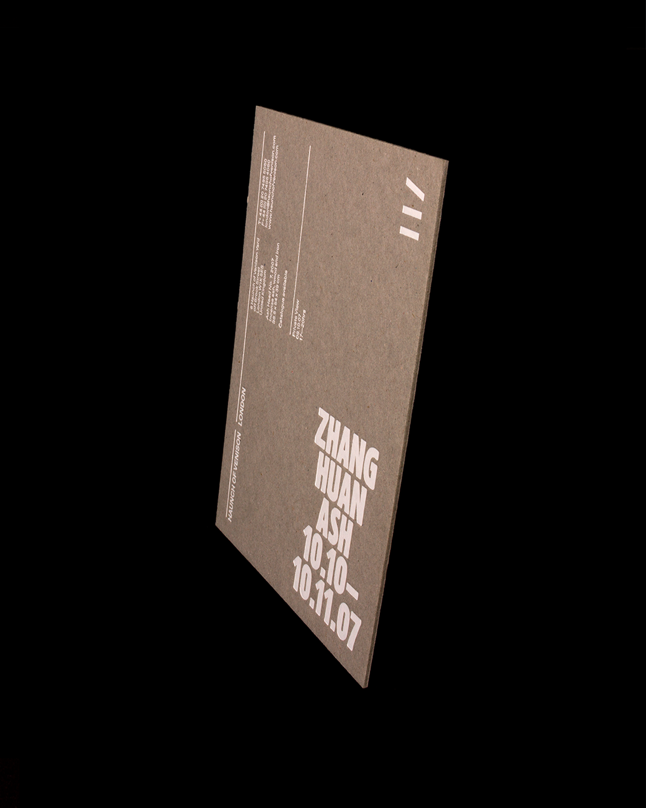
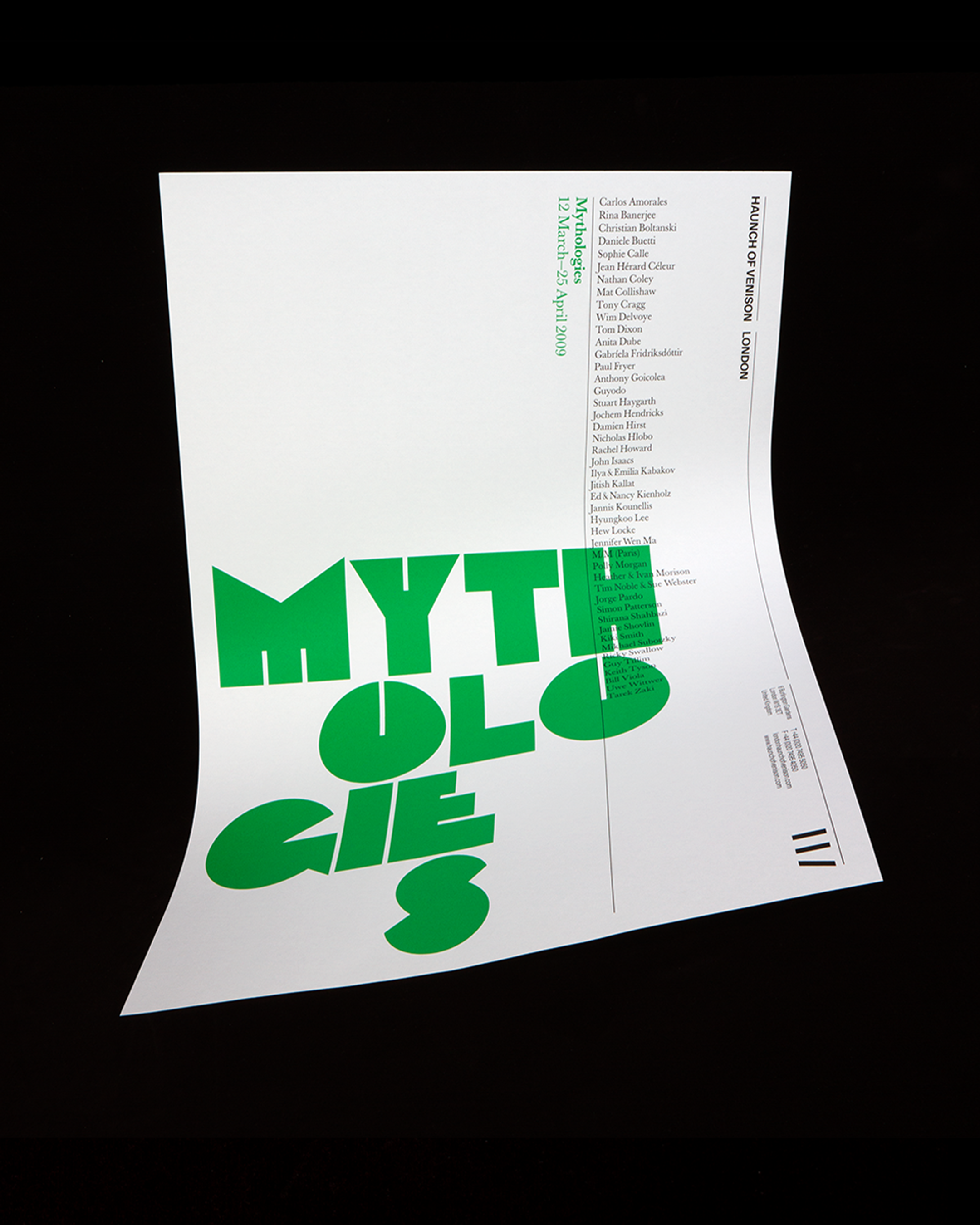
Exhibition posters
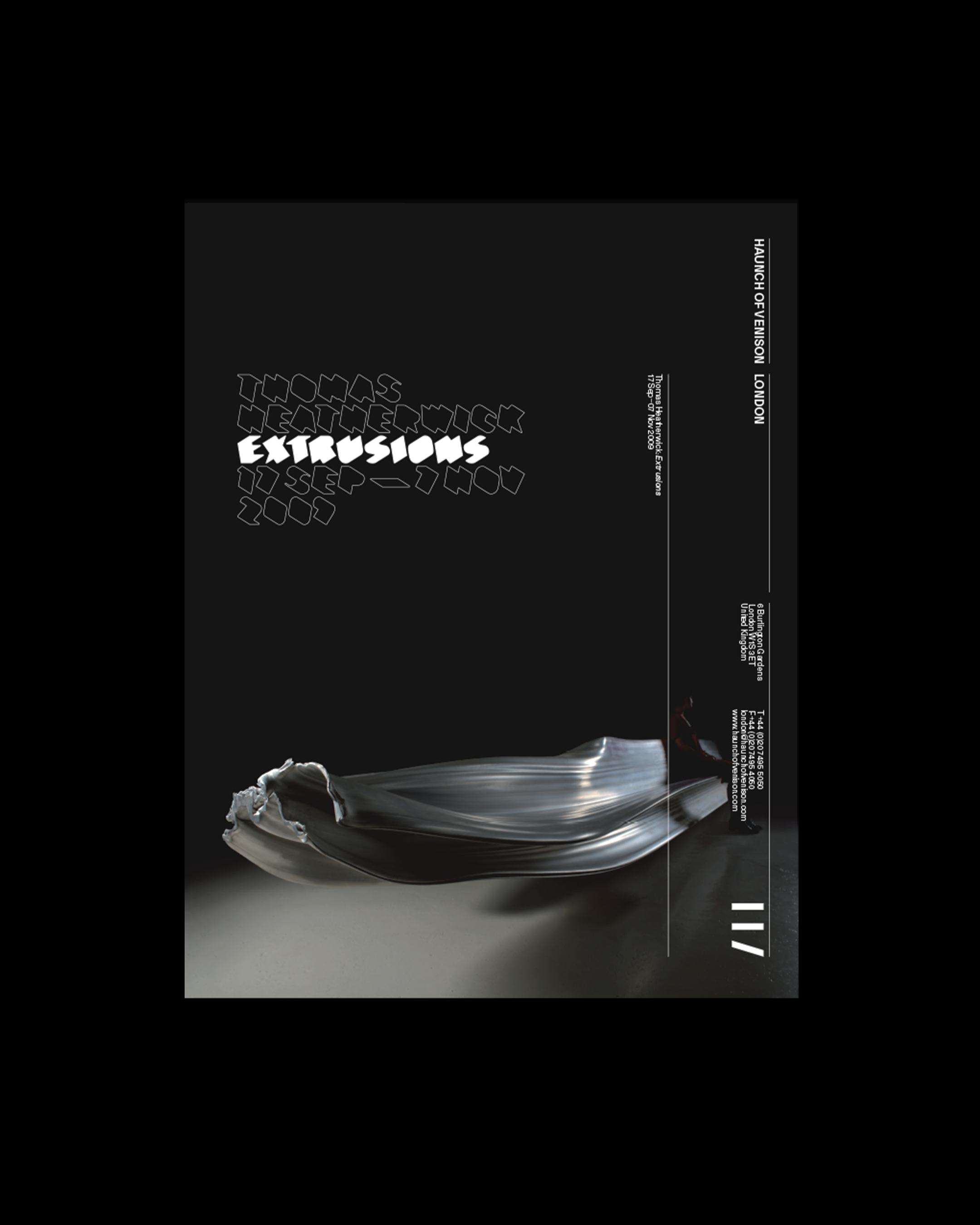
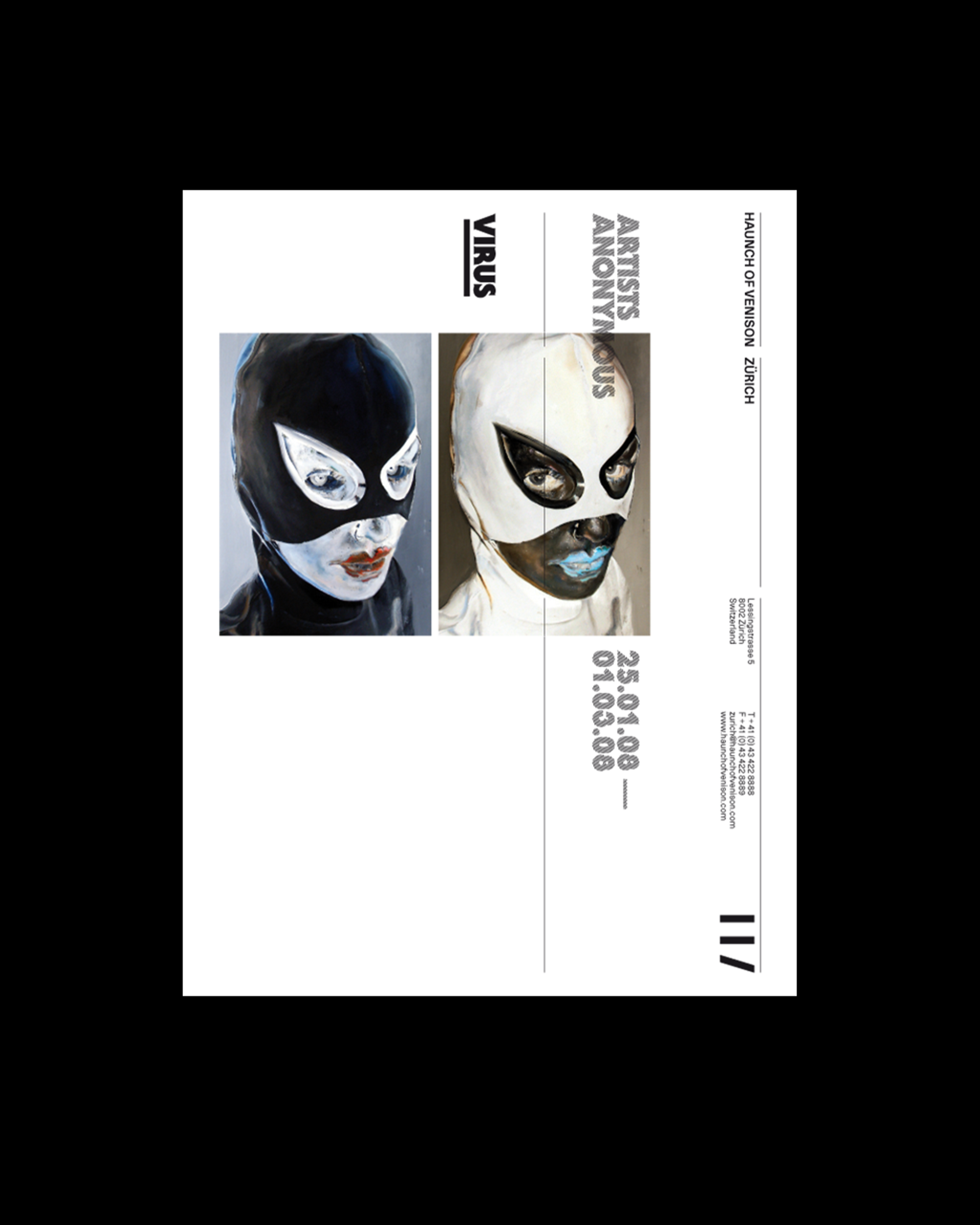
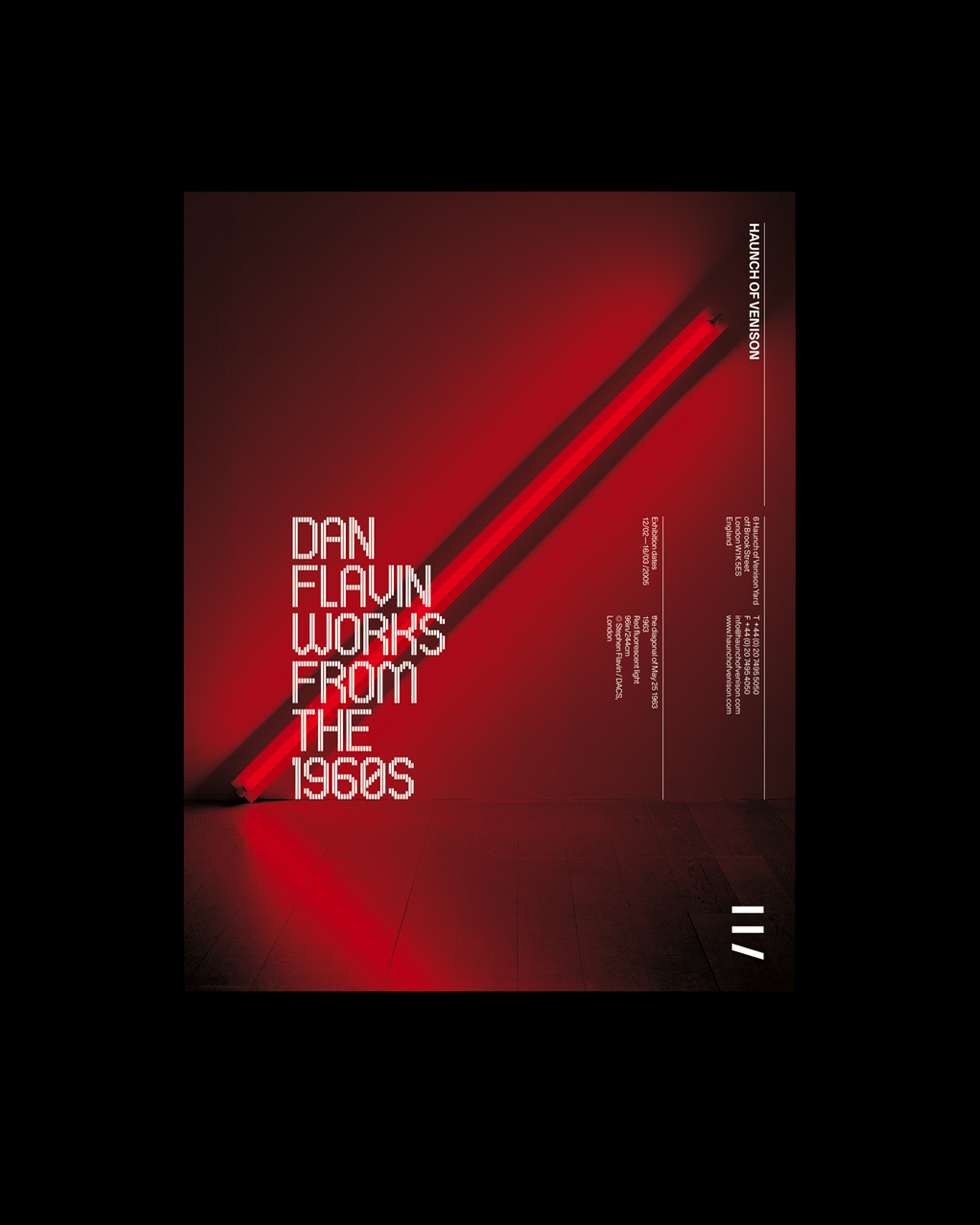
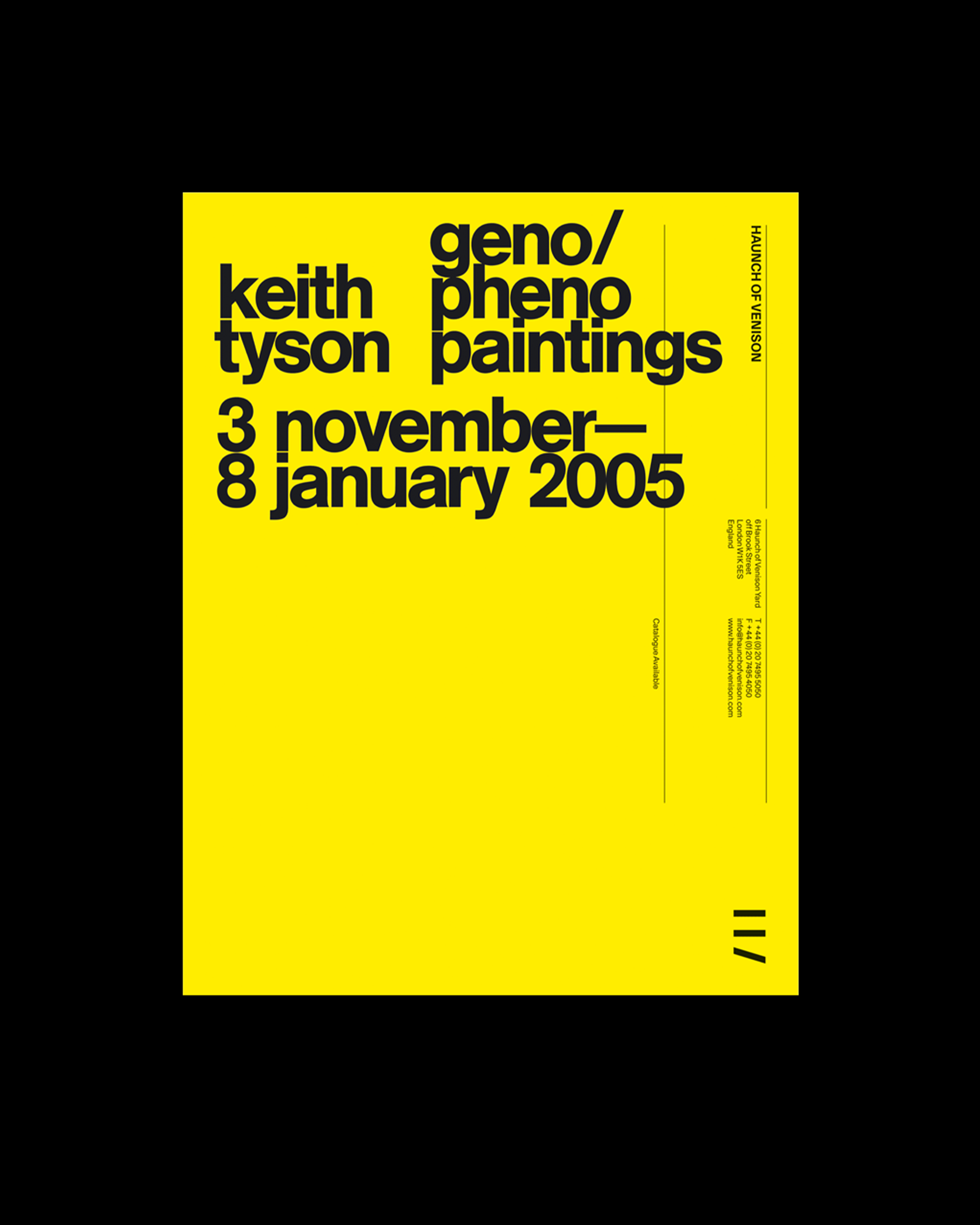
From here, we produced a contemporary, sophisticated visual identity that communicated the nature of Haunch as a world-class gallery, and developed along with the gallery itself as it underwent its expansion process. This included the creation of exhibition identities, exhibition graphics, catalogues, advertising, invitations, website, signage and promotional items. The visual language was underpinned by a multi-faceted approach, aimed at a broad audience composed of curators and collectors, the gallery’s artists, and the general public.
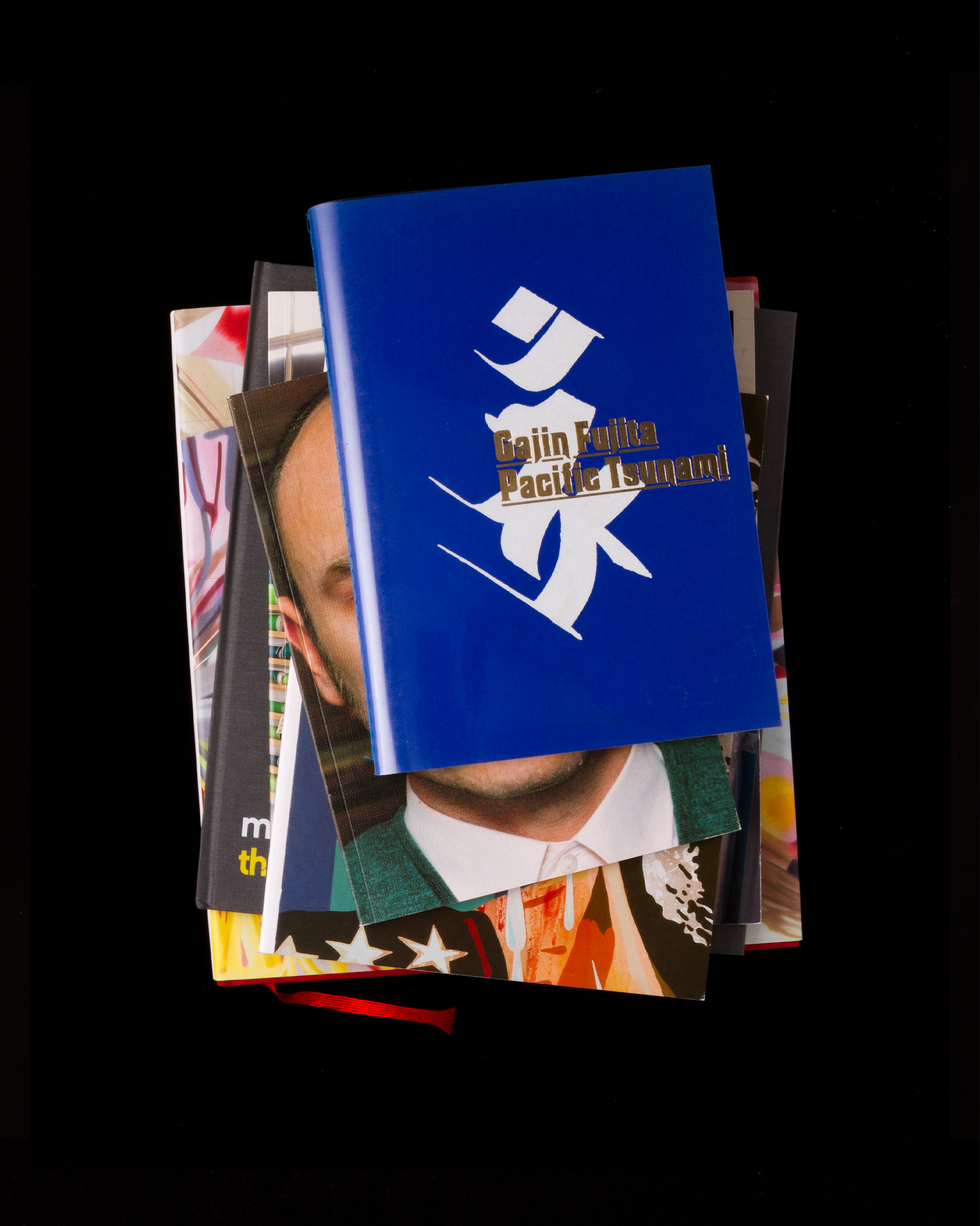
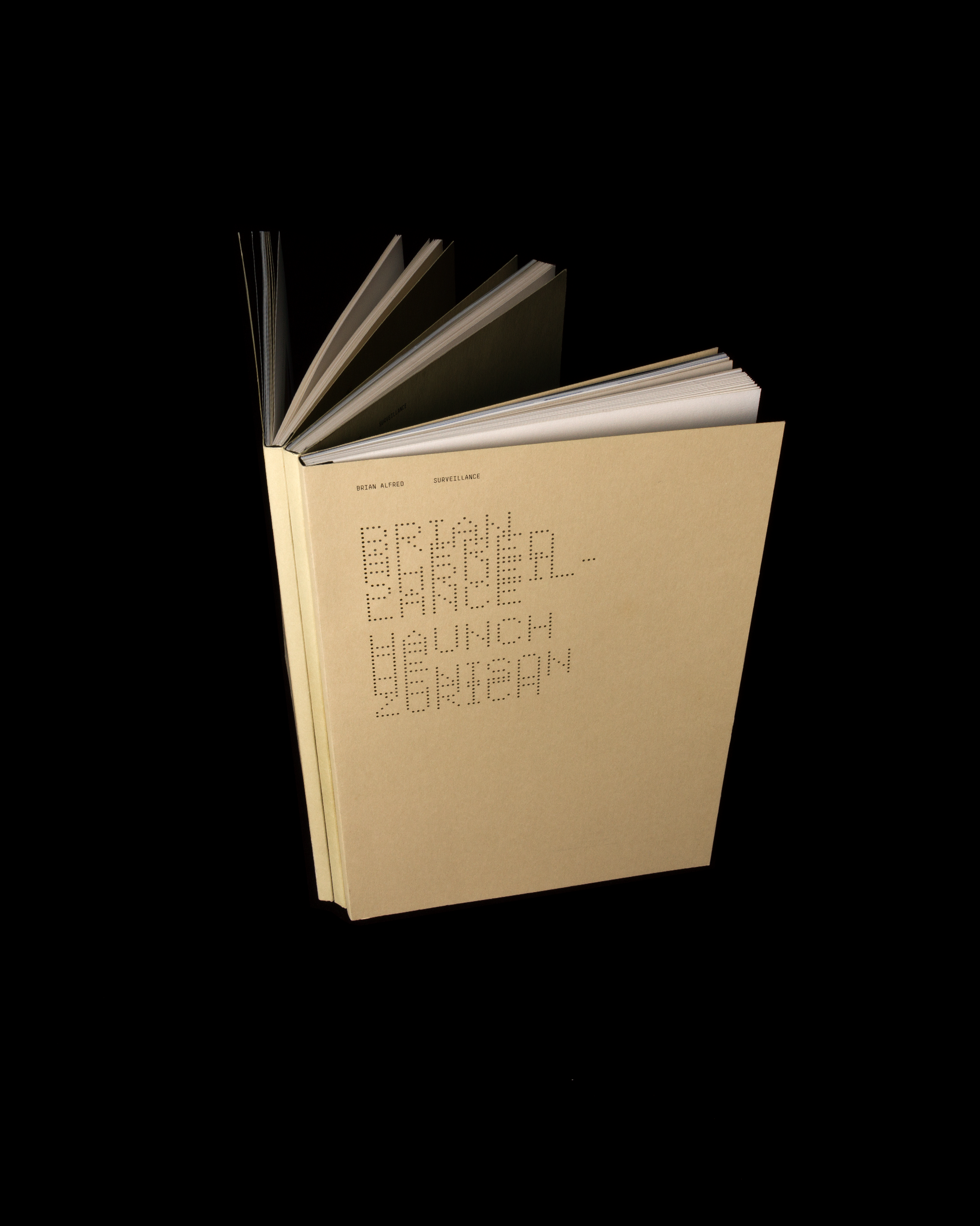
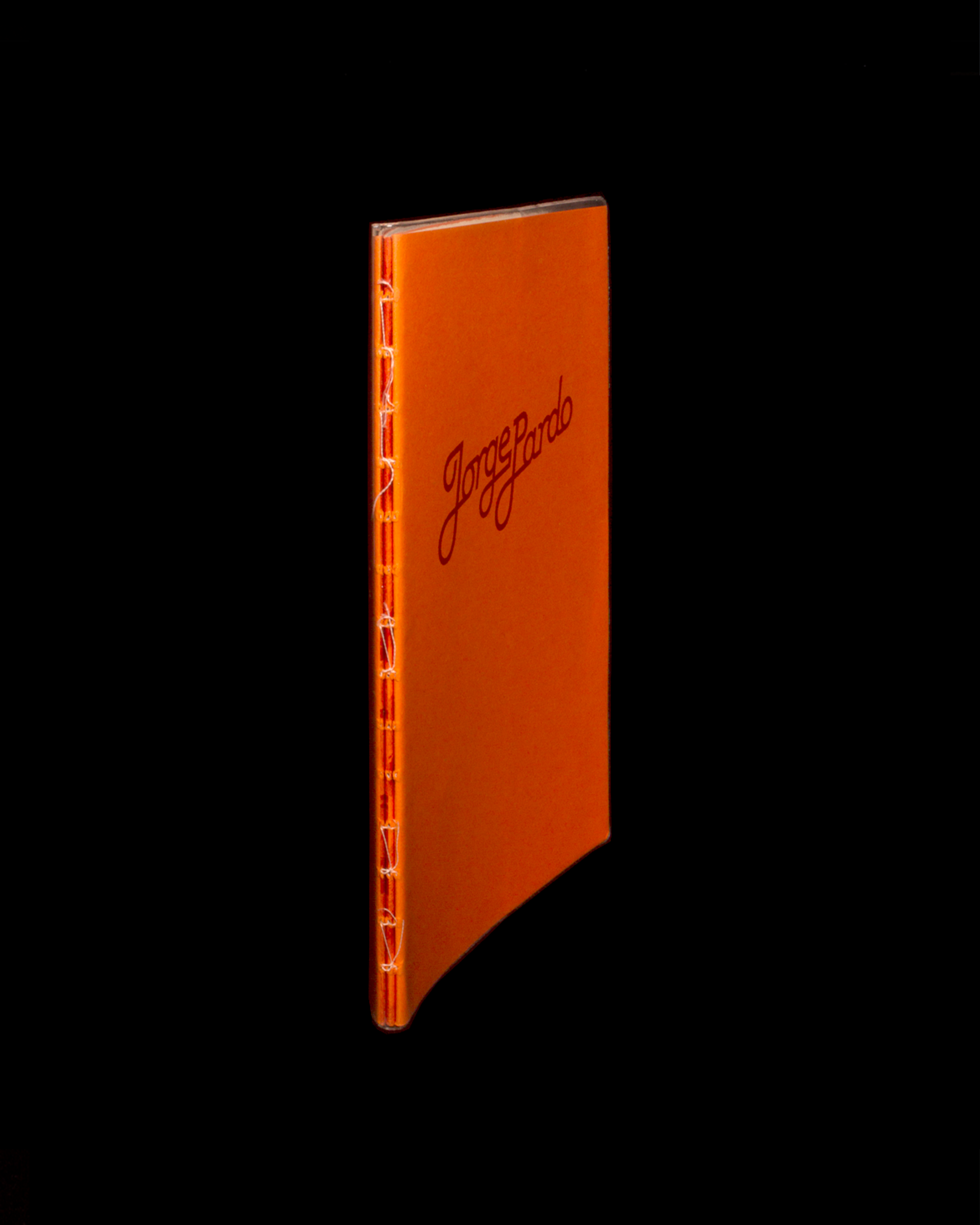
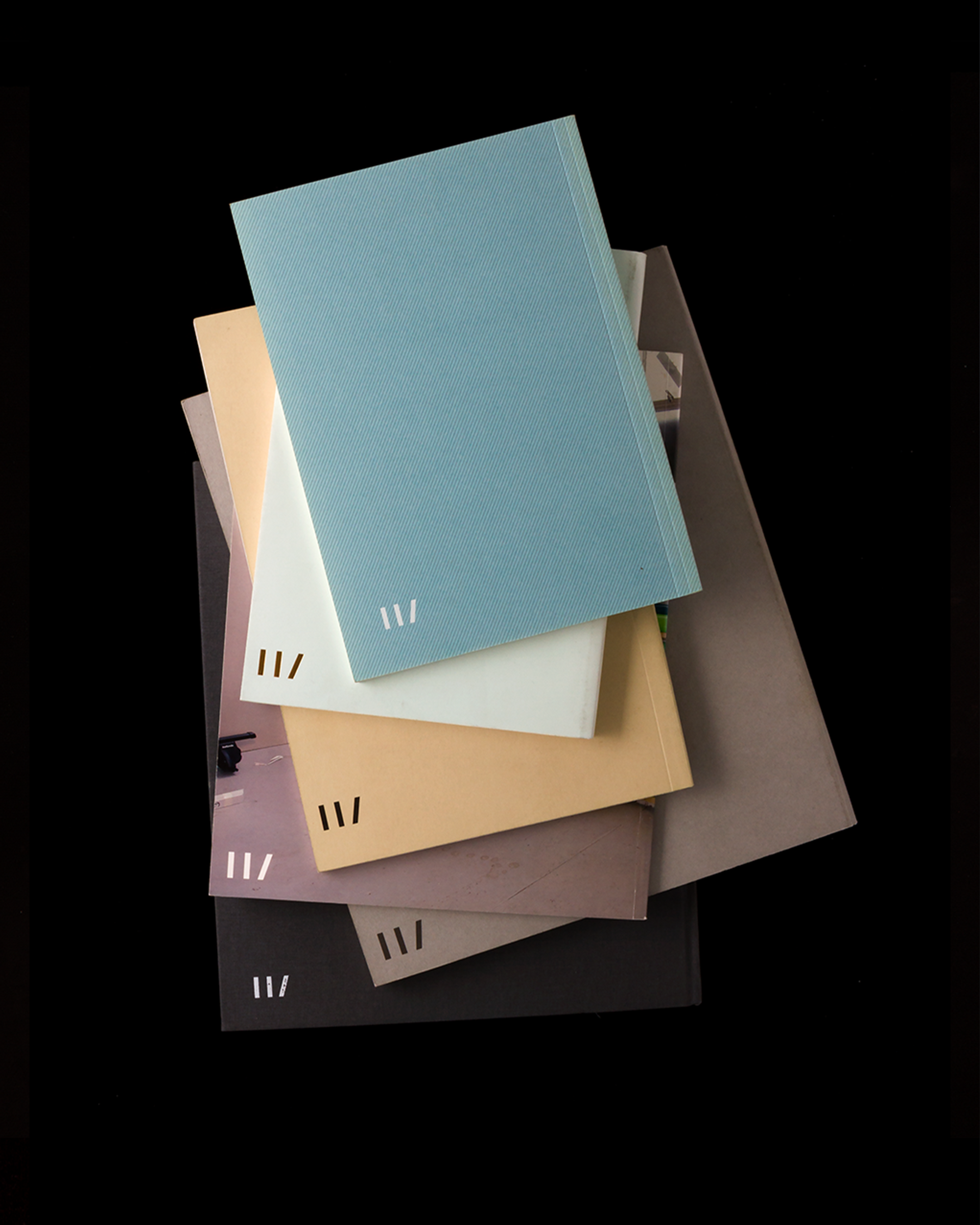
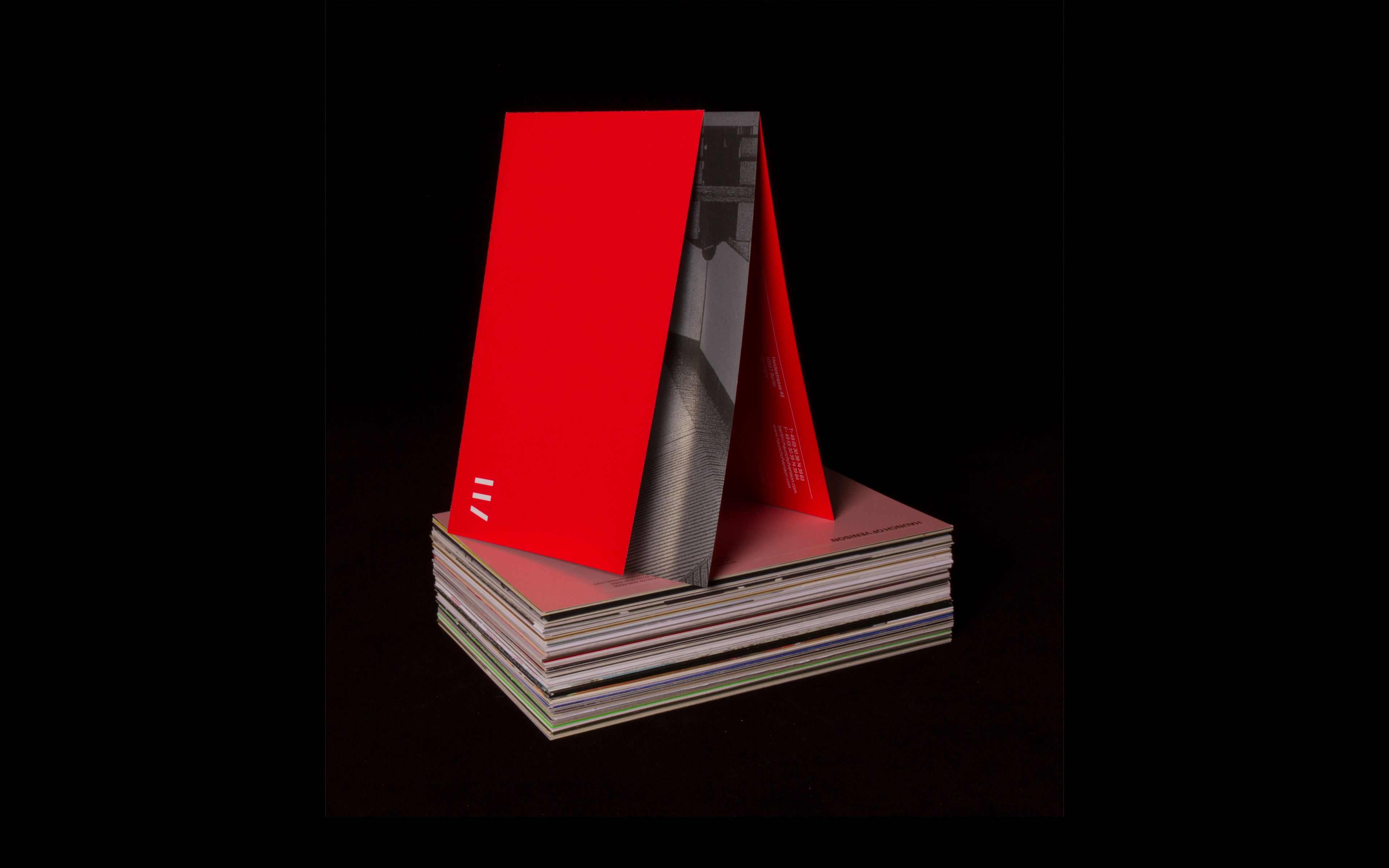
Exhibition catalogues
Exhibition invitations
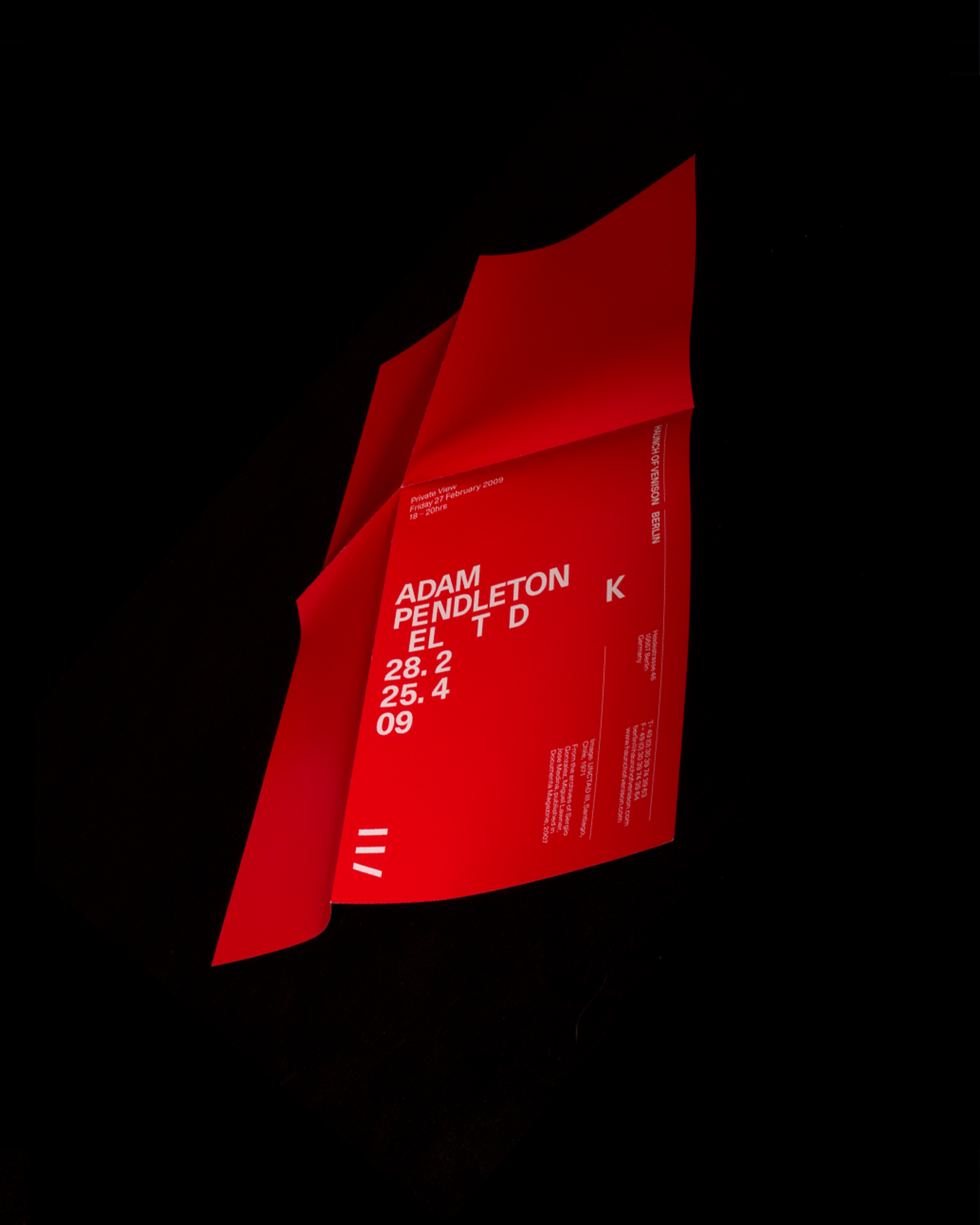
One of the fundamental tasks in the creation of an identity in the arts sector is to achieve the right balance between the presentation of the exhibiting artist (or artists) and the gallery branding. By creating an identity system for exhibition material which established a consistently applied positioning for the gallery branding — a column on the right hand side — we gave ourselves the space to respond to the art in question using the remaining space.
This solution, at once structured and flexible, allowed us to create mini-identities and bespoke responses to each exhibition — giving us the freedom to explore, but always with purpose, and provoking creativity through limitation. The results included varied, unconventional typography and were produced by collaborating directly with the artist in question and experimenting with paper stocks and finishes.
Exhibition poster
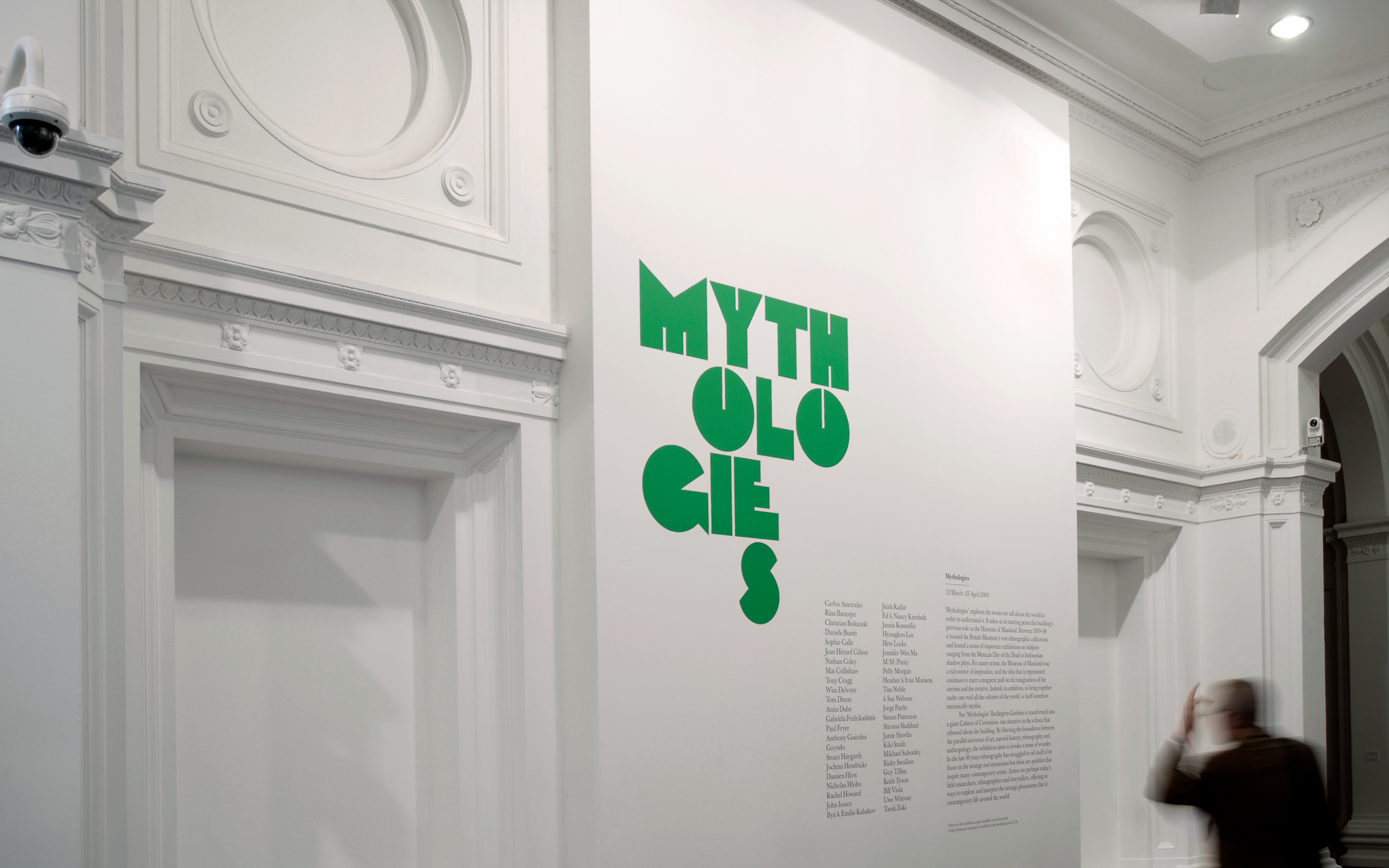
Environmental graphics
Exhibition catalogues
Exhibition poster
