Packaging
Describing their products as ‘Modernist Bavarian Beer’, AND UNION combine respect for the heritage of their craft with a modern, global sensibility. Working with fifth-generation, family-run Bavarian breweries, their beer is unfiltered, unpasteurised and informed by traditional methods.
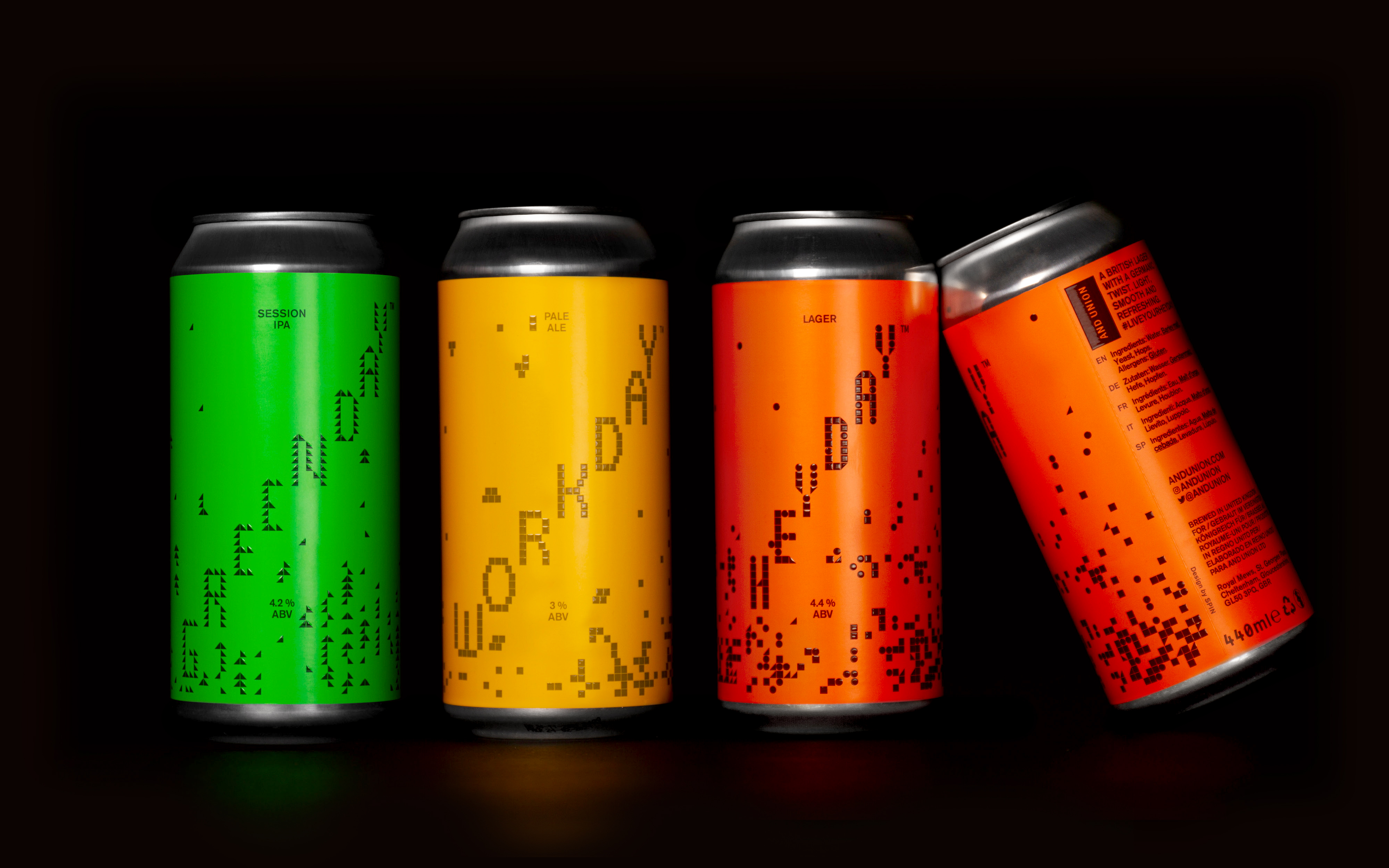
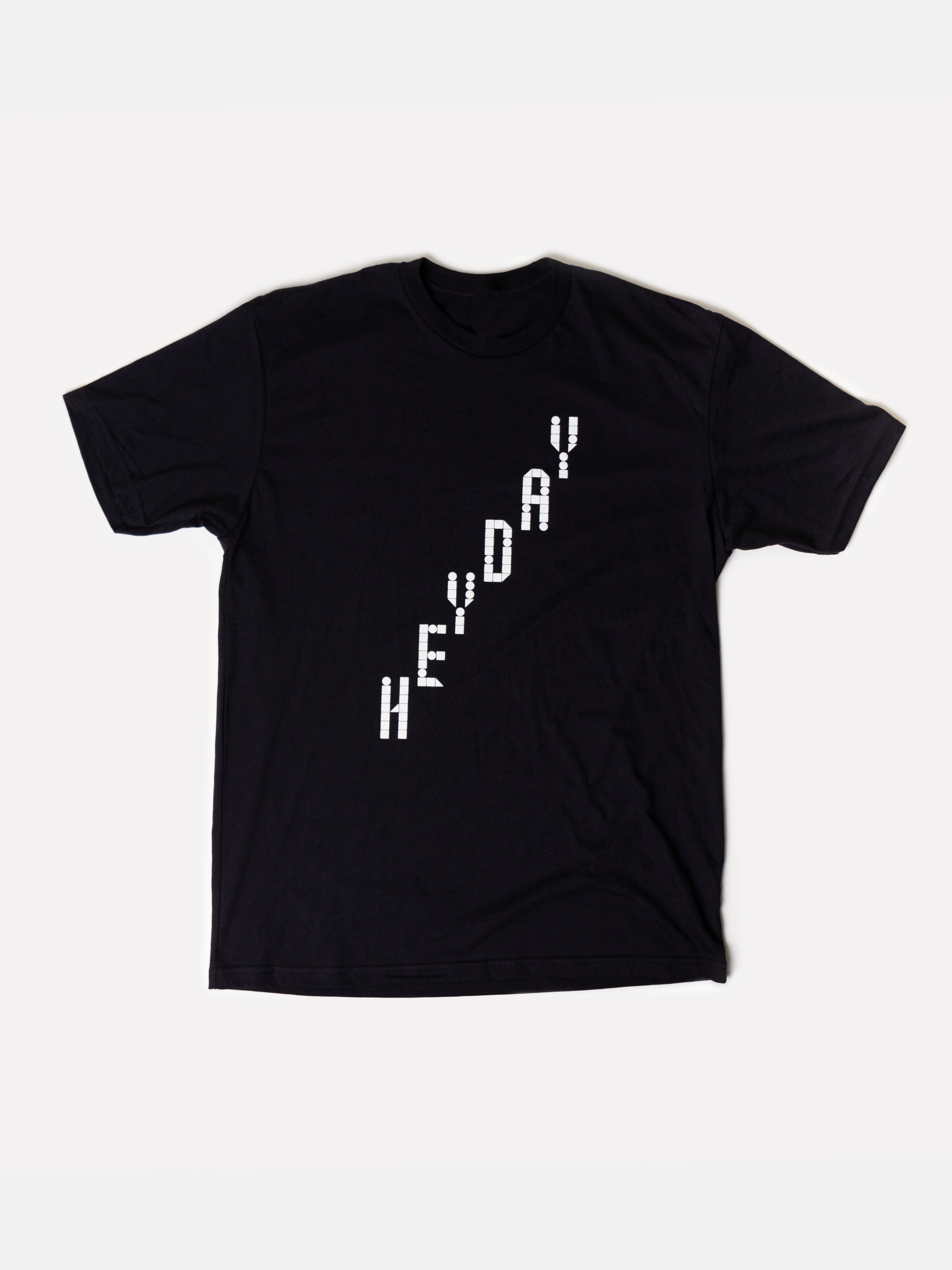
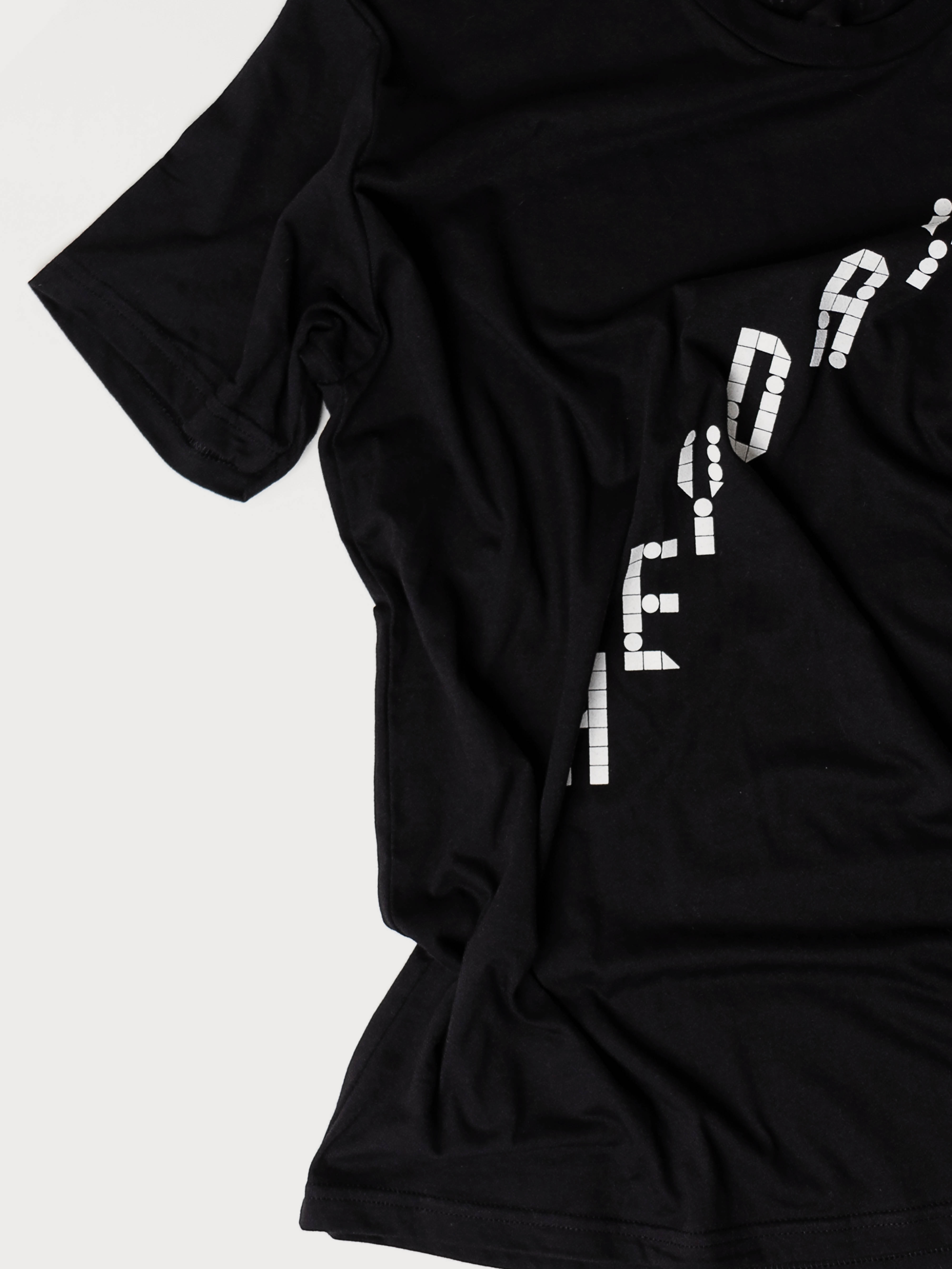
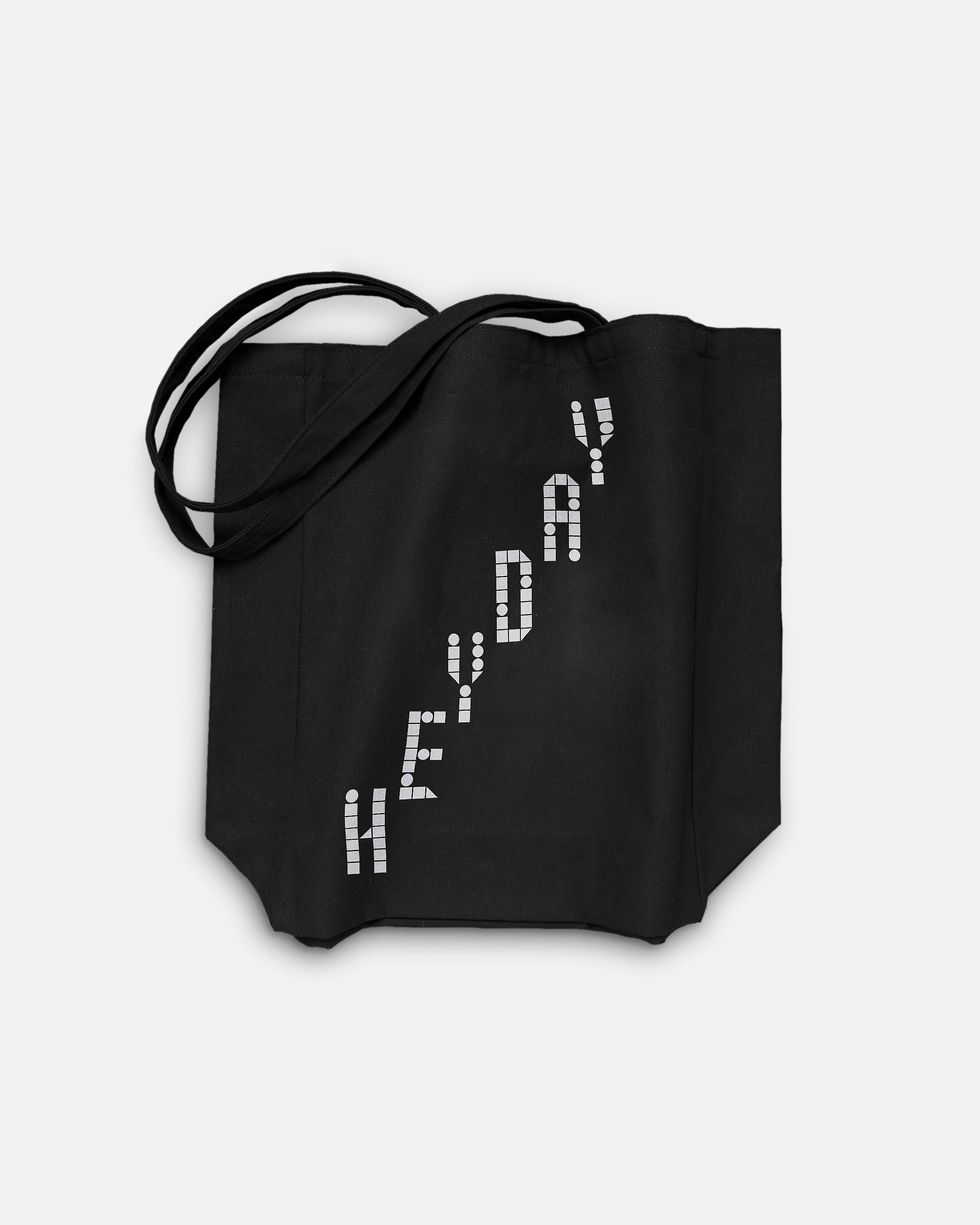
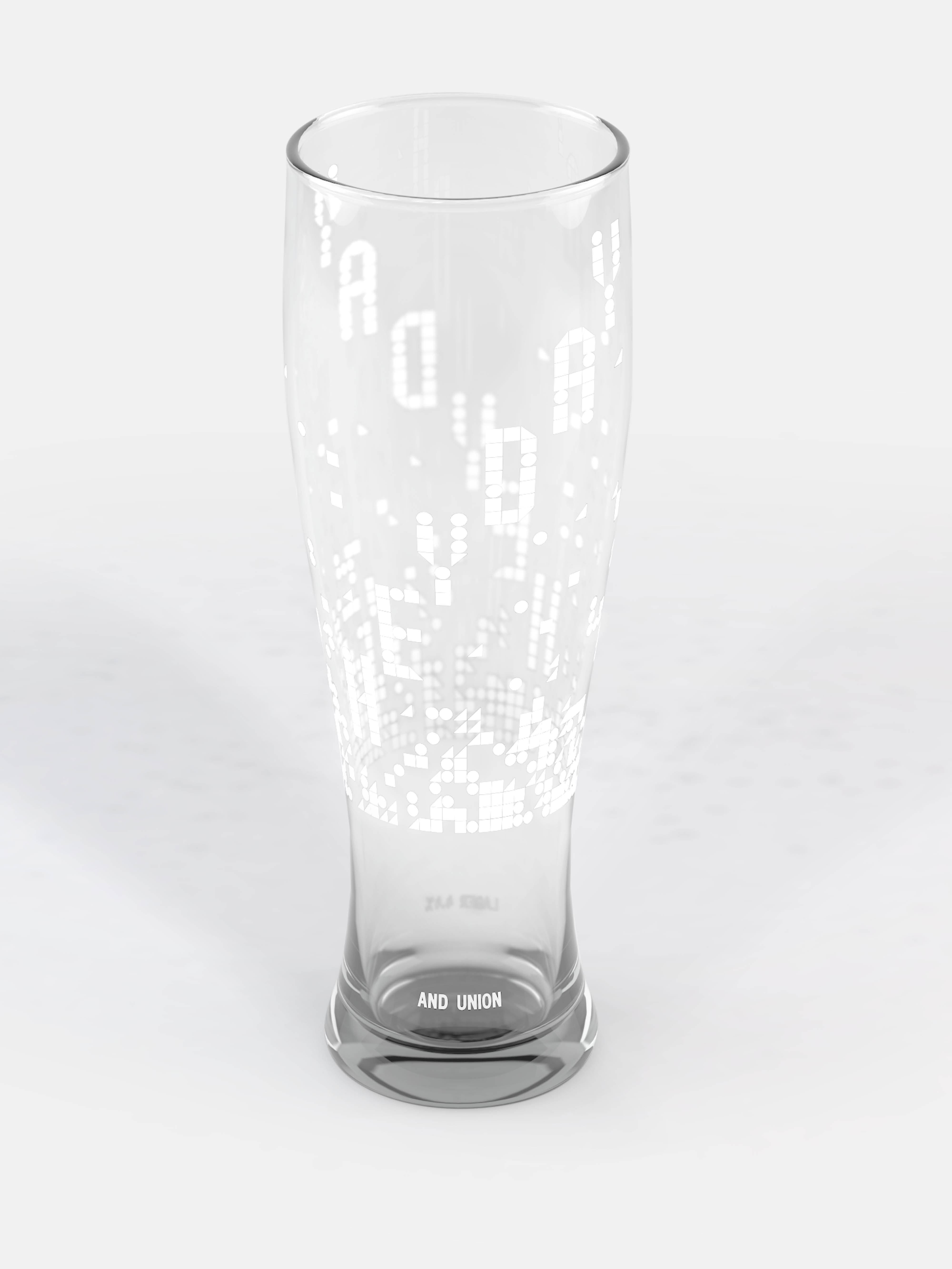
HEYDAY is their take on a lager. Crafted specially for the British pub and restaurant trade, it marked AND UNION’s first foray into brewing in the UK and was released in a limited run. We created an upbeat, lighthearted visual identity for the beer by playfully reconfiguring the geometric shapes of the square, circle and triangle that form the company’s logo. Using these shapes to evoke bubbles rising to the top of a glass or can of beer, we developed bespoke, playful typography for the product.
Social media animations
Marketing materials
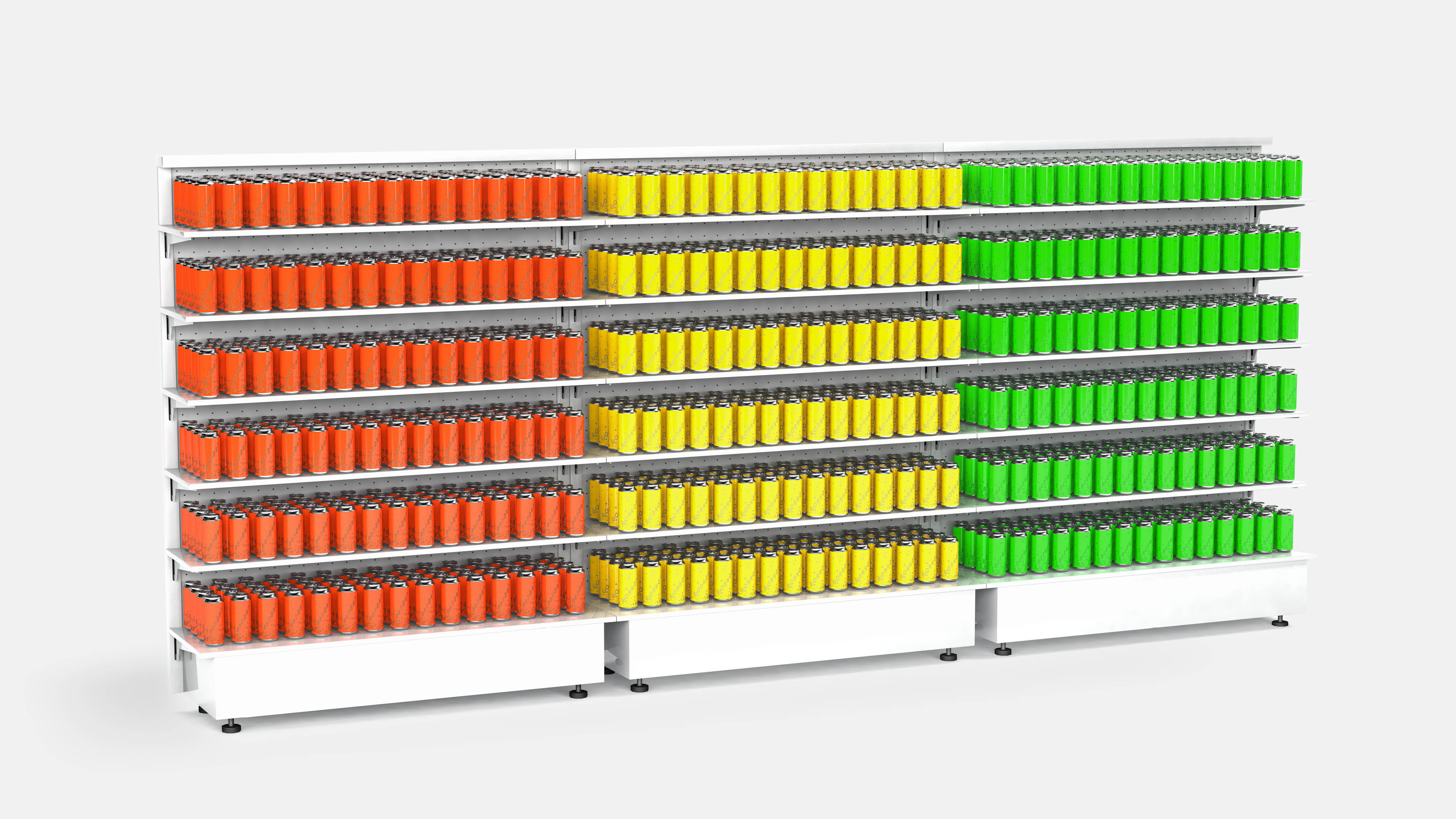
Retail concept
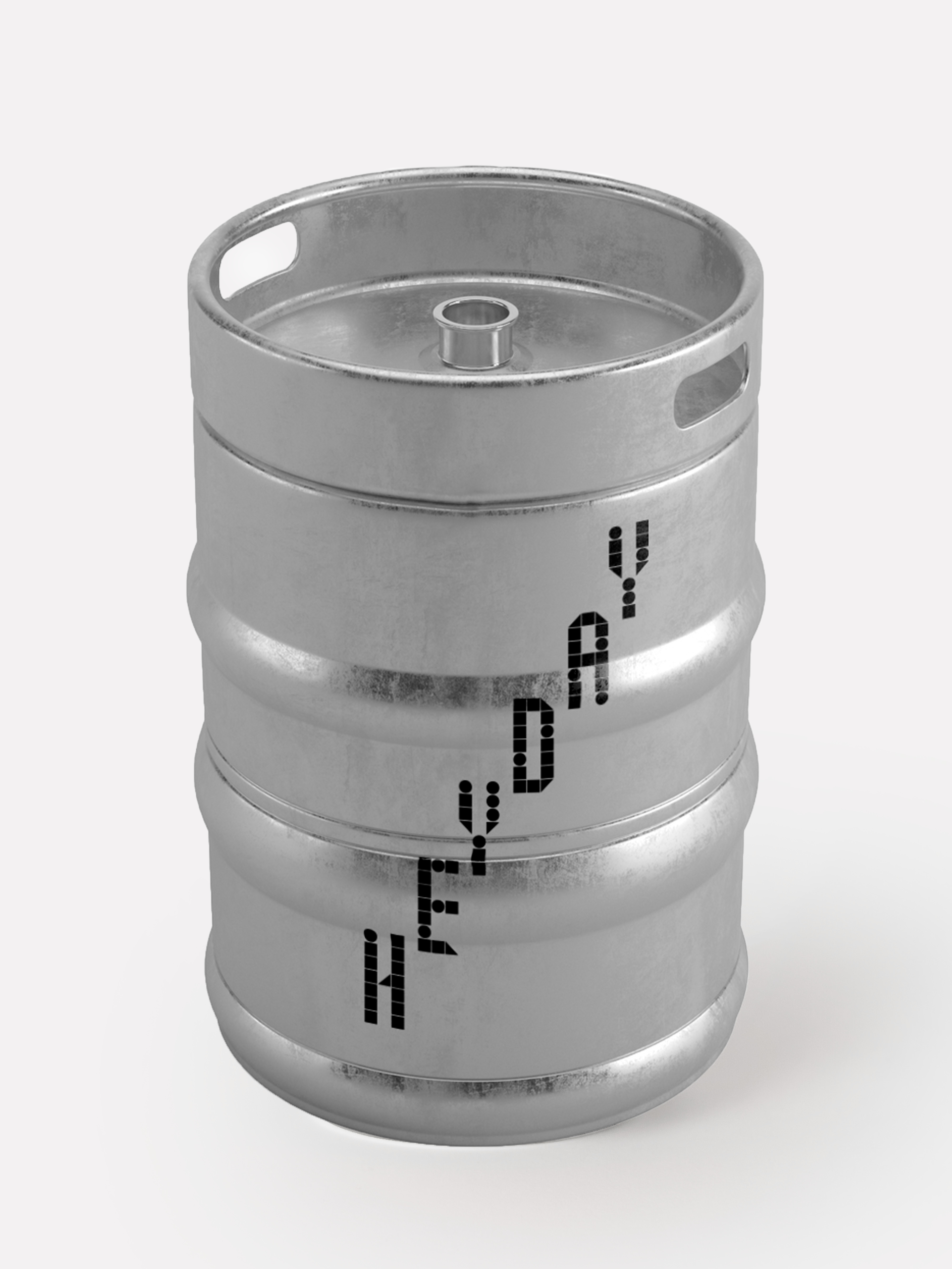
AND UNION went on to extend their special ‘New Day’ range with the GREENDAY session IPA and the WORKDAY pale ale. The lettering is adapted for each drink: GREENDAY, taking its cue from the name, uses only triangles to evoke trees and nature, while WORKDAY uses only squares to represent the consistency of the classic working day. A bright colour palette involving yellow, green and orange reinforces the flexibility and specificity of the identity, and dovetails with the company’s forward-thinking attitude.
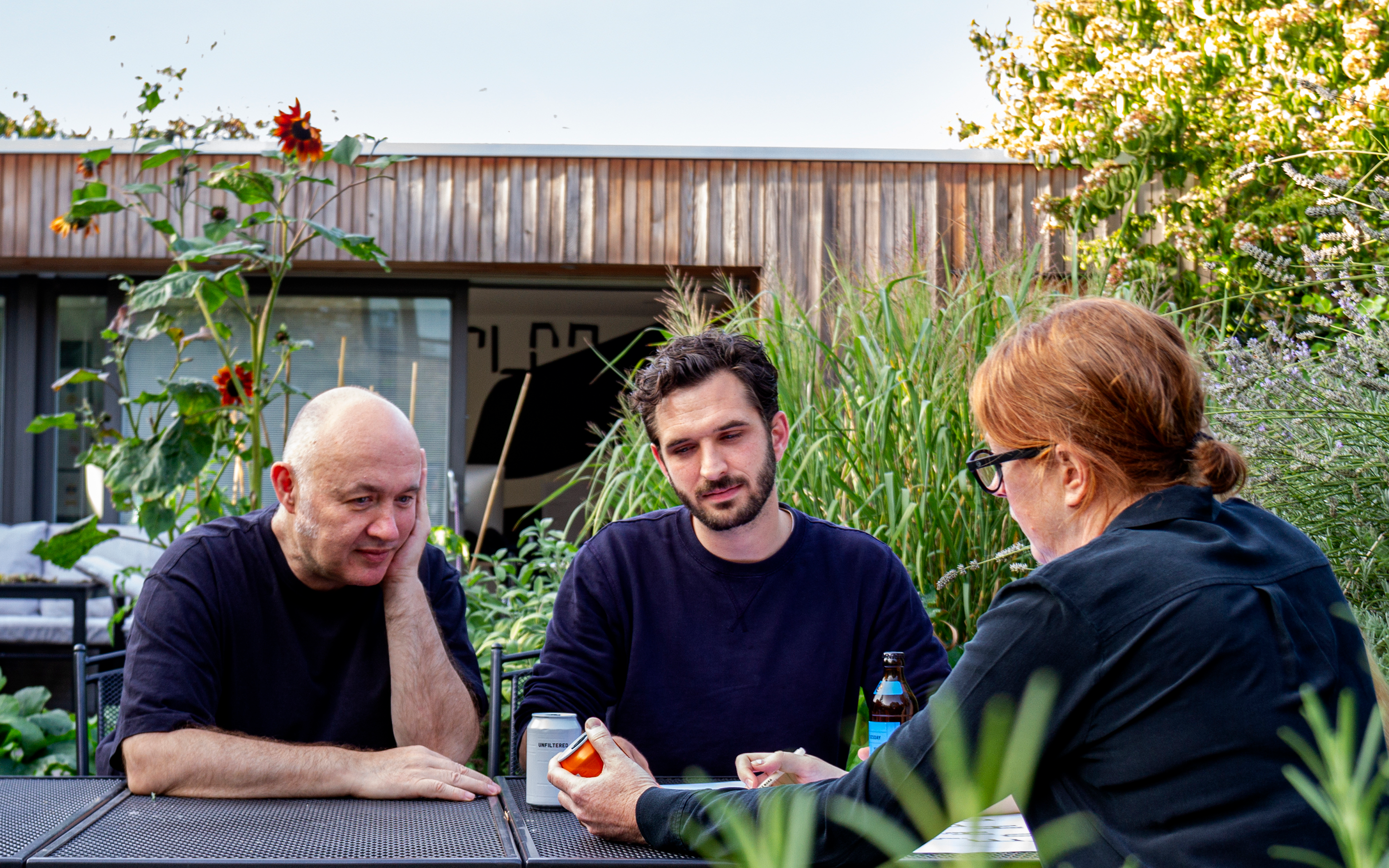
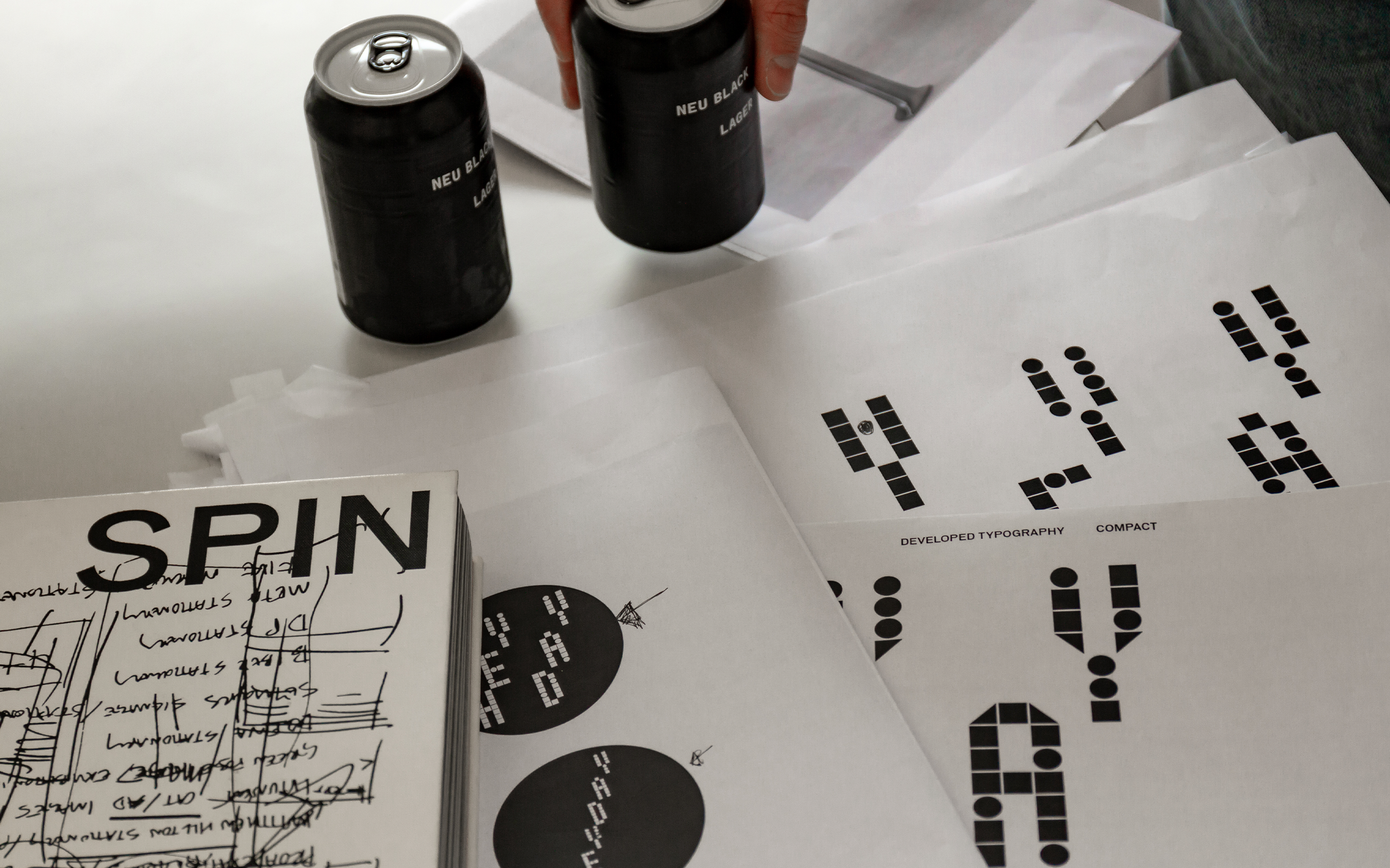
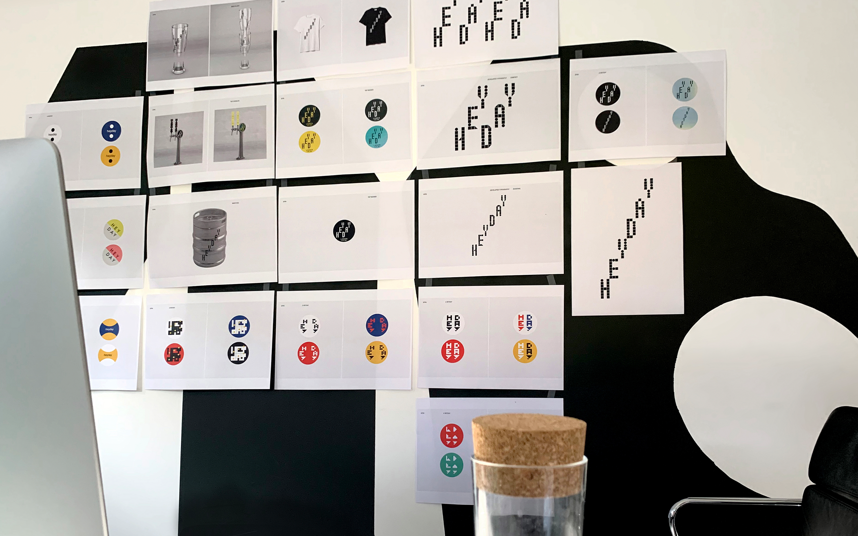
Work in progress
