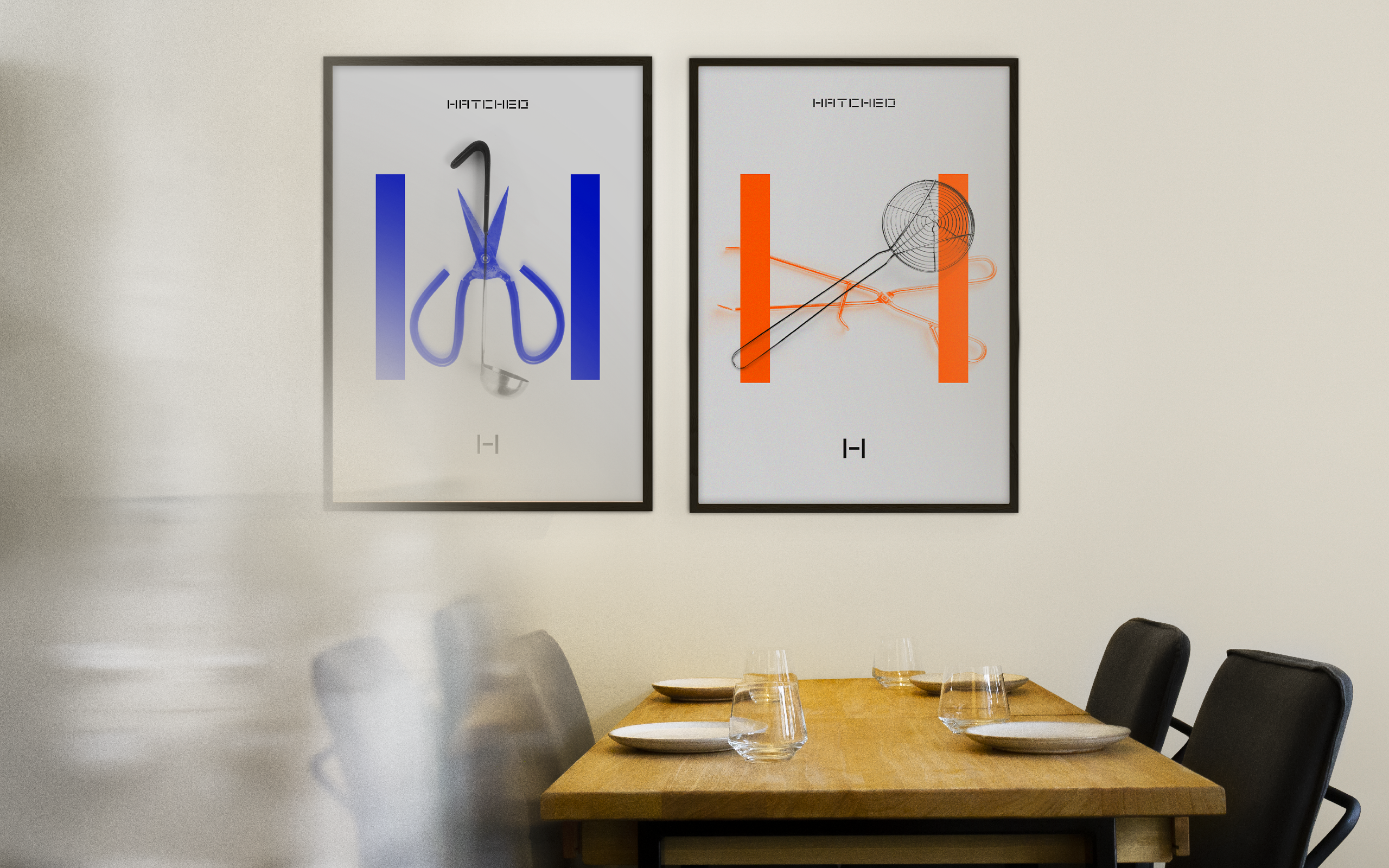
Posters
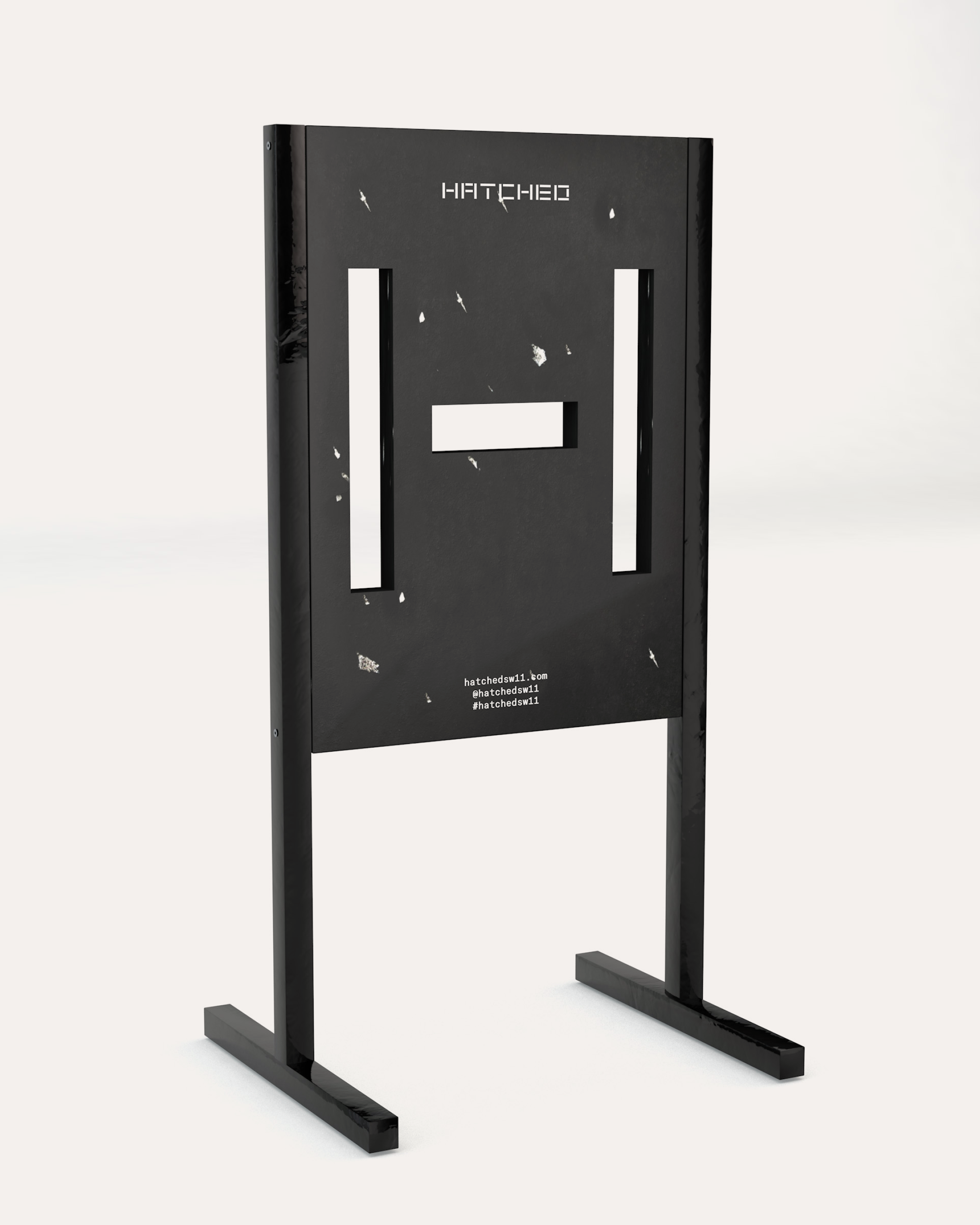
Outdoor signage concept
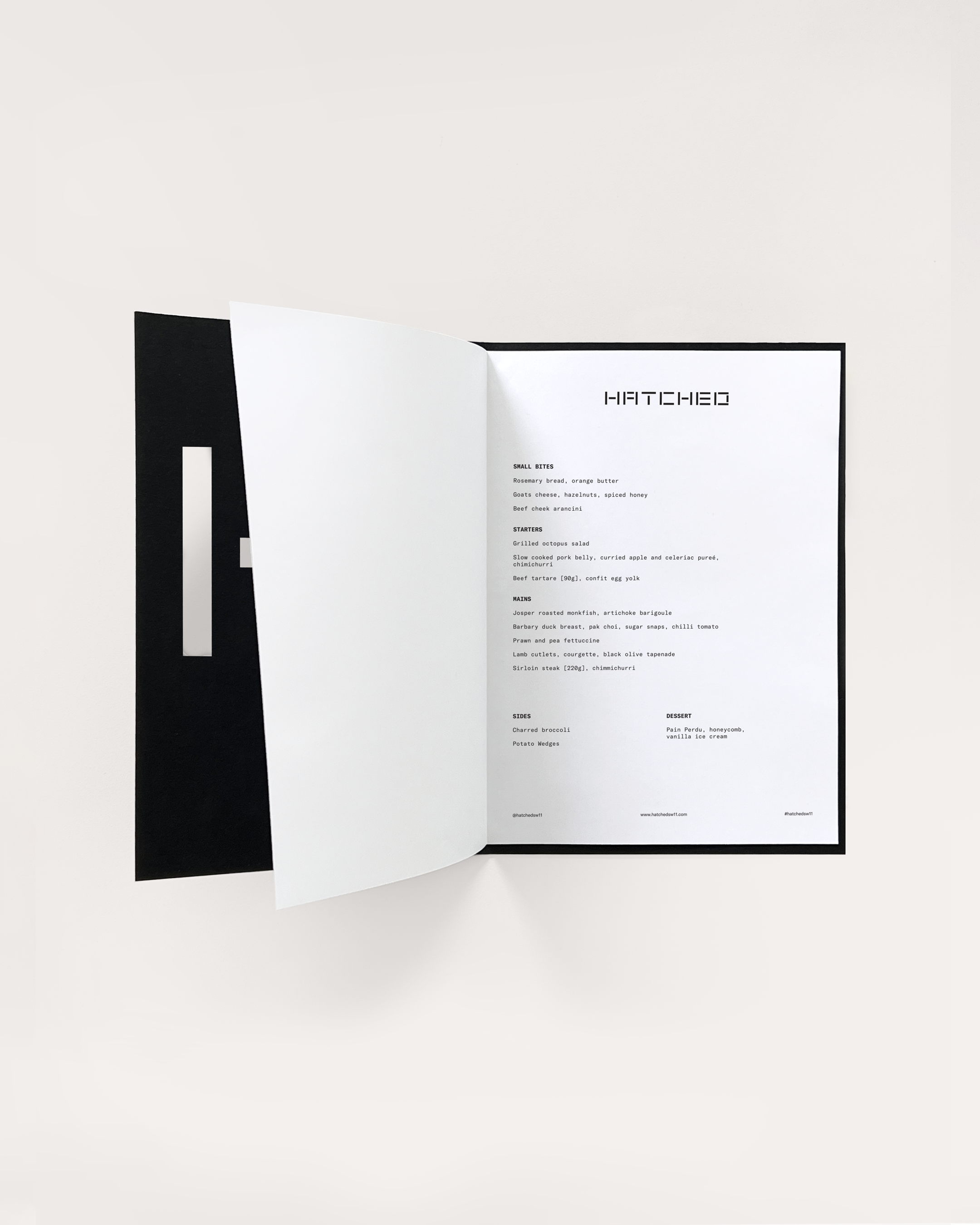
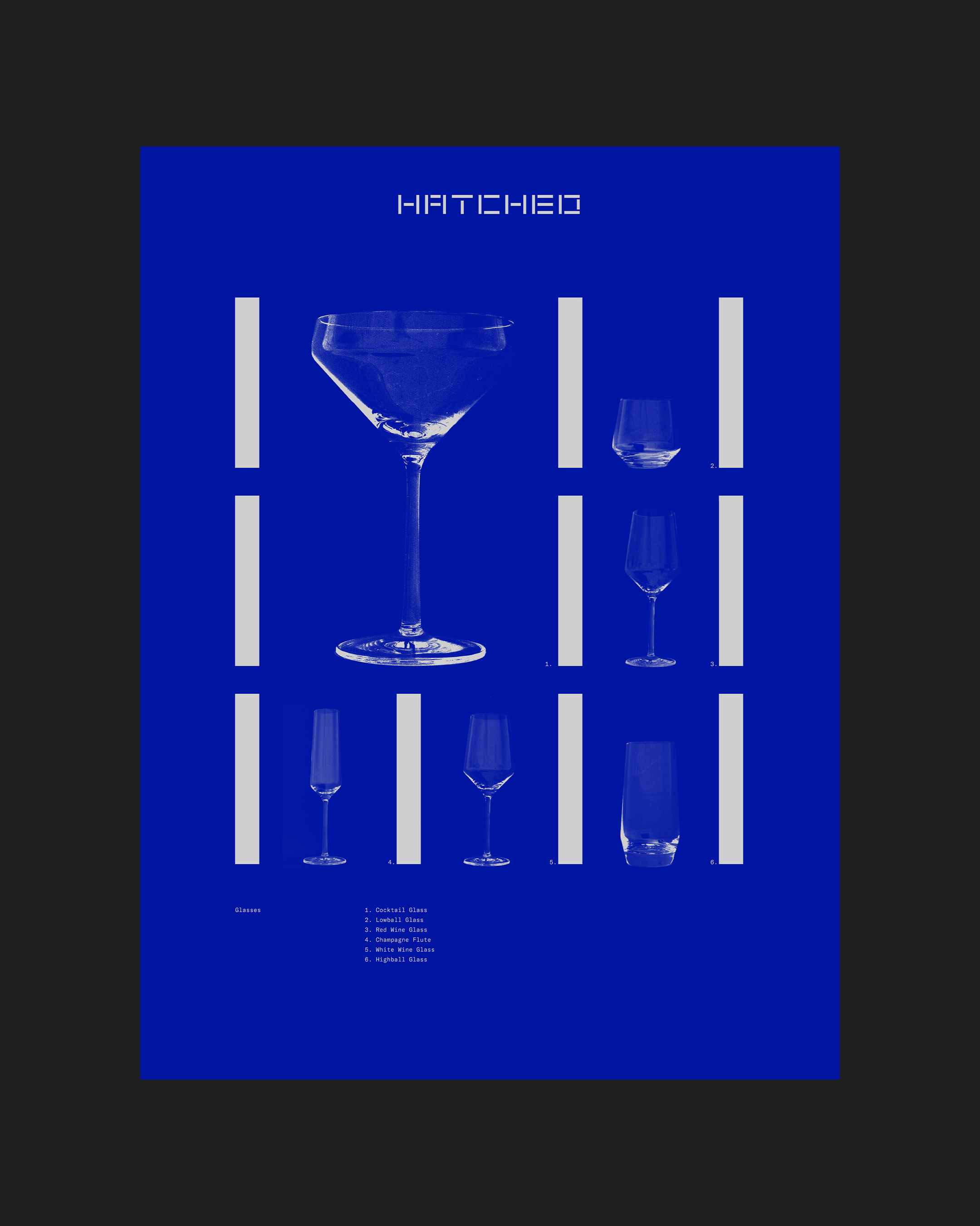
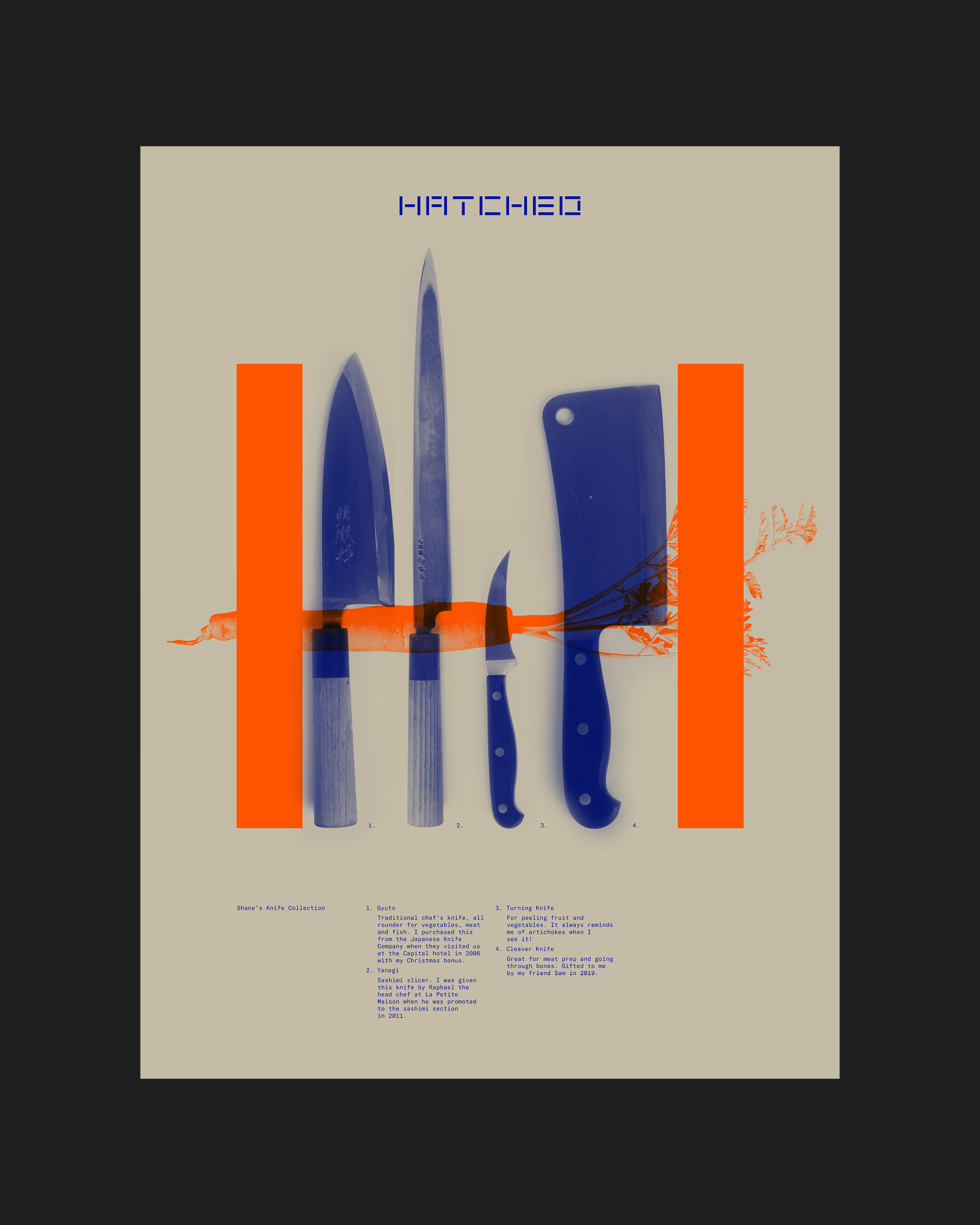
Menu
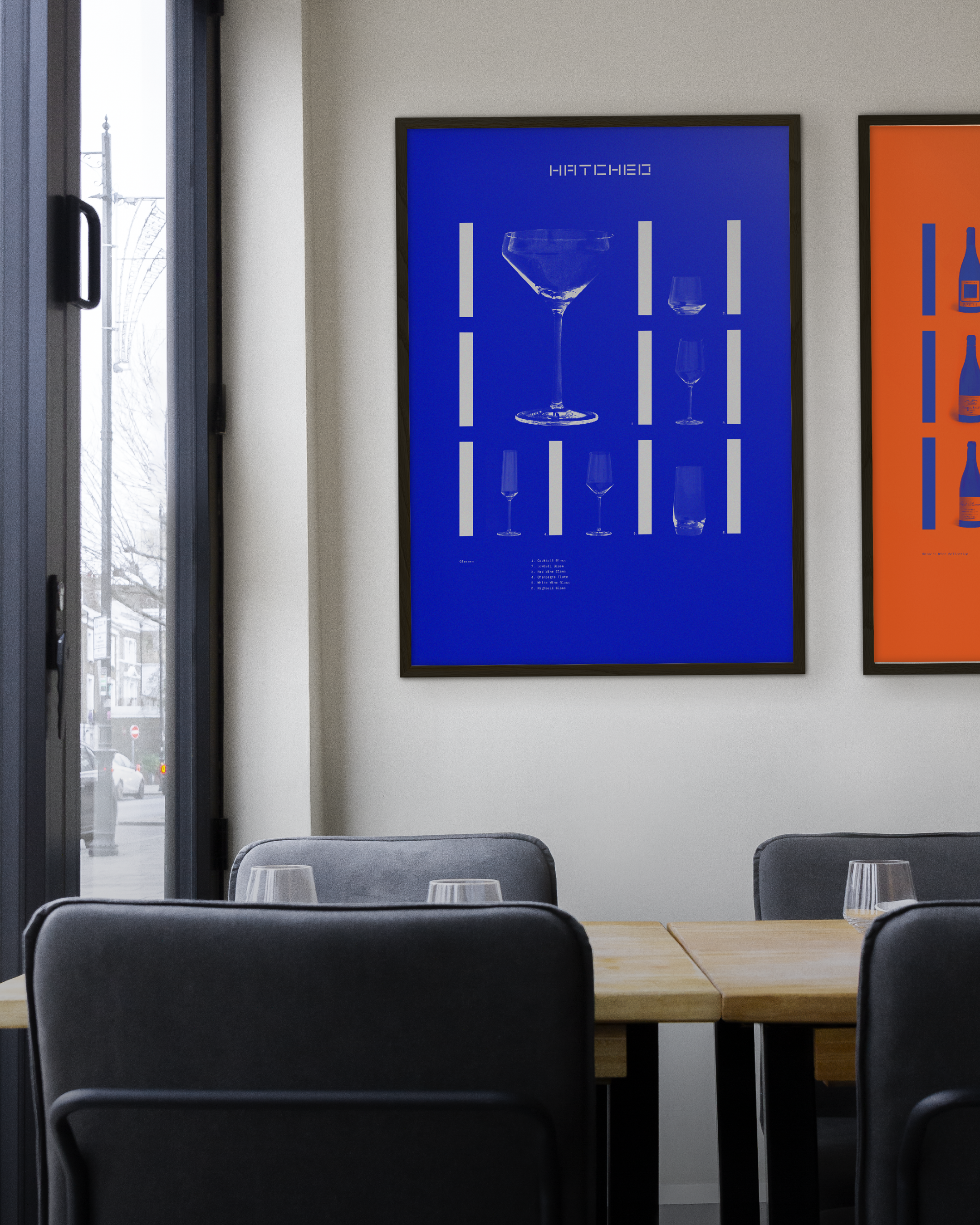
Posters in situ
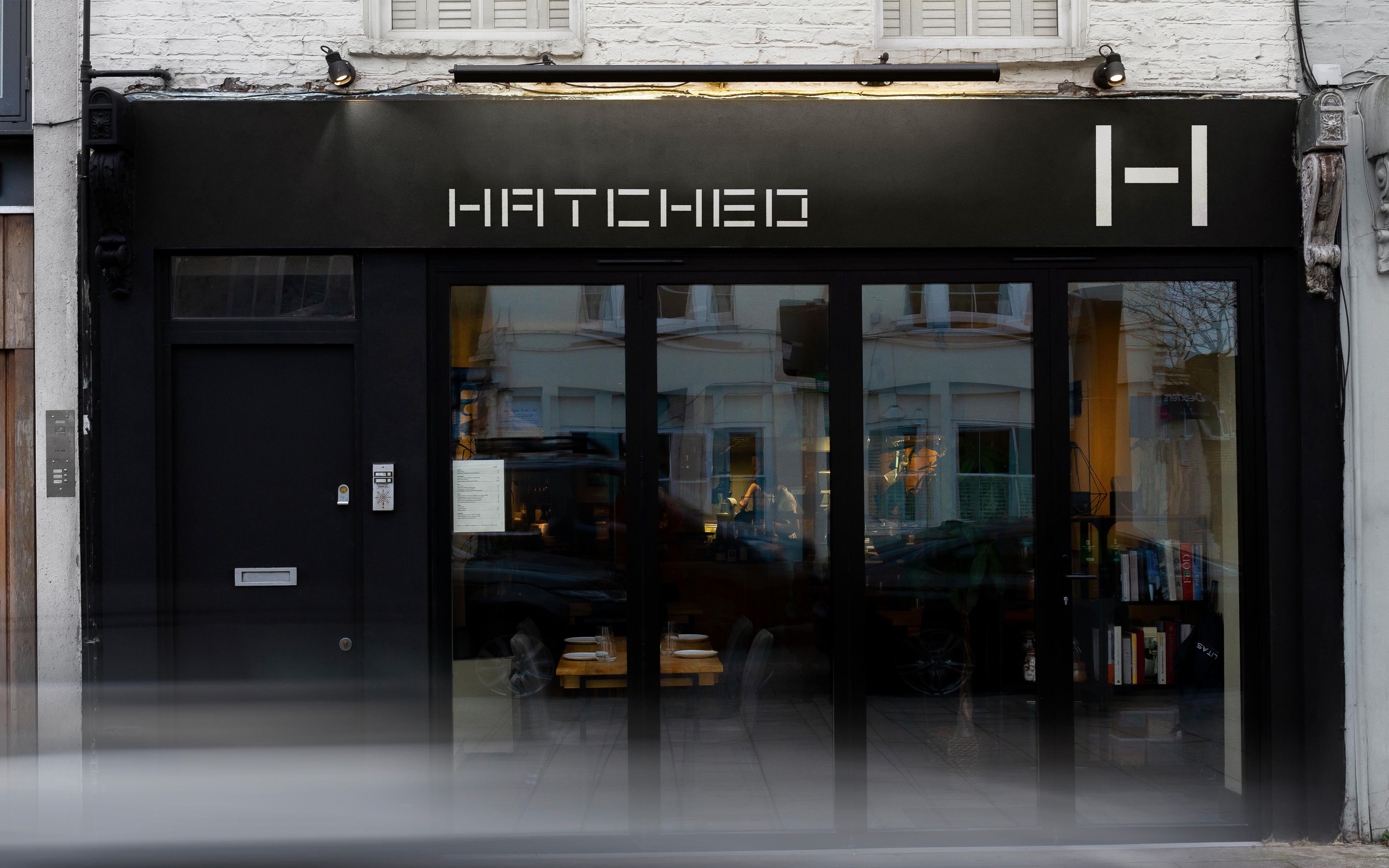
Located a stone’s throw from SPIN between Clapham Junction and Wandsworth Town, Hatched is the passion project of owner and chef Shane Marshall, where he strives to deliver exciting dishes from around the world in a welcoming setting. A seasonal and sustainably sourced menu plus a relaxed, modern atmosphere showcase all the elements that make restaurants vital.
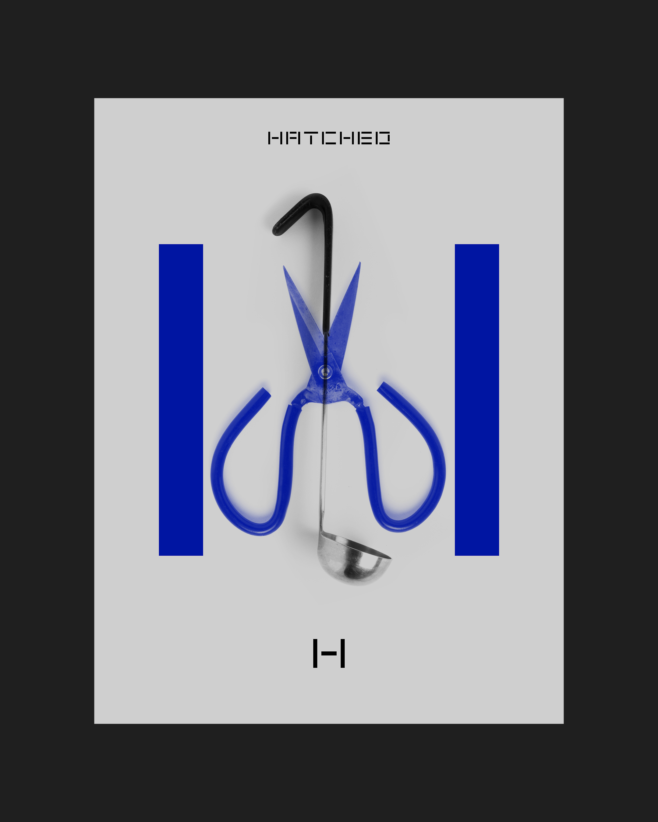
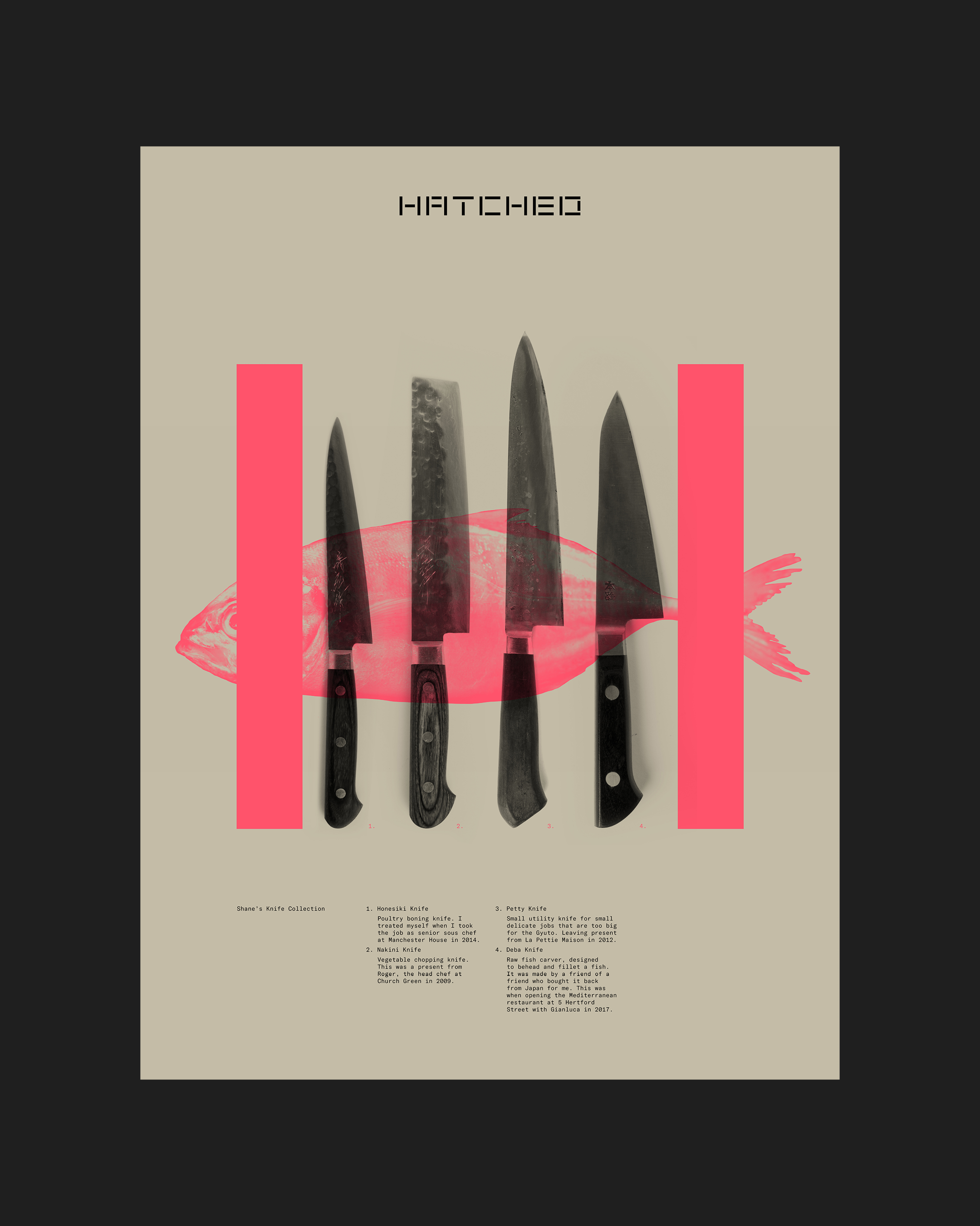
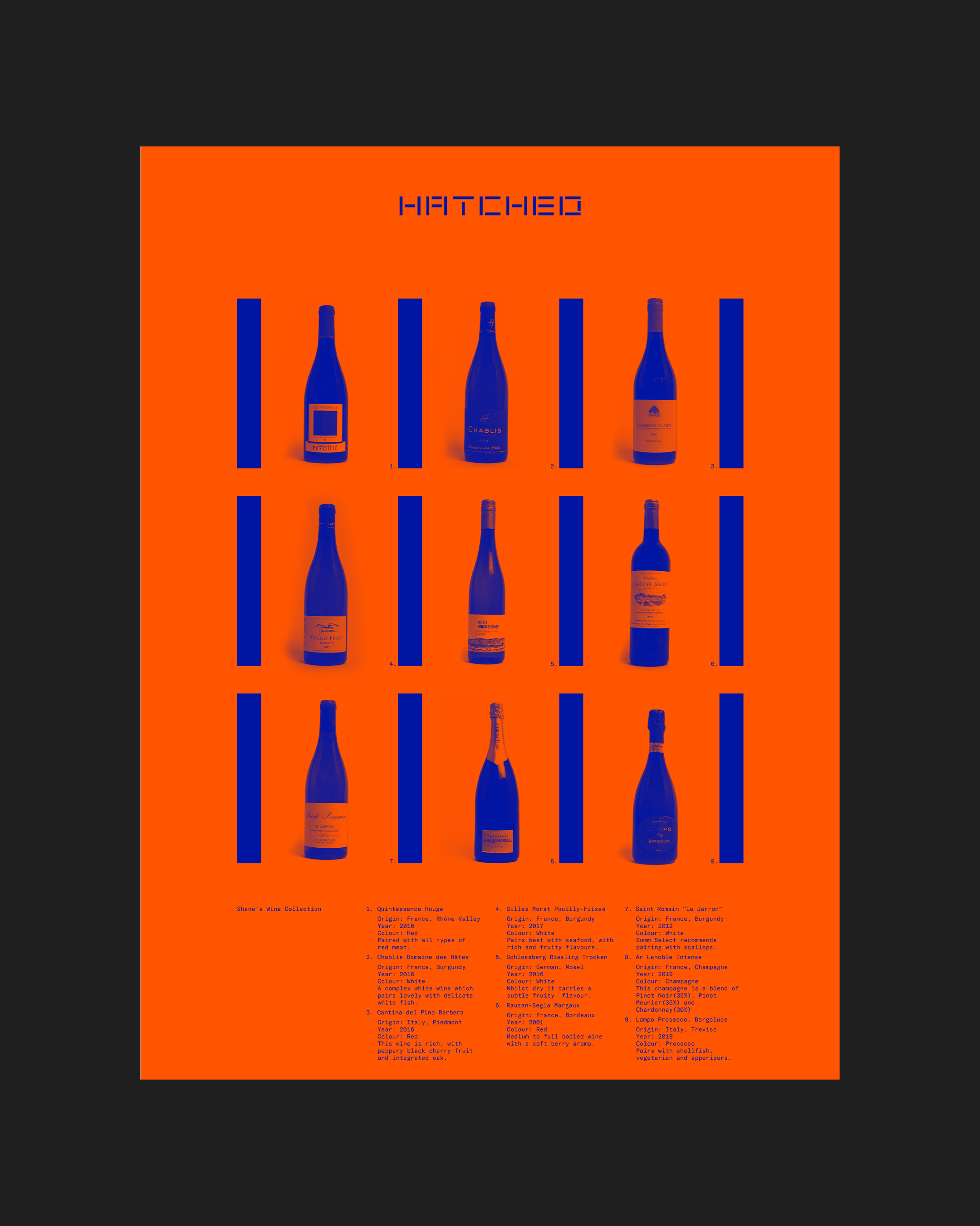
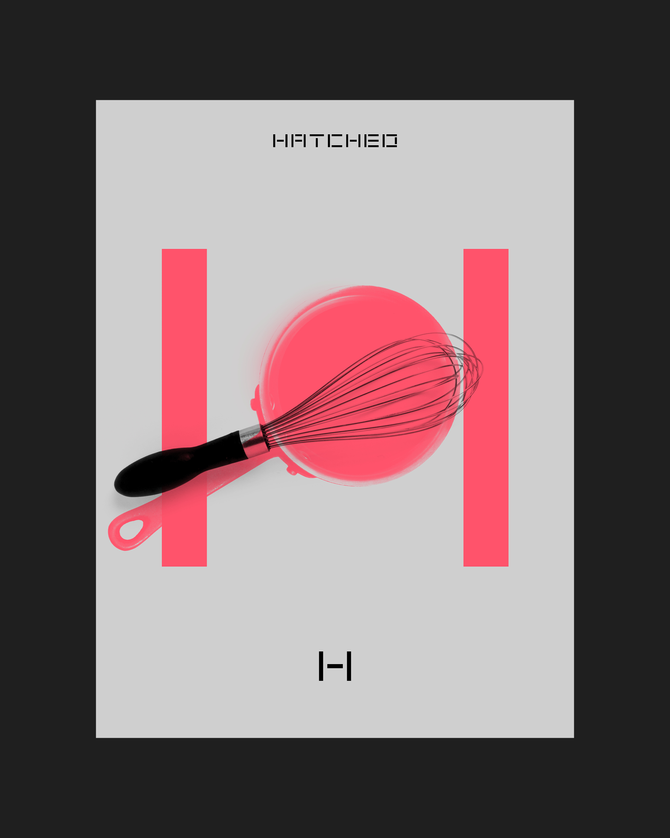
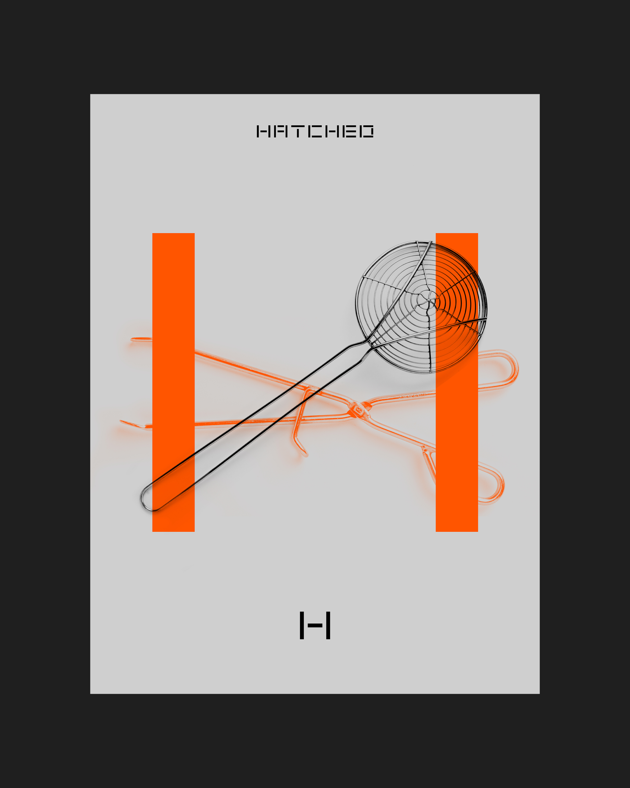
The initial identity we developed for Hatched is built around a logo which renders the restaurant’s name in bespoke stencilled letterforms for a bold, ultra-contemporary feel. The development of this into a full-scale visual language was informed by a happy discovery: that once two upright bars had been established you could put almost anything between them and it would read as the Hatched H.
Following this formula, the strong, fundamental form of the mark works in combination with playful photography, depicting various kitchen ingredients and utensils, to produce various spins on the H letterform. The same effect is translated into animations by incorporating short clips from the preparation of Hatched dishes. Together with unusual colour combinations, this brings out the rich and detailed nature of Hatched's philosophy, which centres around the unexpected synthesis of beautiful quality ingredients. The flexibility of having a varied colour palette gives the option to create a variety of moods, from serious through to upbeat, which keeps interest high and allows for moments of delight.
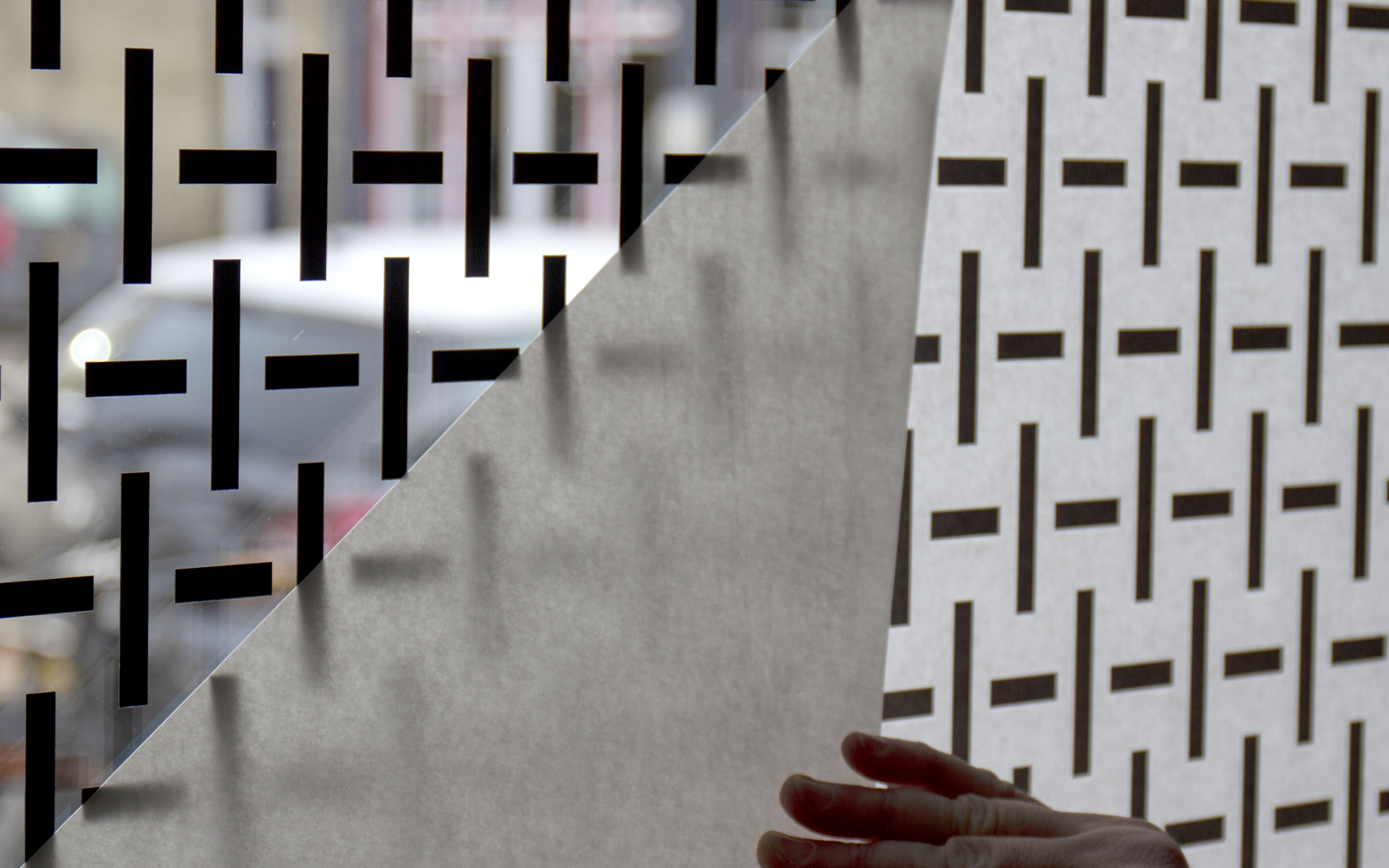
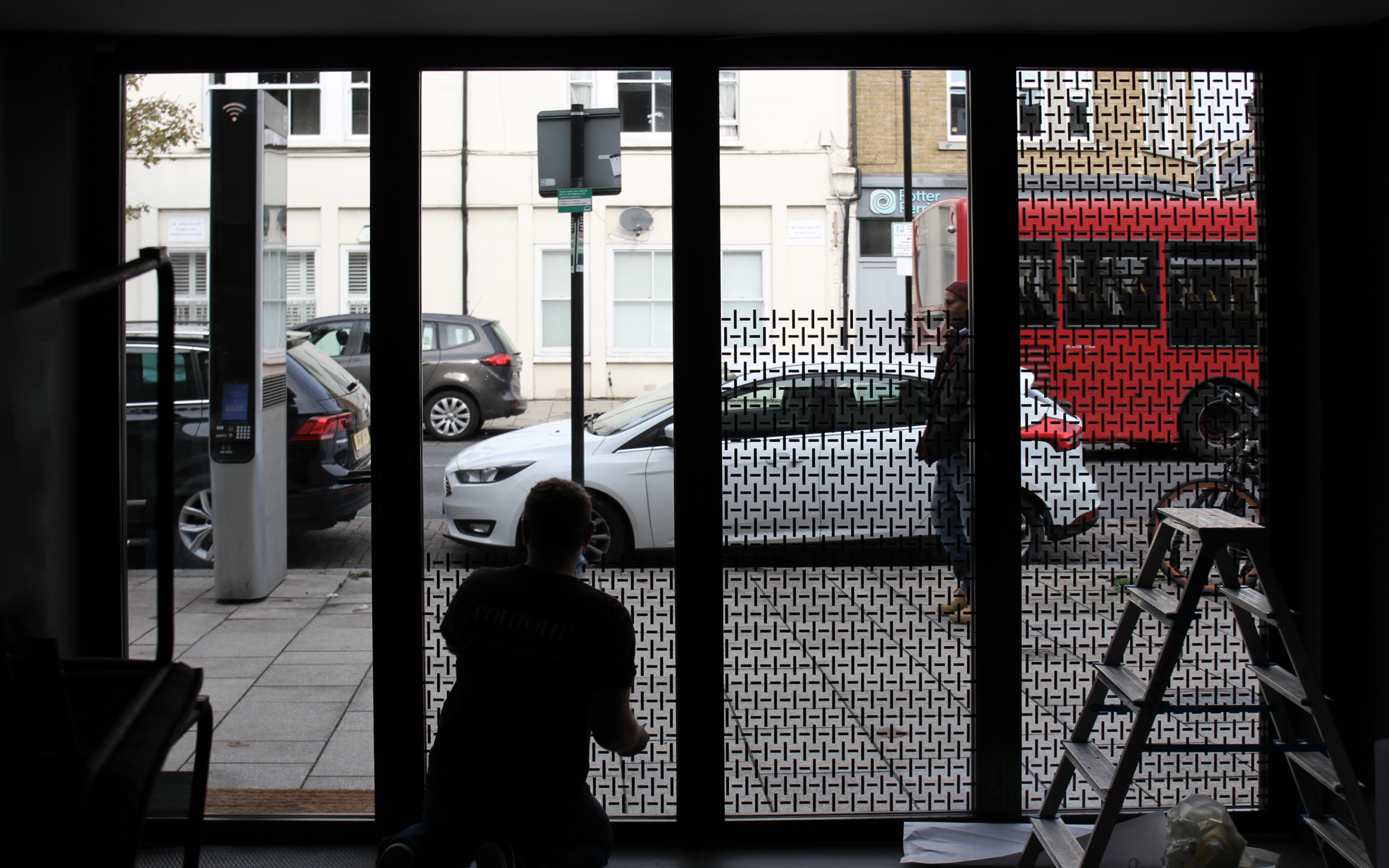
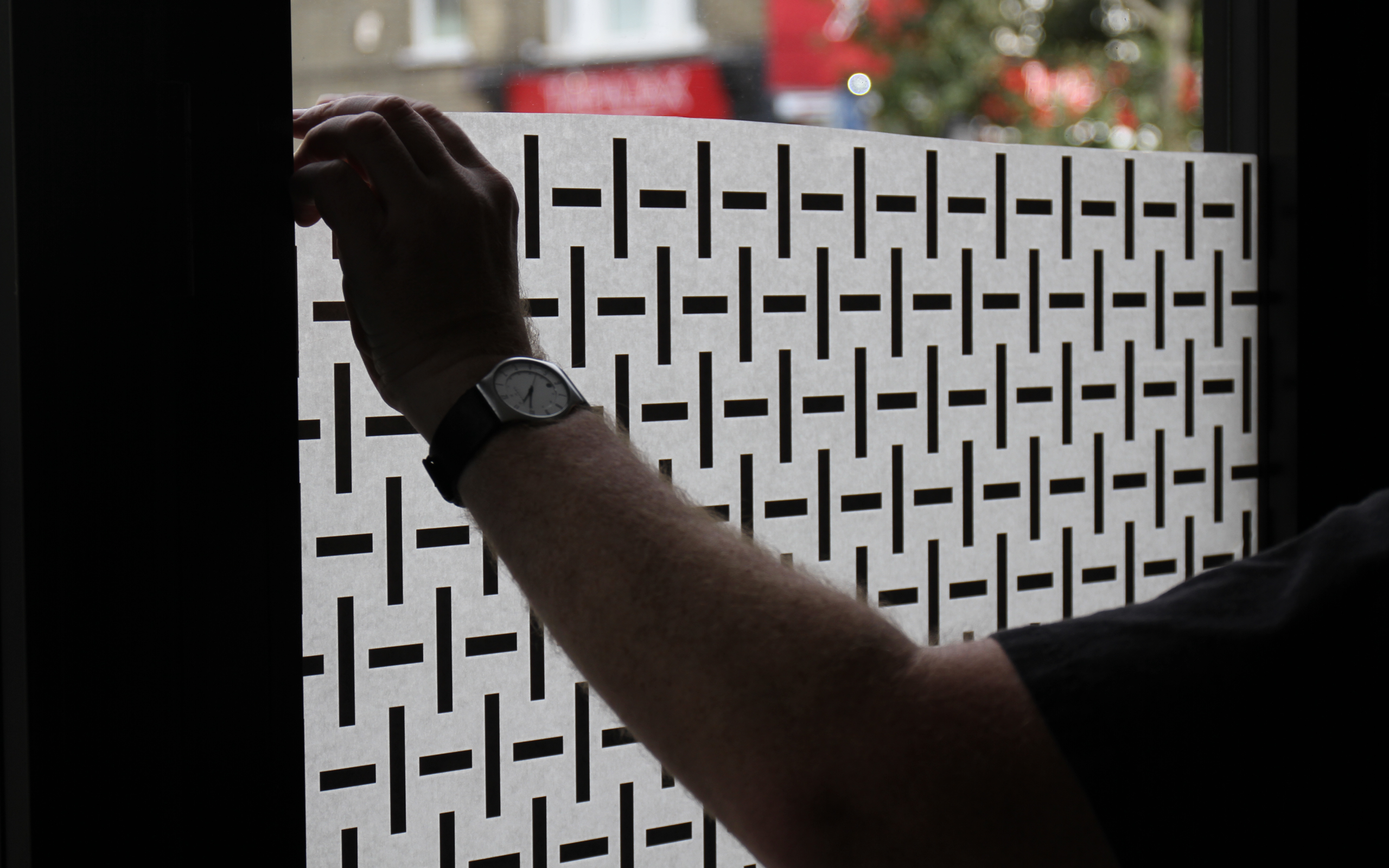
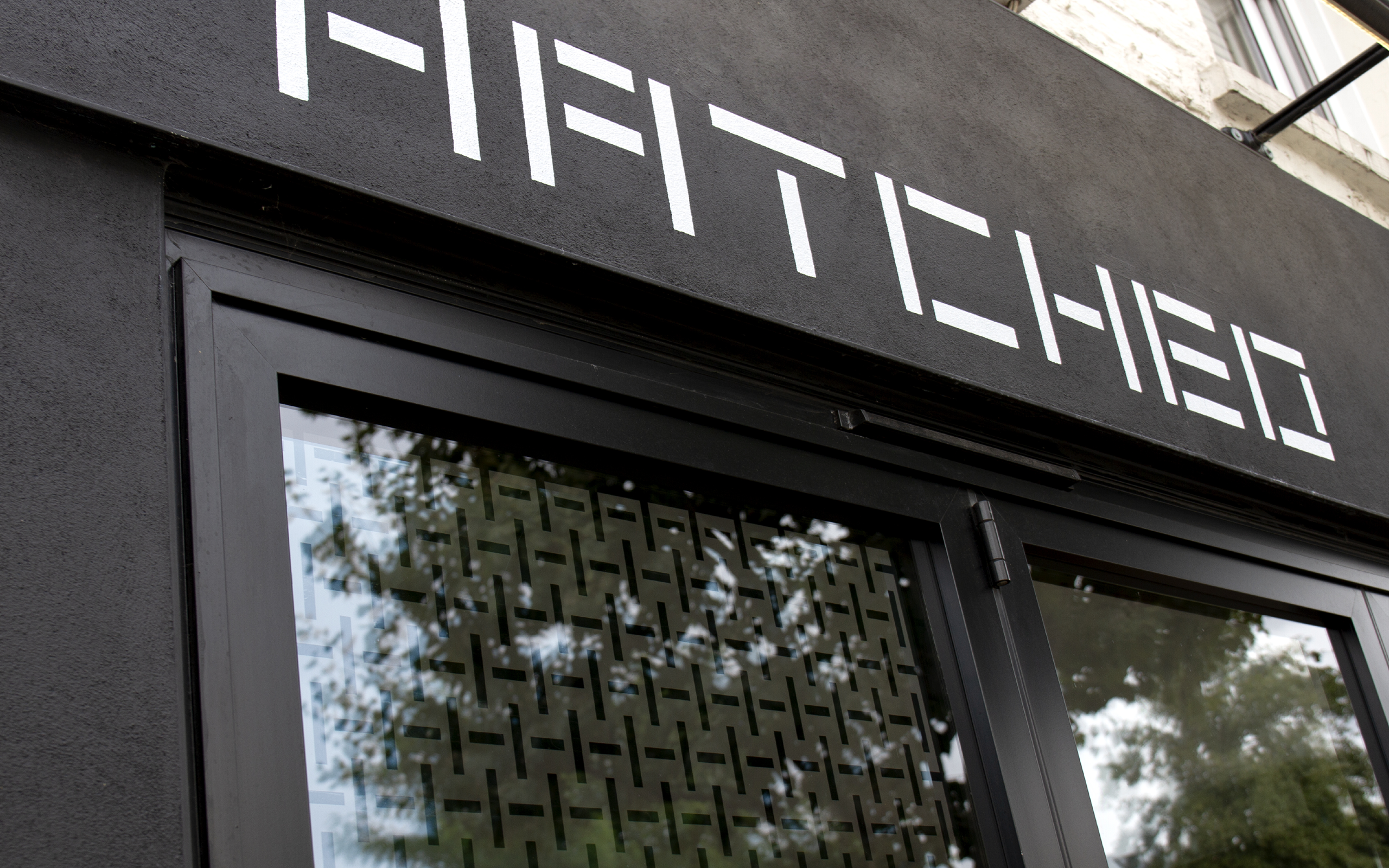
Restaurant facade and windows