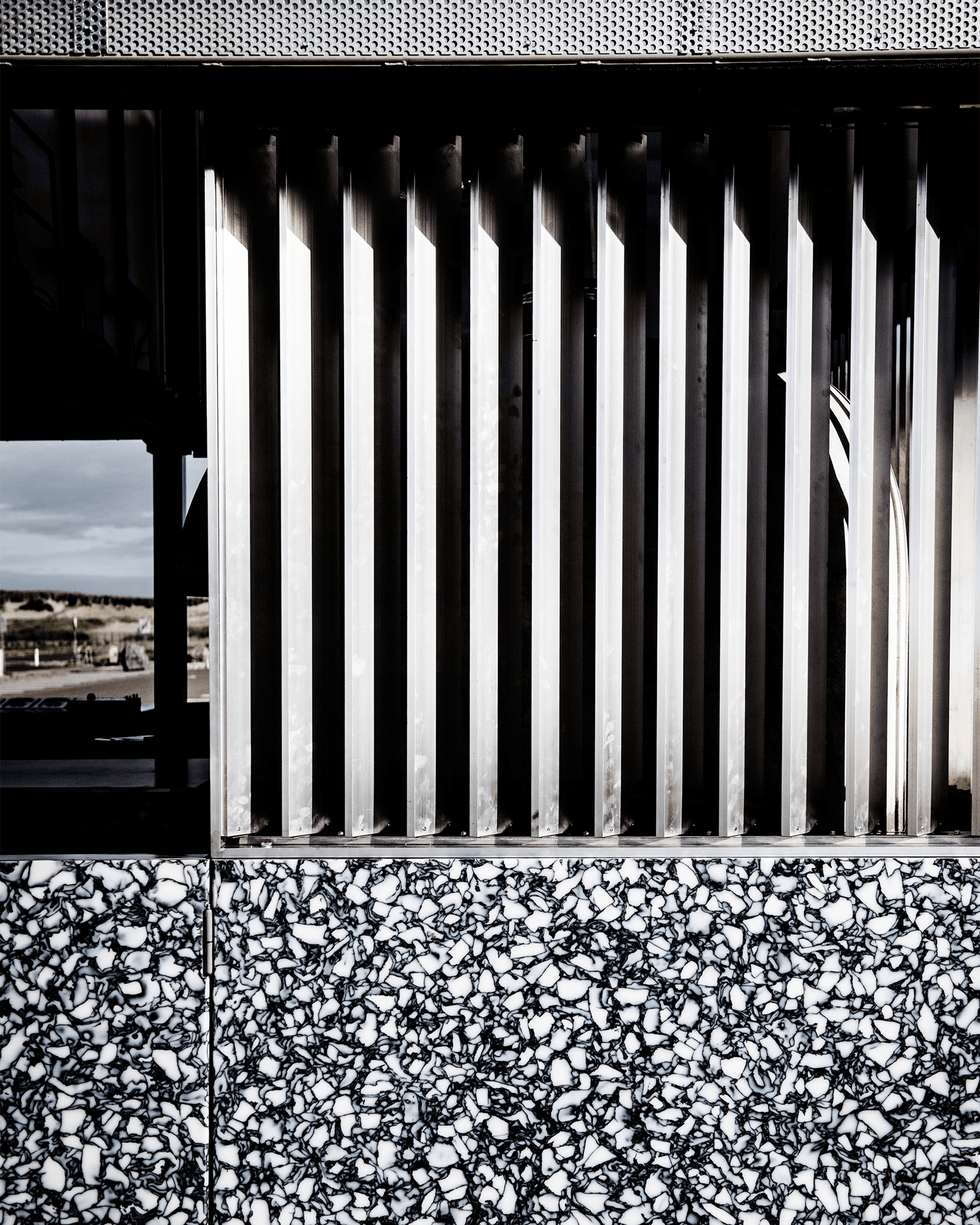
Materials by Smile Plastics
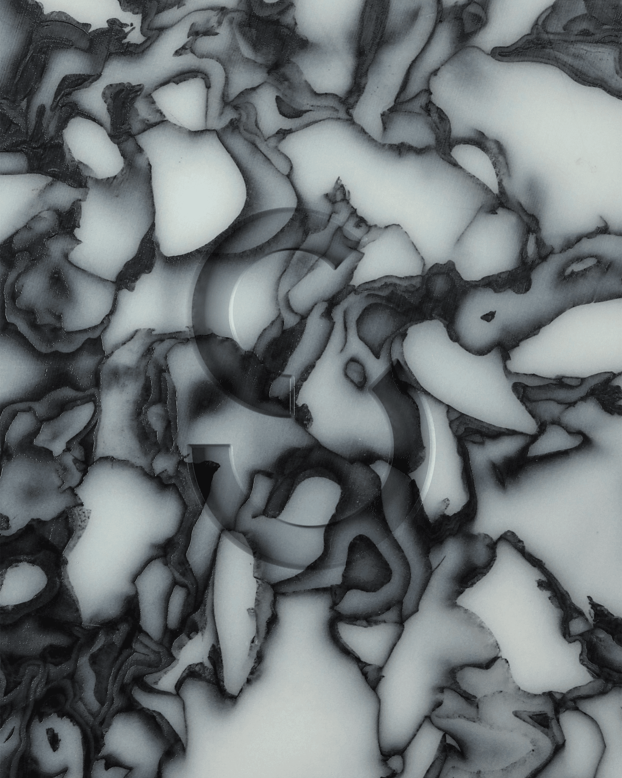
Smile Plastics is a materials design and manufacturing house that transforms plastic waste into unique and exquisite materials for the architecture and design industries. They offer a ‘classics’ range of panels, plus limited editions and a bespoke materials service; applications range from small products to large-scale installations in both residential and commercial settings.
Animations
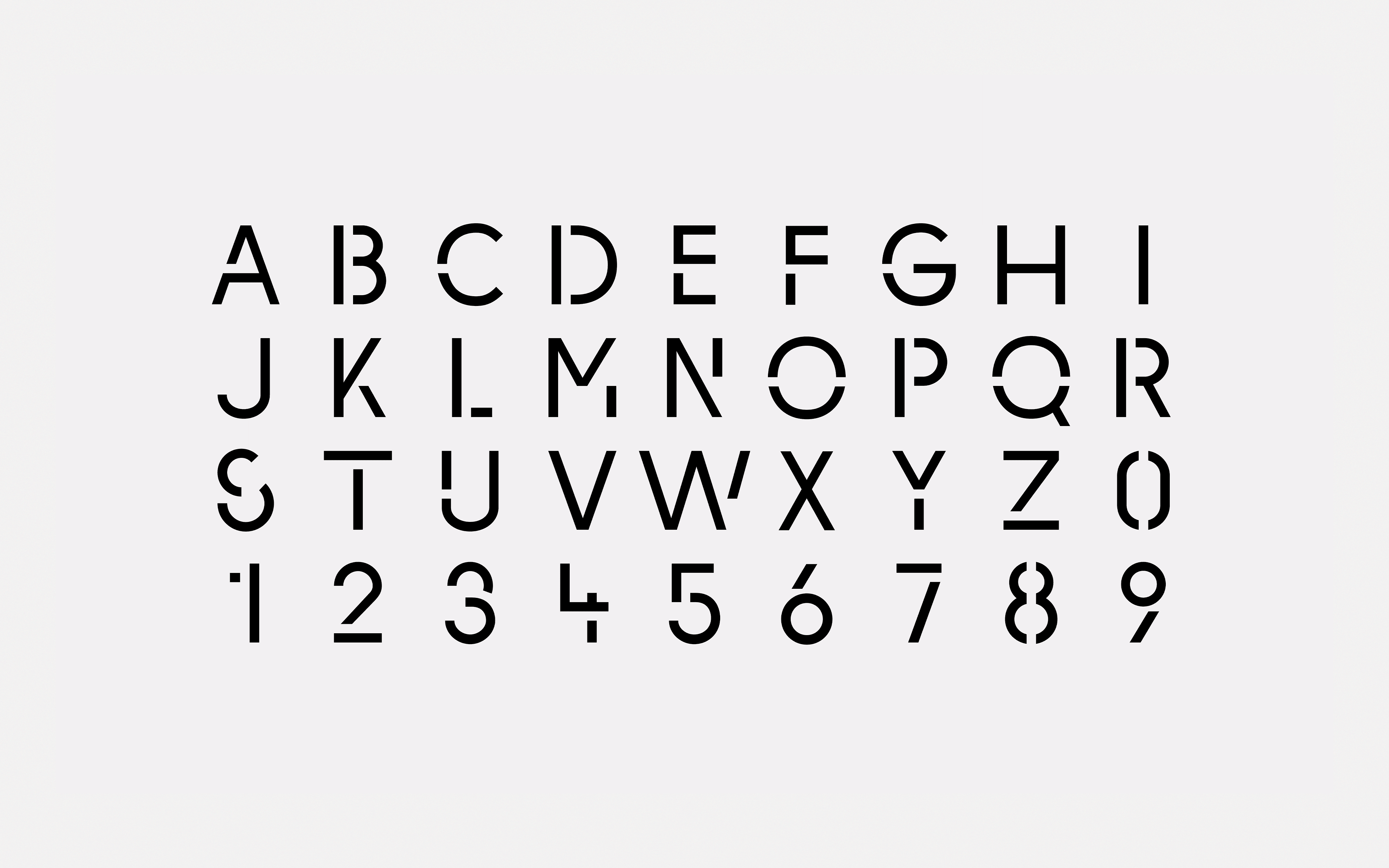
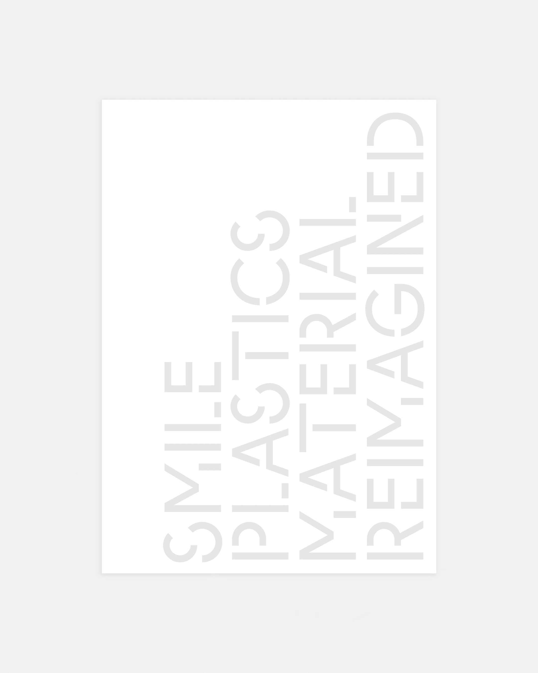
Bespoke display typography
In the context of sustainability and other ecological concerns increasingly driving the choices we make, Smile Plastics are part of a vanguard of visionary designers imagining new and better ways of living. Creating decorative panels from 100% recycled (and 100% recyclable) materials, their mission is to change people’s perception of waste and material life cycles via innovation.
Having spent a decade developing design solutions for the reuse of waste materials, award-winning design partners Adam Fairweather and Rosalie McMillan re-established Smile Plastics in 2014, focusing on new technology and industrial ecosystems. They also began to evolve the company’s design and to grow its product range. Their success since then is reflected in their clientele, which includes Stella McCartney, Acne Studios, Christian Dior, Paul Smith, Selfridges, Liberty, Cos, the Wellcome Trust, Droog, LUSH, Heals and Ace Hotel.
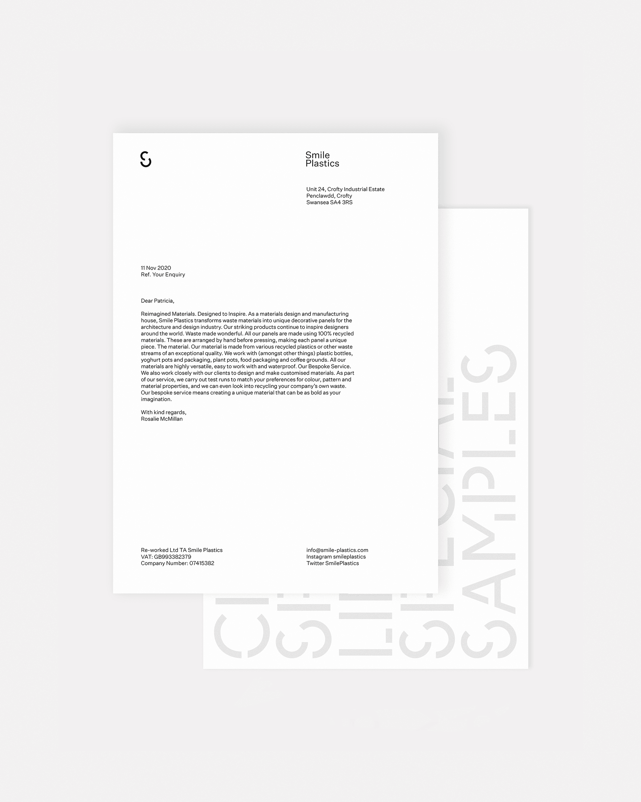
Stationery
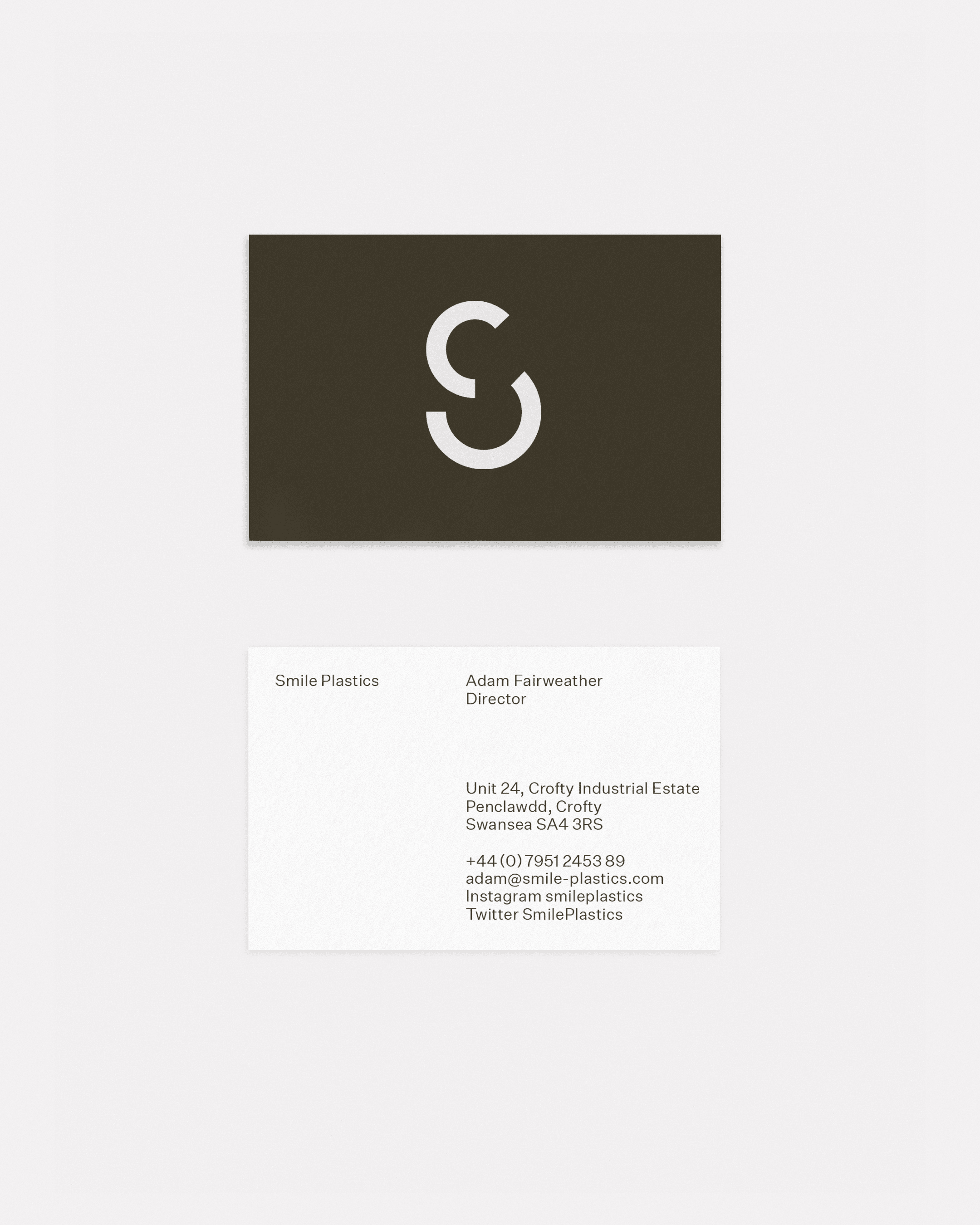
We created a flexible programme that suggests myriad visual possibilities without sacrificing cohesion. For the deconstructed S-mark, we looked at the idea of circularity in a literal way, taking our cue from Smile’s association with recycling and the circular economy. Experimenting with different ways of using circles to create letterforms, we arrived at a configuration that expresses the idea of cyclicality while also reading clearly as a letter S.
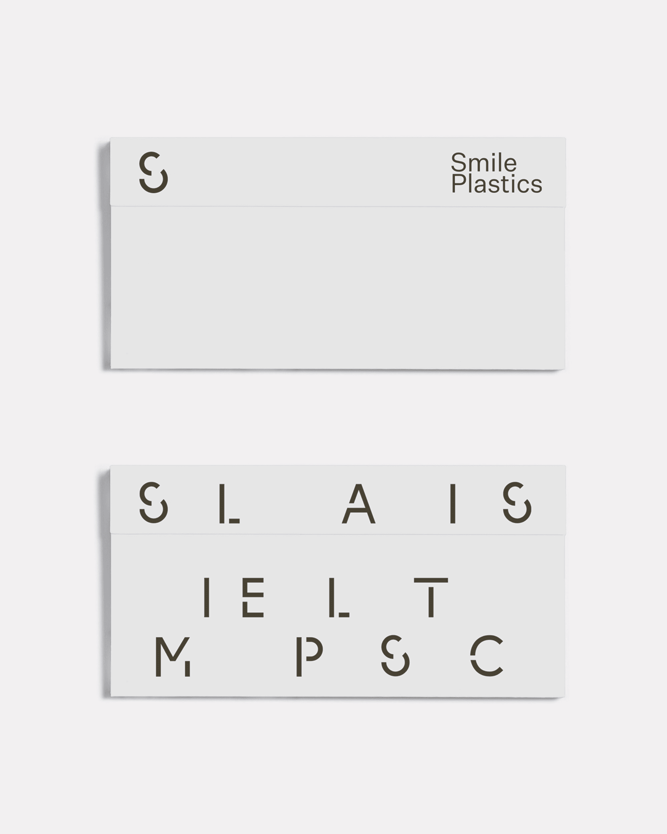
This formed the seed from which we grew a bespoke stencil typeface that hinted towards modularity. Typographic animations play with the company name, treating language as raw material to be ‘recycled’ (a strategy inspired by the way that concrete poetry uses words and letters). In support, we opted for a rounded secondary typeface whose rational form adds to the clarity of the identity. The overall visual language has a crafted quality to it: minimalistic but assured and future-facing.
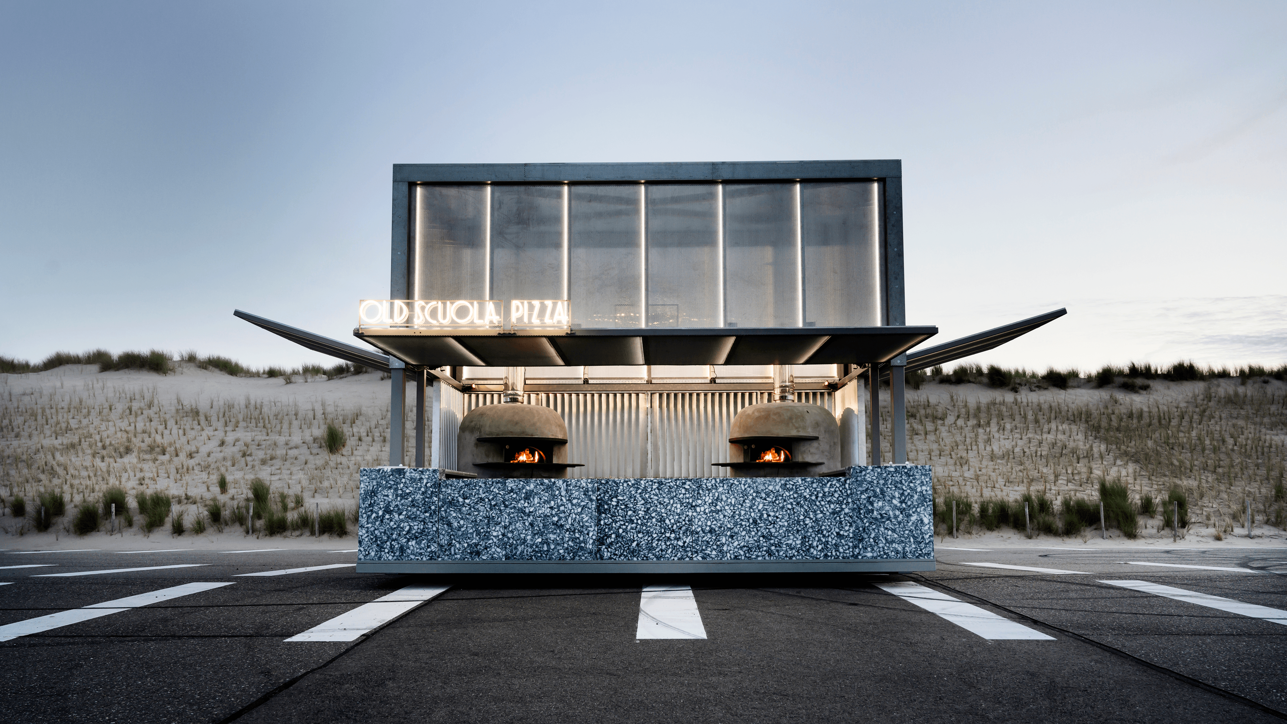
Materials by Smile Plastics
Credits: IWT (architectural design), Jurgen Jacob Lodder (photography)
