Type and colour variants
Sounds Like These is a creative audio company established by four friends in 2014 and located in north London. They offer music composition, sound design and audio post-production. Working across the media and cultural landscape, Sounds Like These have attracted an impressive roster of clients, including Nike, Off-White, Netflix, Google and TikTok. Their work has appeared in animations, television adverts, documentaries, games and more, and alongside their commercial work they also run Beat Club, a community-based jam session for music producers.
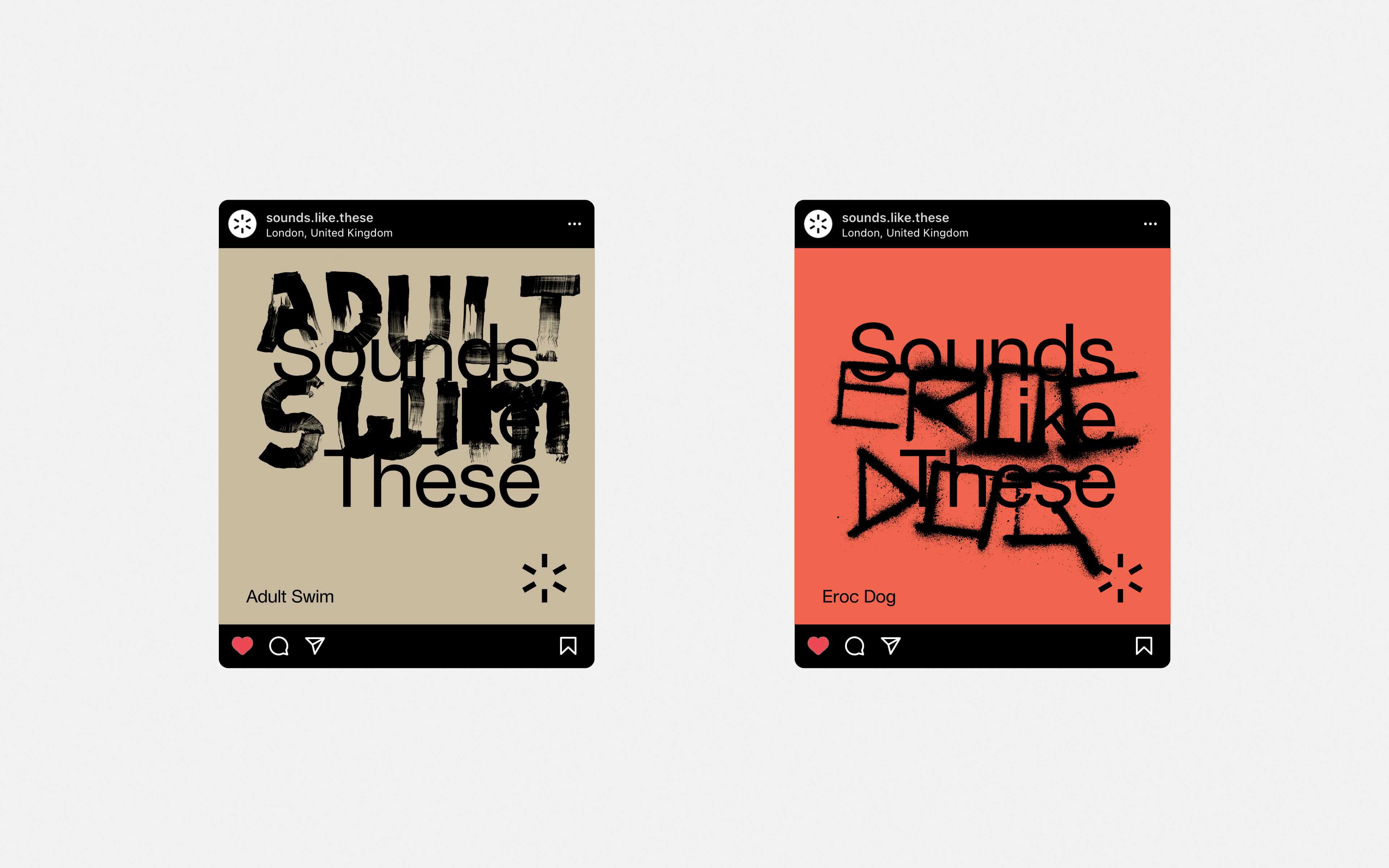
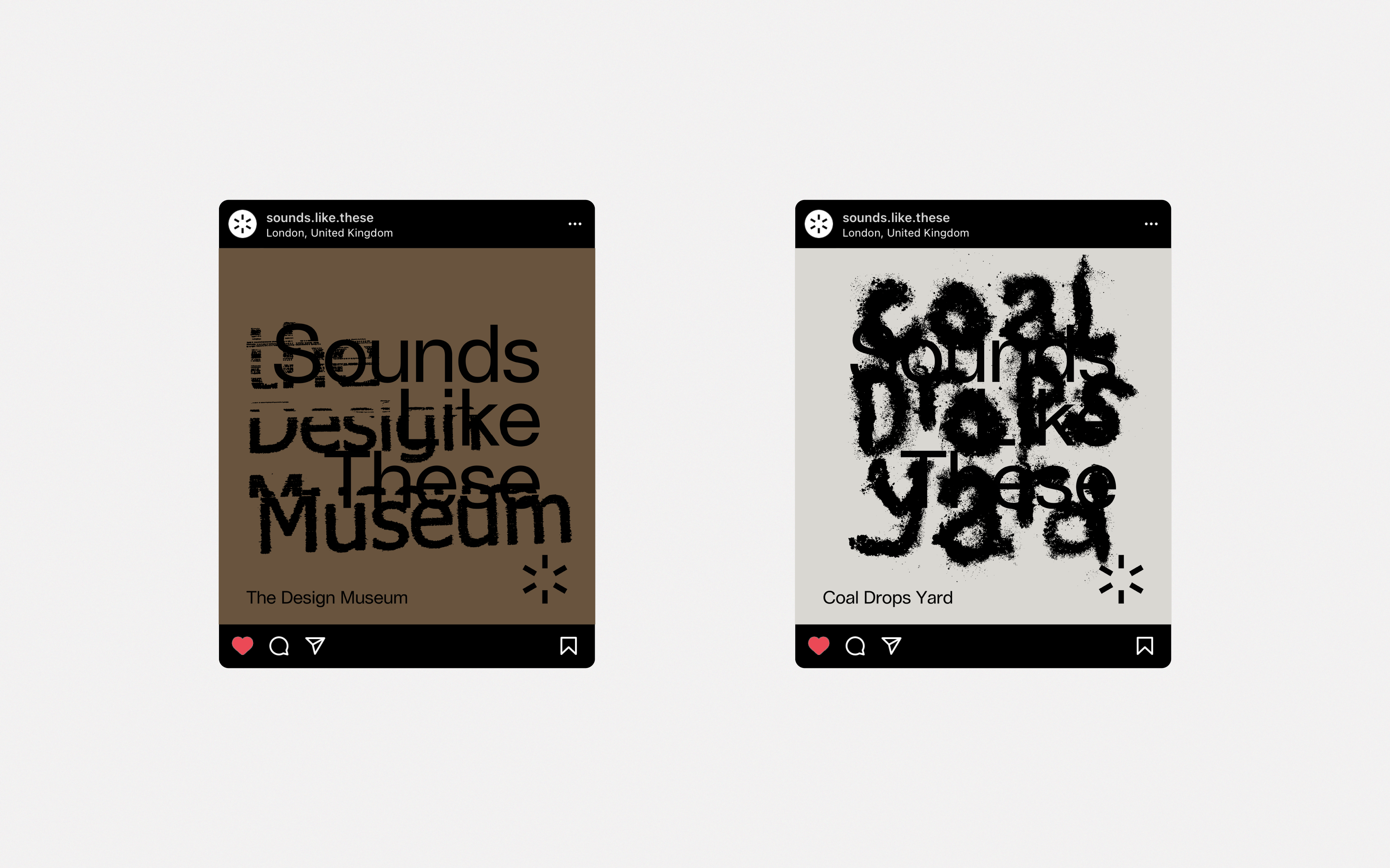
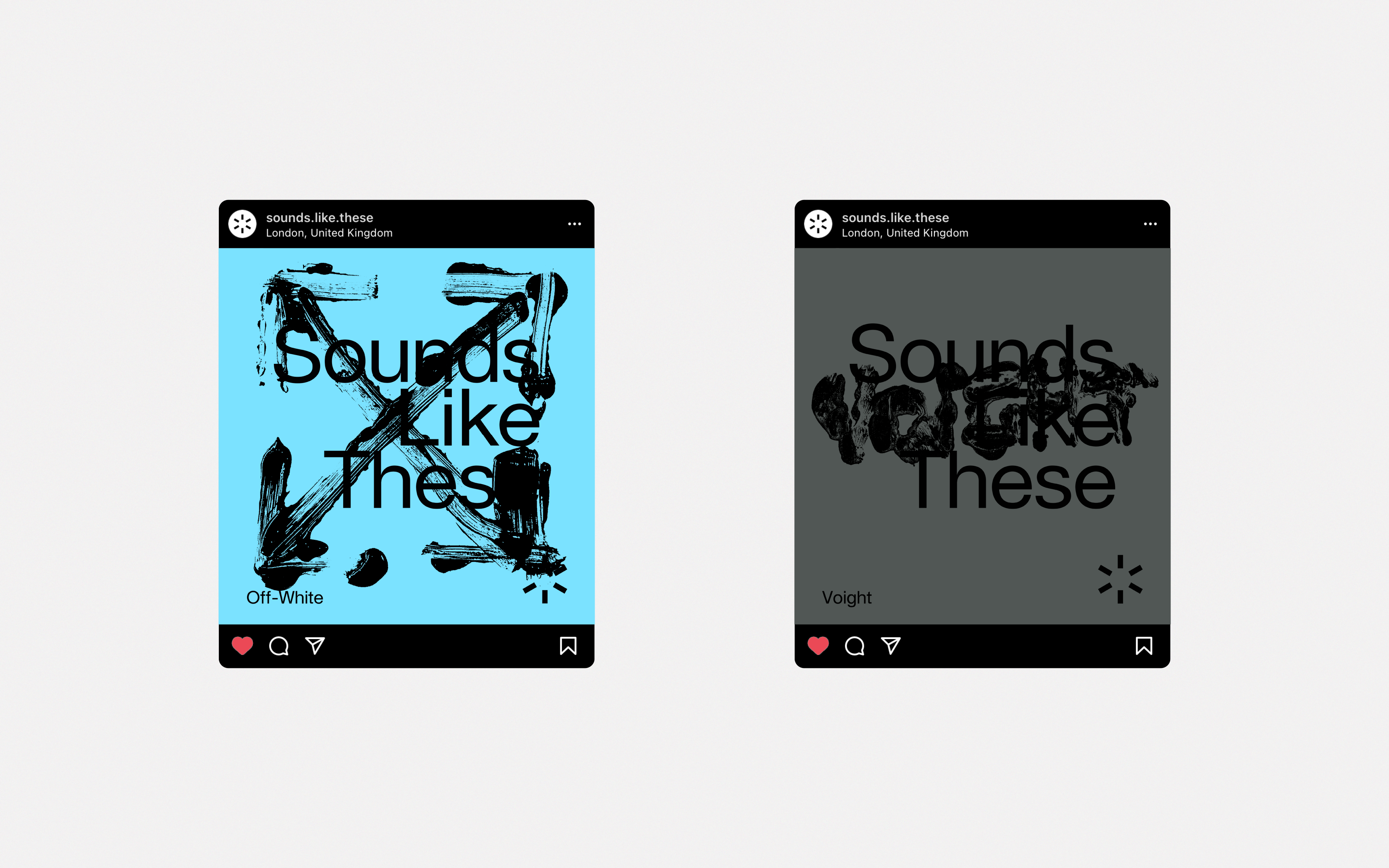
Social media campaign
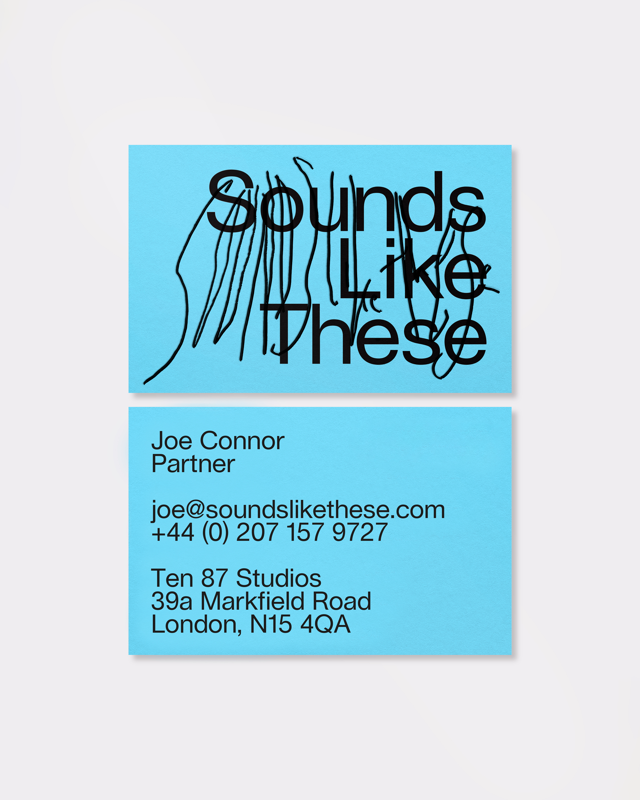
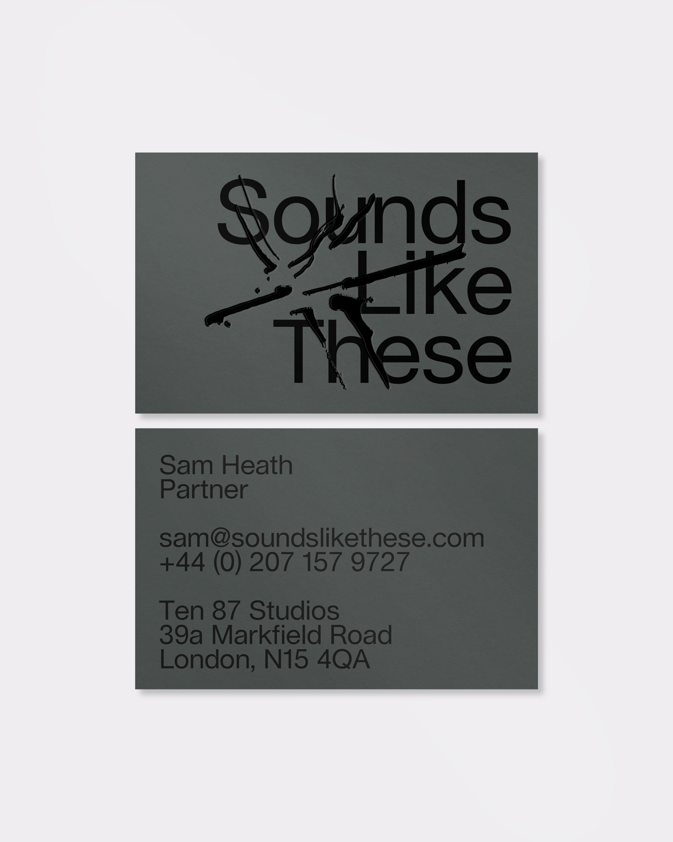

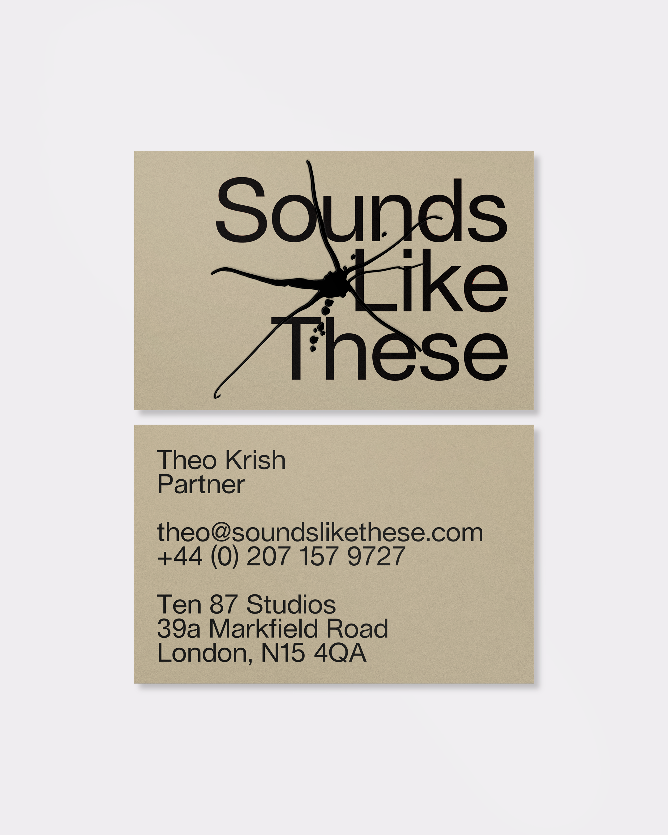
Stationery
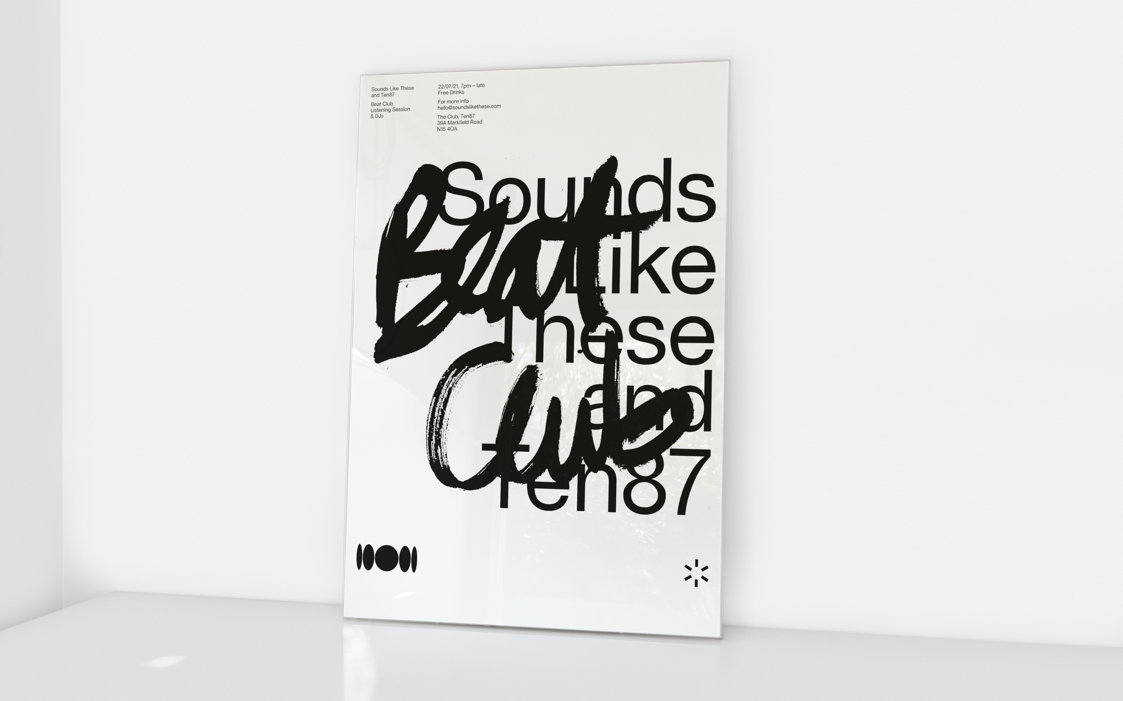
Poster
Sound brings whole new registers of experience into play: it is anarchic rather than ordered, fluid rather than dogmatic. Driven by their innovative approach, Sounds Like These use a variety of sources for creating their sonic landscapes, including traditional instruments, synths and found sounds. They believe that all sound can be musical and so are open to all possibilities.
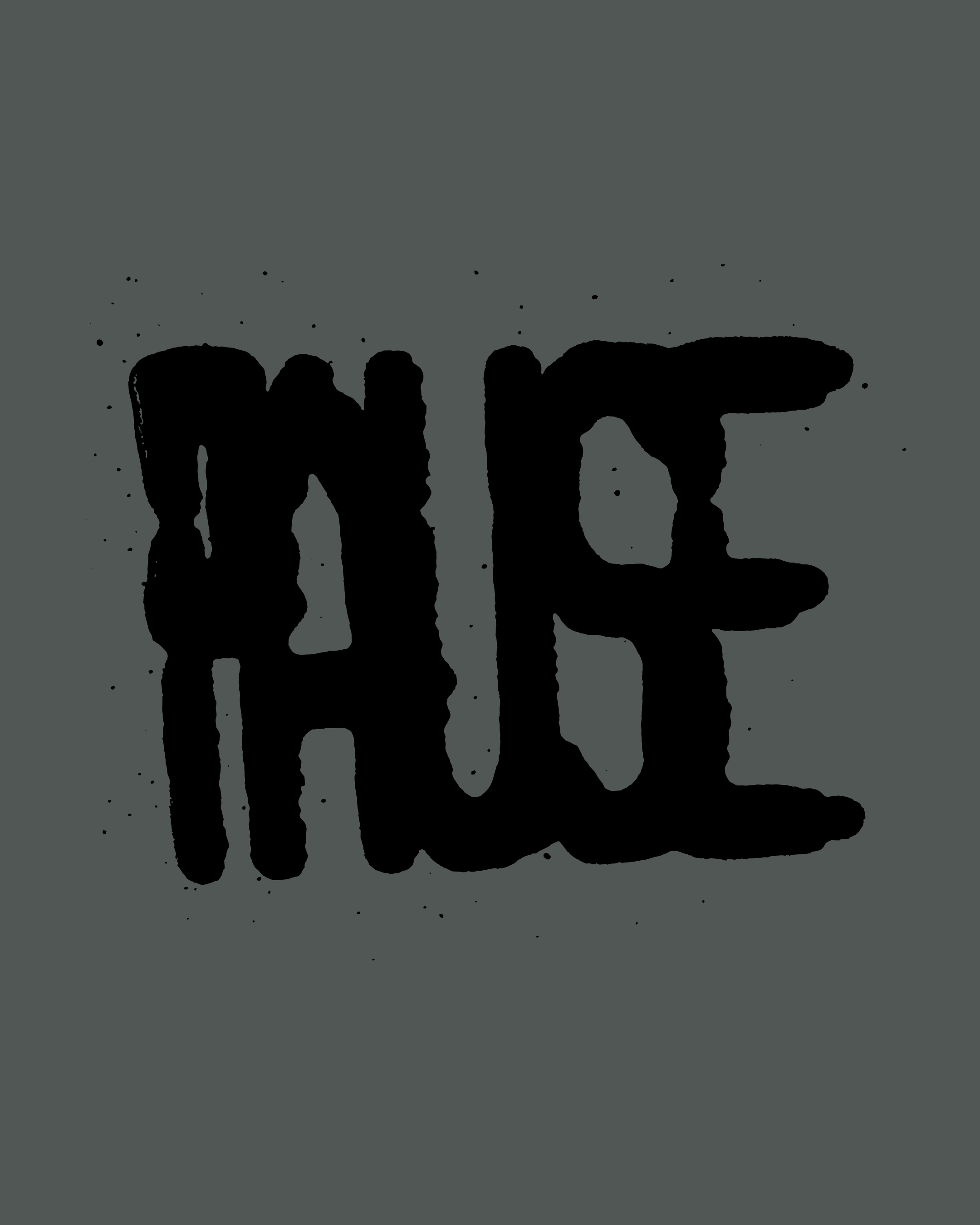
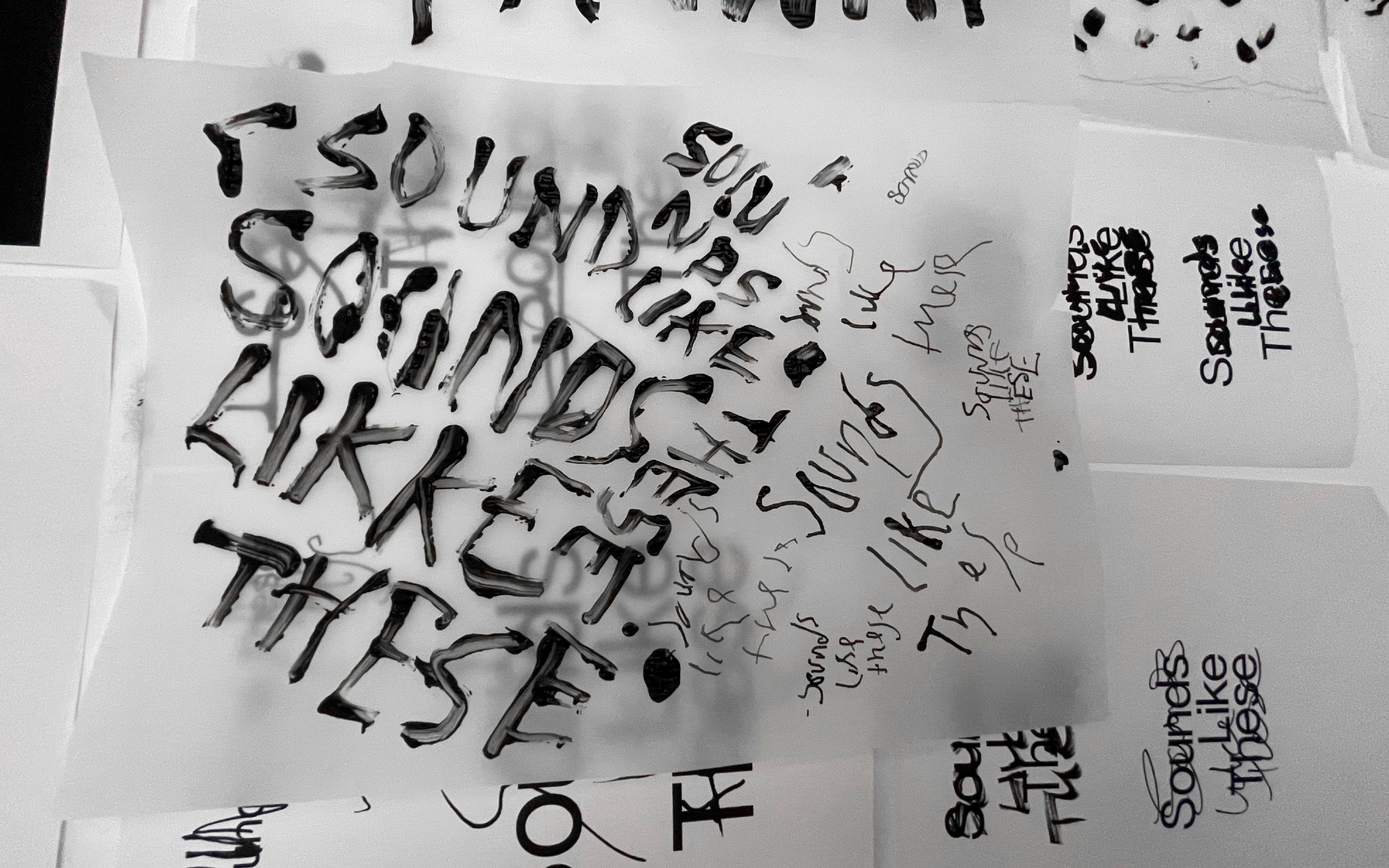
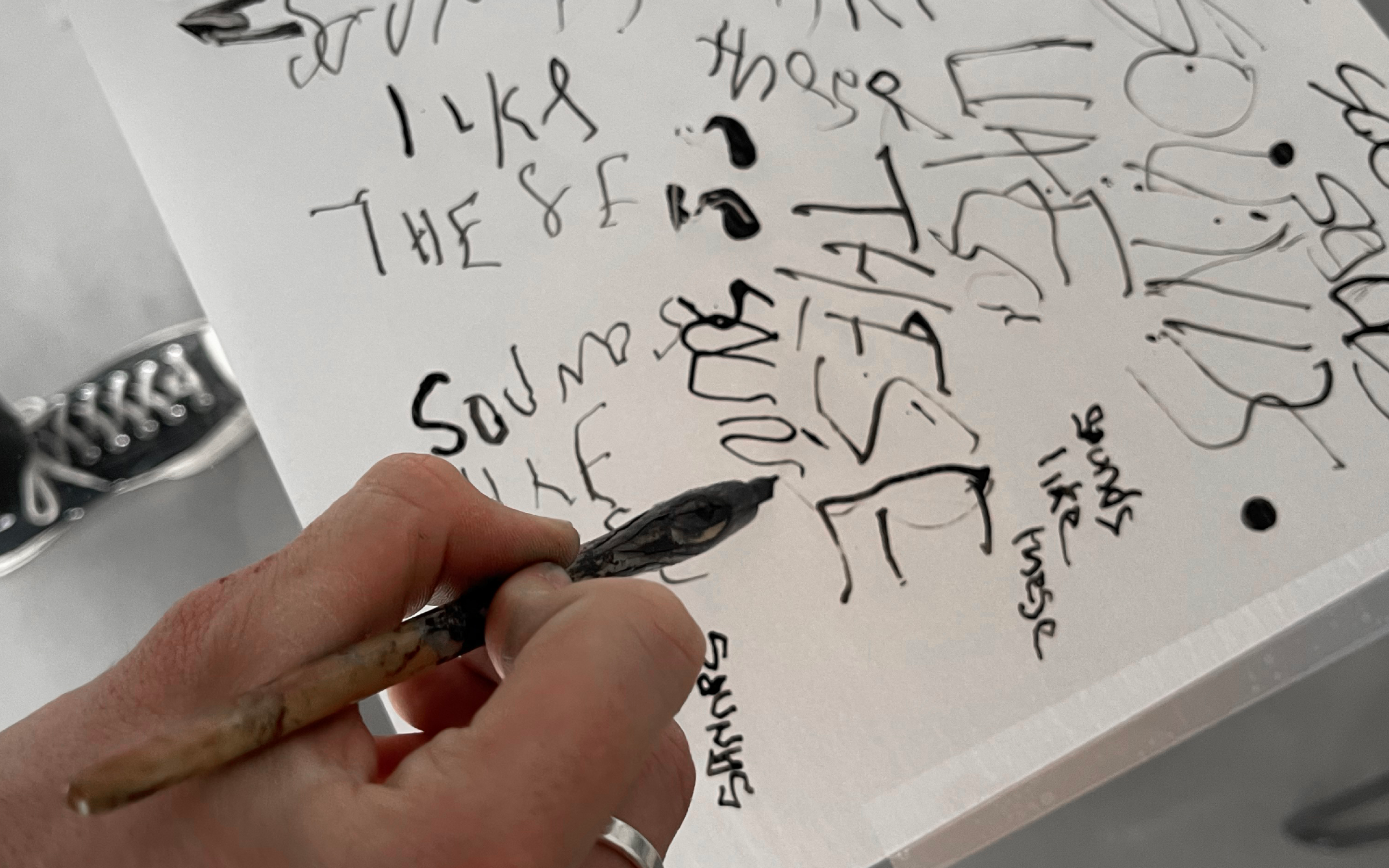
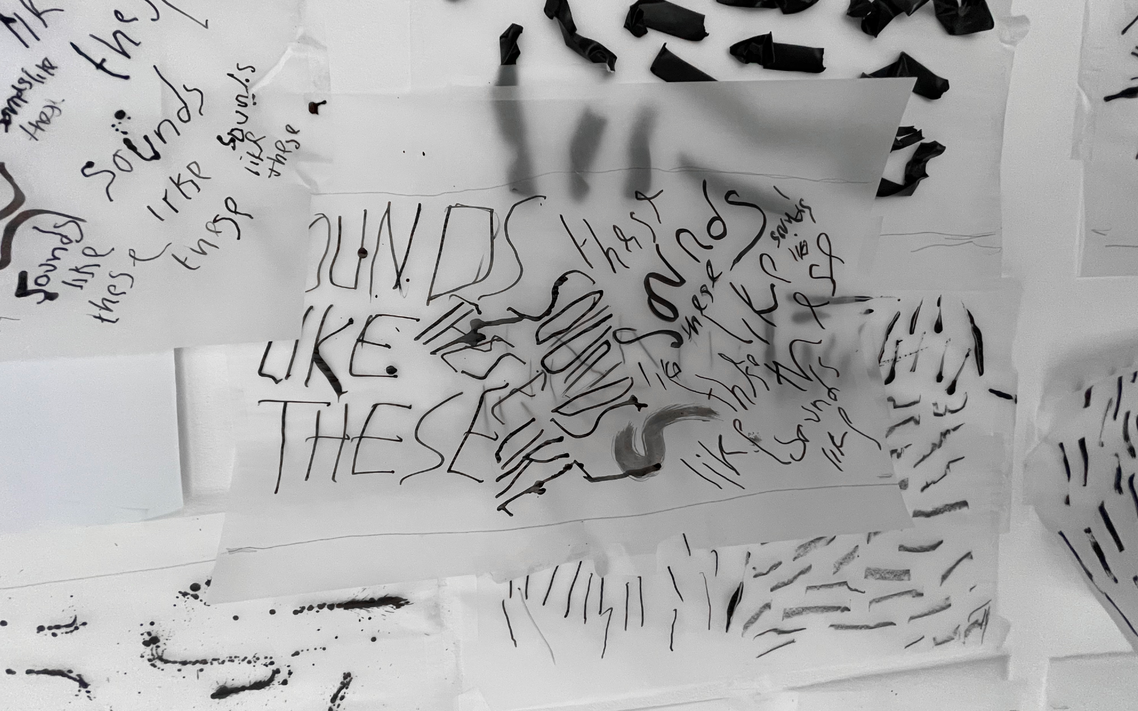
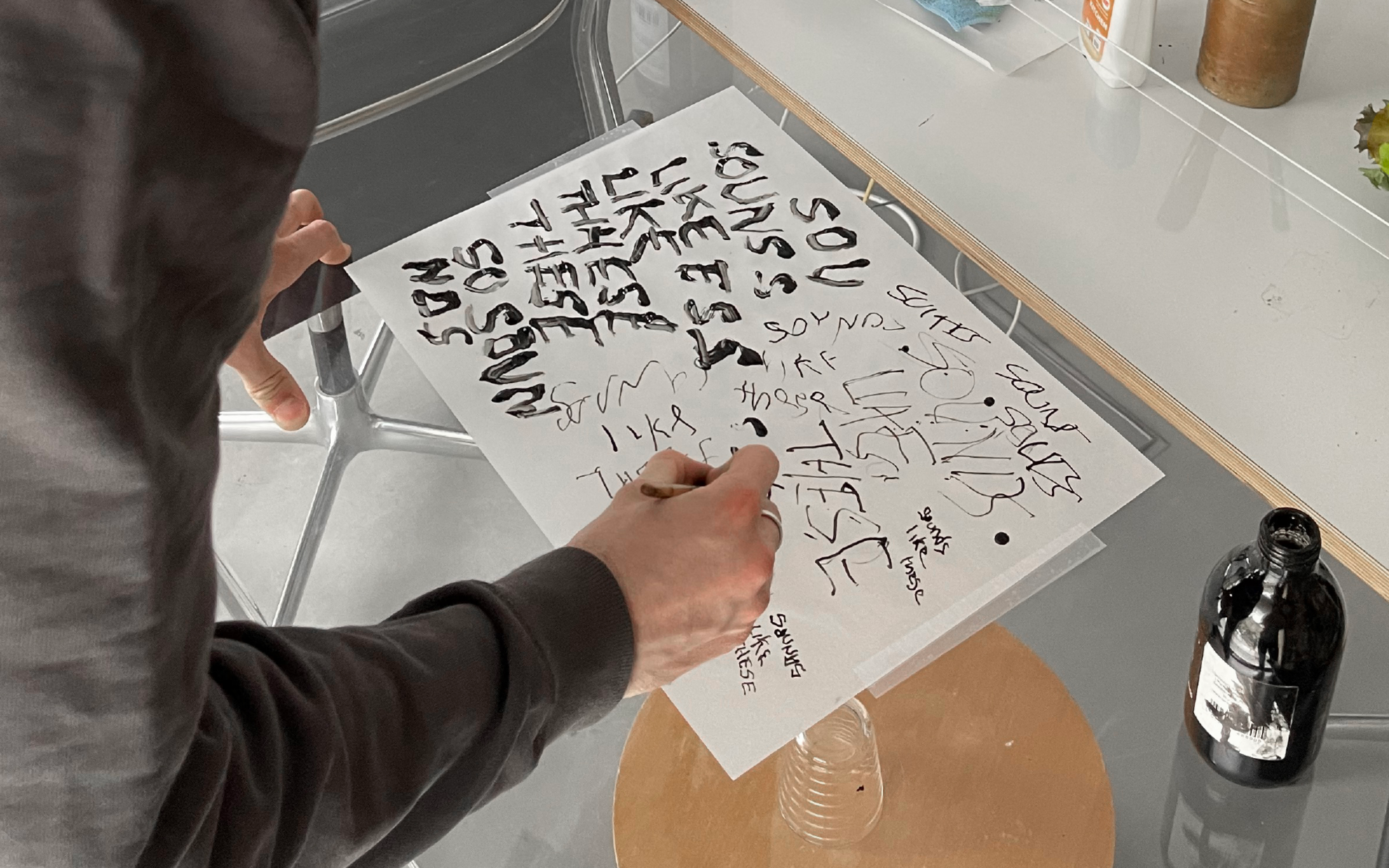
Faced with the challenge of giving a visual personality to a very audible company, we wanted to move as far away as possible from traditional corporate behaviour and instead represent sound in a direct, intuitive way. To do this, we experimented with a fusion of analogue and digital methods, creating a playful and productive clash between the handmade and the computer-generated.
Sonic texture is imported into the identity via raw gestural marks that represent letters, logos or more abstract symbols. This works in combination with an existing typeface, whose rigorous but open form acts as a kind of visual foundation for the grittier, more expressive flourishes we produced. The shadowplay between these produces a real sense of vitality: the result is a varied and responsive identity that matches sound’s unique quality and reflects the breadth of the SLT output.
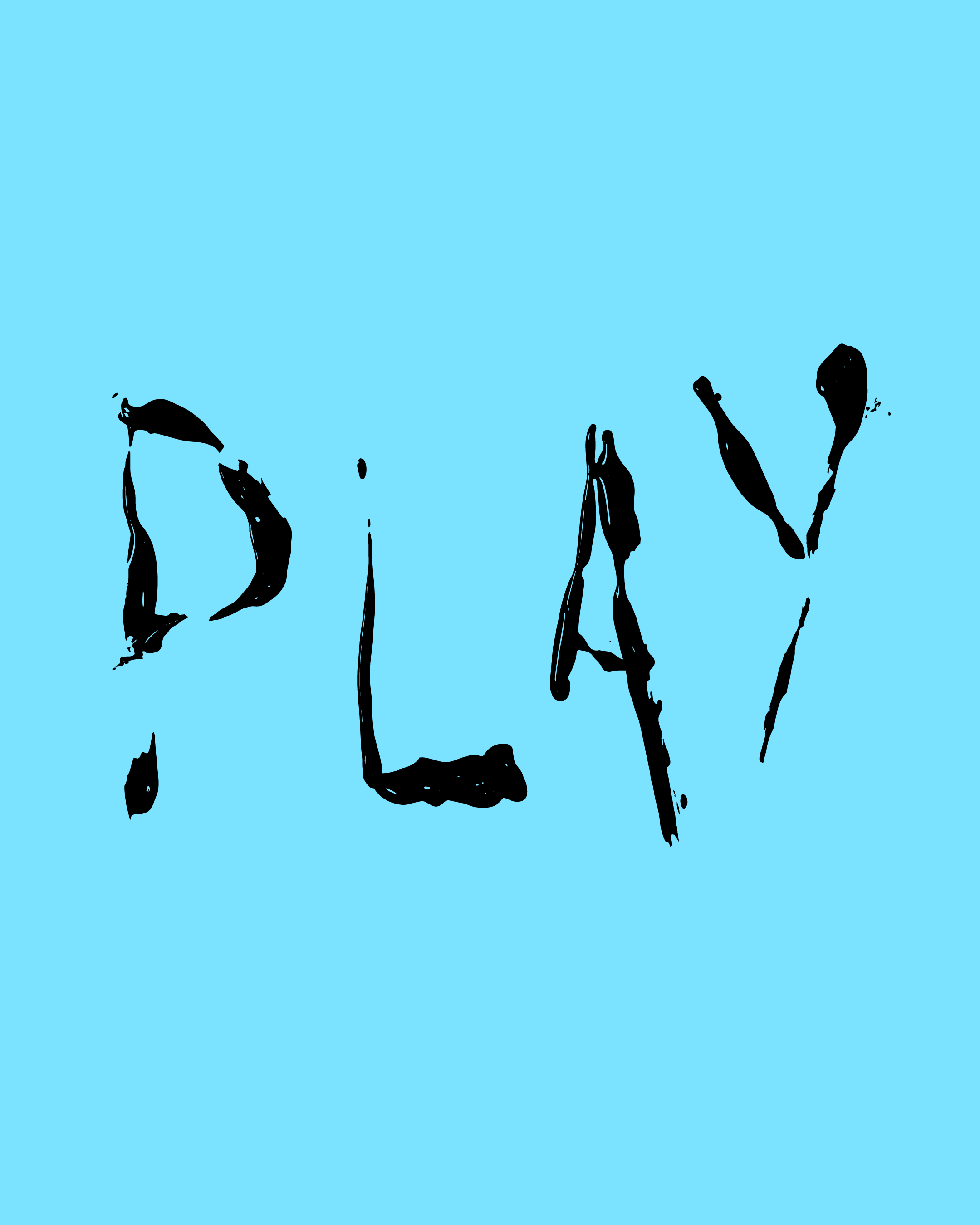
The overall visual language works with a punchy mark inspired by comic-book renderings of noise and a fresh colour palette, with various bold hues that extend the identity’s emotional range. The website also brings animated graphic interruptions and playful interactive elements into the visual mix.
UI elements
Animations
Sketches
