Primary logo
Helsing is a new kind of security and artificial intelligence company, founded in 2021 to harness the capabilities of AI in a defence context. Their platform uses AI to analyse live data and improving the decision-making of defence, intelligence and national security systems.
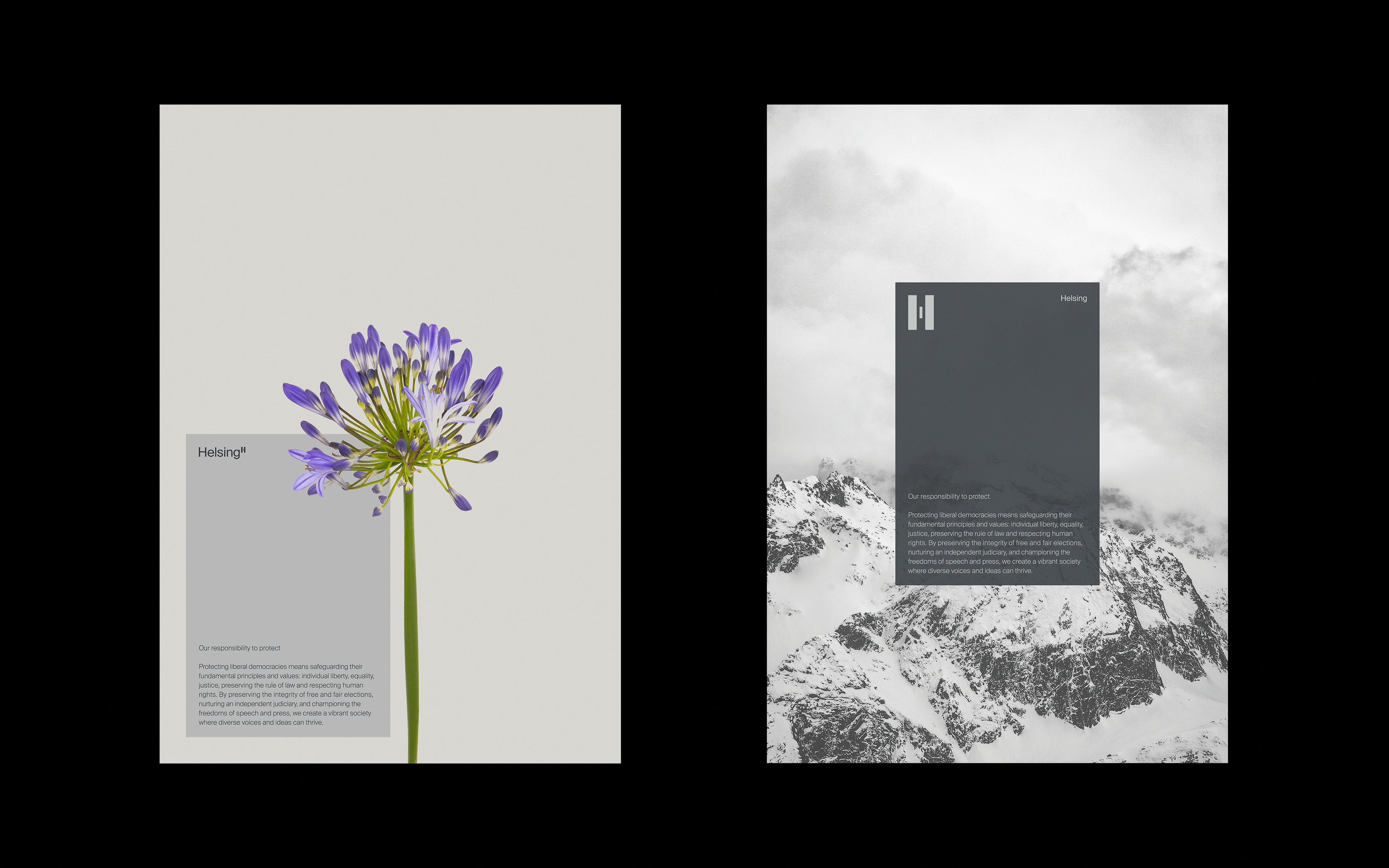
In particular, they are driven by the principle of protecting liberal democracies from contemporary sources of threat, and plan to serve only those countries which meet certain democratic standards. They’re also determined that technology has to be used according to ethical principles of transparency and accountability.
Logo animation
The ‘deep tech’ market in which Helsing operate is often characterised by the clichéd and obvious imagery. We saw an opportunity to redefine the field and aimed for a visual language that instead emphasised refinement and finesse. It was also important for the identity to cut through on a human level, to distance it from received notions of AI as purely robotic or removed from social agency; and the context of the high-end technical complexity of Helsing’s work, they needed an identity that counterbalanced this by being simple, but not simplistic.
The logo we designed interprets the Helsing ‘H’ as a symbol of protection, with the centre piece flanked by the two outer components. Three lock-up options provide maximum flexibility across different assets, each allowing for a different relationship between the mark and the company name.
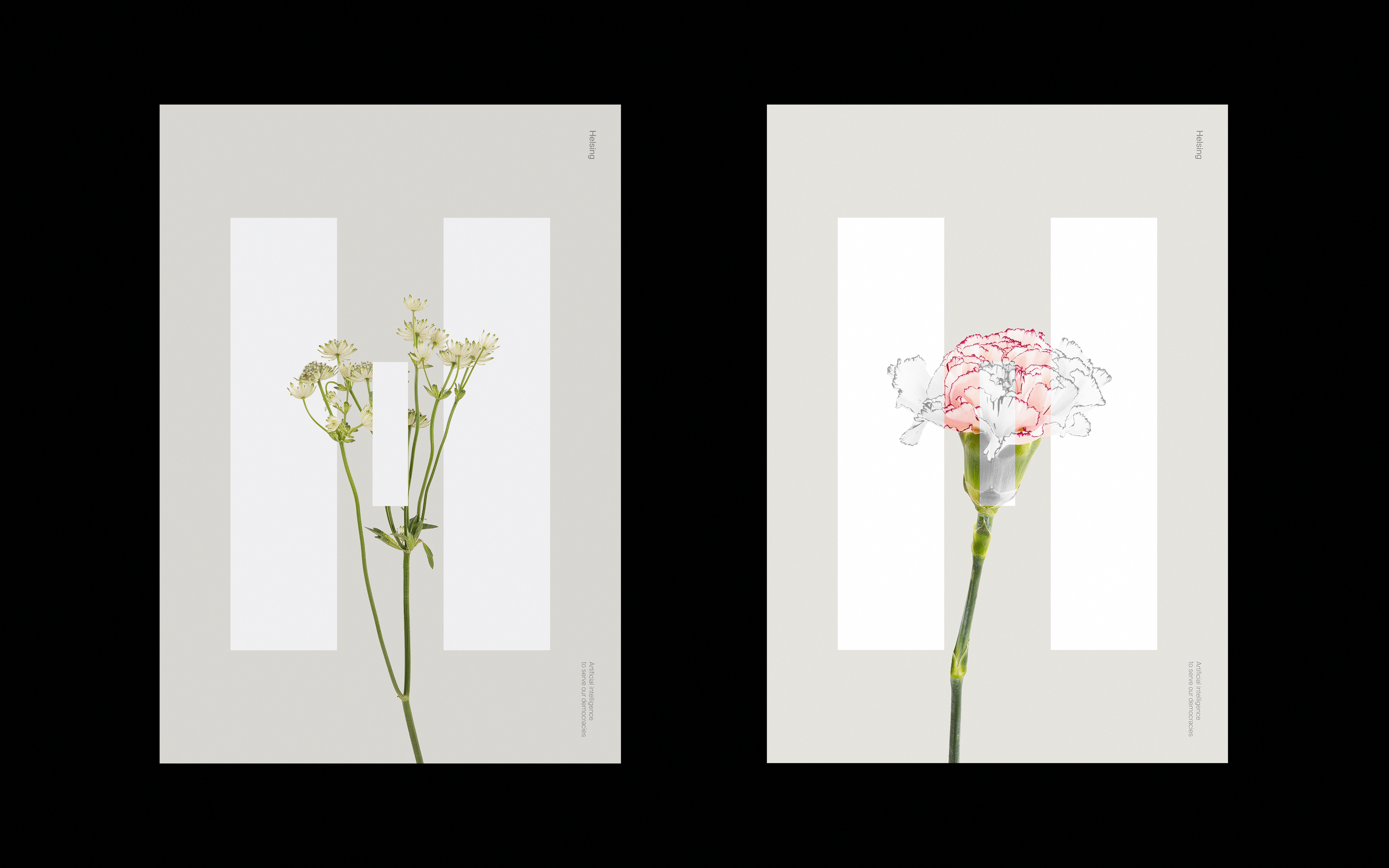
Posters
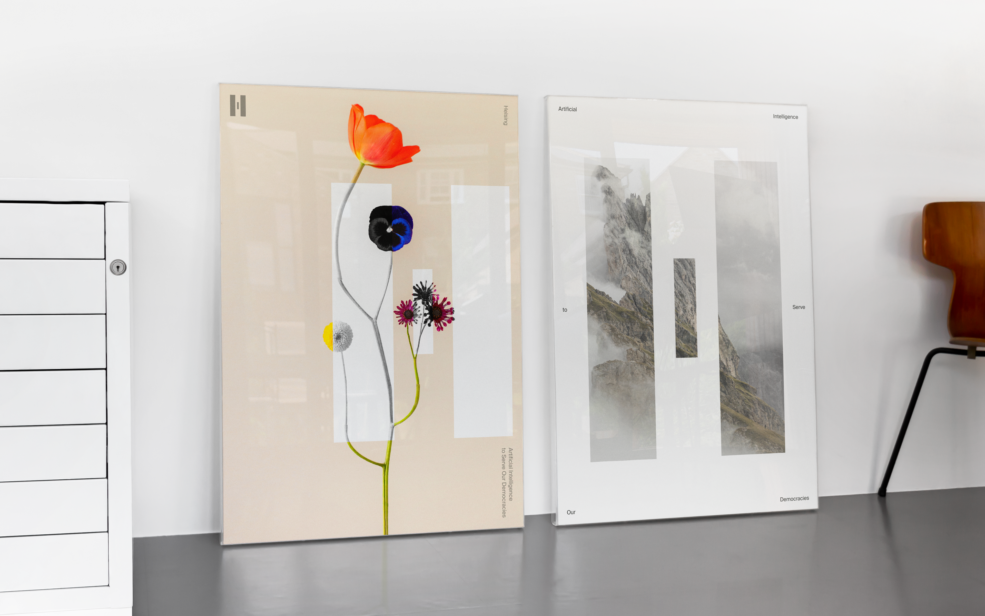
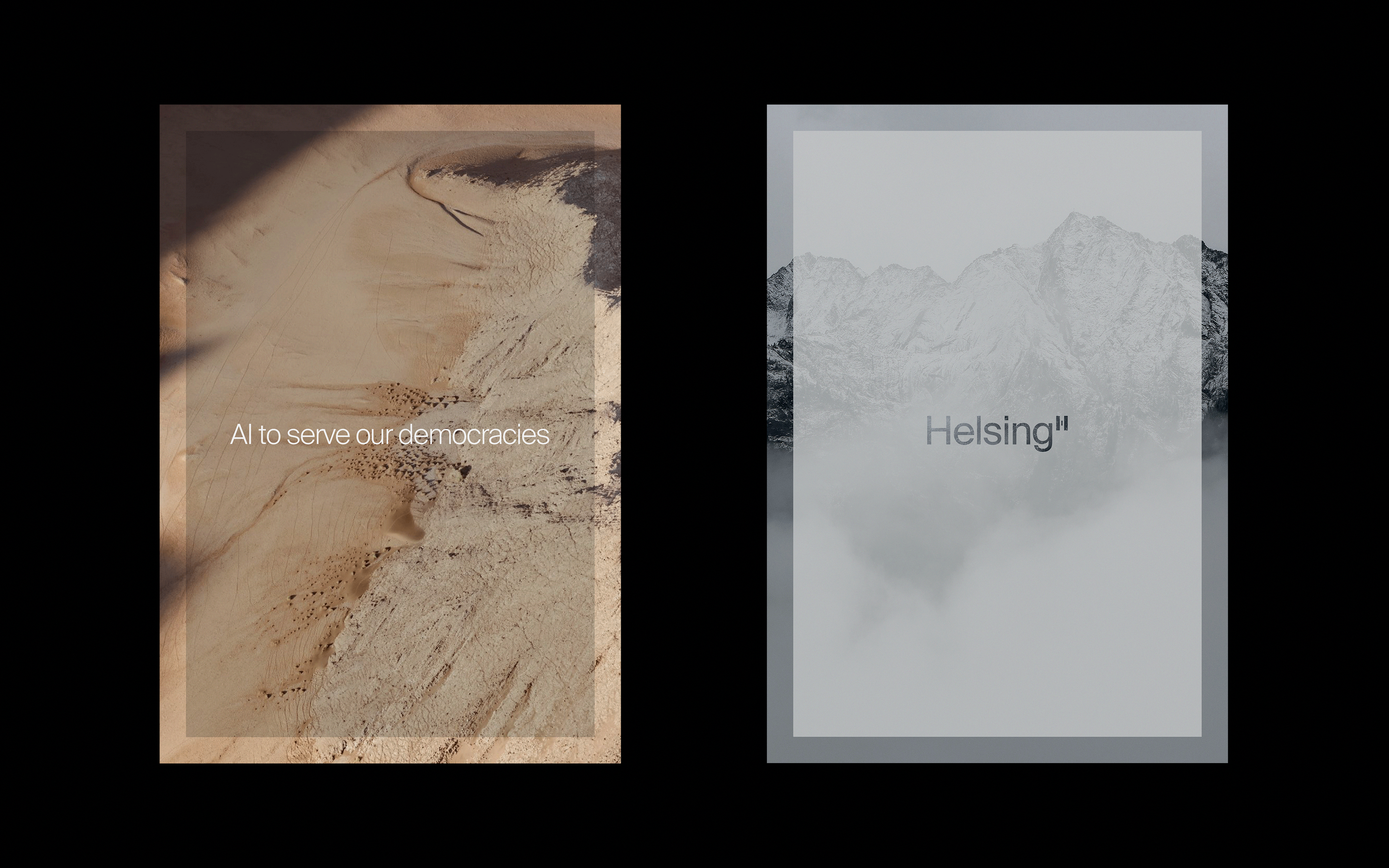
The broader identity adopts a minimal and sophisticated approach to colour and typography. Core colours of off-black and off-white provide a classic, understated base and are complemented by the selective use of spot colours to help the identity cut through on screen. The chosen typeface for the brand has a clean, contemporary feel and avoids overstatement.
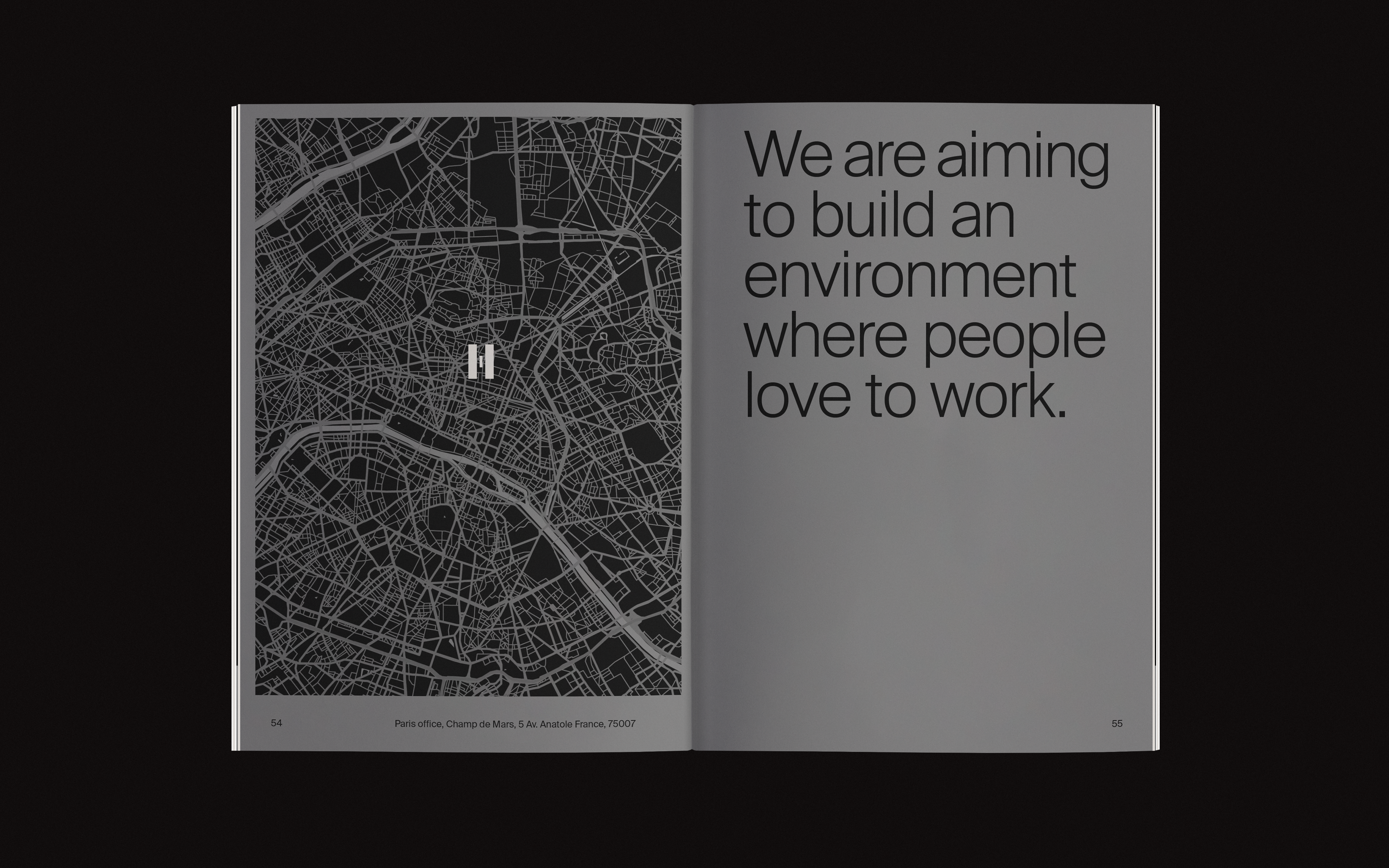
The use of imagery was carefully considered. Images of landscapes — across land, sea and air — are at the core of the Helsing brand and implies the importance of their work by showing its physical backdrops, the territories to be navigated and defended, while remaining neutral and elegant in appearance. The other uses striking images of flowers, an unusual choice for a defence or technology company, and is used for internal communications. These images symbolise the need to protect fragile things so that they can grow and flourish — a visual metaphor for Helsing’s approach to liberal democracies. ’Containers’ of text are used with imagery to define content and offer space.
Animations
The overall identity positions Helsing as the equivalent of a high-end, luxury brand in their sector, one that is confident, innovative and able to talk to a range of audiences without ever losing sight of its essential aims and beliefs.
Recruitment brochure
