Office Design
Environmental animations
Animations
Plural is a collective of European entrepreneurs offering support to young companies in the form of funding, advice and mentoring borne from their own experience in the competitive arena of the startup world.
Plural’s members are all founders-turned-investors who can offer not just capital, but time and expertise. A diverse group in terms of background and areas of expertise, they are united by a shared interest on innovative uses of technology and “harder to resolve” problems, with initial investments in businesses focused on climate, AI and Web3. Operating via a profit-sharing, non-hierarchical model, Plural’s long-term vision and principles set them apart within the venture capital world and allow them to share tailored, holistic guidance with each business under their care.
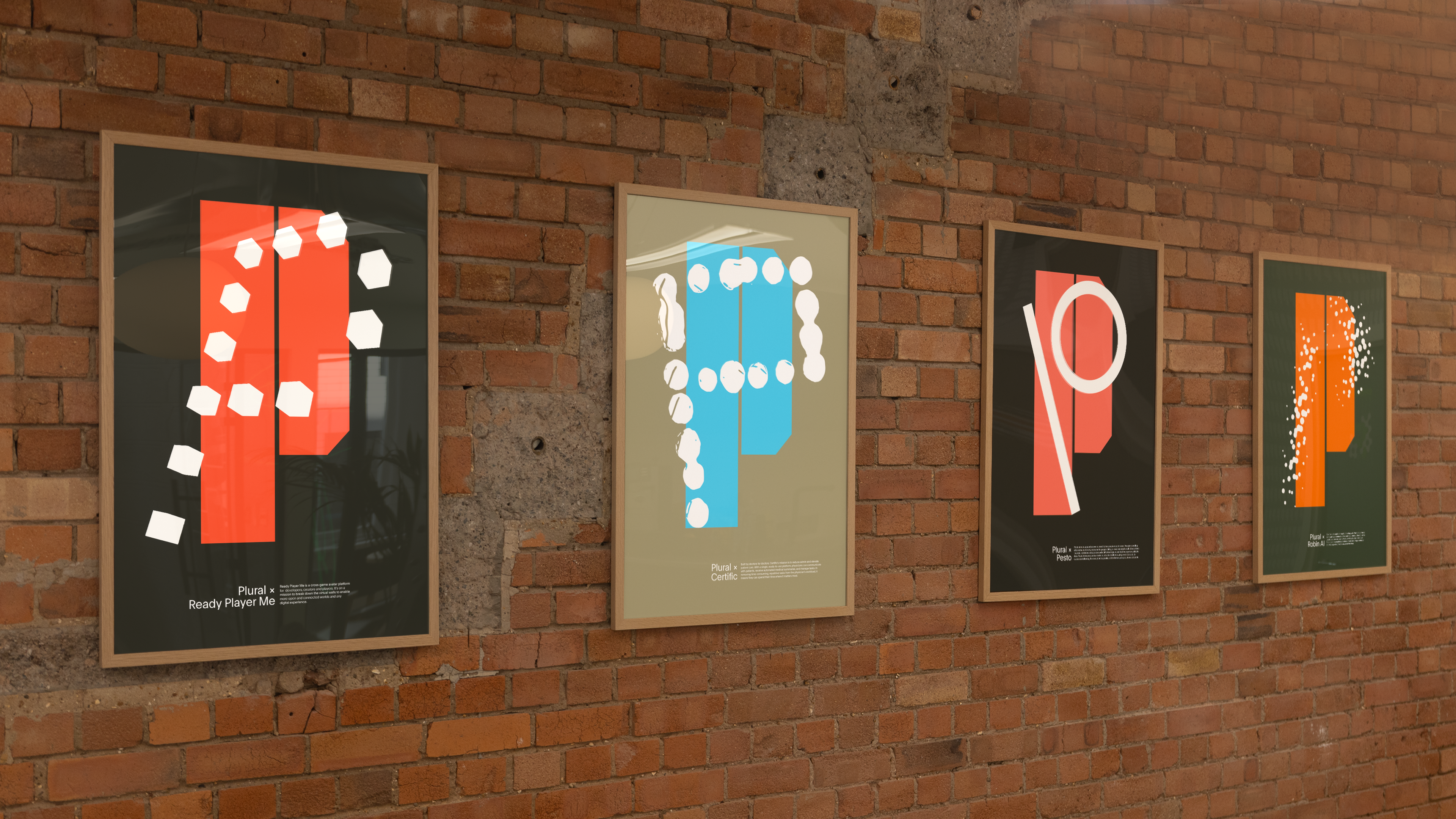
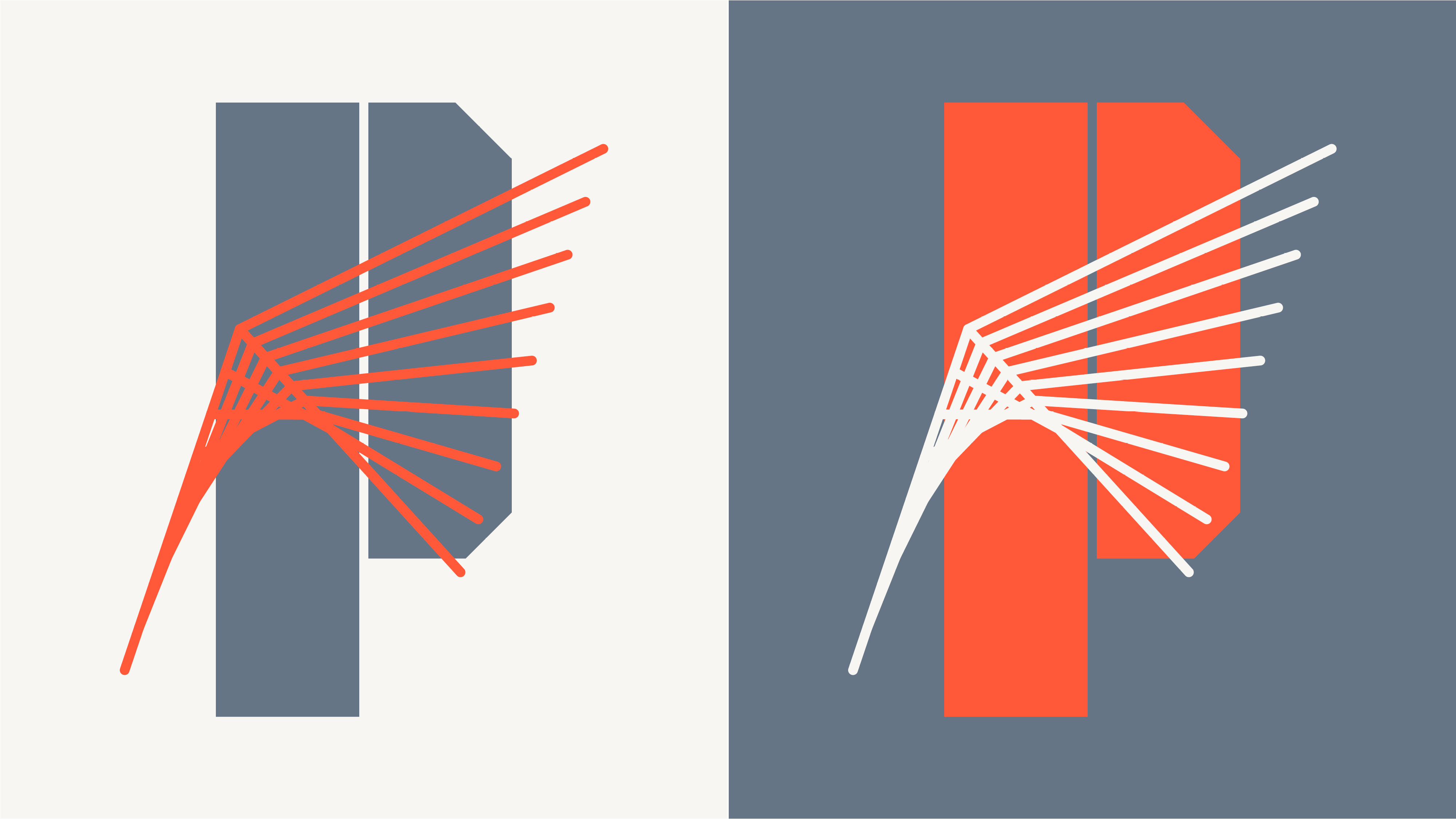
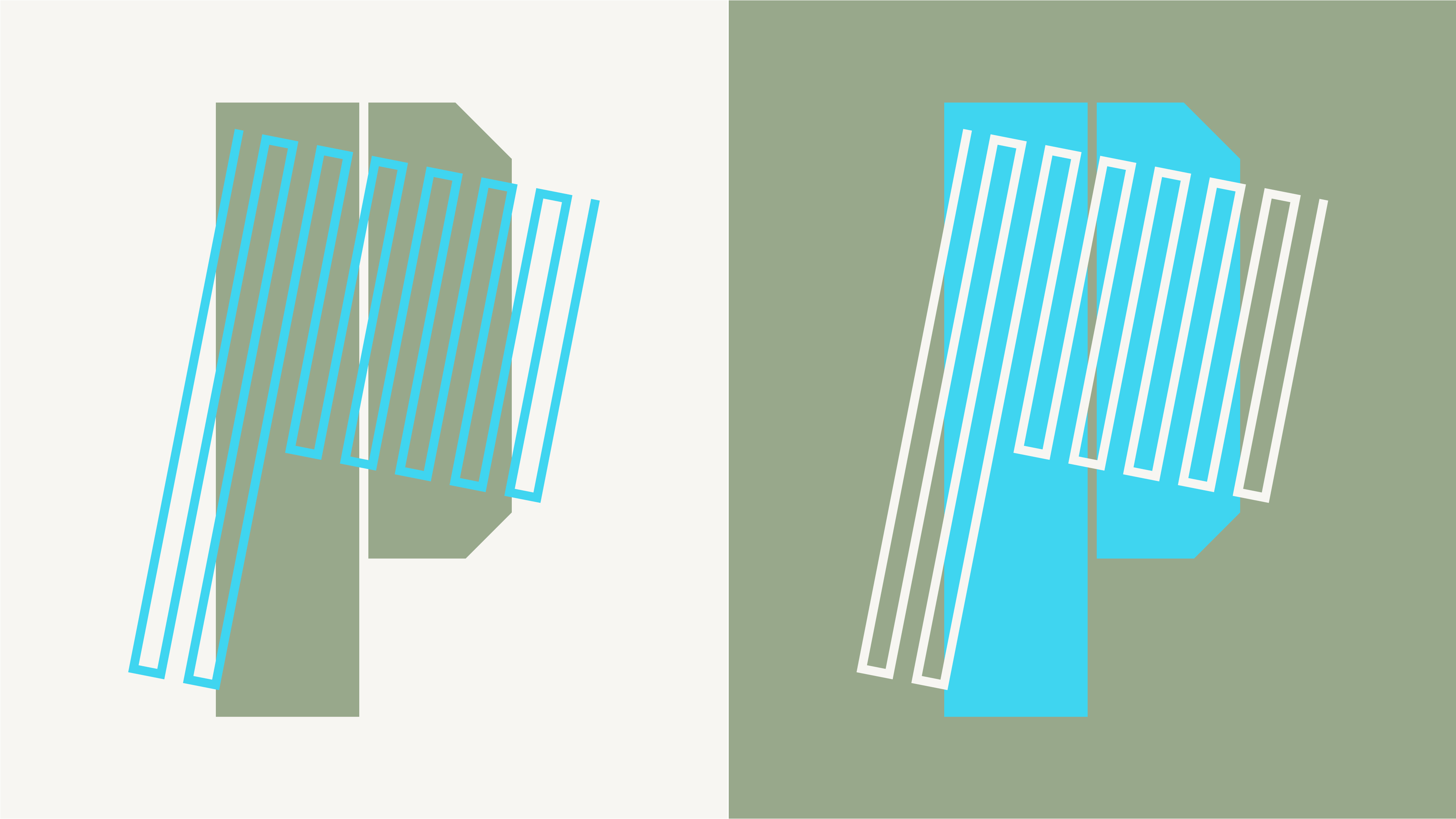
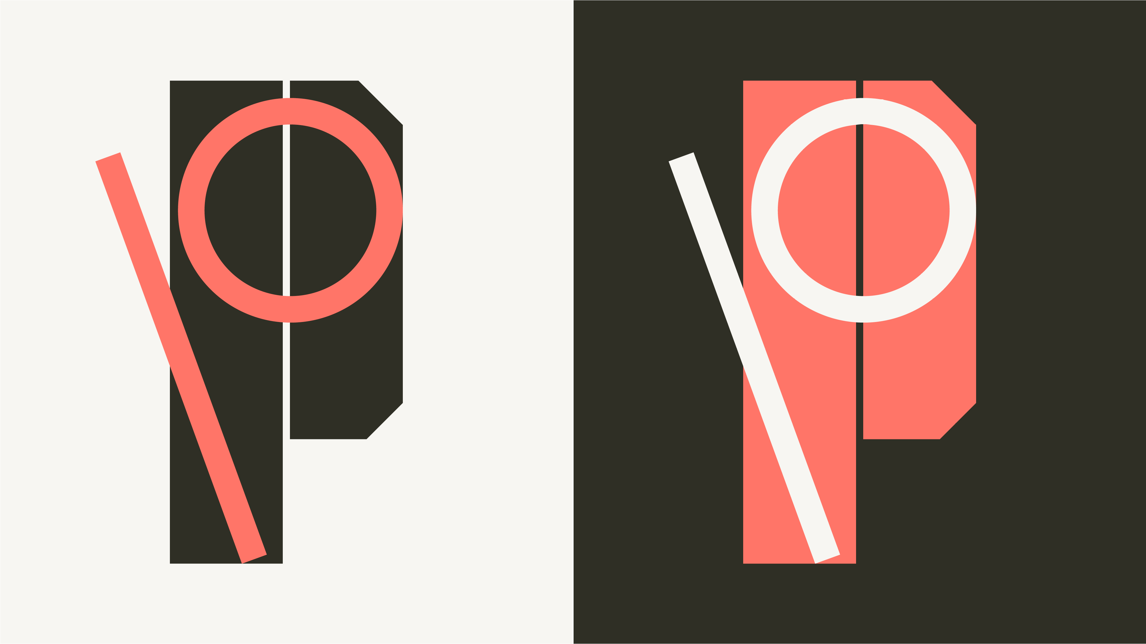
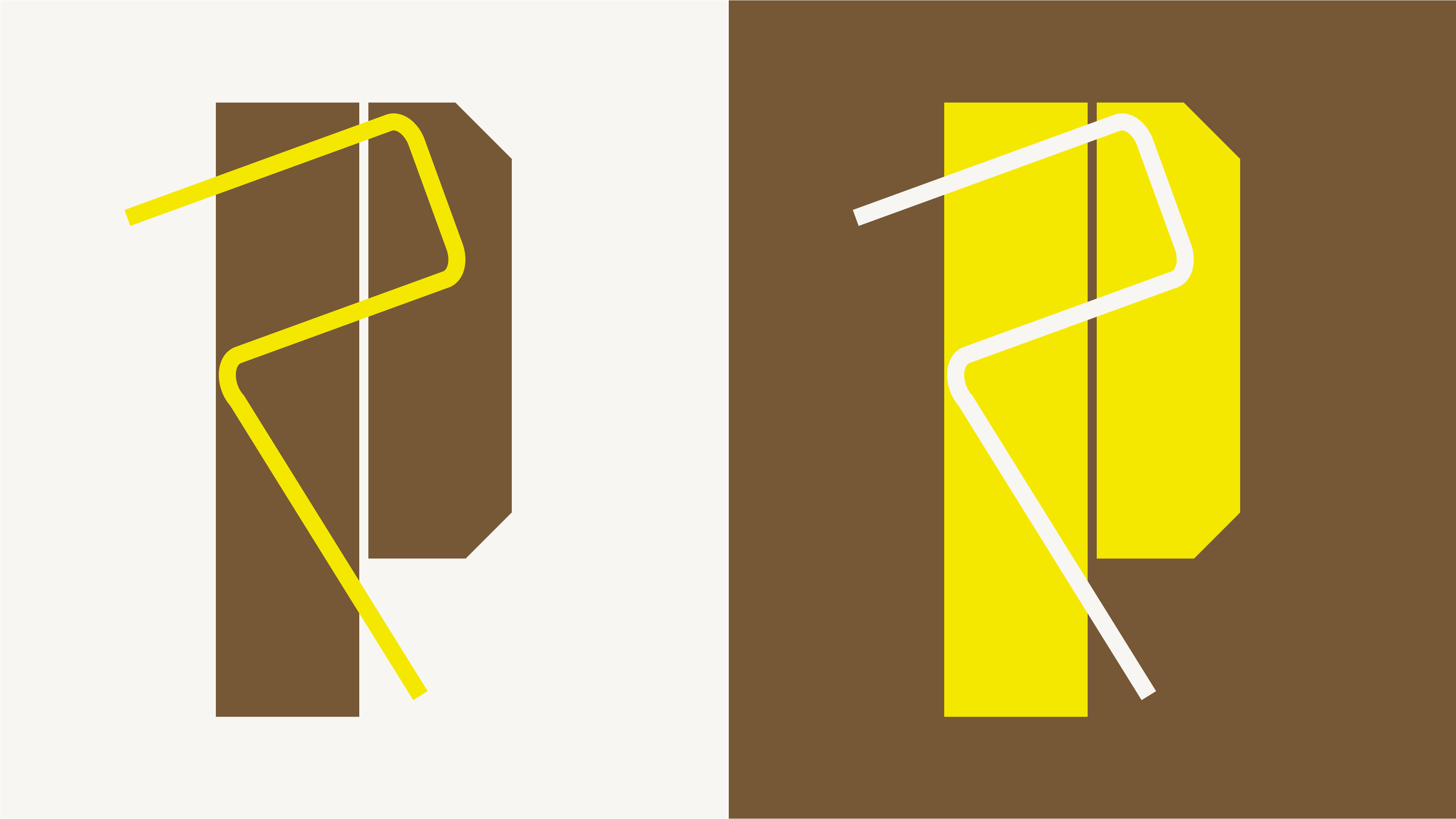
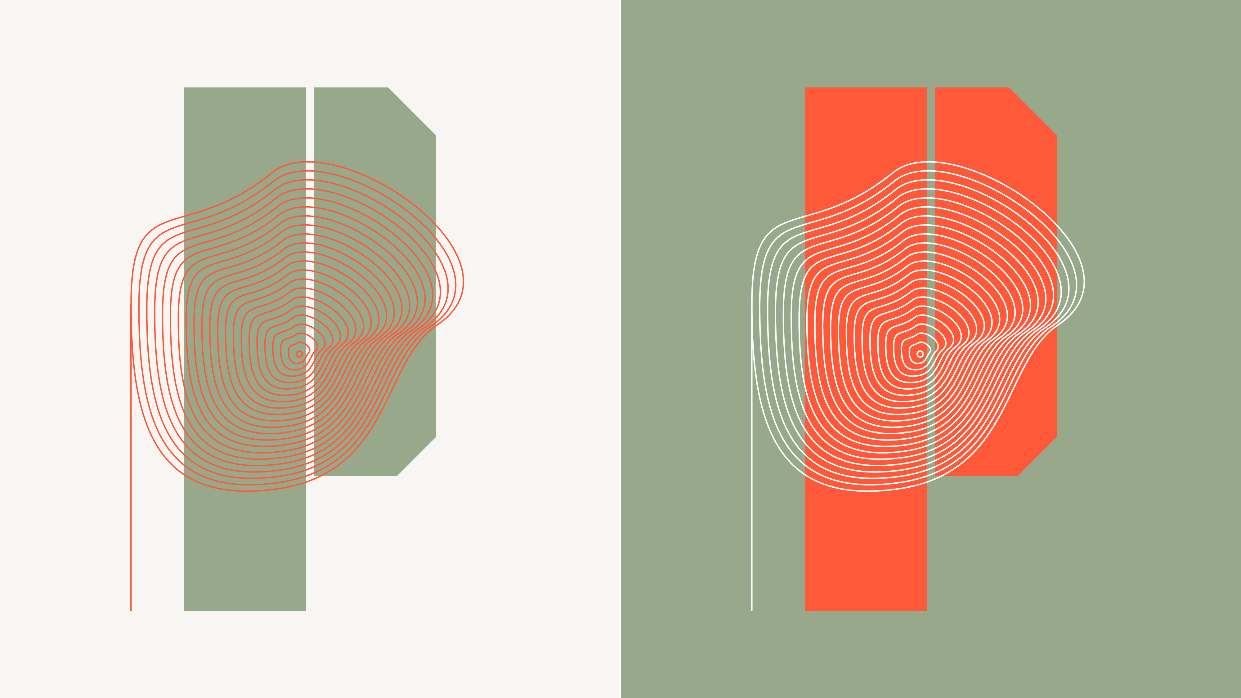
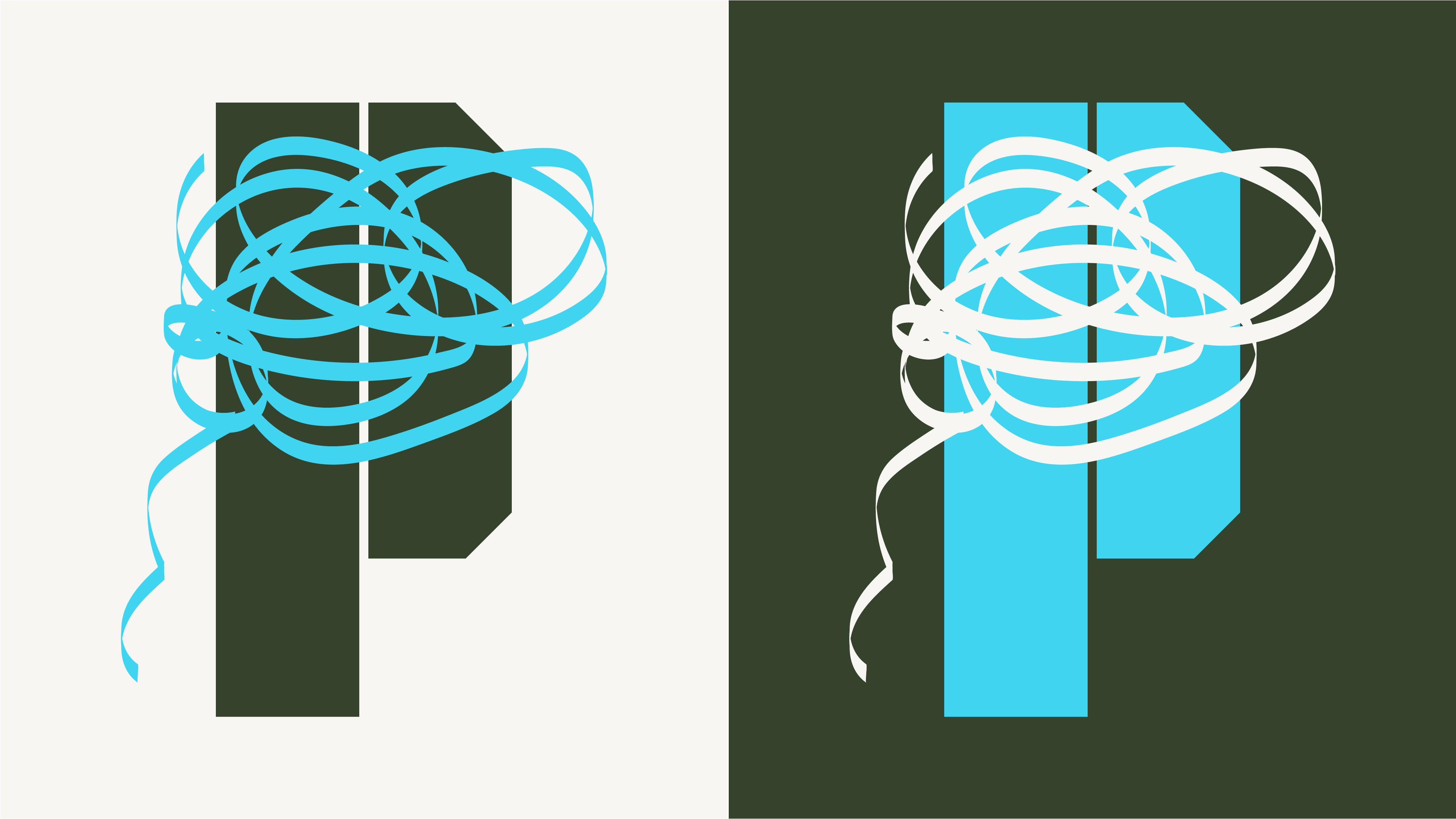
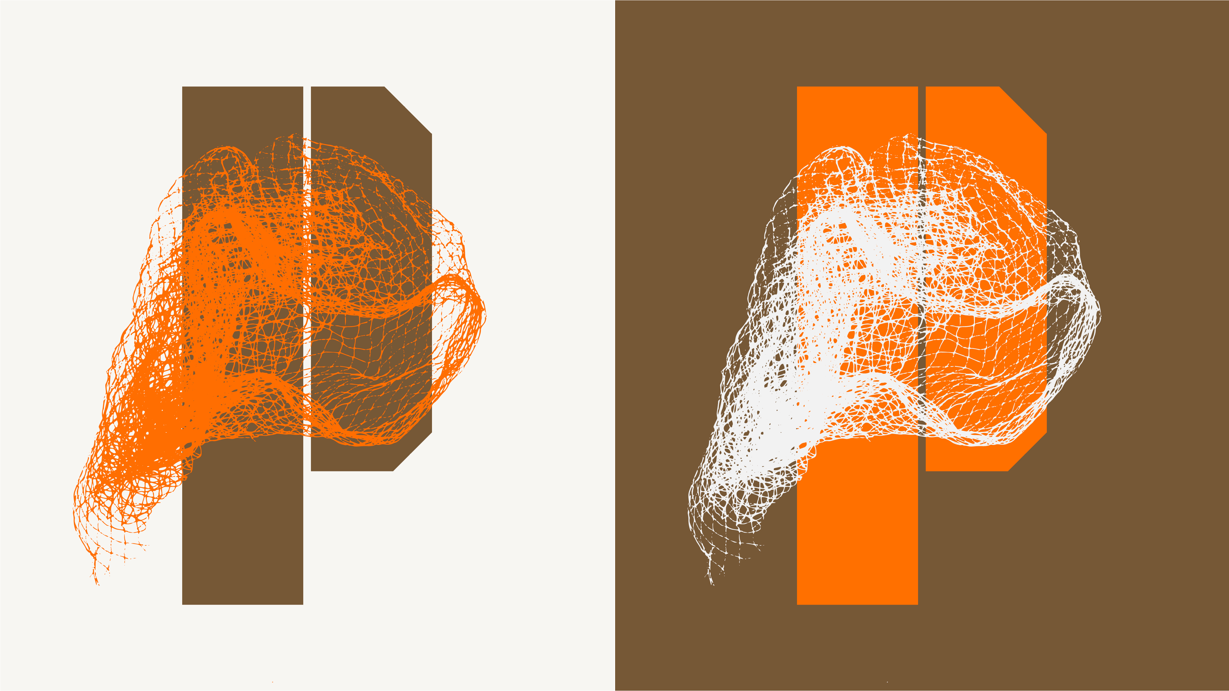
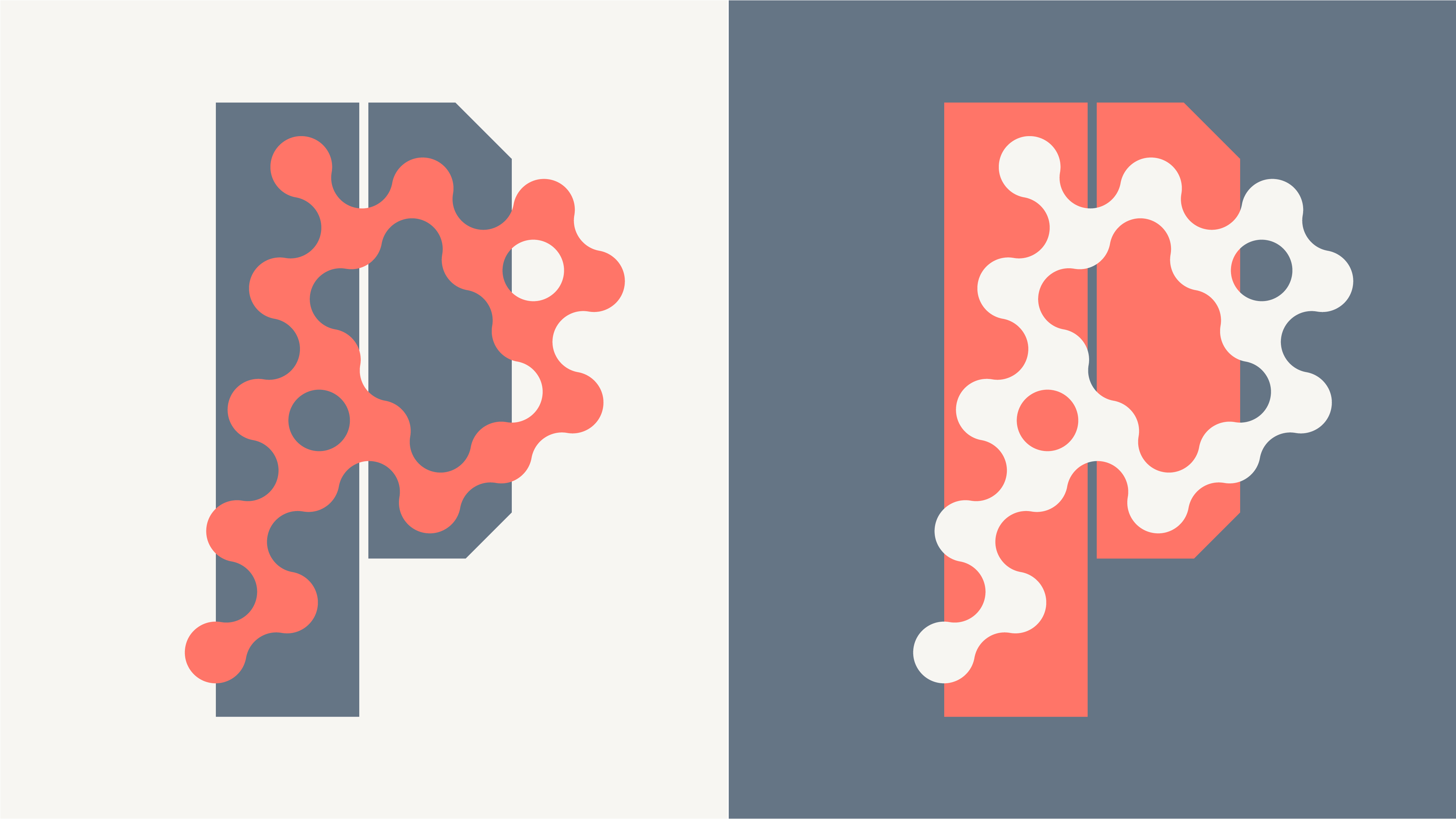
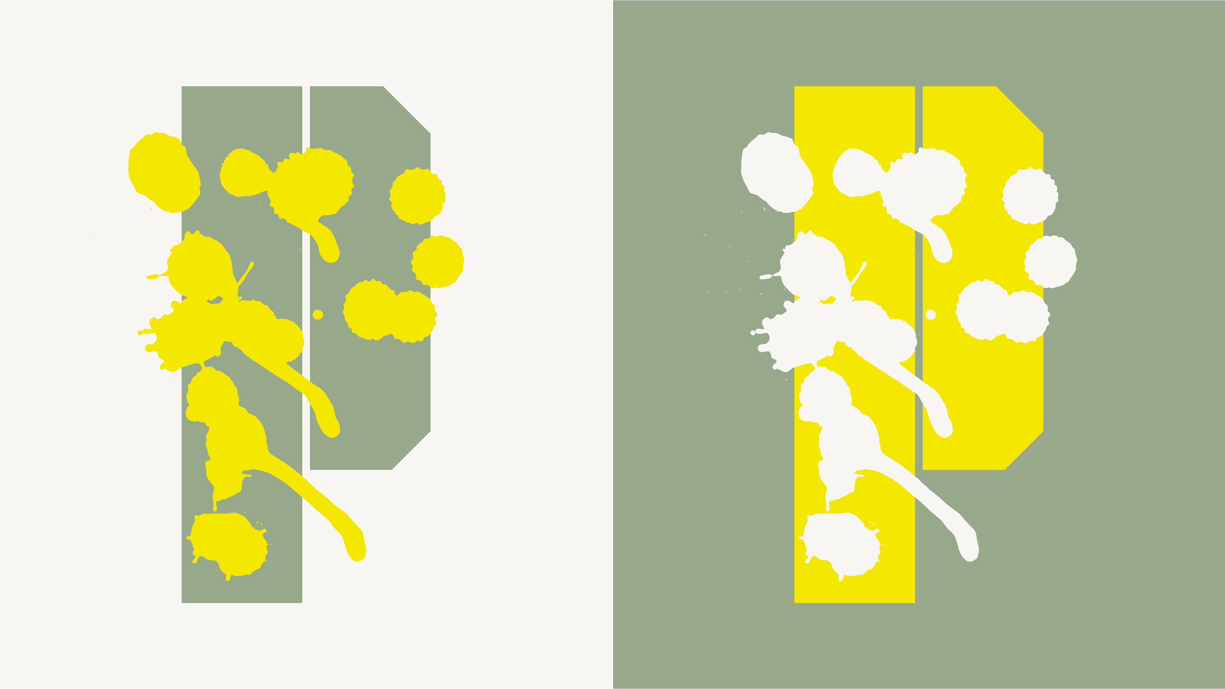
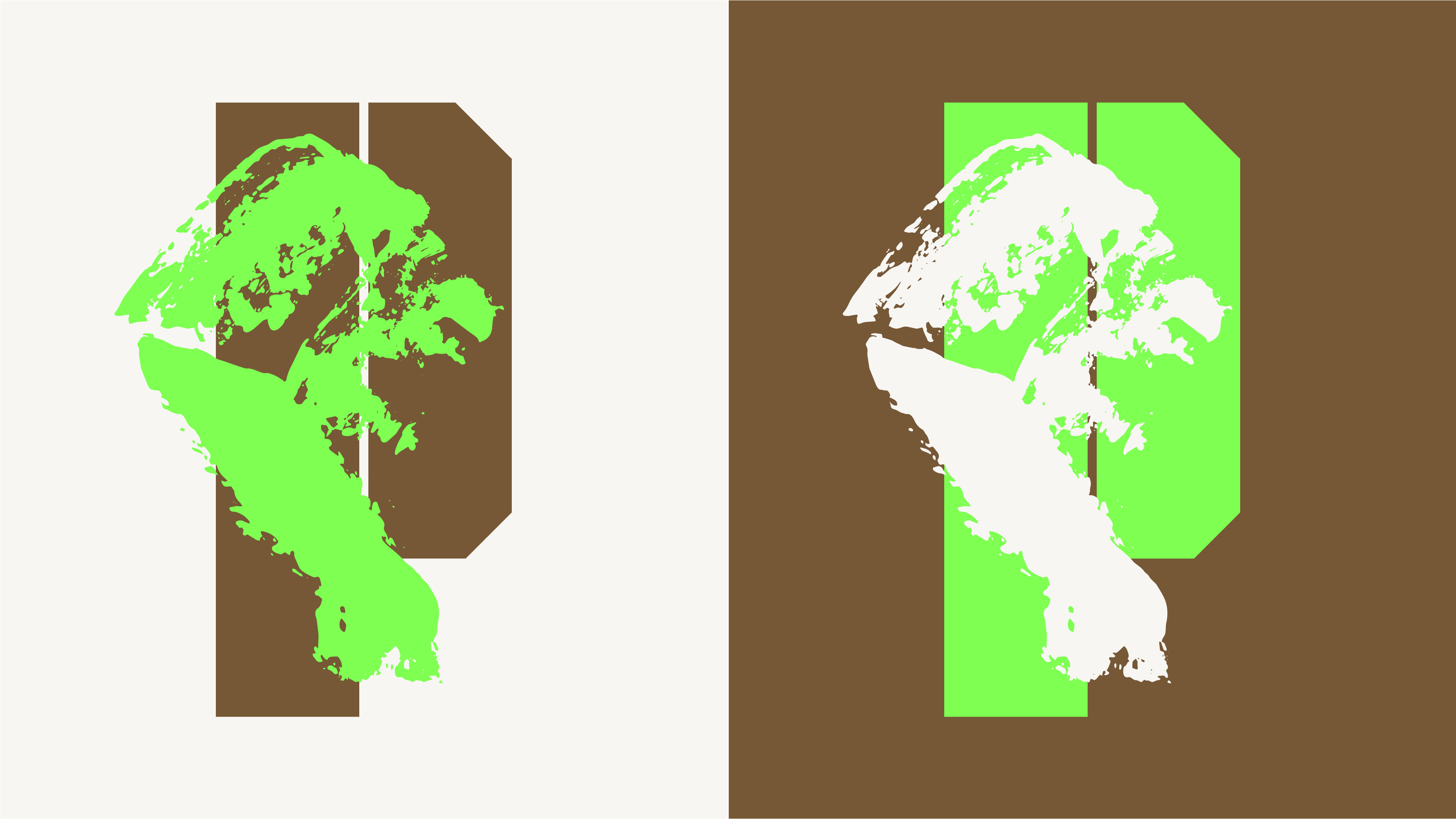
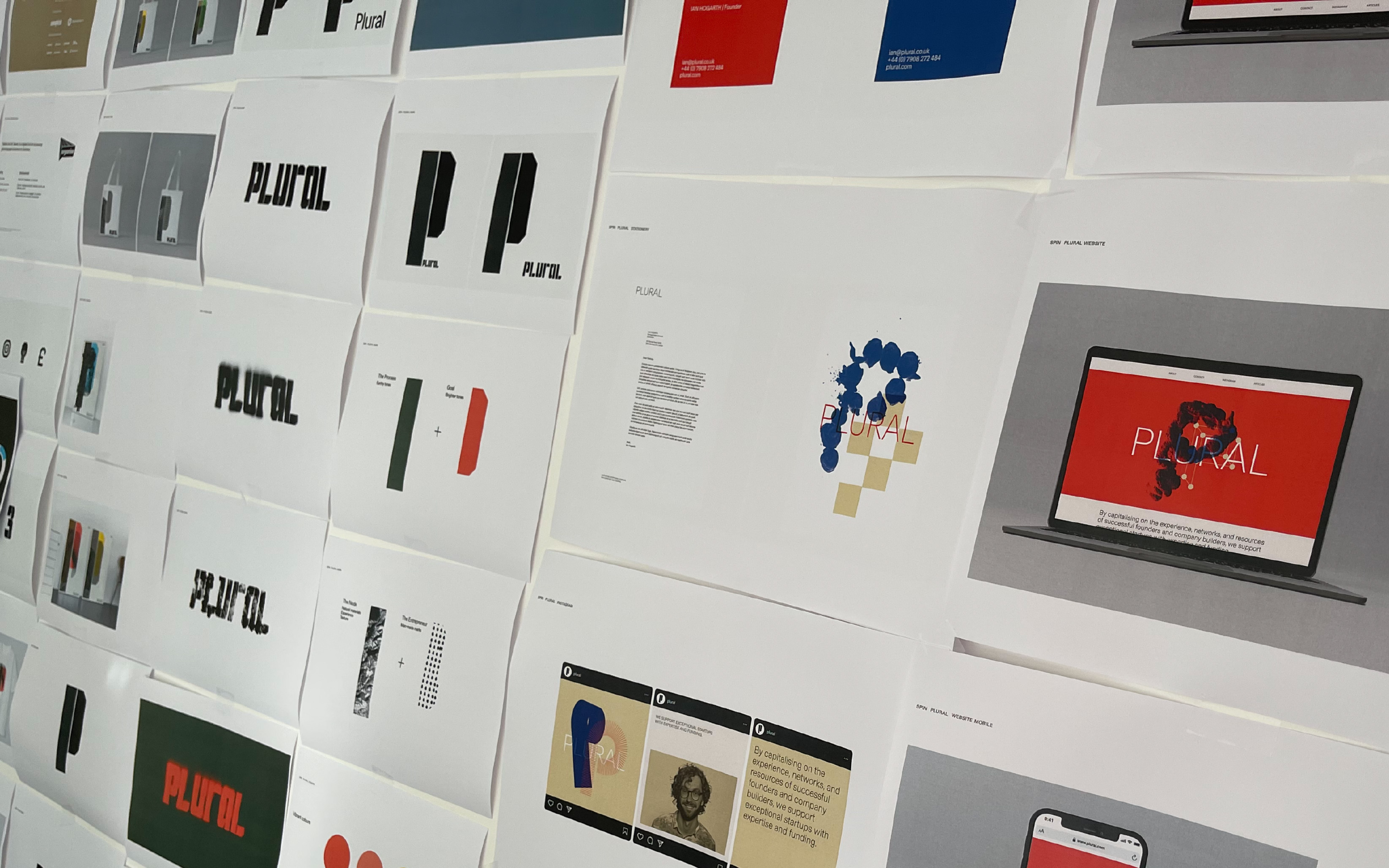
Their visual identity needed to be approachable but challenging, able to communicate their position on the leading edge of business as well as their fundamental values of openness and egalitarianism. We created a system for them that takes its cue from the company’s name and guiding ethos — a flexible, literally plural take on a corporate identity. With a different iteration for each founder-investor relationship that Plural fosters, the identity retains a constant sense of originality while always remaining recognisable.
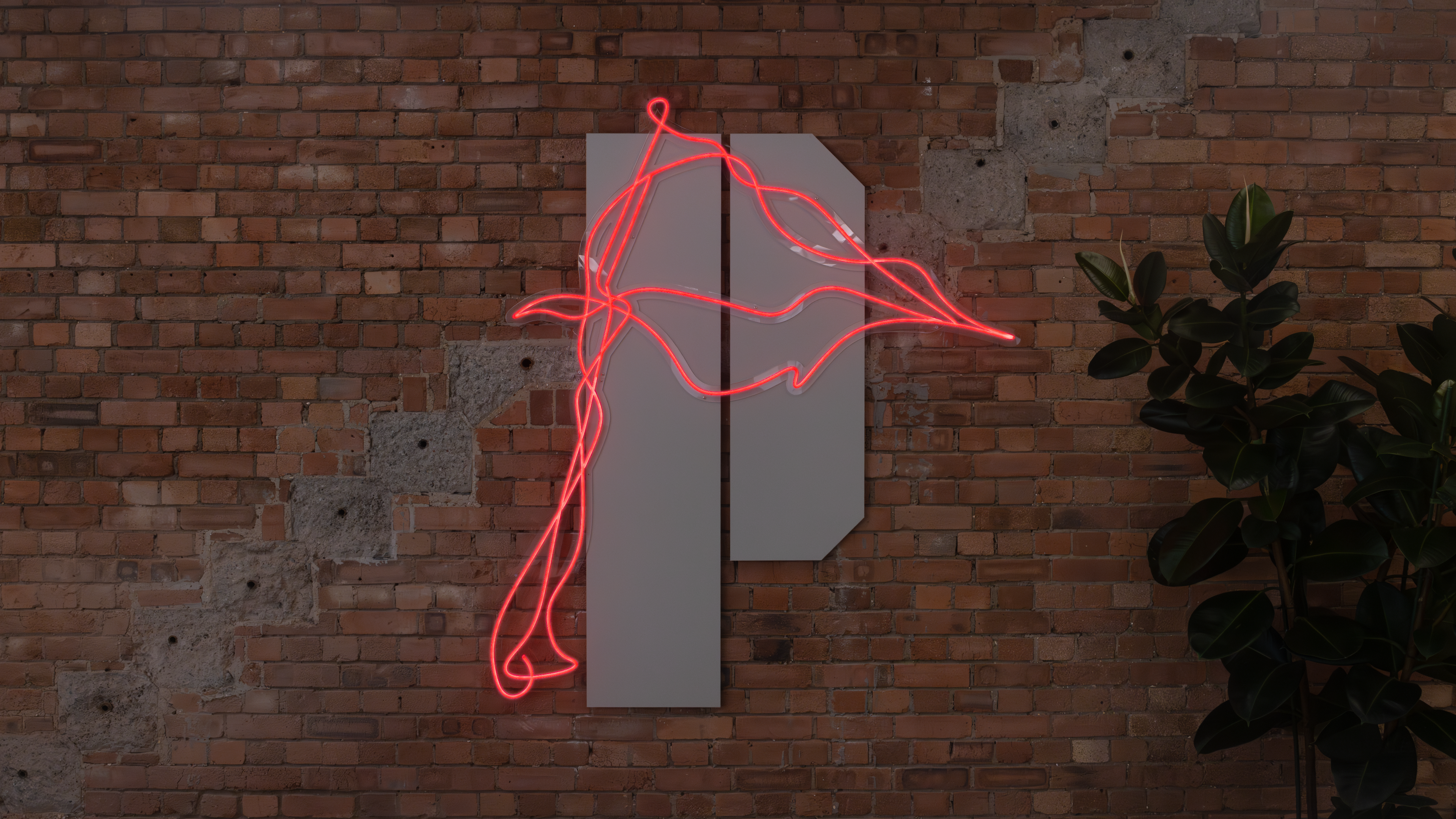
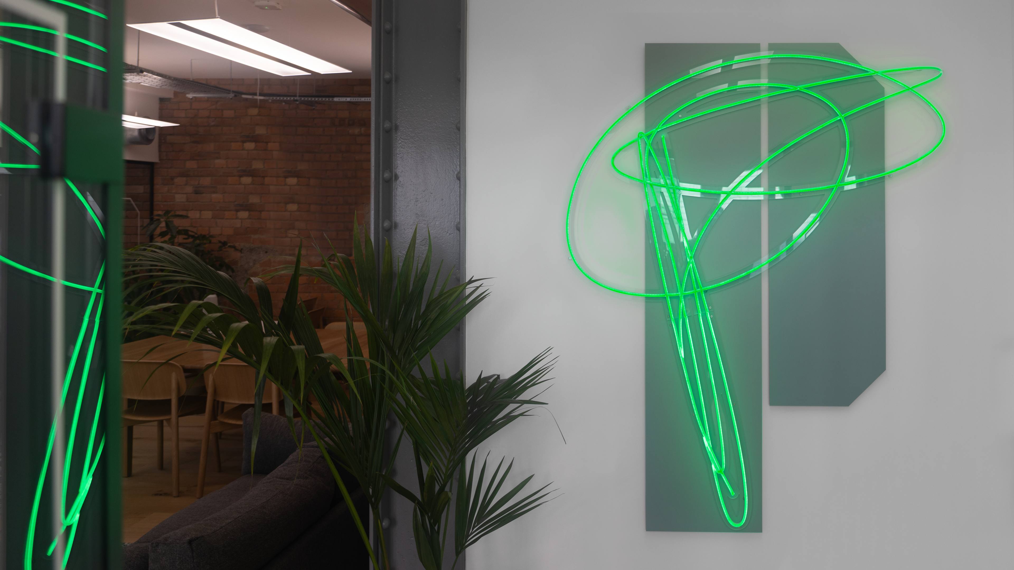
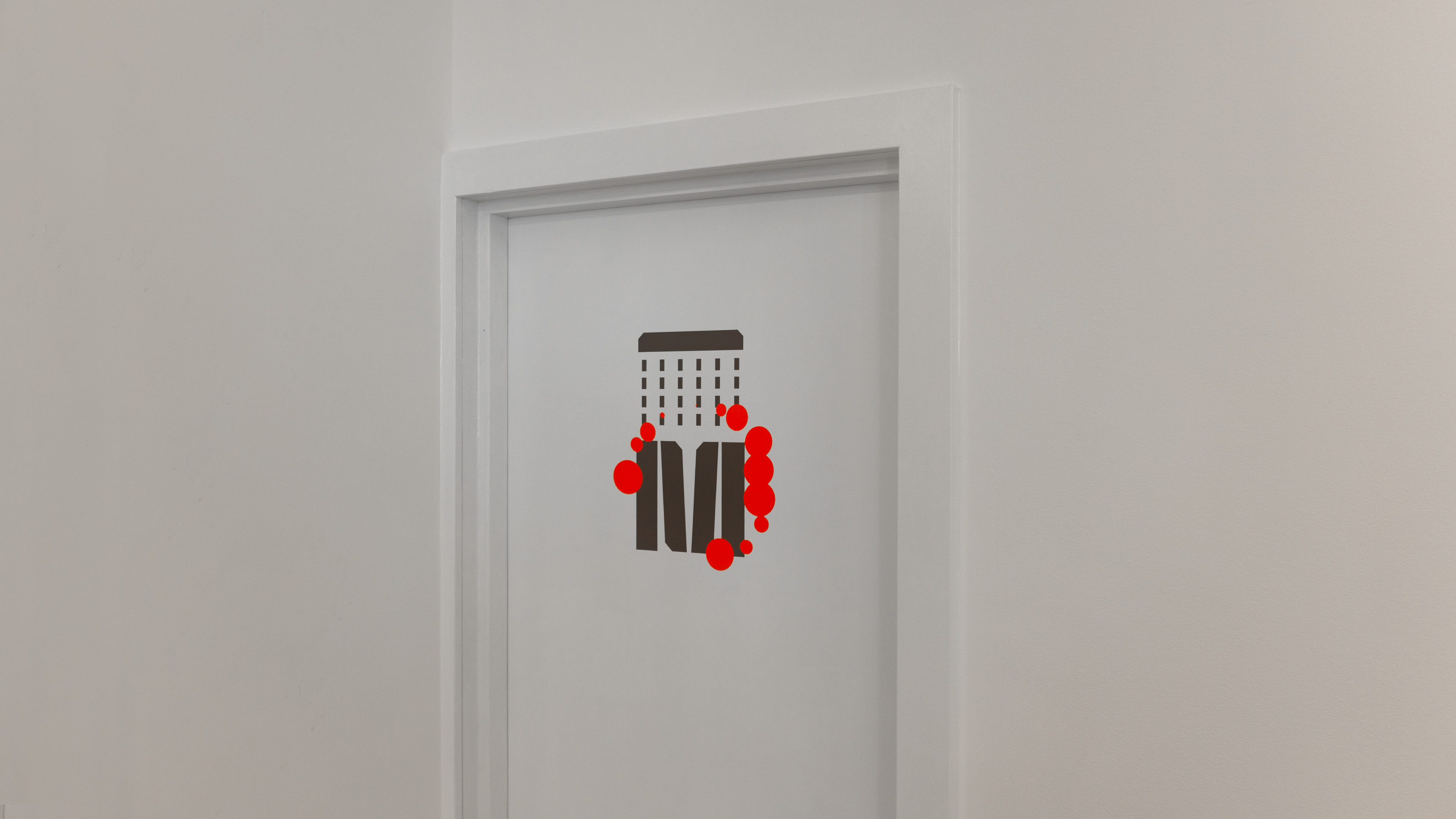
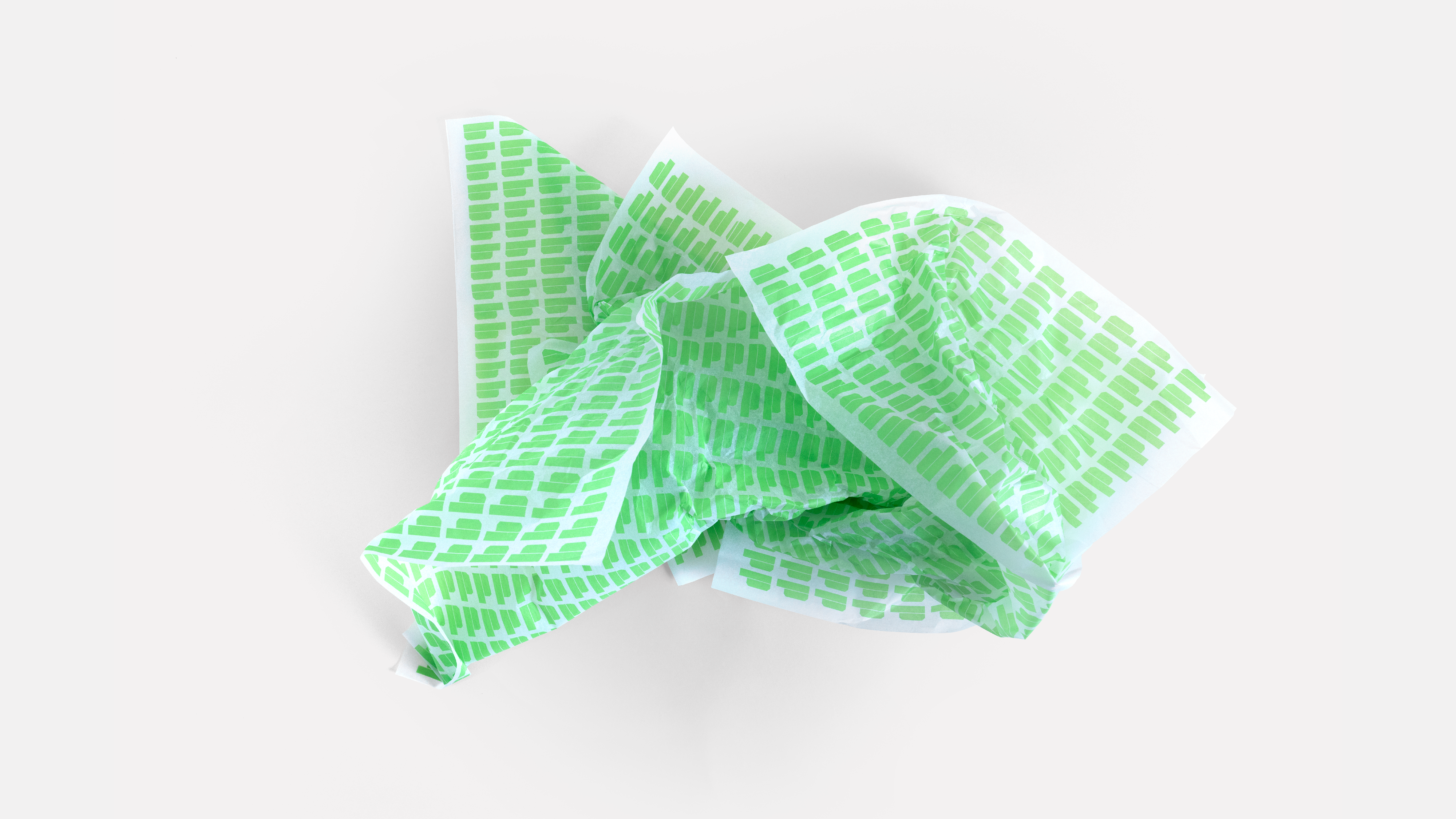
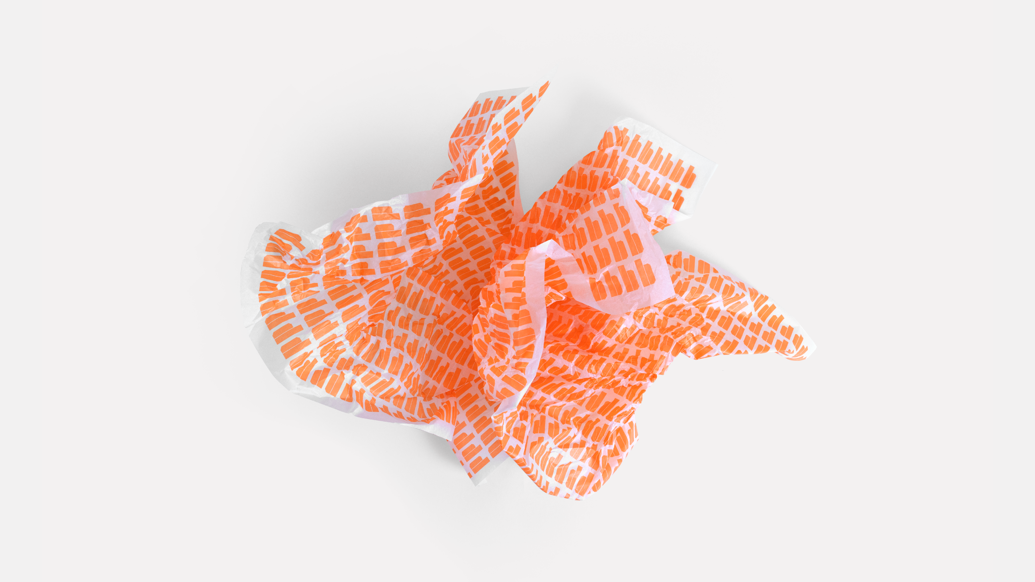
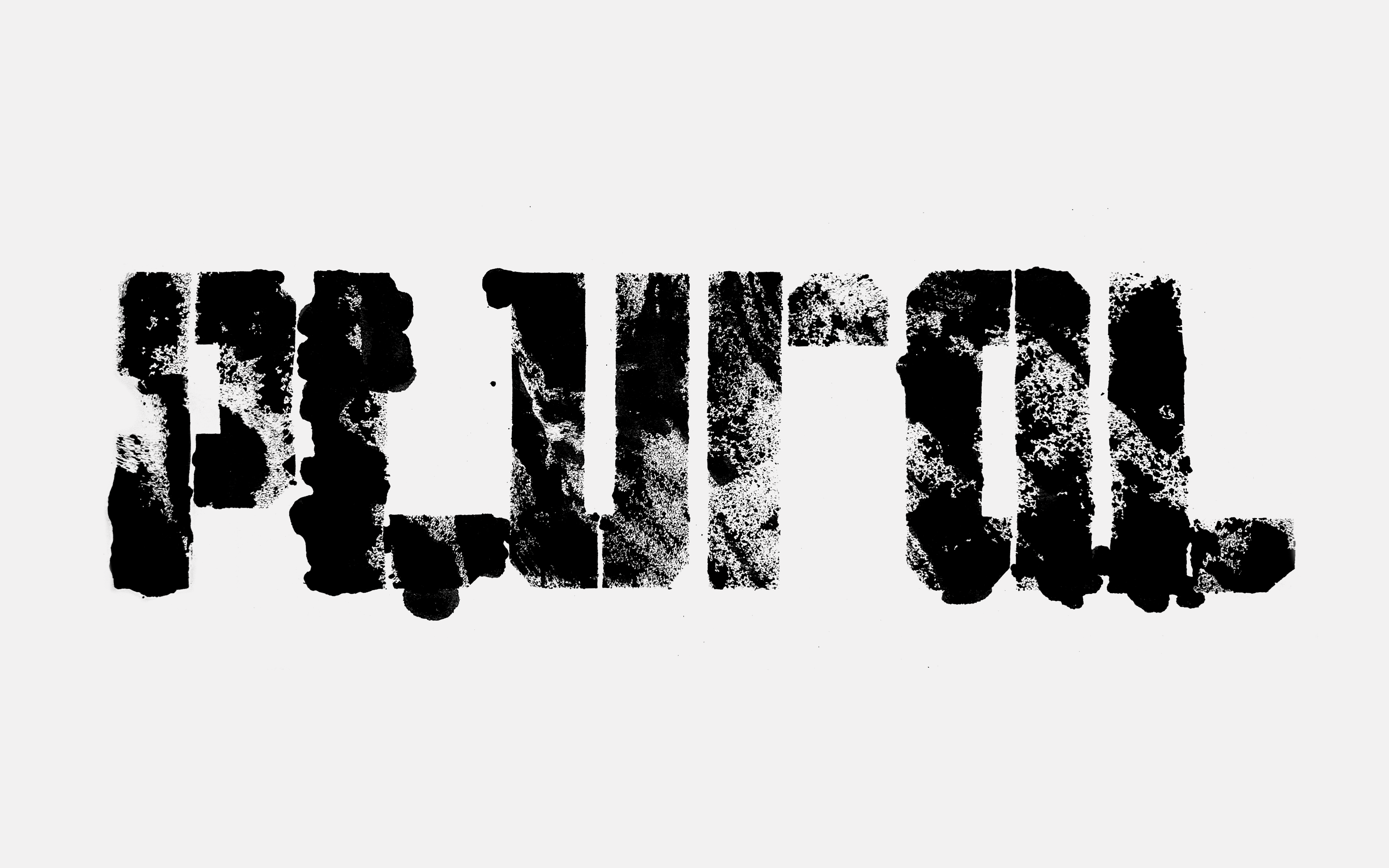
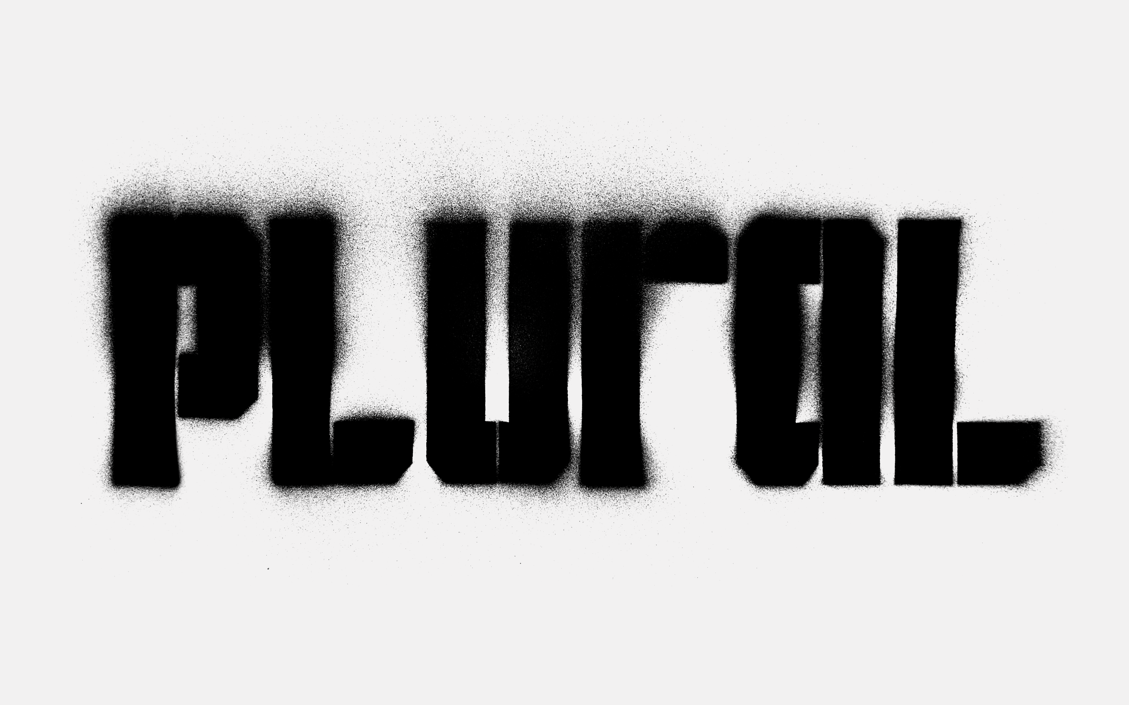
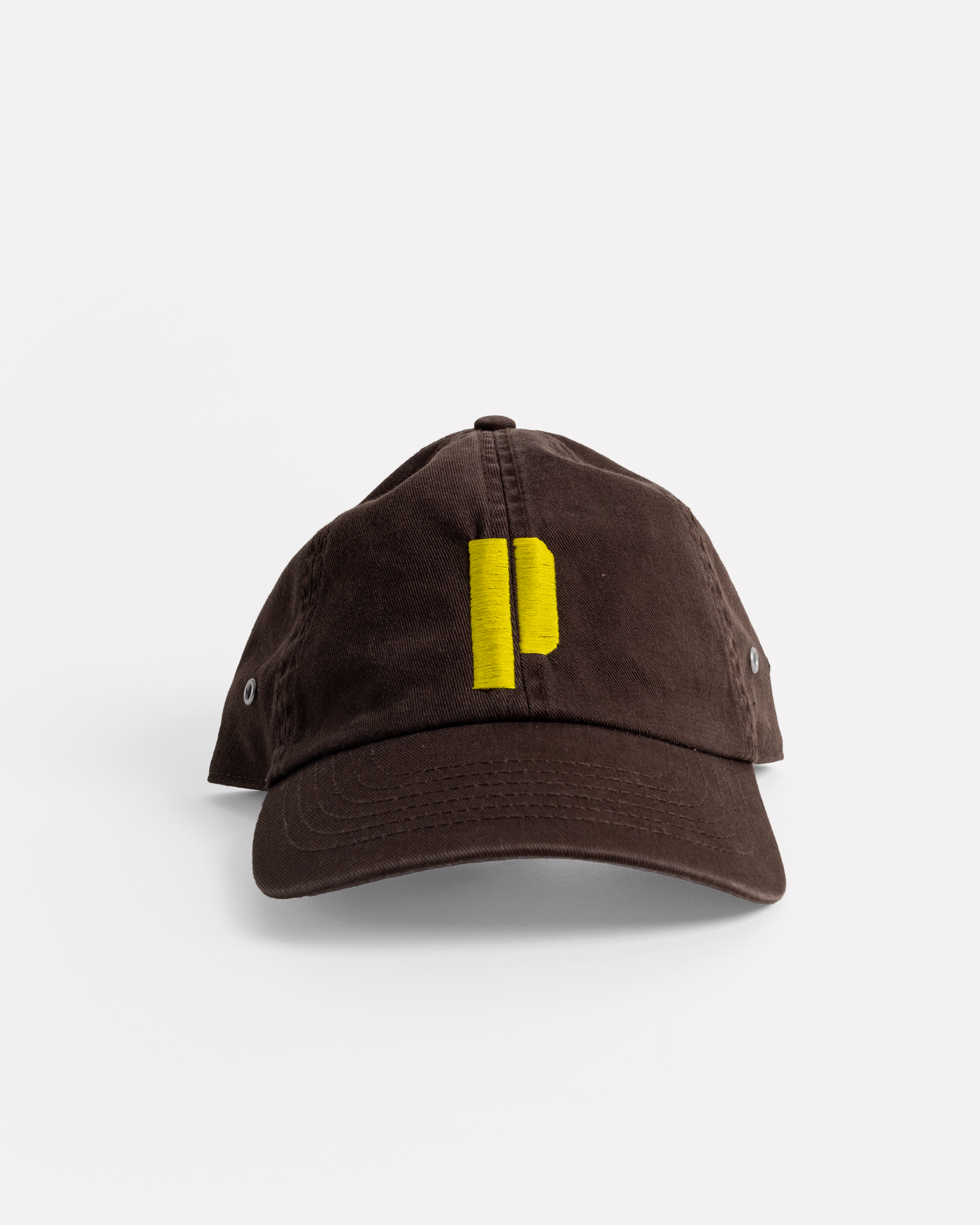
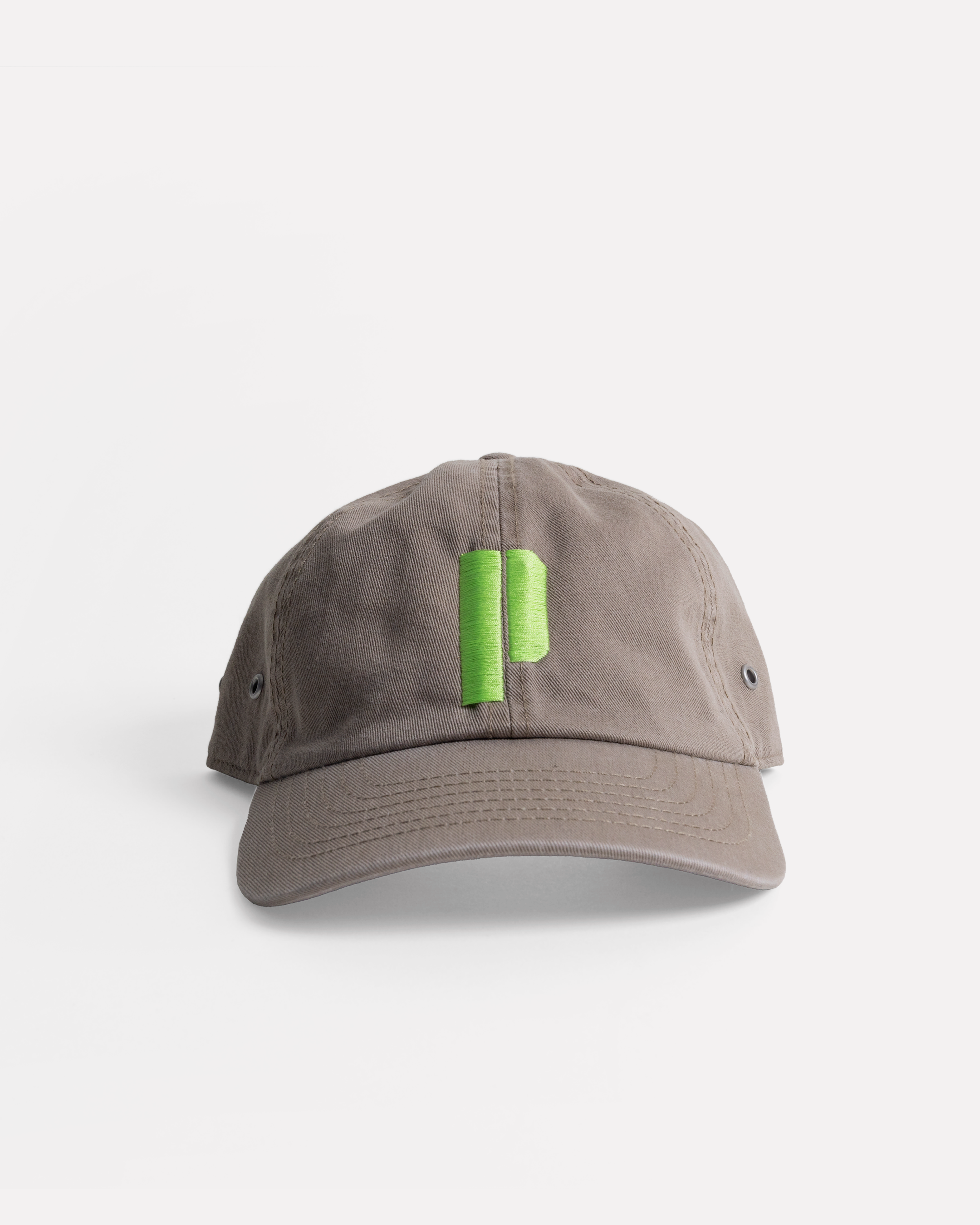
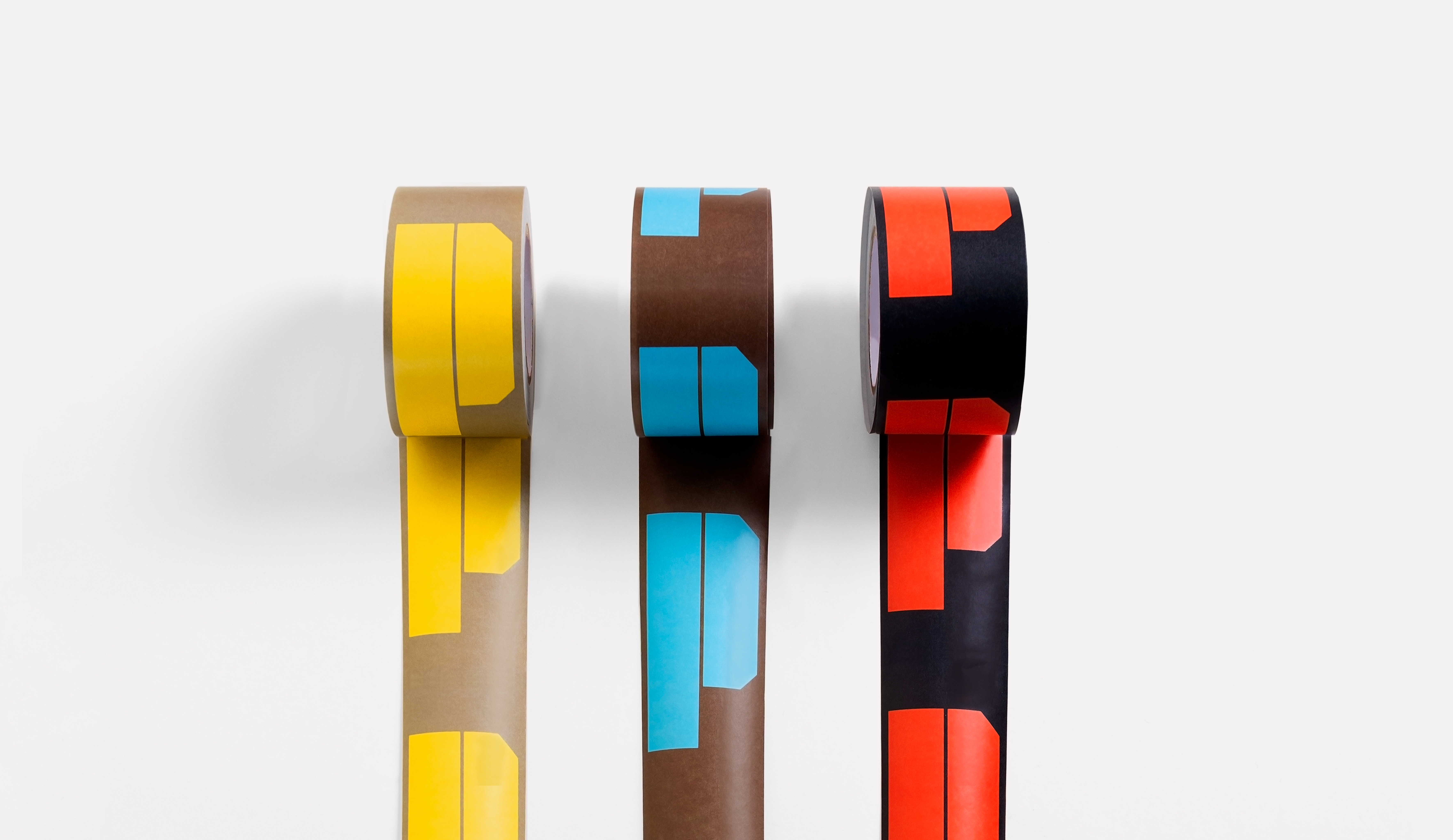
The stencilled ‘P’ forms the bedrock of the mark, allowing variation and expression to occur in the top layer: experimental versions of the ‘P’ letterform using treated photography and vector graphics. Alongside the mark, the use of colour reinforces the bespoke characteristics of each relationship, with specific pairings of earthy and vibrant shades.
Using a mixture of digital and analogue elements, the visual language we established is organic, sophisticated and unconventional. By having no fixed or ‘original’ form, the identity is instead about the uniqueness of each iteration and the link between its components, visualising the narrative behind Plural.
Screen-printing merchandise
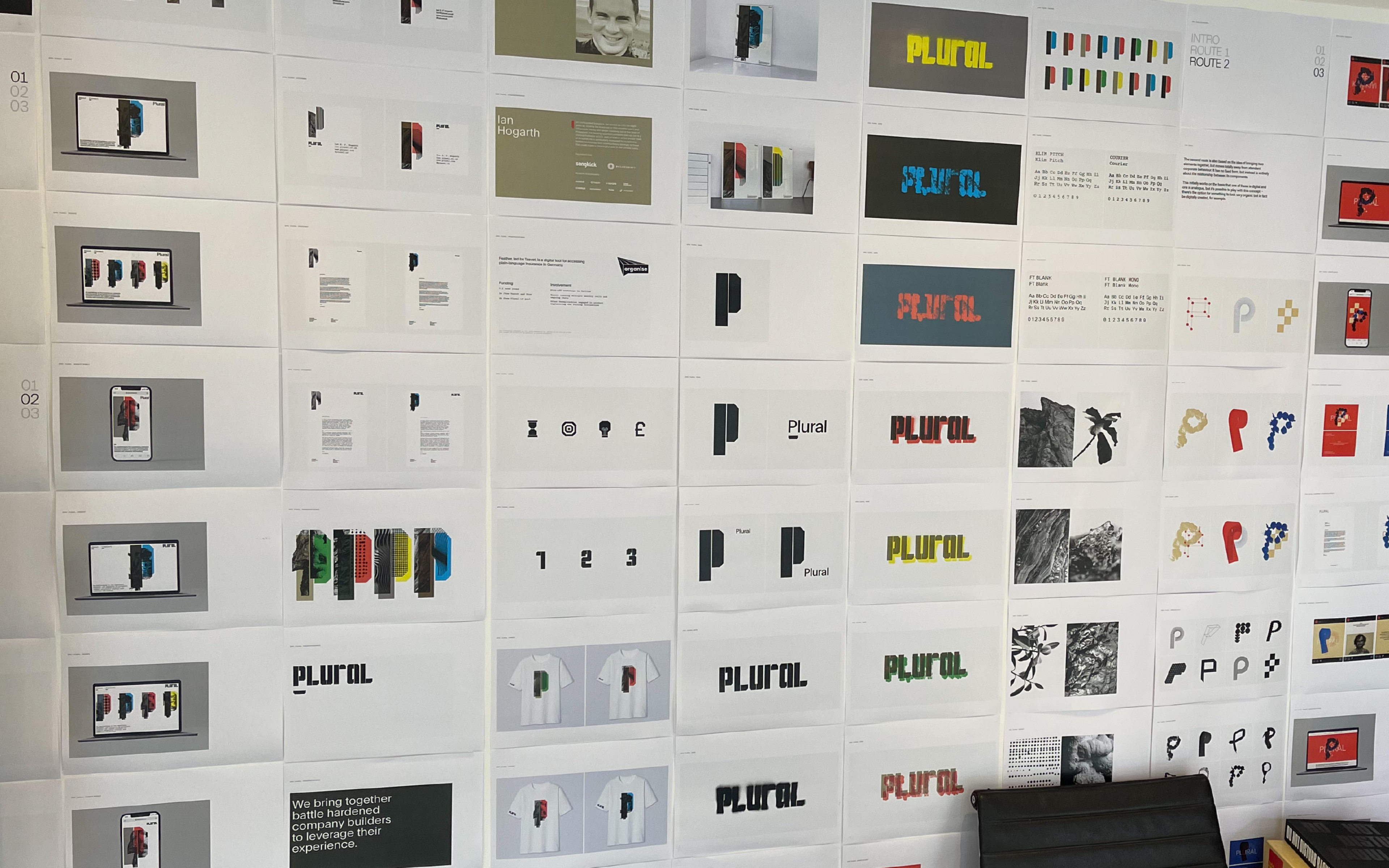
Work in progress
