The core mark with some of the original inspiration
Animations
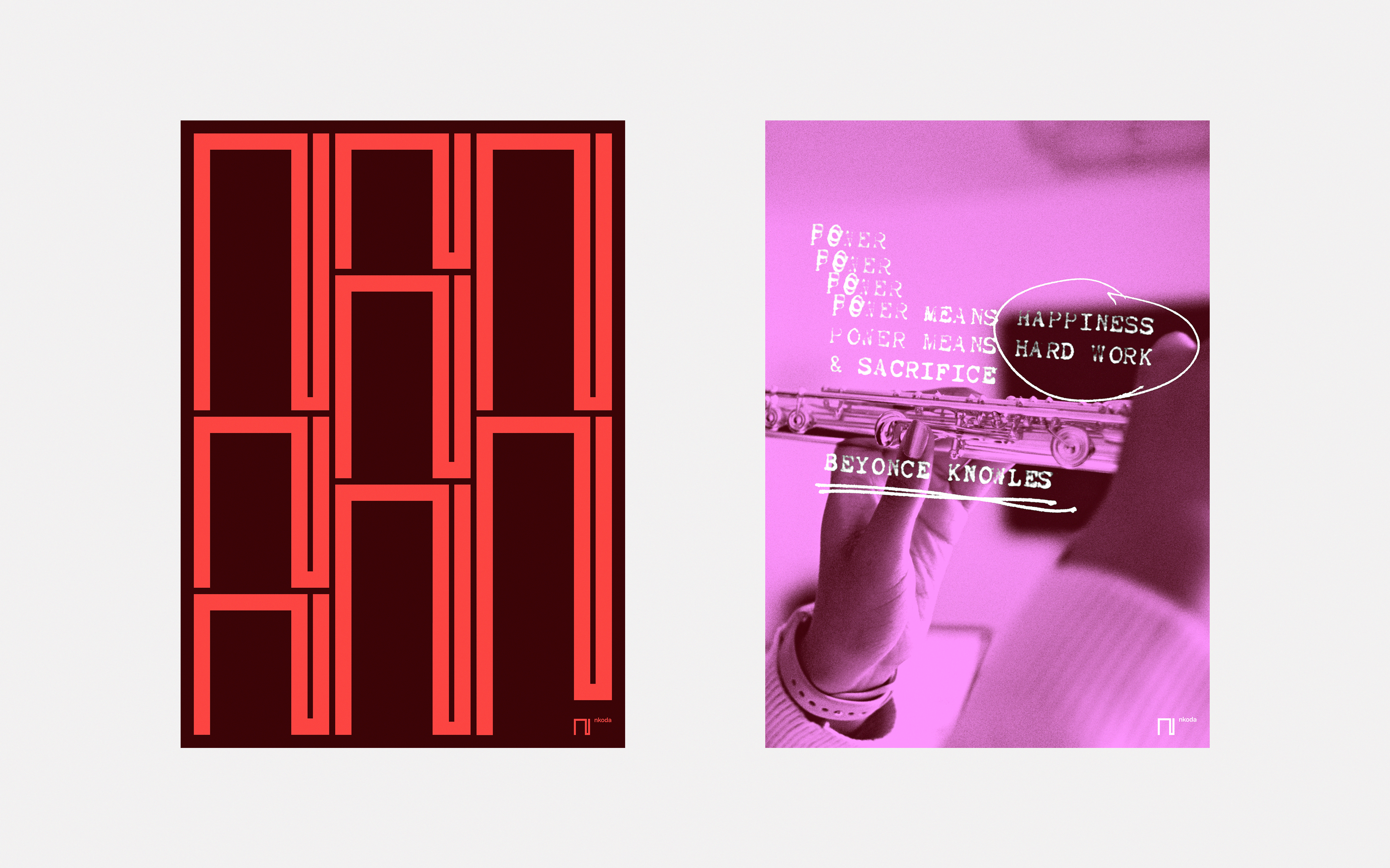
Posters
nkoda’s mission is to change the way music is played by providing a digital sheet music subscription service where the work of artists and composers, from Chopin to Kraftwerk, can be found. Designed to help musicians, their service also extends beyond this core to encompass tools and products covering practice tips, learning spaces, and funds to improve access to musical education.
nkoda’s defining aims are to help people on their musical journey and aim to bring music-making to as many people around the world as possible. We worked with nkoda to develop a visual identity that highlighted their ambition and did justice to their offering.
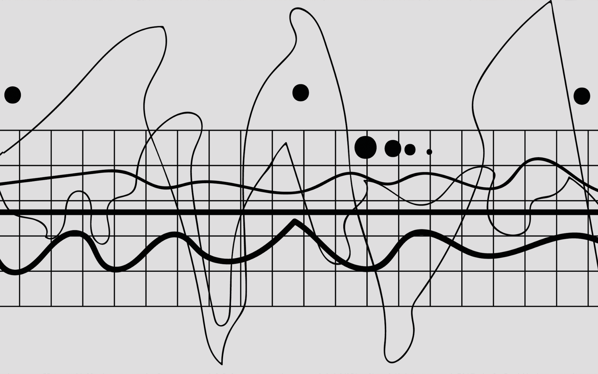
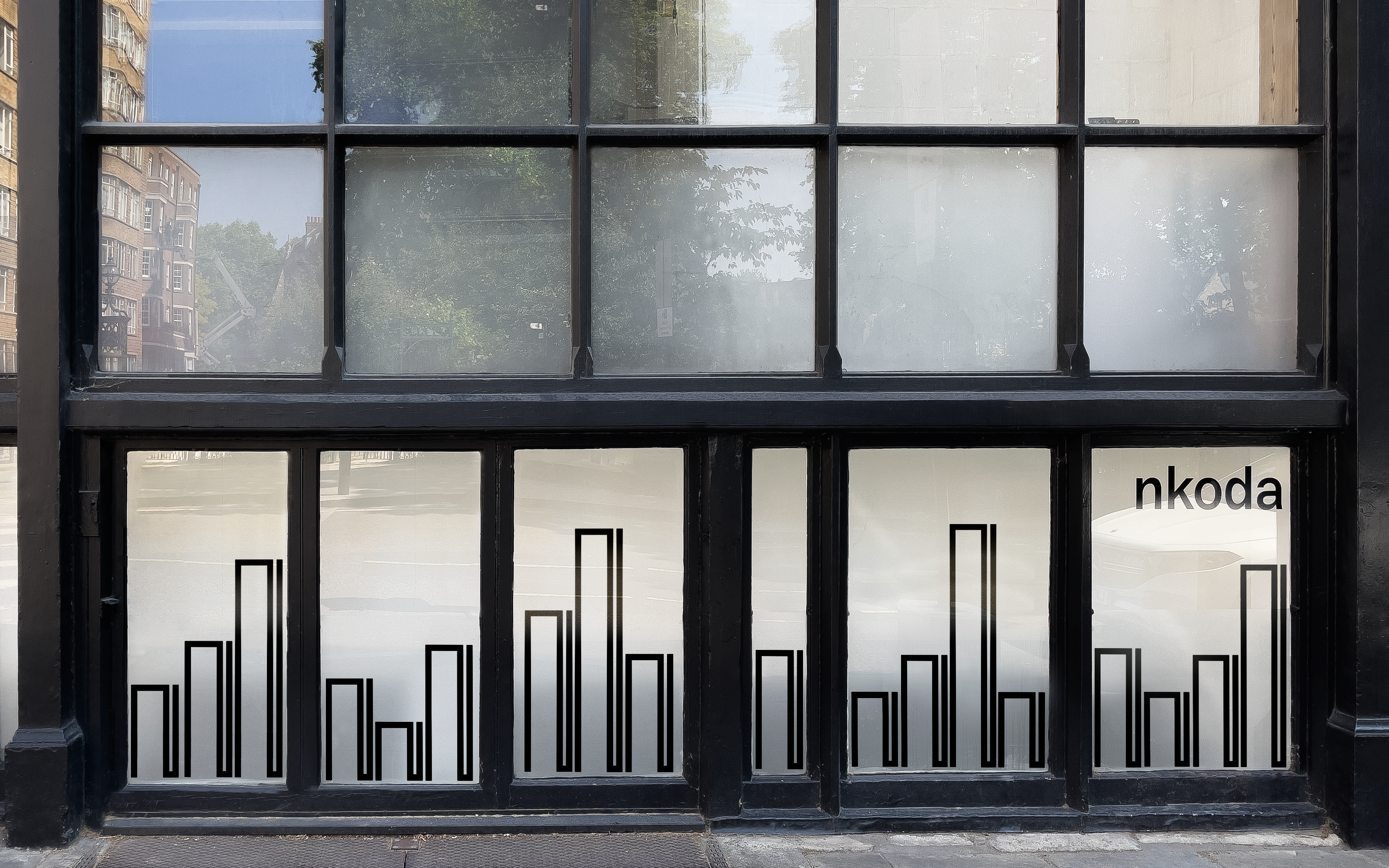
There has always been a fascinating and productive tension between the visual and aural forms of music: think of the relationship between musical score and performance, or a phrase like reading music. The nkoda identity presented us with the opportunity to translate unique quality of music into graphic terms. Importantly, the new identity also needed to balance disruption — a more confident and vibrant identity than the typical detached startup aesthetic — with authenticity, the fact that nkoda themselves come from music.
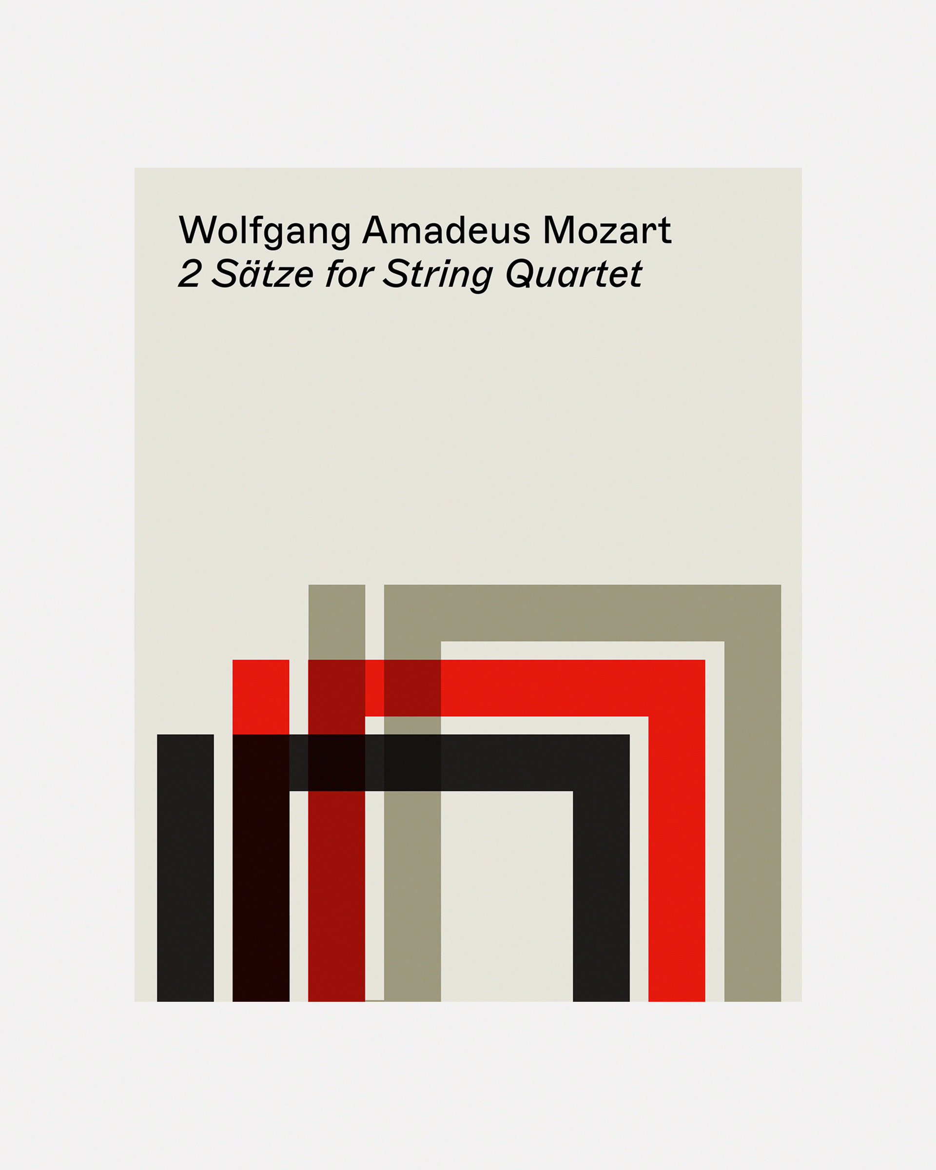
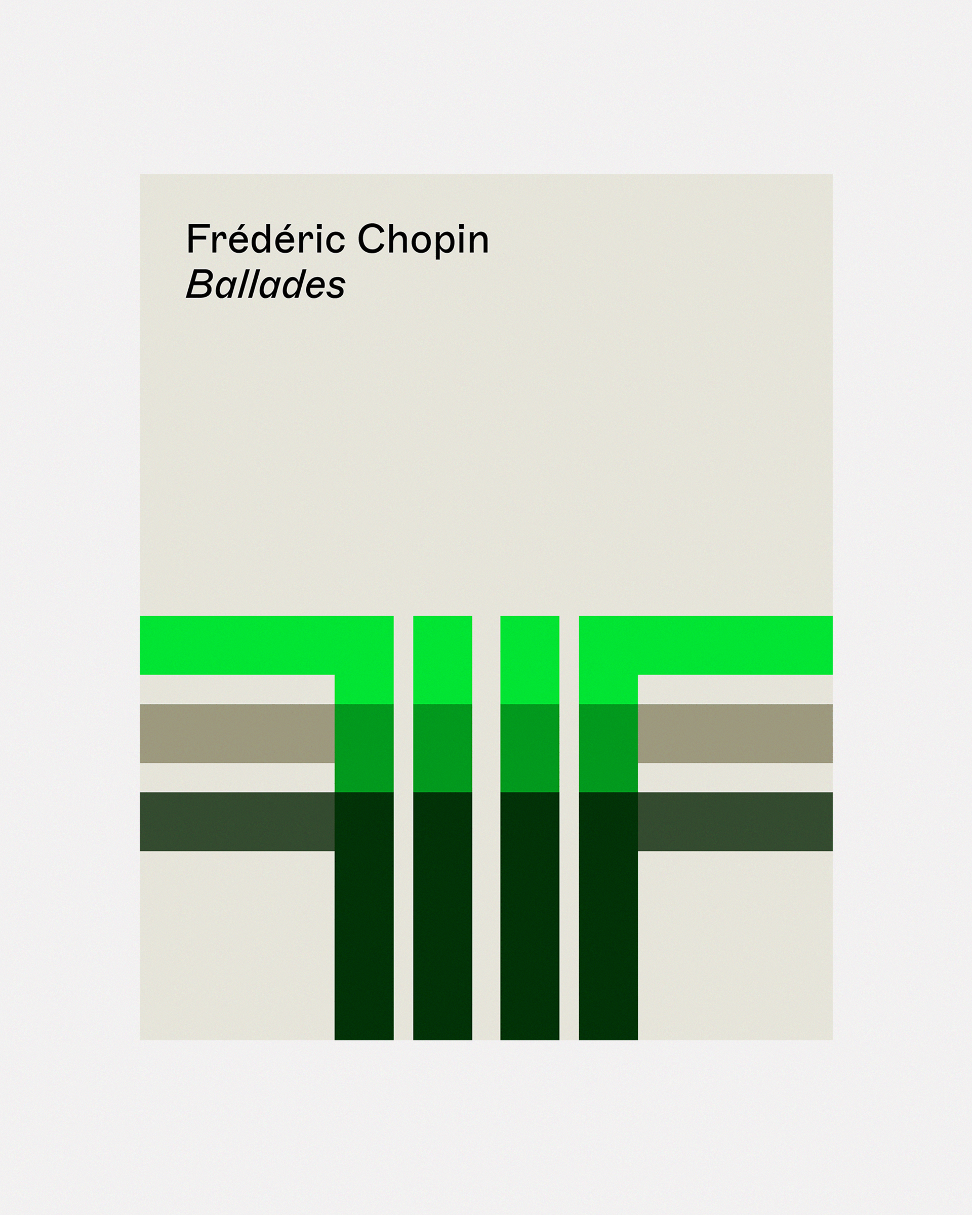
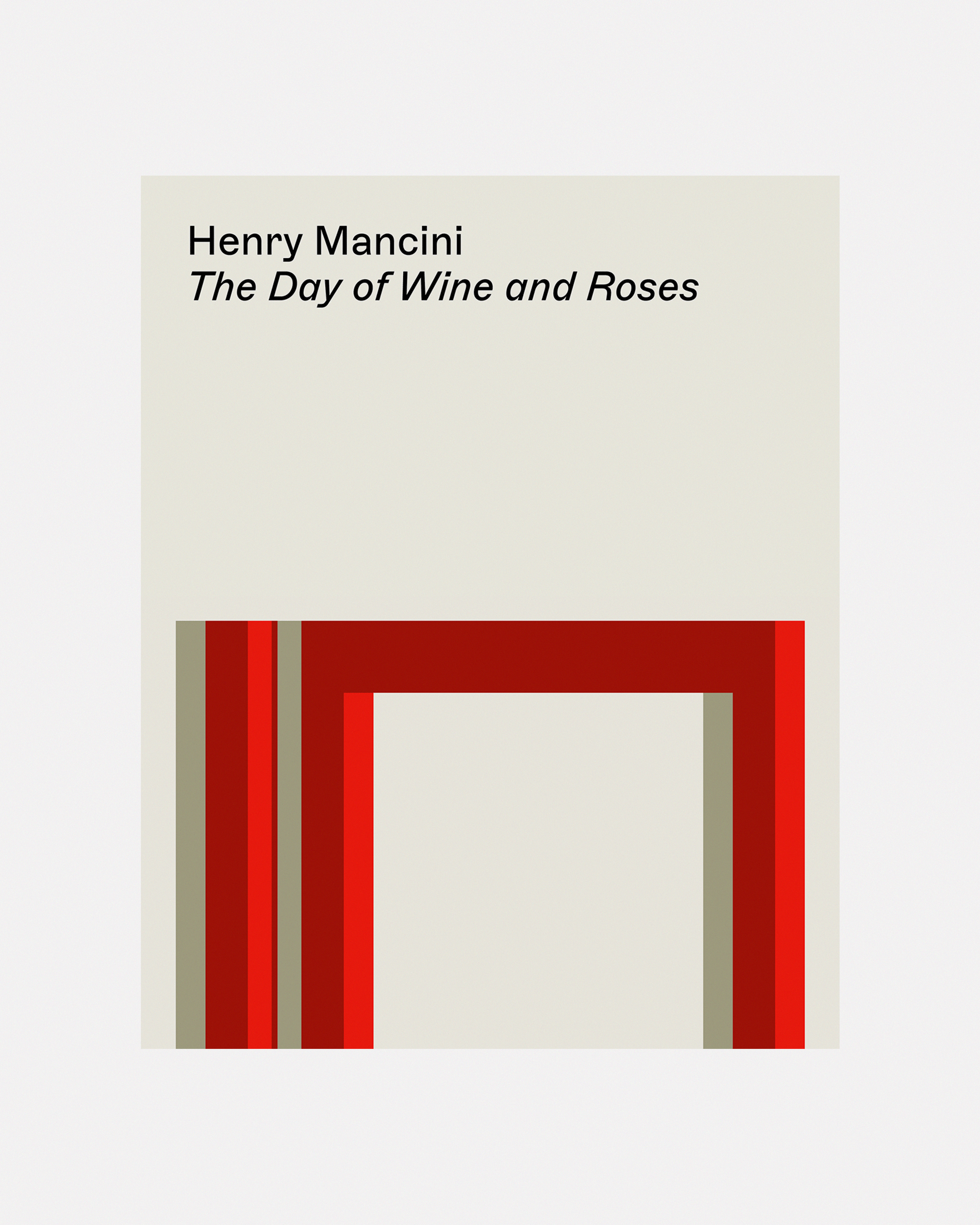
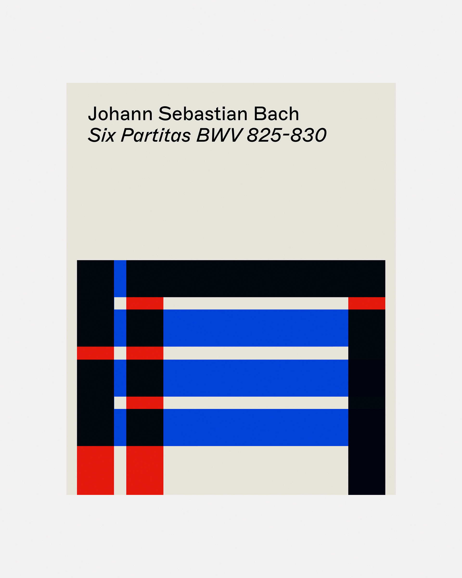
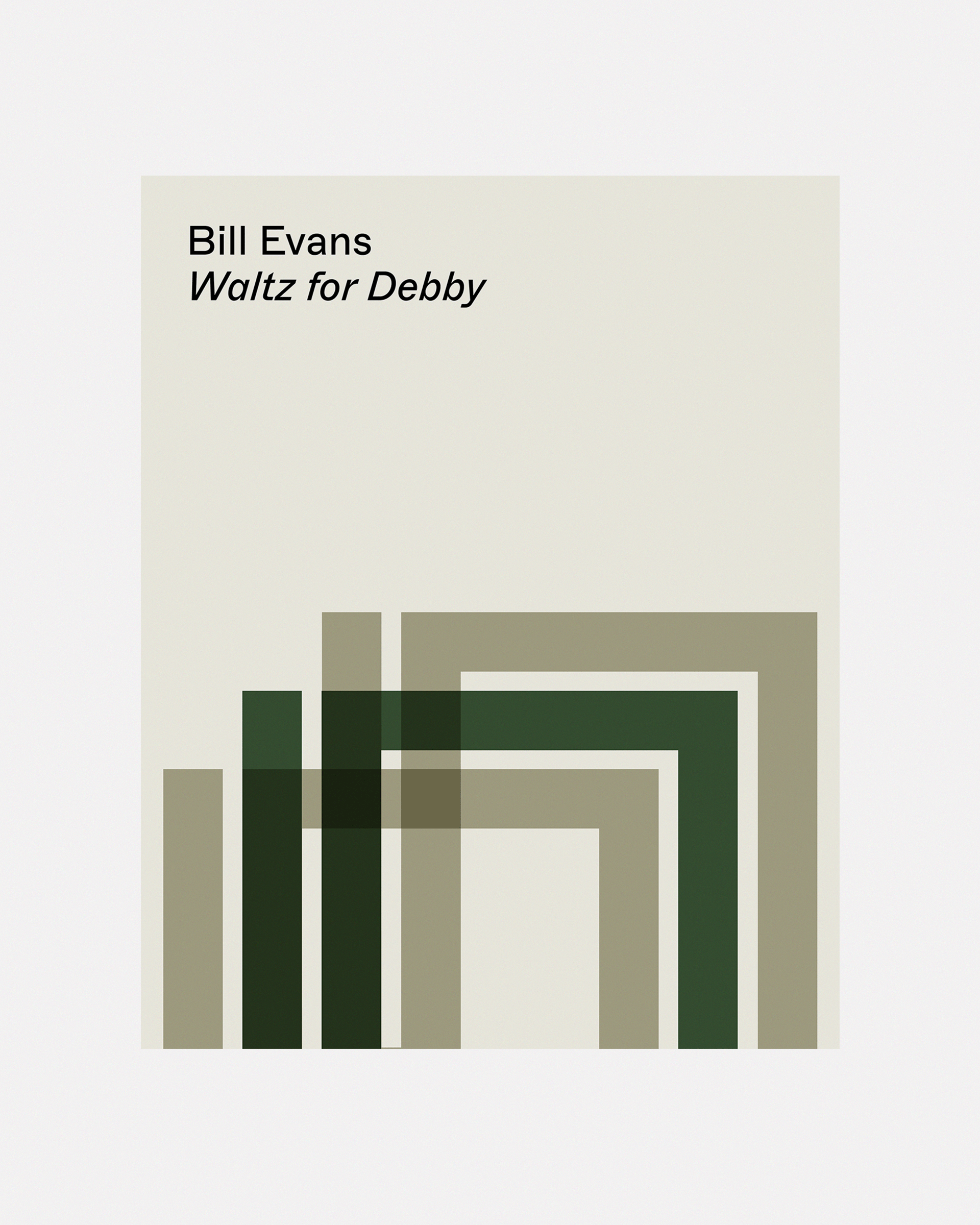
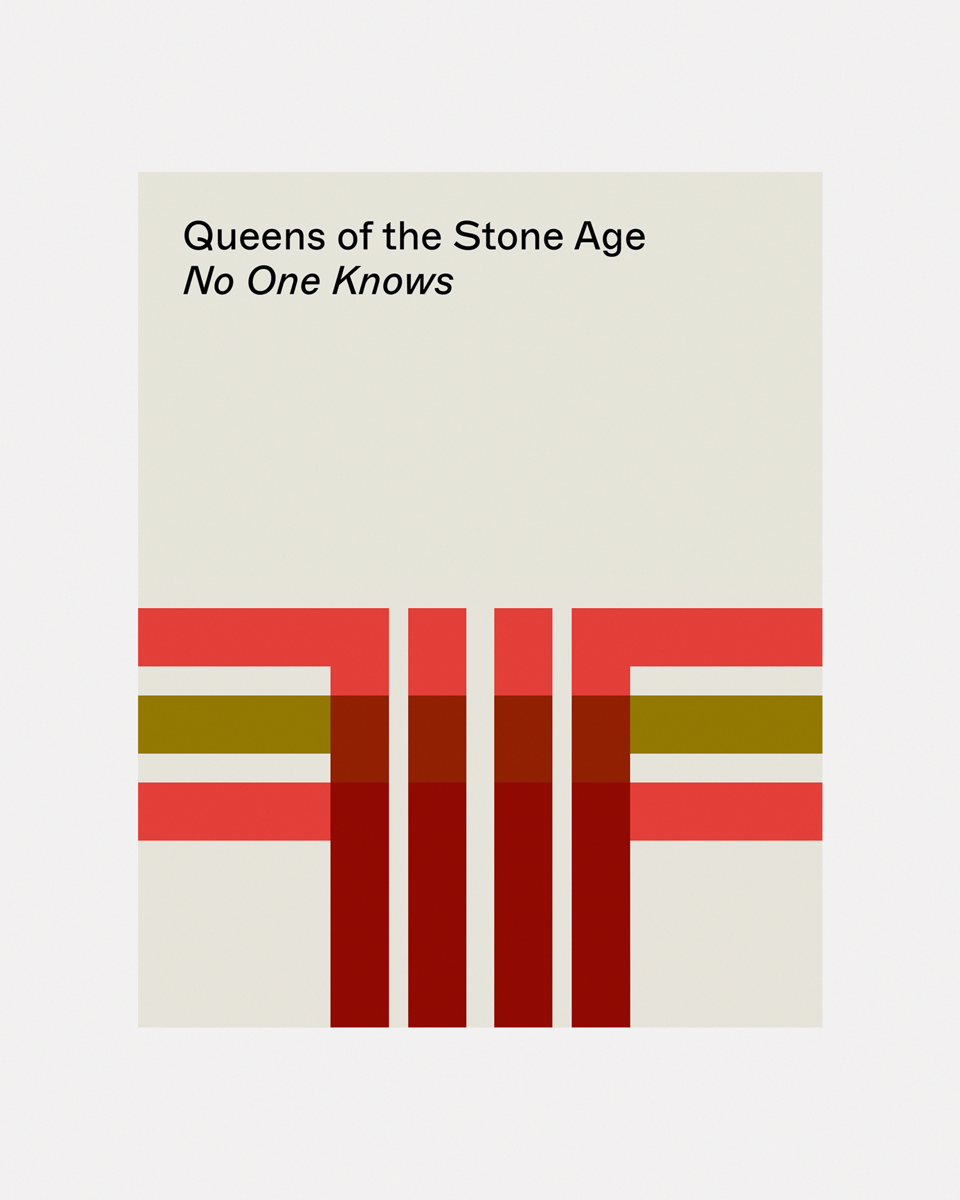
Visual language (edition covers)
Environmental graphics
Starting by defining music as the organisation of sound, we arrived at the soundwave as a universal visual expression of music. This also chimed with nkoda’s approach to music-making: their platform is designed to break down the act of practice into individual moments in order to build it, piece by piece, into the strongest possible version of itself. With this in mind, we developed the nkoda identity to invoke the soundwave in a distinctive and unmistakably contemporary way.
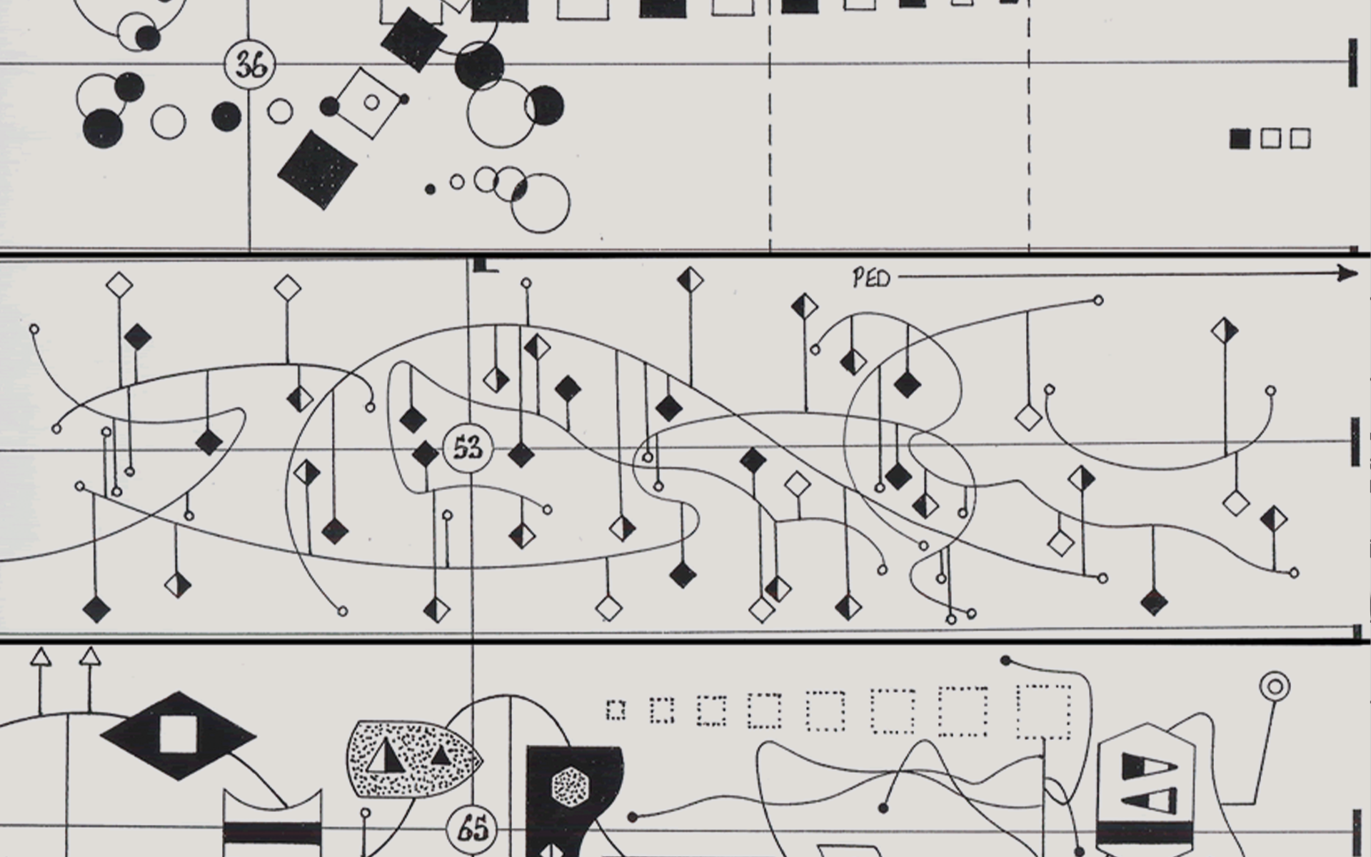
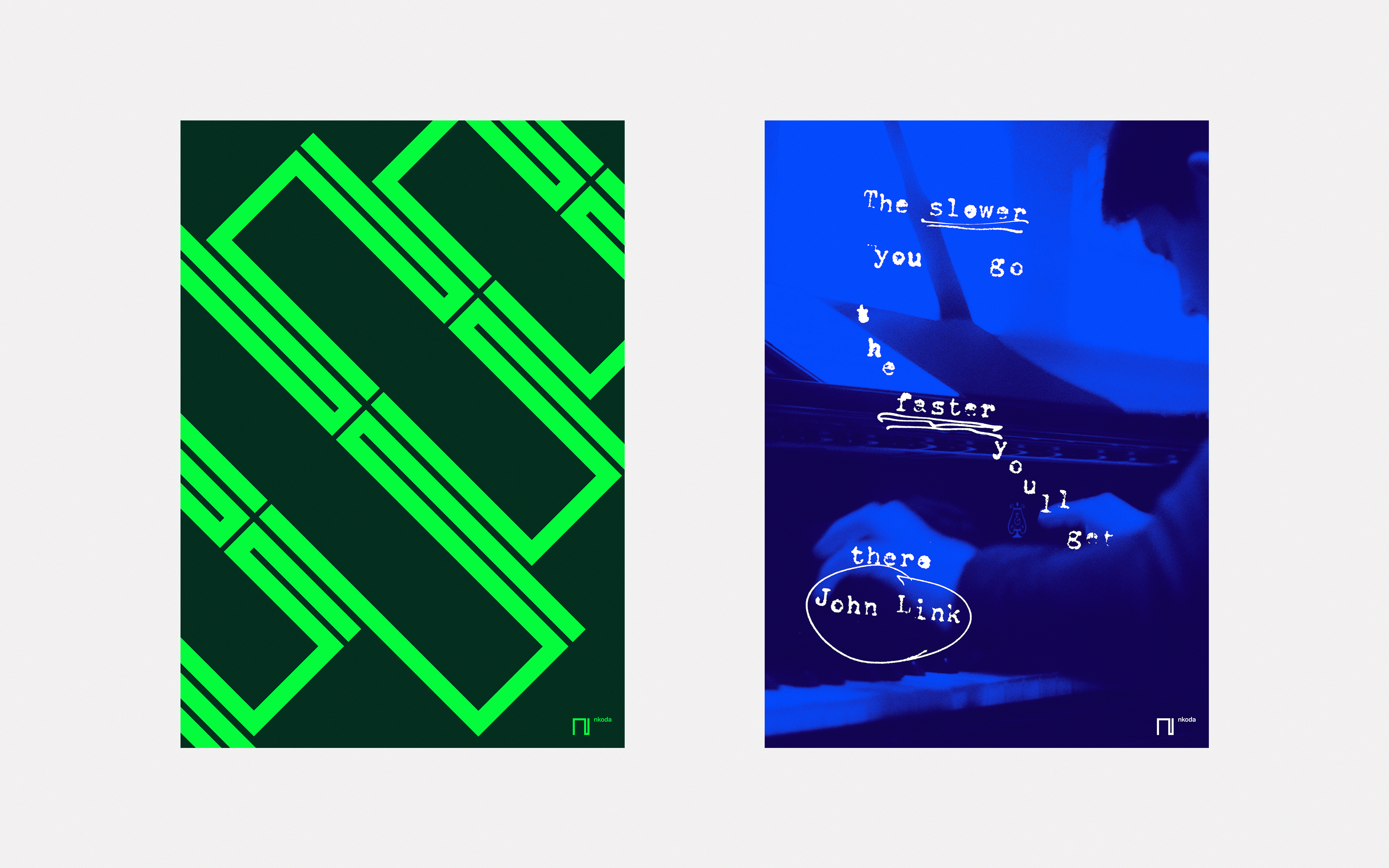
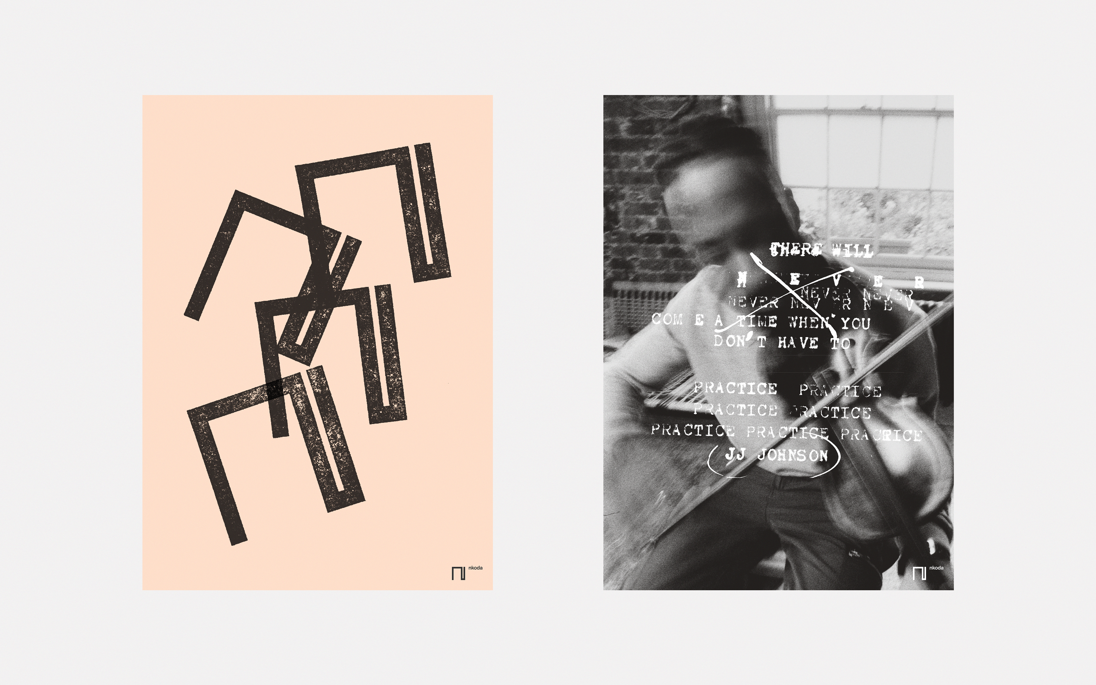
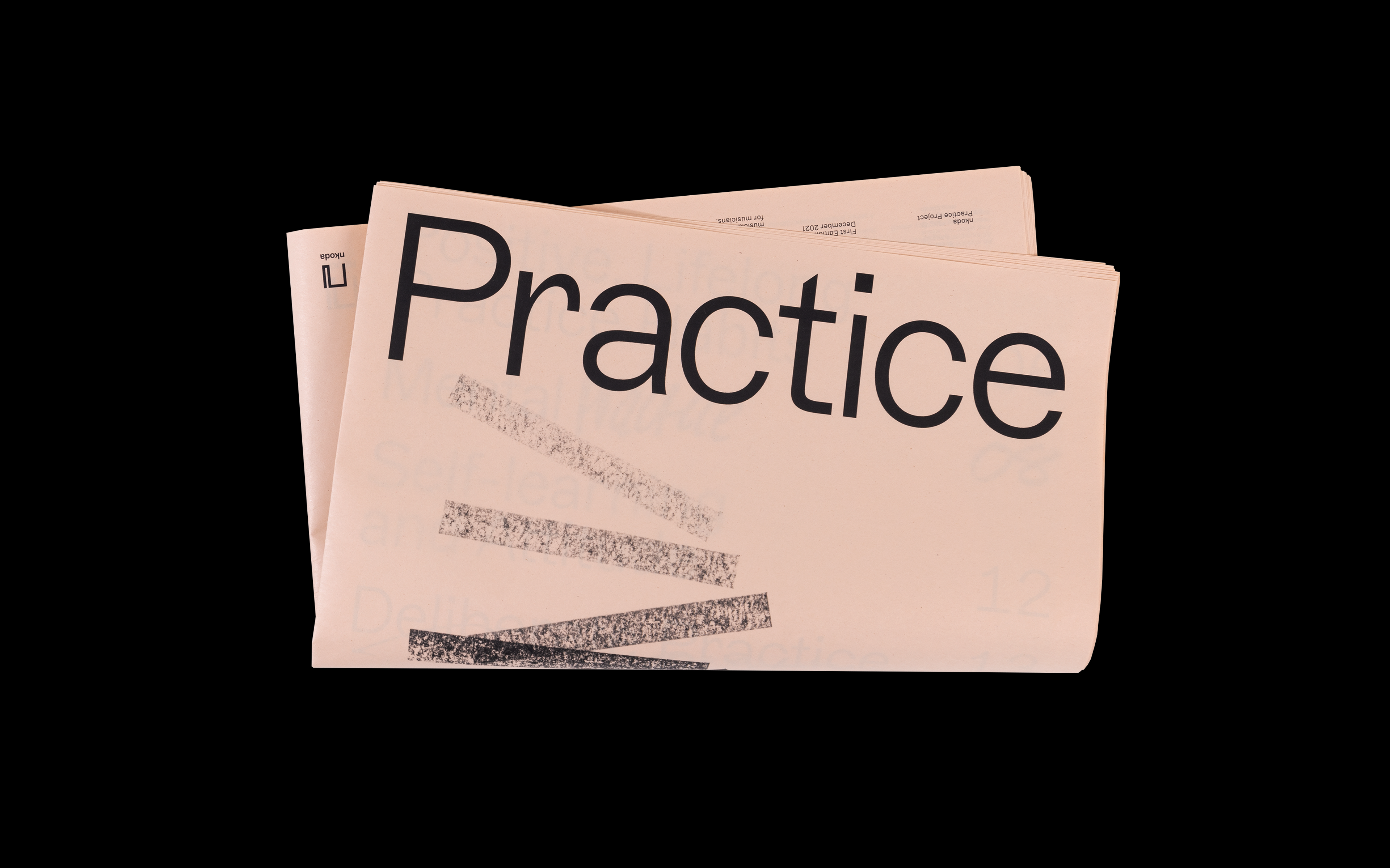
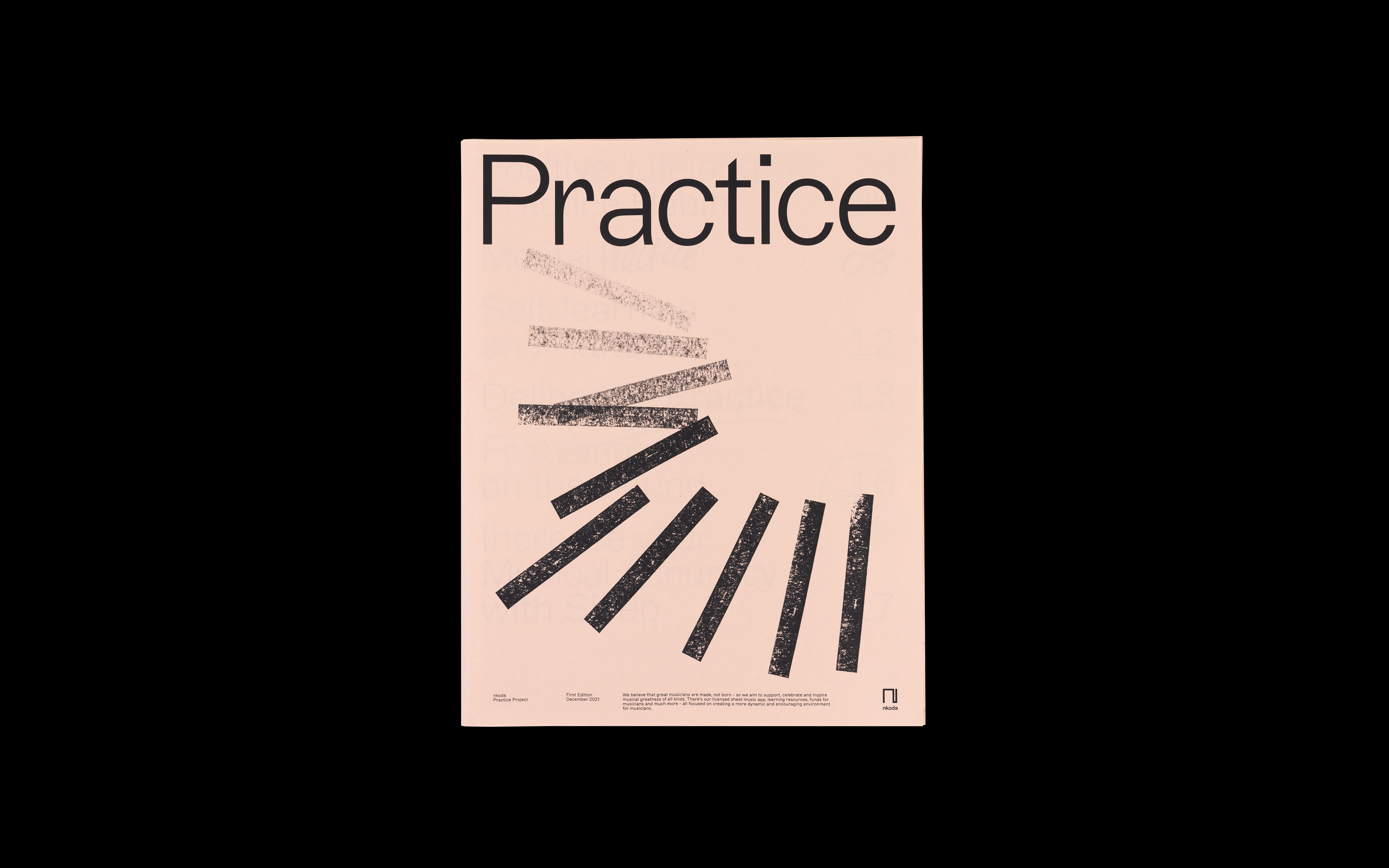
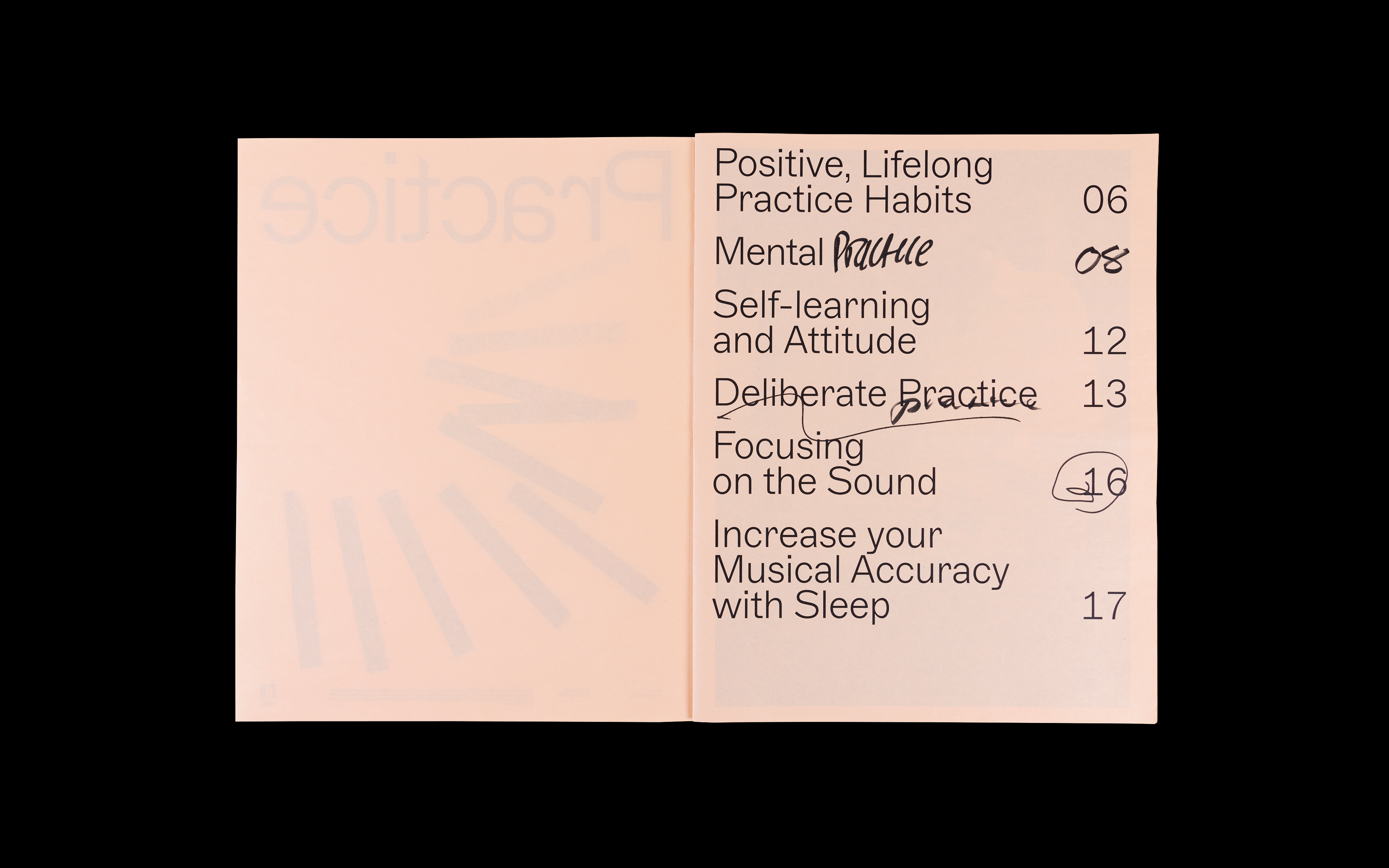
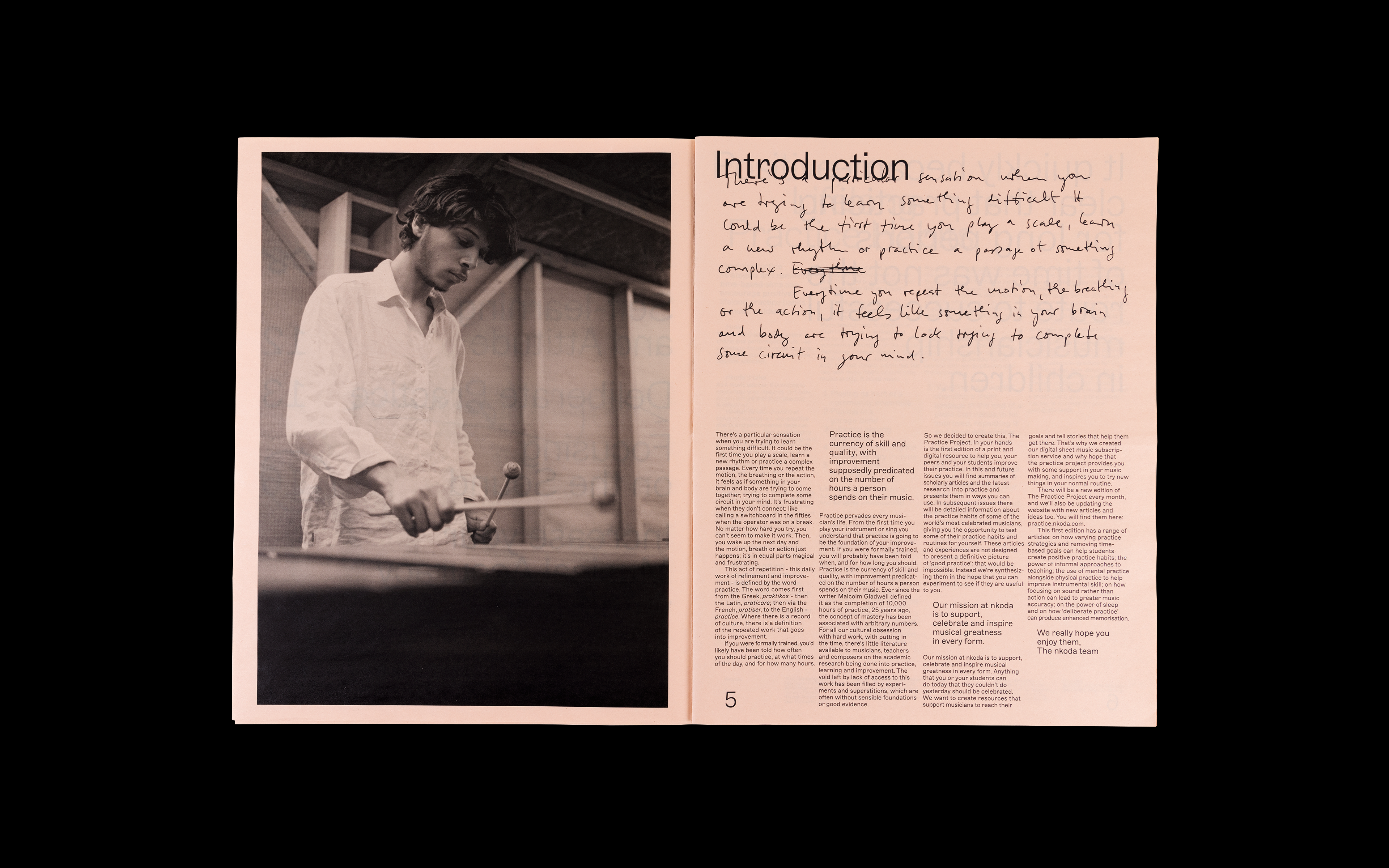
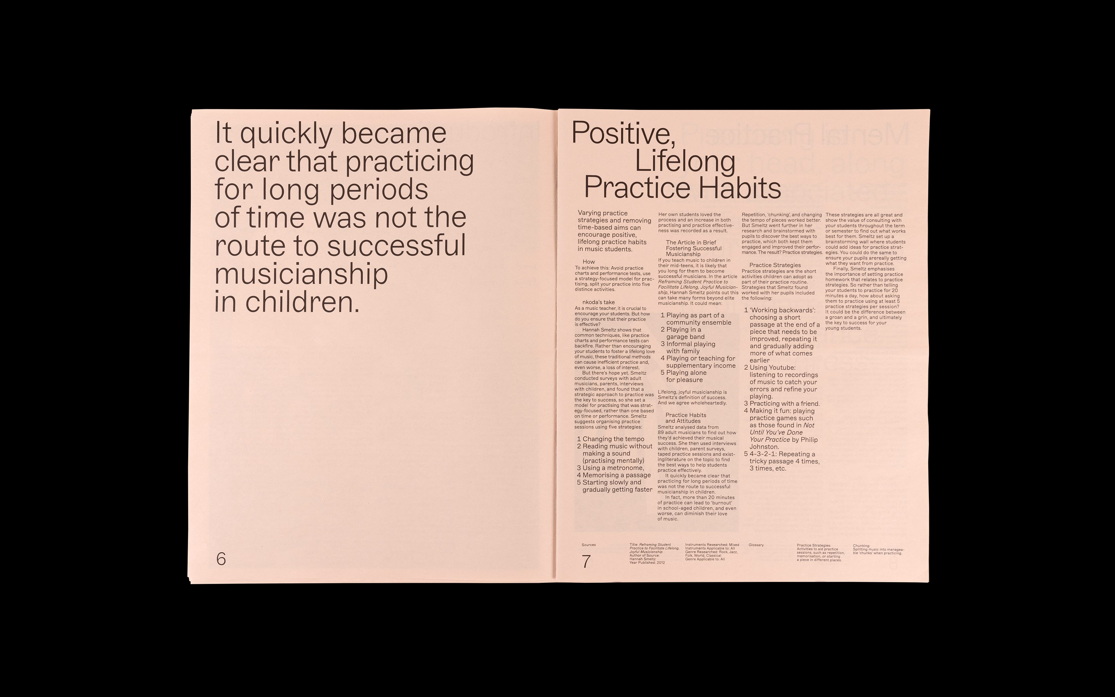
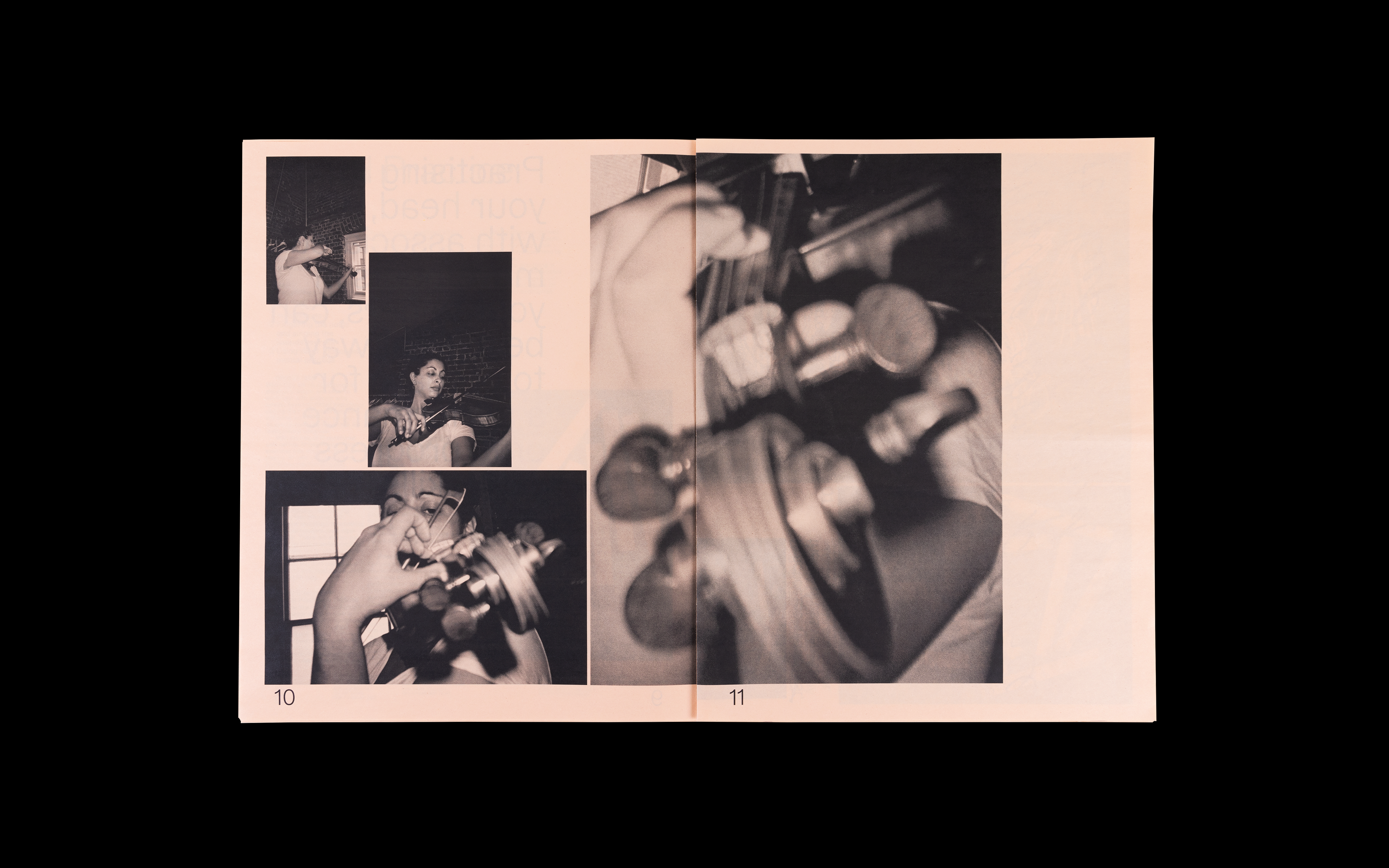
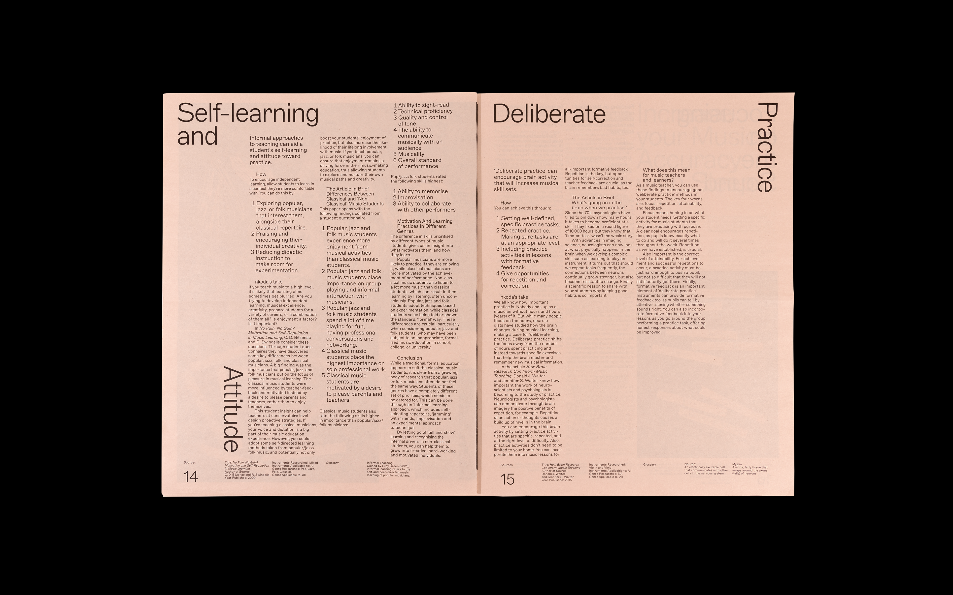
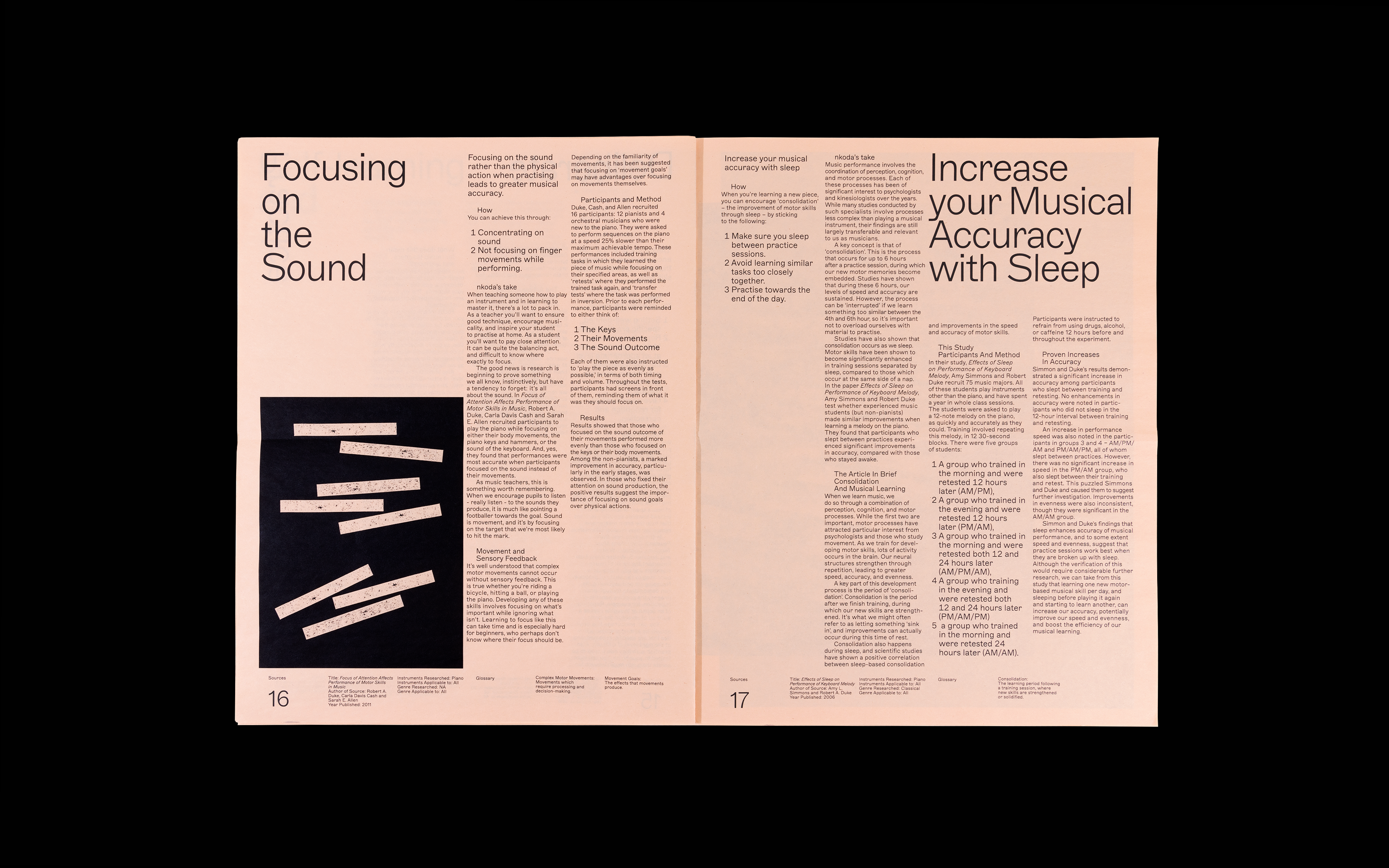
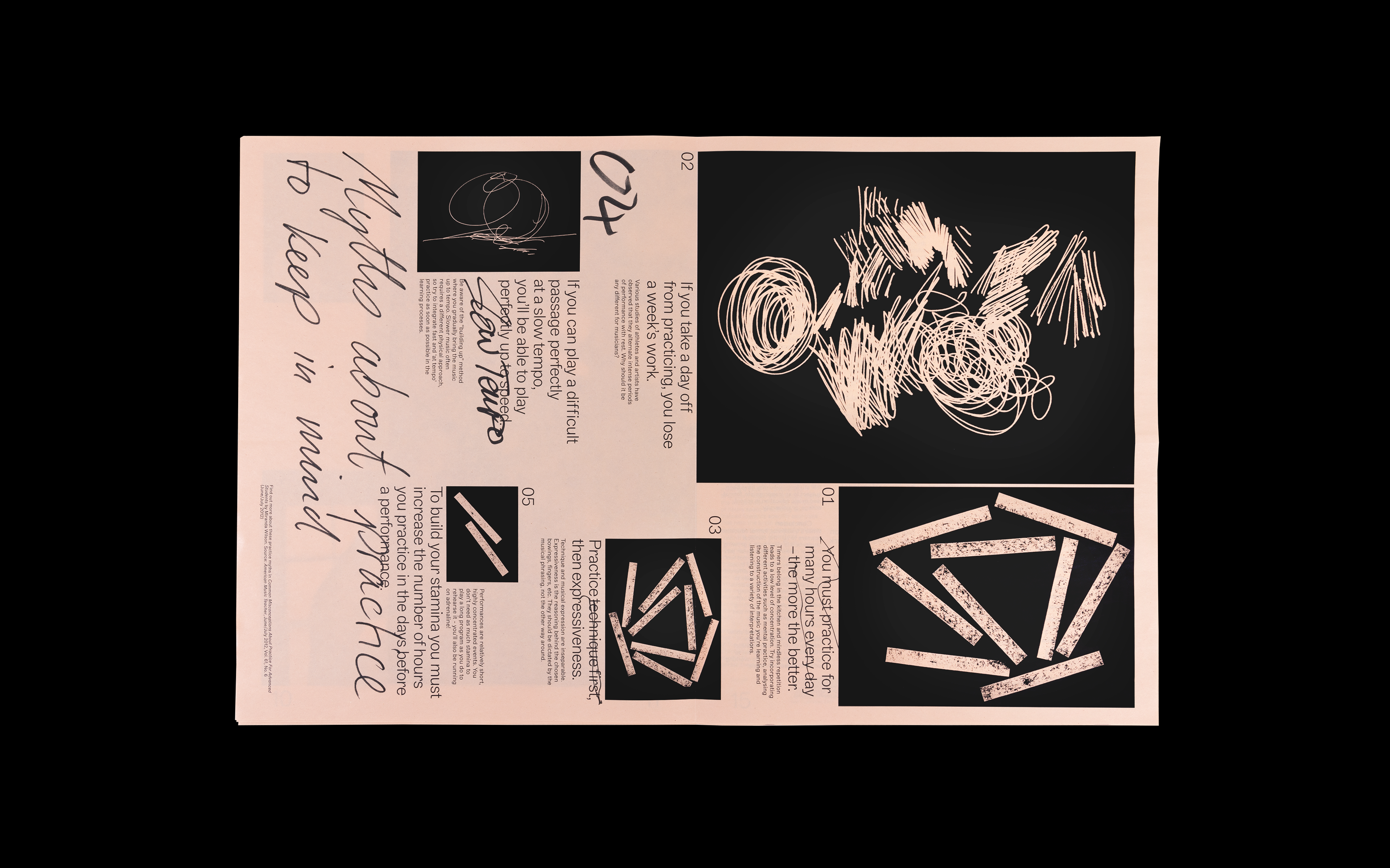
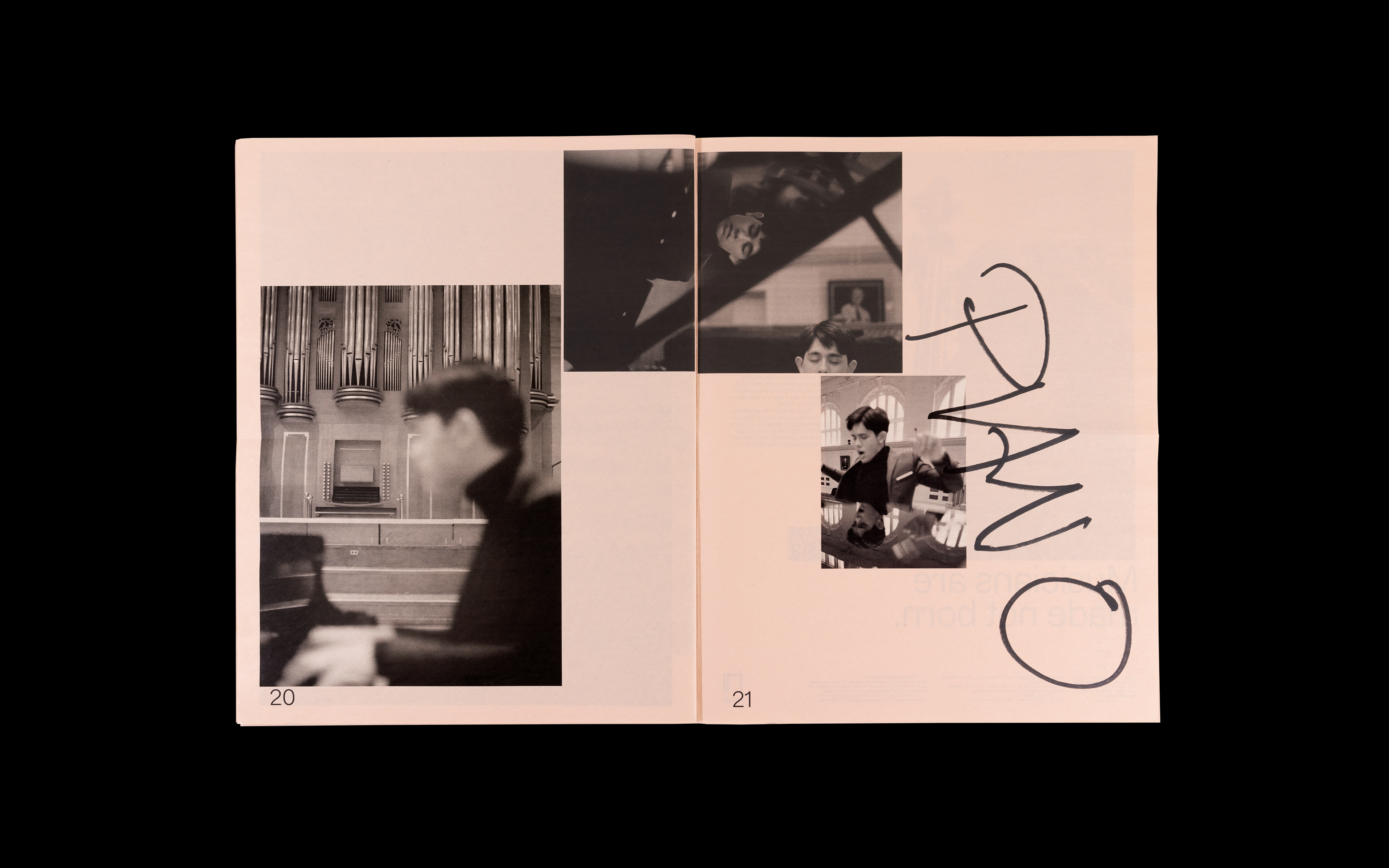
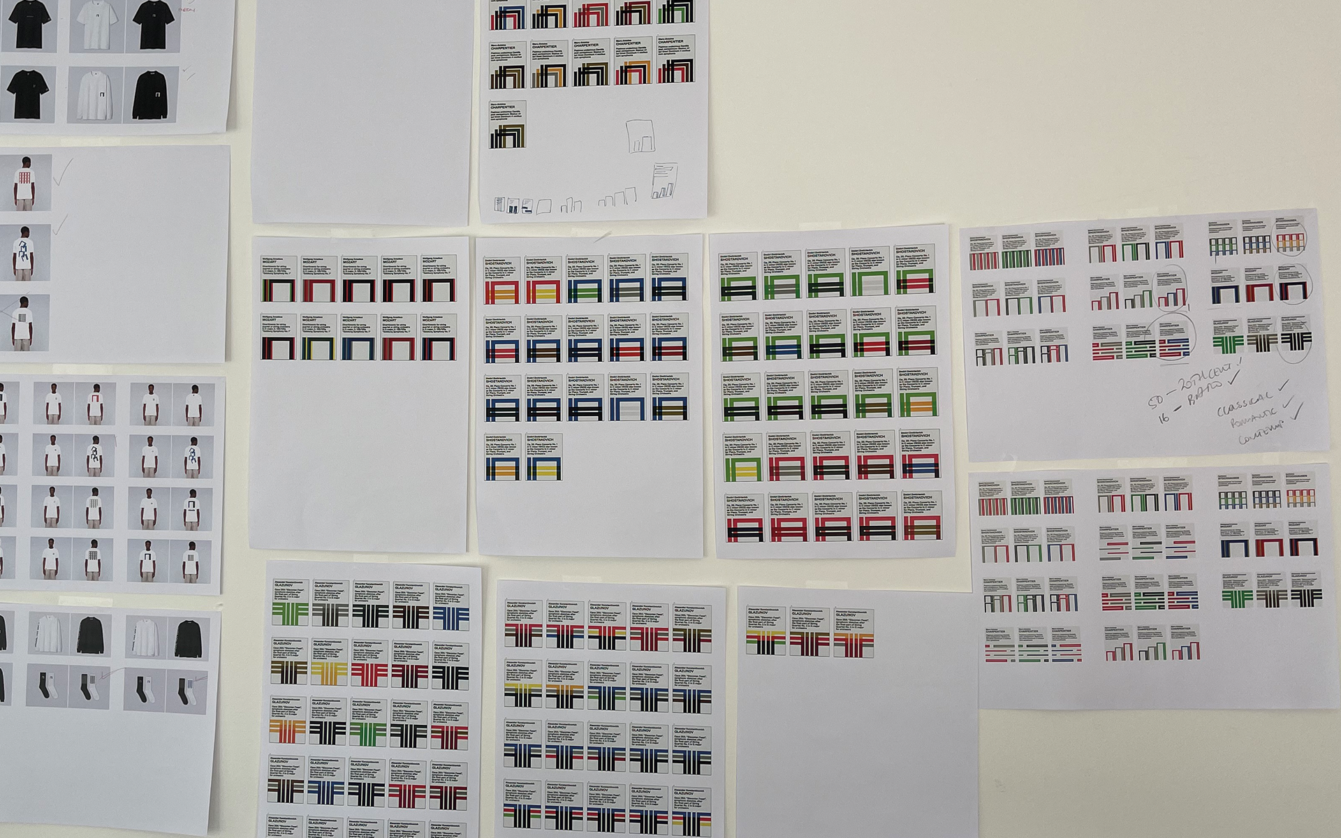
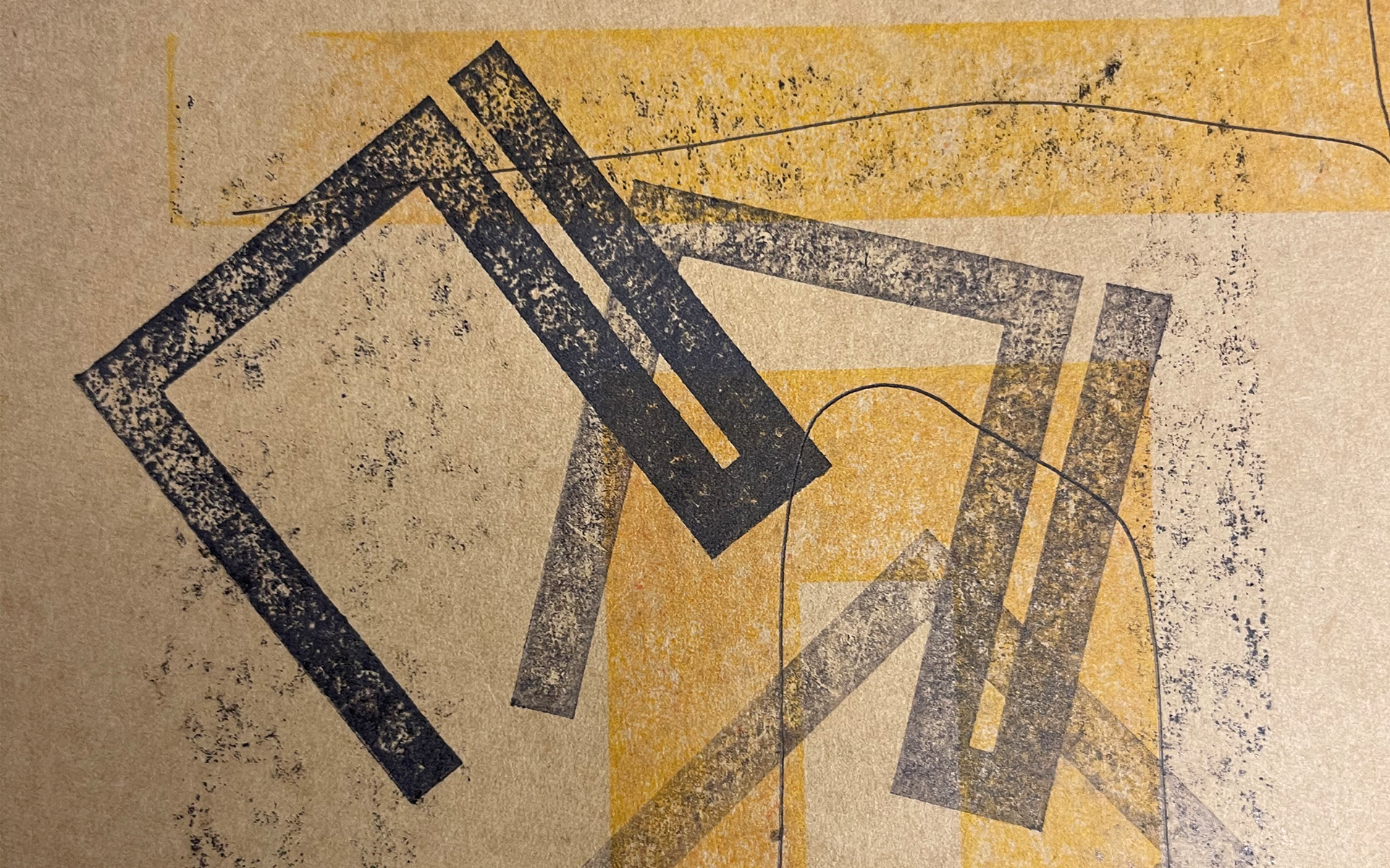
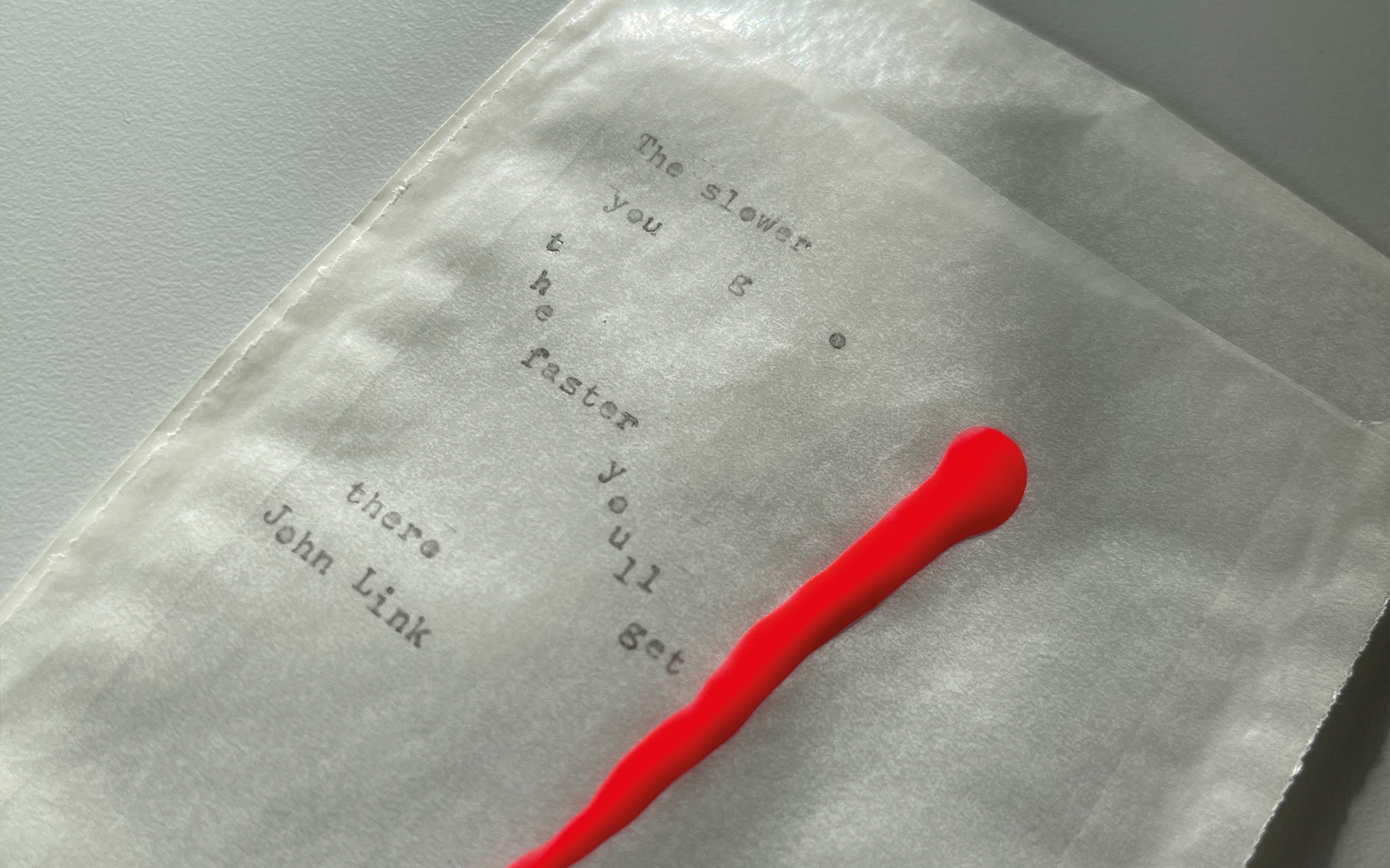
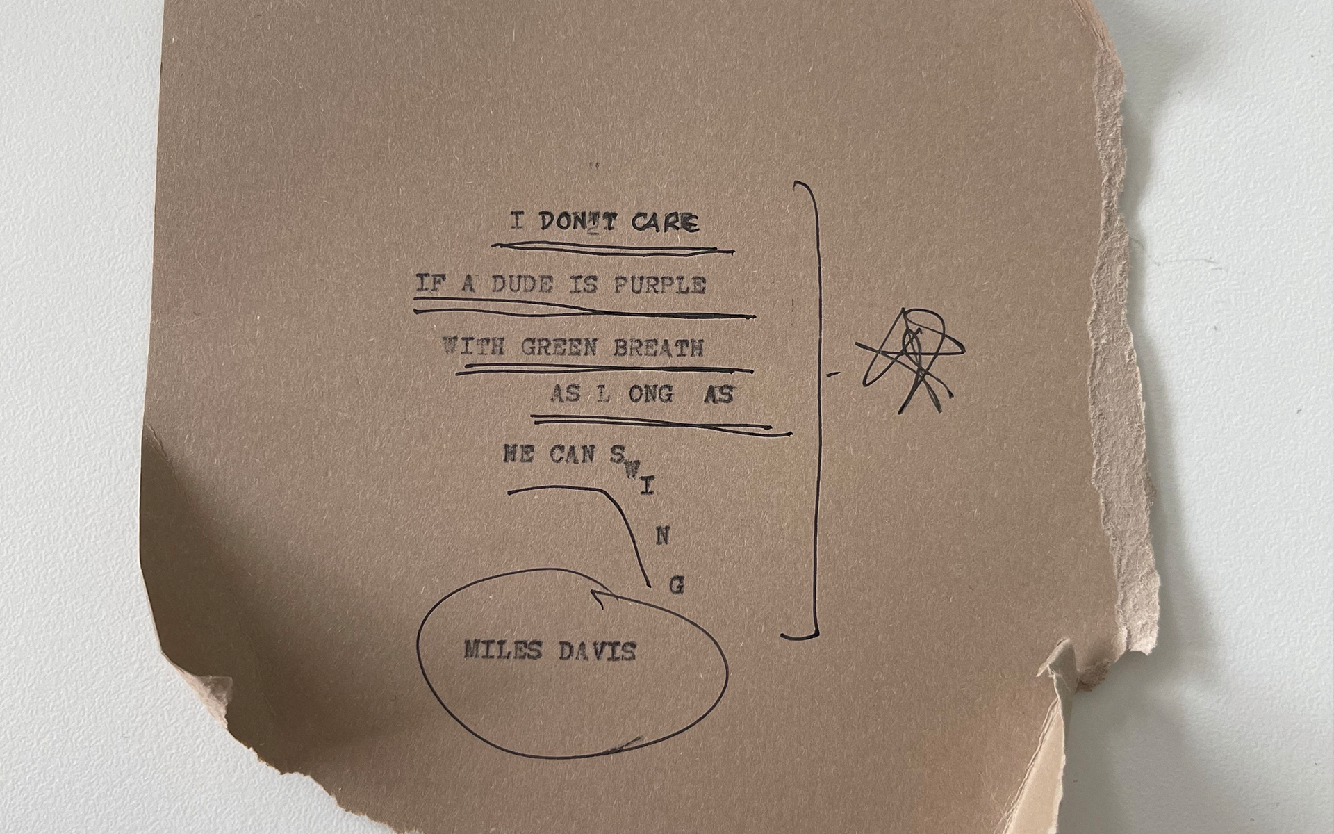
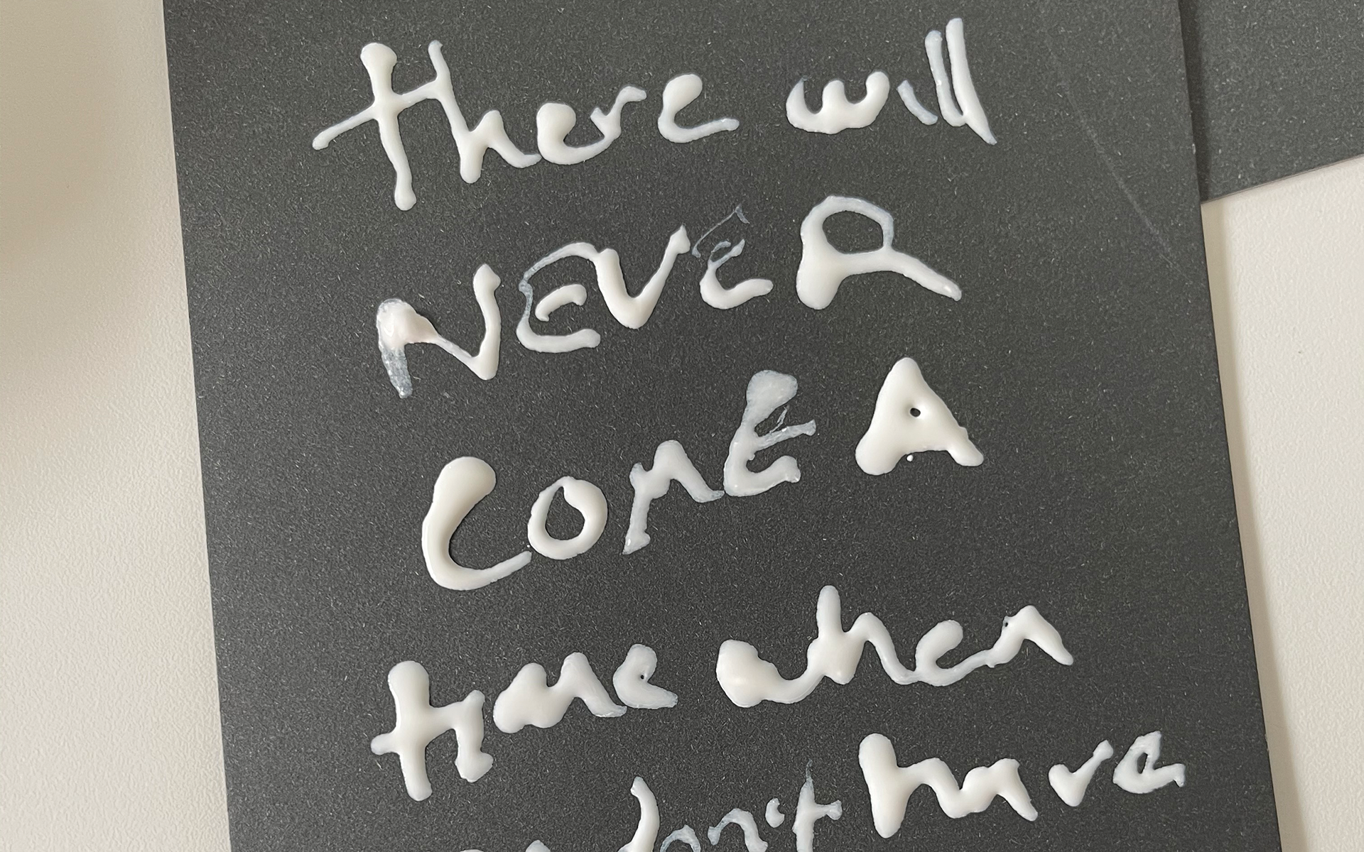
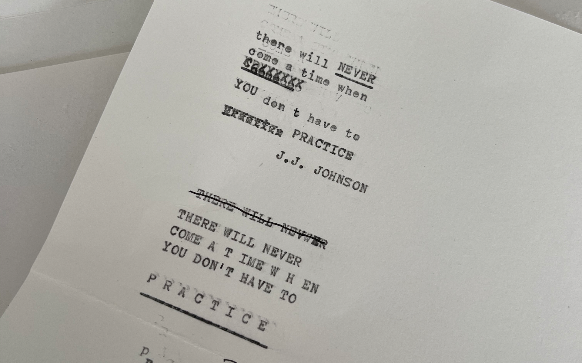
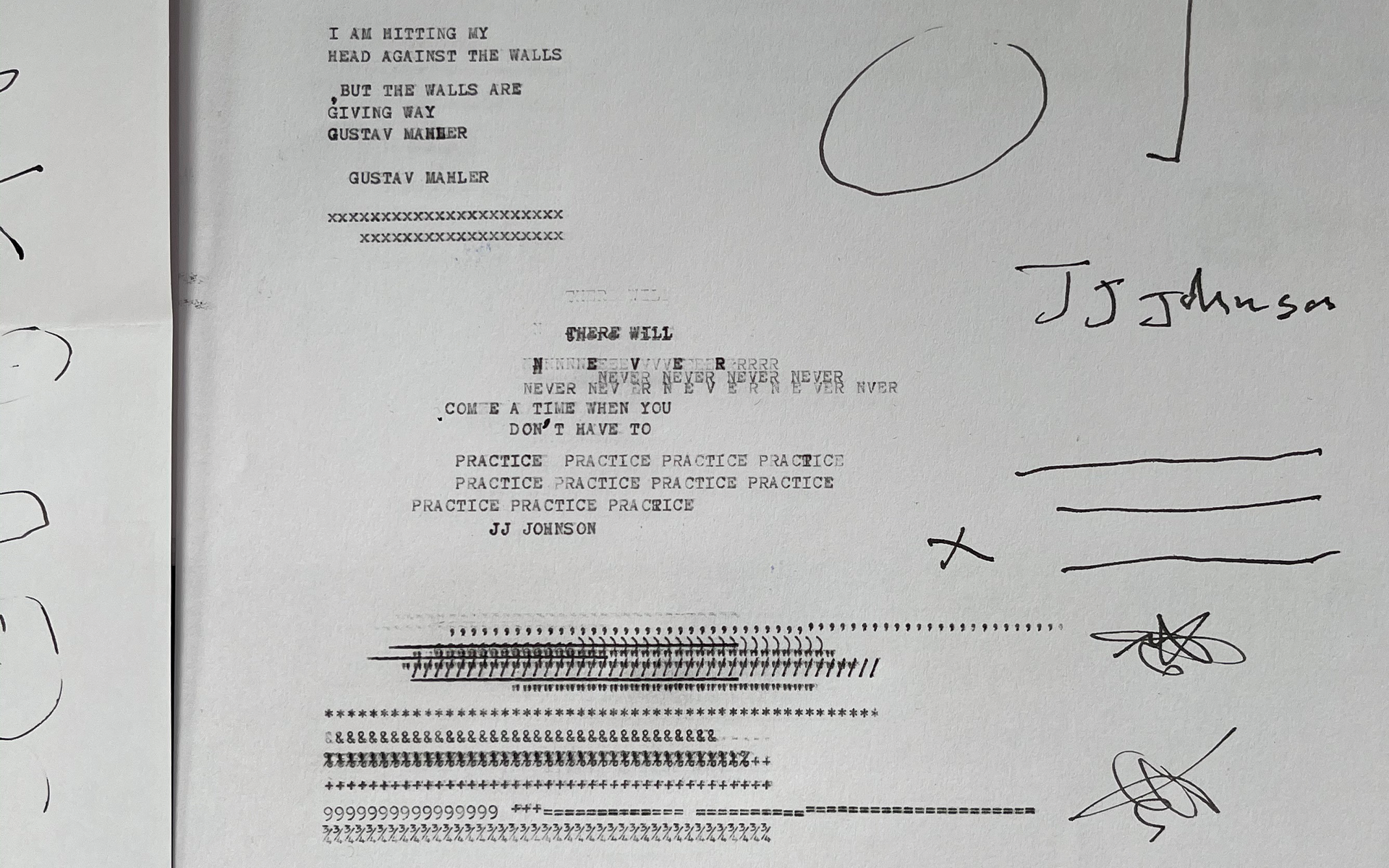
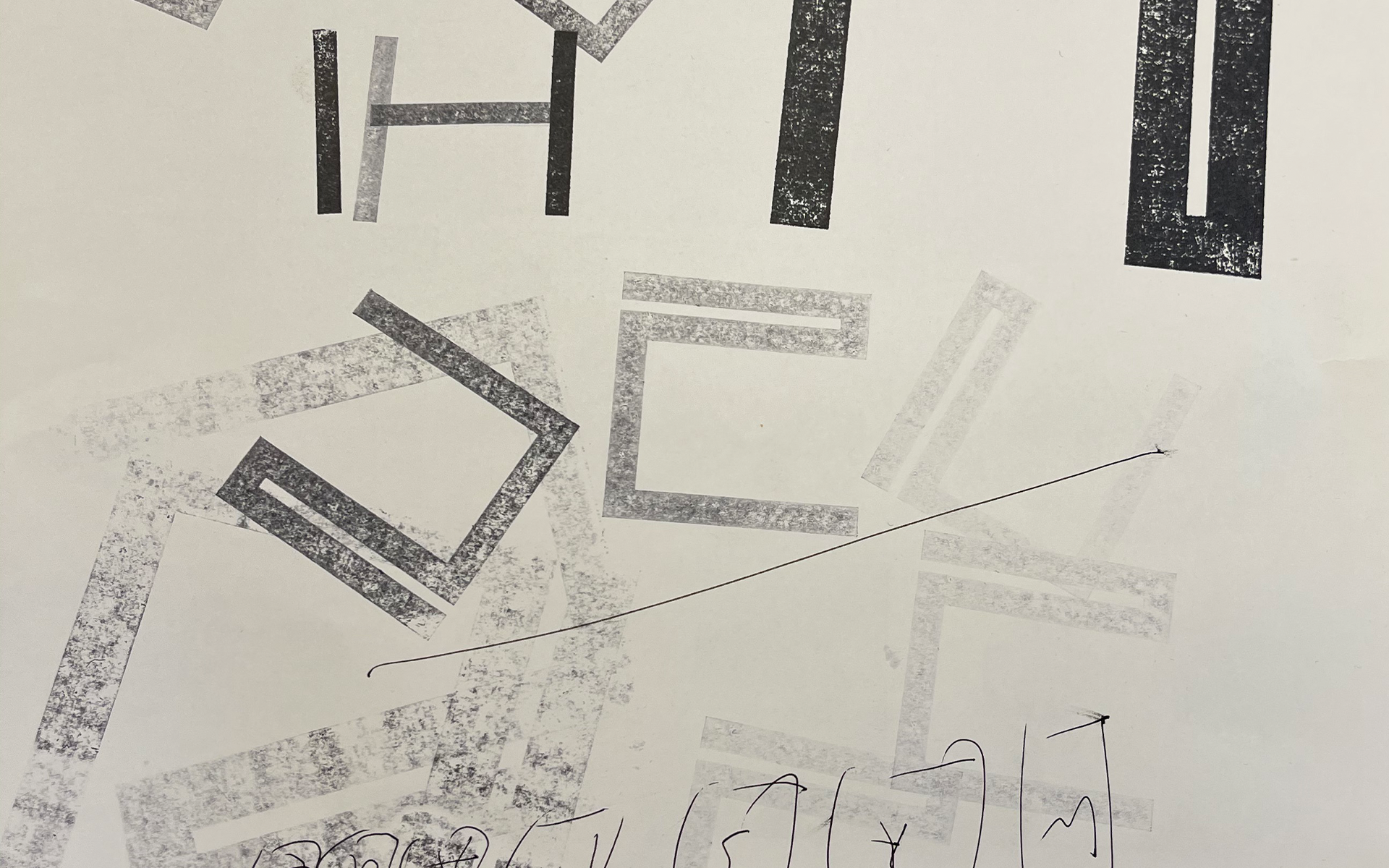
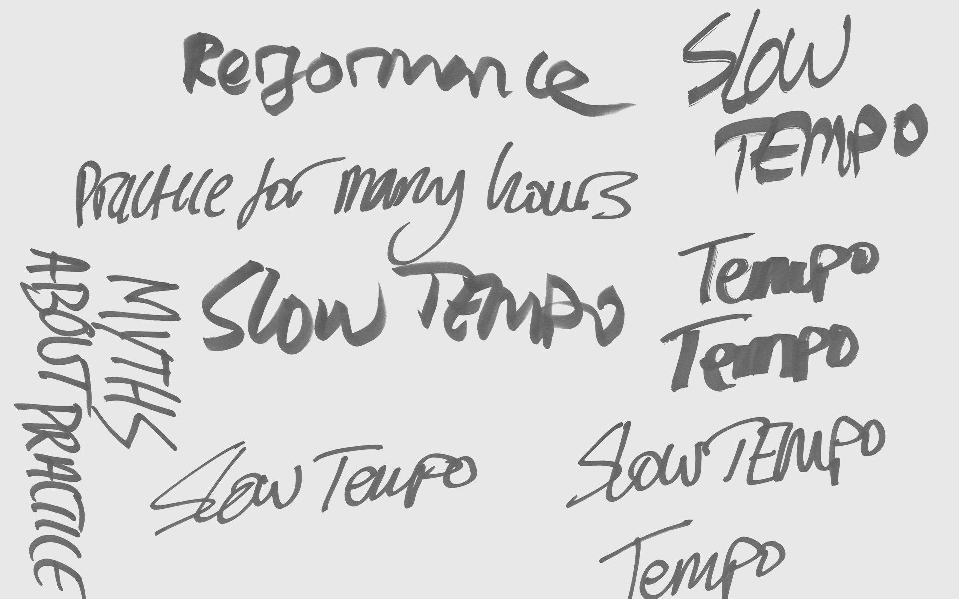
Since the initial creation of the identity, we have continued to work with nkoda on extending the visual language across a variety of platforms, including two apps and the Practice Project: a printed publication with engaging short-form content, based on academic and scientific research, that aims to enhance the experience of practice. The Practice Project brings the identity into the realm of editorial design, using an accessible newspaper-style format and combining clean, contemporary typography with the rougher feel of handwritten and stamped textures.
Practice Project visual language
Practice Project
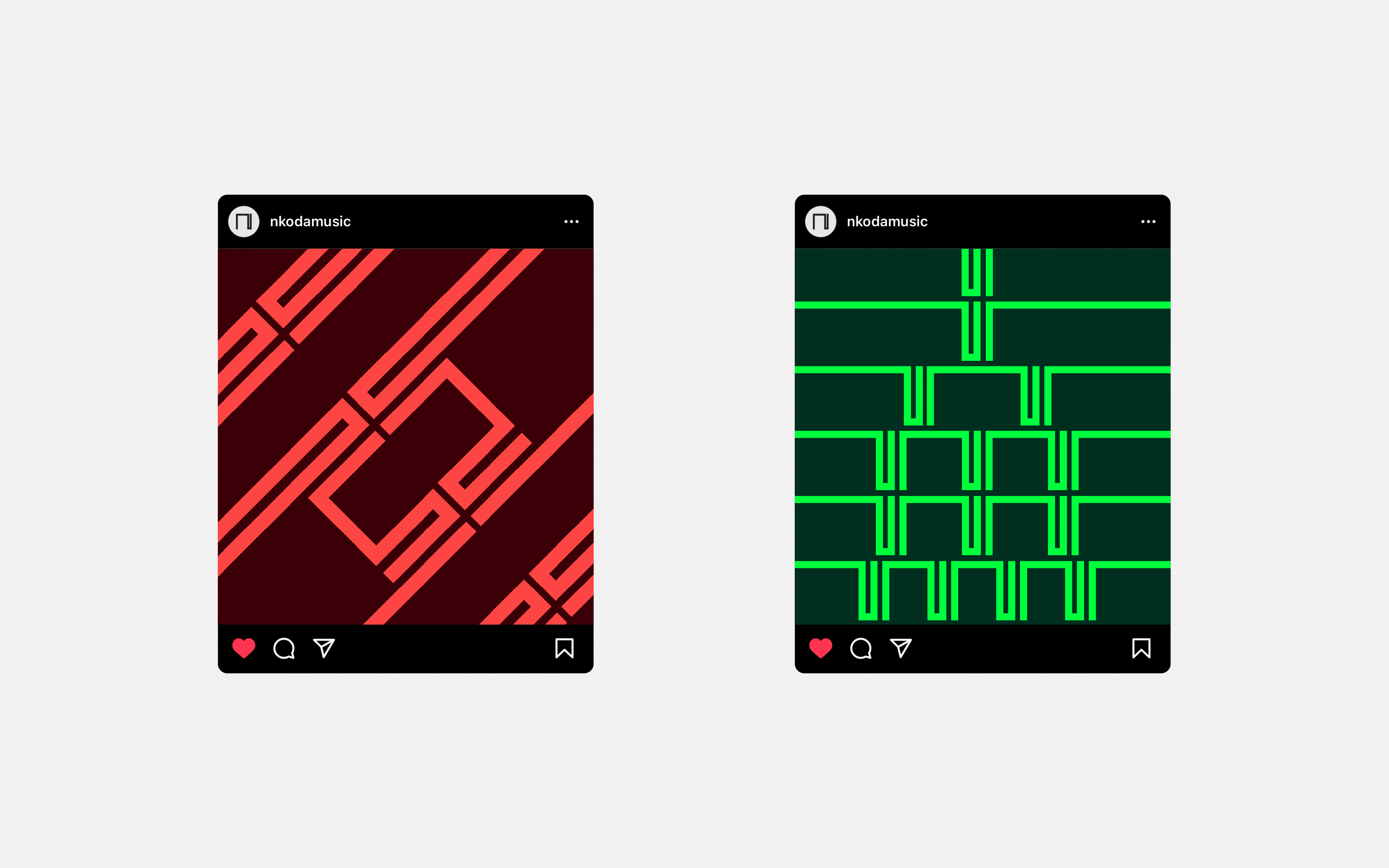
A strong yet agile shape, the soundwave, abstracted and made ownable as a distinctive N-letterform, forms the basis of a mark that is fluid and dynamic without compromising its essential form. With its clean lines and pixelated shape, the mark is built for the digital environment, and rhythmic animations put in in motion.
We have opted for an energetic, tempo-raising typeface and a colour palette flexible enough to express a variety of distinct moods, from restless and vibrant to calm and serious. This is put to full use across campaigns, which play with the form of the mark while bringing photography into the mix. A bespoke suite of musical icons also forms a key element of nkoda's digital offering.
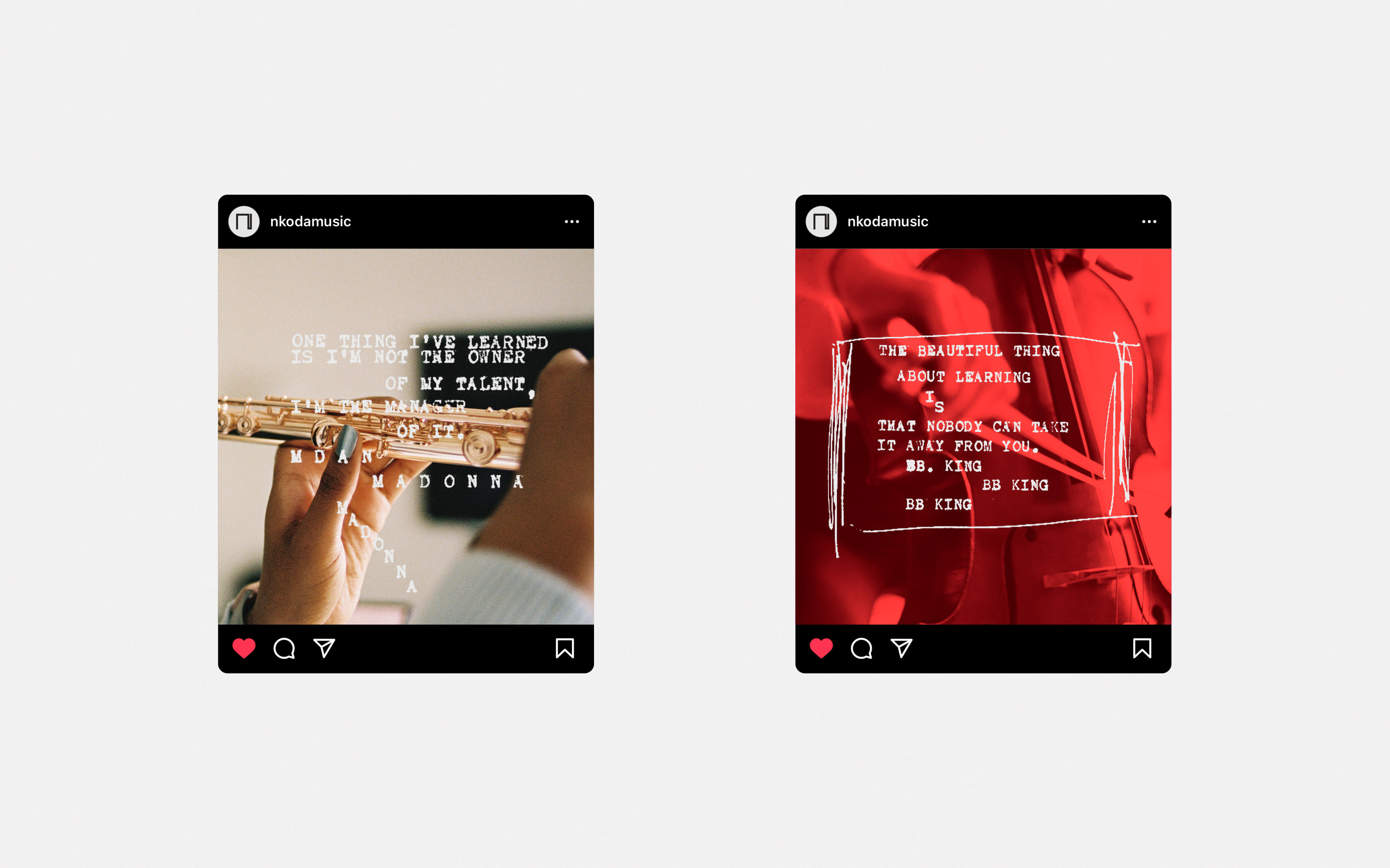
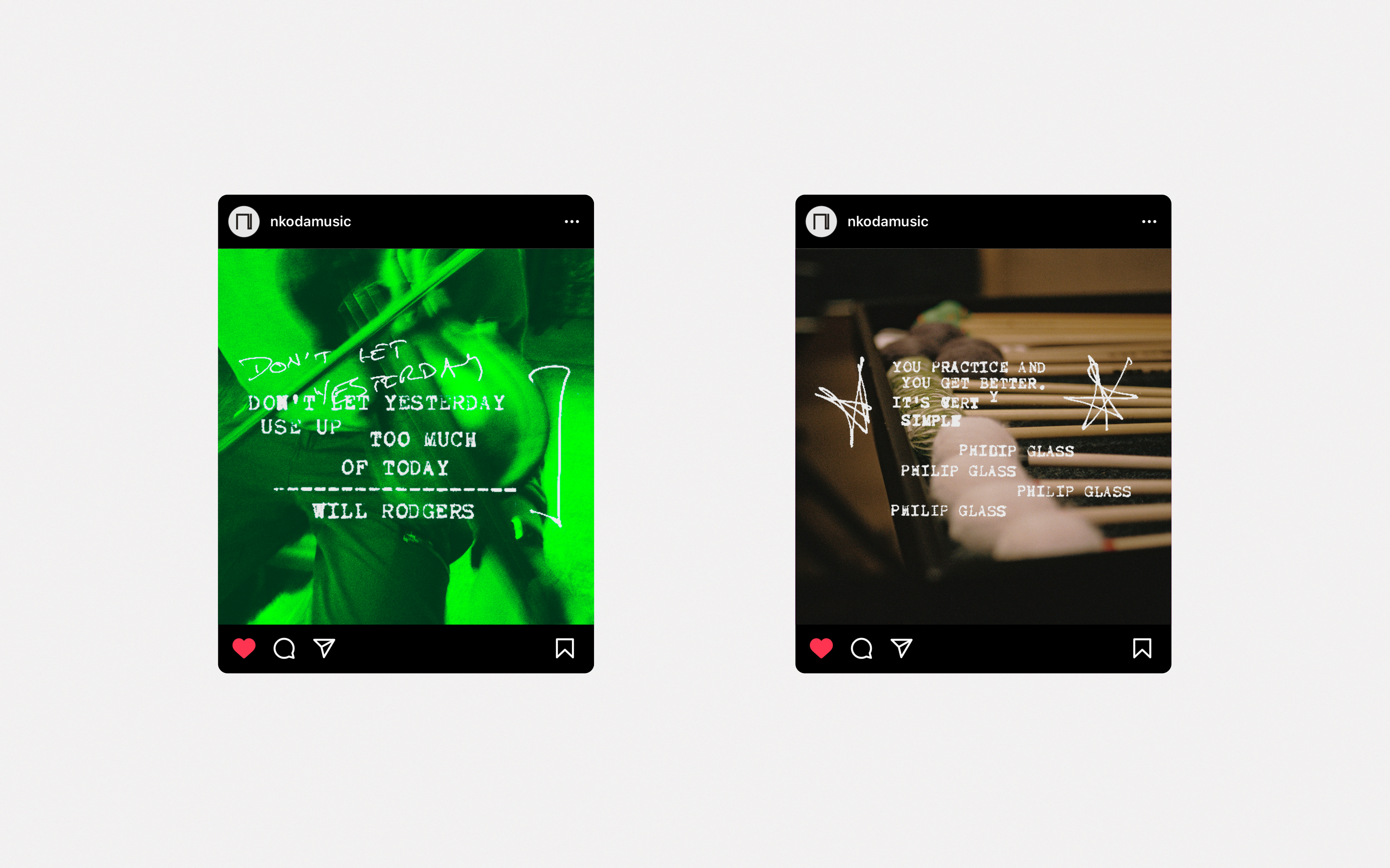
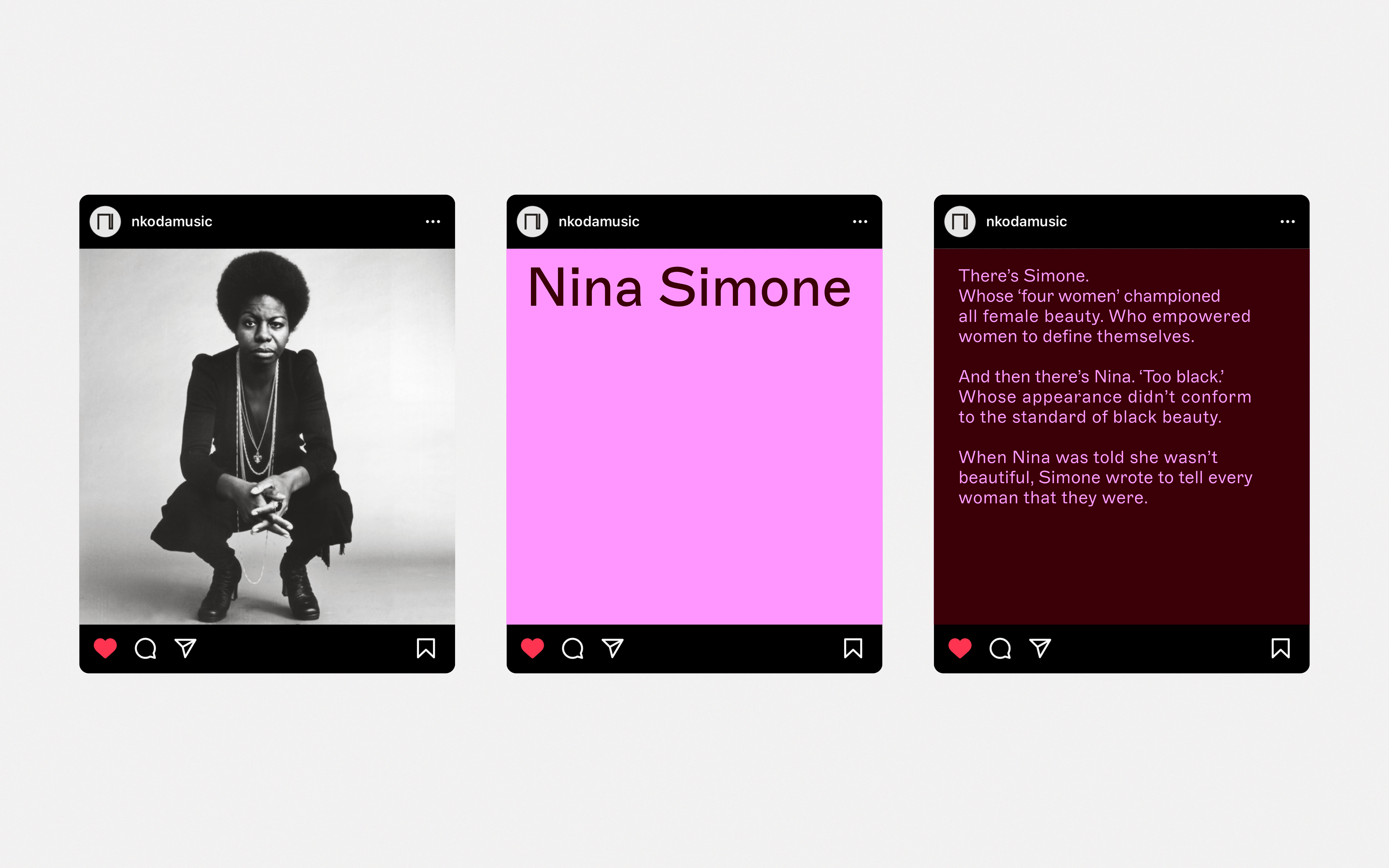
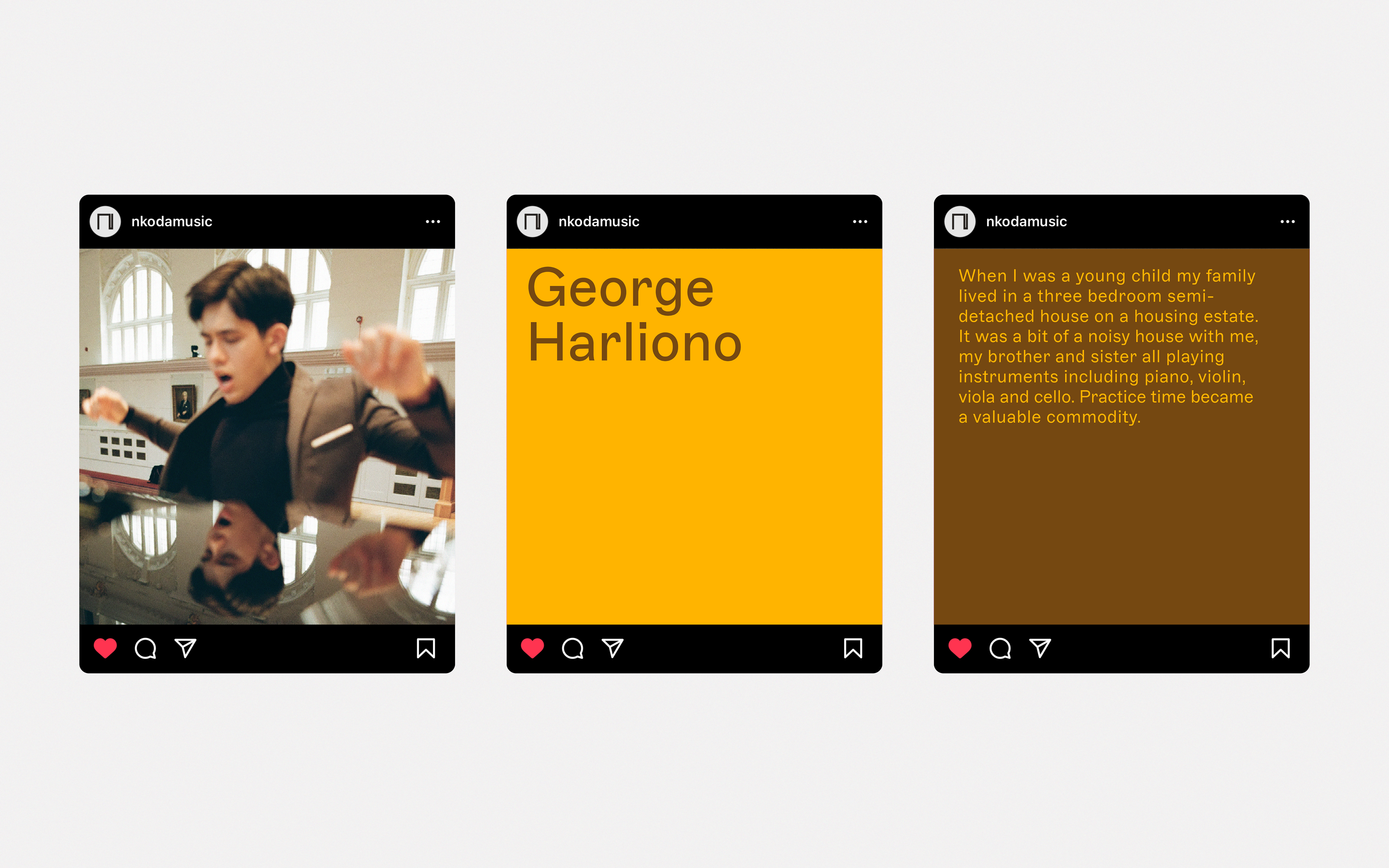
Social media campaign
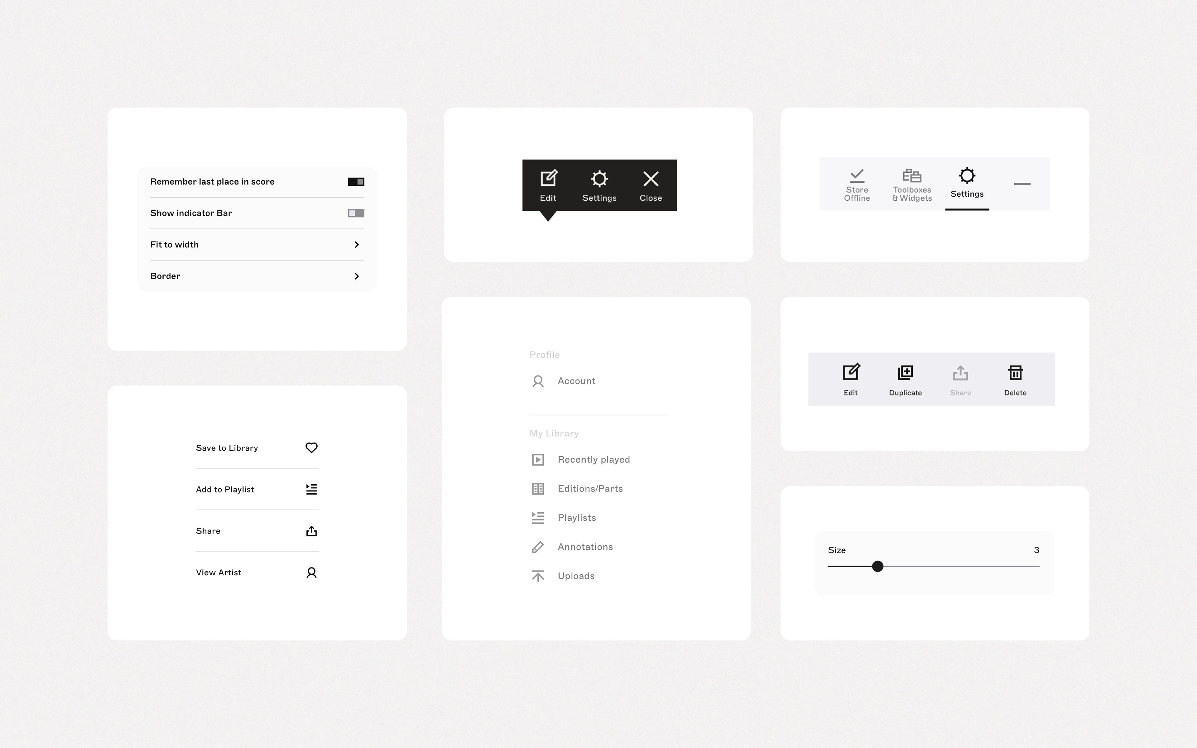
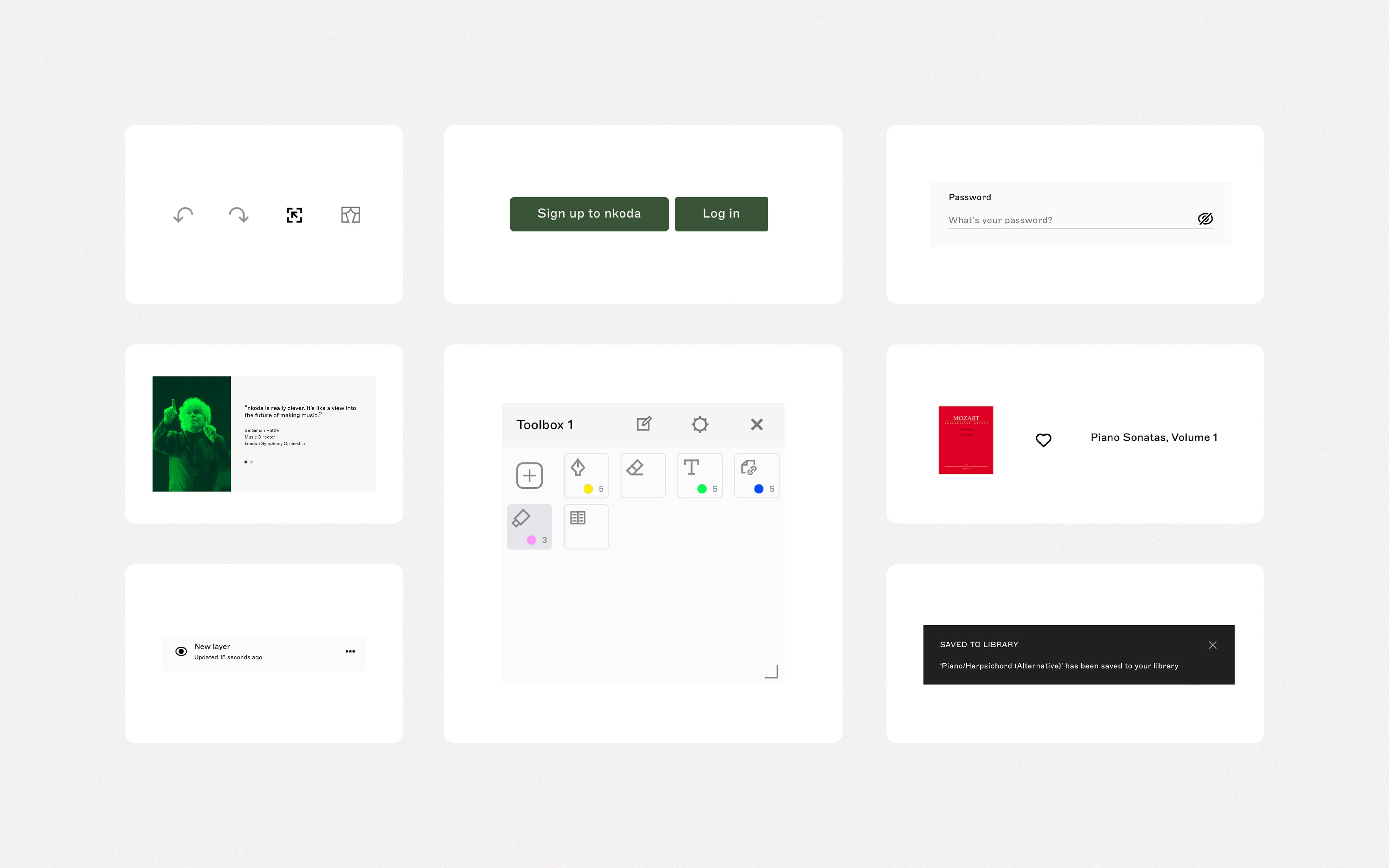
Icons and UI elements
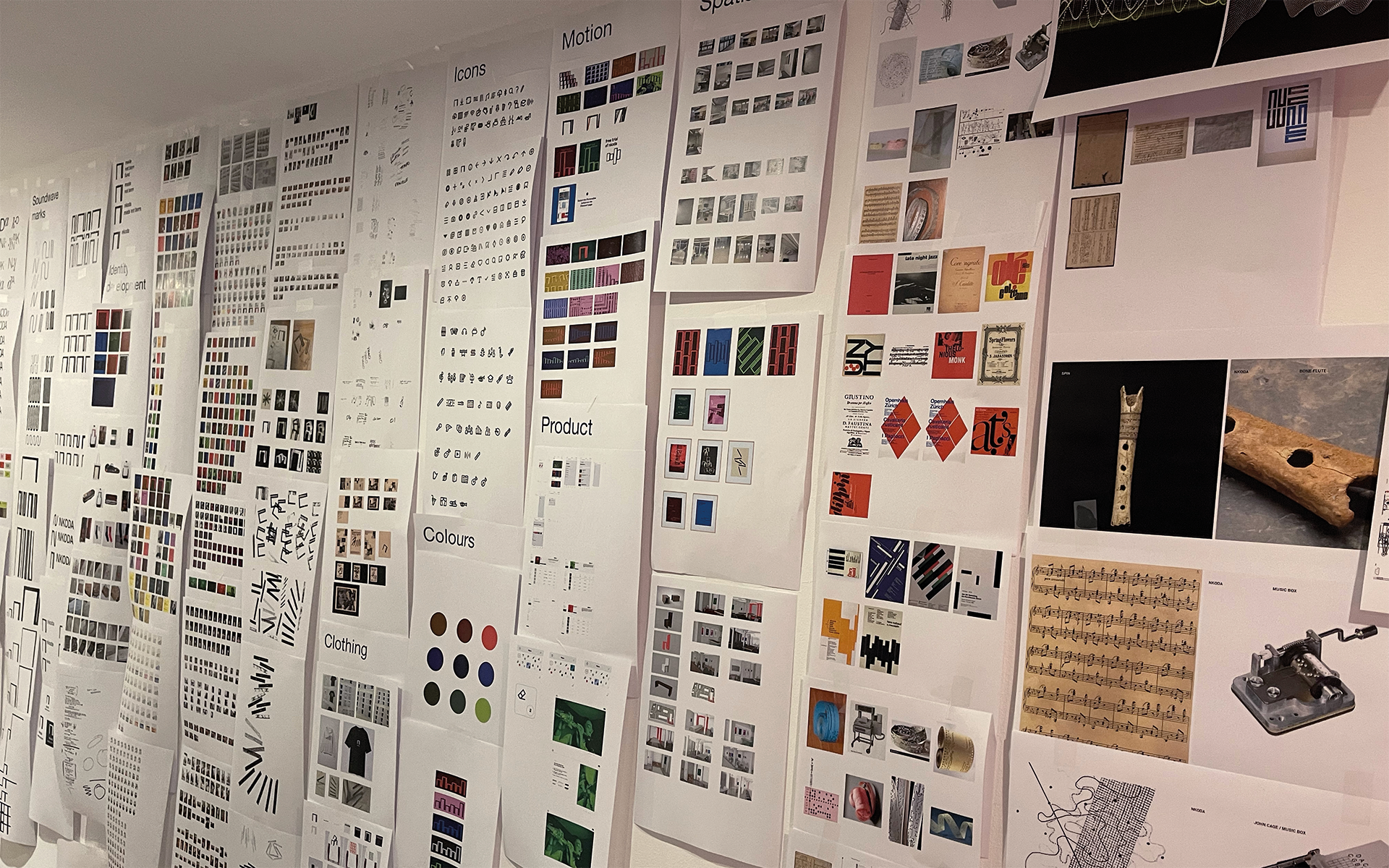
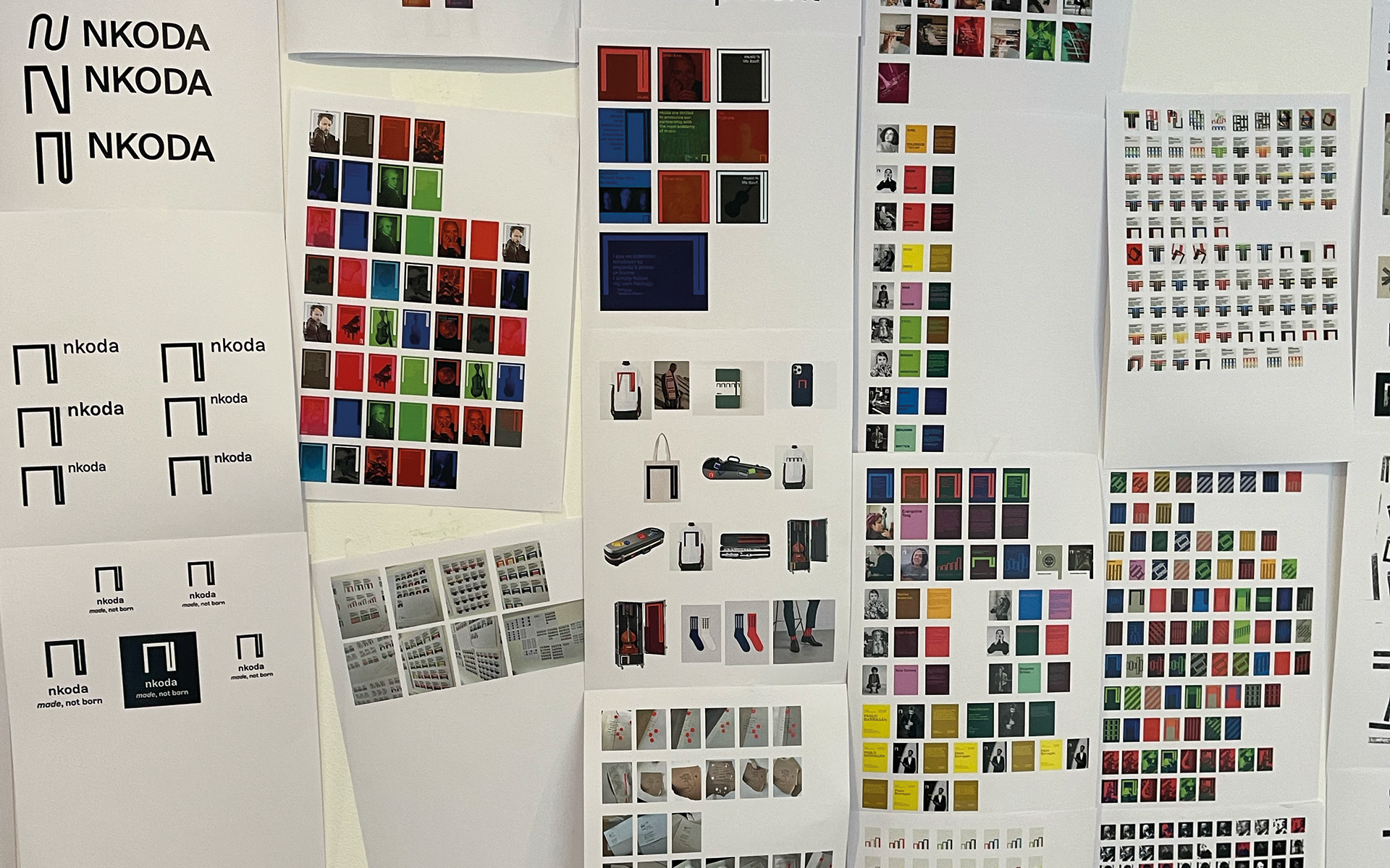
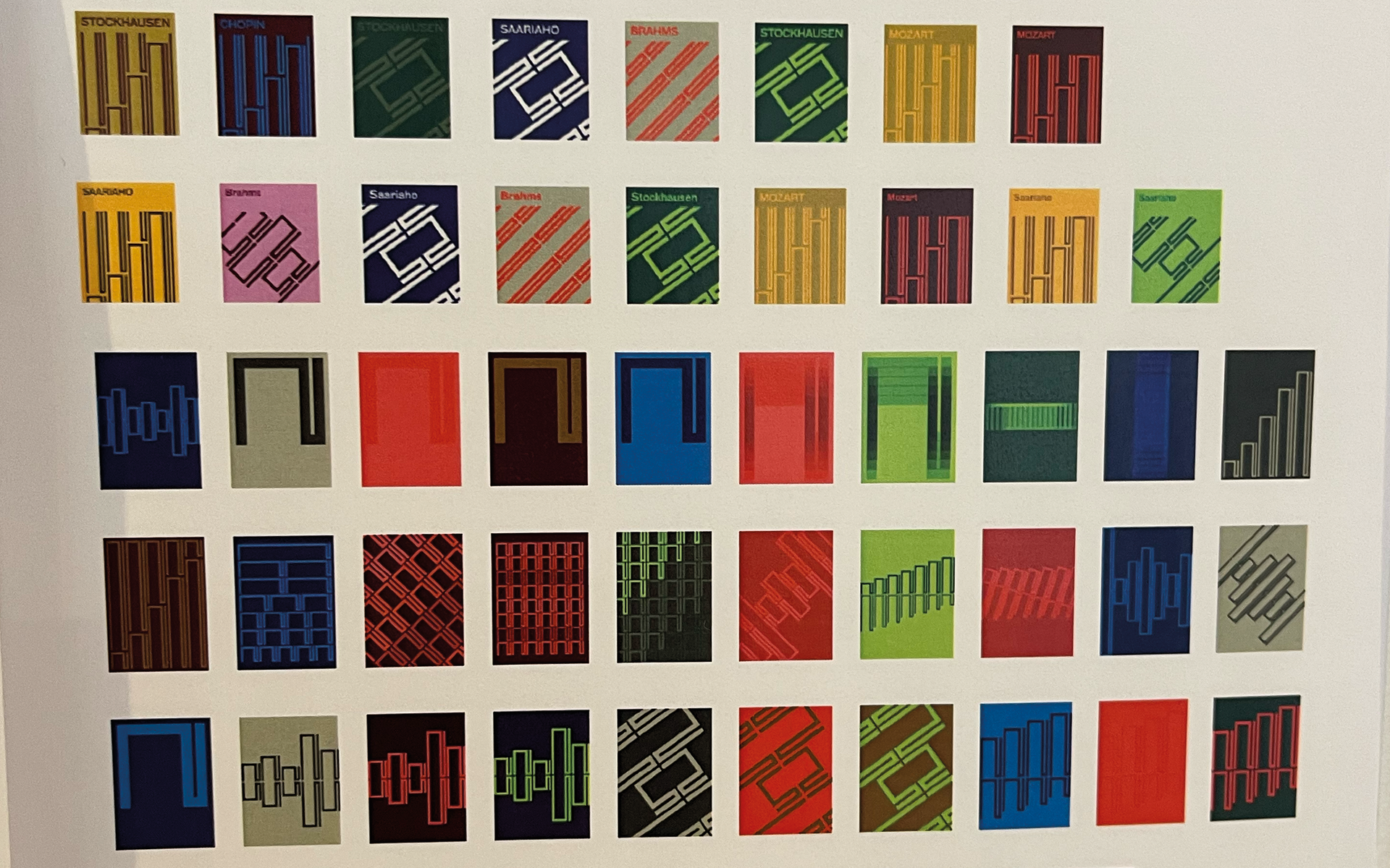
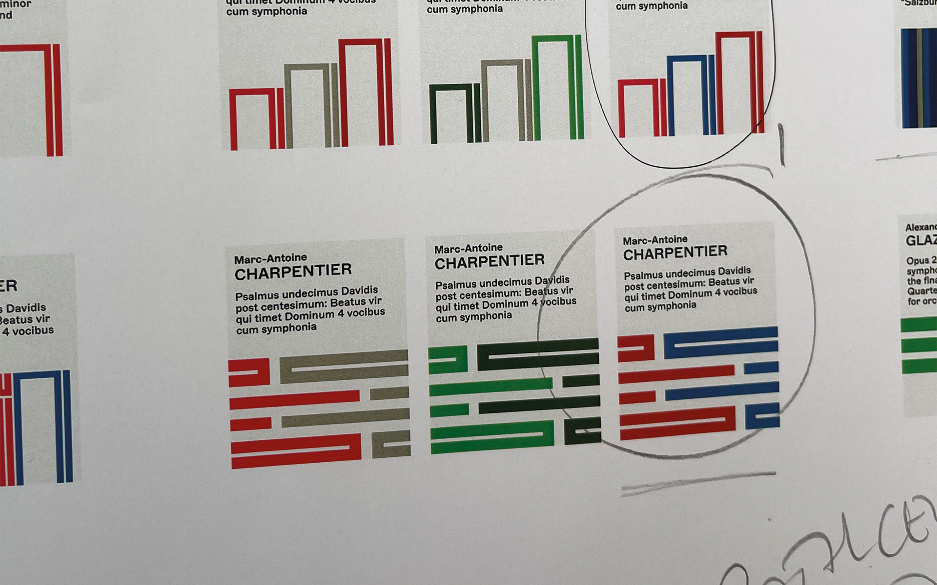
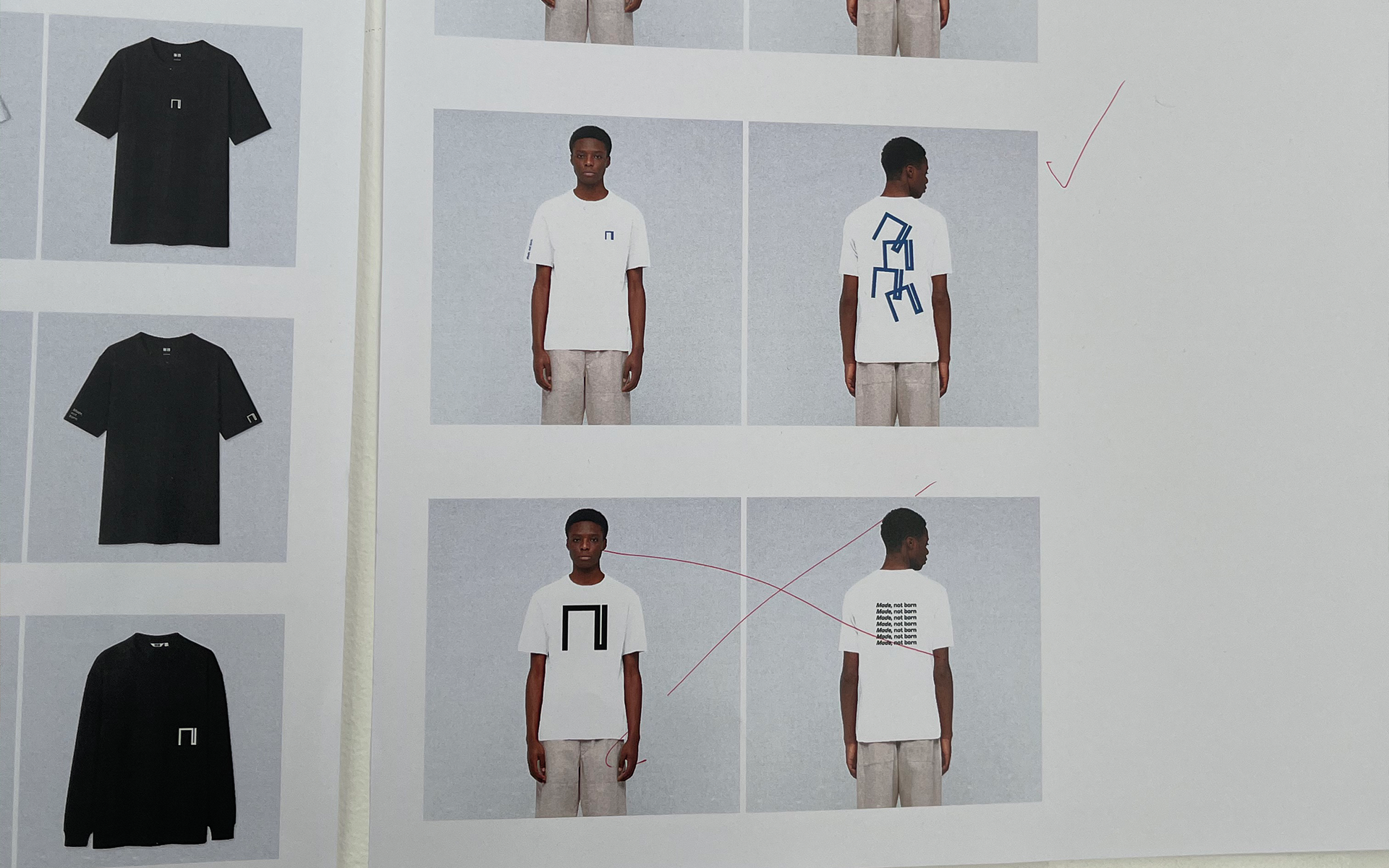
Work in progress
