Animations
Social media
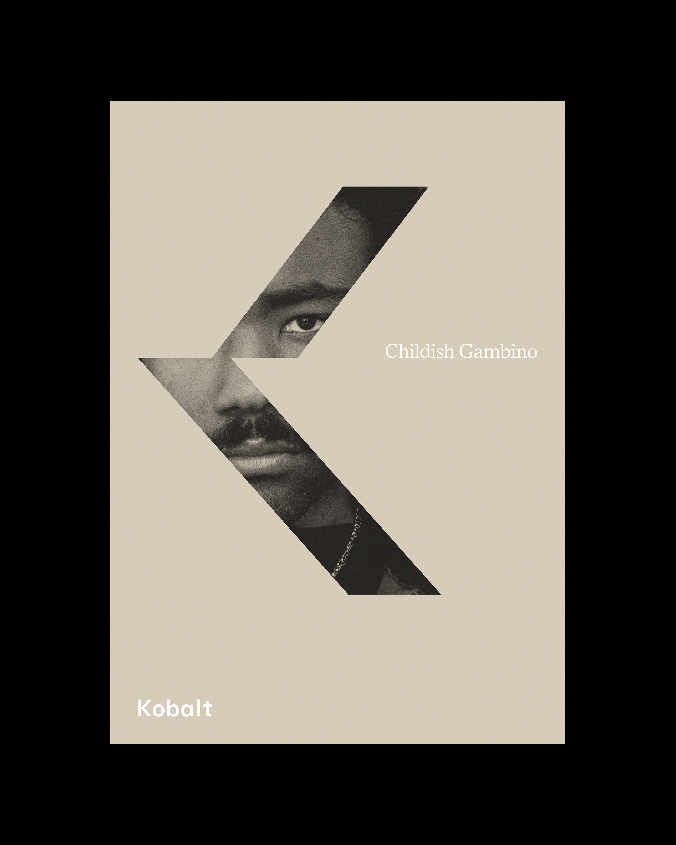
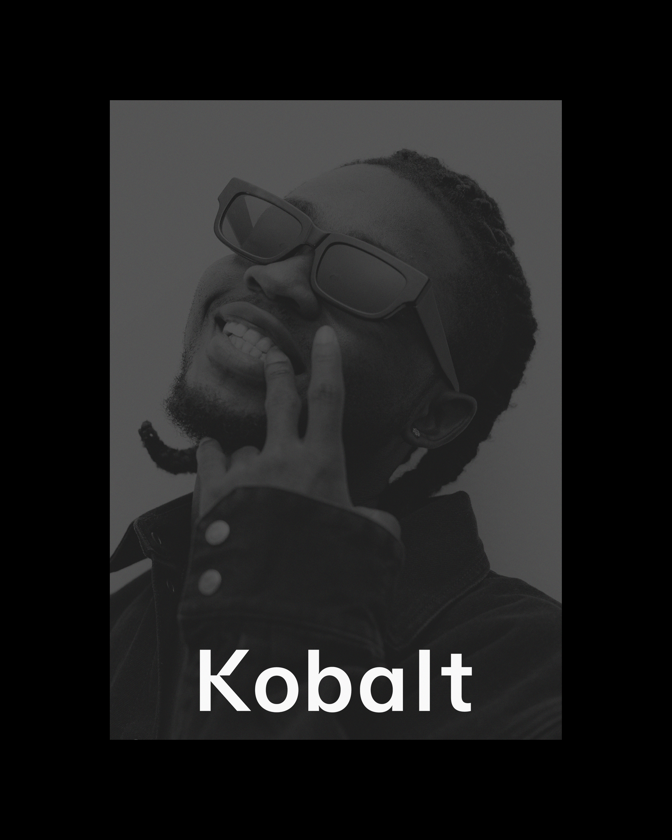
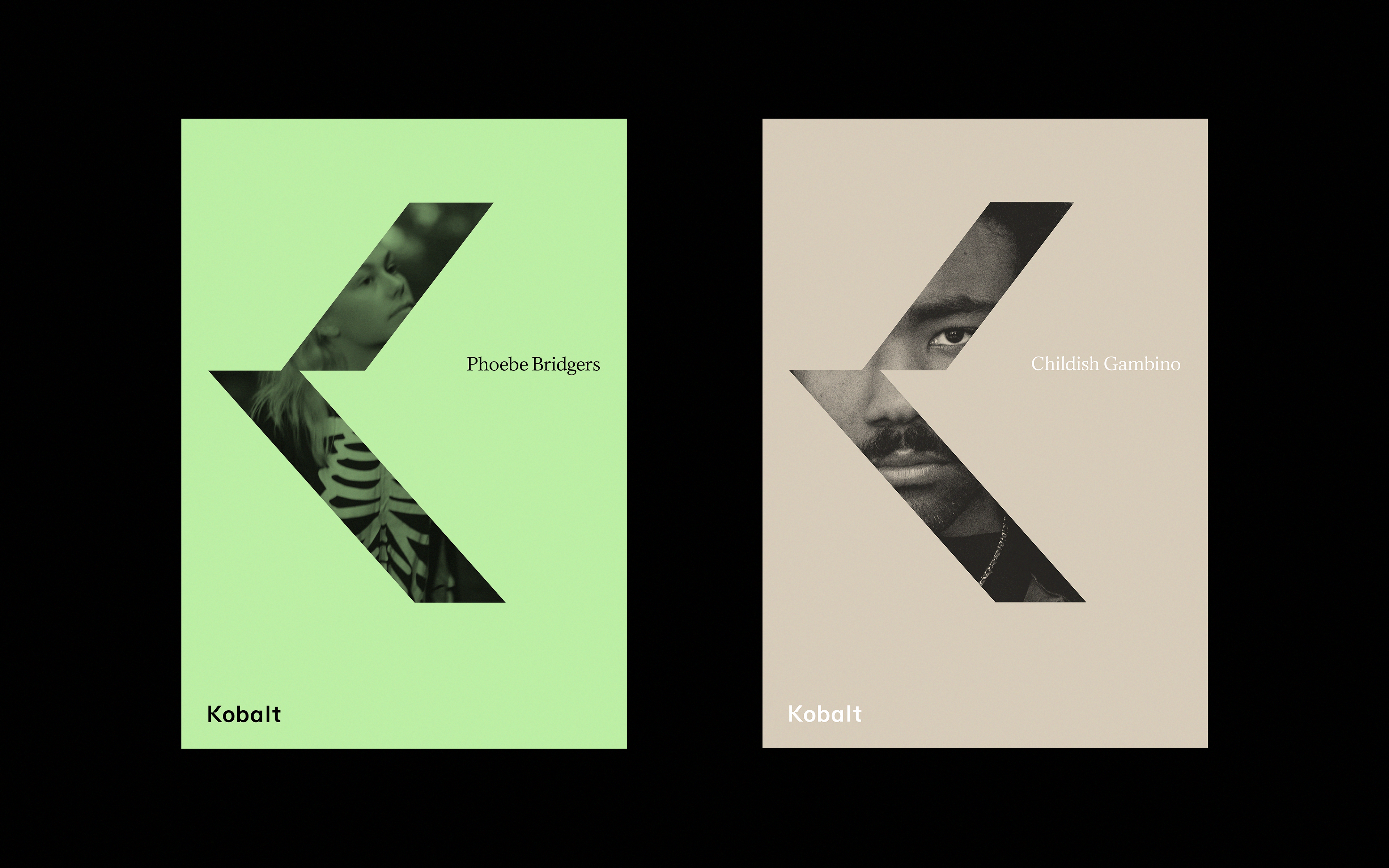
Kobalt are a music publishing company who, since their founding at the turn of the twenty-first century, have staked their reputation on being at the cutting edge of their industry. Driven by their passion for music and creativity, their offering prioritises the musicians and songwriters they represent — a list which includes the likes of Childish Gambino, Paul McCartney, Beck, Phoebe Bridgers and many others — and is underpinned by forward-thinking technology and data.
Website
Icons
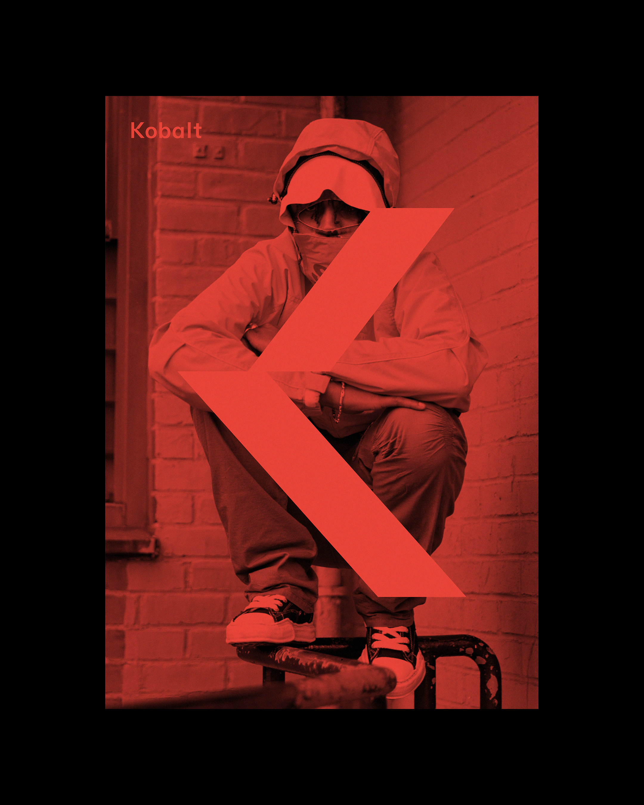
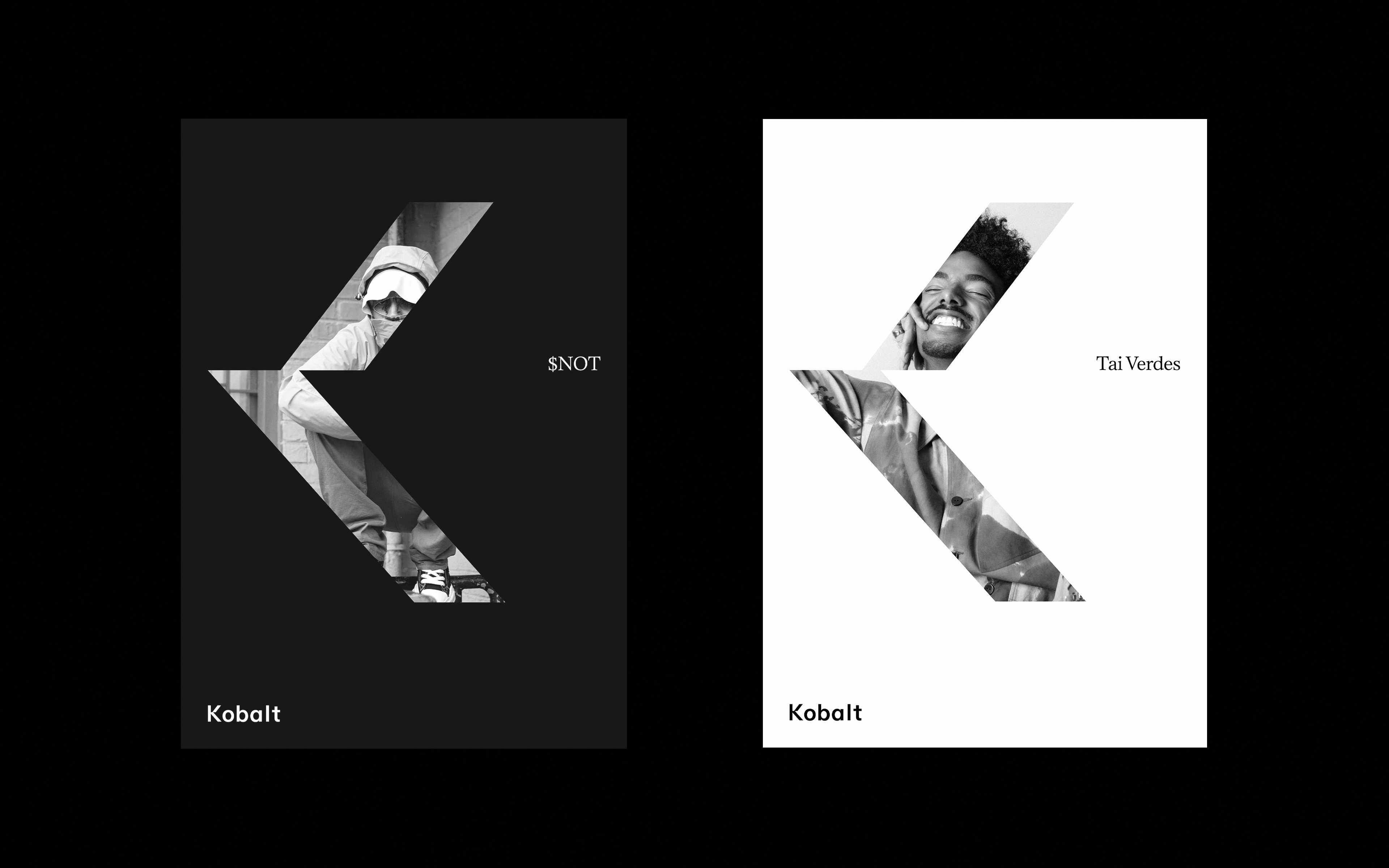
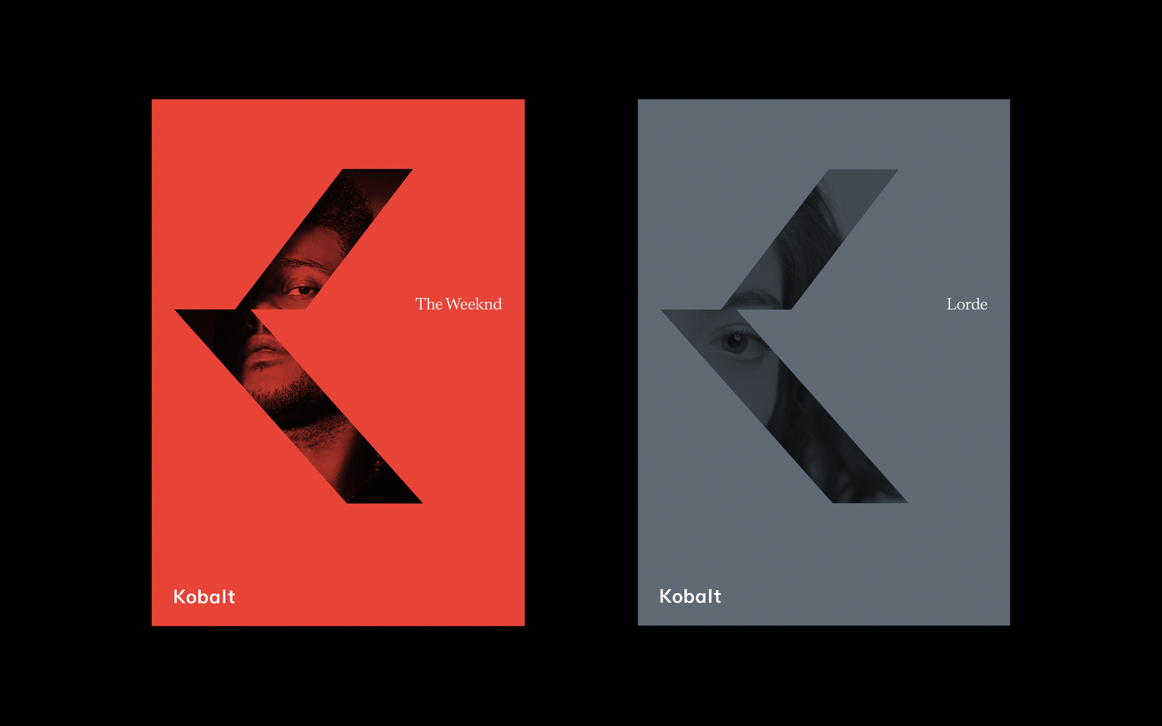
Posters
Initially founded on the back of the music industry’s digital revolution, Kobalt’s use of technology to drive artist payments removes the inefficiencies in the traditional industry model and allows artists to track rights ownership and royalties in real time, as well as advanced analytics on how, where and when their music is played. Involving a more equal split of royalty payments, fairer contracts and creators retaining control of copyrights, Kobalt’s is a genuinely artist-first offering in an industry where this has often been a rarity.
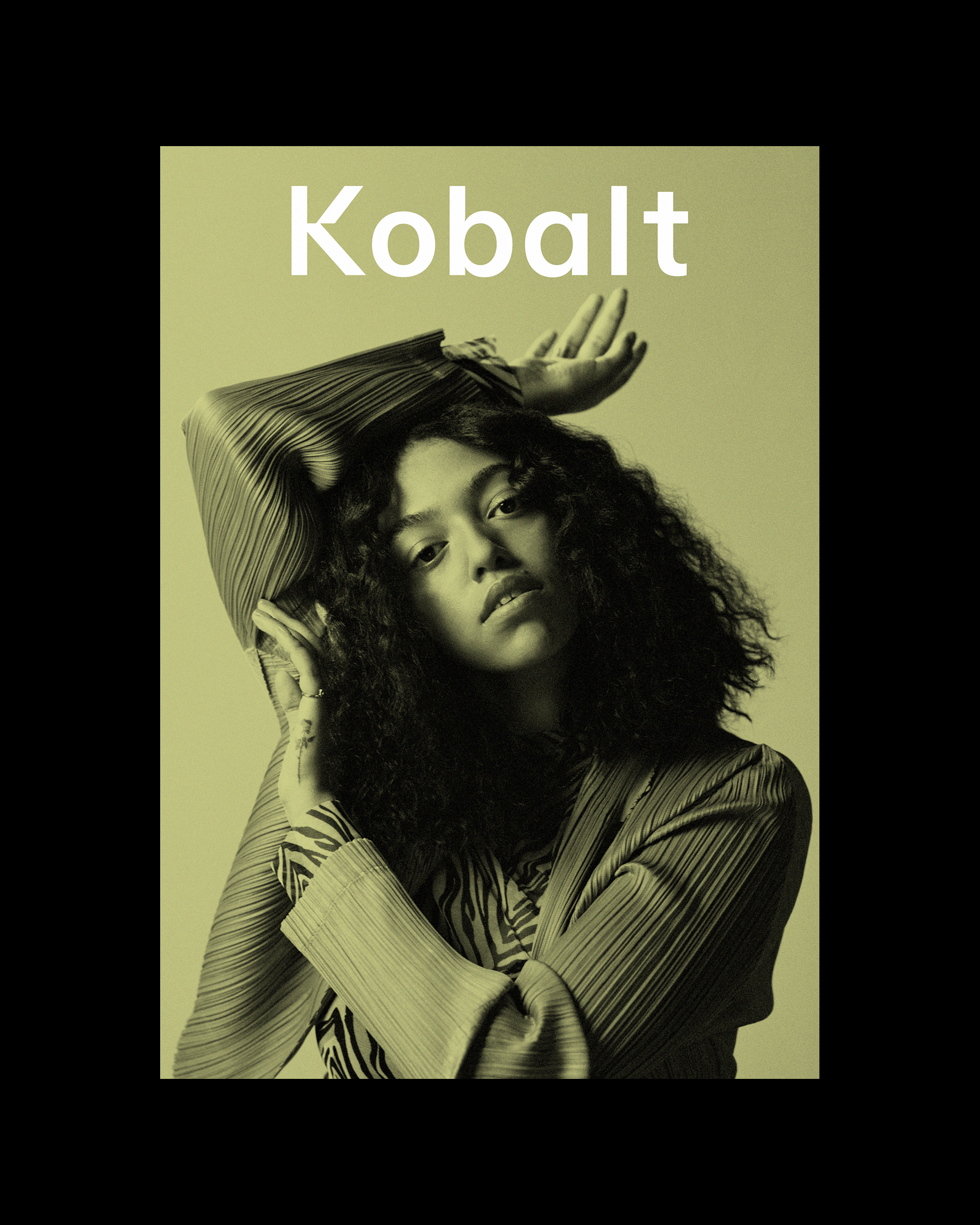
Their visual identity needed to be sophisticated enough to reflect their ambition, while remaining flexible and simple enough for use across a company of more than 400 employees. What began as an ‘evolution’ of their branding evolved into an entirely new identity which embodies both their essential status as disruptors in the music business, and the transparency which forms the basis of their appeal to artists.
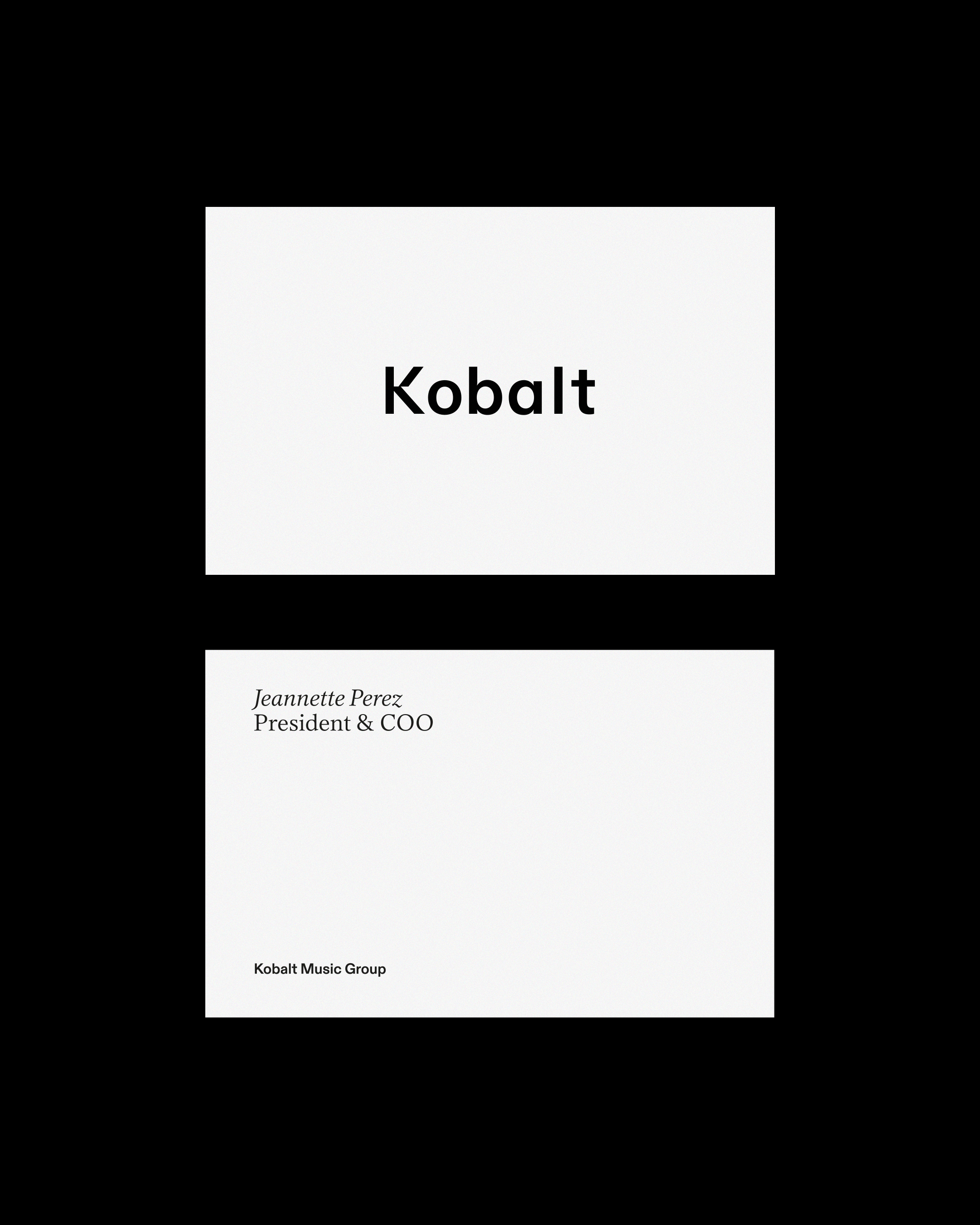
Stationery
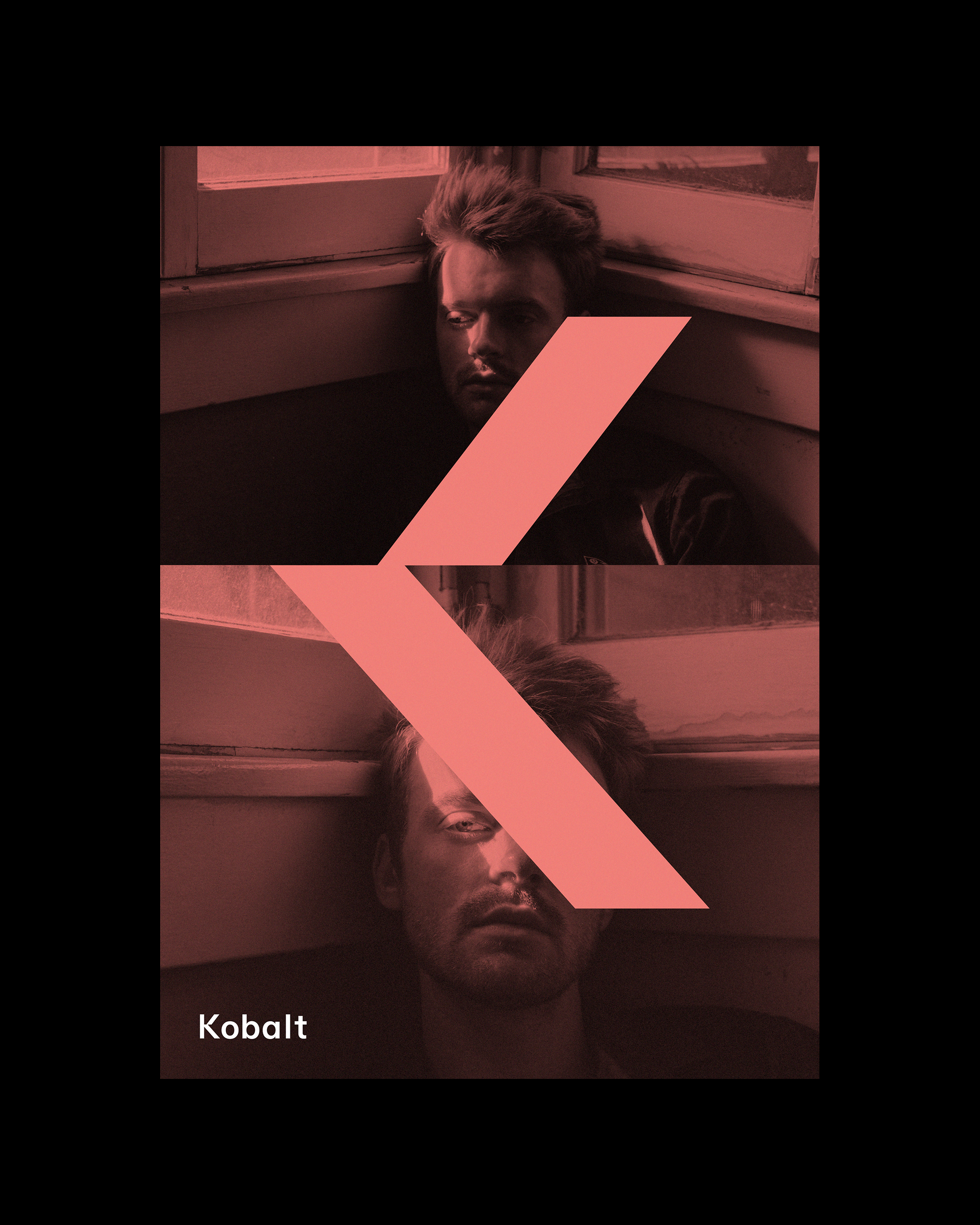
We created a responsive, sophisticated identity with a new wordmark, plus a standalone K mark — to be used as a supporting asset in situations (often digital) where the wordmark would appear too small — and a graphic mark. This is a more abstract shape (the ‘kick’ of the K) which works as a striking graphic element or framing device for more occasional use, for example when integrated with imagery.
This suite of options allows for huge flexibility, and is complemented by an expanded, nuanced colour palette which offers a greater emotional range and avoids a standard corporate behaviour. New typefaces — both a serif and a sans-serif to offer further flexibility in tone — were selected for their sense of clarity and elegance. A new Kobalt website has a refined, spacious structure, while animation is a key asset for a vibrant, technically advanced identity that is intuitively suited to the digital landscape.
