Identity and bespoke typography
Animation
Wouter Boer Architects is a design-led architecture studio focused on providing elegant and sophisticated solutions across residential architecture and interior design. They are based in the Dupont Circle neighbourhood of Washington, DC but work on a range of projects across the United States. The firm has won multiple awards and been widely published in leading architecture and design magazines.
Posters
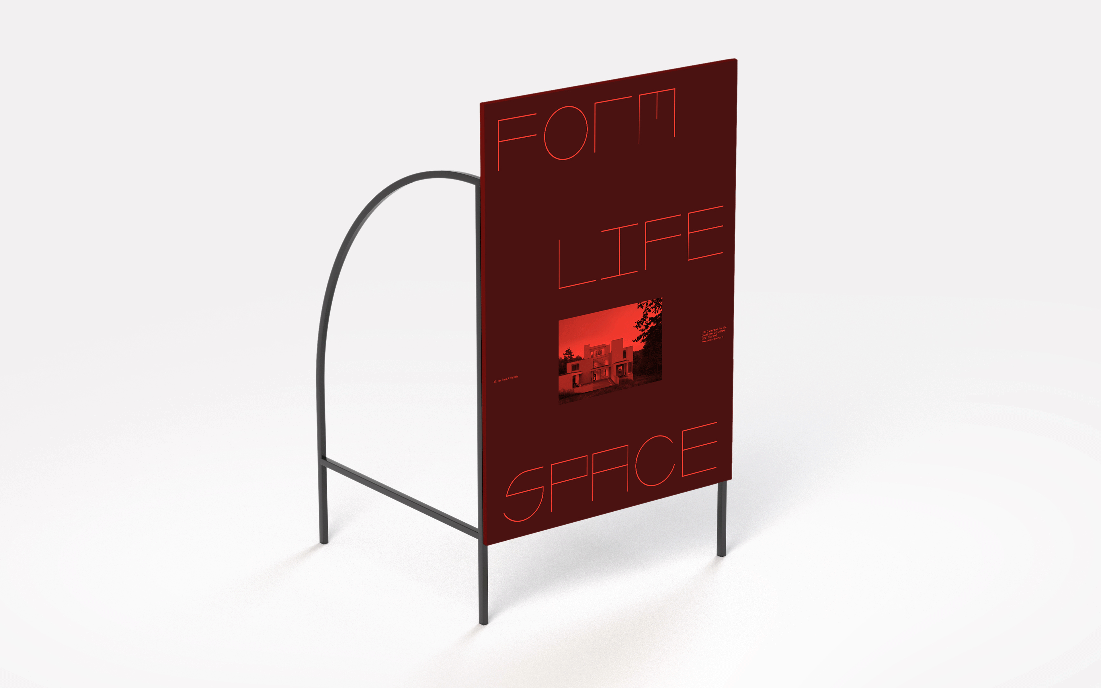
Outdoor signage concept
The firm is informed by modernist thinking but with a contemporary edge — their work is refined and elegant, with a distinctive personal quality. Our approach curates and builds on a number of citations and references in order to construct a visual language that is steeped in architecture and design history yet unmistakably contemporary.
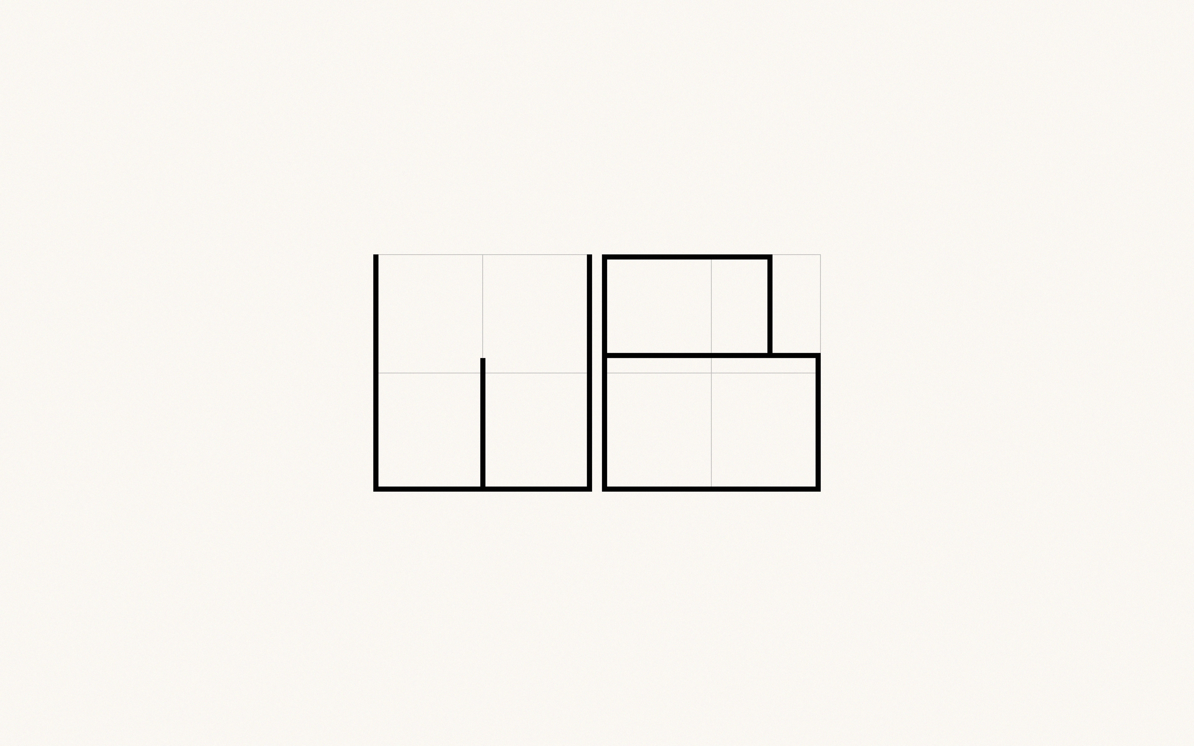
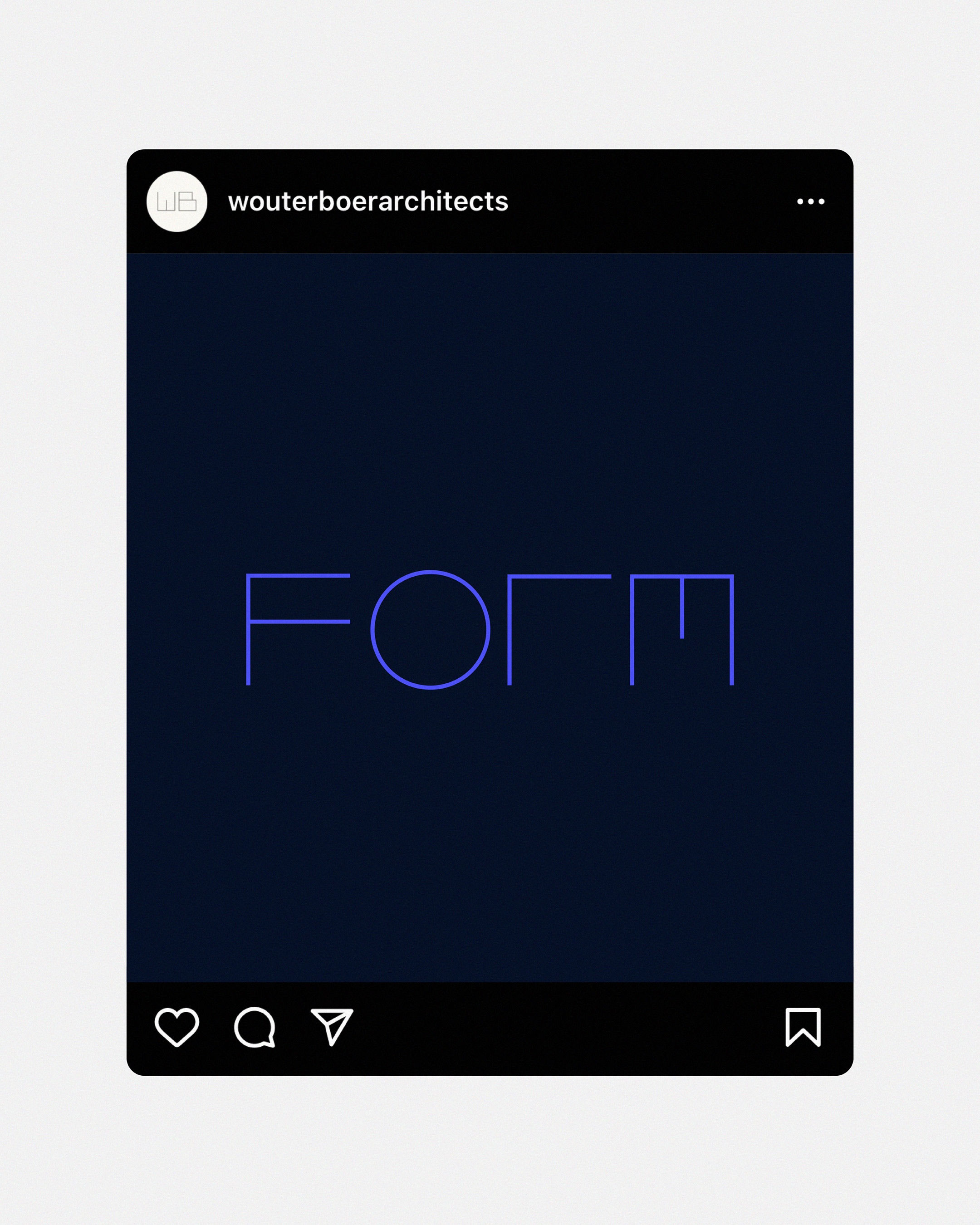
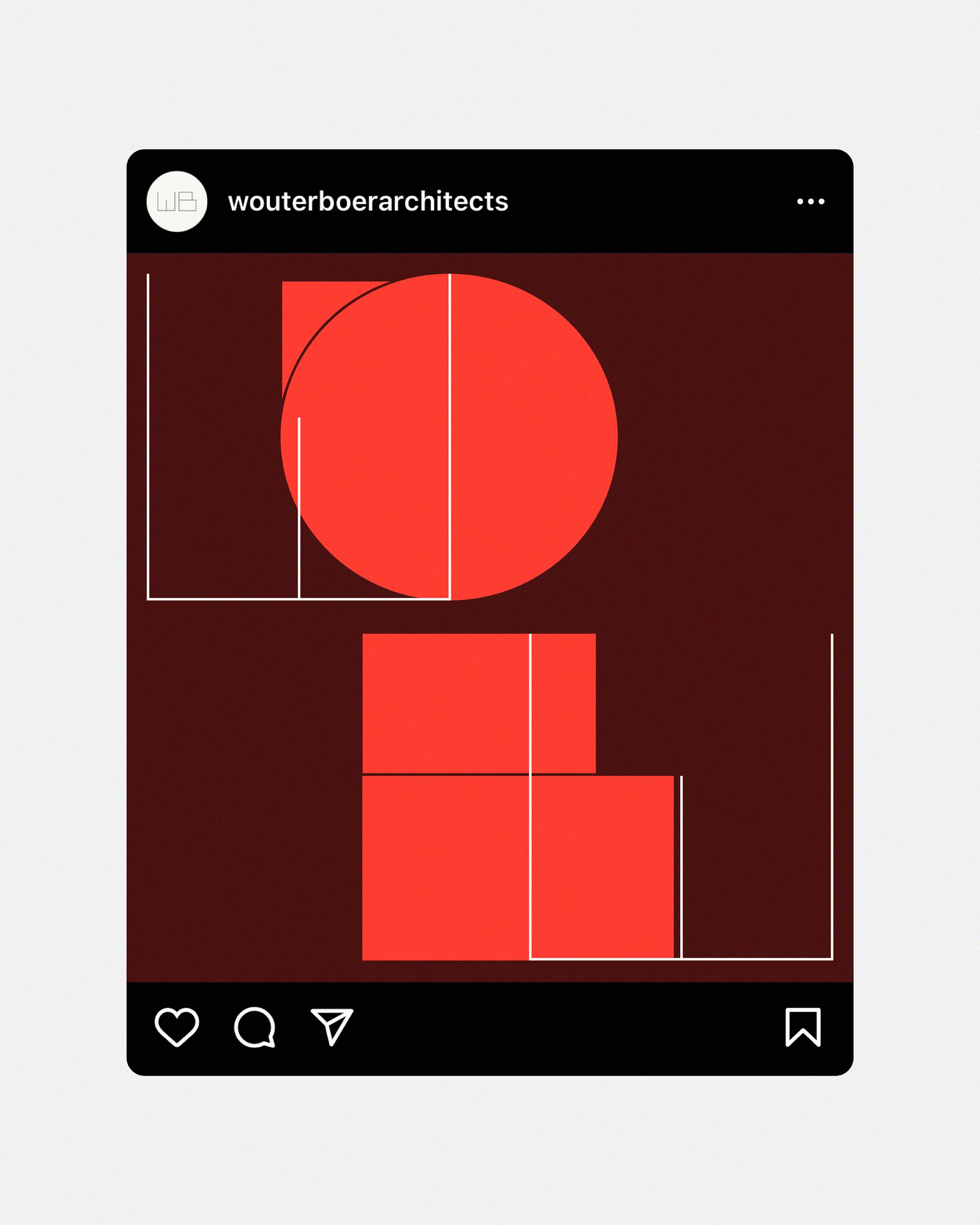
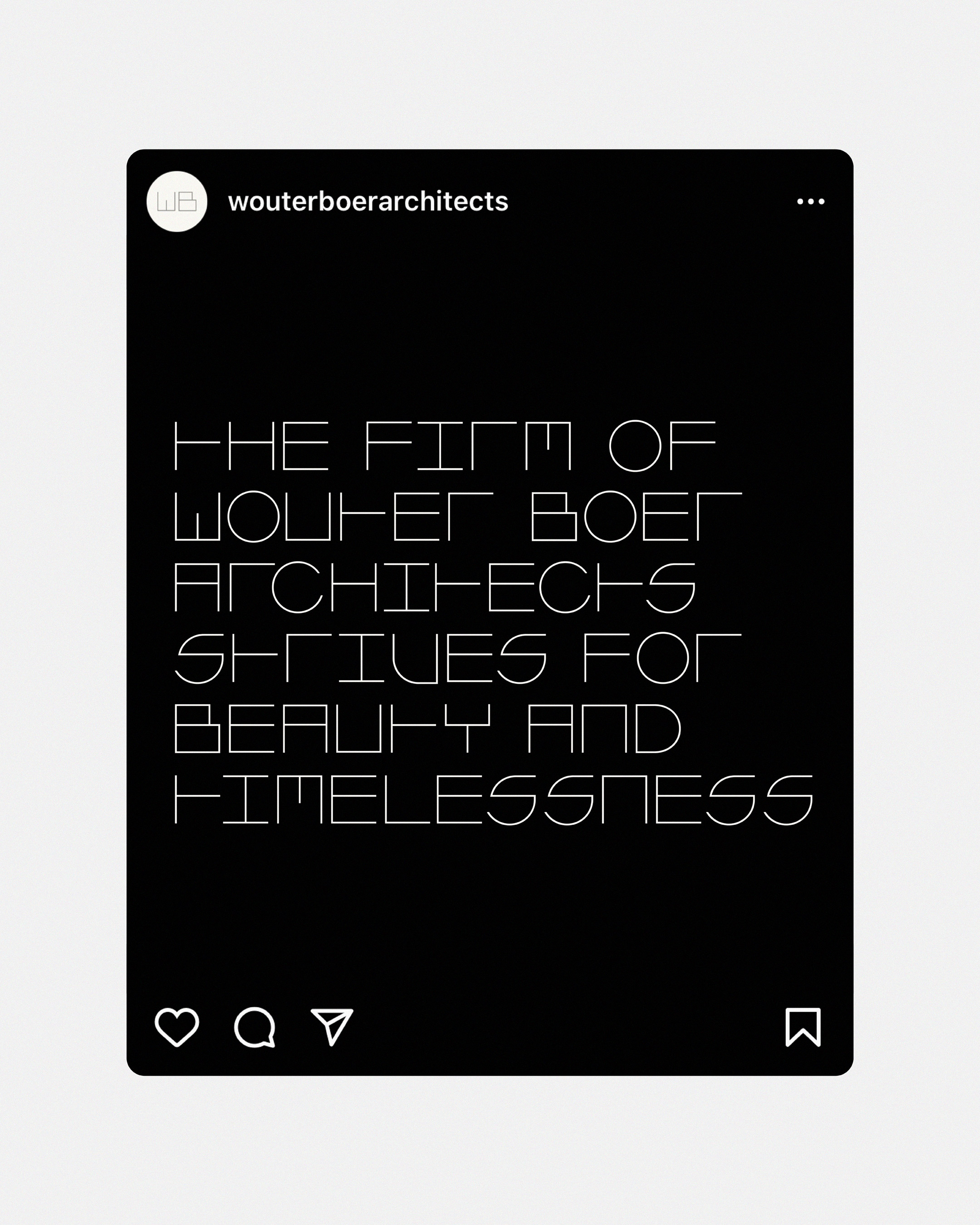
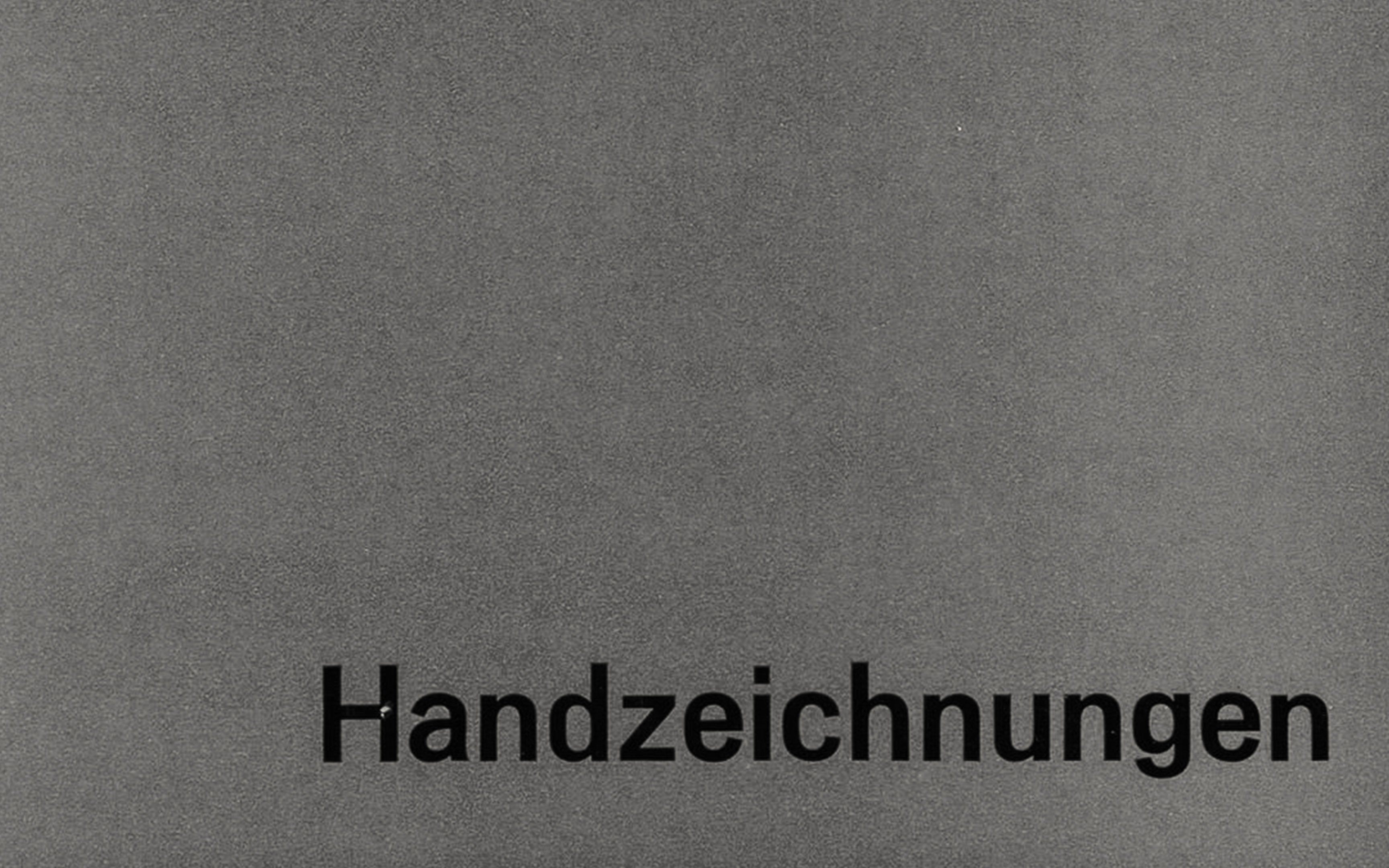
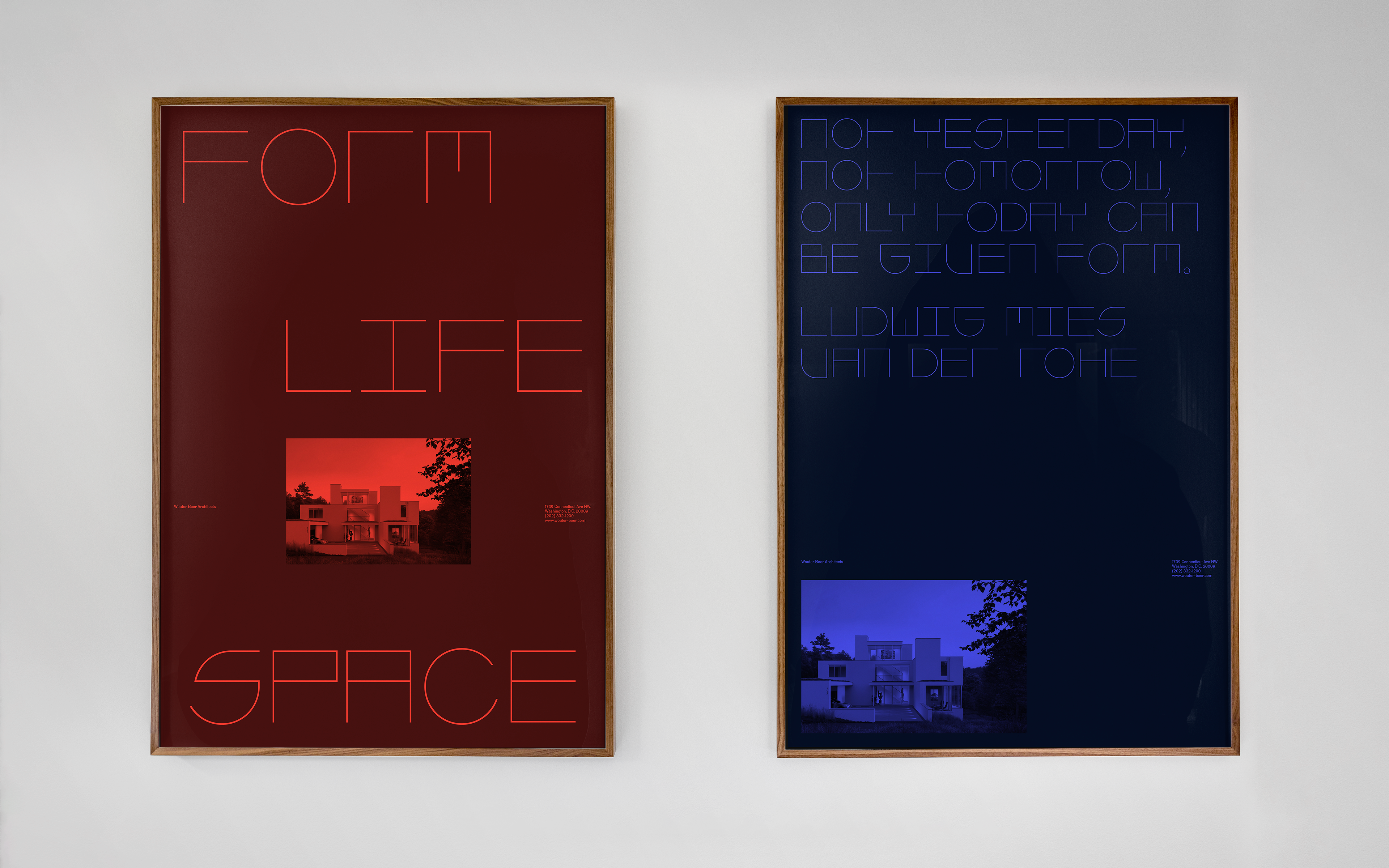
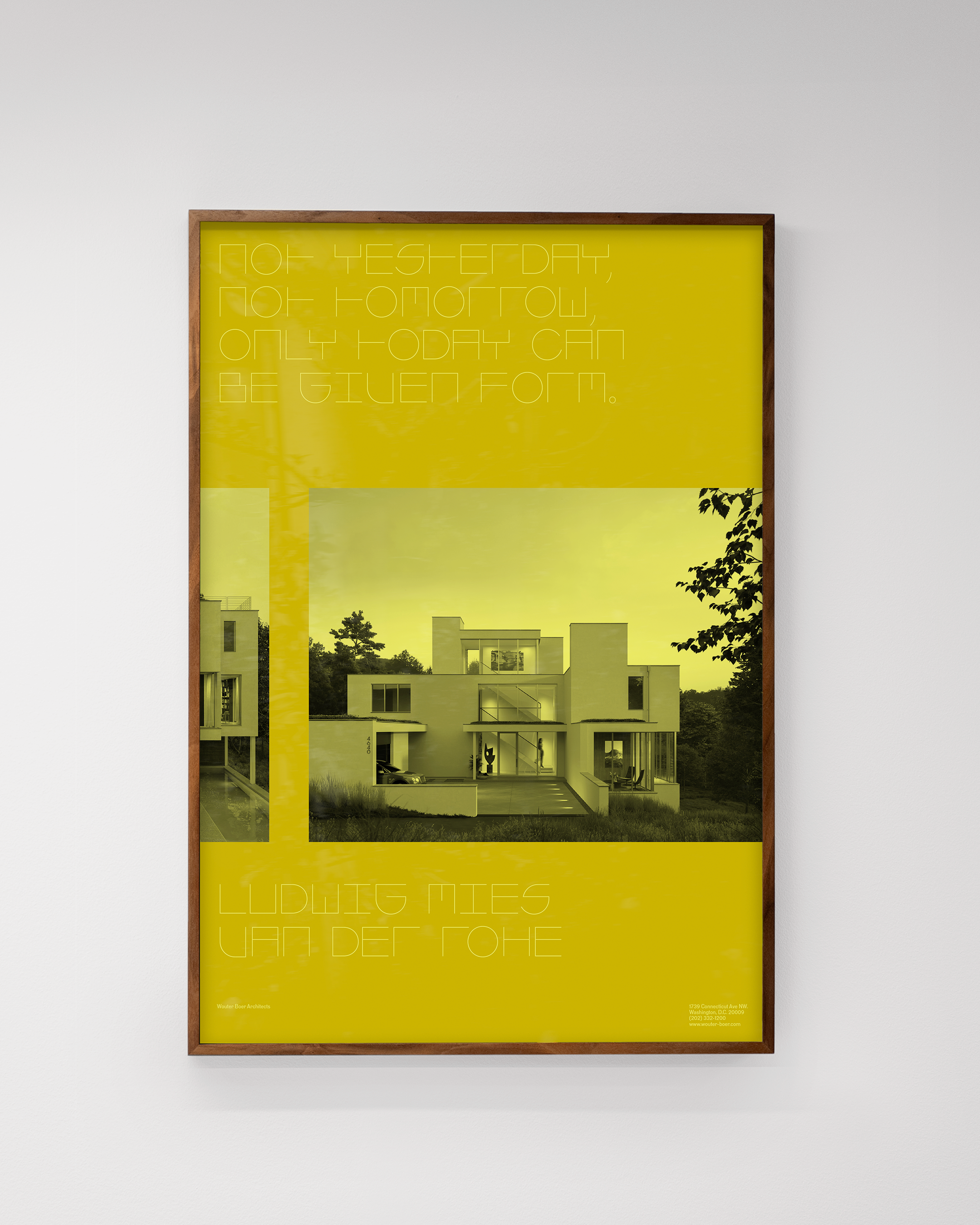
The centrepiece of the identity is a bespoke, modular display typeface constructed from geometric forms and inspired by the floor plans of Mies van der Rohe, one of the giants of architectural modernism and one of the firm’s key influences. This is supported by a contemporary version of the ‘Neue Moderne Grotesk’ typeface used by Arnold Bode in 1964 for the seminal art exhibition documenta III, which featured the likes of Paul Klee, Hans Arp, Ellsworth Kelly and Larry Rivers. The colour palette, meanwhile, spans deep red to pale yellow and was influenced by colour studies developed by the Bauhaus master Josef Albers.
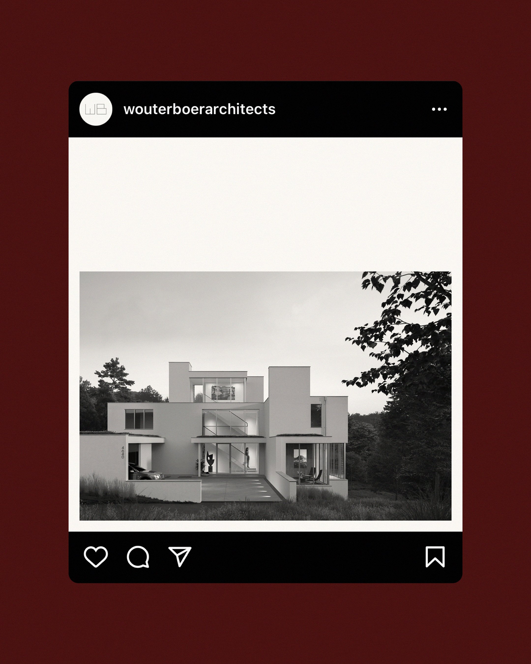
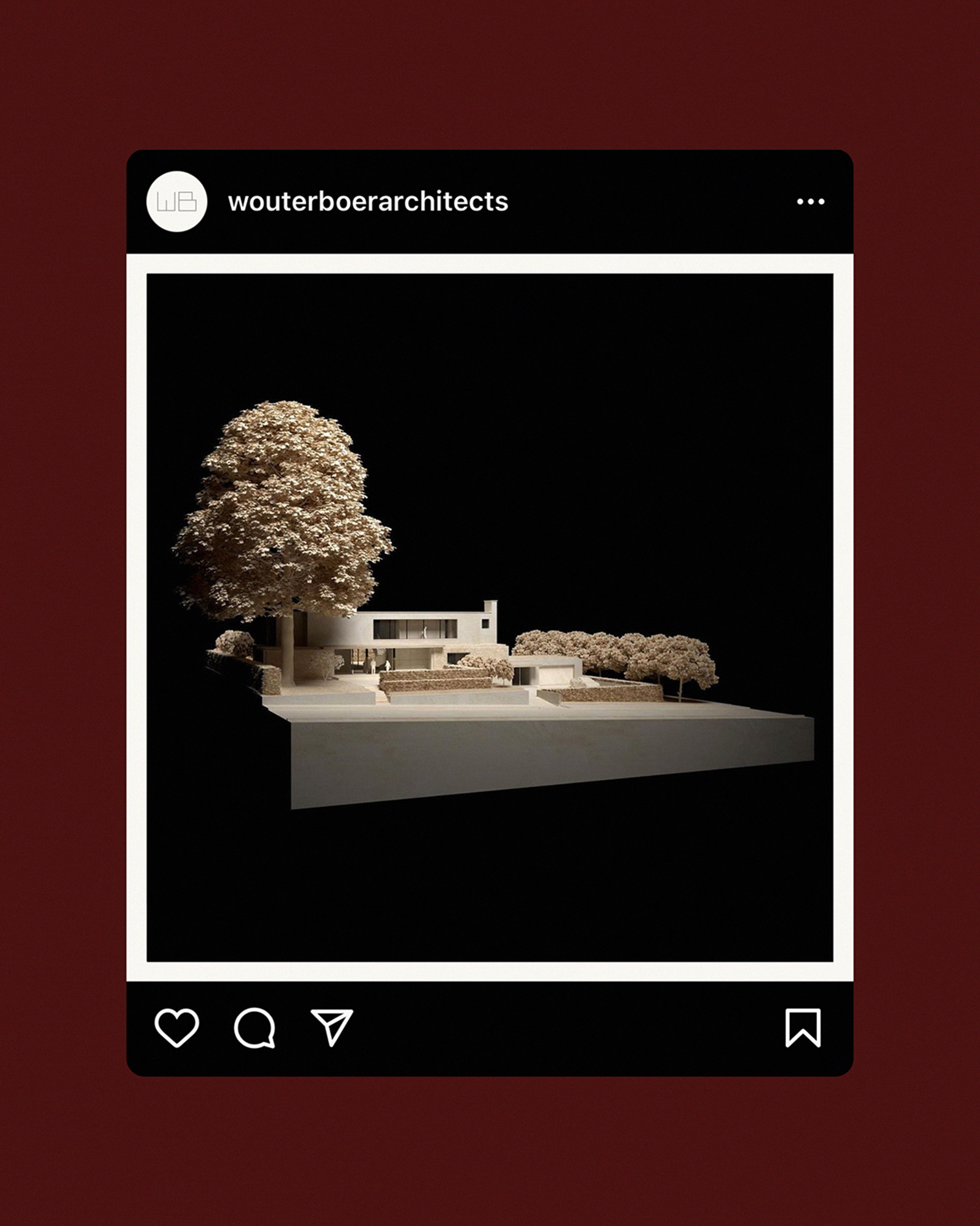
Social media posts
Despite modernist architecture’s sometime emphasis on minimalism and rationality — Mies famously summarised his approach with the phrase ‘less is more’, Le Corbusier described a house as a ‘machine for living in’ — its aspirations were utopian: a unison of form and function motivated by the belief that design could improve people’s lives; new worlds in steel, concrete and glass. Translating some of its qualities into graphic terms, the identity is a rigorously executed system that explores ideas of beauty, space and formal purity.
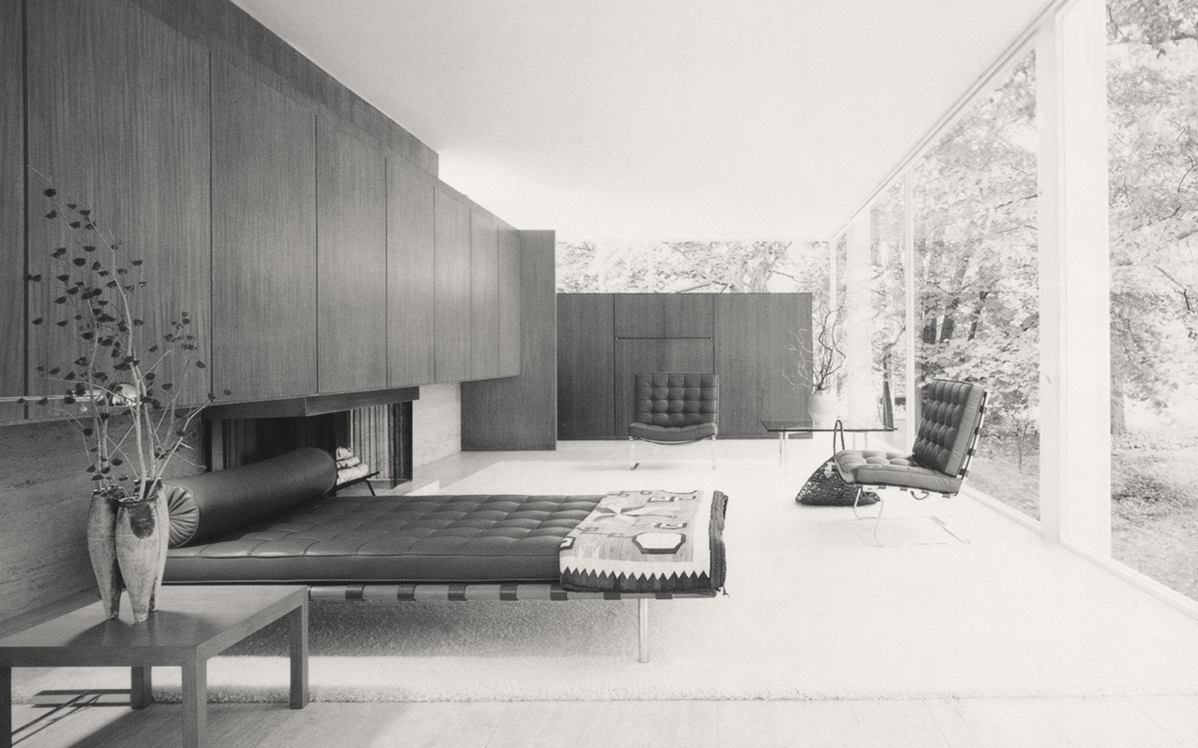
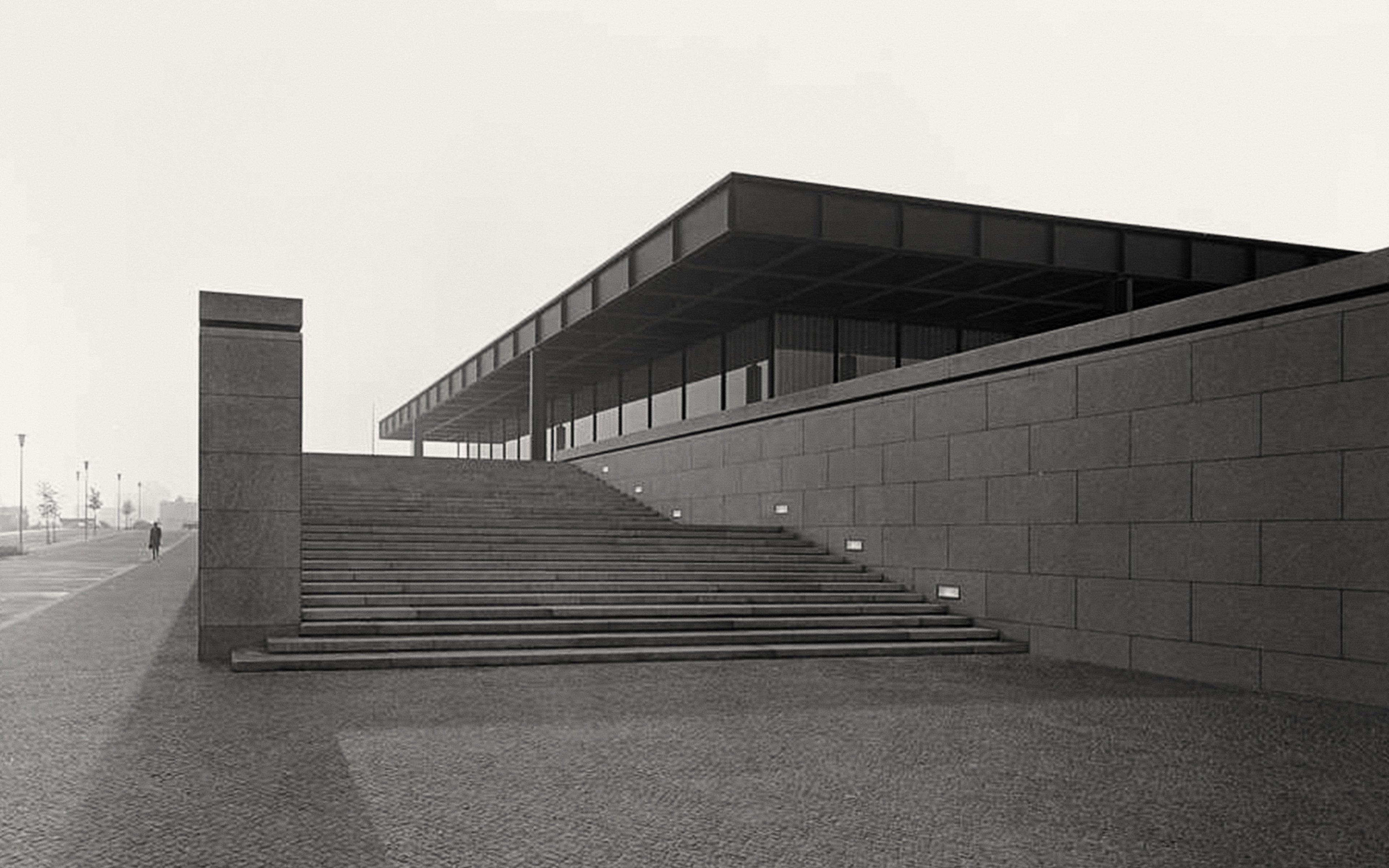
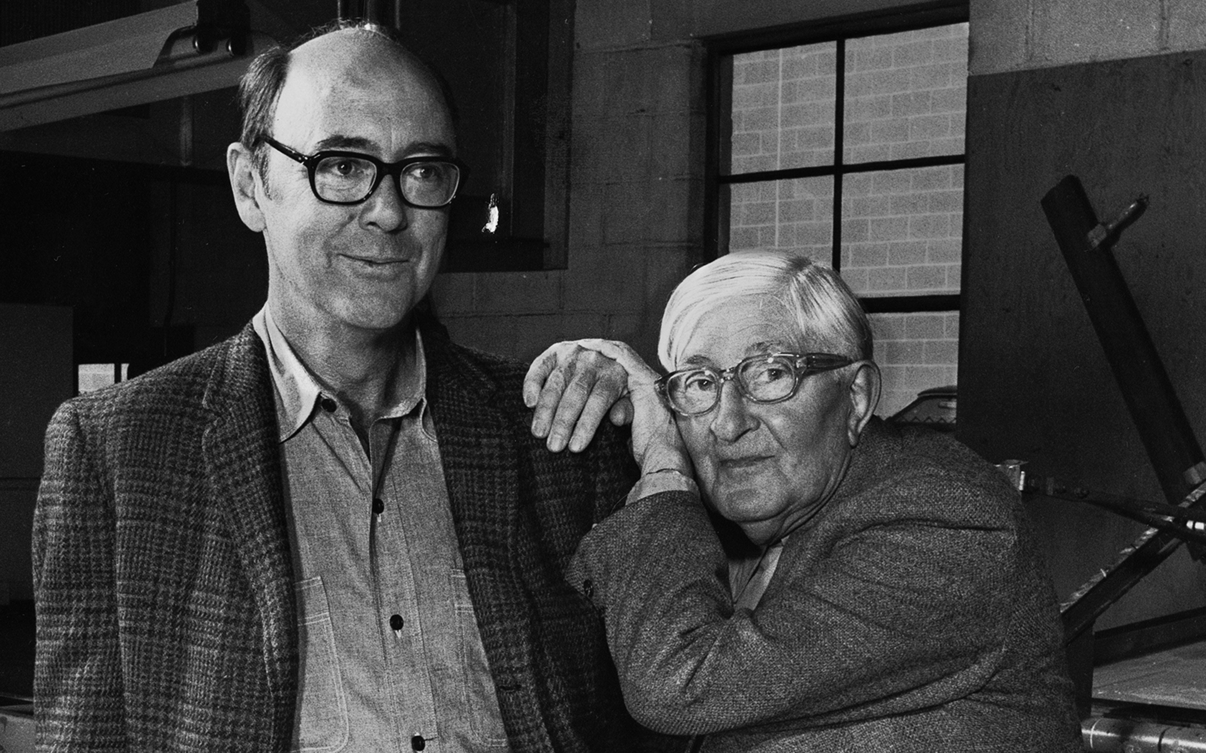
Inspiration: buildings by Mies van der Rohe; 'Normal Grotesk' in use for the documenta III catalogue in 1964; Norman Ives and Josef Albers
